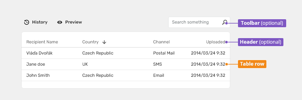
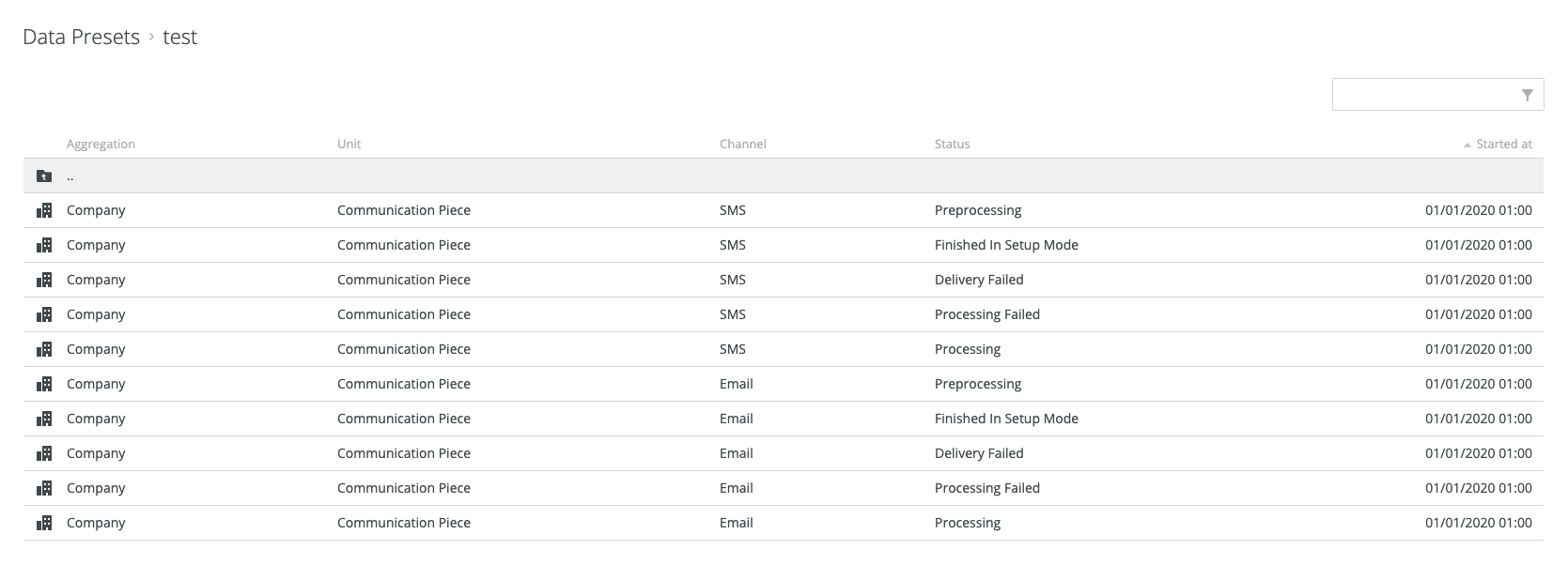
Tables are used to organize and display data efficiently using rows and columns.
Component Status
 Design Kit: IN DEVELOPMENT
 Bobwai component: bobwai--table RELEASED
Usage
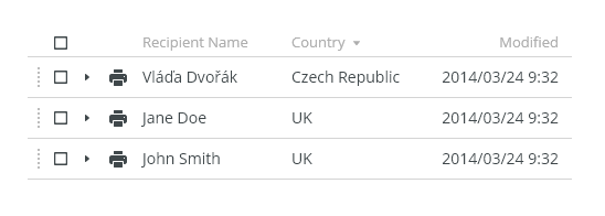
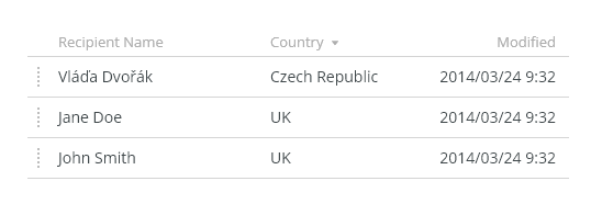
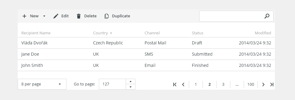
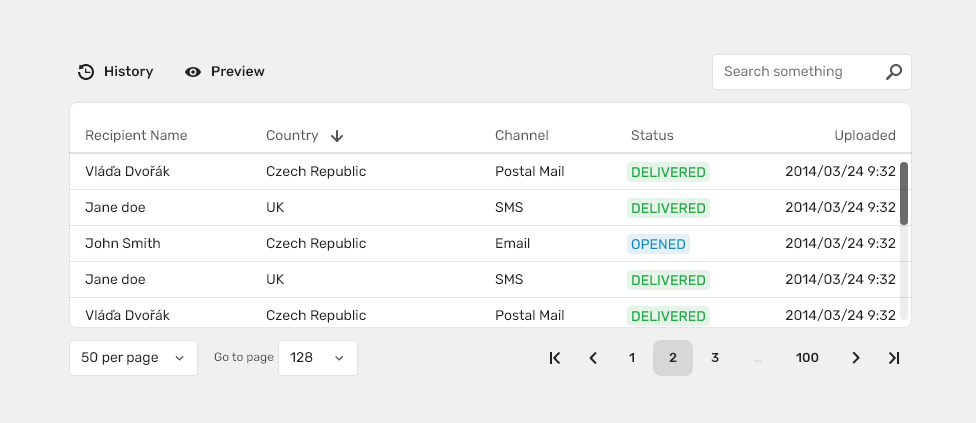
The data table features are ideal for organizing and displaying data in a UI. The column headers can sort data in ascending or descending order, rows can be expanded to progressively disclose information, and single or batch actions can be taken on rows.
The data table toolbar contains primary buttons, search, filtering, etc.


To organize and display data.
- To navigate to a specific piece of data to complete a task.
- To display all user’s resources.

- Do not include a tree in a table.
- Do not use a table as a replacement for a spreadsheet application.
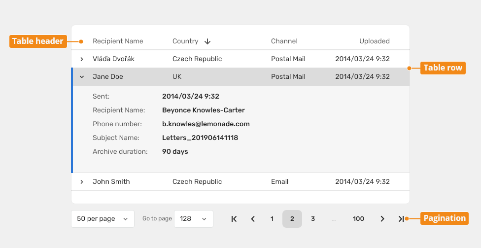
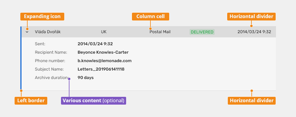
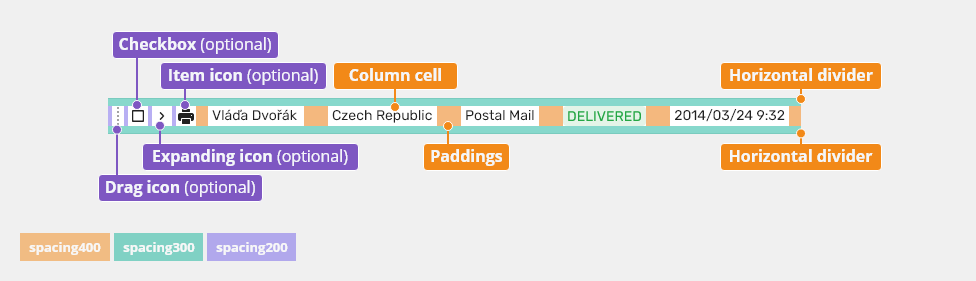
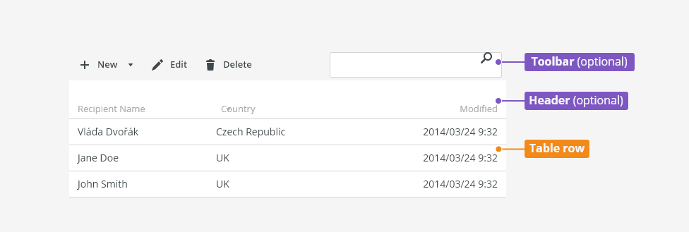
Anatomy

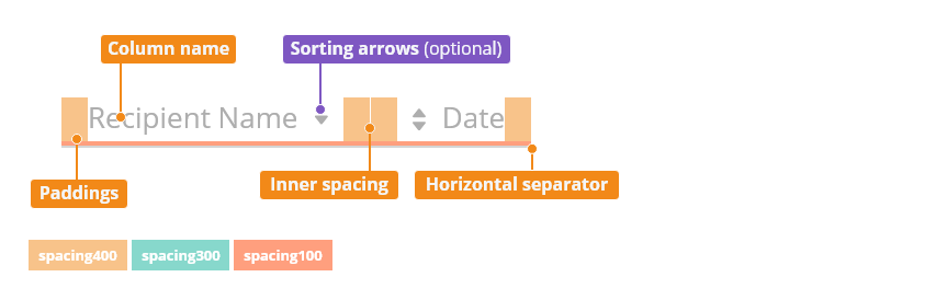
Header
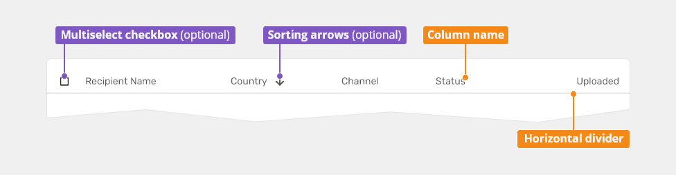
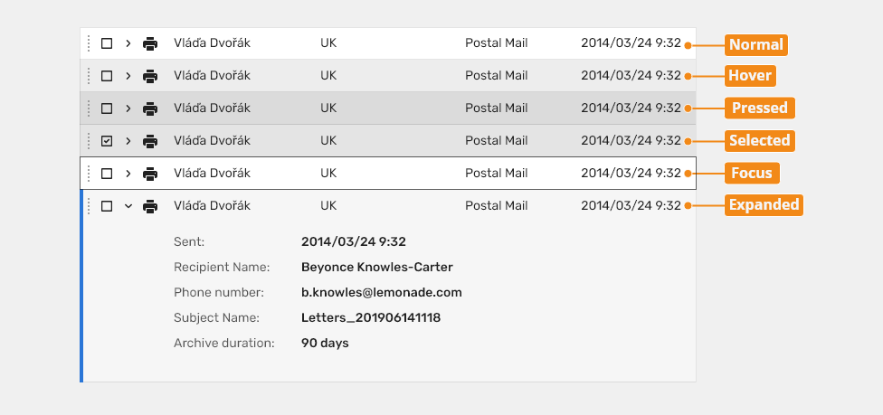
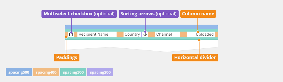
Table Row

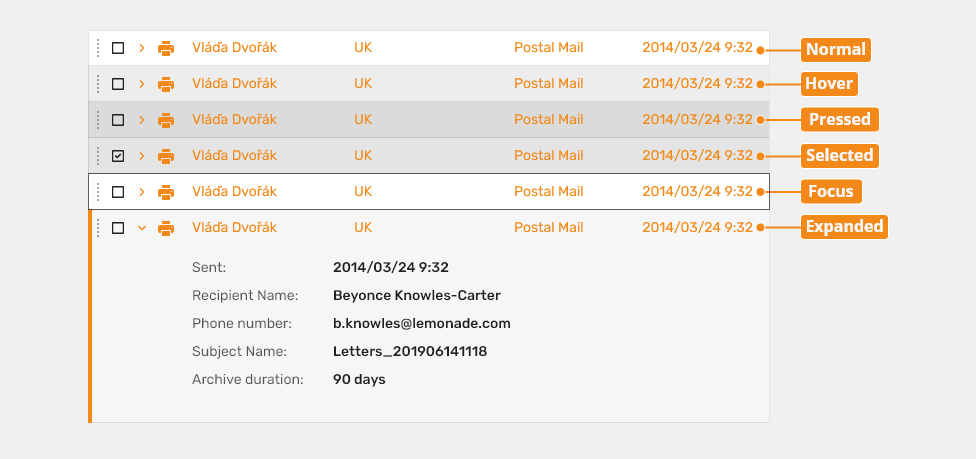
Expandable Table Row

Legend:
- Toolbar (recommended): Toolbar includes action buttons and search/filtering.
- Header: All tables should have a header. It consists of titles for column names and (optional) sorting arrows. A table header is always sticky and shows column names.
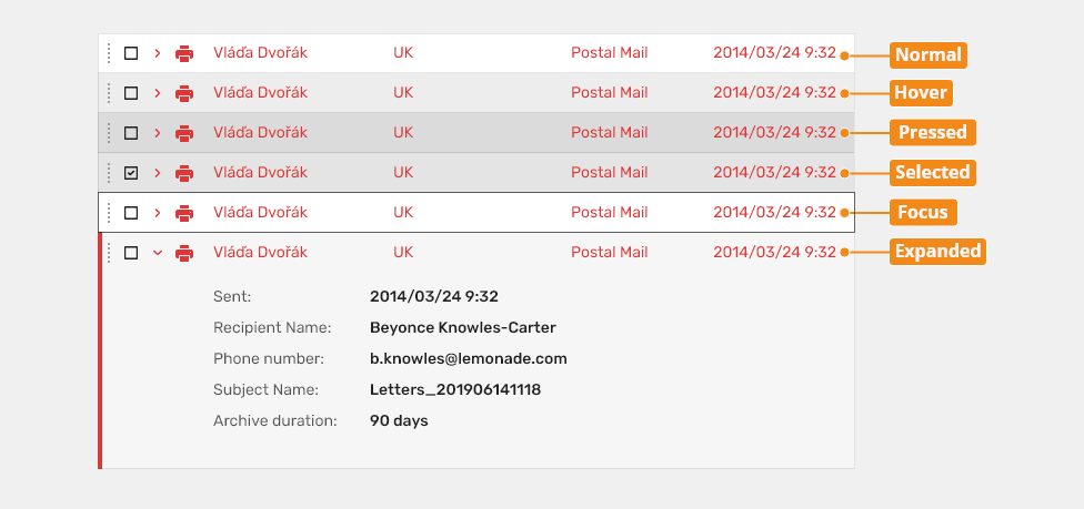
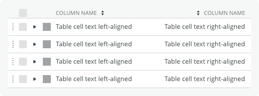
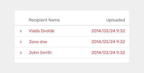
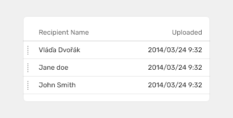
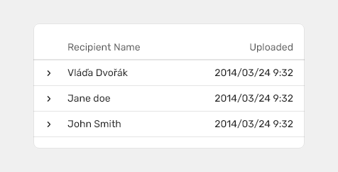
- Table row: Can be configured to show different types of data. Rows can be selectable, expandable and draggable.
- Expandable table row: Can be configured to show different types of data. Rows can be selectable, expandable.
Types
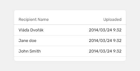
Simple
Use simple table if you want to just show basic information formatted as a table.

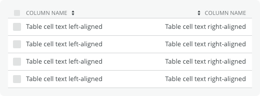
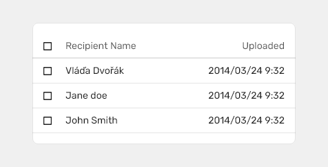
Batch/multiselect
Use batch/multiselect table if you would like users to select multiple items.

Behavior
- Use row checkboxes to select individual rows.
- Use a table header checkbox to select all checkboxes on the page; the same applies to unselect.
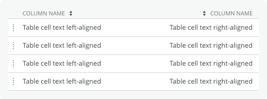
Draggable
Draggable rows are used when users need to sort rows according to their preference.

- Do not use sorting in tables with draggable rows.
Variants
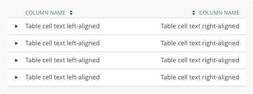
Table with Expandable Rows
Table which can show additional information.

Usage
- Use for additional information which needs not be shown at all times.
- Use for limited number of information items.
- Do not use for long lists with detailed information.
- Users must not use a scrollbar to navigate through it.
Detail
Behavior
- Can be expanded to display hidden content or information.
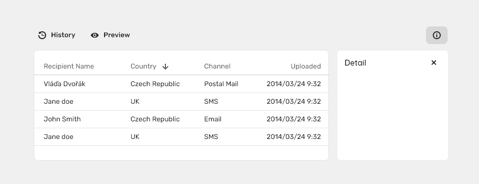
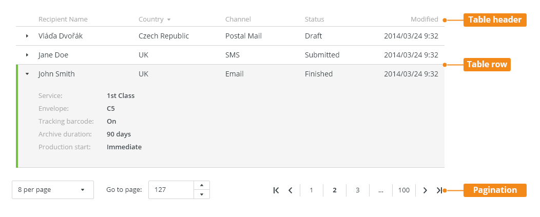
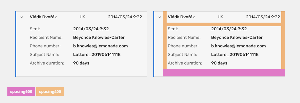
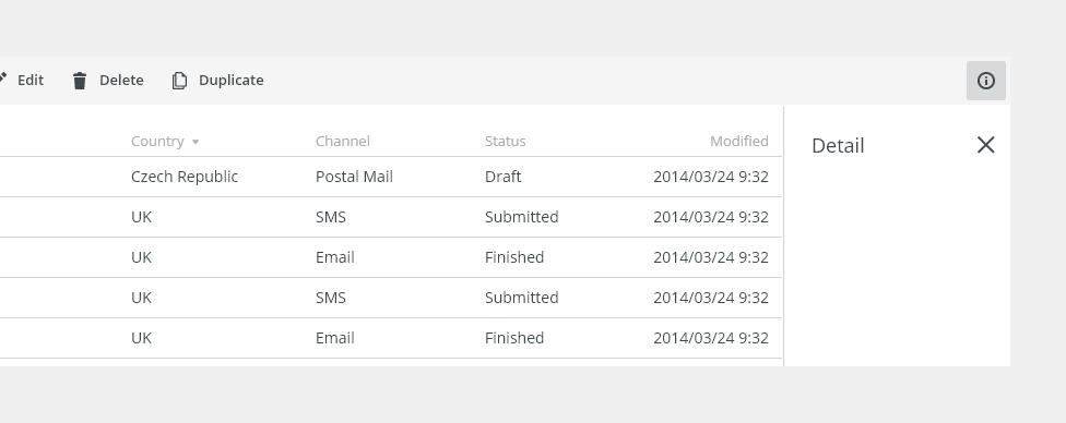
Table with Detail Panel
Allows to display additional information while staying in context.
Use detail panel table:
- For larger amount of data.
- For additional information that does not need to be shown at all times.
Behavior
Empty State
- This pattern is used when there is no content to be displayed - see Empty States.
Double Click
- The primary action is carried out - e.g. edit - if the primary action is clear.
Right Click
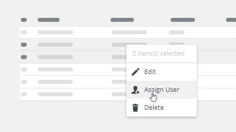
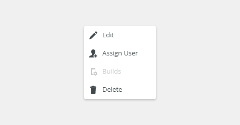
- Right clicking on a row opens a context Menu
- Mandatory for a table with action buttons.
Single Click
- Selects a row.
- Table with action buttons:
- Only relevant action buttons are shown - we do not display actions which can never be performed by a user with given permissions.
- Disabled button can be used in some cases - see Disabled States.
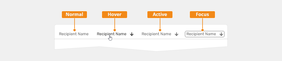
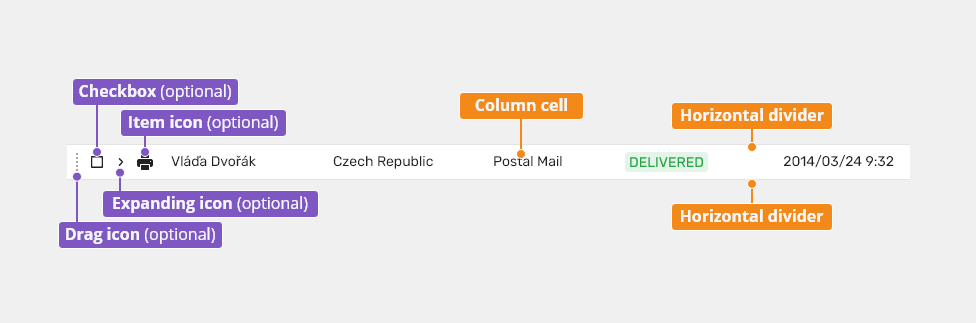
Columns
- Can be sorted.
- Sorting arrows - displayed on hover: first we show both arrows, on click just one arrow.
- Sorting arrows are placed reversed to the column alignment.
Rows
- Can be in the disabled state - see Disabled States.
- If a value does not fit the cell is truncated by ellipsis and full value is displayed in a tooltip on hover.
Multiline rows are used when the full value needs to be displayed.
- Do not use inline action buttons - their usage is OBSOLETE.
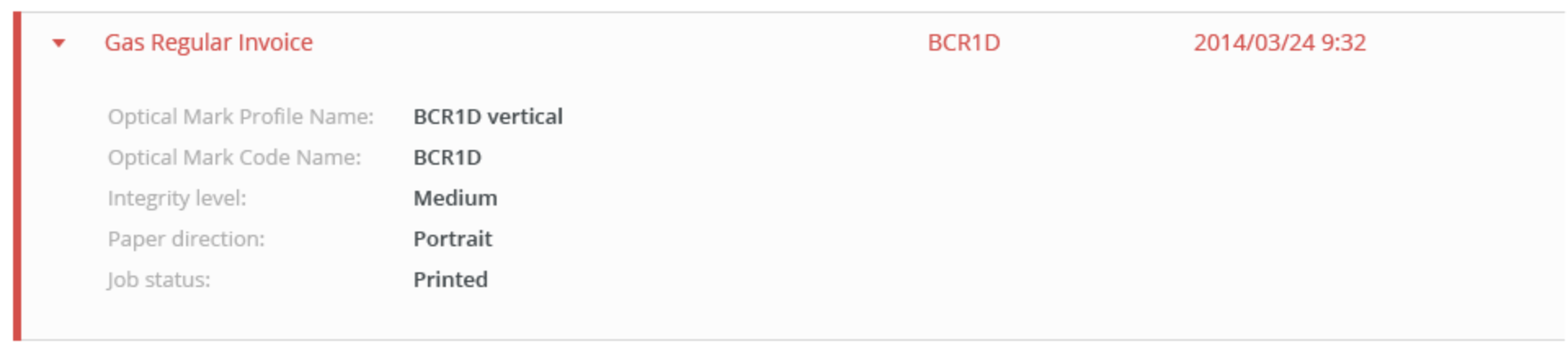
Row with Error
- Used to display an error if there is a conflict within the object - a specific color must be used.

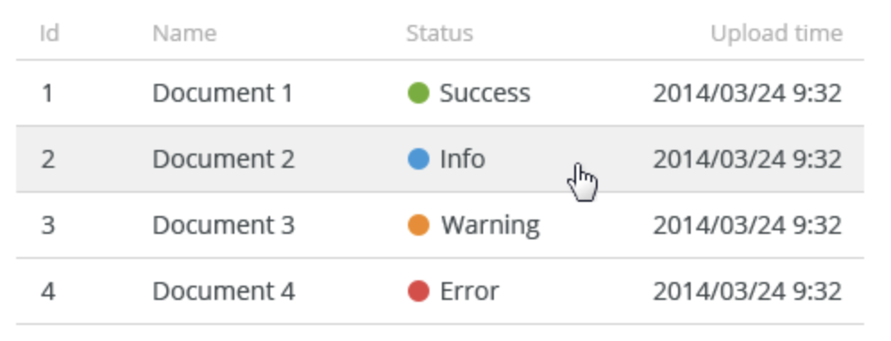
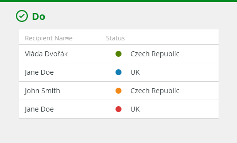
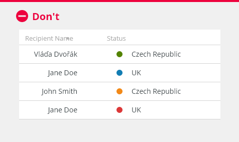
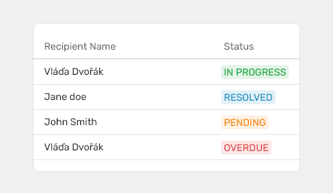
Row with Indicator
- Used for displaying a status indicator - e.g. a production status.

Loading Table Content
- If a table cannot be displayed immediately (e.g. loading content, filtering, sorting), display a loader.
Missing Values in Cells
Use N/A (not accessible) when data cannot be retrieved - N/A is translated.
- Use (-) when data are non-existing.
CRUD actions
Keyboard Interactions
Keys |
Interactions |
|---|---|
Arrows ⇩⇧ |
Navigate to the previous/next row. also selection. //TODO |
Page Down ▼ / Page Up ▲ |
Navigate one page up/down. |
Home ⇤ / End ⇥ |
Jump to the first/last row (must be enabled in public constants). |
Shift + ⇩⇧ |
Navigate previous/next row with multiselect. |
Shift + Page Down ▼ / Page Up ▲ |
Navigate one page up/down with multiselect. |
Shift + Home ⇤ / End ⇥ |
Jump to the first/last row with multiselect (must be enabled in public constants). |
Ctrl/Cmd + A |
Select all rows (in multiselect tables). |
Arrows ⇦ ⇨ |
Collapse/expand the row detail. |
Enter ↵ |
Call the default action for a row (similar to the double-click). |
Delete |
Delete the selected row (if supported by the application). |
Editorial
Capitalization
- Use title case for table headers (column names).
- Use sentence case for table cell content.
Refer to the Content section for detailed capitalization rules.
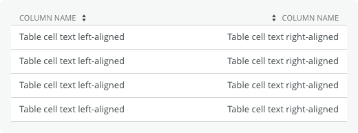
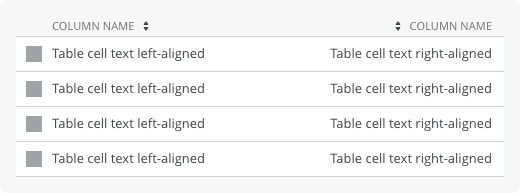
Column Alignment
- Text - left align
- Numbers and dates - right align
- Icons and images - center align
Related Components
- Action buttons (optional)
- Filter (optional)
- Pagination (optional)
- Table tree

Table Header

States of Table Header
Default State
| Used In | Type | Token |
|---|---|---|
| Text color | Color |
color-text-200 |
| Text font | Font | font-body |
| Header separator width | Border | border-width-200 |
| Header separator color | Color | color-border-150 |
Active State
| Used In | Type | Token |
|---|---|---|
| Icon color | Color | color-icon-100 |
| Icon opacity | Opacity | opacity-700 |
Focus State
| Used In | Type | Token |
|---|---|---|
| Icon color | Color | color-icon-100 |
| Icon opacity | Opacity | opacity-700 |
| Focus border | Border | border-width-100 |
| Focus color | Color | color-focus-200 |
Hover State
| Used In | Type | Token |
|---|---|---|
| Text color | Color | color-text-100 |
| Icon color | Color | color-icon-100 |
Spacing and Density

| Used In | Type | PX | Token |
|---|---|---|---|
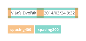
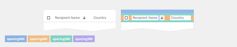
| Vertical space in header | padding-bottom | 8 | spacing-300 |
| Vertical space in header | padding-top | 8 | spacing-300 |
| Vertical space above header | padding-top | 16 | spacing-500 |
| Horizontal space on the left of the sorting icon | padding-left | 4 | spacing-200 |
| Horizontal space on the left of checkbox | padding-left | 12 | spacing-400 |
| Horizontal space in column name cell | padding-left, padding-right | 12 | spacing-400 |
Table Row

States of Table Row
Default State
| Used In | Type | Token |
|---|---|---|
| Text color | Color |
color-text-100 |
| Text font | Font | font-body |
| Row separator width | Border | border-width-100 |
| Row separator color | Color | color-border-150 |
| Item icon color | Color | color-icon-100 |
| Expanding icon color | Color | color-icon-100 |
| Drag icon color | Color | color-icon-400 |
| Background color | Color | color-bg-interactive-400 |
Selected State
| Used In | Type | Token |
|---|---|---|
Background color |
Color | color-bg-interactive-400-selected |
Focus State
| Used In | Type | Token |
|---|---|---|
| Focus color | Color | color-focus-200 |
| Focus border | Border-width | border-width-100 |
Hover State
| Used In | Type | Token |
|---|---|---|
Bg color |
Color | color-bg-interactive-400-hover |
Pressed State
| Used In | Type | Token |
|---|---|---|
Bg color |
Color | color-bg-interactive-400-pressed |
Expanded
| Used In | Type | Token |
|---|---|---|
Bg color |
Color | color-bf-ui-200 |
Border-left width |
Border | border-width-400 |
| Border-left color | Color | color-border-500 |
Error Table Row
All States
| Used In | Type | Token |
|---|---|---|
| Text color | Color |
color-error |
| Item icon color | Color | color-icon-error |
| Expanding icon color | Color | color-icon-error |
Expanded
| Used In | Type | Token |
|---|---|---|
Border-left width |
Border | border-width-400 |
| Border-left color | Color | color-border-error |
Warning Table Row

All States
| Used In | Type | Token |
|---|---|---|
| Text color | Color |
color-warning |
| Item icon color | Color | color-icon-warning |
| Expanding icon color | Color | color-icon-warning |
Expanded
| Used In | Type | Token |
|---|---|---|
Border-left width |
Border | border-width-400 |
| Border-left color | Color | color-border-warning |
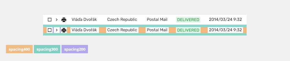
Spacing and Density: Table Row
| Used In | Type | PX | Token |
|---|---|---|---|
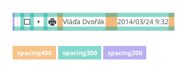
| Vertical space in row | padding-top, padding-bottom | 8 | spacing-300 |
| Horizontal space in column cell | padding-left, padding-right | 12 | spacing-400 |
| Horizontal space on the left of checkbox | padding-left | 12 | spacing-400 |
| Horizontal space on the left of expanding icon | padding-left | 4 | spacing-200 |
| Horizontal space on the left of item icon | padding-left | 4 | spacing-200 |
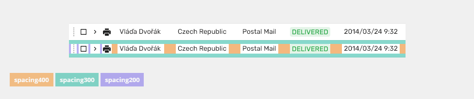
Spacing and Density: Draggable Table Row
| Used In | Type | PX | Token |
|---|---|---|---|
| Vertical space in row | padding-top, padding-bottom | 8 | spacing-300 |
| Horizontal space in column cell | padding-left, padding-right | 12 | spacing-400 |
| Horizontal space on the left of draggable icon | padding-left | 4 | spacing-200 |
| Horizontal space on the left of checkbox | padding-left | 4 | spacing-200 |
| Horizontal space on the left of expanding icon | padding-left | 4 | spacing-200 |
| Horizontal space on the left of item icon | padding-left | 4 | spacing-200 |
Spacing and Density: Expanded Table Row

| Used In | Type | PX | Token |
|---|---|---|---|
| Top space in expanded table row | padding-top | 12 | spacing-400 |
| Bottom space in expanded table row | padding-bottom | 24 | spacing-600 |
| Horizontal space in expanded table row | padding-left, padding-right | 12 | spacing-400 |
Border-left width |
Border | 4 | border-width-400 |
Accessibility
Accessibility Considerations
- The data table headers accurately describe the data contained in the rows and columns.
- If the data table has labels they should be clear and concise.
- If the data table has a caption or description,
aria-describedbyshould be set on the table element with a value referring to the element containing the description.
Links
https://www.w3.org/TR/wai-aria-practices-1.1/#table
https://webaim.org/techniques/tables/data
Attachments:
 image2020-9-11_10-39-18.png (image/png)
 image2020-9-11_10-40-34.png (image/png)
 image2020-9-11_10-40-57.png (image/png)
 table.gif (image/gif)
 image2020-9-11_11-5-47.png (image/png)
 image2020-9-11_11-5-58.png (image/png)
 image2020-9-11_11-6-48.png (image/png)
 image2020-9-11_11-8-23.png (image/png)
 table-anatomy.png (image/png)
 table-header-anatomy.png (image/png)
 table-row-anatomy.png (image/png)
 table-row-detail-anatomy.png (image/png)
 giphy-16.gif (image/gif)
 giphy-17.gif (image/gif)
 basic-table-anatomy.png (image/png)
 Snímek obrazovky 2020-09-16 v 12.57.54.png (image/png)
 table-anatomy.png (image/png)
 basic-table-header-construction.png (image/png)
 table-header-construction.png (image/png)
 table-header-states.png (image/png)
 basic-table-header-sizes.png (image/png)
 table-header-sizes.png (image/png)
 table-header-construction.png (image/png)
 table-row-construction.png (image/png)
 table-states.png (image/png)
 table-states.png (image/png)
 table-error-states.png (image/png)
 table-warning-state.png (image/png)
 basic-table-row-sizes.png (image/png)
 table-row-sizes.png (image/png)
 table-row-detail-sizes.png (image/png)
 footer-construction.png (image/png)
 footer-states.png (image/png)
 footer-sizes.png (image/png)
 giphy-14.gif (image/gif)
 table-style.png (image/png)
 table-row-construction.png (image/png)
 footer-states.png (image/png)
 table-row-detail-sizes.png (image/png)
 table-row-construction.png (image/png)
 table-header-construction.png (image/png)
 table-style.png (image/png)
 basic-table-anatomy.png (image/png)
 table-row-detail-anatomy.png (image/png)
 default table.png (image/png)
 expandable table.png (image/png)
 selectable table.png (image/png)
 dragable table.png (image/png)
 combined table.png (image/png)
 Snímek obrazovky 2020-09-30 v 10.27.01.png (image/png)
 Snímek obrazovky 2020-09-30 v 10.24.45.png (image/png)
 Snímek obrazovky 2020-09-30 v 10.24.08.png (image/png)
 Snímek obrazovky 2020-09-30 v 10.23.14.png (image/png)
 image2020-10-9_9-42-59.png (image/png)
 image2020-10-9_11-58-25.png (image/png)
 table-row-detail-anatomy.png (image/png)
 table-row-detail-anatomy.png (image/png)
 error table.png (image/png)
 indicator table.png (image/png)
 table-style.png (image/png)
 table-states.png (image/png)
 table-error-states.png (image/png)
 table-warning-state.png (image/png)
 table-row-detail-sizes.png (image/png)
 table with side panel.png (image/png)
 basic-table-header-sizes.png (image/png)
 table-header-sizes.png (image/png)
 basic-table-row-sizes.png (image/png)
 table-row-sizes.png (image/png)
 table-row-detail-sizes.png (image/png)
 image2020-11-30_14-8-32.png (image/png)
 image2020-11-27_12-13-3.png (image/png)
 image2020-11-27_12-24-3.png (image/png)
 image2020-12-1_10-57-14.png (image/png)
image2020-12-1_10-59-46.png (image/png)
image2020-11-30_14-17-56.png (image/png)
image2020-12-1_10-57-14.png (image/png)
image2020-12-1_10-59-46.png (image/png)
image2020-11-30_14-17-56.png (image/png)
 Context-menu-type-multilevel.png (image/png)
 image2020-11-27_15-19-14.png (image/png)
 image2020-11-27_15-14-27.png (image/png)
 image2020-11-27_15-46-5.png (image/png)
 table-title.png (image/png)
 basic-table-anatomy.png (image/png)
 table-header-anatomy.png (image/png)
table-row-anatomy.png (image/png)
table-header-anatomy.png (image/png)
table-row-anatomy.png (image/png)
 table-row-detail-anatomy.png (image/png)
 default table.png (image/png)
 selectable table.png (image/png)
 dragable table.png (image/png)
 expandable table.png (image/png)
 table with side panel.png (image/png)
 error table.png (image/png)
 indicator table.png (image/png)
 table-title.png (image/png)
 table-title.png (image/png)
basic-table-anatomy.png (image/png)
table-row-anatomy.png (image/png)
table-title.png (image/png)
basic-table-anatomy.png (image/png)
table-row-anatomy.png (image/png)
 table-row-anatomy.png (image/png)
table-row-detail-anatomy.png (image/png)
default table.png (image/png)
selectable table.png (image/png)
dragable table.png (image/png)
expandable table.png (image/png)
table with side panel.png (image/png)
error table.png (image/png)
indicator table.png (image/png)
table-anatomy.png (image/png)
table-header-construction.png (image/png)
table-header-states.png (image/png)
table-header-sizes.png (image/png)
table-row-anatomy.png (image/png)
table-row-detail-anatomy.png (image/png)
default table.png (image/png)
selectable table.png (image/png)
dragable table.png (image/png)
expandable table.png (image/png)
table with side panel.png (image/png)
error table.png (image/png)
indicator table.png (image/png)
table-anatomy.png (image/png)
table-header-construction.png (image/png)
table-header-states.png (image/png)
table-header-sizes.png (image/png)
 table-header-sizes.png (image/png)
table-row-construction.png (image/png)
table-states.png (image/png)
table-error-states.png (image/png)
table-warning-state.png (image/png)
table-row-basic.png (image/png)
table-row-draggable.png (image/png)
table-row-detail-sizes.png (image/png)
table-header-sizes.png (image/png)
table-row-construction.png (image/png)
table-states.png (image/png)
table-error-states.png (image/png)
table-warning-state.png (image/png)
table-row-basic.png (image/png)
table-row-draggable.png (image/png)
table-row-detail-sizes.png (image/png)