Maintaining consistent and engaging digital interfaces throughout Quadient calls for extended guidance on color usage.
The following concepts are the foundation as we strive to achieve balance and harmony through our User Interface design.
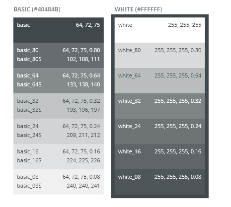
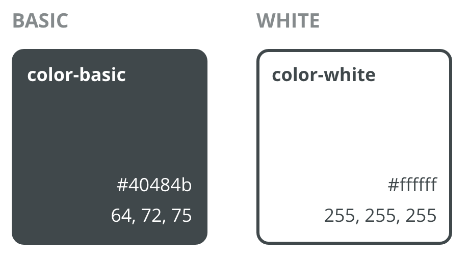
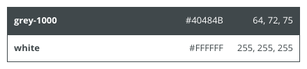
Neutral Colors
Neutral colors are used in tokens for Text and UI Components (buttons, icons, navigation bars, etc.).
| Token | HEX | RGB | Examples of use | |
|---|---|---|---|---|
| grey-1000 | #212121 | (33, 33, 33) | text color |
| white | #ffffff | (255, 255, 255) | background color |


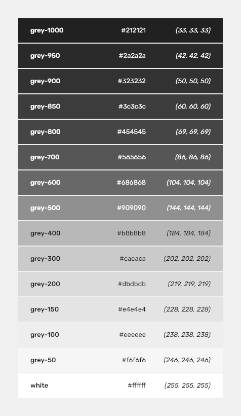
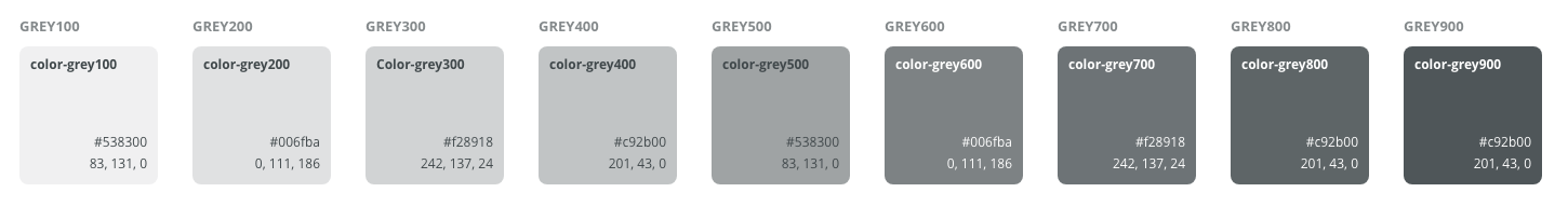
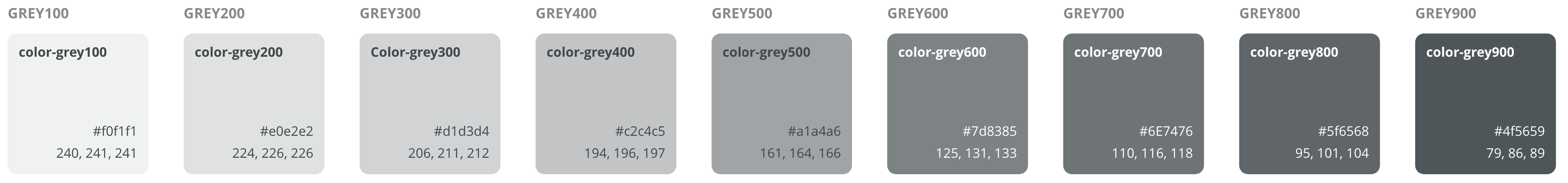
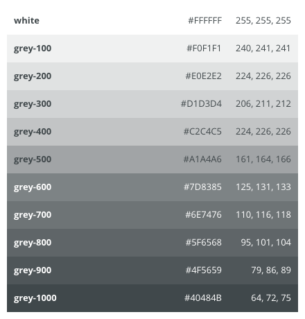
Grey Colors
Grey colors are used for various tokens for backgrounds, borders, dividers - mostly on items where opacity values cannot be used.
Token | Hex | RGB | Example of use | |
|---|---|---|---|---|
| grey-950 | #2a2a2a | (42, 42, 42) | Texts |
| grey-900 | #323232 | (50, 50, 50) | Texts |
| grey-850 | #3c3c3c | (60, 60, 60) | Texts |
| grey-800 | #454545 | (69, 69, 69) | Texts |
| grey-700 | #565656 | (86, 86, 86) | Texts |
| grey-600 | #686868 | (104, 104, 104) | Borders |
| grey-500 | #909090 | (144, 144, 144) | Borders |
| grey-400 | #b8b8b8 | (184, 184, 184) | Borders |
| grey-300 | #cacaca | (202, 202, 202) | Backgrounds |
| grey-200 | #dbdbdb | (219, 219, 219) | Backgrounds |
| grey-150 | #e4e4e4 | (228, 228, 228) | Backgrounds |
| grey-100 | #eeeeee | (238, 238, 238) | Backgrounds |
| grey-50 | #f6f6f6 | (246, 246, 246) | Backgrounds |


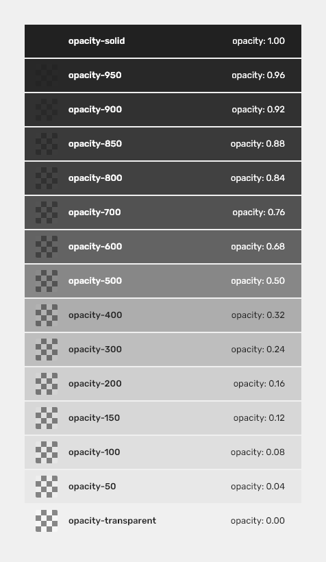
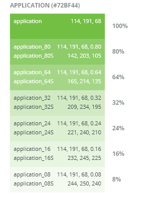
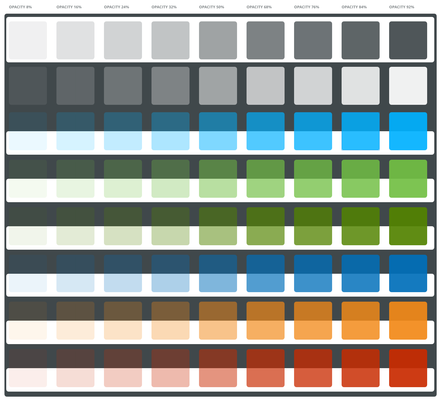
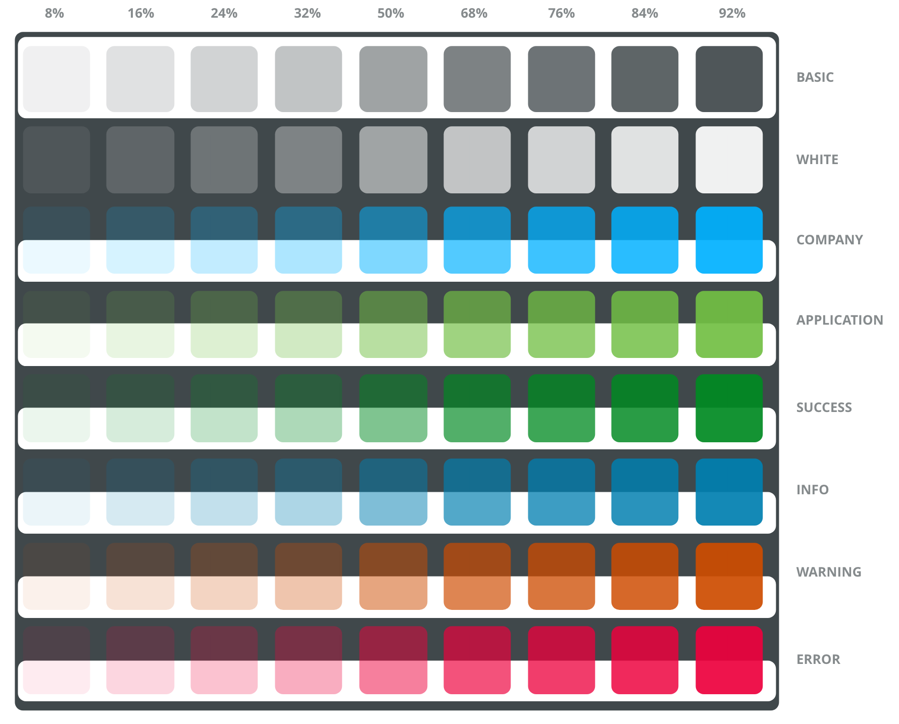
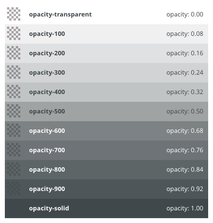
Opacity values
Opacity values are used in combination with all the colors for changes of style or behaviors of selected component.
Token | Opacity value % | Examples of use | |
|---|---|---|---|
| opacity-solid | 100 | Solid color |
| opacity-950 | 96 | - |
| opacity-900 | 92 | Hover |
| opacity-850 | 88 | Selected/Activate |
| opacity-800 | 84 | On click/Pressed, Shadow value |
| opacity-700 | 76 | - |
| opacity-600 | 68 | Disabled state, Focused state |
| opacity-500 | 50 | Page overlay |
| opacity-400 | 32 | Focused state, Disabled state |
| opacity-300 | 24 | - |
| opacity-200 | 16 | On click/Pressed |
| opacity-150 | 12 | Selected/Activate |
| opacity-100 | 8 | Hover |
| opacity-50 | 4 | - |
| opacity-transparent | 0 | Transparent objects |


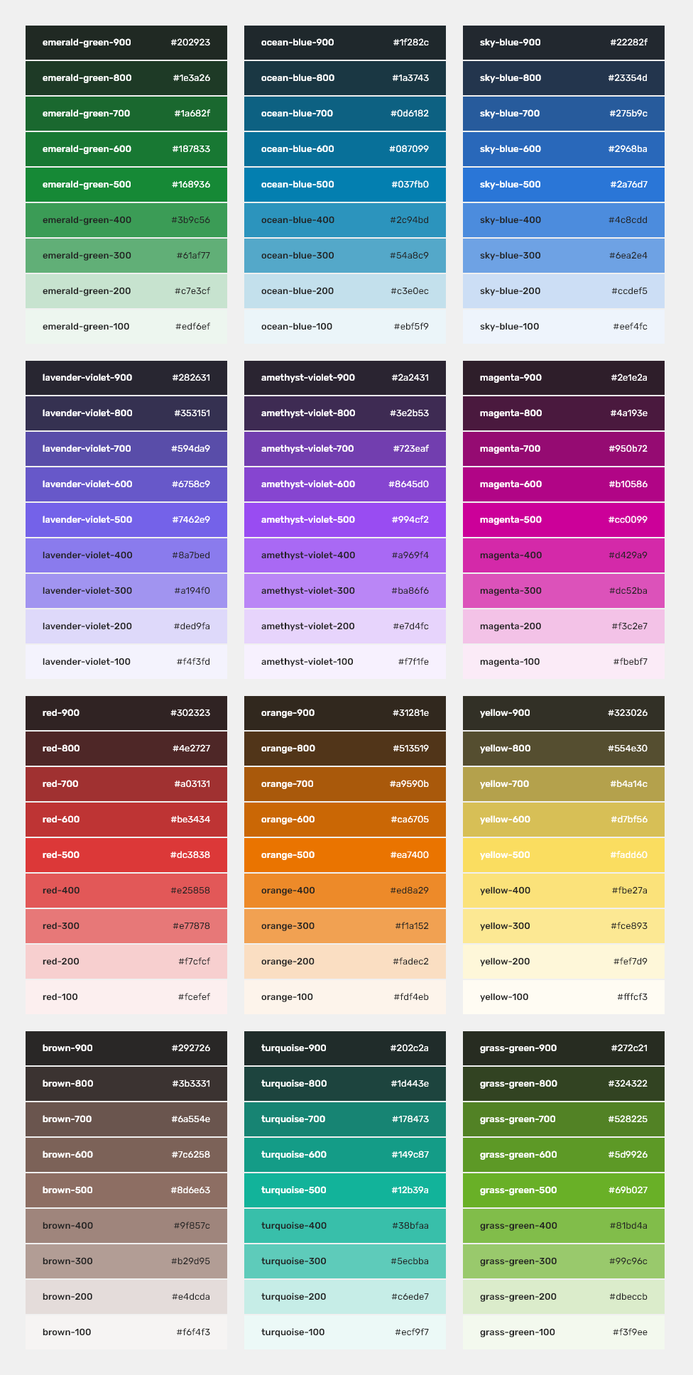
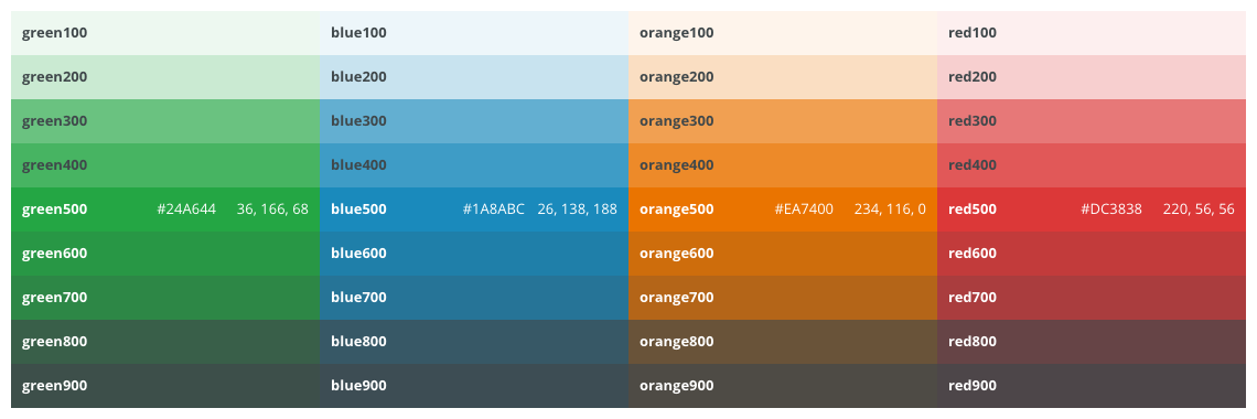
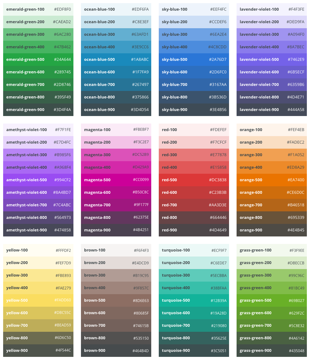
Core Colors
Complete set of colors used in Quadient applications.
| Token alias | HEX | Token alias | HEX | Token alias | HEX | |||||
|---|---|---|---|---|---|---|---|---|---|---|
| emerald-green-900 | #202923 |
| ocean-blue-900 | #1f282c |
| sky-blue-900 | #22282f | ||
| emerald-green-800 | #1e3a26 |
| ocean-blue-800 | #1a3743 |
| sky-blue-800 | #23354d | ||
| emerald-green-700 | #1a682f |
| ocean-blue-700 | #0d6182 |
| sky-blue-700 | #275b9c | ||
| emerald-green-600 | #187833 |
| ocean-blue-600 | #087099 |
| sky-blue-600 | #2968ba | ||
| emerald-green-500 | #168936 |
| ocean-blue-500 | #037fb0 |
| sky-blue-500 | #2a76d7 | ||
| emerald-green-400 | #3b9c56 |
| ocean-blue-400 | #2c94bd |
| sky-blue-400 | #4c8cdd | ||
| emerald-green-300 | #61af77 |
| ocean-blue-300 | #54a8c9 |
| sky-blue-300 | #6ea2e4 | ||
| emerald-green-200 | #c7e3cf |
| ocean-blue-200 | #c3e0ec |
| sky-blue-200 | #ccdef5 | ||
| emerald-green-100 | #edf6ef |
| ocean-blue-100 | #ebf5f9 |
| sky-blue-100 | #eef4fc | ||
| lavender-violet-900 | #282631 |
| amethyst-violet-900 | #2a2431 |
| magenta-900 | #2e1e2a | ||
| lavender-violet-800 | #353151 |
| amethyst-violet-800 | #3e2b53 |
| magenta-800 | #4a193e | ||
| lavender-violet-700 | #594da9 |
| amethyst-violet-700 | #723eaf |
| magenta-700 | #950b72 | ||
| lavender-violet-600 | #6758c9 |
| amethyst-violet-600 | #8645d0 |
| magenta-600 | #b10586 | ||
| lavender-violet-500 | #7462e9 |
| amethyst-violet-500 | #994cf2 |
| magenta-500 | #cc0099 | ||
| lavender-violet-400 | #8a7bed |
| amethyst-violet-400 | #a969f4 |
| magenta-400 | #d429a9 | ||
| lavender-violet-300 | #a194f0 |
| amethyst-violet-300 | #ba86f6 |
| magenta-300 | #dc52ba | ||
| lavender-violet-200 | #ded9fa |
| amethyst-violet-200 | #e7d4fc |
| magenta-200 | #f3c2e7 | ||
| lavender-violet-100 | #f4f3fd |
| amethyst-violet-100 | #f7f1fe |
| magenta-100 | #fbebf7 | ||
| red-900 | #302323 |
| orange-900 | #31281e |
| yellow-900 | #323026 | ||
| red-800 | #4e2727 |
| orange-800 | #513519 |
| yellow-800 | #554e30 | ||
| red-700 | #a03131 |
| orange-700 | #a9590b |
| yellow-700 | #b4a14c | ||
| red-600 | #be3434 |
| orange-600 | #ca6705 |
| yellow-600 | #d7bf56 | ||
| red-500 | #dc3838 |
| orange-500 | #ea7400 |
| yellow-500 | #fadd60 | ||
| red-400 | #e25858 |
| orange-400 | #ed8a29 |
| yellow-400 | #fbe27a | ||
| red-300 | #e77878 |
| orange-300 | #f1a152 |
| yellow-300 | #fce893 | ||
| red-200 | #f7cfcf |
| orange-200 | #fadec2 |
| yellow-200 | #fef7d9 | ||
| red-100 | #fcefef |
| orange-100 | #fdf4eb |
| yellow-100 | #fffcf3 | ||
| brown-900 | #292726 |
| turquoise-900 | #202c2a |
| grass-green-900 | #272c21 | ||
| brown-800 | #3b3331 |
| turquoise-800 | #1d443e |
| grass-green-800 | #324322 | ||
| brown-700 | #6a554e |
| turquoise-700 | #178473 |
| grass-green-700 | #528225 | ||
| brown-600 | #7c6258 |
| turquoise-600 | #149c87 |
| grass-green-600 | #5d9926 | ||
| brown-500 | #8d6e63 |
| turquoise-500 | #12b39a |
| grass-green-500 | #69b027 | ||
| brown-400 | #9f857c |
| turquoise-400 | #38bfaa |
| grass-green-400 | #81bd4a | ||
| brown-300 | #b29d95 |
| turquoise-300 | #5ecbba |
| grass-green-300 | #99c96c | ||
| brown-200 | #e4dcda |
| turquoise-200 | #c6ede7 |
| grass-green-200 | #dbeccb | ||
| brown-100 | #f6f4f3 |
| turquoise-100 | #ecf9f7 |
| grass-green-100 | #f3f9ee |


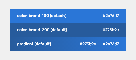
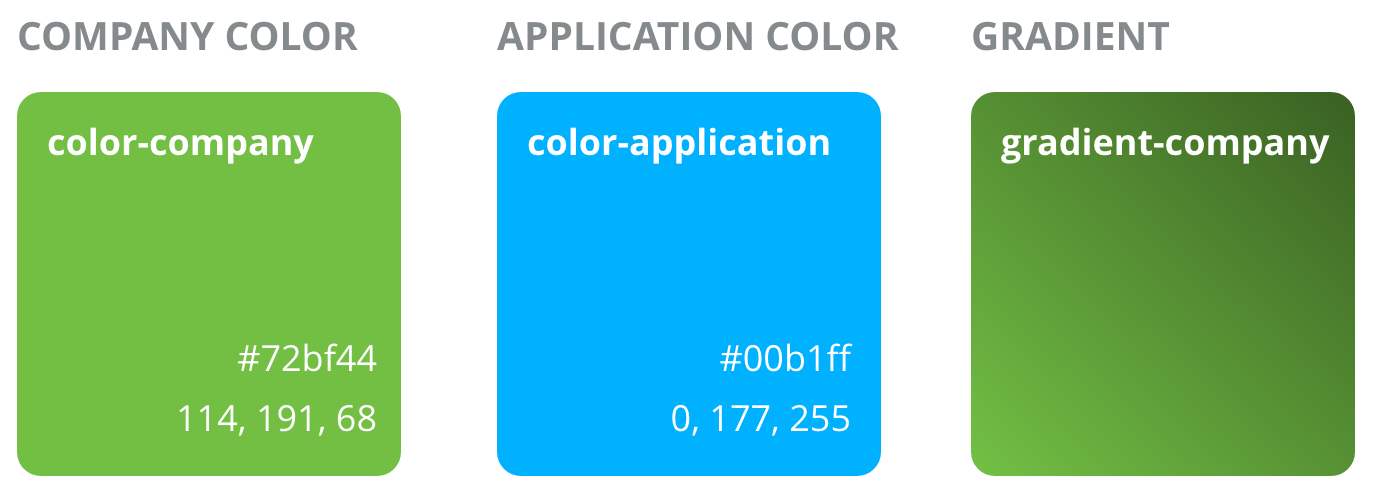
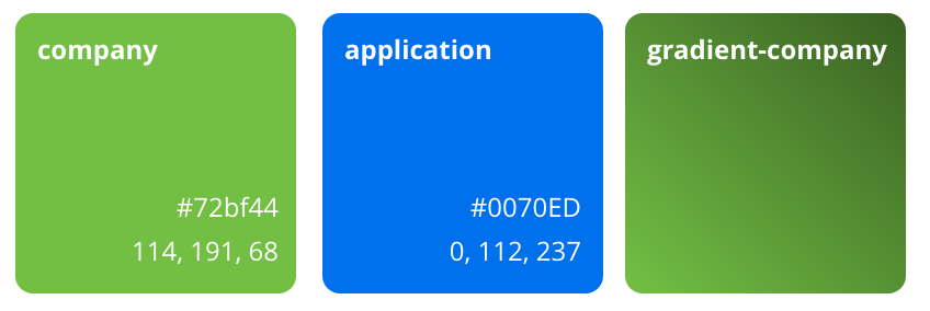
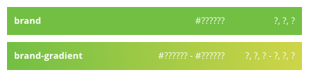
Brand Color
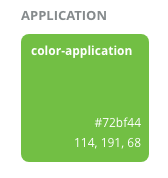
The brand color is a variable color used for branding (each company can define its own color).
This color should be used only in the application sign-in page and application header.
Every application can have one main color, which can be present as a part of header, icons, favicons, dominant color in gradient for background on login screen, splash screen, etc.
Example
Brand color is typically used as Active Item in App-Header Navigation Bar.
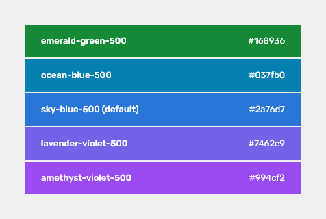
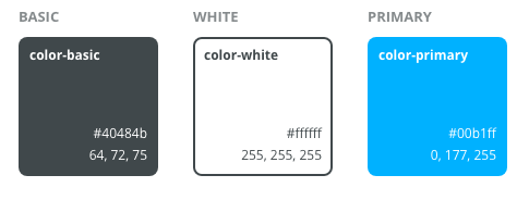
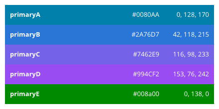
Primary Color
The primary color is a also a variable color (but strictly predefined by Quadient, so the customer can choose from five WCAG-safe color) used for primary actions (like "OK", "SAVE", ""CREATE" buttons), switch buttons, selected items and so on on the application screens and layouts.
The default primary color is set to sky-blue-500.
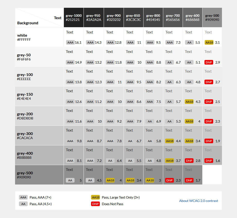
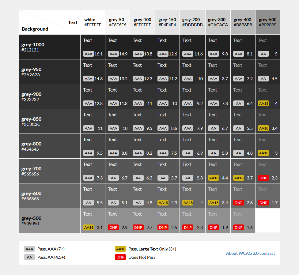
Accessibility
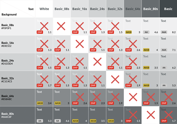
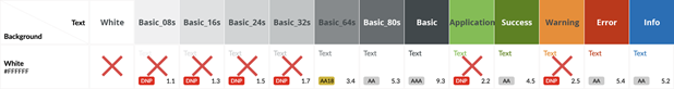
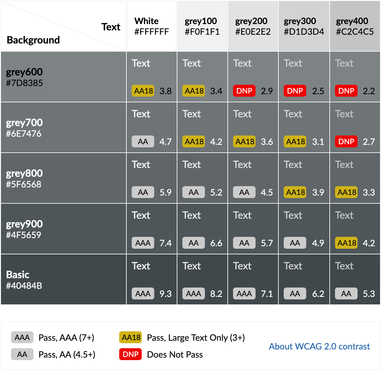
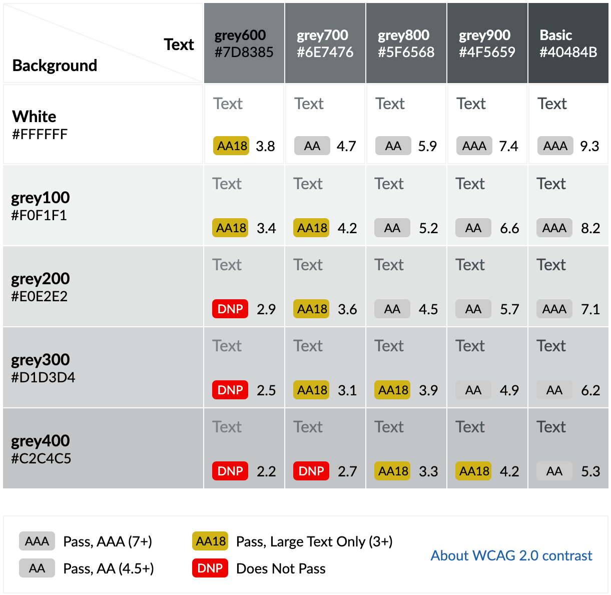
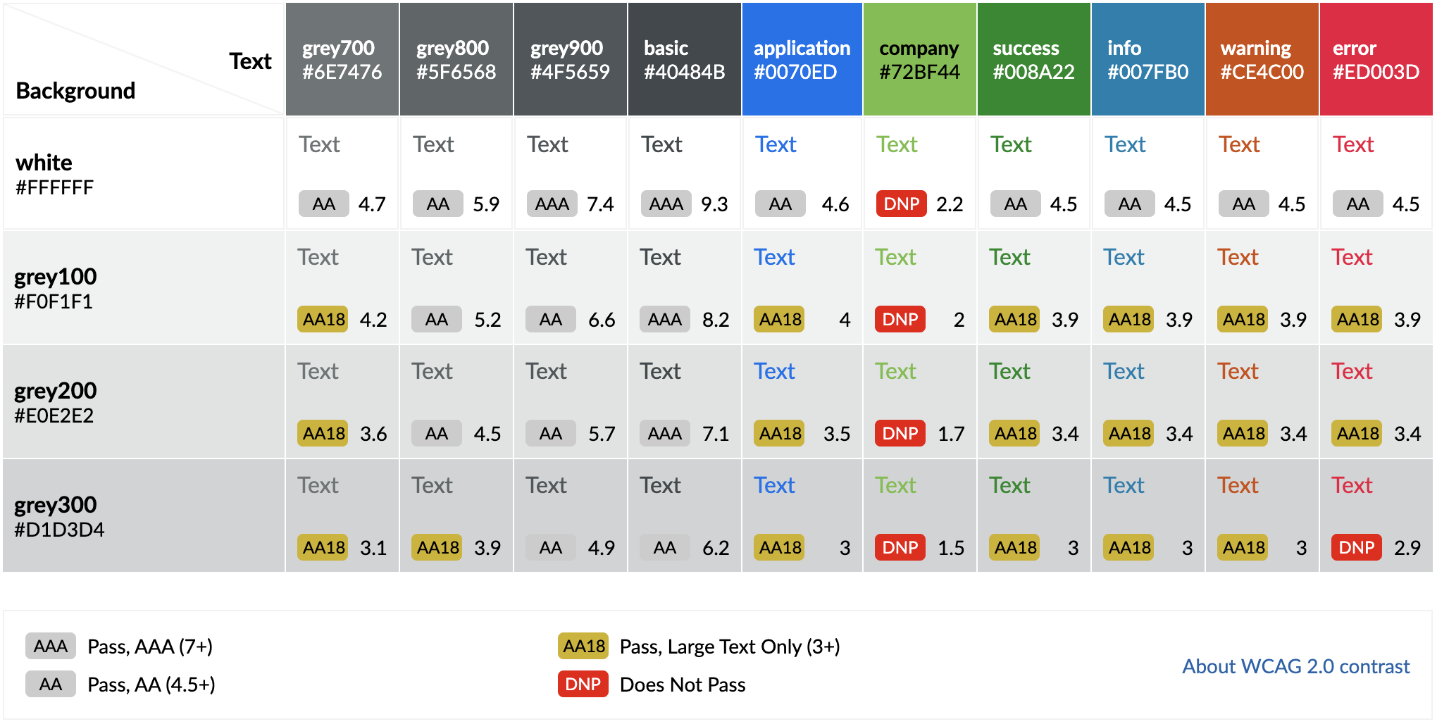
All text color combinations have to pass WCAG AA standards of contrast ratio 4.5 : 1 for normal text (smaller than 18px) and 3 : 1 for large text (18px semi-bold or 22px light and larger).
Dark text on light backgrounds
Text Color | Background | Text | Contrast ratio | |
|---|---|---|---|---|
grey-1000 |
| white | Large Text, Normal Text | 16.1 |
| grey-950 |
| white | 14.3 | |
grey-900 |
| white | 12.8 | |
| grey-850 |
| white | 11 | |
grey-800 |
| white | 9.5 | |
grey-700 |
| white | 7.3 | |
grey-600 |
| white | 5.5 | |
| grey-500 |
| white | Large Text | 3.1 |


Allowed combinations for dark text and light backgrounds.
Light text on dark backgrounds
| Text color | Background | Text | Contrast ratio | |
|---|---|---|---|---|
white |
| grey-1000 | Large Text, Normal Text | 16.1 |
| white |
| grey-950 | 14.3 | |
| white |
| grey-900 | 12.8 | |
white |
| grey-850 | 11 | |
white |
| grey-800 | 9.5 | |
white |
| grey-700 | 7.3 | |
white |
| grey-600 | 5.5 | |
| white |
| grey-500 | Large Text | 3.1 |


Allowed combinations for light text and dark backgrounds.
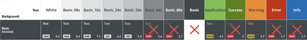
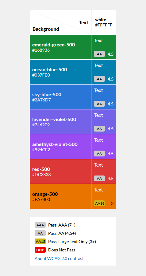
White text on core (primary and feedback) colors

Orange color (meant for warning cases) does not comply with WCAG 4.5:1 ratio in this mode and should by solved with additional shape.
Grey-1000 text on core (primary and feedback) colors
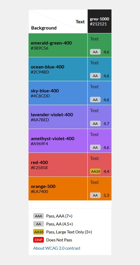
Red color (meant for error cases) does not comply with WCAG 4.5:1 ratio (is 4.42 actually) in this mode and should by solved with additional shape.
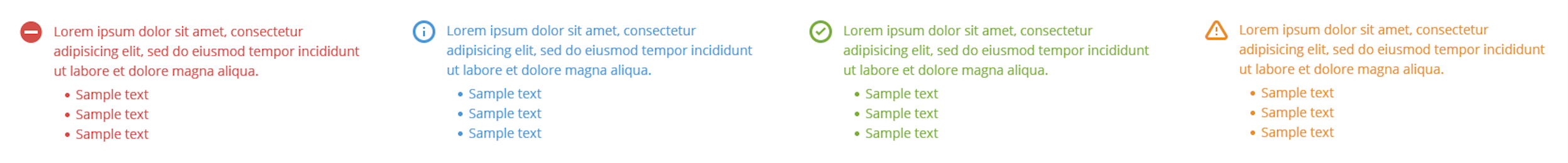
All Components are designed to pass the accessibility contrast test with an AAA, AA or AA18 rating.
Attachments:
 image2019-7-24_16-19-18.png (image/png)
 image2019-7-24_16-18-56.png (image/png)
 image2019-7-24_16-18-1.png (image/png)
 image2019-7-24_16-15-22.png (image/png)
 image2019-7-24_16-15-12.png (image/png)
 image2019-7-24_16-14-36.png (image/png)
 image2019-7-24_16-14-12.png (image/png)
 image2019-7-24_16-11-57.png (image/png)
 image2019-7-24_16-11-3.png (image/png)
 image2019-7-24_16-10-39.png (image/png)
 image2019-7-24_16-10-21.png (image/png)
 image2019-7-24_16-10-2.png (image/png)
 image2019-7-24_16-4-24.png (image/png)
 dbbb.jpg (image/jpeg)
 image2019-7-24_16-0-21.png (image/png)
 image2019-7-24_16-0-3.png (image/png)
 image2019-7-24_15-59-7.png (image/png)
 Screenshot 2019-10-31 at 15.53.28.png (image/png)
 Untitled-2.png (image/png)
 Untitled-3.png (image/png)
 Untitled-5.png (image/png)
 Untitled-2.png (image/png)
 Untitled-3.png (image/png)
 Untitled-3.png (image/png)
 Untitled-3.png (image/png)
 image2019-11-6_10-14-18.png (image/png)
 image2019-11-6_10-14-36.png (image/png)
 image2019-11-6_10-15-0.png (image/png)
 image2019-11-6_10-15-26.png (image/png)
 image2019-11-6_10-15-38.png (image/png)
 image2019-11-6_10-15-57.png (image/png)
 Screenshot 2020-02-07 at 12.16.13.png (image/png)
 Screenshot 2020-02-07 at 12.16.20.png (image/png)
 Screenshot 2020-02-07 at 12.16.29.png (image/png)
 Screenshot 2020-02-07 at 12.18.53.png (image/png)
 Screenshot 2020-02-07 at 12.20.05.png (image/png)
 Screenshot 2020-02-19 at 08.33.18.png (image/png)
 Screenshot 2020-02-19 at 08.34.03.png (image/png)
 Screenshot 2020-02-19 at 08.38.04.png (image/png)
 image2020-2-19_8-43-8.png (image/png)
 image2020-2-19_8-43-32.png (image/png)
 Screenshot 2020-02-19 at 08.53.20.png (image/png)
 white--80.jpg (image/jpeg)
 white--80.jpg (image/jpeg)
 white--64.jpg (image/jpeg)
 color-white.png (image/png)
 color-basic.png (image/png)
 color-success.png (image/png)
 color-info.png (image/png)
 color-warning.png (image/png)
 color-warning.png (image/png)
 color-grey100.png (image/png)
 color-grey200.png (image/png)
 color-grey200.png (image/png)
 color-grey300.png (image/png)
 color-grey400.png (image/png)
 color-grey500.png (image/png)
 color-grey600.png (image/png)
 color-grey700.png (image/png)
 color-grey800.png (image/png)
 color-grey900.png (image/png)
 color-error.png (image/png)
 color-warning.png (image/png)
 opacity000.png (image/png)
 opacity200.png (image/png)
 opacity100.png (image/png)
 opacity300.png (image/png)
 opacity400.png (image/png)
 opacity500.png (image/png)
 opacity600.png (image/png)
 opacity700.png (image/png)
 opacity800.png (image/png)
 opacity900.png (image/png)
 opacity000.png (image/png)
 Screenshot 2020-04-24 at 15.20.18.png (image/png)
 Screenshot 2020-04-24 at 15.26.30.png (image/png)
 contrast-white-basic.png (image/png)
 contrast-white-grey900.png (image/png)
 contrast-white-grey800.png (image/png)
 contrast-white-grey700.png (image/png)
 contrast-white-grey600.png (image/png)
 contrast-basic-white.png (image/png)
 contrast-grey900-white.png (image/png)
 contrast-grey800-white.png (image/png)
 contrast-grey700-white.png (image/png)
 contrast-grey600-white.png (image/png)
 neutral-colors.png (image/png)
 application-colors.png (image/png)
 feedback-colors.png (image/png)
 grey-colors.png (image/png)
 opacities.png (image/png)
 background-dark.png (image/png)
 background-lights.png (image/png)
 light-background.png (image/png)
 neutral-colors.png (image/png)
 color-basic.png (image/png)
 color-white.png (image/png)
 company-color.png (image/png)
 primary-colors.png (image/png)
 primary-colors.png (image/png)
 feedback-colors.png (image/png)
 color-green100.png (image/png)
 color-green200.png (image/png)
 color-green300.png (image/png)
 color-green400.png (image/png)
 color-green500.png (image/png)
 color-green600.png (image/png)
 color-green700.png (image/png)
 color-green800.png (image/png)
 color-green900.png (image/png)
 color-info100.png (image/png)
 color-info200.png (image/png)
 color-info300.png (image/png)
 color-info400.png (image/png)
 color-info500.png (image/png)
 color-info600.png (image/png)
 color-info700.png (image/png)
 color-info800.png (image/png)
 color-info900.png (image/png)
 color-orange100.png (image/png)
 color-orange200.png (image/png)
 color-orange300.png (image/png)
 color-orange400.png (image/png)
 color-orange500.png (image/png)
 color-orange600.png (image/png)
 color-orange700.png (image/png)
 color-orange800.png (image/png)
 color-orange900.png (image/png)
 color-red100.png (image/png)
 color-red200.png (image/png)
 color-red300.png (image/png)
 color-red400.png (image/png)
 color-red500.png (image/png)
 color-red600.png (image/png)
 color-red700.png (image/png)
 color-red800.png (image/png)
 color-red900.png (image/png)
 color-grey100.png (image/png)
 color-grey100.png (image/png)
 color-grey200.png (image/png)
 color-grey300.png (image/png)
 color-grey400.png (image/png)
 color-grey500.png (image/png)
 color-grey600.png (image/png)
 color-grey700.png (image/png)
 color-grey800.png (image/png)
 color-grey900.png (image/png)
 grey-colors.png (image/png)
 opacities.png (image/png)
 color-opacity100.png (image/png)
 color-opacity200.png (image/png)
 color-opacity-transparent.png (image/png)
 color-opacity300.png (image/png)
 color-opacity400.png (image/png)
 color-opacity500.png (image/png)
 color-opacity600.png (image/png)
 color-opacity700.png (image/png)
 color-opacity800.png (image/png)
 color-opacity900.png (image/png)
 color-opacity-solid.png (image/png)
 chart-colors.png (image/png)
 chart_turquoise100.png (image/png)
 chart_turquoise200.png (image/png)
 chart_turquoise300.png (image/png)
 chart_turquoise400.png (image/png)
 chart_turquoise500.png (image/png)
 chart_turquoise600.png (image/png)
 chart_turquoise700.png (image/png)
 chart_turquoise800.png (image/png)
 chart_turquoise900.png (image/png)
 chart_blue100.png (image/png)
 chart_blue200.png (image/png)
 chart_blue300.png (image/png)
 chart_blue400.png (image/png)
 chart_blue500.png (image/png)
 chart_blue600.png (image/png)
 chart_blue700.png (image/png)
 chart_blue800.png (image/png)
 chart_blue900.png (image/png)
 chart_violet100.png (image/png)
 chart_violet200.png (image/png)
 chart_violet300.png (image/png)
 chart_violet400.png (image/png)
 chart_violet500.png (image/png)
 chart_violet600.png (image/png)
 chart_violet700.png (image/png)
 chart_violet800.png (image/png)
 chart_violet900.png (image/png)
 chart_yellow100.png (image/png)
 chart_yellow200.png (image/png)
 chart_yellow300.png (image/png)
 chart_yellow400.png (image/png)
 chart_yellow500.png (image/png)
 chart_yellow600.png (image/png)
 chart_yellow700.png (image/png)
 chart_yellow800.png (image/png)
 chart_yellow900.png (image/png)
 chart_brown100.png (image/png)
 chart_brown200.png (image/png)
 chart_brown300.png (image/png)
 chart_brown400.png (image/png)
 chart_brown500.png (image/png)
 chart_brown600.png (image/png)
 chart_brown700.png (image/png)
 chart_brown800.png (image/png)
 chart_brown900.png (image/png)
 chart_purple100.png (image/png)
 chart_purple200.png (image/png)
 chart_purple300.png (image/png)
 chart_purple400.png (image/png)
 chart_purple500.png (image/png)
 chart_purple600.png (image/png)
 chart_purple700.png (image/png)
 chart_purple800.png (image/png)
 chart_purple900.png (image/png)
 chart_orange100.png (image/png)
 chart_orange200.png (image/png)
 chart_orange300.png (image/png)
 chart_orange400.png (image/png)
 chart_orange500.png (image/png)
 chart_orange600.png (image/png)
 chart_orange700.png (image/png)
 chart_orange800.png (image/png)
 chart_orange900.png (image/png)
 chart_green100.png (image/png)
 chart_green200.png (image/png)
 chart_green300.png (image/png)
 chart_green400.png (image/png)
 chart_green500.png (image/png)
 chart_green700.png (image/png)
 chart_green900.png (image/png)
 chart_green800.png (image/png)
 chart_green700.png (image/png)
 chart_green600.png (image/png)
 neutral-colors.png (image/png)
 color-black.png (image/png)
 core-colors.png (image/png)
 color-emerald-green100.png (image/png)
 color-emerald-green200.png (image/png)
 color-emerald-green300.png (image/png)
 color-emerald-green400.png (image/png)
 color-emerald-green500.png (image/png)
 color-emerald-green600.png (image/png)
 color-emerald-green700.png (image/png)
 color-emerald-green800.png (image/png)
 color-emerald-green900.png (image/png)
 color-ocean-blue100.png (image/png)
 color-ocean-blue200.png (image/png)
 color-ocean-blue300.png (image/png)
 color-ocean-blue400.png (image/png)
 color-ocean-blue500.png (image/png)
 color-ocean-blue600.png (image/png)
 color-ocean-blue700.png (image/png)
 color-ocean-blue800.png (image/png)
 color-ocean-blue900.png (image/png)
 color-sky-blue100.png (image/png)
 color-sky-blue200.png (image/png)
 color-sky-blue300.png (image/png)
 color-sky-blue400.png (image/png)
 color-sky-blue500.png (image/png)
 color-sky-blue600.png (image/png)
 color-sky-blue700.png (image/png)
 color-sky-blue800.png (image/png)
 color-sky-blue900.png (image/png)
 color-levander-violet100.png (image/png)
 color-levander-violet200.png (image/png)
 color-levander-violet300.png (image/png)
 color-levander-violet400.png (image/png)
 color-levander-violet500.png (image/png)
 color-levander-violet600.png (image/png)
 color-levander-violet700.png (image/png)
 color-levander-violet800.png (image/png)
 color-levander-violet900.png (image/png)
 color-amethyst-violet100.png (image/png)
 color-amethyst-violet200.png (image/png)
 color-amethyst-violet300.png (image/png)
 color-amethyst-violet400.png (image/png)
 color-amethyst-violet500.png (image/png)
 color-amethyst-violet600.png (image/png)
 color-amethyst-violet700.png (image/png)
 color-amethyst-violet800.png (image/png)
 color-amethyst-violet900.png (image/png)
 color-magenta100.png (image/png)
 color-magenta200.png (image/png)
 color-magenta300.png (image/png)
 color-magenta400.png (image/png)
 color-magenta500.png (image/png)
 color-magenta600.png (image/png)
 color-magenta600.png (image/png)
 color-magenta700.png (image/png)
 color-magenta800.png (image/png)
 color-magenta900.png (image/png)
 color-red100.png (image/png)
 color-red200.png (image/png)
 color-red300.png (image/png)
 color-red400.png (image/png)
 color-red500.png (image/png)
 color-red600.png (image/png)
 color-red700.png (image/png)
 color-red800.png (image/png)
 color-red900.png (image/png)
 color-orange100.png (image/png)
 color-orange200.png (image/png)
 color-orange300.png (image/png)
 color-orange400.png (image/png)
 color-orange500.png (image/png)
 color-orange600.png (image/png)
 color-orange700.png (image/png)
 color-orange800.png (image/png)
 color-orange900.png (image/png)
 color-yellow100.png (image/png)
 color-yellow200.png (image/png)
 color-yellow300.png (image/png)
 color-yellow400.png (image/png)
 color-yellow500.png (image/png)
 color-yellow600.png (image/png)
 color-yellow700.png (image/png)
 color-yellow800.png (image/png)
 color-yellow900.png (image/png)
 color-brown100.png (image/png)
 color-brown200.png (image/png)
 color-brown300.png (image/png)
 color-brown400.png (image/png)
 color-brown500.png (image/png)
 color-brown600.png (image/png)
 color-brown700.png (image/png)
 color-brown800.png (image/png)
 color-brown900.png (image/png)
 color-turquoise100.png (image/png)
 color-turquoise200.png (image/png)
 color-turquoise300.png (image/png)
 color-turquoise400.png (image/png)
 color-turquoise500.png (image/png)
 color-turquoise600.png (image/png)
 color-turquoise700.png (image/png)
 color-turquoise800.png (image/png)
 color-turquoise900.png (image/png)
 color-grass-green100.png (image/png)
 color-grass-green200.png (image/png)
 color-grass-green300.png (image/png)
 color-grass-green400.png (image/png)
 color-grass-green500.png (image/png)
 color-grass-green600.png (image/png)
 color-grass-green700.png (image/png)
 color-grass-green800.png (image/png)
 color-grass-green900.png (image/png)
 neutral-colors.png (image/png)
 grey-colors.png (image/png)
 color-shadow-core100.png (image/png)
 color-shadow-core200.png (image/png)
 neutral-colors.png (image/png)
 company-color.png (image/png)
 grey-colors.png (image/png)
 opacities.png (image/png)
 core-colors.png (image/png)
 contrast-white-basic.png (image/png)
 contrast-white-grey900.png (image/png)
 contrast-white-grey800.png (image/png)
 contrast-white-grey700.png (image/png)
 contrast-white-grey600.png (image/png)
 contrast-basic-white.png (image/png)
 contrast-grey900-white.png (image/png)
 contrast-grey800-white.png (image/png)
 contrast-grey700-white.png (image/png)
 contrast-grey600-white.png (image/png)
 colors-neutral-colors.png (image/png)
color-grey-1000.png (image/png)
color-white.png (image/png)
colors-brand-color.png (image/png)
colors-neutral-colors.png (image/png)
color-grey-1000.png (image/png)
color-white.png (image/png)
colors-brand-color.png (image/png)
 colors-grey-shades.png (image/png)
colors-opacities.png (image/png)
colors-primary-colors.png (image/png)
colors-color-shades.png (image/png)
color-grey-50.png (image/png)
colors-grey-shades.png (image/png)
colors-opacities.png (image/png)
colors-primary-colors.png (image/png)
colors-color-shades.png (image/png)
color-grey-50.png (image/png)
 color-grey-50.png (image/png)
color-grey-100.png (image/png)
color-grey-150.png (image/png)
color-grey-200.png (image/png)
color-grey-300.png (image/png)
color-grey-400.png (image/png)
color-grey-500.png (image/png)
color-grey-600.png (image/png)
color-grey-700.png (image/png)
color-grey-50.png (image/png)
color-grey-100.png (image/png)
color-grey-150.png (image/png)
color-grey-200.png (image/png)
color-grey-300.png (image/png)
color-grey-400.png (image/png)
color-grey-500.png (image/png)
color-grey-600.png (image/png)
color-grey-700.png (image/png)
 color-grey-700.png (image/png)
color-grey-800.png (image/png)
color-grey-850.png (image/png)
color-grey-950.png (image/png)
color-grey-900.png (image/png)
color-basic-opacity-solid.png (image/png)
color-basic-opacity-950.png (image/png)
color-basic-opacity-900.png (image/png)
color-grey-700.png (image/png)
color-grey-800.png (image/png)
color-grey-850.png (image/png)
color-grey-950.png (image/png)
color-grey-900.png (image/png)
color-basic-opacity-solid.png (image/png)
color-basic-opacity-950.png (image/png)
color-basic-opacity-900.png (image/png)
 color-basic-opacity-900.png (image/png)
color-basic-opacity-850.png (image/png)
color-basic-opacity-900.png (image/png)
color-basic-opacity-850.png (image/png)
 color-basic-opacity-850.png (image/png)
color-basic-opacity-700.png (image/png)
color-basic-opacity-600.png (image/png)
color-basic-opacity-500.png (image/png)
color-basic-opacity-400.png (image/png)
color-basic-opacity-850.png (image/png)
color-basic-opacity-700.png (image/png)
color-basic-opacity-600.png (image/png)
color-basic-opacity-500.png (image/png)
color-basic-opacity-400.png (image/png)
 color-basic-opacity-transparent.png (image/png)
color-basic-opacity-400.png (image/png)
color-basic-opacity-50.png (image/png)
color-basic-opacity-100.png (image/png)
color-basic-opacity-150.png (image/png)
color-basic-opacity-200.png (image/png)
color-basic-opacity-300.png (image/png)
color-basic-opacity-800.png (image/png)
color-emerald-green900.png (image/png)
color-basic-opacity-transparent.png (image/png)
color-basic-opacity-400.png (image/png)
color-basic-opacity-50.png (image/png)
color-basic-opacity-100.png (image/png)
color-basic-opacity-150.png (image/png)
color-basic-opacity-200.png (image/png)
color-basic-opacity-300.png (image/png)
color-basic-opacity-800.png (image/png)
color-emerald-green900.png (image/png)
 color-emerald-green800.png (image/png)
 color-emerald-green700.png (image/png)
 color-emerald-green600.png (image/png)
 color-emerald-green500.png (image/png)
 color-emerald-green400.png (image/png)
 color-emerald-green300.png (image/png)
 color-emerald-green200.png (image/png)
 color-emerald-green100.png (image/png)
 color-emerald-green900.png (image/png)
color-emerald-green800.png (image/png)
color-emerald-green700.png (image/png)
color-emerald-green600.png (image/png)
color-emerald-green500.png (image/png)
color-emerald-green400.png (image/png)
color-emerald-green300.png (image/png)
color-emerald-green200.png (image/png)
color-emerald-green100.png (image/png)
color-amethyst-violet900.png (image/png)
color-amethyst-violet800.png (image/png)
color-amethyst-violet700.png (image/png)
color-amethyst-violet600.png (image/png)
color-amethyst-violet500.png (image/png)
color-amethyst-violet400.png (image/png)
color-amethyst-violet300.png (image/png)
color-amethyst-violet200.png (image/png)
color-amethyst-violet100.png (image/png)
color-brown900.png (image/png)
color-brown800.png (image/png)
color-brown700.png (image/png)
color-brown600.png (image/png)
color-brown500.png (image/png)
color-brown400.png (image/png)
color-brown300.png (image/png)
color-brown200.png (image/png)
color-brown100.png (image/png)
color-grass-green900.png (image/png)
color-grass-green800.png (image/png)
color-grass-green700.png (image/png)
color-grass-green600.png (image/png)
color-grass-green500.png (image/png)
color-grass-green400.png (image/png)
color-grass-green300.png (image/png)
color-grass-green200.png (image/png)
color-grass-green100.png (image/png)
color-magenta900.png (image/png)
color-magenta800.png (image/png)
color-magenta700.png (image/png)
color-magenta600.png (image/png)
color-magenta500.png (image/png)
color-magenta400.png (image/png)
color-magenta300.png (image/png)
color-magenta200.png (image/png)
color-magenta100.png (image/png)
color-levander-violet800.png (image/png)
color-levander-violet900.png (image/png)
color-levander-violet700.png (image/png)
color-levander-violet600.png (image/png)
color-levander-violet500.png (image/png)
color-levander-violet400.png (image/png)
color-levander-violet300.png (image/png)
color-levander-violet200.png (image/png)
color-levander-violet100.png (image/png)
color-orange900.png (image/png)
color-orange800.png (image/png)
color-orange700.png (image/png)
color-orange600.png (image/png)
color-orange500.png (image/png)
color-orange400.png (image/png)
color-orange300.png (image/png)
color-orange200.png (image/png)
color-orange100.png (image/png)
color-ocean-blue900.png (image/png)
color-ocean-blue800.png (image/png)
color-ocean-blue700.png (image/png)
color-ocean-blue600.png (image/png)
color-emerald-green900.png (image/png)
color-emerald-green800.png (image/png)
color-emerald-green700.png (image/png)
color-emerald-green600.png (image/png)
color-emerald-green500.png (image/png)
color-emerald-green400.png (image/png)
color-emerald-green300.png (image/png)
color-emerald-green200.png (image/png)
color-emerald-green100.png (image/png)
color-amethyst-violet900.png (image/png)
color-amethyst-violet800.png (image/png)
color-amethyst-violet700.png (image/png)
color-amethyst-violet600.png (image/png)
color-amethyst-violet500.png (image/png)
color-amethyst-violet400.png (image/png)
color-amethyst-violet300.png (image/png)
color-amethyst-violet200.png (image/png)
color-amethyst-violet100.png (image/png)
color-brown900.png (image/png)
color-brown800.png (image/png)
color-brown700.png (image/png)
color-brown600.png (image/png)
color-brown500.png (image/png)
color-brown400.png (image/png)
color-brown300.png (image/png)
color-brown200.png (image/png)
color-brown100.png (image/png)
color-grass-green900.png (image/png)
color-grass-green800.png (image/png)
color-grass-green700.png (image/png)
color-grass-green600.png (image/png)
color-grass-green500.png (image/png)
color-grass-green400.png (image/png)
color-grass-green300.png (image/png)
color-grass-green200.png (image/png)
color-grass-green100.png (image/png)
color-magenta900.png (image/png)
color-magenta800.png (image/png)
color-magenta700.png (image/png)
color-magenta600.png (image/png)
color-magenta500.png (image/png)
color-magenta400.png (image/png)
color-magenta300.png (image/png)
color-magenta200.png (image/png)
color-magenta100.png (image/png)
color-levander-violet800.png (image/png)
color-levander-violet900.png (image/png)
color-levander-violet700.png (image/png)
color-levander-violet600.png (image/png)
color-levander-violet500.png (image/png)
color-levander-violet400.png (image/png)
color-levander-violet300.png (image/png)
color-levander-violet200.png (image/png)
color-levander-violet100.png (image/png)
color-orange900.png (image/png)
color-orange800.png (image/png)
color-orange700.png (image/png)
color-orange600.png (image/png)
color-orange500.png (image/png)
color-orange400.png (image/png)
color-orange300.png (image/png)
color-orange200.png (image/png)
color-orange100.png (image/png)
color-ocean-blue900.png (image/png)
color-ocean-blue800.png (image/png)
color-ocean-blue700.png (image/png)
color-ocean-blue600.png (image/png)
 color-ocean-blue500.png (image/png)
color-ocean-blue400.png (image/png)
color-ocean-blue300.png (image/png)
color-ocean-blue500.png (image/png)
color-ocean-blue400.png (image/png)
color-ocean-blue300.png (image/png)
 color-ocean-blue200.png (image/png)
color-ocean-blue100.png (image/png)
color-red900.png (image/png)
color-red800.png (image/png)
color-red700.png (image/png)
color-red600.png (image/png)
color-red500.png (image/png)
color-red400.png (image/png)
color-red300.png (image/png)
color-red200.png (image/png)
color-red100.png (image/png)
color-sky-blue900.png (image/png)
color-sky-blue800.png (image/png)
color-sky-blue700.png (image/png)
color-ocean-blue600.png (image/png)
color-sky-blue600.png (image/png)
color-sky-blue500.png (image/png)
color-sky-blue400.png (image/png)
color-ocean-blue300.png (image/png)
color-sky-blue200.png (image/png)
color-sky-blue100.png (image/png)
color-sky-blue300.png (image/png)
color-turquoise900.png (image/png)
color-turquoise800.png (image/png)
color-turquoise700.png (image/png)
color-turquoise600.png (image/png)
color-turquoise500.png (image/png)
color-turquoise400.png (image/png)
color-turquoise300.png (image/png)
color-turquoise200.png (image/png)
color-turquoise100.png (image/png)
color-yellow900.png (image/png)
color-yellow800.png (image/png)
color-yellow700.png (image/png)
color-yellow600.png (image/png)
color-yellow500.png (image/png)
color-yellow400.png (image/png)
color-yellow300.png (image/png)
color-yellow200.png (image/png)
color-yellow100.png (image/png)
colors-contrast-grey1000-on-white.png (image/png)
colors-contrast-grey950-on-white.png (image/png)
colors-contrast-grey900-on-white.png (image/png)
colors-contrast-grey850-on-white.png (image/png)
colors-contrast-grey800-on-white.png (image/png)
colors-contrast-grey700-on-white.png (image/png)
colors-contrast-grey600-on-white.png (image/png)
colors-contrast-grey500-on-white.png (image/png)
colors-contrast-white-on-grey1000.png (image/png)
colors-contrast-white-on-grey950.png (image/png)
colors-contrast-white-on-grey900.png (image/png)
colors-contrast-white-on-grey800.png (image/png)
color-ocean-blue200.png (image/png)
color-ocean-blue100.png (image/png)
color-red900.png (image/png)
color-red800.png (image/png)
color-red700.png (image/png)
color-red600.png (image/png)
color-red500.png (image/png)
color-red400.png (image/png)
color-red300.png (image/png)
color-red200.png (image/png)
color-red100.png (image/png)
color-sky-blue900.png (image/png)
color-sky-blue800.png (image/png)
color-sky-blue700.png (image/png)
color-ocean-blue600.png (image/png)
color-sky-blue600.png (image/png)
color-sky-blue500.png (image/png)
color-sky-blue400.png (image/png)
color-ocean-blue300.png (image/png)
color-sky-blue200.png (image/png)
color-sky-blue100.png (image/png)
color-sky-blue300.png (image/png)
color-turquoise900.png (image/png)
color-turquoise800.png (image/png)
color-turquoise700.png (image/png)
color-turquoise600.png (image/png)
color-turquoise500.png (image/png)
color-turquoise400.png (image/png)
color-turquoise300.png (image/png)
color-turquoise200.png (image/png)
color-turquoise100.png (image/png)
color-yellow900.png (image/png)
color-yellow800.png (image/png)
color-yellow700.png (image/png)
color-yellow600.png (image/png)
color-yellow500.png (image/png)
color-yellow400.png (image/png)
color-yellow300.png (image/png)
color-yellow200.png (image/png)
color-yellow100.png (image/png)
colors-contrast-grey1000-on-white.png (image/png)
colors-contrast-grey950-on-white.png (image/png)
colors-contrast-grey900-on-white.png (image/png)
colors-contrast-grey850-on-white.png (image/png)
colors-contrast-grey800-on-white.png (image/png)
colors-contrast-grey700-on-white.png (image/png)
colors-contrast-grey600-on-white.png (image/png)
colors-contrast-grey500-on-white.png (image/png)
colors-contrast-white-on-grey1000.png (image/png)
colors-contrast-white-on-grey950.png (image/png)
colors-contrast-white-on-grey900.png (image/png)
colors-contrast-white-on-grey800.png (image/png)
 colors-contrast-white-on-grey850.png (image/png)
colors-contrast-white-on-grey800.png (image/png)
colors-contrast-white-on-grey700.png (image/png)
colors-contrast-white-on-grey600.png (image/png)
colors-contrast-white-on-grey500.png (image/png)
wcag-contrast-dark-on-light.png (image/png)
colors-contrast-white-on-grey850.png (image/png)
colors-contrast-white-on-grey800.png (image/png)
colors-contrast-white-on-grey700.png (image/png)
colors-contrast-white-on-grey600.png (image/png)
colors-contrast-white-on-grey500.png (image/png)
wcag-contrast-dark-on-light.png (image/png)
 wcag-contrast-dark-on-light.png (image/png)
wcag-contrast-light-on-dark.png (image/png)
wcag-contrast-white-on-core-colors.png (image/png)
wcag-contrast-dark-on-light.png (image/png)
wcag-contrast-light-on-dark.png (image/png)
wcag-contrast-white-on-core-colors.png (image/png)
 wcag-contrast-grey-1000-on-core-colors.png (image/png)
 wcag-contrast-white-on-core-colors.png (image/png)
wcag-contrast-grey-1000-on-core-colors.png (image/png)
colors-brand-color.png (image/png)
wcag-contrast-white-on-core-colors.png (image/png)
wcag-contrast-grey-1000-on-core-colors.png (image/png)
colors-brand-color.png (image/png)