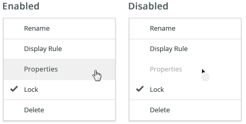
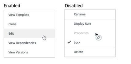
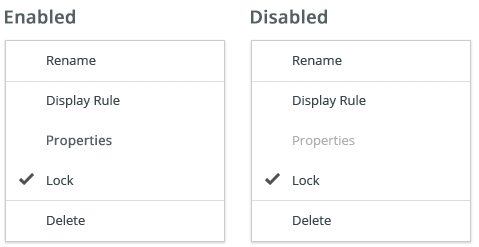
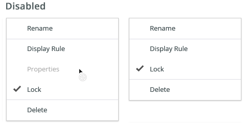
A disabled state removes the interactivity of a component. User is not allowed to interact with the component due to either permissions, dependencies, or pre-requisites.
Default Disabled
A component cannot be interacted with but remains visible to the user in a disabled visual style.
The default disabled state is used when a component is temporarily disabled due to dependencies or pre-requisites. It returns to its enabled state once the pre-requisites are fulfilled or the dependencies are resolved. A disabled state is most commonly triggered by the user’s action or inaction.
A component in the disabled state cannot be clicked, selected or interacted with but it should never fully disappear from the user’s view.
Style
Token | Type | Used for |
|---|---|---|
opacity 400 | 32% opacity | Buttons, Form elemets, Text, Icons |
| none | Hover | |
| not-allowed | Cursor |
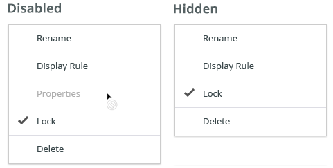
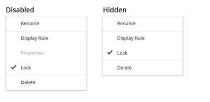
Read-Only
A component cannot be interacted with, but the user can read the information.
The read-only state is used when a component needs to be disabled but its content is still relevant to the user (e.g. for a completion of a task).
A component in the read-only state is visible to the user but cannot be interacted with. It should always be accessible to a screen reader.
Style
The visual style of the read-only states vary by component but should never contain any interactive indicators, hover states or text underlines.
Hidden
A component cannot be interacted with and is not visible to the user.
A hidden state is used when there is no permission to view or interact with a component.
A component in the hidden state is completely hidden from the user interface.
The only way to enable the hidden element and have it in the UI is to change the assigned permission (e.g. an administrator can have more actions on his dashboard than a reader).
Attachments:
 Untitled-14.jpg (image/jpeg)
 Untitled-13.jpg (image/jpeg)
 image2020-6-10_9-3-9.png (image/png)
 image2020-6-10_9-11-12.png (image/png)
image2020-6-10_9-22-3.png (image/png)
image2020-6-10_9-11-12.png (image/png)
image2020-6-10_9-22-3.png (image/png)
 image2020-6-10_9-22-45.png (image/png)