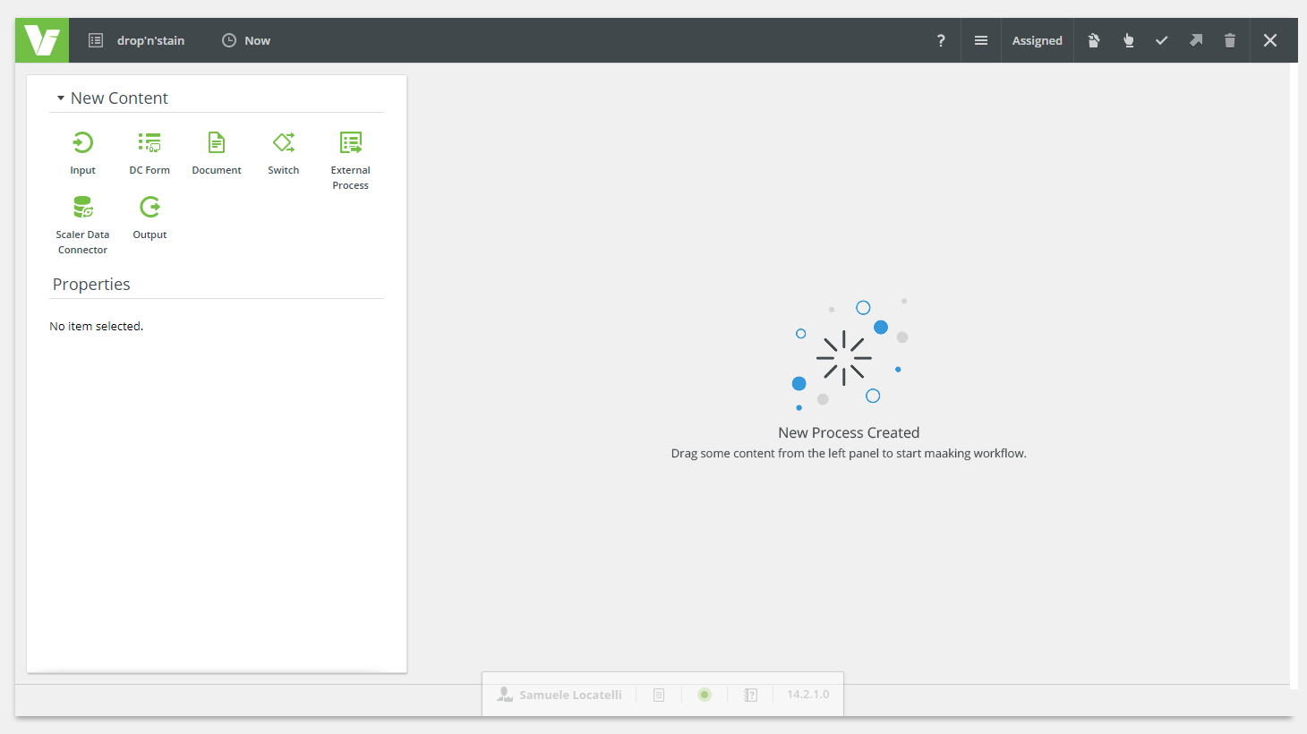
BOBWAI COMPONENT bobwai--empty-state 
Informs users that there is no content to display.
Usage
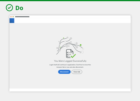
Empty states are a powerful way to support users in scenarios where they would otherwise be blocked by an empty screen. They provide guidance about what the user would see if the data were present and help them make next steps. This can make the user experience much smoother. There is not just one approach to fit all situations, hence, explore the variants below.

For the first use, starter content, onboarding, or error management.

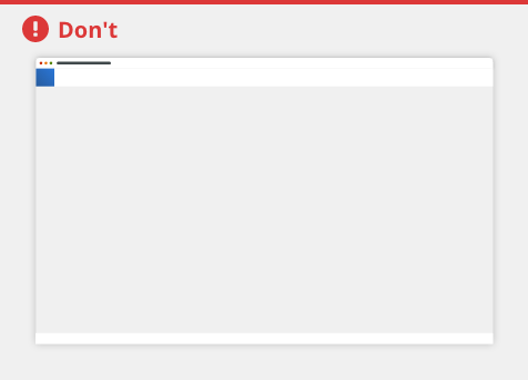
Never leave a page blank, it might confuse users.
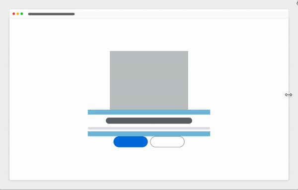
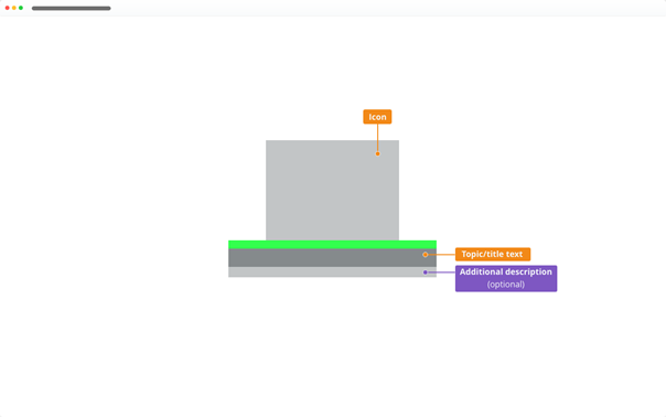
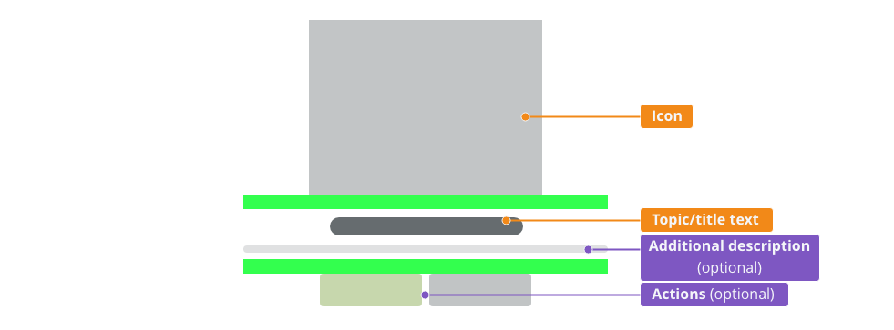
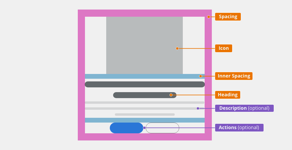
Anatomy

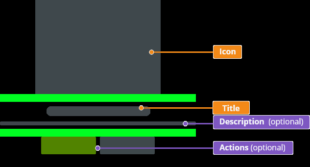
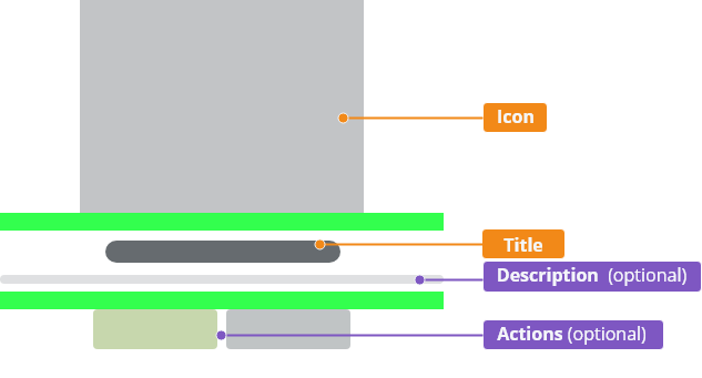
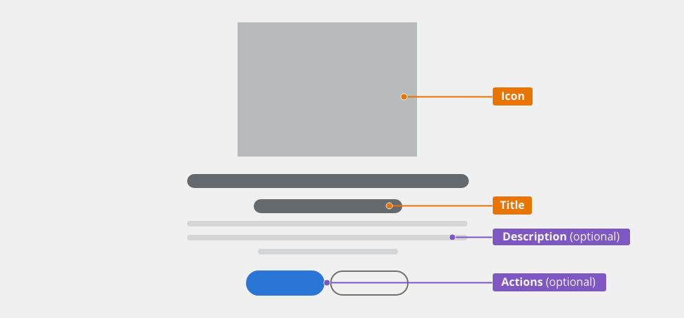
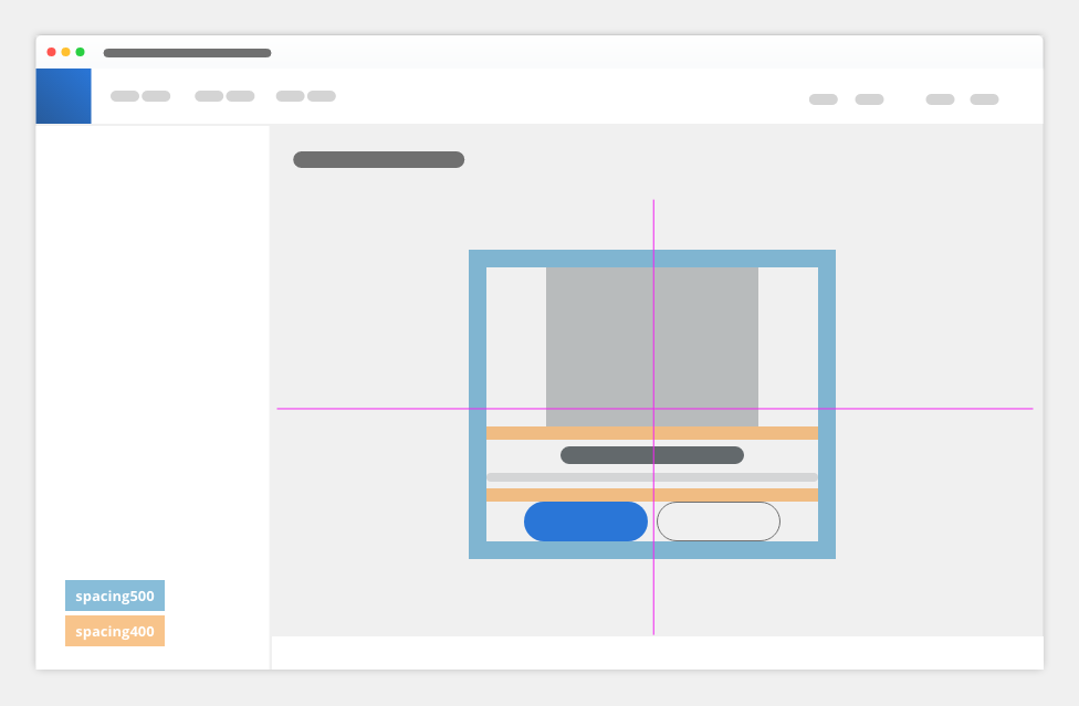
Component Empty state consists of:
- Icon: selected icon from a set of prepared illustrations, visually describes a task.
- Title (in Title Case): as short as possible but accurate note about what happened (no data, no results etc.).
- Description (optional, in Sentence case): about what happened or a guide how to solve an issue; to structure empty content add a bullet list to add specific criteria.
- Actions (optional): what action has to be taken, what user should do to have the content visible. a link for navigating to another area, a button to explain why space is empty and includes the benefit of taking this step.
Variants
First Usage
- The information is shown when an object is firstly used:
- new template/workflow,
- first login of the writer into the application without tickets, etc.
- User has to start with an action:
- insert an object (block into a new workflow),
- create the first ticket in the system, etc.
- User has to be guided to start a new action:
- selection of space where a new object can be placed together with a description of the expected action (e.g. "Drop the block here."),
- shortcut for the creation of a new object or a description of the way leading to its creation, etc.

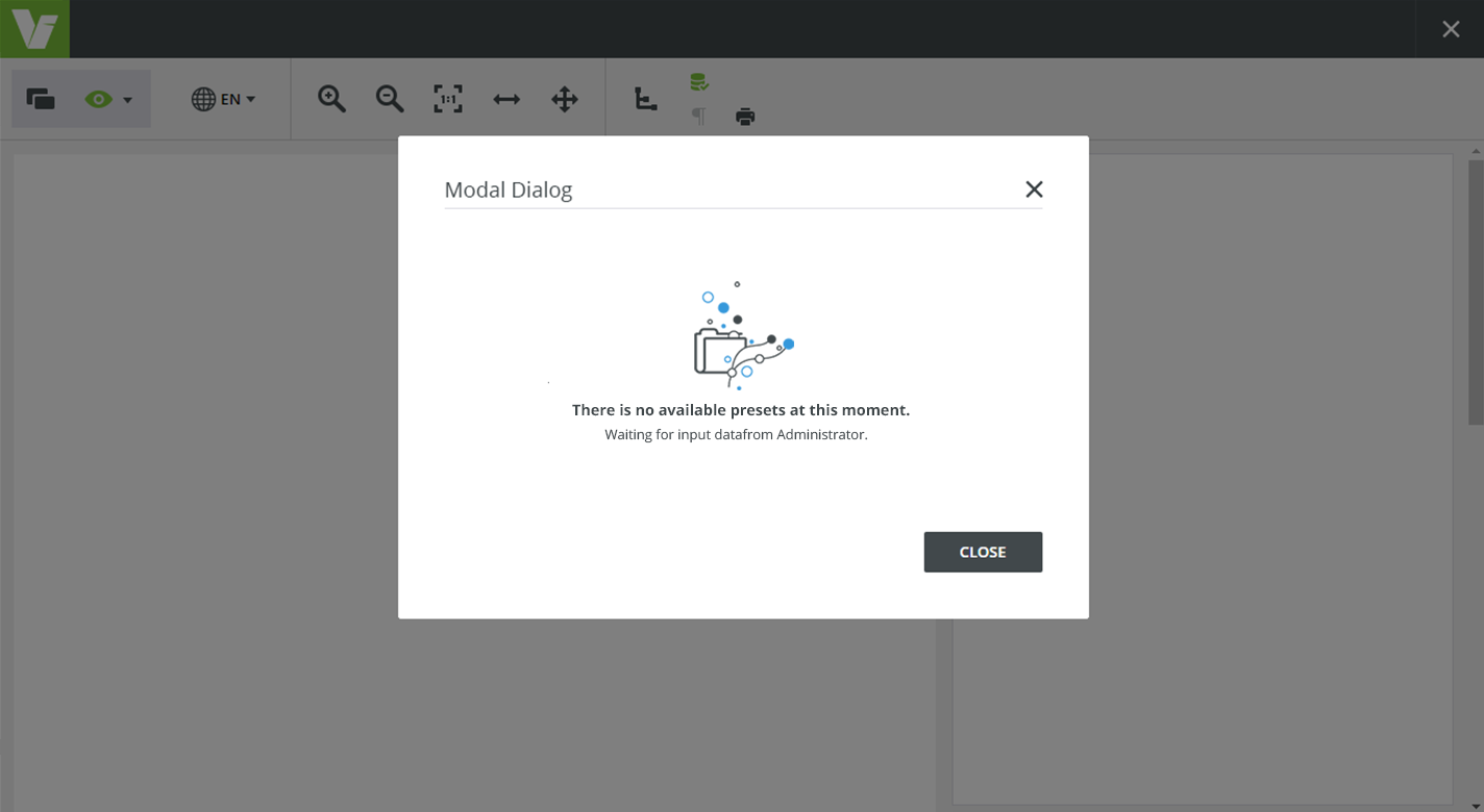
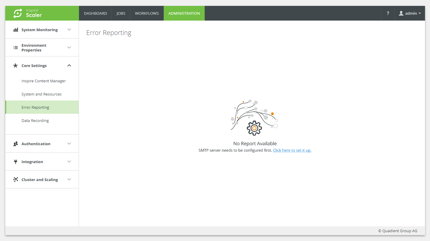
Missing Data
- An object which depends on data that does not exist yet or resources are not connected.
- Resources or data are set by someone else, not the users themselves:
- non-existing blocks,
- a chart which is not connected to its database or using an empty database,
- missing thumbnail or no preview.
- Users have to be informed about the reason of not being able to see the content and that they cannot change it themselves, including the information about who can do such a change (e.g. No data – contact your administrator).

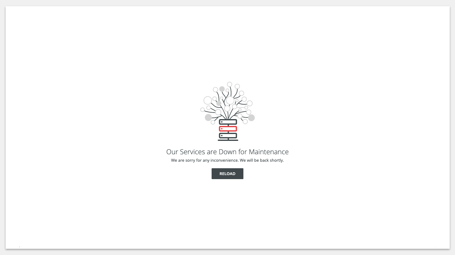
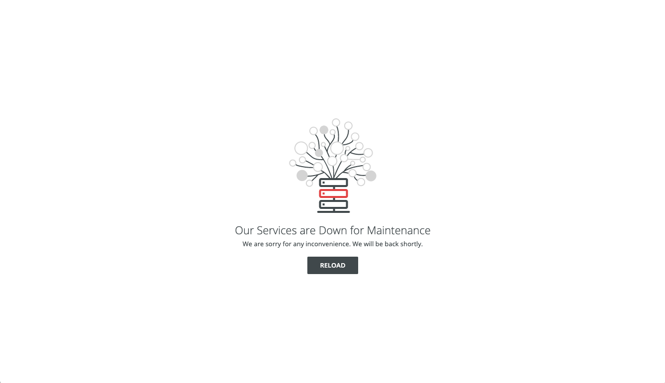
Example
For of temporal unavailability of the content on page use the following example including text:
Our Services Are Down for Maintenance
We are sorry for any inconvenience. We will be back shortly.
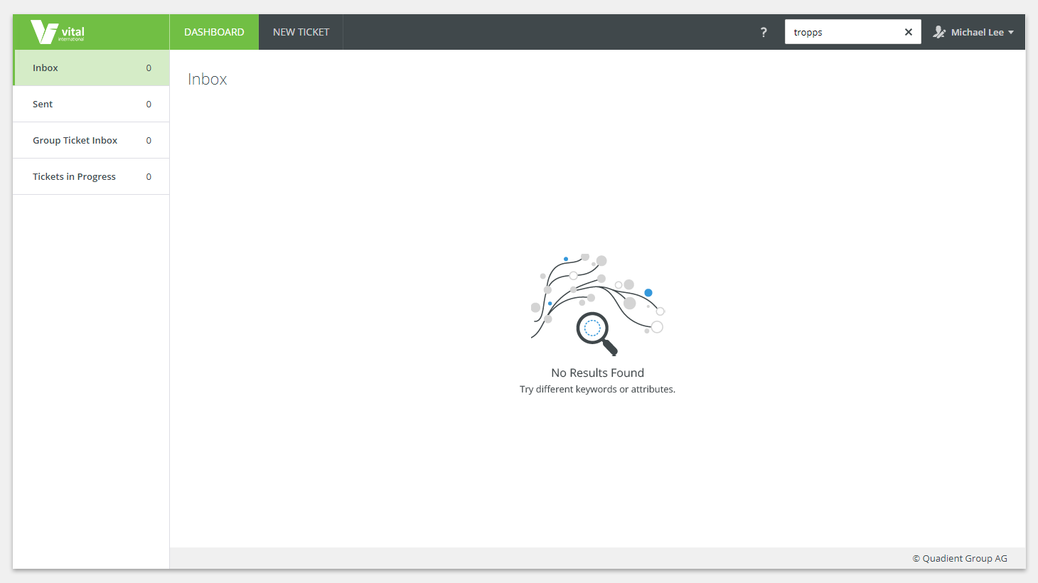
Nothing Found (No Results)
The result of a search or a filter which does not exist in the searched/filtered data.

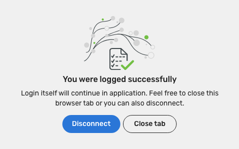
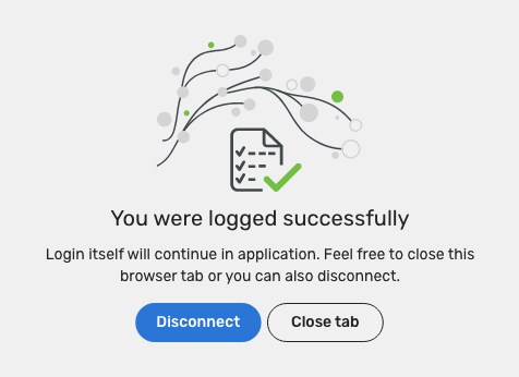
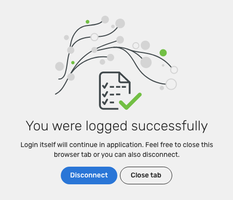
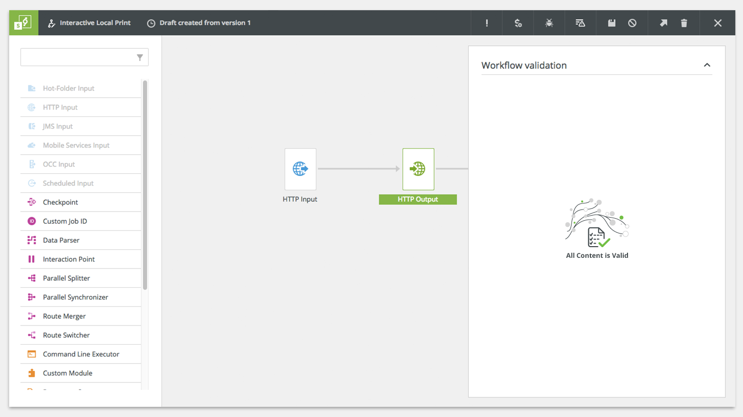
Positive Notification
- The user has to be informed that it is correct that the actual space if empty.
- Validation of a workflow: All content is valid.

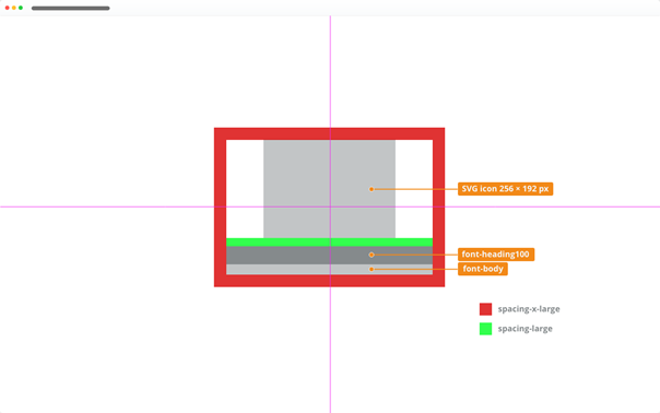
Appearance - Sizes
Empty states come in the following sizes based on the container to be placed:
Small
For content with limited spaces - Sidebars
Medium
Main content of a page
Large
Empty pages
Behaviour
Empty state uses space respectively - it swaps between its sizes if there is not enough space to fit into the set container.
Elements

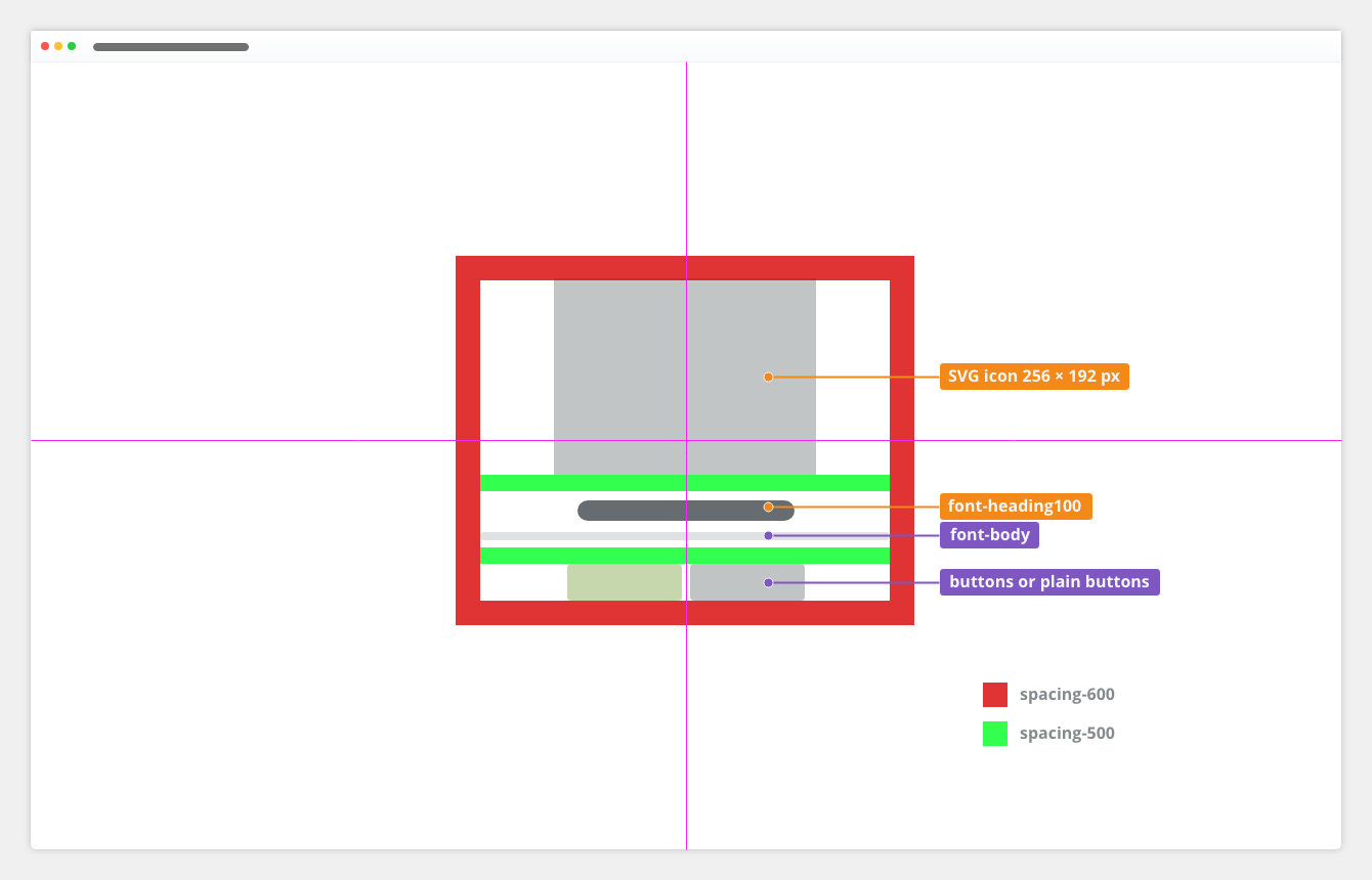
Large: Empty Page

Responsivity
- Minimum width: 256 px
- Maximum width: 512 px
Icon
fixed size 256 ✕ 192 px (4:3 ratio).Typography
Used in |
Type |
Token |
|---|---|---|
heading/empty space topic |
Heading 1 (H1) |
font-heading-600 |
| description | Body | font-body |
Color
Used in |
Type |
Token |
|---|---|---|
links |
link color |
color-text-info |
| heading, body text | text color | color-text-100 |
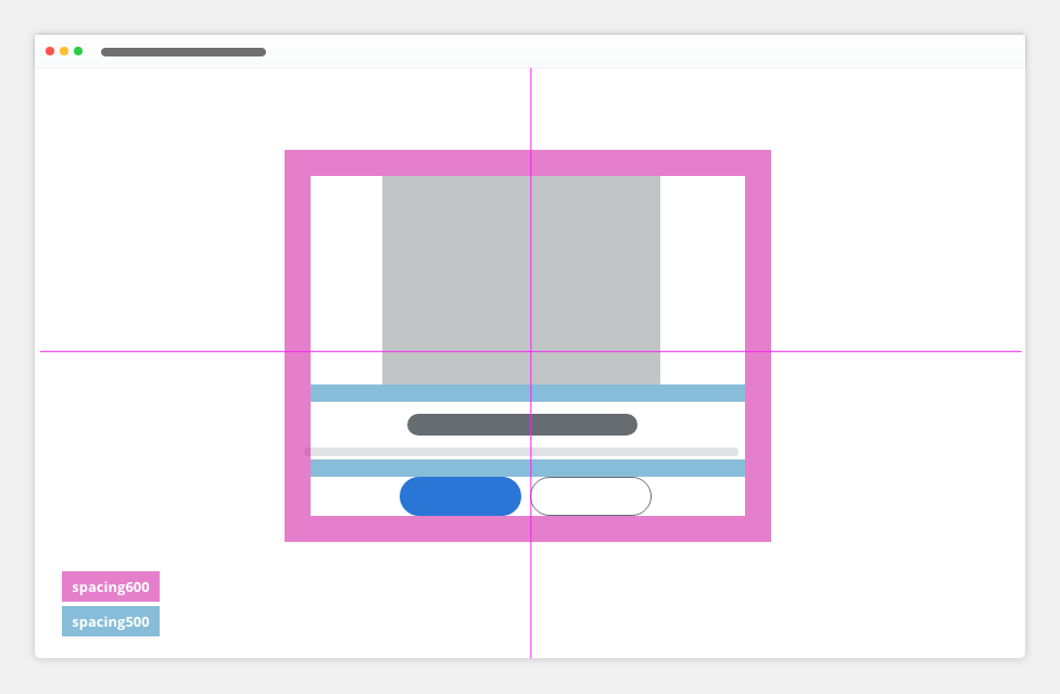
Spacing
Used in |
Type |
Token |
|---|---|---|
between icon and heading |
margin | spacing-500 |
around the whole object |
padding | spacing-600 |
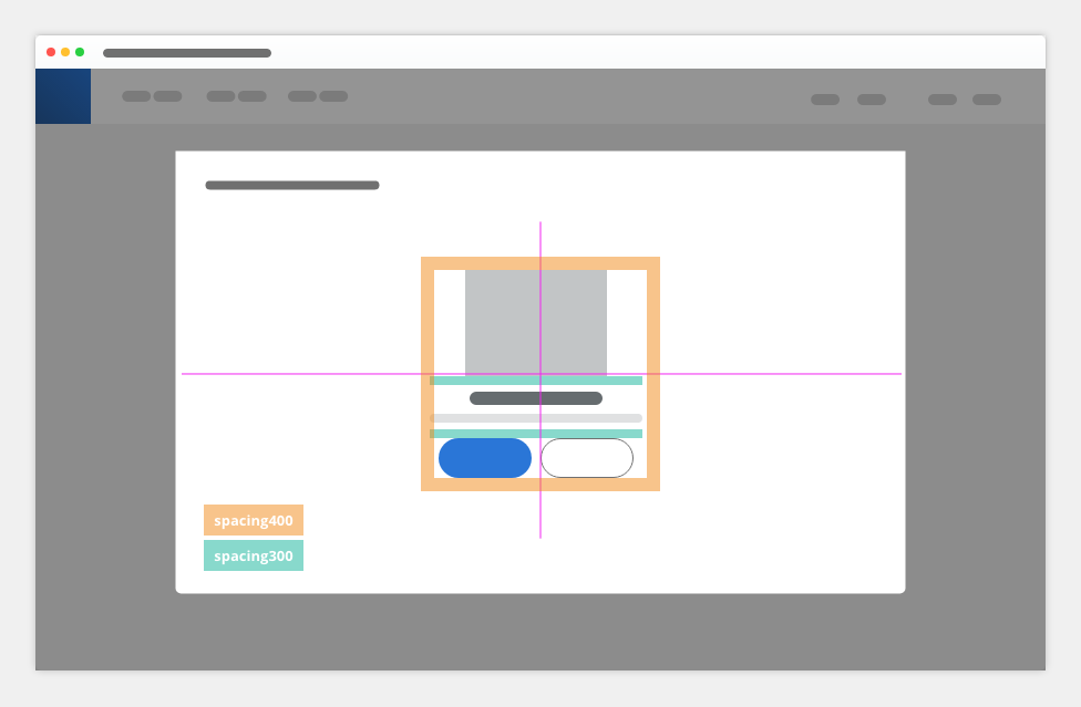
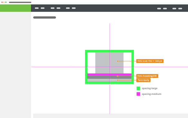
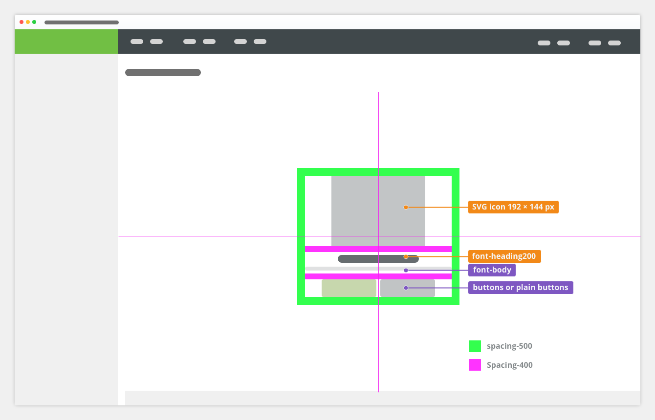
Medium: Main Content of a Page

Responsivity
- Minimum width: 192 px
- Maximum width: 384 px
Icon
fixed size 192 ✕ 144 px (4:3 ratio).
Typography
Used in |
Type |
Token |
|---|---|---|
message heading/empty space topic |
Heading 2 (H2) |
font-heading-500 |
| description | Body | font-body |
Color
Used in |
Type |
Token |
|---|---|---|
Link |
link color |
color-text-link |
| heading, body text | text color | color-text-100 |
Spacing
Used in |
Type |
Token |
|---|---|---|
| between icon and heading between description and button(s) |
margin | spacing-400 |
around the whole object |
padding | spacing-500 |
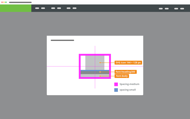
Small: Side Panel
Responsivity
- Minimum width: 144 px
- Maximum width: 288 px
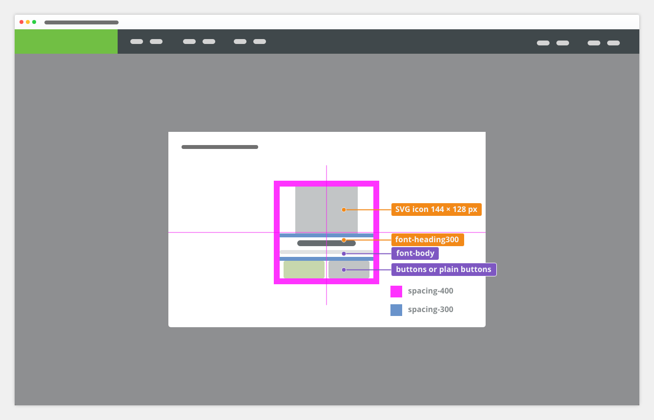
Icon
fixed size 144 ✕ 128 px (4:3 ratio)
Typography
Used in |
Type |
Token |
|---|---|---|
heading |
Heading 3 (H3) |
font-heading-300 |
| description | Body | font-body |
Color
Used in |
Type |
Token |
|---|---|---|
links |
link color |
color-text-link |
| heading, body text | text color | color-text-100 |
Spacing
Token |
Type |
Used In |
|---|---|---|
| between Icon and heading between description and button(s) |
margin | spacing-300 |
around the whole object |
padding | spacing-400 |
First Usage


Missing Data


Nothing Found

Positive Notification

Attachments:
 image2019-12-13_9-16-27.png (image/png)
 image2019-12-13_9-17-20.png (image/png)
 image2019-12-13_9-18-10.png (image/png)
 image2019-12-13_9-18-33.png (image/png)
 EC2 - graphical spec - content.png (image/png)
 EC2 - graphical spec - content.png (image/png)
 EC2 - graphical spec-L.png (image/png)
 EC2 - graphical spec-M.png (image/png)
 EC2 - graphical spec-S.png (image/png)
 EC2 - graphical spec - content.png (image/png)
 EC2 - graphical spec-L.png (image/png)
 EC2 - graphical spec-M.png (image/png)
 EC2 - graphical spec-S.png (image/png)
 wflow.png (image/png)
 wflow2.png (image/png)
 reporting.png (image/png)
 not-found.png (image/png)
 validace.png (image/png)
 mdal.png (image/png)
 panel.png (image/png)
 es-error-4xx.svg (image/svg+xml)
es-error-4xx.png (image/png)
es-error-5xx.png (image/png)
es-error-5xx.svg (image/svg+xml)
es-empty-folder.png (image/png)
es-empty-folder.svg (image/svg+xml)
es-empty-workflow.png (image/png)
es-empty-workflow.svg (image/svg+xml)
es-not-configured.png (image/png)
es-not-configured.svg (image/svg+xml)
es-not-found.png (image/png)
es-not-found.svg (image/svg+xml)
es-success.png (image/png)
es-success.svg (image/svg+xml)
EC2 - graphical spec-L.png (image/png)
es-error-4xx.svg (image/svg+xml)
es-error-4xx.png (image/png)
es-error-5xx.png (image/png)
es-error-5xx.svg (image/svg+xml)
es-empty-folder.png (image/png)
es-empty-folder.svg (image/svg+xml)
es-empty-workflow.png (image/png)
es-empty-workflow.svg (image/svg+xml)
es-not-configured.png (image/png)
es-not-configured.svg (image/svg+xml)
es-not-found.png (image/png)
es-not-found.svg (image/svg+xml)
es-success.png (image/png)
es-success.svg (image/svg+xml)
EC2 - graphical spec-L.png (image/png)
 EC2 - graphical spec-M.png (image/png)
 EC2 - graphical spec-S.png (image/png)
 Screenshot 2020-03-06 at 10.01.34.png (image/png)
 es-empty-apps.svg (image/svg+xml)
 es-empty-apps.png (image/png)
 es-empty-apps.png (image/png)
 es-select.svg (image/svg+xml)
es-select.png (image/png)
es-error-user.png (image/png)
es-error-user.svg (image/svg+xml)
wflow.png (image/png)
wflow2.png (image/png)
es-select.svg (image/svg+xml)
es-select.png (image/png)
es-error-user.png (image/png)
es-error-user.svg (image/svg+xml)
wflow.png (image/png)
wflow2.png (image/png)
 wflow2.png (image/png)
style.png (image/png)
panel.png (image/png)
not-found.png (image/png)
wflow2.png (image/png)
style.png (image/png)
panel.png (image/png)
not-found.png (image/png)
 reporting.png (image/png)
 not-found.png (image/png)
validace.png (image/png)
reporting.png (image/png)
not-found.png (image/png)
validace.png (image/png)
reporting.png (image/png)
 reporting.png (image/png)
error500.png (image/png)
image2020-3-26_10-31-49.png (image/png)
reporting.png (image/png)
error500.png (image/png)
image2020-3-26_10-31-49.png (image/png)
 fe742620-bfa8-48f5-a5b4-22c6a43fe994.png (image/png)
 es-empty-apps.svg (image/svg+xml)
 es-empty-apps.svg (image/svg+xml)
 es-empty-apps.svg (image/svg+xml)
es-empty-apps.png (image/png)
es-empty-apps.svg (image/svg+xml)
es-empty-apps.png (image/png)
 es-empty-apps.png (image/png)
empty-states-anatomy.png (image/png)
es-empty-apps.png (image/png)
empty-states-anatomy.png (image/png)
 image2020-11-27_12-24-3.png (image/png)
 empty-states-do-example.png (image/png)
 empty-states-dont-example.png (image/png)
 Context-menu-type-multilevel.png (image/png)
 empty-states-size-l.png (image/png)
 empty-states-size-m.png (image/png)
 empty-states-size-s.png (image/png)
 empty-states-elements.png (image/png)
 empty-states-elements.png (image/png)
 empty-states-elements.png (image/png)
 empty-states-size-l.png (image/png)
 empty-states-size-m.png (image/png)
 empty-states-size-s.png (image/png)
 empty-states-do-example.png (image/png)
empty-states-dont-example.png (image/png)
empty-states-anatomy.png (image/png)
empty-states-elements.png (image/png)
empty-states-size-l.png (image/png)
empty-states-size-m.png (image/png)
empty-states-size-s.png (image/png)
empty-state.webp (application/octet-stream)
empty-states-do-example.png (image/png)
empty-states-dont-example.png (image/png)
empty-states-anatomy.png (image/png)
empty-states-elements.png (image/png)
empty-states-size-l.png (image/png)
empty-states-size-m.png (image/png)
empty-states-size-s.png (image/png)
empty-state.webp (application/octet-stream)
 empty-state.gif (image/gif)
empty-states-sizes-small.png (image/png)
empty-states-sizes-medium.png (image/png)
empty-states-sizes-large.png (image/png)
empty-state.gif (image/gif)
empty-states-sizes-small.png (image/png)
empty-states-sizes-medium.png (image/png)
empty-states-sizes-large.png (image/png)