Tooltips provide useful contextual information upon hovering or focusing on a UI component.
Component Status
 Design Kit: RELEASED
 Bobwai Component: bobwai--tooltip-message RELEASED

Usage
Use tooltips for actionable UI elements, typically in toolbars or forms. The information in the tooltip should be contextual and helpful, but non-essential. Users should be able to complete an action without reading the tooltip.
- Use tooltips consistently throughout your product.
- Always use tooltips for icons without text.
- Support both mouse hover and keyboard hover (focus).
- Provide brief and helpful content.
- Do not use tooltips for information that is vital for the task completion.
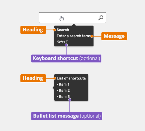
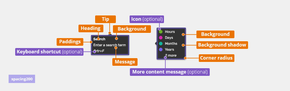
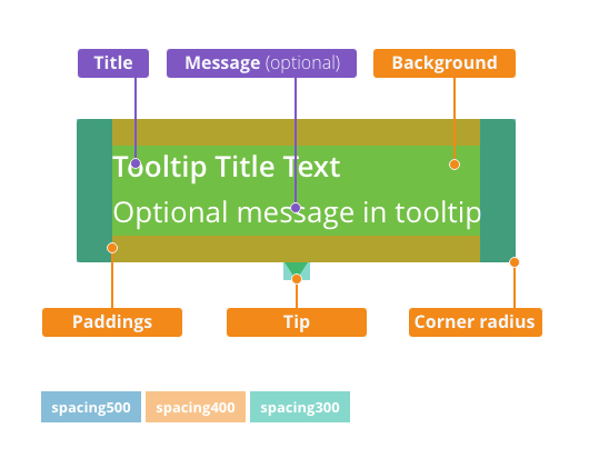
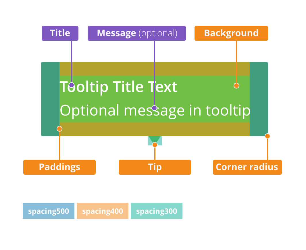
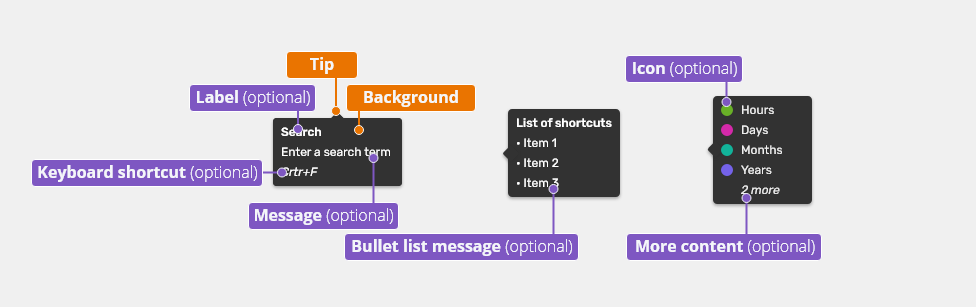
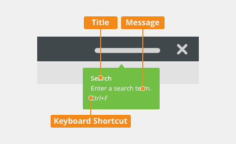
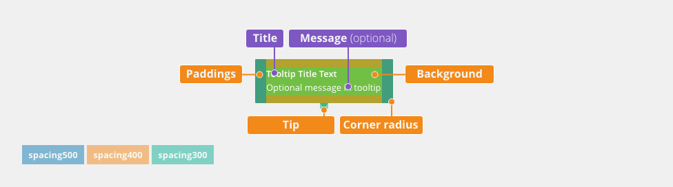
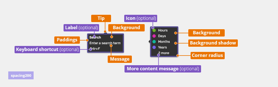
Anatomy
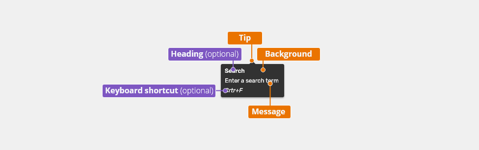
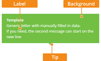
- Heading (optional) - Name of the feature. Read more about writing tooltip messages in the Content section below.
- Message - Information about components or the contextual help.
- Keyboard shortcut (optional)
- Background
- Tip - Located based on the tooltip placement.
Types
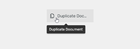
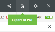
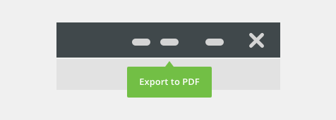
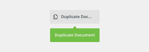
Simple Tooltip
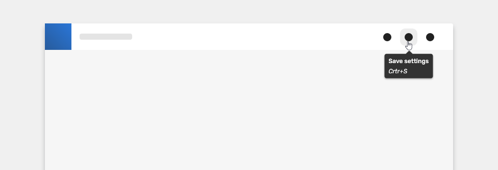
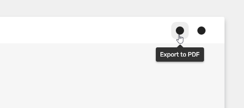
Use it to clarify the purpose of an interactive UI element (icon, button, menu item etc.). Its content is as brief as possible.

Use the button tooltip also to display the text which was cut off due to space saving using the ellipsis character.
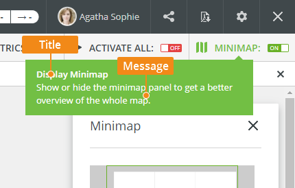
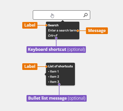
Descriptive Tooltip
Use the descriptive tooltip to provide additional guidance to a UI feature.
It consists of the following parts:
- Heading - Name of the feature.
- Message - Brief description of the feature and/or its value for the user.
- Keyboard shortcut (optional) - If available, a keyboard shortcut is displayed on a separate line.
- Bullet list message (draft)
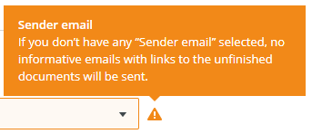
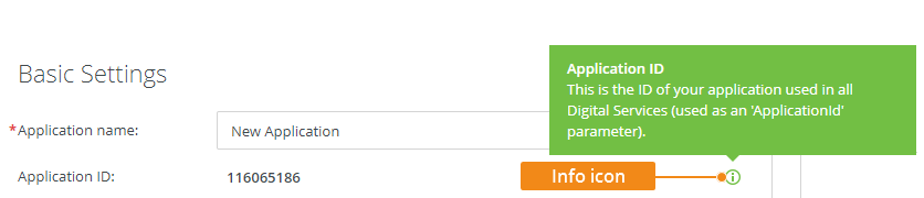
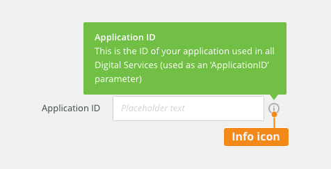
Info Tooltip
Use tooltips paired with the Info icon in places where users might encounter obstacles within the task flow. The icon increases the visibility of the guidance.
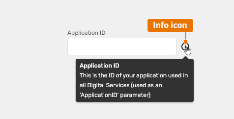
- Use where information from a 3rd party system is needed.
- Use for explaining concepts the users are unfamiliar with, e.g. industry-specific concepts or those unique to your system.
- Usability testing can help you determine the places to use the Info tooltips (users get stuck without guidance).
- Use in UIs for touch-controlled devices.
- Do not use the Info icon tooltips for all fields in a form.
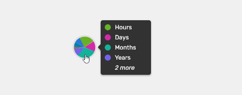
Chart Tooltip
Use chart tooltip list in combination with charts.

Semantic Variants
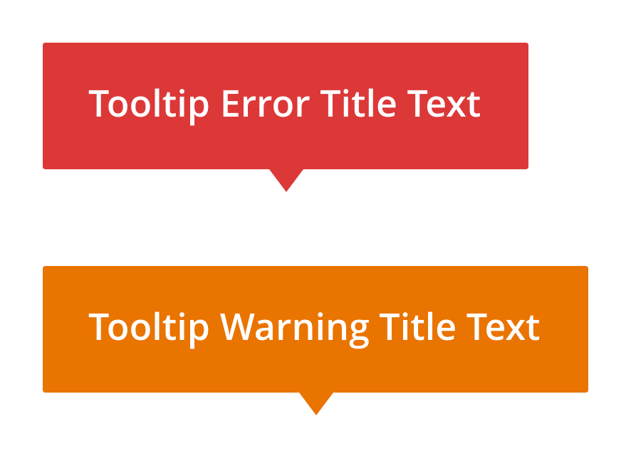
Apart from the neutral tooltips described above, the following variants may occur:
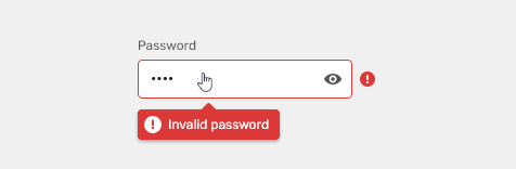
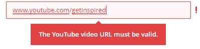
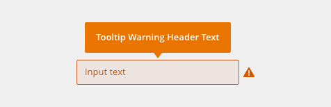
- Error - Used to provide explanation to an error (typically an input validation error). The error color is used in the background.
Appearance
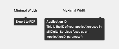
Width
The tooltip box wraps around its content while the maximum width is 240 pixels. The tooltip message is wrapped into multiple lines.

Behavior
Icon and Basic Tooltips
- Appears on hover and focus on the related UI element.
- Is not displayed immediately, the delay is 500ms.
- Should not immediately disappear, unless the user hovers over another element with a tooltip. The delay for disappearance is 500ms.
- When the user scrolls, their attention is no longer on the tooltip. Hide it immediately.
Přidat ukázkovou animaci.
Keyboard Interactions
Key |
Interaction |
|---|---|
| <Tab> or <Shift>+<Tab> | Tabbing into an compoents that has a tooltip associated with it (e.g., an icon) shows the tooltip. |
| Esc | Hides the tooltip. |
Info Tooltip
- Appears on hover, focus and click/tap on the Info icon.
- Clicking on the Info icon displays the tooltip immediately and the tooltip message remains visible.
- If opened by clicking, the tooltip message is closed either by clicking outside of the message box or by interacting with another UI element.
- Rules for hover and focus are the same as described in the section above.
Přidat ukázkovou animaci.
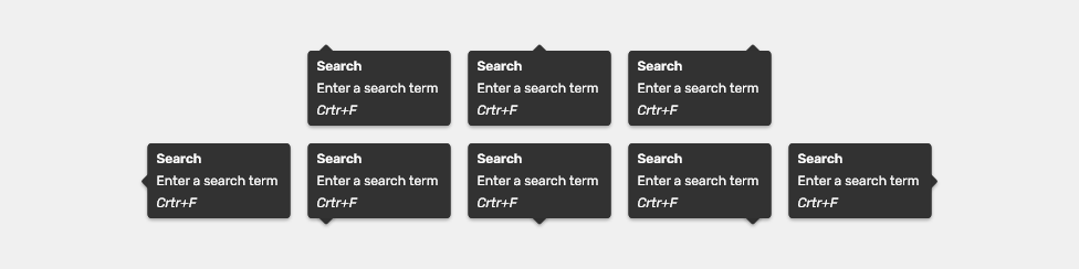
Placement
Tooltips can be positioned top, bottom, left, or right to the trigger item depending on how close the item is to the edge of the screen. See bobwai--tooltip-emplacer for available variants.
Editorial
Content of tooltips should be helpful, brief and follow the general writing guidelines.
Casing
Simple tooltip - Title case
Explanatory tooltip
- Heading - Title case
- Message - sentence case
Related Components
- Tooltip emplacer
- Form inputs
Style
Tooltip Elements
Used In |
Type |
Token |
|---|---|---|
Heading color |
Color |
color-text-400 |
Heading font |
Font |
font-label (semibold) |
| Message color | Color | color-text-400 |
| Message font | Font | font-label |
| Keyboard shortcut color | Color | color-text-400 |
| Keyboard shortcut font | Font | font-label + italic |
| More content color | Color | color-text-400 |
| More content font | Font | font-label + italic |
| Icon size | Size | sizing-icon-200 |
Background color |
Color |
color-bg-ui-300-inverted |
| Tip color | Color | color-bg-ui-300-inverted |
| Corner radius | Border radius | radius-200 |
| Shadow of tooltip | Shadow | shadow-100 |
Error Tooltip

Used In |
Type |
Token |
|---|---|---|
Background of Error feedback tooltip |
Color |
color-error |
| Icon color | Color | color-icon-200 |
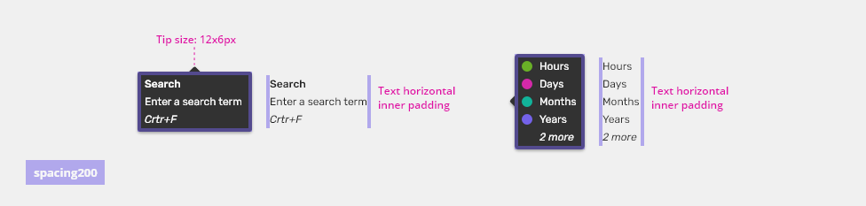
Spacing

| Used In | Type | PX | Token |
|---|---|---|---|
| Padding | Spacing | 4 | spacing-200 |
Accessibility
- A tooltip does not have focus; the focus never leaves the UI element which invokes the tooltip.
- Support both mouse and keyboard focus on UI elements which invoke a tooltip.
- Add ARIA role
role=”tooltip”to the element which serves as the tooltip container. - Add ARIA property
”describedby”to the element which invokes the tooltip. - For ARIA names, state and roles, as well as the expected keyboard interactions, refer to the W3C WAI-ARIA Authoring Practices article.
Attachments:
 definition_tooltip.png (image/png)
 simple_tooltip.png (image/png)
 image2020-8-14_10-41-45.png (image/png)
image2020-8-14_10-49-41.png (image/png)
tooltipanatomy.png (image/png)
image2020-8-14_10-41-45.png (image/png)
image2020-8-14_10-49-41.png (image/png)
tooltipanatomy.png (image/png)
 tooltip_error.png (image/png)
 tooltip_warning.png (image/png)
 tooltip_error.png (image/png)
 image2020-9-8_15-52-42.png (image/png)
 tooltip-style.png (image/png)
 tooltip-style.png (image/png)
 tooltip-style-2x.png (image/png)
 tooltip-warning-error@2x.png (image/png)
 tooltip-warning-error.png (image/png)
 popup_tip.png (image/png)
 popup_tip.png (image/png)
 tooltip-anatomy.png (image/png)
 Tooltip-simple-example01.png (image/png)
 Tooltip-simple-example02.png (image/png)
 Tooltip-standard-example01.png (image/png)
 tooltip-info-example01.png (image/png)
 tooltip-width.png (image/png)
 tooltip-placement.png (image/png)
 tooltip-warning-error.png (image/png)
 tooltip-error.png (image/png)
 tooltip-warning.png (image/png)
 image2020-12-1_10-57-14.png (image/png)
image2020-12-1_10-59-46.png (image/png)
tooltip-anatomy.png (image/png)
image2020-12-1_10-57-14.png (image/png)
image2020-12-1_10-59-46.png (image/png)
tooltip-anatomy.png (image/png)
 Tooltip-simple-example01.png (image/png)
 Tooltip-simple-example02.png (image/png)
 Tooltip-standard-example01.png (image/png)
 tooltip-info-example01.png (image/png)
 tooltip-title.png (image/png)
 tooltip-anatomy.png (image/png)
 tooltip-anatomy.png (image/png)
 tooltip-warning.png (image/png)
 tooltip-error.png (image/png)
 tooltip-width.png (image/png)
 tooltip-placement.png (image/png)
 tooltip-content.png (image/png)
 tooltip-warning-error.png (image/png)
 tooltip-title.png (image/png)
 tooltip-anatomy.png (image/png)
 tooltip-anatomy.png (image/png)
 Tooltip-simple.png (image/png)
 Tooltip-simple-ellipsis.png (image/png)
 Tooltip-descriptive.png (image/png)
 tooltip-info.png (image/png)
 tooltip-list.png (image/png)
 tooltip-error-input.png (image/png)
 tooltip-width.png (image/png)
 tooltip-placement.png (image/png)
 tooltip-elements.png (image/png)
 tooltip-error.png (image/png)
 tooltip-spacing.png (image/png)
 tooltip-title.png (image/png)
tooltip-anatomy.png (image/png)
tooltip-title.png (image/png)
tooltip-anatomy.png (image/png)
 Tooltip-simple.png (image/png)
Tooltip-simple-ellipsis.png (image/png)
Tooltip-descriptive.png (image/png)
Tooltip-simple.png (image/png)
Tooltip-simple-ellipsis.png (image/png)
Tooltip-descriptive.png (image/png)
 tooltip-info.png (image/png)
tooltip-list.png (image/png)
tooltip-error-input.png (image/png)
tooltip-width.png (image/png)
tooltip-placement.png (image/png)
tooltip-elements.png (image/png)
tooltip-info.png (image/png)
tooltip-list.png (image/png)
tooltip-error-input.png (image/png)
tooltip-width.png (image/png)
tooltip-placement.png (image/png)
tooltip-elements.png (image/png)
 tooltip-error.png (image/png)
 tooltip-spacing.png (image/png)
image2021-5-27_16-46-16.png (image/png)
image2021-5-27_16-49-12.png (image/png)
image2021-5-27_16-56-52.png (image/png)
tooltip-error.png (image/png)
tooltip-spacing.png (image/png)
image2021-5-27_16-46-16.png (image/png)
image2021-5-27_16-49-12.png (image/png)
image2021-5-27_16-56-52.png (image/png)
tooltip-error.png (image/png)