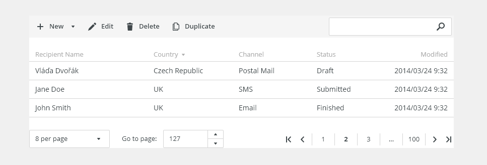
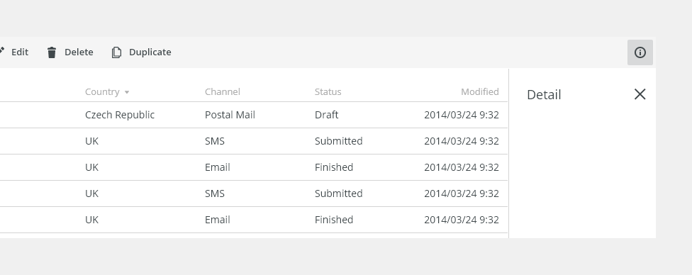
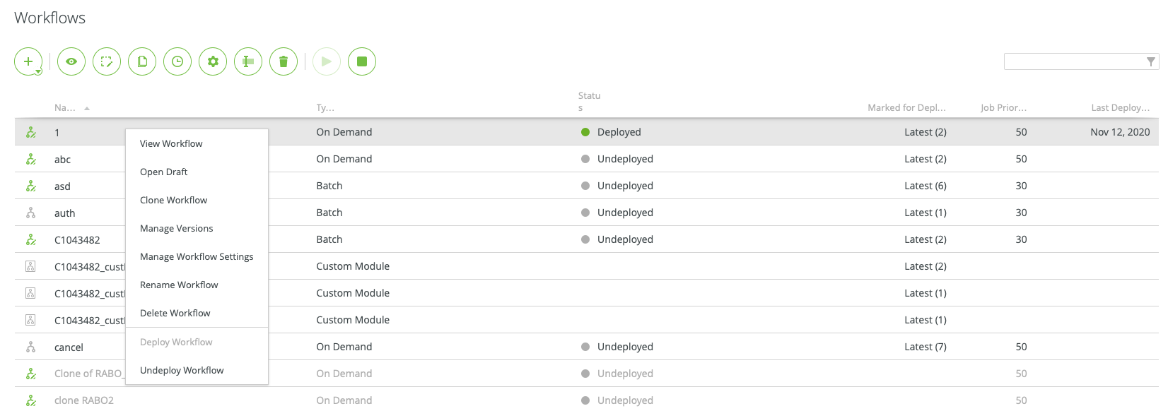
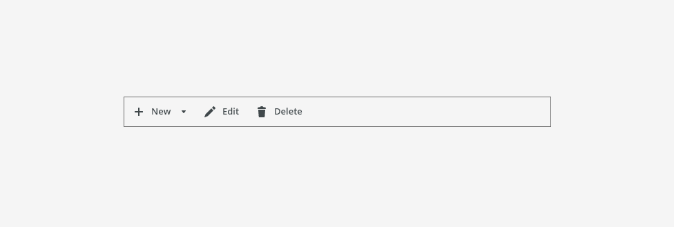
Action bar is a set of buttons that allows users to edit, filter etc. An action bar is always used above a table or a thumbnail view.
Component Status
 Design Kit: RELEASED
 Bobwai component: bobwai--action-buttons RELEASED

Usage
The action bar is used for key actions that impact the entire table or each row. The action bar can be customized by adding or removing icon buttons based on specific user needs.
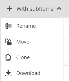
Typical actions are, for example: Create, Edit, Paste, Upload, Import, Rename, Move, Clone, Download.

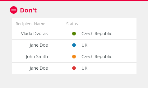
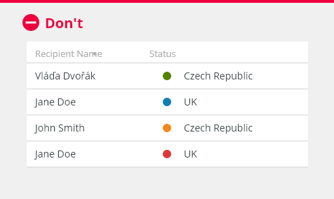
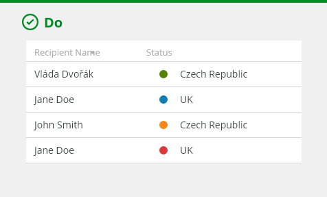
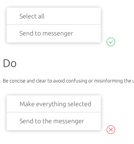
- Sort actions in order of importance from left to right, depending on the culture.

- Do not use for simple tables, when there is no need to use global or contextual actions for the table.
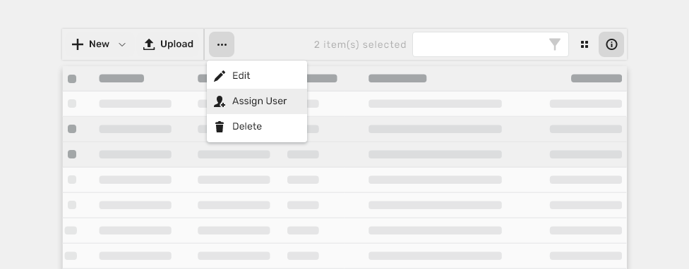
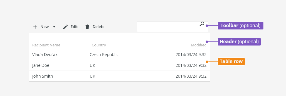
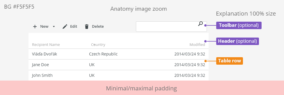
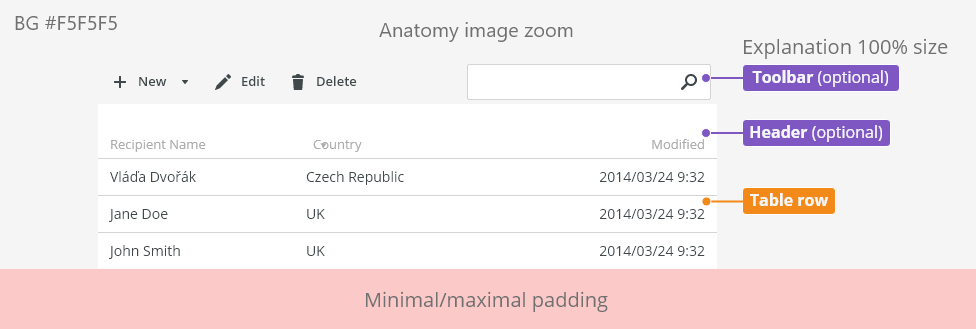
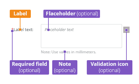
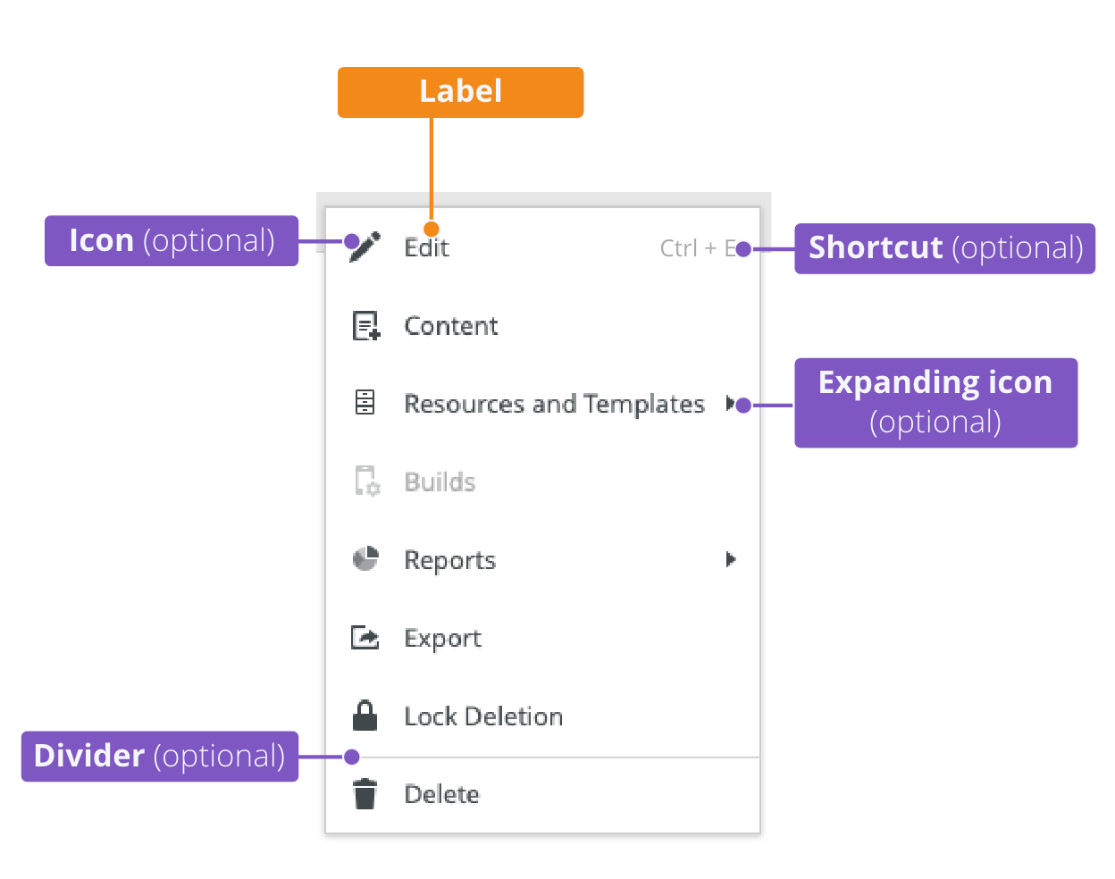
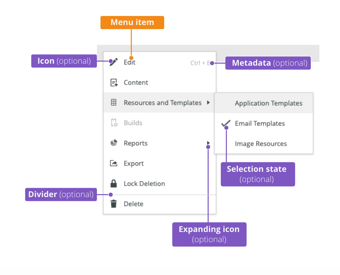
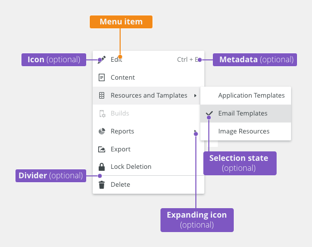
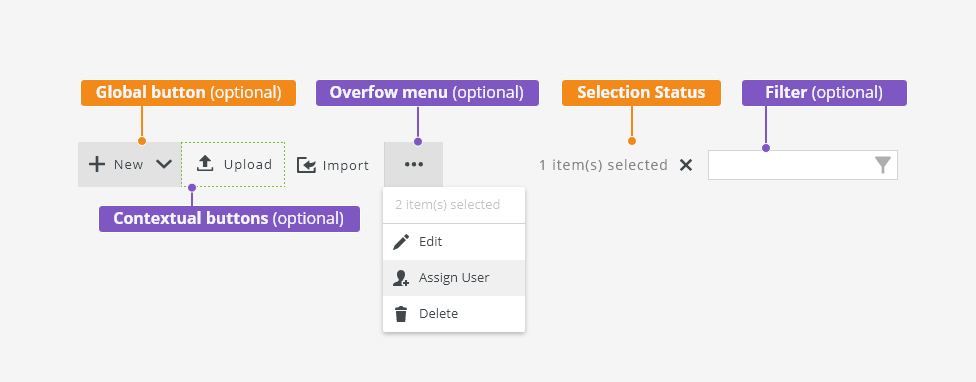
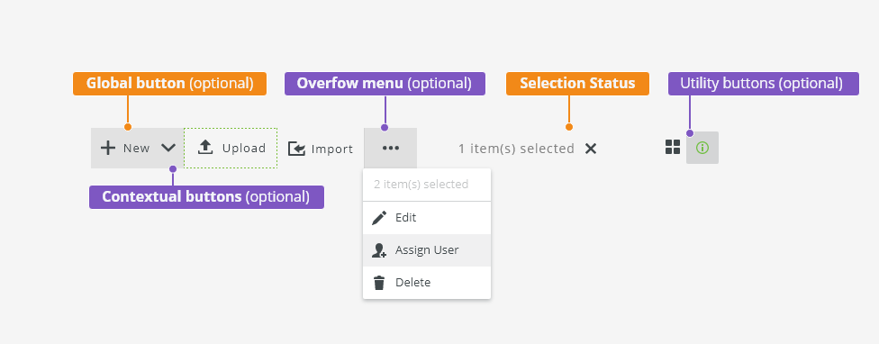
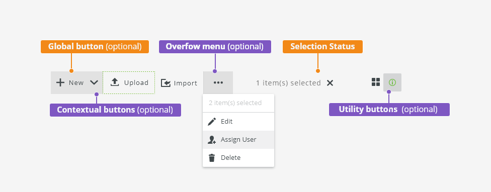
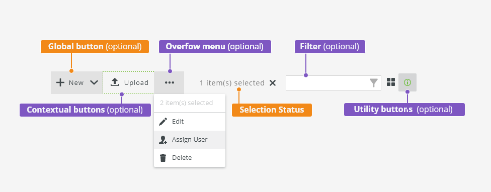
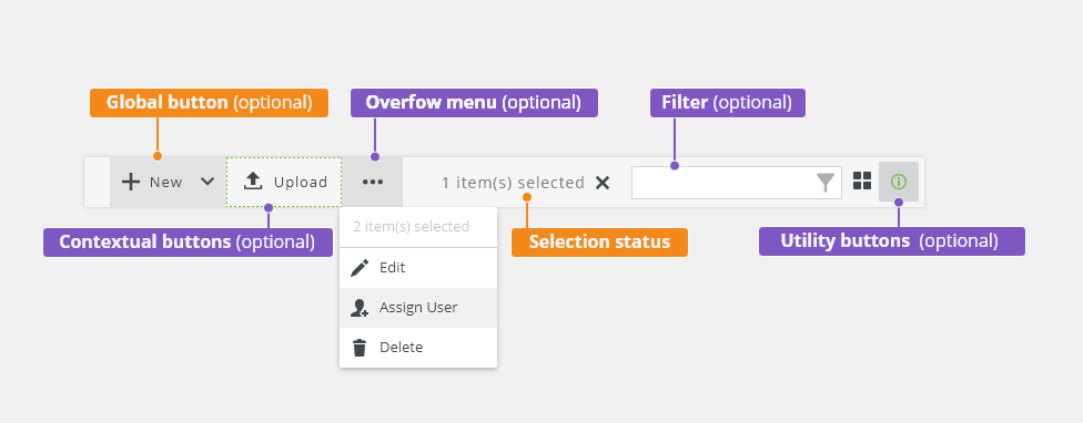
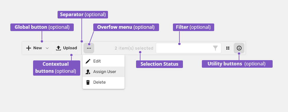
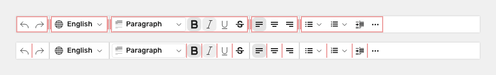
Anatomy

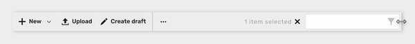
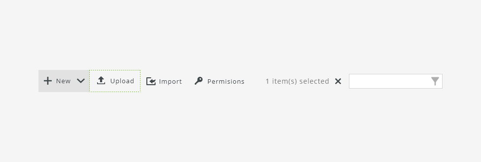
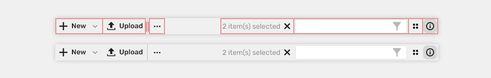
- Global button (optional) - Contains primary app-specific actions for each use case.
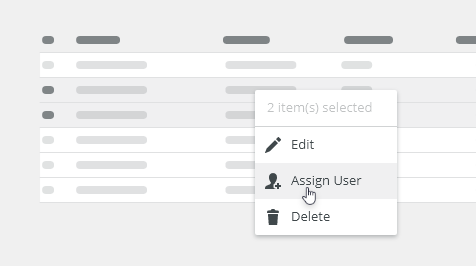
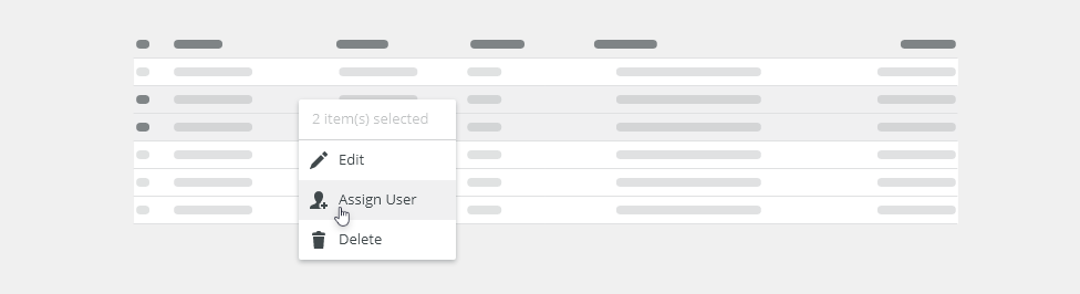
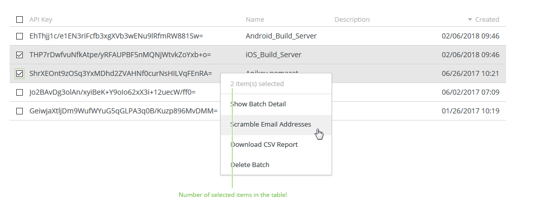
- Contextual buttons (optional) - Actions related to the selected table/thumbnail item.
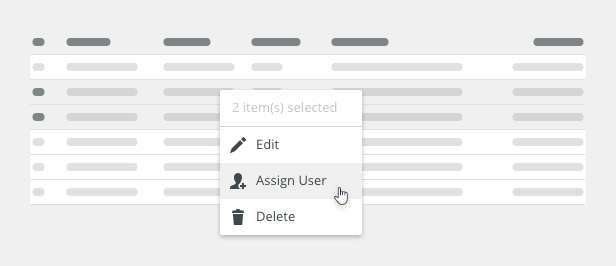
- Selection status (optional) - Informs users about the selected items.
- Filter (optional) - Text field for basic filtering.
- Utility buttons (optional) - Allow using table-related tools/actions.
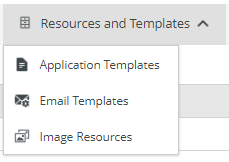
Global Button
Action that does not depend on the selected line. The global action button can have a dropdown with menu which contains primary app-specific actions, typically Create or Add actions. All buttons should have an icon and a label.

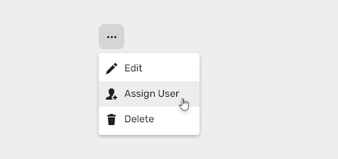
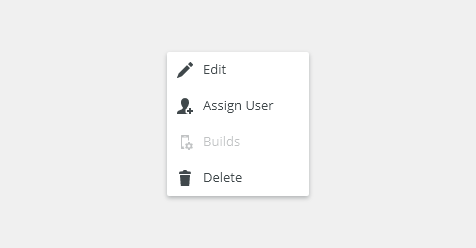
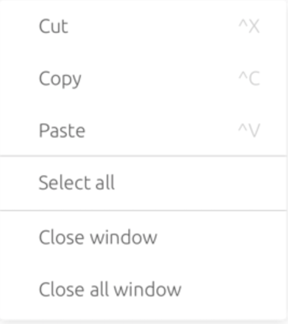
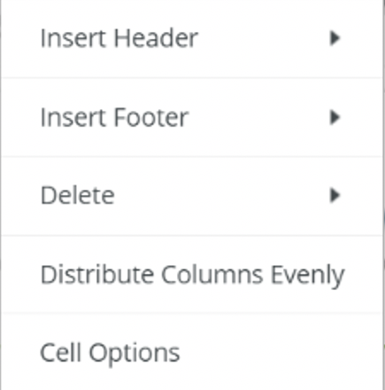
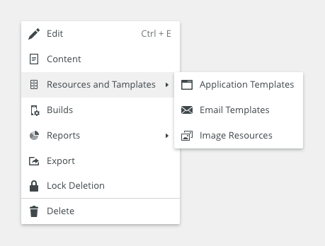
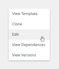
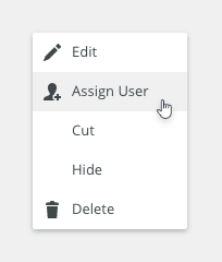
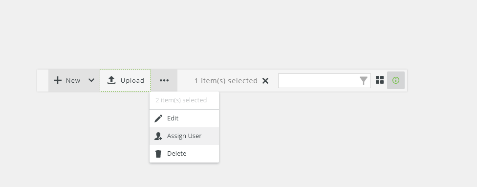
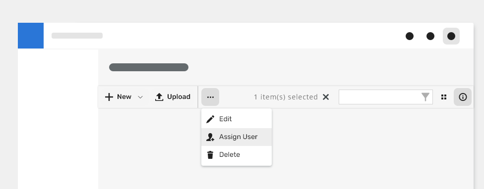
Contextual Buttons
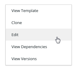
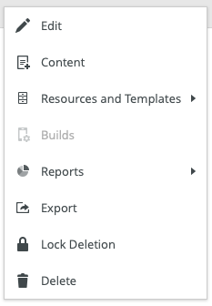
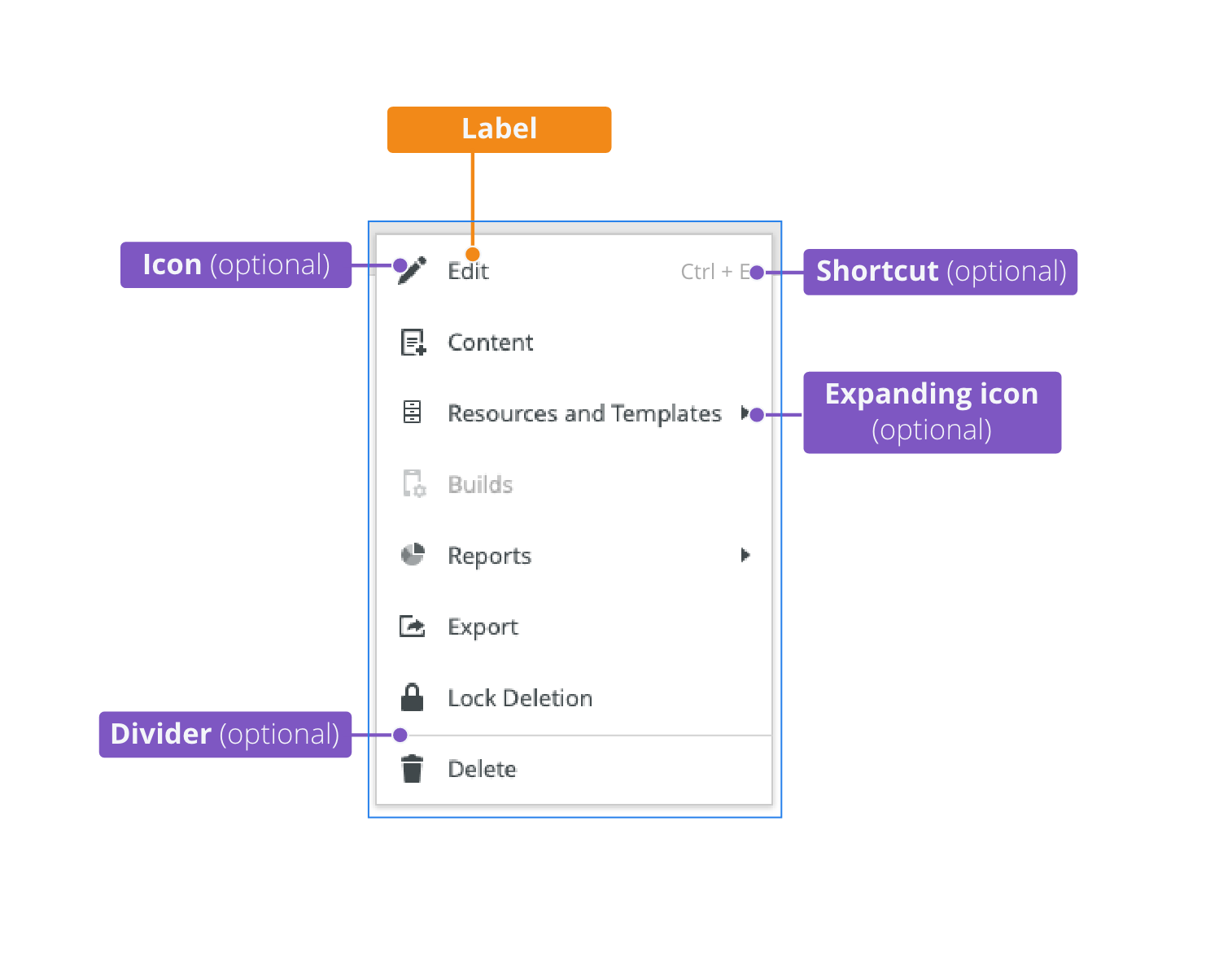
Actions related to the selected table/thumbnail item. The contextual buttons can have a dropdown with menu. All buttons should have an icon and a label. Organize buttons into logical groupings.
Standard action buttons. It is recommended to display no more than 5-7 actions.

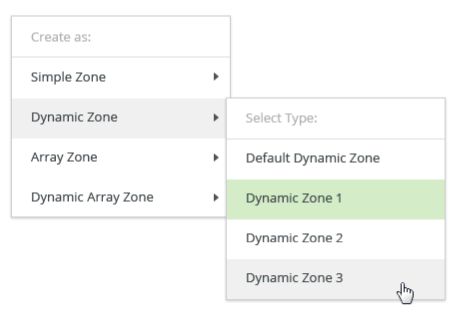
Contextual buttons can have a dropdown with menu which adopt the menu style.

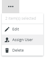
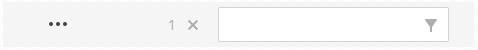
Overflow Menu
The overflow menu is used to display a list of multiple controls when horizontal space for the toolbar becomes restricted. Use overflow for less frequently used actions.
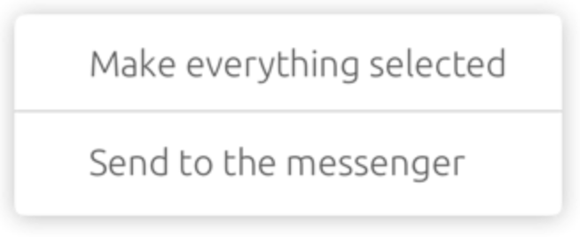
Selection Status
Status informs users about the currently selected items.

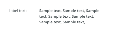
Filter
Users can trim the content of a table by typing a keyword in the text field. For advanced filtering use an advanced filter and position it above the action bar.

Utility Buttons

Appearance
The width of the Action lbar is 100% of the width of the table.
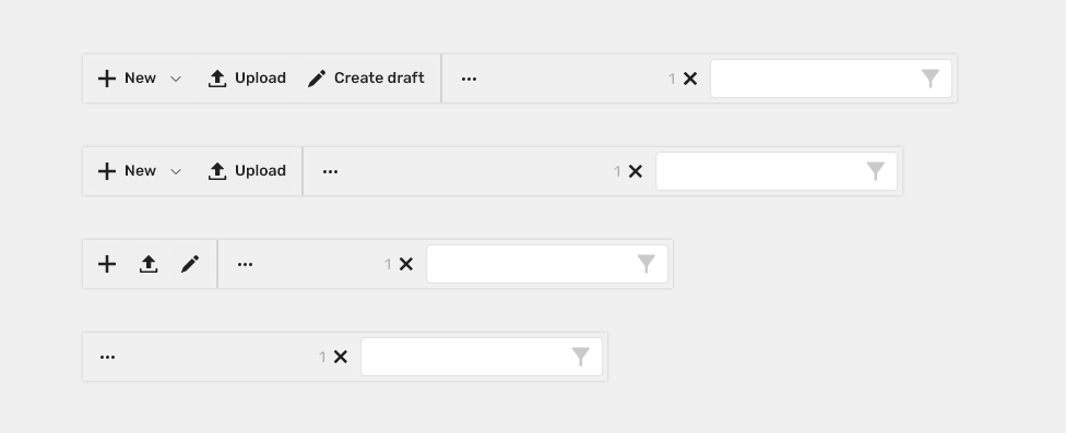
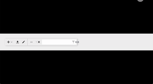
Responsivity

The action bar flexes in size to adapt to the view size.
Fluid layout in a constrained space behaves in the following steps:
- Buttons hide in the overflow menu.
- Text of buttons hides and only icons remain.
- The rest of the buttons hide in the overflow menu.
Behavior
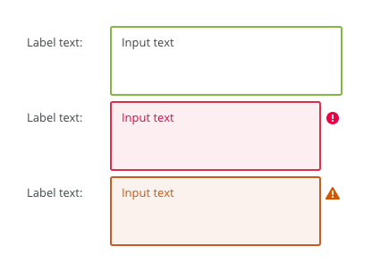
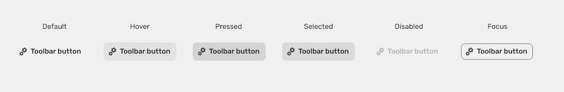
States
The action bar includes a series of actions that adopt the toolbar button style. The action buttons typically have five different states: enabled, hover, focus, active, and disabled.
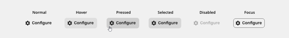
Disabled
Cannot be interacted with but remains visible to the user in a disabled visual style. Should be accompanied with an explanation and help in a tooltip on hover.

Keyboard Interactions
| Key | Interaction |
|---|---|
| <Tab> and <Shift> + <Tab> | Tab keys allow moving focus in and out of the toolbar.. |
| <Left Arrow> | Moves focus to the previous control. |
| <Right Arrow> | Moves focus to the next control. |
| <Up Arrow> and <Down Arrow> | Navigate to different options within the menu. |
| <Enter> | Opens the menu and confirms the select item. |
| <Esc> | Closes the menu. |
Editorial
- Use the title case for action buttons.
- Use the sentence case for selection info.
Related Components
- Table: bobwai–table - Tables are used to organize and display data efficiently using rows and columns.
- Advanced filter: bobwai--advanced-filter - Advanced filter allows a user to add or remove data items from a displayed data set.
Style
Elements
| Used in | Type | px | Token |
|---|---|---|---|
| Background (possible values) | Color | none, color-bg-ui-100, color-bg-ui-200 |
|
| Separator | Color | color-border-200 | |
| Separator | Width | border-width-200 |
|
| Borders | Color | color-border-200 |
|
| Borders | Width | border-width-200 |
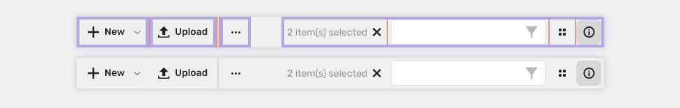
Spacing
Medium

| Used in | Type | px | Token |
|---|---|---|---|
| Group spacing | spacing | 4 | spacing-200 |
| Separator | spacing | 2 | spacing-100 |
| Item gutter (space between items) | spacing | 2 | spacing-100 |
Small

| Used in | Type | px | Token |
|---|---|---|---|
| Group spacing | spacing | 2 | spacing-100 |
| Separator | spacing | 2 | spacing-100 |
| Item gutter (space between items) | spacing | 2 | spacing-100 |
Accessibility
- Guidance for Design pattern for toolbar
Attachments:
 image2020-12-1_10-59-46.png (image/png)
image2020-12-1_10-57-28.png (image/png)
image2020-12-1_10-59-46.png (image/png)
image2020-12-1_10-57-28.png (image/png)
 image2020-12-1_10-57-14.png (image/png)
image2020-12-1_10-56-37.png (image/png)
image2020-12-1_10-57-14.png (image/png)
image2020-12-1_10-56-37.png (image/png)
 image2020-11-30_14-32-1.png (image/png)
 image2020-11-30_14-17-56.png (image/png)
 image2020-11-30_14-8-32.png (image/png)
 image2020-11-30_14-3-56.png (image/png)
 image2020-11-27_15-46-5.png (image/png)
 image2020-11-27_15-19-14.png (image/png)
 image2020-11-27_15-14-27.png (image/png)
 image2020-11-27_15-4-12.png (image/png)
 image2020-11-27_15-3-39.png (image/png)
 image2020-11-27_12-24-3.png (image/png)
 image2020-11-27_12-20-20.png (image/png)
 image2020-11-27_12-13-3.png (image/png)
 image2020-11-27_10-59-3.png (image/png)
 image2020-11-27_9-53-18.png (image/png)
 image2020-10-5_10-17-0.png (image/png)
 image2020-10-5_10-25-57.png (image/png)
 image2020-10-5_10-26-24.png (image/png)
 image2020-10-5_10-26-47.png (image/png)
 image2020-10-2_15-23-33.png (image/png)
 image2020-10-2_13-45-41.png (image/png)
 image2020-10-2_13-46-8.png (image/png)
 image2020-10-5_10-52-58.png (image/png)
 image2020-10-5_10-53-29.png (image/png)
 image2020-10-5_10-54-33.png (image/png)
 image2020-10-5_10-54-40.png (image/png)
 image2020-10-5_10-55-2.png (image/png)
 image2020-10-5_11-37-46.png (image/png)
 image2020-10-2_14-20-45.png (image/png)
 image2020-10-2_14-21-11.png (image/png)
 image2020-10-2_14-20-58.png (image/png)
 image2020-10-2_14-21-26.png (image/png)
 image2020-10-2_14-33-47.png (image/png)
 image2020-10-2_14-34-9.png (image/png)
 image2020-10-2_14-25-18.png (image/png)
 image2020-10-2_14-25-33.png (image/png)
 image2020-10-2_14-42-44.png (image/png)
 image2020-10-23_15-38-49.png (image/png)
 image2020-10-26_13-21-57.png (image/png)
 image2020-10-26_13-22-16.png (image/png)
 image2020-10-26_13-22-55.png (image/png)
 image2020-10-26_13-24-0.png (image/png)
 image2020-10-26_13-26-26.png (image/png)
 textarea-style@2x.png (image/png)
 textarea@2x.png (image/png)
 text-area-anatomy.png (image/png)
 text-area-label-vertical.png (image/png)
 text-area-validation.png (image/png)
 text-area-style.png (image/png)
 text-area-label-horizontal.png (image/png)
 text-area-state-selected.png (image/png)
 text-area-state-disabled.png (image/png)
 text-area-state-readonly.png (image/png)
 text-area-state-focus.png (image/png)
 text-input-density-small.png (image/png)
 text-area-density-default.png (image/png)
 text-area-density-small.png (image/png)
 text-input-variants-warning-icon.png (image/png)
 text-area-variants-error-icon.png (image/png)
 text-area-variants-warning-icon.png (image/png)
 image2020-11-2_9-24-56.png (image/png)
 image2020-11-2_9-26-14.png (image/png)
 image2020-11-2_9-26-30.png (image/png)
 Screenshot 2020-11-16 at 15.01.07.png (image/png)
 Screenshot 2020-11-16 at 14.58.54.png (image/png)
 Screenshot 2020-11-16 at 15.09.35.png (image/png)
 Screenshot 2020-11-16 at 15.19.01.png (image/png)
 Screenshot 2020-11-16 at 15.22.41.png (image/png)
 Screenshot 2020-11-18 at 12.49.34.png (image/png)
 Screenshot 2020-11-18 at 13.11.11.png (image/png)
 Screenshot 2020-11-18 at 13.22.39.png (image/png)
 Screenshot 2020-11-16 at 13.53.55.png (image/png)
 Screenshot 2020-11-19 at 08.14.25.png (image/png)
 Screenshot 2020-11-19 at 08.14.34.png (image/png)
 Screenshot 2020-11-18 at 13.08.21.png (image/png)
 Screenshot 2020-11-18 at 13.08.05.png (image/png)
 Screenshot 2020-11-19 at 09.57.10.png (image/png)
 Screenshot 2020-11-20 at 14.27.17.png (image/png)
 context-menu-anatomy.png (image/png)
 Context-menu-type-basic.png (image/png)
 Context-menu-type-multilevel.png (image/png)
 Context-menu-variants-text-only.png (image/png)
 Context-menu-variants-text-icons.png (image/png)
 Context-menu-variants-with-title.png (image/png)
 Context-menu-groups.png (image/png)
 Context-menu-states-disabled.png (image/png)
 Context-menu-do-short.png (image/png)
 Context-menu-dont-short.png (image/png)
 Context-menu-do-groups.png (image/png)
 Context-menu-dont-groups.png (image/png)
 image2020-12-4_9-2-44.png (image/png)
 image2020-12-4_9-27-32.png (image/png)
 image2020-12-4_9-56-21.png (image/png)
 image2020-12-4_12-20-22.png (image/png)
 image2020-12-4_12-23-14.png (image/png)
 image2020-12-4_12-24-57.png (image/png)
 image2020-12-4_12-25-21.png (image/png)
 image2020-12-4_12-27-34.png (image/png)
 image2020-12-4_12-28-7.png (image/png)
 image2020-12-4_12-29-3.png (image/png)
 image2020-12-4_12-32-54.png (image/png)
 image2020-12-4_12-33-58.png (image/png)
 image2020-12-4_12-40-36.png (image/png)
 image2020-12-4_12-41-26.png (image/png)
 image2020-12-4_12-43-58.png (image/png)
 image2020-12-4_12-44-41.png (image/png)
 image2020-12-4_12-52-40.png (image/png)
 image2020-12-4_12-55-58.png (image/png)
 image2020-12-4_12-59-28.png (image/png)
 image2020-12-4_15-30-41.png (image/png)
 image2020-12-4_15-31-13.png (image/png)
 image2020-12-8_17-27-42.png (image/png)
 image2020-12-8_17-33-37.png (image/png)
 image2020-12-8_17-35-19.png (image/png)
 image2020-12-8_17-35-59.png (image/png)
 image2020-12-8_17-37-3.png (image/png)
 image2020-12-8_17-37-55.png (image/png)
 image2020-12-8_17-38-48.png (image/png)
 image2020-12-10_12-5-5.png (image/png)
 actionbar-anatomy-usage.png (image/png)
 actionbar-anatomy.png (image/png)
 actionbar-normal.png (image/png)
 actionbar-contextual-buttons.png (image/png)
 actionbar-contextual-buttons-dropdown.png (image/png)
 actionbar-contextual-overflow.png (image/png)
 actionbar-selected status.png (image/png)
 actionbar-filter.png (image/png)
 actionbar-utility-buttons.png (image/png)
 actionbar-responsivity.png (image/png)
 actionbar-button.png (image/png)
 actionbar-hover.png (image/png)
 actionbar-normal.png (image/png)
 actionbar-focus.png (image/png)
 actionbar-disabled.png (image/png)
 actionbar-disabled.png (image/png)
 actionbar-contextual-buttons-dropdown.png (image/png)
 image2020-12-17_11-7-6.png (image/png)
 image2020-12-17_11-21-42.png (image/png)
 image2020-12-17_13-44-48.png (image/png)
 actionbar-anatomy_1.png (image/png)
 actionbar-anatomy.png (image/png)
 actionbar-normal.png (image/png)
 actionbar-normal.png (image/png)
 actionbar-contextual-buttons.png (image/png)
 actionbar-contextual-buttons-dropdown.png (image/png)
 actionbar-contextual-overflow.png (image/png)
 actionbar-selected status.png (image/png)
 actionbar-filter.png (image/png)
 actionbar-utility-buttons.png (image/png)
 actionbar-responsivity.png (image/png)
 actionbar-normal.png (image/png)
 actionbar-hover.png (image/png)
 actionbar-active.png (image/png)
 actionbar-hover.png (image/png)
 actionbar-focus.png (image/png)
 actionbar-disabled.png (image/png)
 actionbar-hover.png (image/png)
 actionbar-spacing-small.png (image/png)
 actionbar-spacing-medium.png (image/png)
 actionbar-anatomy_1.png (image/png)
 actionbar-anatomy.png (image/png)
 actionbar-normal.png (image/png)
 actionbar-buttons_states.png (image/png)
 actionbar-spacing-medium.png (image/png)
 actionbar-spacing-small.png (image/png)
 actionbar-anatomy-appearance.png (image/png)
 actionbar-anatomy-appearance.png (image/png)
 actionbar-anatomy_1.png (image/png)
 actionbar-anatomy.png (image/png)
 actionbar-anatomy.png (image/png)
 toolbar-spacing-medium.png (image/png)
 toolbar-spacing-small.png (image/png)
 actionbar-spacing-medium.png (image/png)
 actionbar-spacing-small.png (image/png)
 actionbar-spacing-medium.png (image/png)
 actionbar-spacing-small.png (image/png)
 actionbar-spacing-medium.png (image/png)
 actionbar-disabled.png (image/png)
actionbar-normal.png (image/png)
actionbar-disabled.png (image/png)
actionbar-normal.png (image/png)
 actionbar-utility-buttons.png (image/png)
 actionbar-utility-buttons.png (image/png)
 actionbar-anatomy_1.png (image/png)
actionbar-anatomy-appearance.png (image/png)
actionbar-spacing-medium.png (image/png)
actionbar-spacing-small.png (image/png)
resize.gif (image/gif)
actionbar-anatomy_1.png (image/png)
actionbar-anatomy-appearance.png (image/png)
actionbar-spacing-medium.png (image/png)
actionbar-spacing-small.png (image/png)
resize.gif (image/gif)
 actionbar-anatomy.png (image/png)
 actionbar-normal.png (image/png)
actionbar-contextual-buttons.png (image/png)
actionbar-contextual-buttons-dropdown.png (image/png)
actionbar-contextual-overflow.png (image/png)
actionbar-selected status.png (image/png)
actionbar-filter.png (image/png)
actionbar-utility-buttons.png (image/png)
actionbar-responsivity.png (image/png)
actionbar-anatomy.png (image/png)
actionbar.gif (image/gif)
actionbar-normal.png (image/png)
actionbar-contextual-buttons.png (image/png)
actionbar-contextual-buttons-dropdown.png (image/png)
actionbar-contextual-overflow.png (image/png)
actionbar-selected status.png (image/png)
actionbar-filter.png (image/png)
actionbar-utility-buttons.png (image/png)
actionbar-responsivity.png (image/png)
actionbar-anatomy.png (image/png)
actionbar.gif (image/gif)
 actionbar.gif (image/gif)