Remember that we communicate with our customers by any GUI string in our applications.
Why Voice and Tone
Each person involved in the process of creating UI uses their communication skills differently. This is why we need guidelines to sound as one voice.
Voice
To be consistent and help our UI resonate well with our customers, follow these main principles for how Quadient voice should sound in the applications:
Friendly and human
DO
- Use language your audience can relate to.
- Communicate in a positive way.
- Suggest how an issue can be solved, rather than just reporting what went wrong.
DO NOT
- Do not use jargon - Technical details make error messages overly complex.
- Never use dramatic words - problem, illegal, bad, fatal, kill.
- Avoid abbreviations (comm. = communication/common?)
- Clear and professional
DO
- Always offer complete thoughts in plain language. Remember that our audience is international.
- Stick to the terminology. Remember that GUI strings are localized into other languages.
- Keep in mind who the audience is: educated people - with technical background or assistants or even managers. Our customers use the software at work, not in their free time.
DO NOT
- Do not write in flowery language.
- Avoid contractions - isn't, you've, can't etc.
- Be direct. No unnecessary please (unless the user is in an uneasy situation) and thank you.
- Expressions you may have seen in applications for fun, for masses, such as Oops, Let's roll, or smileys, should not be used in Quadient solutions.
Tone
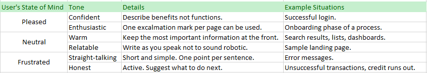
Tone means a different voice type for different reader’s states of mind.
- Are they relieved to be finished with a job?
- Are they confused and seeking our help?
Once you have an idea of their emotional state, you can adjust your tone accordingly:
| User's State of Mind | Tone | Details | Example Situations |
|---|---|---|---|
| Pleased | Confident | Describe benefits not functions. | Successful login |
| Enthusiastic | One exclamation mark per page can be used. | Onboarding phase of a process | |
| Neutral | Warm | Keep the most important information at the front. | Search results, lists, dashboards |
| Relatable | Write as you speak not to sound robotic. | Sample landing page | |
| Frustrated | Straight-talking | Short and simple. One point per sentence. | Error messages |
| Honest | Active. Suggest what to do next. | Unsuccessful transactions, credit runs out |
-
- User First
- Clear
- Concise
- Useful
-
- Content#Buttons
- Content#Links
-
Use Structure
Be Clear and Concise
Be Specific
Be Consistent
Call to Action
General Principles
User First
By focusing on what the user wants to achieve, you create content that brings value and represents the brand well.
Clear
Focus on users actions not on new features or technical issues.
Use verbs related to user actions as the most powerful parts of messages.
DO
Template draft could not be found.
Template draft is not available.
DO NOT
Template draft does not exist.
Concise
Write UI text in short, efficient segments. Every word on the screen has a distinct job. Leave out all unimportant words.
Do not "fill" headers with text if not necessary.
Begin with important concepts, do not leave them to the end of a sentence.
Write 8 words or less - users will comprehend 100% of the message.
Use a 43-word sentence - users will comprehend below 10%.
DO
The output file cannot be deleted.
Fill in all mandatory fields.
DO NOT
Output file cannot be deleted, because it is in not deletable state.
Please fill in all mandatory fields to continue.
Useful
Show users the options what actions to do next.
DO
An unsupported file format uploaded. Upload either PDF or TNO files.
DO NOT
You have uploaded a file format which is not supported.
A/B Testing
If unsure what version works best with users, A/B test the variants.
Source: https://uxplanet.org/ux-writing-how-to-do-it-like-google-with-this-powerful-checklist-e263cc37f5f1, https://material.io/design/communication/writing.html#principles
Wrap-Up Example
DO
Set End date within {x, y} range.
- User action - verb set. Clear info what to set (End date value).
- Most important at the beginning. No useless words.
- Useful info about the range - exact values shown.
DO NOT
The dateTo is out of the allowed range.
- dateTo - name of a variable, not a true GUI name.
- No solution suggested.
- No clear info about the range.
Rules for Specific UI Parts
Specific writing principles for selected components or other UI parts are summarized below.
For recommended usage and other specifications see also section Components.
Buttons
Users should be able to anticipate what will happen when they select a button.
Action Verbs
Buttons should always lead with a strong verb that encourages action, an action verb.
Avoid using generic "yes" and "no" words for actions. If users skip or misread the dialog, they will press the wrong button.
DO
Save changes?
DISCARD / SAVE
DO NOT
Save changes?
NO / YES
Task-Specific Language
If the button is used in the last step of "publishing" a template, use the verb "Publish", instead of a more generic "Submit".
Verb Connotation
Each action verb has a specific connotation, although the meaning can be similar.
Example 1
- “Delete” implies that the button will erase the item from the system.
- “Remove” implies that the button will separate the item from a group (only remove it from a list).
Example 2
- "Remove Settings" implies that the button will erase all settings from the page, users will not be able to set them again.
- "Clear Settings" implies that the button will just erase already entered data in a form, and users can start filling in the form again.
Verb and Noun, No Articles
Where possible, use the {verb} + {noun} content formula on buttons, except in the case of common actions like “Done”, “Close”, “Cancel”.
Avoid unnecessary words and articles.
DO
Create Template
CREATE TEMPLATE
DO NOT
Create
Create a Template
Links
Users should be able to anticipate what will happen when they select a link.
Links should never use “click here” or “here” as link text.
DO
Download sample templates.
DO NOT
Sample templates can be downloaded here.
Modal Dialogs
A dialog may contain a title and always contains the message text.
- Title - reflects the action that launched it, i.e. verb and noun (e.g. Upload Image).
DO NOT
Do not use the title in case the title says the same message as the text.
- Text - should be concise, preferably one sentence. If the content overflows, e.g. for localized text, it is truncated with ellipsis.
In case that questions are used:
- Always give users the option to either confirm or cancel their action.
- Keep the content short and actionable.
DO
Discard unsaved changes?
DO NOT
Are you sure you want to close without saving?
Source: https://polaris.shopify.com/content/actionable-language#navigation, https://uxmovement.com/buttons/5-rules-for-choosing-the-right-words-on-button-labels/
Error and Warning Messages
Error and warning messages should form full, meaningful sentences written in sentence style with punctuation at the end.
Their content should follow the general principles (focus on users, clear, concise, useful).
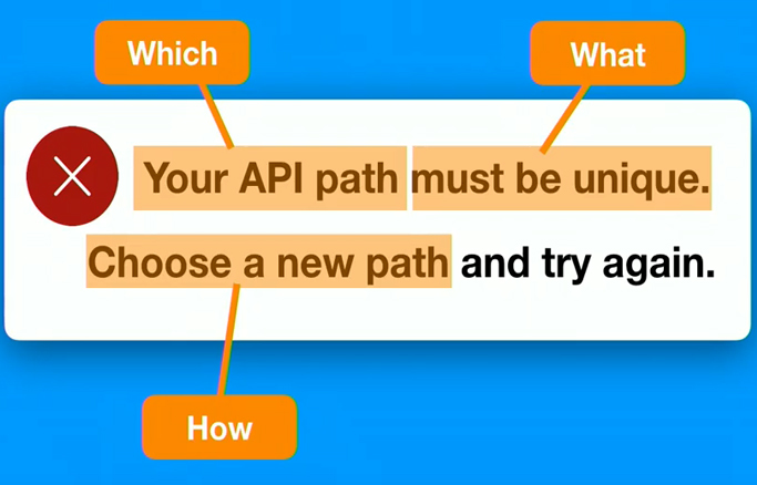
Use Structure
Explain what happened (and why) and provide the solution. Provide names, locations, and values of the objects involved.
- Notification that something went wrong
- Explanation of why it went wrong (optional)
Solution to the problem
DO
Your API path must be unique. (1)
Choose a new path and try again. (3)
Be Clear and Concise
Describe what has happened and tell users how to fix it. The message must be in plain English, use positive language and get to the point.
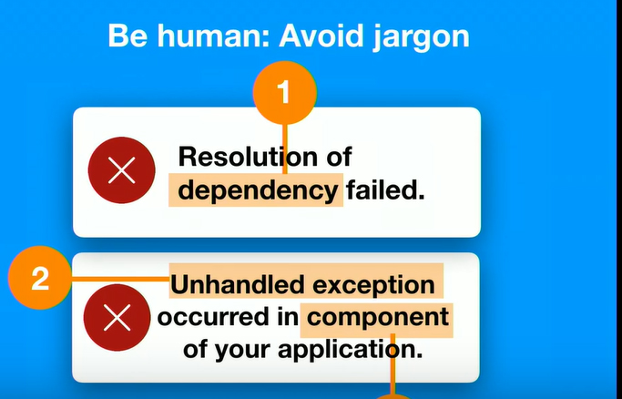
Do NOT use:
- technical jargon like form post error, unspecified error, or error 0x0000000643
- dramatic or negative words like forbidden, illegal, you forgot, or prohibited
- please for required actions because it implies a choice
- sorry because it does not help fix the problem
- valid and invalid because they do not add anything to the message
humorous, informal language like oops
- long explanations and descriptions where simple actionable verb could be used instead
DO NOT
Resolution of dependency failed.
Unhandled exception occurred in component xyz.
Invalid value in text field.
Be Specific
General errors are not helpful. They do not make sense out of context.
Avoid short and generic messages.
DO NOT
An error occurred.
Select an option.
Fill in the field.
This field is required.
Try to provide different errors for different messages and scenarios.
DO
- Your project title needs to have at least 3 characters.
- Display name is required.
DO NOT
- Name is too short.
- Field is empty. / Your display name cannot be blank.
Be Consistent
Avoid writing different messages that have the same meaning. Use the one written in plain language for maximum clarity.
DO
Your password needs to have at least 8 characters.
DO NOT
Your password should not have less than 8 characters.
Your password has fewer than 8 characters.
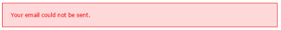
Call to Action
Tell users what to do next to solve the problem. If the user cannot fix the problem, let them know what next step they should take (such as trying again later or contacting help).
It is important not to lead users to a dead end, solution needs to be always provided.
DO
Check your password and sign in again.
DO NOT
Your email could not be sent.
Source: https://design-system.service.gov.uk/components/error-message/, https://design.gitlab.com/content/error-messages/, https://designsystem.quickbooks.com/pattern/errors/
-
- Numbers
Date and Time
Spelling
- Verb Tense
- First and Second Person
- Singular "They"
- Content#Punctuation
Default UI Language
Default UI language is US English.
Numbers
Decimal and Thousands Separators
Follow US rules for decimal and thousands separators:
• Use a period not a comma to indicate the decimal place (e.g., 1.06377 units)
• To separate groups of thousands, you can use a comma or a space, or nothing. (e.g., 1,024 bytes, or 1024 bytes, or 1 024 bytes)
WARNING: Failure to follow the above rules can cause problems when parsing CSV files.
Date and Time
Date Format
In US English, dates are written in month-day-year order. Slash “/” or hyphen “-“ are preferred separators. Acceptable formats are: MM-DD-YYYY, MM-DD-YY, or YYYY-MM-DD.
Example: “April 18, 2016” or “04/18/2016” or “04/18/16” or “2016/04/18”.
Time Format
US English uses 12-hour notation almost exclusively.
Example: 12:49 PM or 4:59 AM
First Day of Week
Sunday is used as the first day of week in US locale.
Spelling
Follow US English spelling conventions. Some of the key differences between British English and American English spelling are here:
US Spelling (Quadient UI default) |
British Spelling |
|---|---|
| color | colour |
| gray, grayscale | grey, greyscale |
| center | centre |
| license | licence |
| organize | organise |
| canceled | cancelled |
If you are not sure about the correct spelling, contact a member of the Documentation team.
Capitalization
Information in this section used to be a part of UI Language Guidelines (aka UI Development Styleguide).
Capitalization Styles
3 capitalization styles, or cases, may be used in Quadient applications’ user interface:
- Sentence case
- Title case
- All caps
Sentence Case
Only the first word is capitalized, except for proper nouns and other words which are generally capitalized by a more specific rule.
Example: The server encountered an internal error or miss-configuration and was unable to complete your request. Please contact the administrator.
Usage (web and desktop):
- empty state messages (see Bobwai gallery empty-state)
- form labels
- form input placeholders
- combo-box values
- message body text (error, warning, info)
- tooltip body
Title Case
All words capitalized, except for articles (i.e. ‘an’, 'the'), prepositions and conjunctions (e.g. 'of' or 'and').
Capitalize prepositions or conjunctions if they are the last word of a multi-word expression (e.g. Save As, Zoom In).
Example: Assigned Template Drafts
Usage (web and desktop):
- action menu buttons (see Bobwai gallery action-buttons)
- context menu items
- dialog names
- navigation tab labels
- page names
- page section names
- proper names, e.g. names of modules referred to in messages
- table names
- table (column) headers
- tooltip titles
- vertical menu items
Usage (desktop):
- main application menu
- buttons
All Caps
All letters capitalized.
Example: CONTENT MANAGER
Usage (web and desktop):
- file format (e.g. XML or JSON)
- abbreviations (e.g. MSSQL)
- “OK” button
Usage (web only):
- main menu items (including wizard navigation steps, e.g. Customer Preference Management in Cloud)
- button labels (including text buttons)
- dashboard headers
- chart labels
Rules of Thumb
Here are some rules to help you decide which capitalization style to use:
- Is the text regular body text, message or a value? Use sentence case.
- Is the text a title of some sort or name of a thing, e.g. a dialog name, table header or subheading? Use title case.
- Is the text a navigation tab label? Use title case.
- Is the text a vertical menu item? Use title case.
- Is the text a file format abbreviation? Use all caps.
- Is the text going to be on a button?
WEB: Use all caps.
DESKTOP: Use title case. - Is the text a main menu item? Use all caps.
WEB: Use all caps.
DESKTOP: Use title case.
Examples of Use – Web Applications
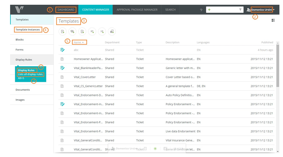
Page with Table
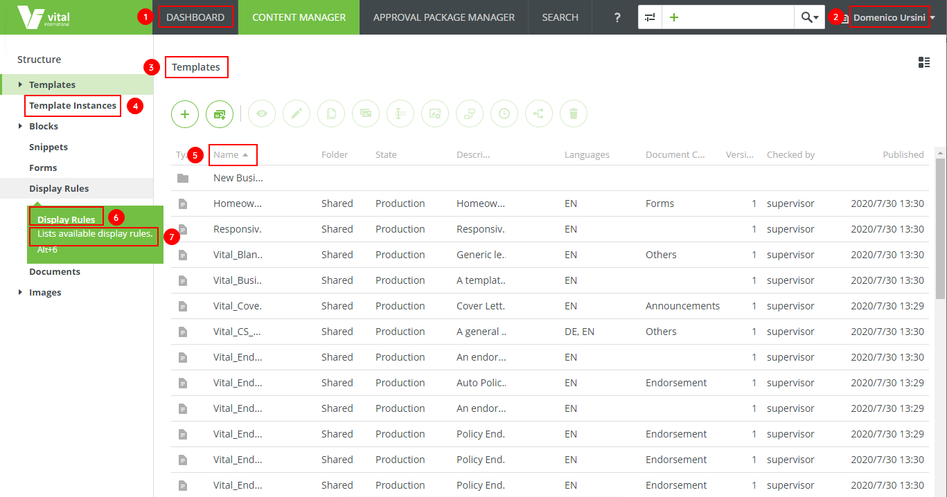
Legend:
- Main menu item - all caps
- Proper name - title case
- Page/table - tittle case
- Vertical menu item - tittle case
- Table header - tittle case
- Tooltip heading - tittle case
- Tooltip body - sentence case
Dialog Window with Form
Legend:
- Dialog name - title case
- Form label - sentence case
- Tab label (heading) - tittle case
- File format - all caps
- Button label - all caps
Page with Switches
Switch labels are considered form labels - use sentence case.
Simple Tooltips (Heading Only)
Simple tooltips - title case (treat them like tooltip headings).
Complex Tooltips
Complex tooltips - title case for the heading, sentence case for the body.
Examples of Use – Desktop Applications
Workflow
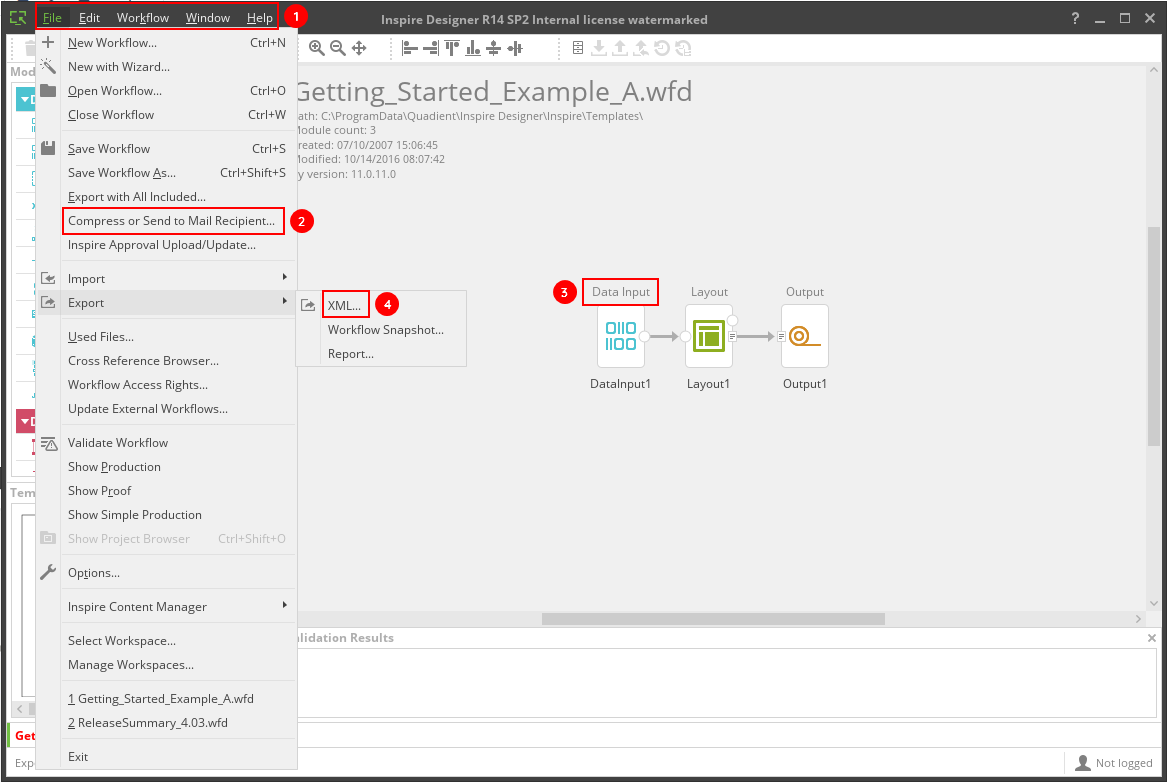
Legend:
- Main menu item - title case
- Menu item - title case
- Module name - tittle case
- File format - all caps
Dialog Window with Form
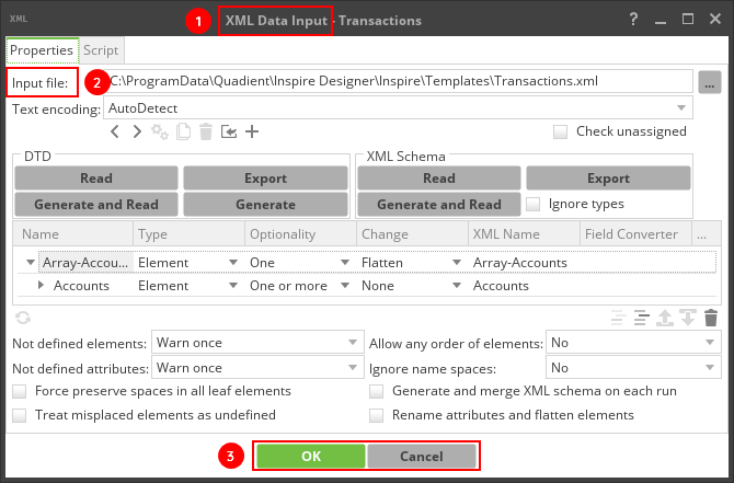
Legend:
- Dialog name - title case
- Form label - sentence case
- Button label - title case (apart from "OK")
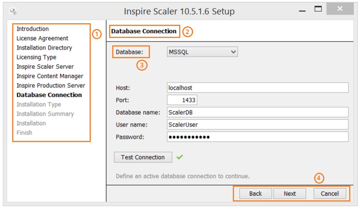
Installer Step
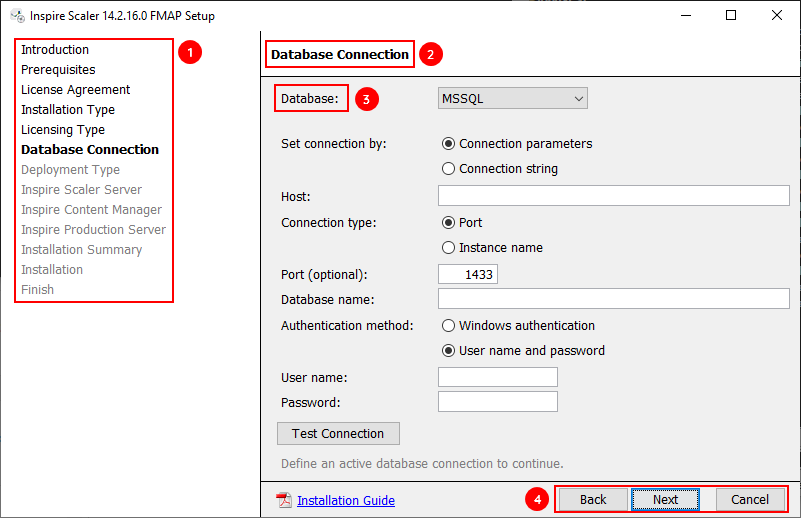
Legend:
- Vertical menu items - title case
- Step name - title case
- Form label - sentence case
- Button label - title case
Active and Passive Voice
Use active voice in most cases. Use active voice when subject of the sentence is a human not system.
DO
John will print the document.
DO NOT
The document will be printed by John.
Use passive voice in specific cases, when active voice can come across too harshly. With passive voice, you can soften and provide distance in select situations (e.g. notification of a disabled account).
DO
Your payment has been declined.
DO NOT
We declined your payment.
Verb Tense
Use the present tense where possible, also
- instead of the future tense to describe product behavior.
- instead of the present perfect tense which describes "what has happened". Describe the result in present tense instead.
Always use correct grammar. Present perfect for an action in an undefined past is allowed, but consider rephrasing the sentence using the present tense.
DO
Value set to (xy).
DO NOT
The option has been set to (xy) value.
First and Second Person
Most of the time, use second person (you, your) to address users and services.
DO
You can export your data here.
Use first person (me, I, my) only in specific situations:
- In the case of possessive adjectives in the UI (e.g. "My Account").
- In the case there is a legal need to use first person to ask for consent (e.g. “I agree to these terms and conditions”).
Singular "They"
When we refer to a user, we use singular they, not to assume their gender. We do not use “he/she” or “(s)he” — those are clunky and they exclude users who identify outside of the male/female binary.
DO
New user created! Assign them a role.
DO NOT
New user created! Assign him/her a role.
Punctuation
Ampersand
Do not use ampersands (&) in UI. Instead, use the word “and”.
Ampersands are not as accessible for people using screen readers. They also bring attention to the conjunction, which is the least important part of the string.
Apostrophe
Do not use apostrophes (') in place of quotation marks.
Asterisk
Use asterisks (*) or "(required)*" for required fields of a form.
Comma
When listing things, use the serial comma (Oxford comma). This means providing a comma before the “and” when listing multiple items in a sentence (e.g. “Bacon, lettuce, and tomato”).
Ellipsis
Use ellipses (…) when truncating text in small spaces.
Emoji
Do not use emoji in any interface language.
Exclamation Mark
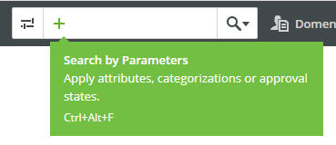
Do not overuse exclamation marks (!). One exclamation mark can be used in a "success sentence", using enthusiastic tone. Never with bad news or recommendations.
Hyphens and Dashes
Use em dashes (—) to separate distinct but related thoughts. Include spaces before and after. (e.g. "Shaken — not stirred").
Use en dashes (–) for number ranges and lengths of time, with no spaces before or after (e.g. "Repeat steps 1–4"). However, do not use them when paired with the words “from” or “between.” When needing to show gaps in data in a table, use an en dash to represent null, unavailable, or inapplicable values.
Use hyphens (-) between words, and with no spaces before or after (e.g. "A once-in-a-lifetime opportunity").
Period
In the majority of cases, do not use periods (.) or any other punctuation on the end of bulleted or numbered lists. If one list item is a complete sentence, then it would end with a period (or question mark). In this case, use periods at the end of all items.
Do not use periods in headers or buttons.
Source: https://spectrum.adobe.com/page/grammar-and-mechanics/
Only correct English strings can be correctly localized into other languages (German, French, Spanish, Italian, Dutch ... Japanese, Chinese etc.).
Key Points for Correct English Strings
- Use a spell-checker.
- Check unknown words in a dictionary. Do not invent words.
- Consult all strings and messages with documentation team members or localization@quadient.com. Never hesitate to ask!
General Rules
Always think what your string or message would sound like in Czech (or any other language you speak) to verify that it can be easily translated.
Remember that localized GUI strings may be longer than English texts and sometimes more complex.
Make sure the string makes sense and that any helpful localization instructions are added.
Localization Instructions
Most Quadient applications use SIT format for GUI strings export and import, which enables developers add information related to the GUI strings for the localization purposes. If you do this directly when adding the string to the code, you reduce the workload of localization coordinators, project managers, translators, and yourself or your colleagues later in the process.
See Translations Guidelines (not only for Cloud) with details how to add localization instructions to I: .
(When working on other projects, add a simple comment to the code for the case that a localization coordinator has questions about the string.)
Not Translated Parts
If a part of a string or message should not be translated (product name, parameter name, service name), especially if a common word is used for it (e.g. Interactive, Distribute), specify this.
Think also about the opposite case: Inspire Content Manager is not translated, but the Content Manager part in Interactive or Scaler should be translated.
S:Configure an Interactive connection to get the complete API documents.
I:do not translate Interactive
T:Configure an Interactive connection to get the complete API documents.
Parts of Speech
Be sure about the correct grammar and what part of speech the words are, especially words like "import", "archive", "copy" are tricky to translate (nouns or verbs?).
S:Copy
I:verb
T:Copy
Meaning
Think about the meaning of the string: Can it be translated in one way only?
S:Bio
I:biography of person
T:Bio
Maximum Length
Specify requirements for maximum string length (e.g. I:max. 12 chars).
Variables
It is useful to provide information what values the variables a string can have.
DO NOT
Never use variables as a part of a message. The values would have to be translated separately, and
- in case of verbs, e.g. for German, where the word order is specific, it may not be translated and put together correctly.
Your file is {variable}. (values: imported, sent, archived) - in case of nouns, each value may require a different article or pronoun form depending on its gender.
Your {variable} is archived. (values: email, SMS, file)
Attachments:
 errorrr.jpg (image/jpeg)
 Untitled-13.jpg (image/jpeg)
 Untitled-122.jpg (image/jpeg)
 Tone.png (image/png)
 Tone.png (image/png)
 image2020-7-29_9-4-56.png (image/png)
 image2020-7-29_9-10-19.png (image/png)
 image2020-7-29_9-48-3.png (image/png)
 image2020-7-29_9-53-42.png (image/png)
 image2020-7-29_9-56-49.png (image/png)
 image2020-7-29_10-1-17.png (image/png)
 image2020-7-29_10-2-33.png (image/png)
 InteractiveCM-GrammarCasingExample.png (image/png)
ScalerModal-GrammarCasingExample.png (image/png)
SimpleTooltip-GrammarCasingExample.png (image/png)
ComplexTooltip-GrammarCasingExample.png (image/png)
DesignerWF-GrammarCasingExample.png (image/png)
designer02modal.png (image/png)
ScalerInstaller-GrammarCasingExample.png (image/png)
MicrosoftTeams-image (5).png (image/png)
InteractiveCM-GrammarCasingExample.png (image/png)
ScalerModal-GrammarCasingExample.png (image/png)
SimpleTooltip-GrammarCasingExample.png (image/png)
ComplexTooltip-GrammarCasingExample.png (image/png)
DesignerWF-GrammarCasingExample.png (image/png)
designer02modal.png (image/png)
ScalerInstaller-GrammarCasingExample.png (image/png)
MicrosoftTeams-image (5).png (image/png)