Design tokens store visual design attributes instead of hard-coded properties.
Component Status
 Design Kit: RELEASED
 Bobwai component: bobwai--style-tokens RELEASED
Usage
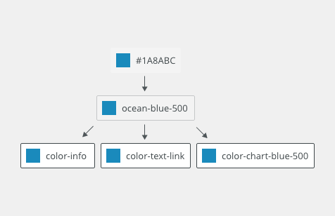
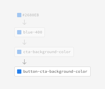
Tokens (design decisions) can also be nested within other tokens. For example, Alias token interactive-01 references color palette constant (design options) grey500
Tokens helps across product and platforms with
- Consistency
- Maintainability
- Scalability
- Themes
DO
- use alias tokens for most of the cases
DO NOT
- do not create a component-specific tokens which applies across mutiple components
Installation
Public
Public NPM packages with instructions can be found here.
Source code of package is available via Quadient github.
Internal - Bobril library
For internal usage there are Bobwai design tokens which are transformed public Quadient design tokens.
Token Types
Global tokens (design options)
primitive values represented by context-agnostic names.
- Color constants
- Size
- Typography
Use only: when there are no alias for use case.

Alias tokens
Use most of the time: specific context - value with a single purpose for multiple places.
Component-specific tokens
Specific to component without dependence on design logic
Use only: When is applicable to single component.

Naming convention
Key Value
property-type-usage-scale-state
color-bg-interactive-100-hover #00A991
Global tokens
Spacing
Token |
px |
rem |
Examples of use |
|---|---|---|---|
spacing-000 |
0 | 0.000 | no spacing |
spacing-100 |
2 |
0.125 |
spacing in toolbars |
spacing-200 |
4 |
0.250 |
between icon and text, between radio button and check-box inputs, lists |
spacing-300 |
8 |
0.500 |
between buttons, between lines of form |
spacing-400 |
12 |
0.750 |
|
spacing-500 |
16 |
1.000 |
container header and footer paddings |
spacing-600 |
24 |
1.500 |
between sections of form, page paddings |
spacing-700 |
32 |
2.000 |
|
spacing-800 |
48 |
3.000 |
Opacity values
Token |
/ | % |
Examples of use |
|---|---|---|---|
opacity-solid |
1.00 | 100 | |
opacity-950 |
0.96 | 96 |
|
opacity-900 |
0.92 | 92 |
|
opacity-850 |
0.88 | 88 |
|
opacity-800 |
0.84 | 84 | |
opacity-700 |
0.76 | 76 |
|
opacity-600 |
0.68 | 68 |
|
opacity-500 |
0.50 | 50 |
|
opacity-400 |
0.32 | 32 |
component (disabled), chart (selected) |
opacity-300 |
0.24 | 24 | chart (hover) |
opacity-200 |
0.16 | 16 | color bg (pressed) |
opacity-150 |
0.12 | 12 | color bg (selected) |
opacity-100 |
0.08 | 8 | color bg (hover) |
opacity-050 |
0.04 | 4 | |
opacity-transparent |
0.00 | 0 |
Typography - Body
| Token | Type |
Family | Size [px]|[rem] |
Line-Height [px]|[rem] | Weight |
Transform | Used for |
|---|---|---|---|---|---|---|---|
font-body |
Body | Rubik | 14 | 0.875 | 20 | 1.25 | 400 | regular | default body text | |
font-code |
Code |
Droid Sans Mono | 12 | 0.750 |
20 | 1.25 | 400 | regular |
programming code | |
font-label |
Caption |
Rubik | 12 | 0.750 |
20 | 1.25 | 400 | regular |
labels, caption under pics, etc. | |
font-note |
Caption | Rubik | 12 | 0.750 | 16 | 1.00 | 400 | regular | note | |
font-placeholder |
Placeholder |
Rubik | 14 | 0.875 |
20 | 1.25 | 400 | regular | font-style: italic | placeholders in inputs/forms |
font-strong |
Clickable |
Rubik | 14 | 0.875 |
20 | 1.25 | 500 | medium |
primary selected navigation text, buttons and plain buttons, active tabs, etc. | |
| font-xsmall | Rubik | 8 | 0.500 | 12 | 0.75 | 700 | bold | small avatar |
Typography - Headings
| Token | Type |
Family | Size [px]|[rem] |
Line Height [px]|[rem] | Weight |
Letter Spacing [px] | Transform | Used for |
|---|---|---|---|---|---|---|---|---|
font-heading-100 |
Quicksand | 12 | 0.750 |
20 | 1.25 | 500 | medium |
0 | text-transform: uppercase | ||
font-heading-200 |
Quicksand | 14 | 0.875 |
20 | 1.25 | 700 | bold |
0 | |||
font-heading-300 |
Quicksand | 16 | 1.000 |
24 | 1.50 | 500 | medium |
0 | |||
font-heading-400 |
Quicksand | 18 | 1.125 |
24 | 1.50 | 400 | regular | 0 | |||
font-heading-500 |
Quicksand | 20 | 1.250 |
28 | 1.75 | 400 | regular |
0 | |||
font-heading-600 |
Quicksand | 28 | 1.750 |
36 | 2.25 | 400 | regular | 0 |
Expressive typography (used for charts, etc.)
| Token | Type |
Family | Size [px]|[rem] |
Line Height [px]|[rem] | Weight |
Letter Spacing [px] | Transform | Used for |
|---|---|---|---|---|---|---|---|---|
font-expressive-100 |
Rubik | 18 | 1.125 |
24 | 1.50 | 500 | medium |
0 | |||
font-expressive-200 |
Rubik | 24 | 1.500 |
32 | 2.00 | 400 | regular |
0 | |||
font-expressive-300 |
Rubik | 30 | 1.875 |
40 | 2.50 | 400 | regular |
0 | |||
font-expressive-400 |
Rubik | 36 | 2.250 |
44 | 2.75 | 400 | regular |
0 |
Border size
| Token | Size [px] | Used in | Example |
|---|---|---|---|
border-width-none |
0 | objects with no border |
|
border-width-100 |
1 | default border size |
|
border-width-200 |
2 | selected tabs |
|
border-width-300 |
4 | left border of expanded table, active main-menu-items stripes on top |
|
border-width-400 |
8 | banner notification left border |
|
border-width-500 |
12 | ||
border-width-600 |
16 | chart value arcs | |
border-width-700 |
24 | chart value arcs (interactive states) |
Border radius
| Token | Value | Used in | Example |
|---|---|---|---|
radius-none |
0px |
|
|
radius-100 |
2px | default radius value |
|
radius-200 |
4px |
|
|
radius-300 |
8px |
|
|
radius-400 |
12px |
|
|
radius-500 |
16px |
|
|
radius-600 |
24px | ||
radius-full |
50% |
|
|
radius-pill |
20em |
|
|
Component specific border radius |
|||
radius-input-100 |
radius-200 |
default border radius of inputs |
|
radius-button-100 |
radius-600 |
default border radius of buttons |
|
radius-button-200 |
radius-300 |
border radius of toolbar buttons |
 |
radius-list-100 |
radius-300 |
Default border radius of navigation items (primary, secondary navigation, tabs) |
|
radius-container-100 |
radius-300 |
Border radius of modals, panels, cards and widgets | |


Object size
| Token | Value [px] | Used in | Examples |
|---|---|---|---|
Item sizing |
|||
sizing-item-020 |
4 | ||
sizing-item-030 |
8 | ||
sizing-item-040 |
12 | ||
sizing-item-050 |
16 | checkbox, radiobutton size, switch handler | |
sizing-item-075 |
20 | extra-small avatar, content without padding | |
sizing-item-100 |
24 | super-condensed inputs | |
sizing-item-200 |
28 | small avatar, condensed inputs | |
sizing-item-300 |
36 | (default) medium inputs, (default) medium avatars | |
sizing-item-400 |
48 | large inputs, large avatars | |
sizing-item-450 |
52 | app-header height | |
sizing-item-500 |
64 | extra-large inputs, extra-large avatars | |
| 160 | minimal width of menu, maximal width of text in tab, | ||
| 320 | maximal with of menu | ||
Icon sizes |
|||
sizing-icon-100 |
10 x 10 | x-small icon |
|
sizing-icon-200 |
20 x 20 | small icon (default) |
|
sizing-icon-300 |
30 x 30 | medium icon |
|
sizing-icon-400 |
40 x 40 | large icon |
|
sizing-icon-500 |
60 x 60 | extra-large icon |
|
| Modal sizes | |||
sizing-modal-100 |
400 | Modal window small size |
|
sizing-modal-200 |
608 | Modal window medium size |
|
sizing-modal-300 |
816 | Modal window large size |
|


Angles
Token |
deg |
Examples of use |
|---|---|---|
angle-100 |
0 |
|
angle-200 |
45 |
gradient angle in app header logo or sign-in background |
angle-300 |
90 | gradient angle in app header active stripes |
angle-400 |
135 | |
angle-500 |
180 | |
angle-600 |
225 | |
angle-700 |
270 | |
angle-800 |
315 |
Shadows
| Token | Distance | Color | Example |
|---|---|---|---|
shadow-none |
none |
|
|
shadow-100 |
0px 2px 3px 0px 0px 1px 3px 0px |
rgba(0,0,0,0.24); rgba(0,0,0,0.16); |
|
shadow-200 |
0px 4px 6px 0px 0px 2px 6px 0px |
rgba(0,0,0,0.24); rgba(0,0,0,0.16); |
|
shadow-300 |
0px 6px 9px 0px 0px 3px 9px 0px |
rgba(0,0,0,0.24); rgba(0,0,0,0.16); |
|
shadow-400 |
0px 8px 12px 0px 0px 4px 12px 0px |
rgba(0,0,0,0.24); rgba(0,0,0,0.16); |
|
shadow-500 |
0px 10px 15px 0px 0px 5px 15px 0px |
rgba(0,0,0,0.24); rgba(0,0,0,0.16); |
|
shadow-600 |
0px 12px 18px 0px 0px 6px 18px 0px |
rgba(0,0,0,0.24); rgba(0,0,0,0.16); |
|


Duration
| Token | Value | Type | Description |
|---|---|---|---|
duration-100 |
70 ms | Micro | color fades, hovers, accordions, tooltips, etc. |
duration-150 |
130 ms | Micro | color fades, hovers, accordions, tooltips, etc. |
duration-200 |
160 ms | Micro | color fades, hovers, accordions, tooltips, etc. |
duration-250 |
190 ms | Macro | large panel, movement across the screen, etc. |
duration-300 |
220 ms | Macro |
large panel, movement across the screen, etc. |
duration-350 |
250 ms | Macro | large panel, movement across the screen, etc. |
duration-400 |
300 ms | Macro | large panel, movement across the screen, etc. |
Easing
| Token | Value | Type | Description |
|---|---|---|---|
easing-standard |
cubic-bezier(0.45, 0, 0.40, 1) | ease in out | Use standard-easing when an element is visible from the beginning to the end of a motion. Expanding tiles and change of button states are good examples. |
easing-decelerated |
cubic-bezier(0, 0, 0.40, 1) | ease out | Use decelerated-easing when adding elements to the view, such as a modal or side panel. Elements moving in response to the user’s input, such as a dropdown opening or toggle switching should also use this style. |
easing-accelerated |
cubic-bezier(0.50, 0, 1, 1) | ease in | Use accelerated-easing when removing elements from view, such as closing a modal or side panel. The element speeds up as it exits from view, implying that its departure from the screen is permanent. |
Gradients
| Token | Value | Examples |
|---|---|---|
gradient-app-header-logo |
angle-200 |
|
gradient-app-signin-bg |
angle-200 |
|
gradient-app-header-stripe |
angle-300 |
|


Alias tokens + Component-specific tokens
Color
Primary Color Variants
Primary color variants are preset colors to be used inside the applications.
These colors have been tested to have the appropriate contrast with good readability of content.
| Token | Usage | Value | Inverse Value |
|---|---|---|---|
color-primary-variant-100 |
Primary color 1 |
|
|
color-primary-variant-200 |
Primary color 2 |
|
|
color-primary-variant-300 |
Primary color 3 |
|
|
color-primary-variant-400 |
Primary color 4 |
|
|
color-primary-variant-500 |
Primary color 5 |
|
|
Primary color
The primary color is a variable color (you can choose one of the preset variants) which is used for highlighting primary buttons, switches, and is used for focus on inputs.
| Token | Example of Use | Value | Inverse Value |
|---|---|---|---|
color-primary |
Components set in primary color. |
|
|
|
|
|
||
|
|
|
||
|
|
|
||
|
|
|
Brand Color
| Token | Usage | Value |
|---|---|---|
color-brand-100 |
Brand color (default) |
#2a76d7 |
color-brand-200 |
Additional brand color (to gradient purpose) (default) |
#275b9c |
UI Colors
| Token | Examples of use | Value | Inverse value | Legacy |
|---|---|---|---|---|
UI backgrounds colors |
||||
color-bg-ui-100 |
Background of panels, toolbars, modals |
|
|
|
color-bg-ui-200 |
Background of default page, |
|
|
|
color-bg-ui-300 |
Background of editors, workflow pages |
|
|
|
color-bg-ui-300-inverted |
Tooltip background, inverted backgrounds |
|
|
|
color-bg-header-100 |
Background of application header panel. |
|
|
|
Feedback colors |
||||
color-error |
Error feedback color, |
|
|
|
color-warning |
Warning feedback color |
|
|
|
color-info |
Info feedback color. |
|
|
|
color-success |
Success feedback color |
|
|
|
Text colors |
||||
color-text-100 |
Primary text; Body copy; Headings; Titles; |
|
|
|
color-text-200 |
Secondary text; Helper texts; Labels; |
|
|
|
color-text-300 |
Input placeholders |
|
|
|
color-text-400 |
Text on dark backgrounds |
|
|
|
color-text-link |
Link color |
|
|
|
color-text-error |
Error/Danger text |
|
|
|
color-text-warning |
Warning text |
|
|
|
color-text-interactive-100 |
Primary, Warning, Danger button content, Primary navigation text |
|
|
|
color-text-interactive-200 |
Secondary, Toolbar button content |
|
|
|
color-text-interactive-300 |
Tertiary button content |
|
|
|
Icon colors |
||||
color-icon-100 |
Dark icon on light background |
|
|
|
color-icon-200 |
Light icon on dark background |
|
|
|
color-icon-300 |
Icon in primary color |
|
|
|
color-icon-400 |
Visually less intensive icons |
|
|
|
color-icon-error |
Error icon |
|
|
|
color-icon-warning |
Warning icon |
|
|
|
color-icon-info |
Info icon |
|
|
|
color-icon-success |
Success |
|
|
|
Border colors |
||||
color-border-100 |
Secondary button border |
|
|
|
color-border-200 |
Border of inputs |
|
|
|
color-border-300 |
Low contrast separator |
|
|
|
color-border-400 |
Higher contrast separator |
|
|
|
color-border-500 |
Border of selected input, top border of selected tab |
|
|
|
color-border-600 |
Application Header item separator |
|
|
|
color-border-700 |
White separator on dark backgrounds |
|
|
|
color-border-error |
Border of error inputs |
|
|
|
color-border-warning |
Border of warning inputs |
|
|
|
color-border-input |
Default border color of inputs. |
|
|
|
Overlay color |
||||
color-overlay-100 |
Page overlay color |
|
|
|
Component specific background colors |
||||
color-bg-tab |
Enabled/default state of tab |
|
|
|
color-bg-tab-hover |
Hover state of tab. |
|
|
|
color-bg-tab-pressed |
Pressed state of tab |
|
|
|
color-bg-tab-selected |
Selected state of tab. |
|
|
|
color-bg-input |
Default background of inputs. |
|
|
|
color-bg-input-error |
Background of inputs in error state |
|
|
|
color-bg-input-warning |
Background of inputs in warning state |
|
|
|
color-bg-switch-positive |
Color of positive switch |
|
|
|
color-bg-switch-negative |
Color of negative switch |
|
|
|
color-bg-switch-handle-positive |
Color of positive switch handle |
|
|
|
color-bg-switch-handle-negative |
Color of negative switch handle |
|
|
|
Interactive states colors
| Token | Role | Value | Inverse Value | Legacy |
|---|---|---|---|---|
Disabled |
||||
opacity-disabled |
disabled buttons, icons |
|
|
|
Focus colors |
||||
color-focus-100 |
Focus on primary buttons, main navigation, application logo |
|
|
|
color-focus-200 |
Focus of secondary buttons, icons, table rows, tabs, radio buttons, check boxes, |
|
|
|
color-focus-300 |
Focus of tertiary buttons, text inputs |
|
|
|
Interaction Palettes |
||||
color-bg-interactive-100 |
Primary interactive color; |
|
|
|
color-bg-interactive-100-hover |
Hover state of primary buttons. |
|
|
|
color-bg-interactive-100-selected |
Selected state of primary buttons. |
|
|
|
color-bg-interactive-100-pressed |
Pressed state of primary buttons. |
|
|
|
color-bg-interactive-100-error |
Error interactive color; Enabled/default state of error buttons |
|
|
|
color-bg-interactive-100-error-hover |
Hover state of error buttons. |
|
|
|
color-bg-interactive-100-error-selected |
Selected state of error buttons. |
|
|
|
color-bg-interactive-100-error-pressed |
Pressed state of error buttons. |
|
|
|
color-bg-interactive-100-warning |
Warning interactive color; Enabled/default state of warning buttons |
|
|
|
color-bg-interactive-100-warning-hover |
Hover state of warning buttons. |
|
|
|
color-bg-interactive-100-warning-selected |
Selected state of warning buttons. |
|
|
|
color-bg-interactive-100-warning-pressed |
Pressed state of warning buttons. |
|
|
|
color-bg-interactive-200 |
Secondary interactive color; |
|
|
|
color-bg-interactive-200-hover |
Hover state of secondary and toolbar buttons. |
|
|
|
color-bg-interactive-200-selected |
Selected state of secondary and toolbar buttons. |
|
|
|
color-bg-interactive-200-pressed |
Pressed state of secondary and toolbar buttons. |
|
|
|
color-bg-interactive-200-inverted |
Application header interactive color; Enabled/default state of application header buttons |
|
|
|
color-bg-interactive-200-inverted-hover |
Hover state of application header buttons. |
|
|
|
color-bg-interactive-200-inverted-selected |
Selected state of application header buttons. |
|
|
|
color-bg-interactive-200-inverted-pressed |
Pressed state of application header buttons. |
|
|
|
color-bg-interactive-300 |
Tertiary interactive color; |
|
|
|
color-bg-interactive-300-hover |
Hover state of tertiary buttons. |
|
|
|
color-bg-interactive-300-selected |
Selected state of tertiary buttons. |
|
|
|
color-bg-interactive-300-pressed |
Pressed state of tertiary buttons. |
|
|
|
color-bg-interactive-400 |
Default component background, table, context menu, navigation |
|
|
|
color-bg-interactive-400-hover |
Hover of default component background, table, context menu, navigation |
|
|
|
color-bg-interactive-400-selected |
Selected default component background, table, context menu, navigation |
|
|
|
color-bg-interactive-400-pressed |
Pressed on default component background, table, context menu, navigation |
|
|
|
color-icon-100-hover |
Hover on dark icon on light background |
|
|
|
color-icon-100-selected |
Selected dark icon on light background |
|
|
|
color-icon-100-pressed |
Pressed dark icon on light background |
|
|
|
color-text-interactive-200-hover |
Hover on dark text on light background |
|
|
|
color-text-interactive-200-selected |
Selected dark text on light background |
|
|
|
color-text-interactive-200-pressed |
Pressed text icon on light background |
|
|
|
Chart colors
Basic chart colors |
|||
color-chart-red-500 |
Error color |
|
|
color-chart-red-300 |
Error color |
|
|
color-chart-orange-500 |
Warning color |
|
|
color-chart-orange-300 |
Warning color |
|
|
color-chart-dark-green-500 |
Positive color |
|
|
color-chart-dark-green-300 |
Positive color |
|
|
color-chart-light-blue-500 |
Informative color |
|
|
color-chart-light-blue-300 |
Informative color |
|
|
color-chart-grey-500 |
Neutral color |
|
|
color-chart-grey-300 |
Neutral color |
|
|
| color-chart-grey-100 | Neutral/Empty color |
|
|
Advanced chart colors |
|||
color-chart-turquoise-500 |
Turquoise |
|
|
color-chart-turquoise-300 |
Turquoise |
|
|
color-chart-amethyst-violet-500 |
Blue |
|
|
color-chart-amethyst-violet-300 |
Blue |
|
|
color-chart-purple-500 |
Purple |
|
|
color-chart-purple-300 |
Purple |
|
|
color-chart-light-green-500 |
Green |
|
|
color-chart-light-green-300 |
Green |
|
|
color-chart-lavender-violet-500 |
Blue |
|
|
color-chart-lavender-violet-300 |
Blue |
|
|
color-chart-brown-500 |
Brown |
|
|
color-chart-brown-300 |
Brown |
|
|
color-chart-dark-blue-500 |
Blue |
|
|
color-chart-dark-blue-300 |
Blue |
|
|
color-chart-yellow-500 |
Yellow |
|
|
color-chart-yellow-300 |
Yellow |
|
|

Attachments:
 image2020-9-4_10-40-24.png (image/png)
 image2020-9-4_10-40-32.png (image/png)
 image2020-9-4_10-40-40.png (image/png)
 color-basic.png (image/png)
 color-white.png (image/png)
 color-success.png (image/png)
 color-info.png (image/png)
 color-warning.png (image/png)
 color-error.png (image/png)
 color-grey100.png (image/png)
 color-grey200.png (image/png)
 color-grey300.png (image/png)
 color-grey400.png (image/png)
color-grey500.png (image/png)
color-grey400.png (image/png)
color-grey500.png (image/png)
 color-grey600.png (image/png)
color-grey700.png (image/png)
color-grey600.png (image/png)
color-grey700.png (image/png)
 color-grey800.png (image/png)
 color-grey900.png (image/png)
 image2020-9-10_9-58-57.png (image/png)
 image2020-9-10_9-59-8.png (image/png)
 image2020-9-10_10-12-16.png (image/png)
 image2020-9-10_10-13-15.png (image/png)
 image2020-9-10_10-13-57.png (image/png)
 image2020-9-10_10-18-58.png (image/png)
 image2020-9-10_10-19-20.png (image/png)
 image2020-9-10_10-19-48.png (image/png)
 image2020-9-10_10-20-0.png (image/png)
 image2020-9-10_10-20-33.png (image/png)
 image2020-9-10_10-20-50.png (image/png)
 image2020-9-10_10-20-58.png (image/png)
 image2020-9-10_10-22-1.png (image/png)
 image2020-9-10_10-22-8.png (image/png)
 image2020-9-10_10-22-15.png (image/png)
 image2020-9-10_10-22-23.png (image/png)
 image2020-9-10_10-22-31.png (image/png)
 image2020-9-10_10-32-9.png (image/png)
 image2020-9-10_10-32-16.png (image/png)
 image2020-9-10_10-32-24.png (image/png)
 image2020-9-10_10-32-31.png (image/png)
 image2020-9-10_10-32-41.png (image/png)
 image2020-9-10_10-32-48.png (image/png)
 image2020-9-10_10-32-55.png (image/png)
 image2020-9-10_10-33-2.png (image/png)
 image2020-9-10_10-37-49.png (image/png)
 image2020-9-10_10-37-56.png (image/png)
 image2020-9-10_10-38-3.png (image/png)
 image2020-9-10_10-38-10.png (image/png)
 image2020-9-10_10-38-27.png (image/png)
 image2020-9-10_10-38-33.png (image/png)
 image2020-9-10_10-38-38.png (image/png)
 image2020-9-10_10-38-45.png (image/png)
 image2020-9-10_11-4-31.png (image/png)
 image2020-9-10_11-4-38.png (image/png)
 image2020-9-10_11-4-46.png (image/png)
 image2020-9-10_11-4-53.png (image/png)
 image2020-9-10_12-42-4.png (image/png)
 image2020-9-10_12-42-14.png (image/png)
 image2020-9-10_12-42-30.png (image/png)
 image2020-9-10_12-42-39.png (image/png)
 image2020-9-10_12-45-4.png (image/png)
 image2020-9-10_12-45-46.png (image/png)
 image2020-9-10_12-48-16.png (image/png)
 image2020-9-10_12-49-26.png (image/png)
 image2020-9-10_12-49-41.png (image/png)
 image2020-9-10_12-49-59.png (image/png)
 image2020-9-10_12-50-13.png (image/png)
 image2020-9-10_12-50-28.png (image/png)
 image2020-9-10_12-50-45.png (image/png)
 image2020-9-10_12-52-11.png (image/png)
 image2020-9-10_12-52-39.png (image/png)
 image2020-9-10_12-54-49.png (image/png)
 image2020-9-10_12-54-59.png (image/png)
 image2020-9-10_12-55-35.png (image/png)
 image2020-9-10_12-56-41.png (image/png)
 image2020-9-10_12-57-3.png (image/png)
 image2020-9-10_12-57-13.png (image/png)
 image2020-9-10_12-57-20.png (image/png)
 image2020-9-10_12-57-49.png (image/png)
 image2020-9-10_12-57-57.png (image/png)
 image2020-9-10_13-0-47.png (image/png)
 image2020-9-10_13-0-56.png (image/png)
 image2020-9-10_13-1-3.png (image/png)
 image2020-9-10_13-1-11.png (image/png)
 image2020-9-10_13-1-18.png (image/png)
 image2020-9-10_13-1-25.png (image/png)
 border-none.png (image/png)
 border100.png (image/png)
 border200.png (image/png)
 border300.png (image/png)
 border-radius-none.png (image/png)
border-radius100.png (image/png)
border-radius200.png (image/png)
border-radius300.png (image/png)
border-radius400.png (image/png)
border-radius500.png (image/png)
border-radius-full.png (image/png)
border-radius-pill.png (image/png)
color-white.png (image/png)
border-radius-none.png (image/png)
border-radius100.png (image/png)
border-radius200.png (image/png)
border-radius300.png (image/png)
border-radius400.png (image/png)
border-radius500.png (image/png)
border-radius-full.png (image/png)
border-radius-pill.png (image/png)
color-white.png (image/png)
 color-white.png (image/png)
color-grey100.png (image/png)
color-basic.png (image/png)
color-grey900.png (image/png)
color-grey700.png (image/png)
color-grey200.png (image/png)
color-grey500.png (image/png)
color-grey300.png (image/png)
color-grey800.png (image/png)
color-opacity500.png (image/png)
color-opacity400.png (image/png)
color-opacity600.png (image/png)
color-white.png (image/png)
color-grey100.png (image/png)
color-basic.png (image/png)
color-grey900.png (image/png)
color-grey700.png (image/png)
color-grey200.png (image/png)
color-grey500.png (image/png)
color-grey300.png (image/png)
color-grey800.png (image/png)
color-opacity500.png (image/png)
color-opacity400.png (image/png)
color-opacity600.png (image/png)
 color-opacity-solid.png (image/png)
 color-opacity-transparent.png (image/png)
color-opacity100.png (image/png)
color-opacity-transparent.png (image/png)
color-opacity100.png (image/png)
 color-opacity200.png (image/png)
color-opacity300.png (image/png)
color-opacity700.png (image/png)
color-opacity200.png (image/png)
color-opacity300.png (image/png)
color-opacity700.png (image/png)
 color-opacity800.png (image/png)
 color-opacity900.png (image/png)
 color-opacity500 – 1.png (image/png)
 color-opacity400 – 1.png (image/png)
color-opacity600 – 1.png (image/png)
color-opacity-solid – 1.png (image/png)
color-opacity400 – 1.png (image/png)
color-opacity600 – 1.png (image/png)
color-opacity-solid – 1.png (image/png)
 color-opacity900 – 1.png (image/png)
 color-opacity800 – 1.png (image/png)
 color-opacity700 – 1.png (image/png)
 color-opacity-transparent – 1.png (image/png)
color-opacity100 – 1.png (image/png)
color-opacity200 – 1.png (image/png)
color-opacity300 – 1.png (image/png)
color-primary500.png (image/png)
color-opacity-transparent – 1.png (image/png)
color-opacity100 – 1.png (image/png)
color-opacity200 – 1.png (image/png)
color-opacity300 – 1.png (image/png)
color-primary500.png (image/png)
 color-primary300.png (image/png)
 color-red500.png (image/png)
 color-red500.png (image/png)
color-orange500.png (image/png)
color-orange300.png (image/png)
color-info500.png (image/png)
color-red500.png (image/png)
color-orange500.png (image/png)
color-orange300.png (image/png)
color-info500.png (image/png)
 color-info300.png (image/png)
 color-red300.png (image/png)
color-primary500.png (image/png)
color-red300.png (image/png)
color-primary500.png (image/png)
 color-primary300.png (image/png)
 shadow-none.png (image/png)
shadow100.png (image/png)
shadow200.png (image/png)
shadow300.png (image/png)
shadow400.png (image/png)
shadow500.png (image/png)
shadow600.png (image/png)
size-icon100.png (image/png)
size-icon200.png (image/png)
size-icon300.png (image/png)
size-icon400.png (image/png)
image2020-9-21_15-6-12.png (image/png)
image2020-9-21_15-6-23.png (image/png)
image2020-9-21_15-6-41.png (image/png)
image2020-9-21_15-6-50.png (image/png)
image2020-9-21_15-7-21.png (image/png)
shadow-none.png (image/png)
shadow100.png (image/png)
shadow200.png (image/png)
shadow300.png (image/png)
shadow400.png (image/png)
shadow500.png (image/png)
shadow600.png (image/png)
size-icon100.png (image/png)
size-icon200.png (image/png)
size-icon300.png (image/png)
size-icon400.png (image/png)
image2020-9-21_15-6-12.png (image/png)
image2020-9-21_15-6-23.png (image/png)
image2020-9-21_15-6-41.png (image/png)
image2020-9-21_15-6-50.png (image/png)
image2020-9-21_15-7-21.png (image/png)
 image2020-9-21_15-8-32.png (image/png)
image2020-9-21_15-8-39.png (image/png)
image2020-9-21_15-13-47.png (image/png)
image2020-9-21_15-8-32.png (image/png)
image2020-9-21_15-8-39.png (image/png)
image2020-9-21_15-13-47.png (image/png)
 image2020-9-21_15-14-7.png (image/png)
 image2020-9-21_15-16-12.png (image/png)
image2020-9-21_15-16-20.png (image/png)
image2020-9-21_15-16-28.png (image/png)
image2020-9-21_15-16-12.png (image/png)
image2020-9-21_15-16-20.png (image/png)
image2020-9-21_15-16-28.png (image/png)
 image2020-9-21_15-16-36.png (image/png)
image2020-9-21_15-16-43.png (image/png)
image2020-9-21_15-17-0.png (image/png)
image2020-9-21_15-17-10.png (image/png)
image2020-9-21_15-16-36.png (image/png)
image2020-9-21_15-16-43.png (image/png)
image2020-9-21_15-17-0.png (image/png)
image2020-9-21_15-17-10.png (image/png)
 image2020-9-21_15-17-20.png (image/png)
image2020-9-21_15-17-34.png (image/png)
image2020-9-21_15-18-9.png (image/png)
image2020-9-21_15-18-27.png (image/png)
image2020-9-21_15-17-20.png (image/png)
image2020-9-21_15-17-34.png (image/png)
image2020-9-21_15-18-9.png (image/png)
image2020-9-21_15-18-27.png (image/png)
 image2020-9-21_15-18-38.png (image/png)
image2020-9-21_15-19-15.png (image/png)
image2020-9-21_15-19-37.png (image/png)
image2020-9-21_15-19-58.png (image/png)
image2020-9-21_15-18-38.png (image/png)
image2020-9-21_15-19-15.png (image/png)
image2020-9-21_15-19-37.png (image/png)
image2020-9-21_15-19-58.png (image/png)
 image2020-9-21_15-20-34.png (image/png)
image2020-9-21_15-20-52.png (image/png)
image2020-9-21_15-21-13.png (image/png)
image2020-9-21_15-21-23.png (image/png)
image2020-9-21_15-21-33.png (image/png)
image2020-9-21_15-21-46.png (image/png)
image2020-9-21_15-21-56.png (image/png)
image2020-9-21_15-22-9.png (image/png)
image2020-9-21_15-20-34.png (image/png)
image2020-9-21_15-20-52.png (image/png)
image2020-9-21_15-21-13.png (image/png)
image2020-9-21_15-21-23.png (image/png)
image2020-9-21_15-21-33.png (image/png)
image2020-9-21_15-21-46.png (image/png)
image2020-9-21_15-21-56.png (image/png)
image2020-9-21_15-22-9.png (image/png)
 image2020-9-21_15-22-21.png (image/png)
image2020-9-21_15-23-8.png (image/png)
image2020-9-21_15-23-18.png (image/png)
image2020-9-21_15-23-39.png (image/png)
image2020-9-21_15-22-21.png (image/png)
image2020-9-21_15-23-8.png (image/png)
image2020-9-21_15-23-18.png (image/png)
image2020-9-21_15-23-39.png (image/png)
 image2020-9-21_15-24-8.png (image/png)
image2020-9-21_15-24-20.png (image/png)
image2020-9-21_15-24-46.png (image/png)
image2020-9-21_15-25-4.png (image/png)
image2020-9-21_15-24-8.png (image/png)
image2020-9-21_15-24-20.png (image/png)
image2020-9-21_15-24-46.png (image/png)
image2020-9-21_15-25-4.png (image/png)
 image2020-9-21_15-25-32.png (image/png)
image2020-9-21_15-25-42.png (image/png)
image2020-9-21_15-25-54.png (image/png)
image2020-9-21_15-26-12.png (image/png)
image2020-9-21_15-25-32.png (image/png)
image2020-9-21_15-25-42.png (image/png)
image2020-9-21_15-25-54.png (image/png)
image2020-9-21_15-26-12.png (image/png)
 image2020-9-21_15-26-34.png (image/png)
image2020-9-21_15-26-44.png (image/png)
image2020-9-21_15-26-54.png (image/png)
image2020-9-21_15-27-5.png (image/png)
image2020-9-21_15-26-34.png (image/png)
image2020-9-21_15-26-44.png (image/png)
image2020-9-21_15-26-54.png (image/png)
image2020-9-21_15-27-5.png (image/png)
 image2020-9-21_15-27-14.png (image/png)
border400.png (image/png)
image2020-9-21_15-27-14.png (image/png)
border400.png (image/png)
 color-emerald-green500.png (image/png)
 color-ocean-blue500.png (image/png)
 color-sky-blue500.png (image/png)
 color-sky-blue300.png (image/png)
 color-ocean-blue300.png (image/png)
 color-emerald-green300.png (image/png)
 color-levander-violet500.png (image/png)
 color-levander-violet300.png (image/png)
 color-amethyst-violet500.png (image/png)
 color-amethyst-violet300.png (image/png)
 tokens-global-scheme.png (image/png)
 tokens-alias-scheme.png (image/png)
 color-opacity600.png (image/png)
color-primary-opacity500.png (image/png)
color-primary-opacity300.png (image/png)
color-opacity600.png (image/png)
color-primary-opacity500.png (image/png)
color-primary-opacity300.png (image/png)
 color-primary-opacity900.png (image/png)
 color-primary-opacity800.png (image/png)
color-primary-opacity900.png (image/png)
color-primary-alt-opacity900.png (image/png)
color-primary-opacity800.png (image/png)
color-primary-opacity900.png (image/png)
color-primary-alt-opacity900.png (image/png)
 color-primary-alt-opacity800.png (image/png)
 color-primary-alt-opacity900.png (image/png)
color-primary-alt-opacity700.png (image/png)
color-primary-alt-opacity800.png (image/png)
color-opacity100.png (image/png)
color-primary-alt-opacity200.png (image/png)
color-primary-alt-opacity900.png (image/png)
color-primary-alt-opacity700.png (image/png)
color-primary-alt-opacity800.png (image/png)
color-opacity100.png (image/png)
color-primary-alt-opacity200.png (image/png)
 color-primary-opacity100.png (image/png)
color-primary-opacity200.png (image/png)
color-primary-opacity300.png (image/png)
color-primary-alt-opacity100.png (image/png)
color-primary-alt-opacity200.png (image/png)
color-primary-alt-opacity300.png (image/png)
color-error-opacity900.png (image/png)
color-error-opacity800.png (image/png)
color-error-opacity700.png (image/png)
color-error-alt-opacity900.png (image/png)
color-error-alt-opacity800.png (image/png)
color-error-alt-opacity700.png (image/png)
color-warning-opacity900.png (image/png)
color-warning-opacity800.png (image/png)
color-warning-opacity700.png (image/png)
color-warning-alt-opacity900.png (image/png)
color-warning-alt-opacity800.png (image/png)
color-warning-alt-opacity700.png (image/png)
tokens-global-scheme.png (image/png)
color-primary-opacity100.png (image/png)
color-primary-opacity200.png (image/png)
color-primary-opacity300.png (image/png)
color-primary-alt-opacity100.png (image/png)
color-primary-alt-opacity200.png (image/png)
color-primary-alt-opacity300.png (image/png)
color-error-opacity900.png (image/png)
color-error-opacity800.png (image/png)
color-error-opacity700.png (image/png)
color-error-alt-opacity900.png (image/png)
color-error-alt-opacity800.png (image/png)
color-error-alt-opacity700.png (image/png)
color-warning-opacity900.png (image/png)
color-warning-opacity800.png (image/png)
color-warning-opacity700.png (image/png)
color-warning-alt-opacity900.png (image/png)
color-warning-alt-opacity800.png (image/png)
color-warning-alt-opacity700.png (image/png)
tokens-global-scheme.png (image/png)
 tokens-alias-scheme.png (image/png)
 tokens-component-specific.png (image/png)
 image2020-11-27_15-19-14.png (image/png)
 tokens-global-scheme.png (image/png)
 tokens-alias-scheme.png (image/png)
 tokens-component-specific.png (image/png)
tokens-global-scheme.png (image/png)
tokens-alias-scheme.png (image/png)
image2021-2-18_10-37-9.png (image/png)
image2021-2-18_10-37-25.png (image/png)
image2021-2-18_10-37-36.png (image/png)
image2021-2-18_10-37-44.png (image/png)
image2021-2-18_10-38-9.png (image/png)
image2021-2-18_10-38-33.png (image/png)
image2021-2-18_11-4-48.png (image/png)
image2021-2-18_11-5-6.png (image/png)
tokens-component-specific.png (image/png)
tokens-global-scheme.png (image/png)
tokens-alias-scheme.png (image/png)
image2021-2-18_10-37-9.png (image/png)
image2021-2-18_10-37-25.png (image/png)
image2021-2-18_10-37-36.png (image/png)
image2021-2-18_10-37-44.png (image/png)
image2021-2-18_10-38-9.png (image/png)
image2021-2-18_10-38-33.png (image/png)
image2021-2-18_11-4-48.png (image/png)
image2021-2-18_11-5-6.png (image/png)
 image2021-2-18_11-5-39.png (image/png)
image2021-2-18_11-6-18.png (image/png)
color-red100.png (image/png)
image2021-2-18_11-5-39.png (image/png)
image2021-2-18_11-6-18.png (image/png)
color-red100.png (image/png)
 color-ocean-blue500.png (image/png)
color-ocean-blue300.png (image/png)
color-sky-blue500.png (image/png)
color-sky-blue300.png (image/png)
color-levander-violet500.png (image/png)
color-levander-violet300.png (image/png)
color-amethyst-violet500.png (image/png)
color-amethyst-violet300.png (image/png)
color-emerald-green500.png (image/png)
color-emerald-green300.png (image/png)
image2021-3-17_15-0-22.png (image/png)
image2021-3-17_15-2-19.png (image/png)
image2021-4-28_14-41-24.png (image/png)
color-ocean-blue500.png (image/png)
color-ocean-blue300.png (image/png)
color-sky-blue500.png (image/png)
color-sky-blue300.png (image/png)
color-levander-violet500.png (image/png)
color-levander-violet300.png (image/png)
color-amethyst-violet500.png (image/png)
color-amethyst-violet300.png (image/png)
color-emerald-green500.png (image/png)
color-emerald-green300.png (image/png)
image2021-3-17_15-0-22.png (image/png)
image2021-3-17_15-2-19.png (image/png)
image2021-4-28_14-41-24.png (image/png)
 image2021-4-28_14-41-47.png (image/png)
image2021-4-28_14-41-52.png (image/png)
image2021-4-28_14-42-17.png (image/png)
image2021-4-28_14-42-31.png (image/png)
image2021-4-28_14-46-22.png (image/png)
image2021-4-28_14-46-27.png (image/png)
image2021-4-28_14-46-44.png (image/png)
image2021-4-28_14-46-53.png (image/png)
image2021-4-28_14-59-22.png (image/png)
image2021-4-28_14-59-27.png (image/png)
image2021-4-28_15-0-32.png (image/png)
image2021-4-28_15-0-43.png (image/png)
image2021-4-28_15-3-27.png (image/png)
image2021-4-28_15-4-2.png (image/png)
image2021-4-28_15-4-21.png (image/png)
image2021-4-28_15-4-34.png (image/png)
image2021-4-28_15-6-29.png (image/png)
image2021-4-28_15-6-39.png (image/png)
image2021-4-28_15-9-26.png (image/png)
image2021-4-28_15-9-35.png (image/png)
image2021-4-28_15-9-44.png (image/png)
image2021-4-28_14-41-47.png (image/png)
image2021-4-28_14-41-52.png (image/png)
image2021-4-28_14-42-17.png (image/png)
image2021-4-28_14-42-31.png (image/png)
image2021-4-28_14-46-22.png (image/png)
image2021-4-28_14-46-27.png (image/png)
image2021-4-28_14-46-44.png (image/png)
image2021-4-28_14-46-53.png (image/png)
image2021-4-28_14-59-22.png (image/png)
image2021-4-28_14-59-27.png (image/png)
image2021-4-28_15-0-32.png (image/png)
image2021-4-28_15-0-43.png (image/png)
image2021-4-28_15-3-27.png (image/png)
image2021-4-28_15-4-2.png (image/png)
image2021-4-28_15-4-21.png (image/png)
image2021-4-28_15-4-34.png (image/png)
image2021-4-28_15-6-29.png (image/png)
image2021-4-28_15-6-39.png (image/png)
image2021-4-28_15-9-26.png (image/png)
image2021-4-28_15-9-35.png (image/png)
image2021-4-28_15-9-44.png (image/png)