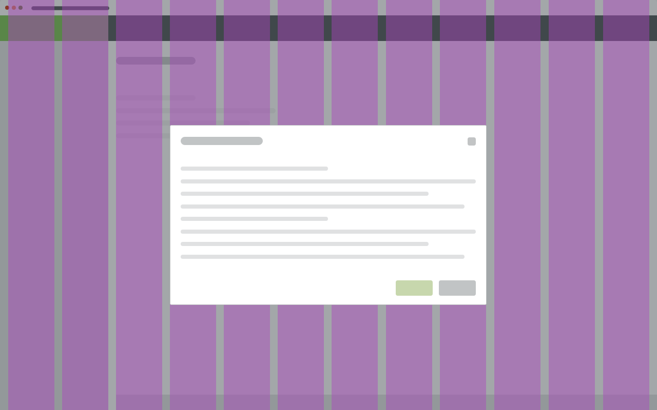
Modals complete tasks or subtasks, or communicate critical information without losing the context of an underlying page.
Component Status
 Design Kit: RELEASED
 Bobwai Component: bobwai–modal RELEASED

Usage
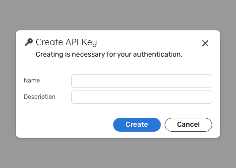
Modal Dialog
A dialog is a “conversation” between the system and the user. Modal dialog is a type of modal window that provides
critical information or information that a required action has been taken, such as deleting a file, or asking users to make a choice.

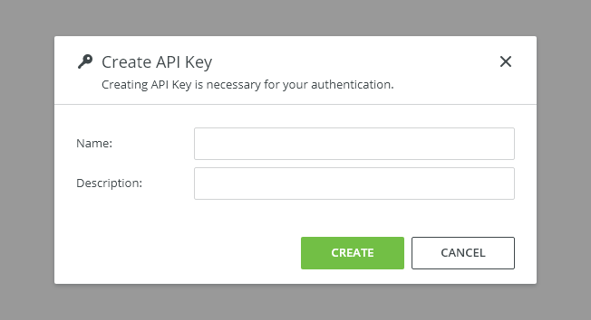
Use a modal dialog
- for a short and non-frequent tasks such as creation or editing tasks,
- for urgent information,
to confirm a user decision.

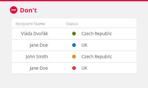
Do NOT use a modal dialog
- to display non-critical information,
- to display large amounts of data (avoid scrolling inside a modal),
- to enter information not related to the current user flow,
- for brief messages about background processes or status changes, (use a notification instead).
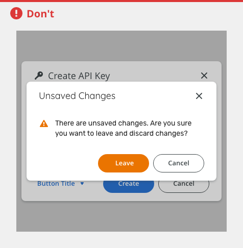
- Do not open multiple dialogs at the same time.
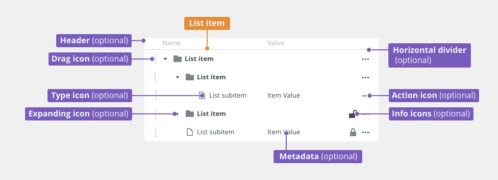
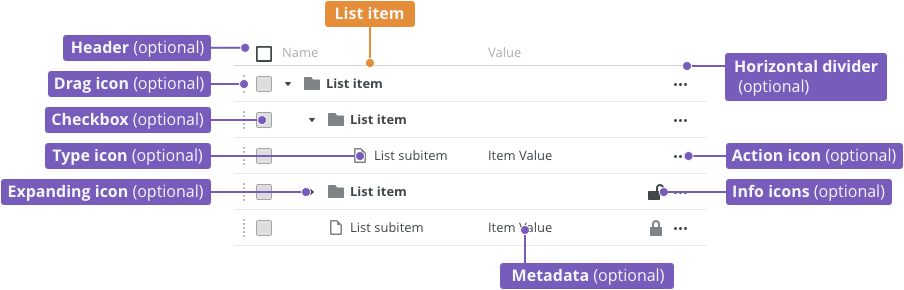
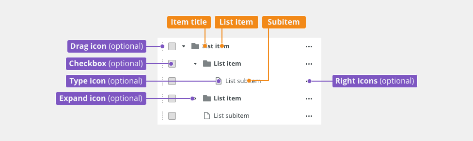
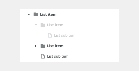
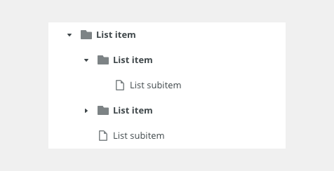
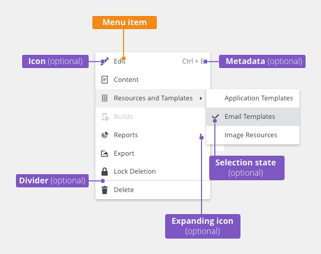
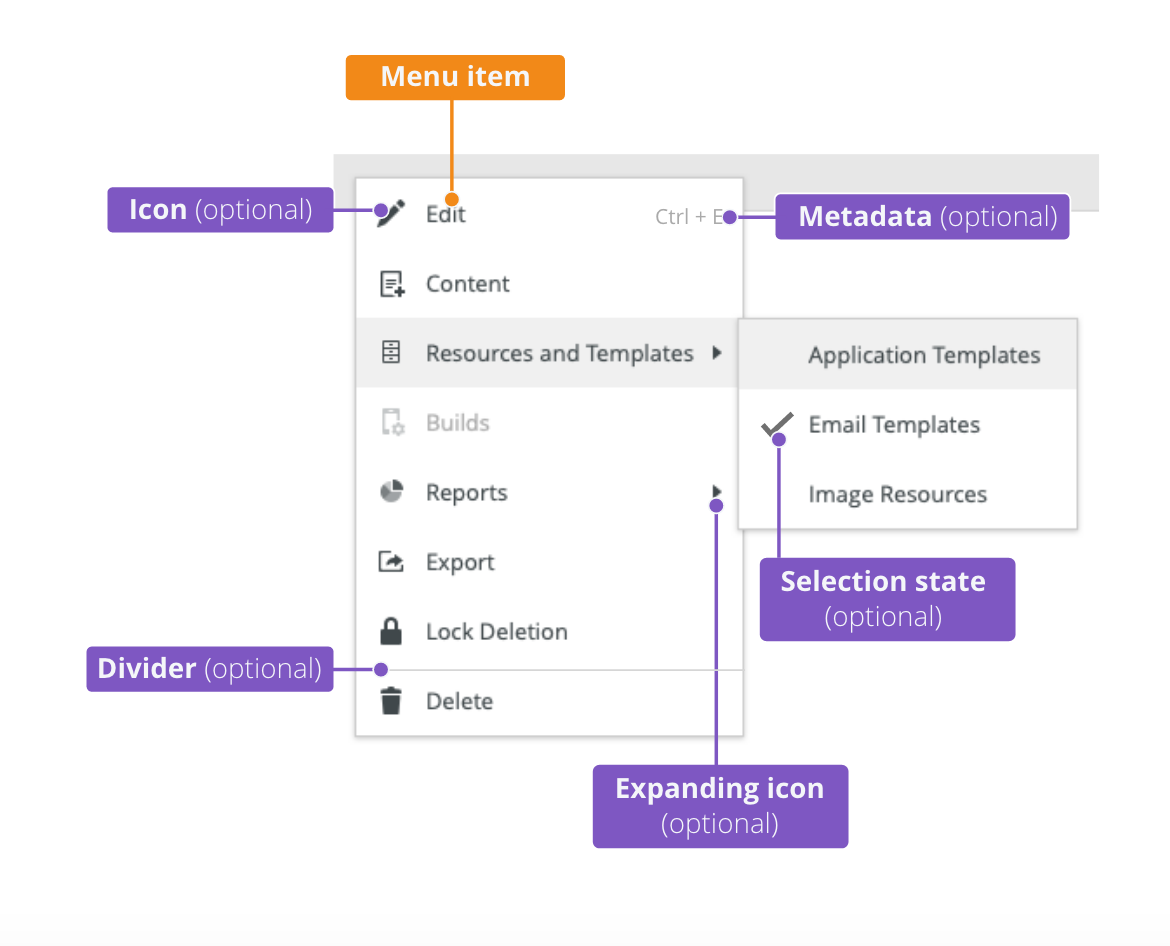
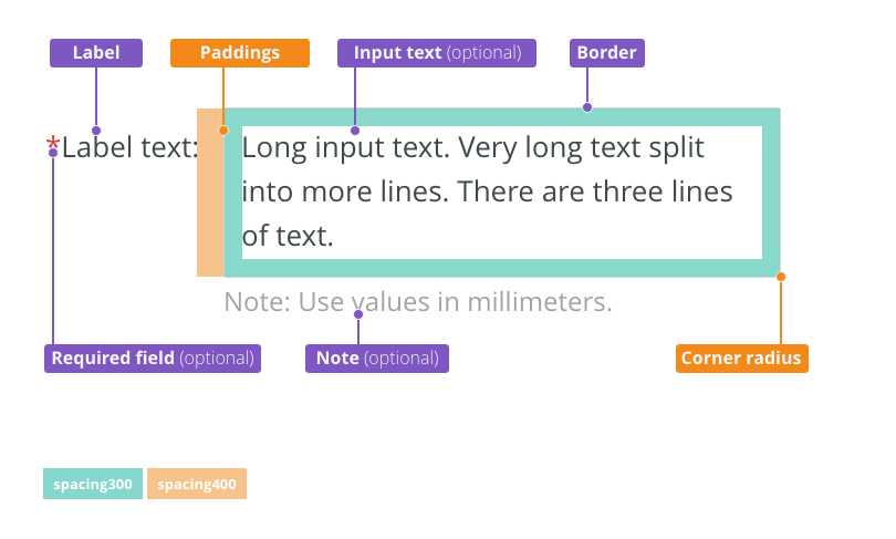
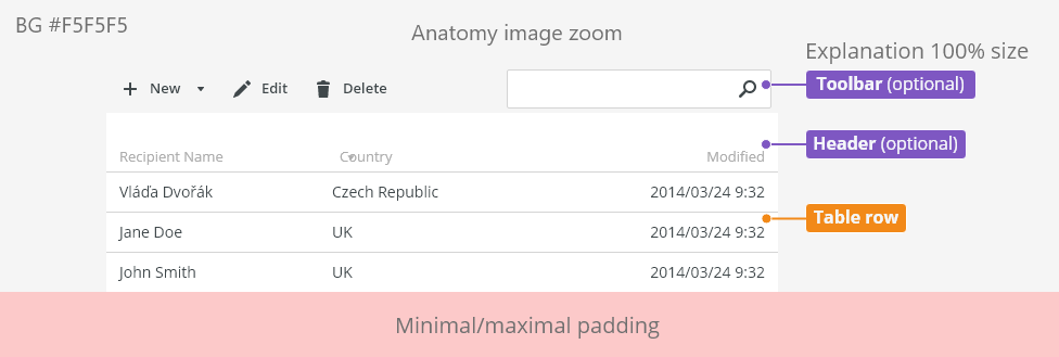
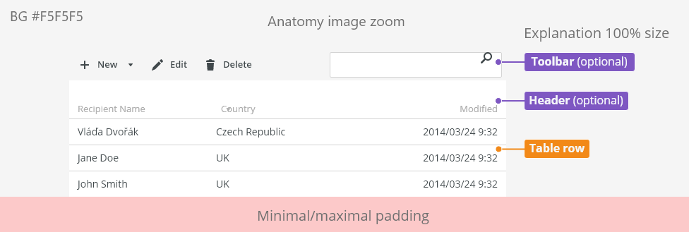
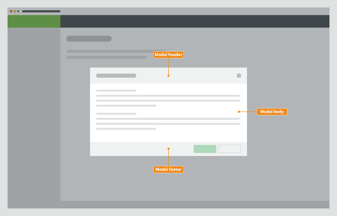
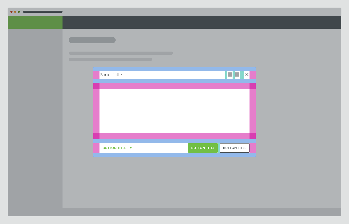
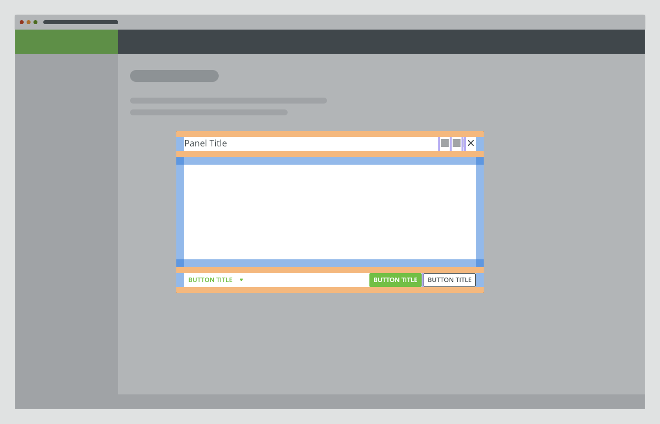
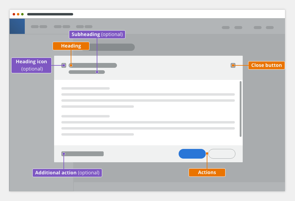
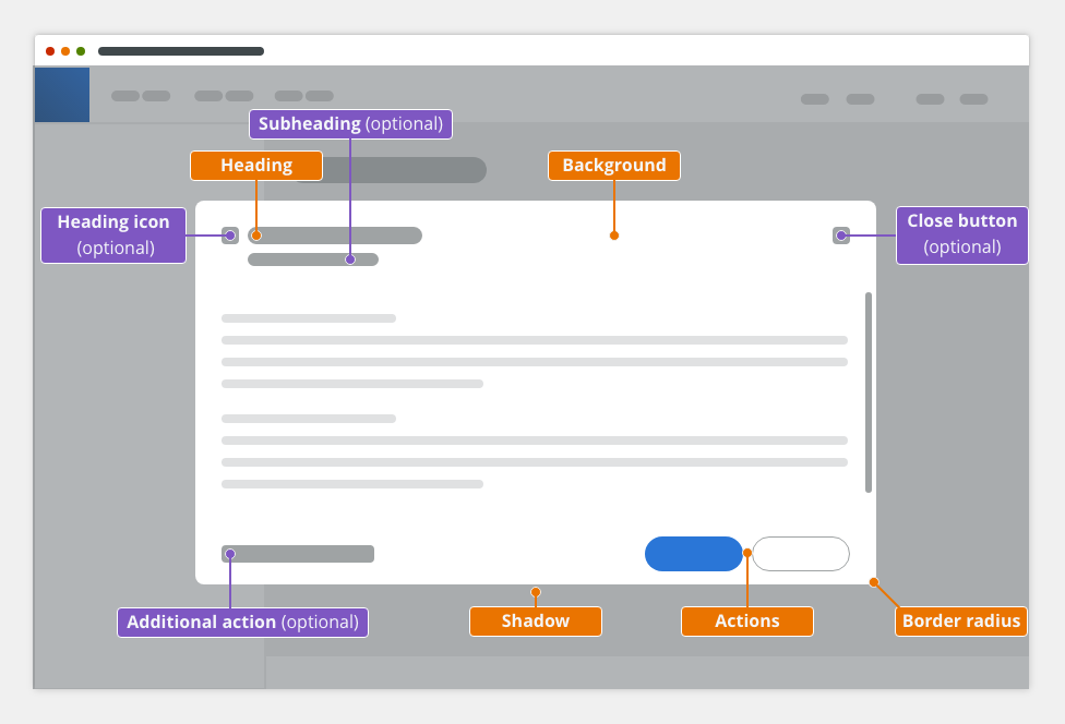
Anatomy
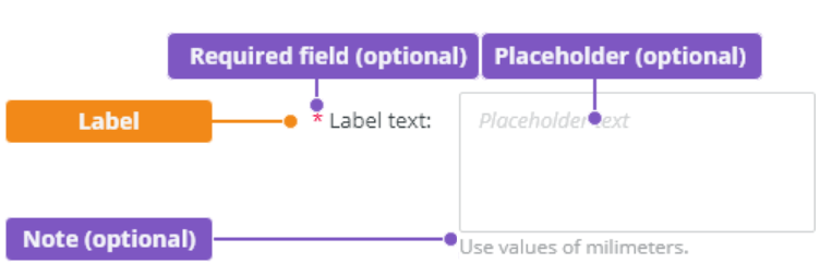
The modal component consists of the following parts:
- Header
- Body
- Footer
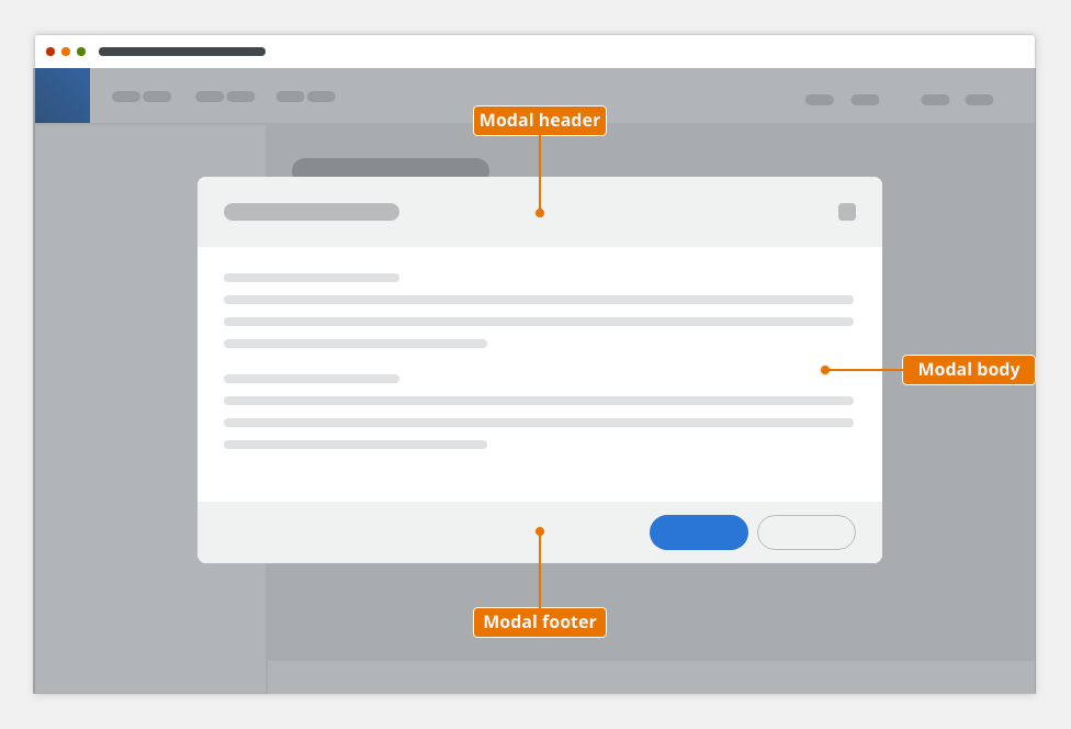
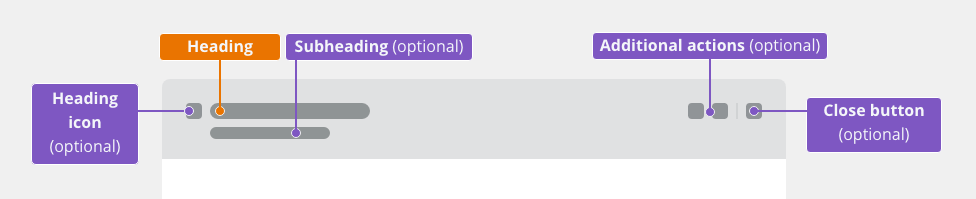
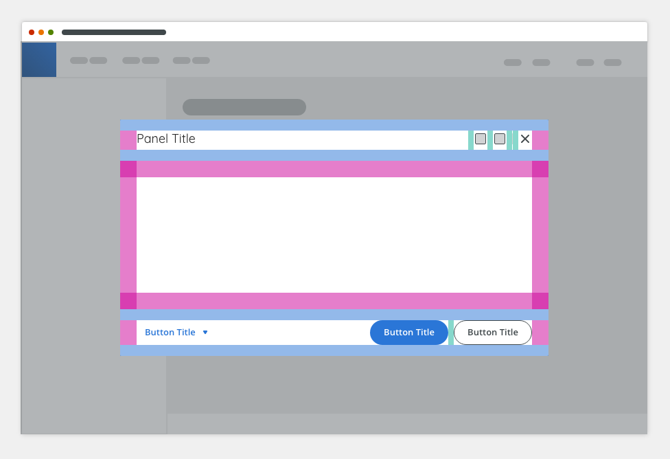
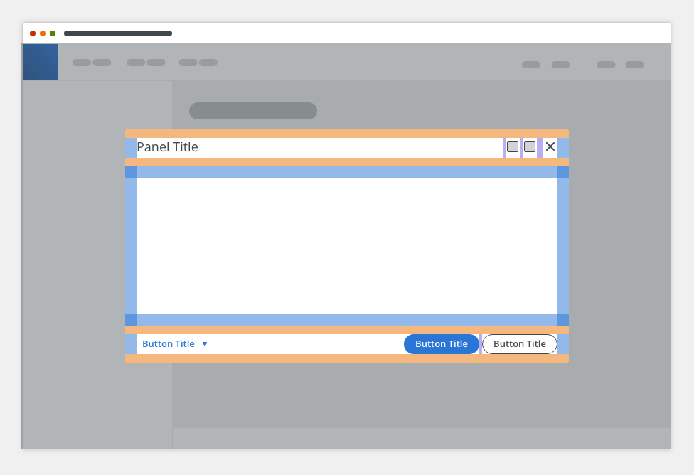
Header
Component: bobwai--panel-header
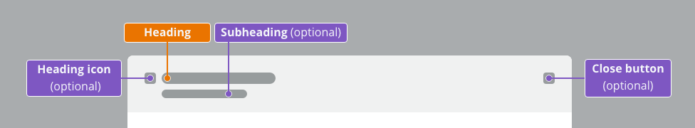
The modal header consists of:
- Icon (optional)
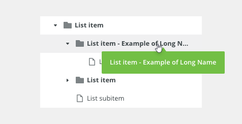
- Heading - contains the title that reflects the action that launched the modal → verb and noun (e.g. Upload Image). Overflow content is truncated with ellipsis.
- Subheading (optional)
- Close button “✕” (optional) - by default it is visible
Body
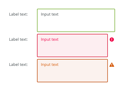
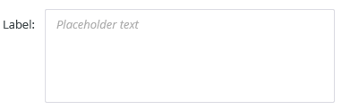
The modal body contains a content. It typically includes a paragraph, a data table, a form or a warning/error/info message.

Footer
The modal footer contains actions and the option to cancel and close the dialog.

Types of Modal Dialogs
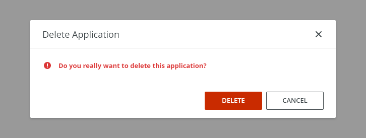
Confirmation
Use a confirmation dialog when asking the user to confirm a choice.
Use it to communicate critical information to the user.
Typically, the confirmation modal requests a 'yes' or 'no' response, however, buttons with verb labels should be used instead (e.g. Create / Create table).
Typical Usage
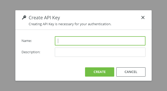
Input/Edit
Input/Edit modals allow the user to change data or settings without leaving the page.
Keep them simple, large modals compromise usability.
Use a side modal or consider a new page for large amounts of data.
Alert (before a destructive action)
Alert dialogs interrupt users with an urgent information when they should confirm an irreversible or a potentially destructive action.
The primary button is replaced by a warning or danger button.
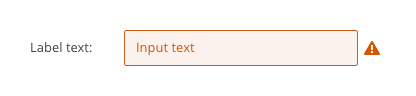
Warning
Use for confirmation dialogs to indicate a higher level of urgency and importance.
Danger
Use for confirmation dialogs to indicate the highest level of urgency and importance.
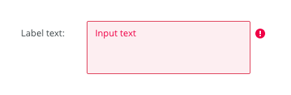
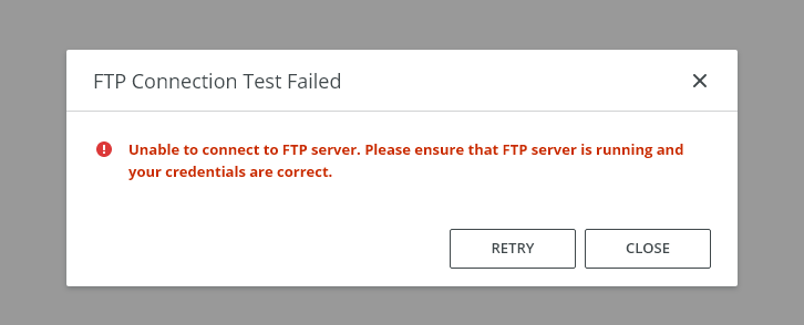
Error
Use error dialogs to inform users of issues interrupting normal or expected behavior.
An error message should be actionable, human-readable, and answer the following questions:
- What is the problem?
- Why did it happen?
- How can I fix it?
Lear more about writing error messages.
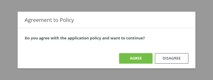
Action Required (no dismissal icon)
Use only when it is critical that the user makes a choice or provides information before they can proceed without dismissing.
Variants
Width
Modals are available in three predefined widths:
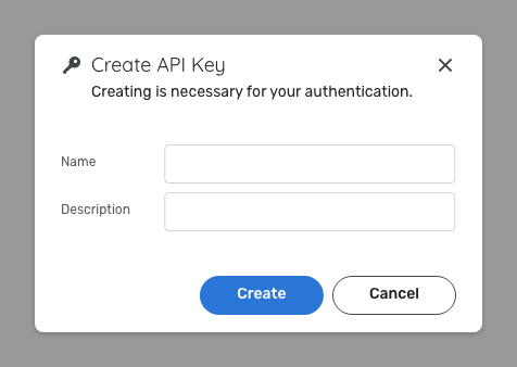
Small
Use small modal if you expect mimimum amount of data, e.g. Creation of a new item:

Medium (default)

Large
For larger content, such as longer forms or tables.
Typically for legacy purposes. Consider using side modal instead.
To-do: pořešit, co se stane, když budem mít malé okno

Appearance
Density
Default
Most of the use cases.

Condensed
Technical applications e.g. Scaler.
Behavior
Trigger
Modals are triggered as a result of a user action. Typical triggers are buttons, links, icons, or a keyboard key: <Enter> or <Space>.
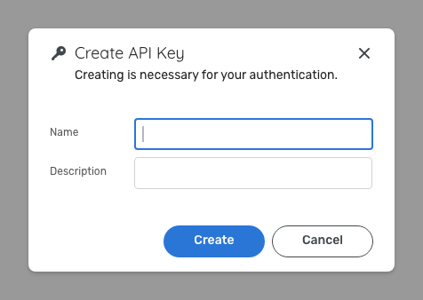
Focus
Once the modal is open, initial focus is on the first element that accepts a user input. Focus should then remain trapped in the dialog until it is closed.
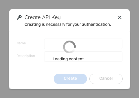
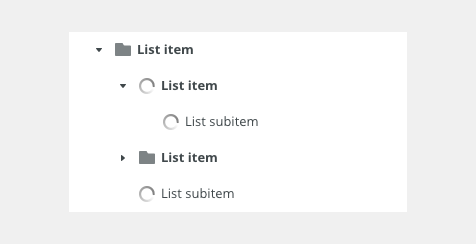
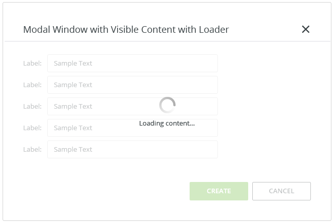
Loading
For actions that take longer than 1 second a loading spinner and overlay should appear on the top of the modal.
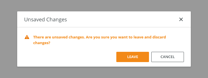
Exiting Modal Dialogs
Closing a dialog is possible in the following ways:
- Task completion - Complete the task and close the modal.
- Cancel button - Close the modal without submitting any data and return to the previous context.
- x - Close the modal without submitting any data and return to the previous context.
- Escape key - Close the modal without submitting any data and return to the previous context.
Keyboard Interactions
| KEY | INTERACTION |
|---|---|
| Tab | Moves focus to next interactive element. If focus is on the last element interactive inside the dialog, moves focus to the first interactive element inside the dialog. |
| Shift + Tab | Moves focus to the previous interactive element inside the dialog. |
| Esc | Dismisses the dialog. Close the modal without submitting any data and return to the previous context. |
Related Components
- Side modal - Use for editing larger content.
- Full screen modal - Use for complex interaction ( e.g. Workflow editor).
- Notifications - Use for displaying non-critical information.
Style

| Used in | Type | px | Token |
|---|---|---|---|
| Background | Color | color-bg-ui-100 |
|
| Border radius | Border radius | radius-container-100 |
|
| Shadow | Shadow | shadow-300 |
|
| Item width | Sizing | 400 608 816 |
sizing-modal-100 sizing-modal-200 sizing-modal-300 |
Header
| Used In | Type | px | Token |
|---|---|---|---|
| Heading | Font | font-heading-400 |
|
| Subheading | Font | font-body | |
| Heading | Color | color-text-100 |
|
| Subheading | Color | color-text-100 |
|
| Heading icon - container | Size | 28x28 | sizing-item-200 |
| Heading icon | Size | 20x20 | sizing-icon-200 |
| Close button - container | Size | 28x28 | sizing-item-200 |
| Close button icon | Size | 20x20 | sizing-icon-200 |
| Close button | Style/Component | toolbar button |
Spacing
Medium (Default)
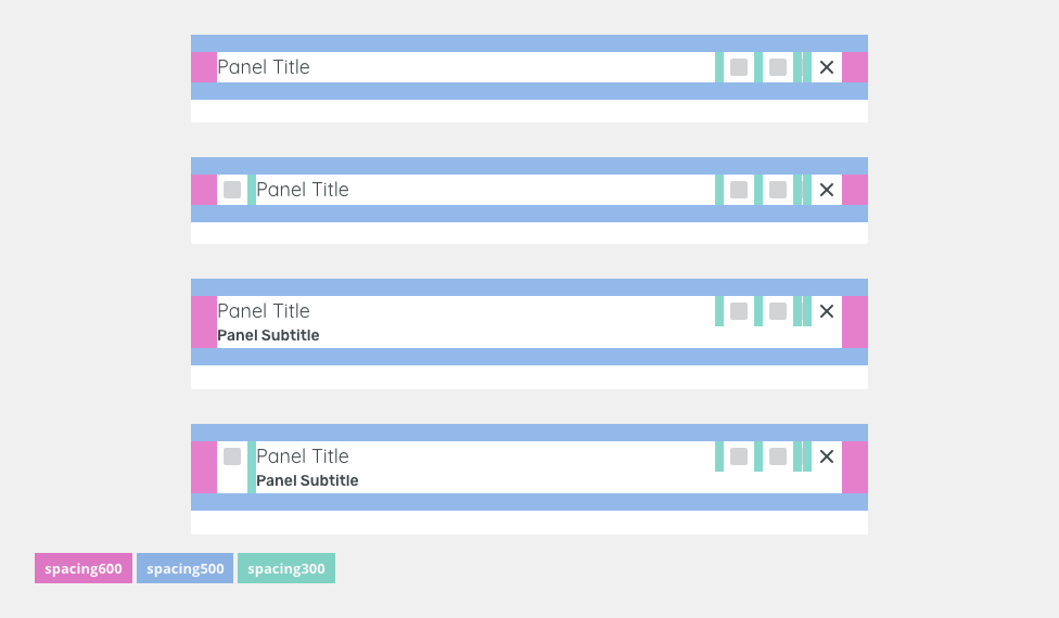
| Used In | Type | PX | Token |
|---|---|---|---|
| Horizontal padding | Spacing | 24 | spacing-600 |
| Vertical padding | Spacing | 16 | spacing-500 |
| Horizontal space between buttons/icons/texts | Spacing | 8 | spacing-300 |
Small (Condensed)
| Used In | Type | PX | Token |
|---|---|---|---|
| Horizontal padding in header | Spacing | 16 | spacing-500 |
| Vertical padding in header | Spacing | 12 | spacing-400 |
| Horizontal space between buttons/icons | Spacing | 4 | spacing-300 |
Footer
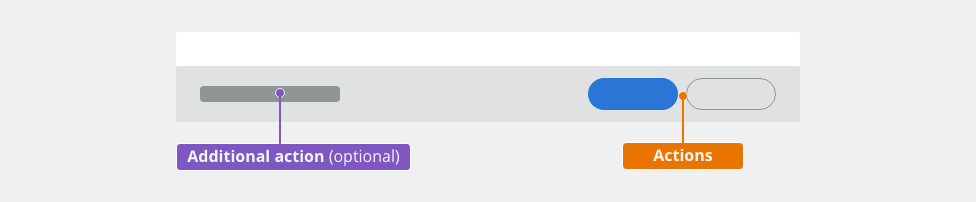
| Actions | Style/Component | use primary and secondary button | |
| Additional action | Style/Component | user tertiary button |
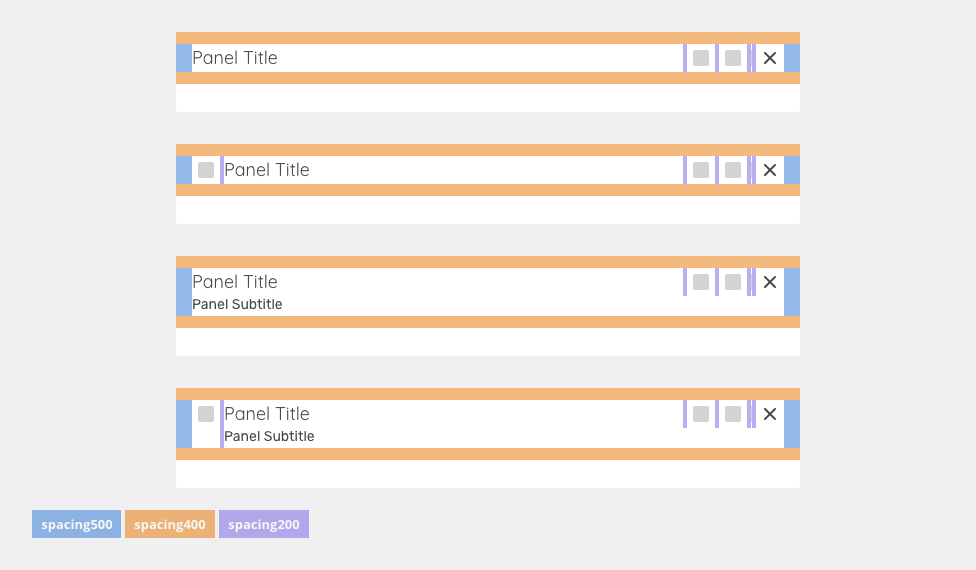
Spacing
Medium (default)

| Used In | Type | PX | Token |
|---|---|---|---|
| Horizontal padding | Spacing | 24 | spacing-600 |
| Vertical padding | Spacing | 16 | spacing-500 |
| Horizontal space between buttons/icons/texts | Spacing | 8 | spacing-300 |
Small (condensed)

| Used In | Type | PX | Token |
|---|---|---|---|
| Horizontal padding in header | Spacing | 16 | spacing-500 |
| Vertical padding in header | Spacing | 12 | spacing-400 |
| Horizontal space between buttons/icons | Spacing | 4 | spacing-300 |
Widths
Small
Medium
Large
Size |
Min width |
Token |
|---|---|---|
S |
400px |
sizing-modal-100 |
| M | 608px |
sizing-modal-200 |
| L | 816px |
sizing-modal-300 |
Accessibility
- When the modal is open, place focus on the first interactive element and trap the focus inside the modal.
- Add ARIA role
role=”dialog”to modal outer wrapper, usearia-labelledbyattribute in the same element for a short description. - Add an
aria-describedbyattribute for any further description if needed. - Add
aria-hidden=”true”attribute when the modal is hidden but present in DOM. - After closing the modal, return focus to the trigger element, usually a button or a link.
Attachments:
 image2021-1-8_14-30-20.png (image/png)
 image2021-1-8_14-29-46.png (image/png)
 image2021-1-8_14-29-33.png (image/png)
 Screenshot 2021-01-07 at 16.54.42.png (image/png)
 Screenshot 2021-01-07 at 16.53.26.png (image/png)
 Screenshot 2021-01-07 at 16.53.57.png (image/png)
 Screenshot 2021-01-07 at 16.53.49.png (image/png)
 image2021-1-7_16-51-54.png (image/png)
 image2021-1-5_14-47-12.png (image/png)
 image2021-1-5_14-39-1.png (image/png)
 image2021-1-5_14-37-22.png (image/png)
 image2021-1-5_14-36-35.png (image/png)
 image2021-1-5_14-36-5.png (image/png)
 image2021-1-5_14-15-59.png (image/png)
 image2020-12-20_19-52-51.png (image/png)
 image2020-12-20_19-52-12.png (image/png)
 image2020-12-18_14-12-49.png (image/png)
 tree-style.png (image/png)
 Tree-text-overflow.png (image/png)
 Tree-variants-error.png (image/png)
 tree-scroll.png (image/png)
 tree-toolbar.png (image/png)
 tree-trigger.png (image/png)
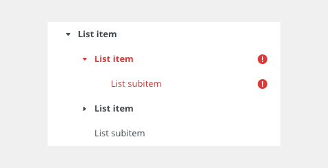
 Tree-list-item.png (image/png)
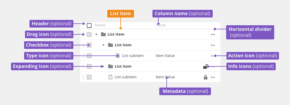 tree-anatomy.png (image/png)
 Tree-states-disabled.png (image/png)
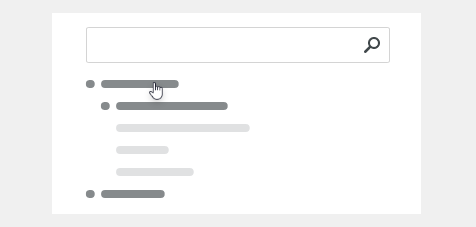
 Tree-states-loading.png (image/png)
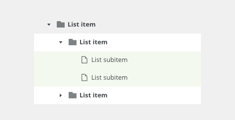
 Tree-states-selected.png (image/png)
 Tree-states-hover.png (image/png)
 Tree-density-condensed.png (image/png)
 Tree-density-default.png (image/png)
 Tree-variants-subitem-icons.png (image/png)
 Tree-variants-with-icons.png (image/png)
 Tree-variants-without-icons.png (image/png)
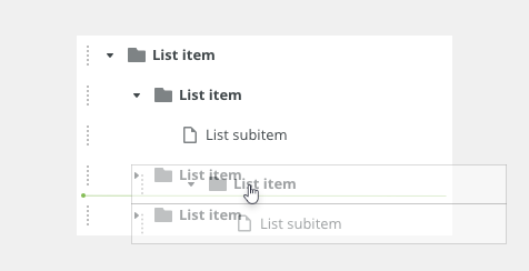
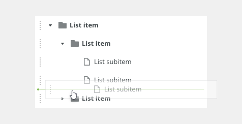
 Tree-types-dragable.png (image/png)
 Tree-types-multi-select.png (image/png)
 Tree-types-single-select.png (image/png)
 tree-title.png (image/png)
 Context-menu-dont-groups.png (image/png)
 Context-menu-do-groups.png (image/png)
 Context-menu-dont-short.png (image/png)
 Context-menu-do-short.png (image/png)
 Context-menu-states-disabled.png (image/png)
 Context-menu-groups.png (image/png)
 Context-menu-variants-with-title.png (image/png)
 Context-menu-variants-text-icons.png (image/png)
 Context-menu-variants-text-only.png (image/png)
 Context-menu-type-multilevel.png (image/png)
 Context-menu-type-basic.png (image/png)
 context-menu-anatomy.png (image/png)
 Screenshot 2020-11-20 at 14.27.17.png (image/png)
 Screenshot 2020-11-19 at 09.57.10.png (image/png)
 Screenshot 2020-11-18 at 13.08.05.png (image/png)
 Screenshot 2020-11-18 at 13.08.21.png (image/png)
 Screenshot 2020-11-19 at 08.14.34.png (image/png)
 Screenshot 2020-11-19 at 08.14.25.png (image/png)
 Screenshot 2020-11-16 at 13.53.55.png (image/png)
 Screenshot 2020-11-18 at 13.22.39.png (image/png)
 Screenshot 2020-11-18 at 13.11.11.png (image/png)
 Screenshot 2020-11-18 at 12.49.34.png (image/png)
 Screenshot 2020-11-16 at 15.22.41.png (image/png)
 Screenshot 2020-11-16 at 15.19.01.png (image/png)
 Screenshot 2020-11-16 at 15.09.35.png (image/png)
 Screenshot 2020-11-16 at 14.58.54.png (image/png)
 Screenshot 2020-11-16 at 15.01.07.png (image/png)
 image2020-11-2_9-26-30.png (image/png)
 image2020-11-2_9-26-14.png (image/png)
 image2020-11-2_9-24-56.png (image/png)
 text-area-variants-warning-icon.png (image/png)
 text-area-variants-error-icon.png (image/png)
 text-input-variants-warning-icon.png (image/png)
 text-area-density-small.png (image/png)
 text-area-density-default.png (image/png)
 text-input-density-small.png (image/png)
 text-area-state-focus.png (image/png)
 text-area-state-readonly.png (image/png)
 text-area-state-disabled.png (image/png)
 text-area-state-selected.png (image/png)
 text-area-label-horizontal.png (image/png)
 text-area-style.png (image/png)
 text-area-validation.png (image/png)
 text-area-label-vertical.png (image/png)
 text-area-anatomy.png (image/png)
 textarea@2x.png (image/png)
 textarea-style@2x.png (image/png)
 image2020-10-26_13-26-26.png (image/png)
 image2020-10-26_13-24-0.png (image/png)
 image2020-10-26_13-22-55.png (image/png)
 image2020-10-26_13-22-16.png (image/png)
 image2020-10-26_13-21-57.png (image/png)
 image2020-10-23_15-38-49.png (image/png)
 image2020-10-2_14-42-44.png (image/png)
 image2020-10-2_14-25-33.png (image/png)
 image2020-10-2_14-25-18.png (image/png)
 image2020-10-2_14-34-9.png (image/png)
 image2020-10-2_14-33-47.png (image/png)
 image2020-10-2_14-21-26.png (image/png)
 image2020-10-2_14-20-58.png (image/png)
 image2020-10-2_14-21-11.png (image/png)
 image2020-10-2_14-20-45.png (image/png)
 image2020-10-5_11-37-46.png (image/png)
 image2020-10-5_10-55-2.png (image/png)
 image2020-10-5_10-54-40.png (image/png)
 image2020-10-5_10-54-33.png (image/png)
 image2020-10-5_10-53-29.png (image/png)
 image2020-10-5_10-52-58.png (image/png)
 image2020-10-2_13-46-8.png (image/png)
 image2020-10-2_13-45-41.png (image/png)
 image2020-10-2_15-23-33.png (image/png)
 image2020-10-5_10-26-47.png (image/png)
 image2020-10-5_10-26-24.png (image/png)
 image2020-10-5_10-25-57.png (image/png)
 image2020-10-5_10-17-0.png (image/png)
 image2020-11-27_9-53-18.png (image/png)
 image2020-11-27_10-59-3.png (image/png)
 image2020-11-27_12-13-3.png (image/png)
 image2020-11-27_12-20-20.png (image/png)
 image2020-11-27_12-24-3.png (image/png)
 image2020-11-27_15-3-39.png (image/png)
 image2020-11-27_15-4-12.png (image/png)
 image2020-11-27_15-14-27.png (image/png)
 image2020-11-27_15-19-14.png (image/png)
 image2020-11-27_15-46-5.png (image/png)
 image2020-11-30_14-3-56.png (image/png)
 image2020-11-30_14-8-32.png (image/png)
 image2020-11-30_14-17-56.png (image/png)
 image2020-11-30_14-32-1.png (image/png)
 image2020-12-1_10-56-37.png (image/png)
 image2020-12-1_10-57-14.png (image/png)
image2020-12-1_10-57-28.png (image/png)
image2020-12-1_10-57-14.png (image/png)
image2020-12-1_10-57-28.png (image/png)
 image2020-12-1_10-59-46.png (image/png)
image2020-8-14_10-41-45.png (image/png)
image2020-8-14_10-49-41.png (image/png)
Modal Dialog - parts.png (image/png)
image2020-12-1_10-59-46.png (image/png)
image2020-8-14_10-41-45.png (image/png)
image2020-8-14_10-49-41.png (image/png)
Modal Dialog - parts.png (image/png)
 Typical Usage.png (image/png)
 Warning.png (image/png)
 Danger.png (image/png)
 Unable to Connect.png (image/png)
 Action Required.png (image/png)
 image2020-9-22_17-42-32.png (image/png)
 image2020-9-22_17-43-0.png (image/png)
 image2020-9-22_17-43-25.png (image/png)
 Typical Usage – Focus.png (image/png)
 image2020-10-8_9-45-17.png (image/png)
 Modal Dialog - paddings.png (image/png)
 Modal Dialog - paddings condensed.png (image/png)
 Mockup_basic – 3.png (image/png)
 Mockup_basic – 4.png (image/png)
 Mockup_basic – 5.png (image/png)
 modal-title.png (image/png)
 Modal-dialog-content.png (image/png)
 modal-dialog-spacing.png (image/png)
 modal-dialog-spacing-condensed.png (image/png)
 Modal-typical-usage-focus.png (image/png)
 modal-typical-usage.png (image/png)
 modal-warning.png (image/png)
 modal-danger.png (image/png)
 modal-danger.png (image/png)
 modal-error.png (image/png)
 modal-action-required.png (image/png)
 modal-size-small.png (image/png)
 modal-size-small.png (image/png)
 modal-size-medium.png (image/png)
 modal-size-large.png (image/png)
 modal-dialog-header-and-footer-content.png (image/png)
 modal-dialog-header-and-footer-content.png (image/png)
 modal-warning.png (image/png)
 modal-danger.png (image/png)
 modal-error.png (image/png)
 modal-loader.png (image/png)
 modal-title.png (image/png)
Modal-dialog-content.png (image/png)
modal-title.png (image/png)
Modal-dialog-content.png (image/png)
 modal-typical-usage.png (image/png)
modal-warning.png (image/png)
modal-danger.png (image/png)
modal-error.png (image/png)
modal-action-required.png (image/png)
modal-size-small.png (image/png)
modal-typical-usage.png (image/png)
modal-warning.png (image/png)
modal-danger.png (image/png)
modal-error.png (image/png)
modal-action-required.png (image/png)
modal-size-small.png (image/png)
 modal-size-medium.png (image/png)
 modal-size-large.png (image/png)
 Modal-density-default.png (image/png)
Modal-density-condensed.png (image/png)
modal-dialog-header-anatomy.png (image/png)
modal-dialog-footer-anatomy.png (image/png)
Modal-dialog-content-anatomy.png (image/png)
Modal-typical-usage-focus.png (image/png)
Modal-dialog-anatomy.png (image/png)
Modal-dialog-content.png (image/png)
container-header-content.png (image/png)
container-header-spacing.png (image/png)
Modal-density-default.png (image/png)
Modal-density-condensed.png (image/png)
modal-dialog-header-anatomy.png (image/png)
modal-dialog-footer-anatomy.png (image/png)
Modal-dialog-content-anatomy.png (image/png)
Modal-typical-usage-focus.png (image/png)
Modal-dialog-anatomy.png (image/png)
Modal-dialog-content.png (image/png)
container-header-content.png (image/png)
container-header-spacing.png (image/png)
 container-header-spacing.png (image/png)
container-header-spacing-condensed.png (image/png)
container-footer-content.png (image/png)
container-footer-spacing.png (image/png)
container-footer-spacing-condensed.png (image/png)
modal-size-small.png (image/png)
modal-size-medium.png (image/png)
modal-size-large.png (image/png)
modal-dont–overlaying.png (image/png)
modal-loader.png (image/png)
container-header-spacing.png (image/png)
container-header-spacing-condensed.png (image/png)
container-footer-content.png (image/png)
container-footer-spacing.png (image/png)
container-footer-spacing-condensed.png (image/png)
modal-size-small.png (image/png)
modal-size-medium.png (image/png)
modal-size-large.png (image/png)
modal-dont–overlaying.png (image/png)
modal-loader.png (image/png)