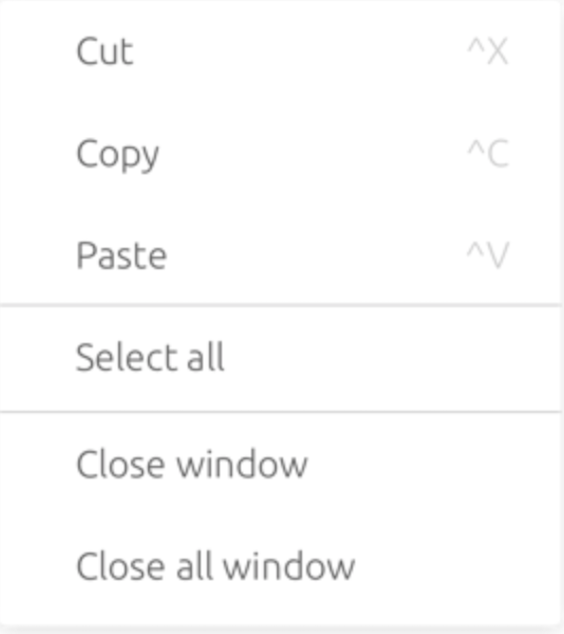
Menu displays a list of options on temporary surfaces.
Component Status
 Design Kit: NOT RELEASED
 Bobwai component: bobwai--menu RELEASED
Content Overview
Usage
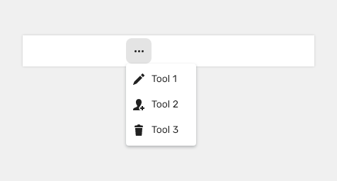
Menus are typically used for navigation or commands.
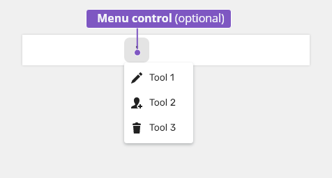
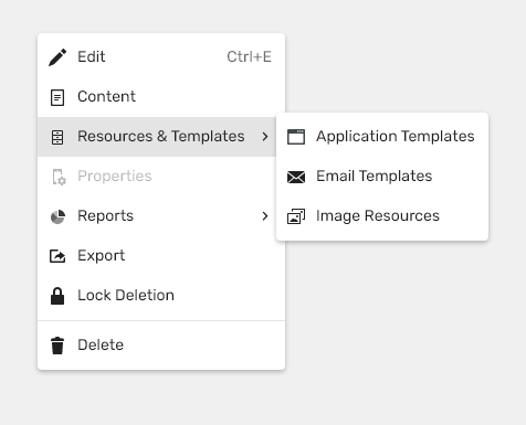
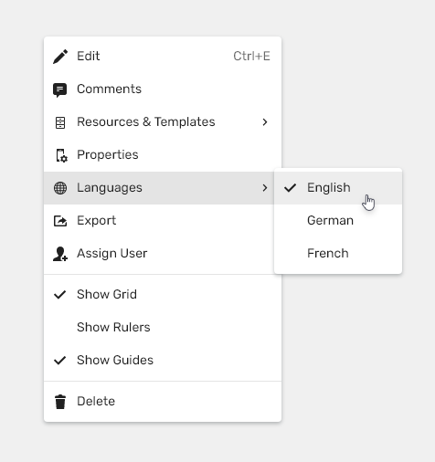
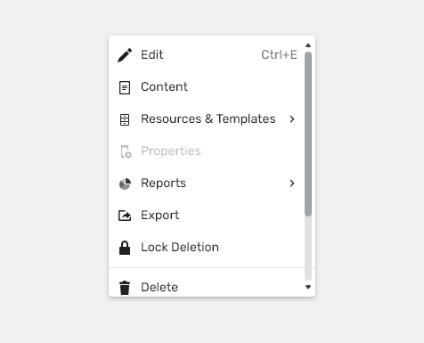
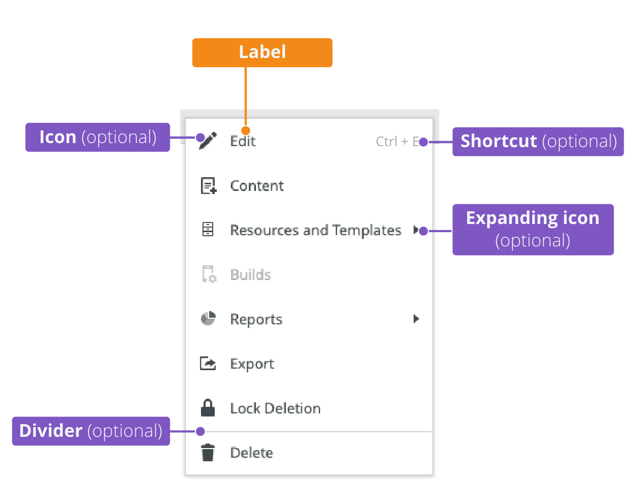
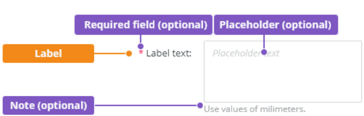
Anatomy

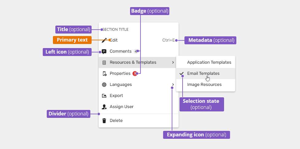
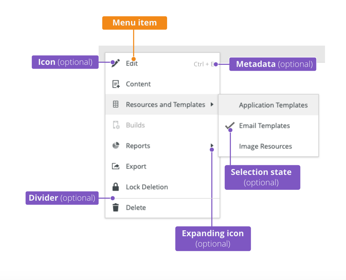
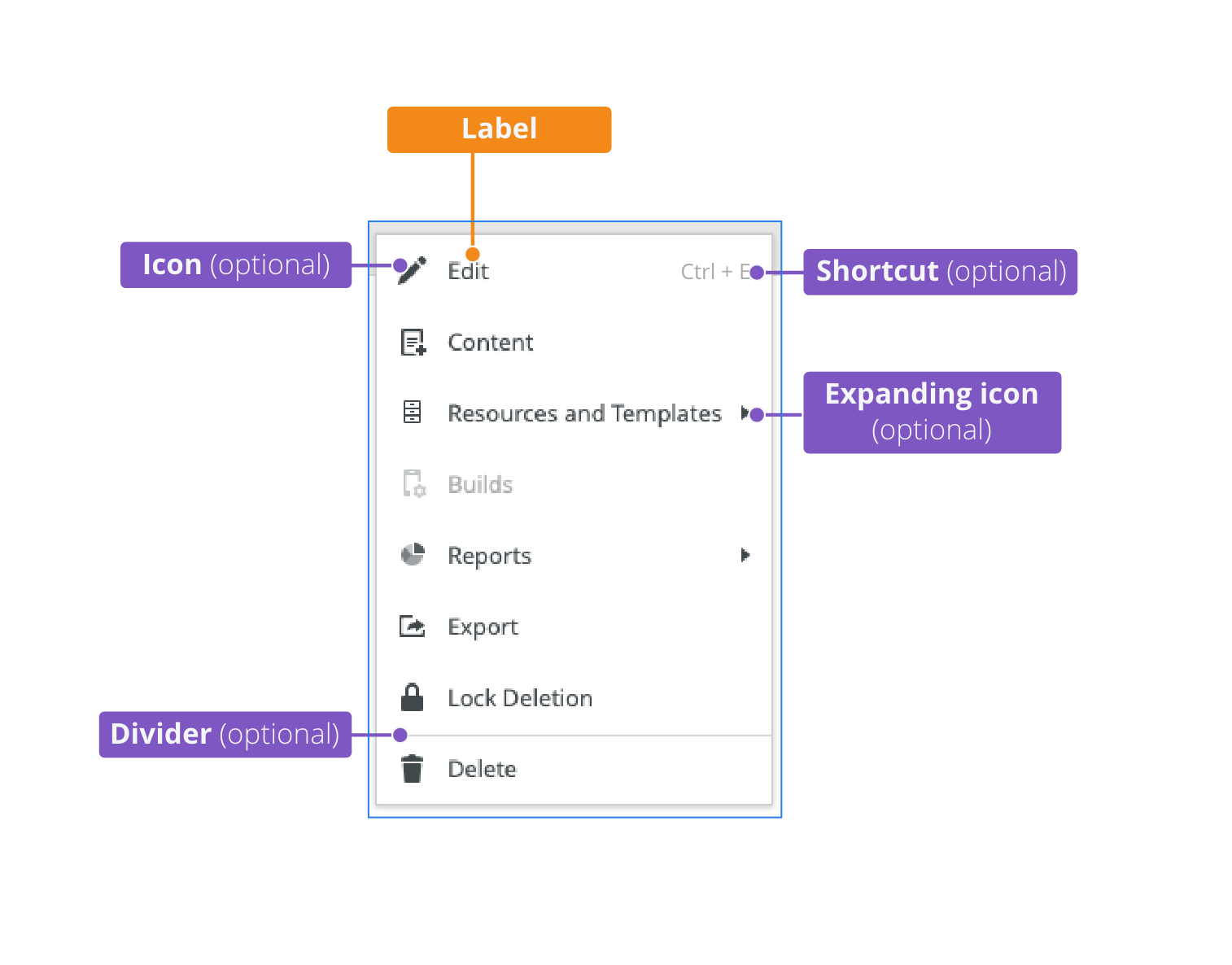
Menu
- A menu appears when a user interacts with a menu control or upon right-clicking when opening a contextual menu.
- It contains the menu items.
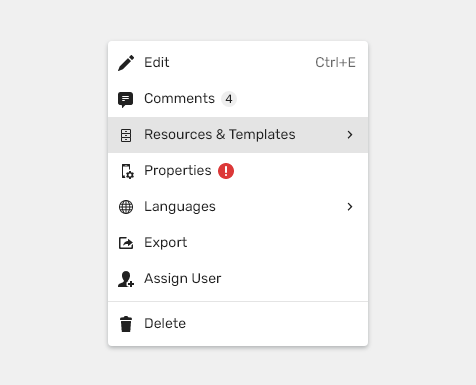
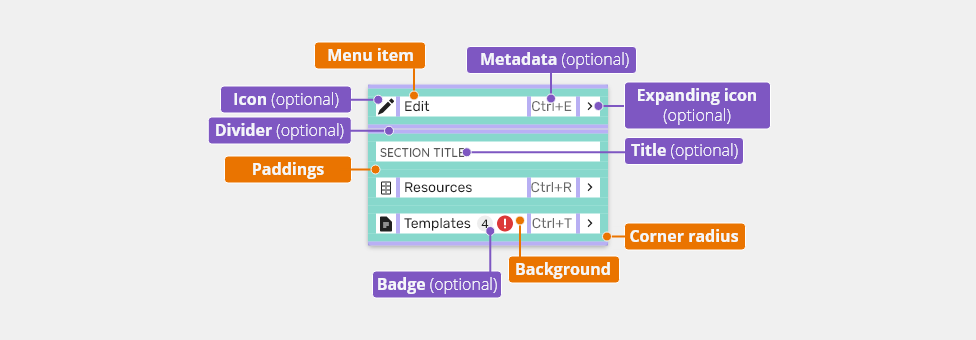
Menu Item
A menu item contains list-item components which include texts and optional icons or an avatar.
- Primary text - -Name of the item.
- Left icon (optional)- The icon emphasizes the text and matches the action.
- Metadata (optional)- Additional information (e.g. a shortcut).
- Expanding icon (optional)- Leads users to submenu.
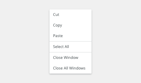
- Divider (optional) - Divides each group of items (if there are any).
- Selection state (optional) - When it is possible to select a state, it is represented by the selection icon.
Types
Dropdown Menu
Dropdown menus display a list of options. The menu opens after interaction with a menu control (e.g. a button, an icon, or an avatar ). The menu button does NOT show the selected item and its text never changes.
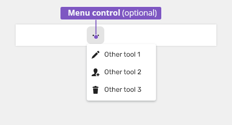
Button as Menu Control
A menu control can be a button or another control which has more than one action to choose from.
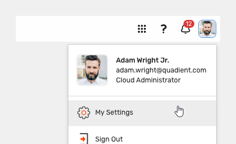
Avatar as Menu Control
Avatar is used as the control for user profiles.
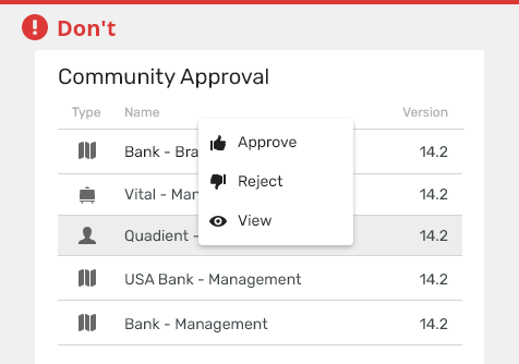
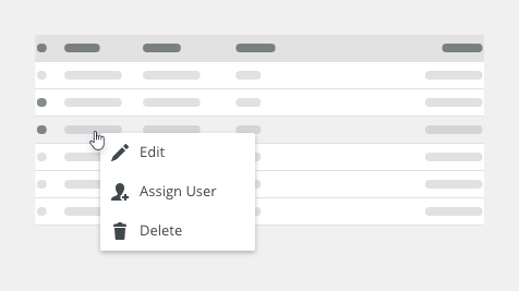
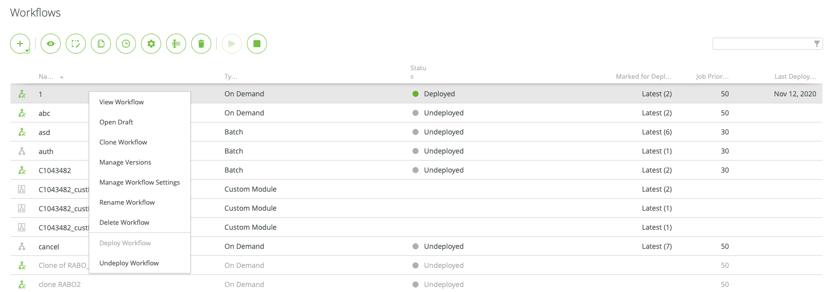
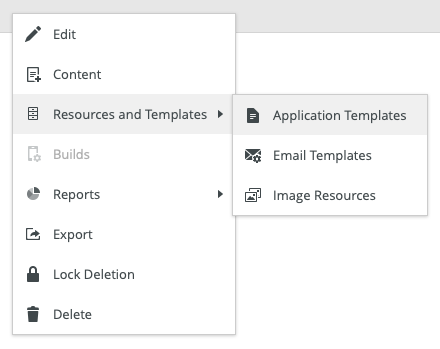
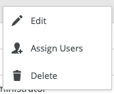
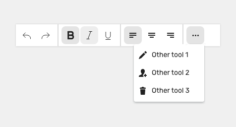
Contextual Menu
A contextual menu is a type of menu that appears on demand, typically upon right-clicking, and contains a list of actions or commands that are relevant to the current context.

.
- Actions in contextual menus are also available from other places in application (e.g. from application menu bar).

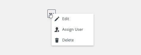
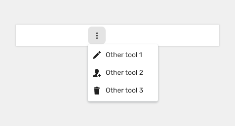
It is recommended to include visual signifiers in the UI to indicate that a contextual menu is available (e.g. a vertical or horizontal ellipsis).
.
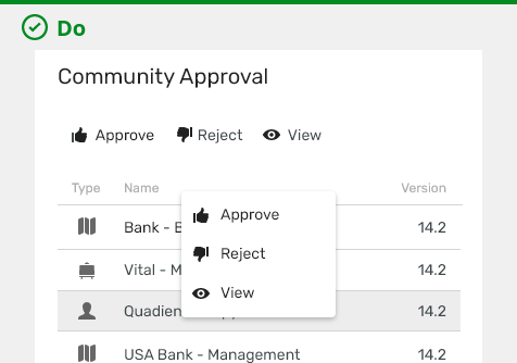
Context menus are always used only as a secondary list of actions.
Variants
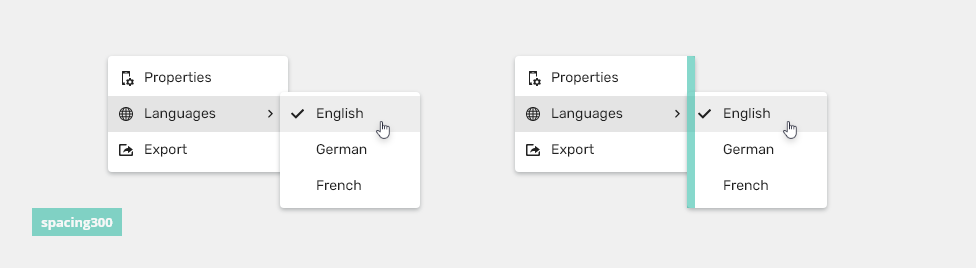
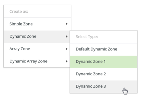
Multi-level
Menu lists can contain child list items.
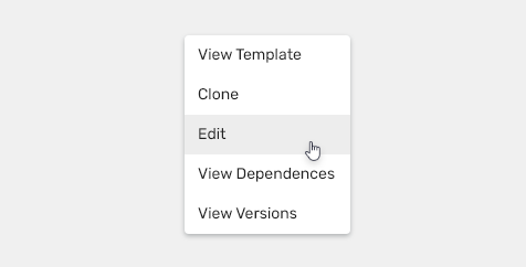
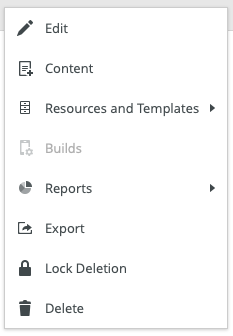
Text Only
Basic variant, when it is not necessary to have icons or other additional information in single items.
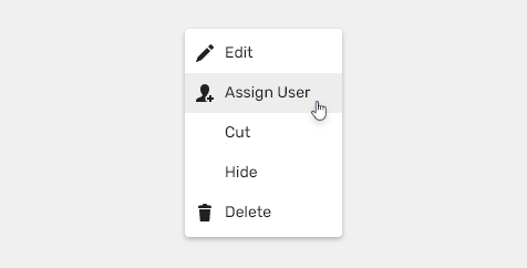
Text + Icon
Left icons match with the action to emphasizes the text.
Use commonly known icons. It is not necessary to have icons for all of the items.
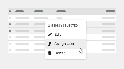
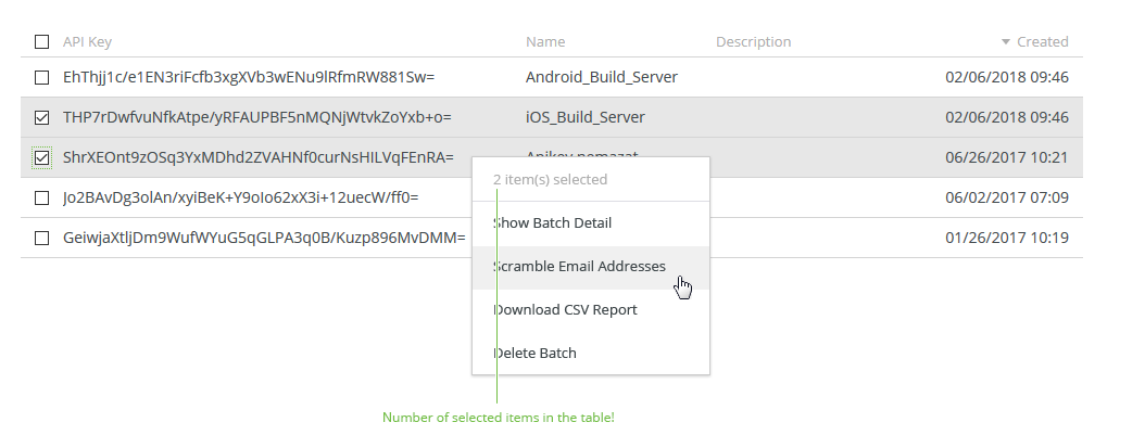
Title
Menus with a title are used for multiple selection (they display a number of selected objects for which the items will be applied).

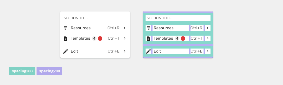
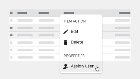
Sections Header
Menus with section headers are used to categorize items in menus.

With Badges
Badges are used to notify or rise attention to changed values, status, or count numbers.
Selection State
Left icons can be used as a selection state indicator.
Appearance
Grouping
Items should be grouped in a logical way using dividers to separate related actions that have been grouped together.
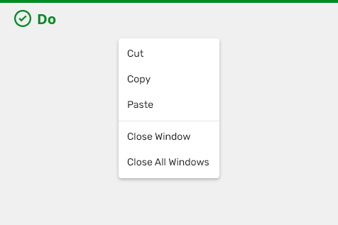
Use grouping of actions separated by dividers or multi-level context menu in an extensive context menu.
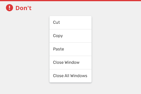
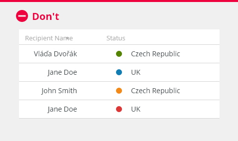
Do not use divider to separate all actions.
Behavior
Overflow
Overflow menu is used when additional options are available and there is a space constraint.
Text Overflow
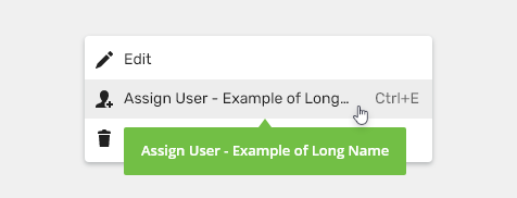
When the item text is too long for the available horizontal space, it is truncated by ellipsis and the full value is displayed in a tooltip on hover.
Scrollbar
When the context menu is too long for the available vertical space, a custom scrollbar appears.
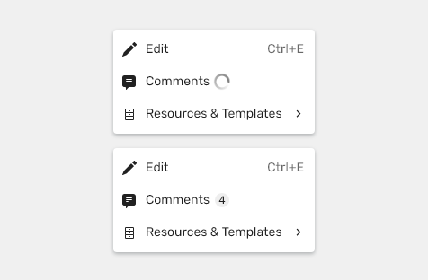
Loader
When the information about the number of items is not available, a loader will appear immediately after opening the context menu.
States
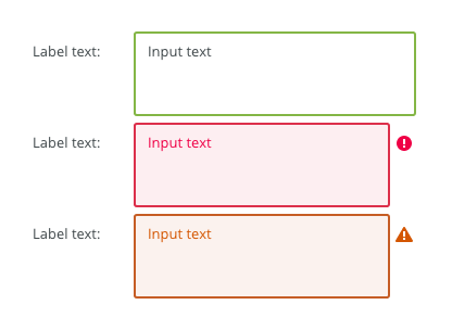
Disabled
Cannot be interacted with but remains visible to the user in a disabled visual style.

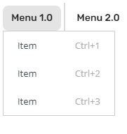
Keyboard Interactions
| Key | Interaction |
|---|---|
| The Up and the Down Arrow Key | Allow to move in the context menu item. |
| Right Arrow | Opens a submenu. |
| Tab | Leaves the action item (dropdown) and moves to the next item of the context menu. |
| Enter | Confirms the select item. |
| Esc | Closes the context menu. |
Editorial
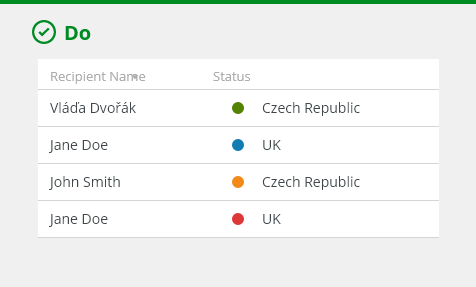
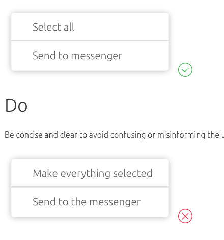
- Use title case for the menu items.
- Keep the text short and specific.

Always use short and clear menu items.
Do not use too long menu item names.
Related Components
Drop Down - Combination of an input field and a dropdown with a list of options.
Style
Context menu container/window

| Used in | Type | px | Token |
|---|---|---|---|
| Container/window background | color | color-bg-ui-100 | |
| Corner radius | corner radius | 4 | radius-200 |
| Container/window shadow | shadow | shadow-200 |
Context Menu Elements
| Used in | Type | px | Token |
|---|---|---|---|
| Divider width | size | 1 | border-width-100 |
| Divider color | color | color-border-300 |
|
| Title color | color | color-text-200 |
|
| Title font | font | font-heading-100 |
States

Single styles for each state are defined in List item in Single line section.
Spacing
List Item

Spacing is defined in List item in Spacing > Medium section. With the following exception
| Used in | Type | px | Token |
|---|---|---|---|
| Padding on the right and left side | Spacing | 8 | spacing-300 |
| Top and bottom padding of item list | Spacing | 4 | spacing-200 |
Submenu
| Used in | Type | px | Token |
|---|---|---|---|
| Submenu offset | Spacing | 8 | spacing-300 |
Section - Title and Divider
| Used in | Type | px | Token |
|---|---|---|---|
| Padding around title | Spacing | 8 | spacing-300 |
| Top and bottom padding of divider | Spacing | 4 | spacing-200 |
Accessibility
- Provide labels and instructions that are clear and concise.
- The menu has the ARIA role of
role="menu", a label ofaria-label="Menu"and includesaria-haspopup="true"to let the user know it is a pop-up menu. - A subheading must have
role="separator"on the<li> - W3C WAI-ARIA Authoring Practices Dialog Menu Button Design Pattern
Attachments:
 context-submenu-spacing.png (image/png)
Context-menu-variants-with-group-header.png (image/png)
context-submenu-spacing.png (image/png)
Context-menu-variants-with-group-header.png (image/png)
 Context-menu-variants-with-title.png (image/png)
 context-menu-anatomy.png (image/png)
 image2021-4-22_16-46-47.png (image/png)
 image2021-4-22_16-40-53.png (image/png)
 context-menu-spacing.png (image/png)
context-menu-content.png (image/png)
context-menu-spacing.png (image/png)
context-menu-content.png (image/png)
 Context-menu-loader.png (image/png)
Context-menu-badges.png (image/png)
Context-menu-select and multiselect.png (image/png)
Context-menu-scrollbar.png (image/png)
context-menu-states.png (image/png)
Context-menu-dont-short.png (image/png)
Context-menu-do-short.png (image/png)
Context-menu-states-disabled.png (image/png)
Context-menu-text-overflow.png (image/png)
Context-menu-trigger2.png (image/png)
Context-menu-loader.png (image/png)
Context-menu-badges.png (image/png)
Context-menu-select and multiselect.png (image/png)
Context-menu-scrollbar.png (image/png)
context-menu-states.png (image/png)
Context-menu-dont-short.png (image/png)
Context-menu-do-short.png (image/png)
Context-menu-states-disabled.png (image/png)
Context-menu-text-overflow.png (image/png)
Context-menu-trigger2.png (image/png)
 Context-menu-dont-groups.png (image/png)
Context-menu-do-groups.png (image/png)
Context-menu-variants-text-icons.png (image/png)
Context-menu-variants-text-only.png (image/png)
Context-menu-type-multilevel.png (image/png)
Context-menu-type-basic.png (image/png)
Context-menu-dont-actions.png (image/png)
Context-menu-do-actions.png (image/png)
context-menu-title.png (image/png)
Context-menu-dont-groups.png (image/png)
Context-menu-do-groups.png (image/png)
Context-menu-variants-text-icons.png (image/png)
Context-menu-variants-text-only.png (image/png)
Context-menu-type-multilevel.png (image/png)
Context-menu-type-basic.png (image/png)
Context-menu-dont-actions.png (image/png)
Context-menu-do-actions.png (image/png)
context-menu-title.png (image/png)
 context-menu-content–container.png (image/png)
image2020-12-3_13-56-46.png (image/png)
context-menu-content–container.png (image/png)
image2020-12-3_13-56-46.png (image/png)
 Context-menu-trigger.png (image/png)
 Context-menu-groups.png (image/png)
 image2020-11-27_12-24-3.png (image/png)
 image2020-11-27_12-13-3.png (image/png)
 Screenshot 2020-11-20 at 14.27.17.png (image/png)
 Screenshot 2020-11-19 at 09.57.10.png (image/png)
 Screenshot 2020-11-18 at 13.08.05.png (image/png)
 Screenshot 2020-11-18 at 13.08.21.png (image/png)
 Screenshot 2020-11-19 at 08.14.34.png (image/png)
 Screenshot 2020-11-19 at 08.14.25.png (image/png)
 Screenshot 2020-11-16 at 13.53.55.png (image/png)
 Screenshot 2020-11-18 at 13.22.39.png (image/png)
 Screenshot 2020-11-18 at 13.11.11.png (image/png)
 Screenshot 2020-11-18 at 12.49.34.png (image/png)
 Screenshot 2020-11-16 at 15.22.41.png (image/png)
 Screenshot 2020-11-16 at 15.19.01.png (image/png)
 Screenshot 2020-11-16 at 15.09.35.png (image/png)
 Screenshot 2020-11-16 at 14.58.54.png (image/png)
 Screenshot 2020-11-16 at 15.01.07.png (image/png)
 image2020-11-2_9-26-30.png (image/png)
 image2020-11-2_9-26-14.png (image/png)
 image2020-11-2_9-24-56.png (image/png)
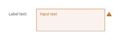
 text-area-variants-warning-icon.png (image/png)
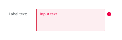
 text-area-variants-error-icon.png (image/png)
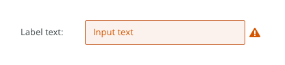
 text-input-variants-warning-icon.png (image/png)
 text-area-density-small.png (image/png)
 text-area-density-default.png (image/png)
 text-input-density-small.png (image/png)
 text-area-state-focus.png (image/png)
 text-area-state-readonly.png (image/png)
 text-area-state-disabled.png (image/png)
 text-area-state-selected.png (image/png)
 text-area-label-horizontal.png (image/png)
 text-area-style.png (image/png)
 text-area-validation.png (image/png)
 text-area-label-vertical.png (image/png)
 text-area-anatomy.png (image/png)
 textarea@2x.png (image/png)
 textarea-style@2x.png (image/png)
 image2020-10-26_13-26-26.png (image/png)
 image2020-10-26_13-24-0.png (image/png)
 image2020-10-26_13-22-55.png (image/png)
 image2020-10-26_13-22-16.png (image/png)
 image2020-10-26_13-21-57.png (image/png)
 image2020-10-23_15-38-49.png (image/png)
 image2020-10-2_14-42-44.png (image/png)
 image2020-10-2_14-25-33.png (image/png)
 image2020-10-2_14-25-18.png (image/png)
 image2020-10-2_14-34-9.png (image/png)
 image2020-10-2_14-33-47.png (image/png)
 image2020-10-2_14-21-26.png (image/png)
 image2020-10-2_14-20-58.png (image/png)
 image2020-10-2_14-21-11.png (image/png)
 image2020-10-2_14-20-45.png (image/png)
 image2020-10-5_11-37-46.png (image/png)
 image2020-10-5_10-55-2.png (image/png)
 image2020-10-5_10-54-40.png (image/png)
 image2020-10-5_10-54-33.png (image/png)
 image2020-10-5_10-53-29.png (image/png)
 image2020-10-5_10-52-58.png (image/png)
 image2020-10-2_13-46-8.png (image/png)
 image2020-10-2_13-45-41.png (image/png)
 image2020-10-2_15-23-33.png (image/png)
 image2020-10-5_10-26-47.png (image/png)
 image2020-10-5_10-26-24.png (image/png)
 image2020-10-5_10-25-57.png (image/png)
 image2020-10-5_10-17-0.png (image/png)
 context-menu-anatomy.png (image/png)
Context-menu-variants-with-title.png (image/png)
Context-menu-variants-with-group-header.png (image/png)
context-menu-content.png (image/png)
context-menu-group-spacing.png (image/png)
context-menu-anatomy.png (image/png)
Context-menu-variants-with-title.png (image/png)
Context-menu-variants-with-group-header.png (image/png)
context-menu-content.png (image/png)
context-menu-group-spacing.png (image/png)
 context-menu-group-spacing.png (image/png)
image2021-5-10_13-22-42.png (image/png)
context-menu-group-spacing.png (image/png)
image2021-5-10_13-22-42.png (image/png)
 image2021-5-11_11-39-46.png (image/png)
 image2021-5-13_8-52-55.png (image/png)
 image2021-6-2_13-24-43.png (image/png)
 image2021-6-2_13-24-56.png (image/png)
 image2021-6-2_13-50-30.png (image/png)
 image2021-6-2_13-51-23.png (image/png)
 image2021-6-8_15-38-22.png (image/png)
image2021-6-9_13-4-17.png (image/png)
image2021-6-8_15-38-22.png (image/png)
image2021-6-9_13-4-17.png (image/png)
 image2021-6-10_10-55-40.png (image/png)
image2021-6-15_14-51-51.png (image/png)
image2021-6-10_10-55-40.png (image/png)
image2021-6-15_14-51-51.png (image/png)