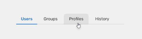
Tabs are used to segregate information into logical sections and allow users to navigate easily between views within the same context.
Component Status
 Design kit: RELEASED
 Bobwai Component: bobwai–tab RELEASED
Usage
Use tabs
- to navigate between views within the same context,
- to segregate large amount data which are related to each other,
for hierarchical structures - segregate data to smaller subcategories the user can navigate through.

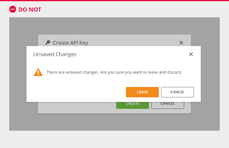
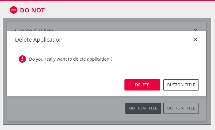
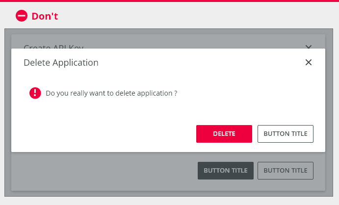
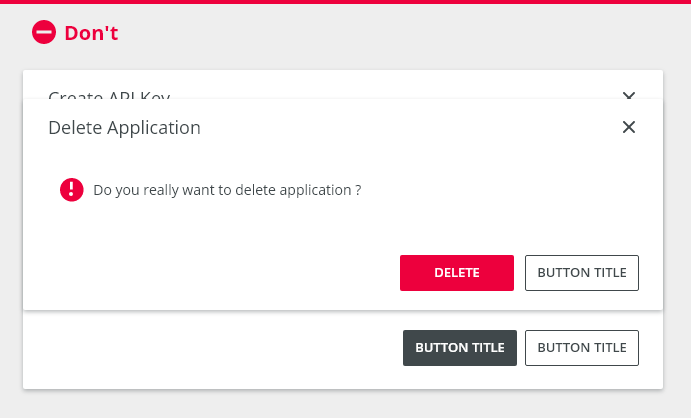
Do NOT use tabs
- for different topics which might not be related,
- to navigate to separate view/page which might or might not be related to the current view,
- for sequential content which requires users to go step-by-step or to follow a specific path.
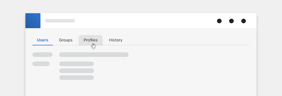
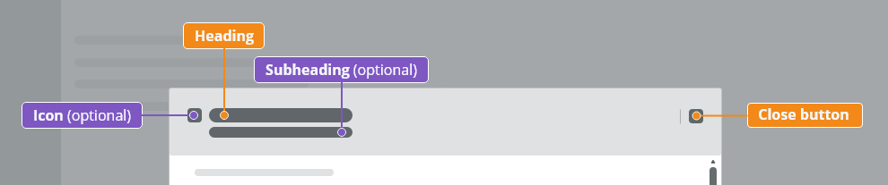
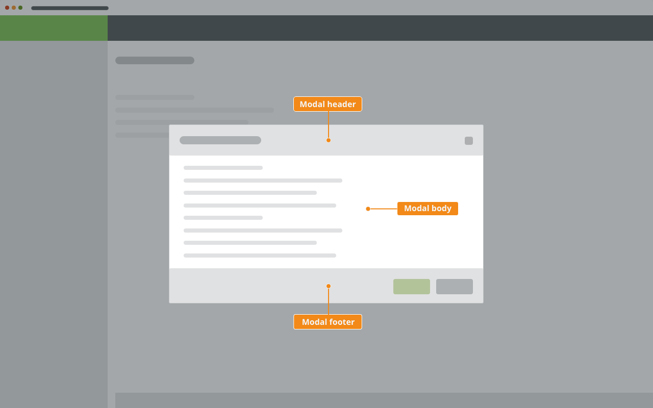
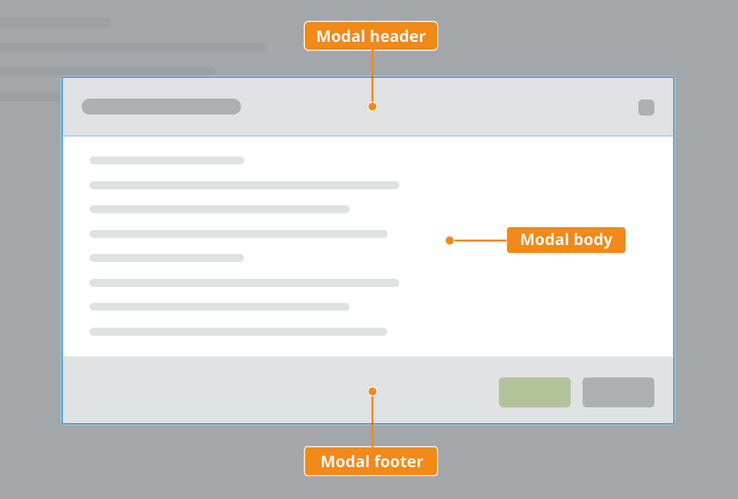
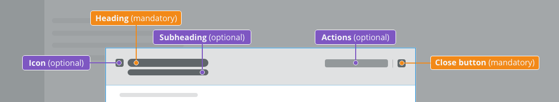
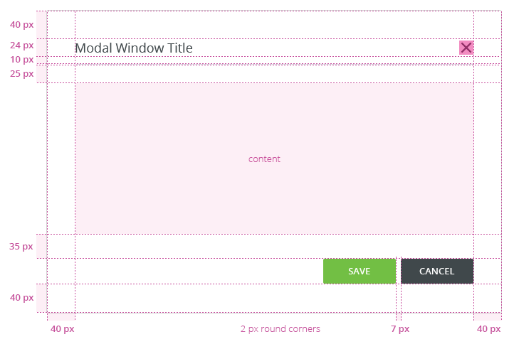
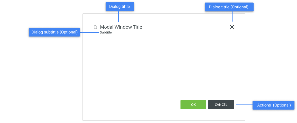
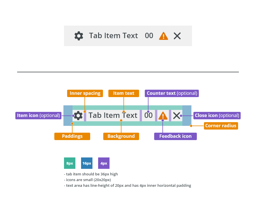
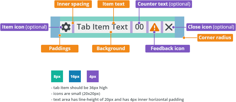
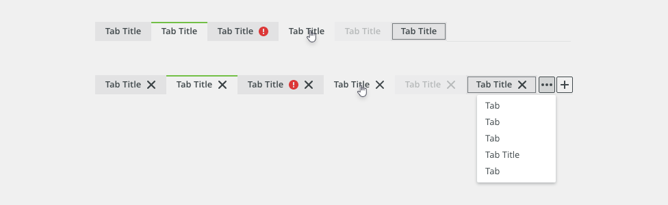
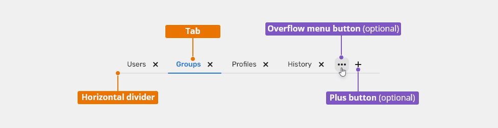
Anatomy
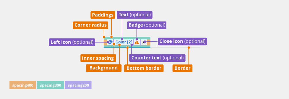
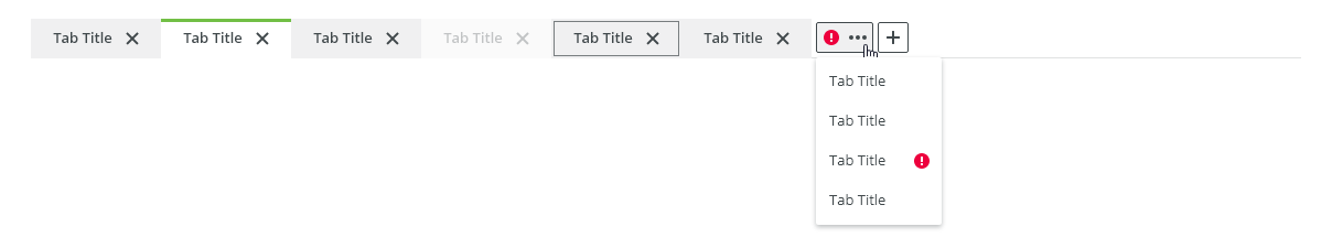
Tabs

- Tab - Can contain a number or an icon, longer text is truncated by ellipsis and full value is displayed in a tooltip on hover.
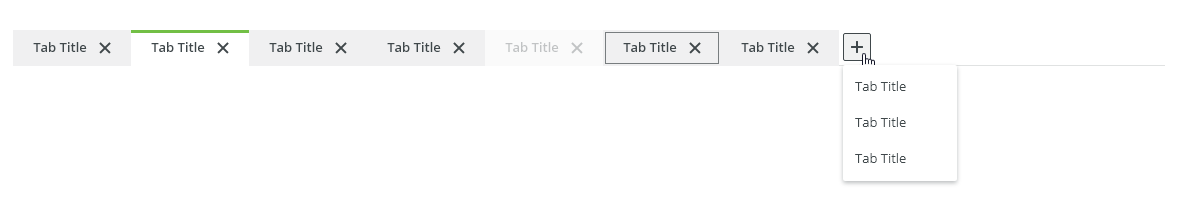
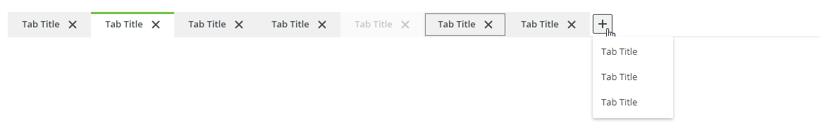
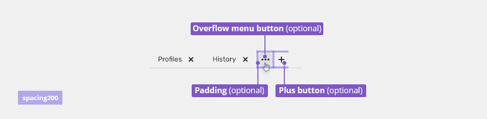
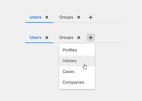
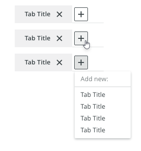
- Plus button (optional) - Adds an additional tab.
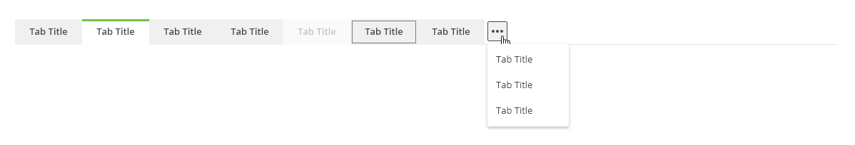
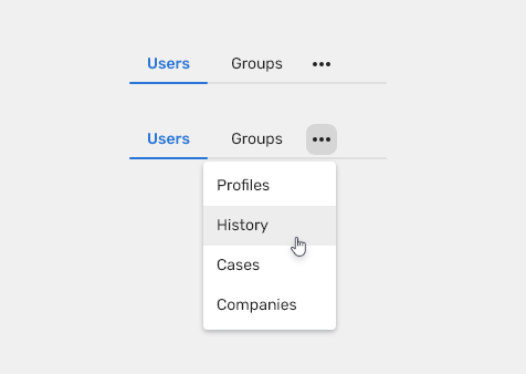
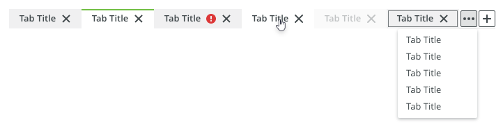
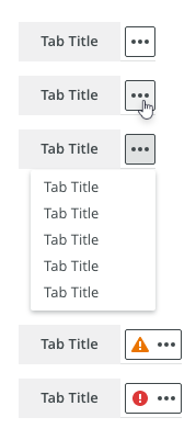
- Overflow menu button (optional) - When there is not enough space for all tabs, they will be displayed in a list invoked by this button.
- Horizontal divider- Horizontal line dividing tabs from the content, leads to the end of the content.
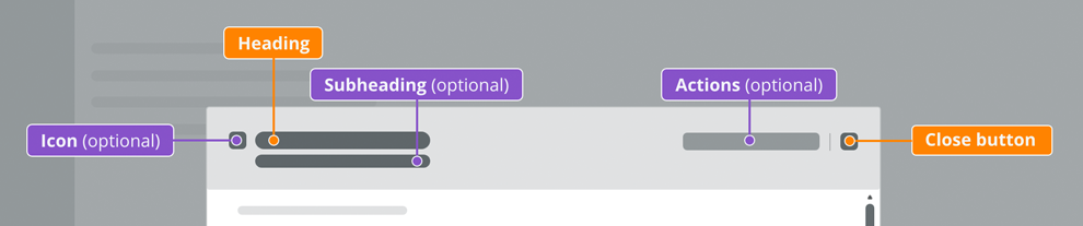
Tab
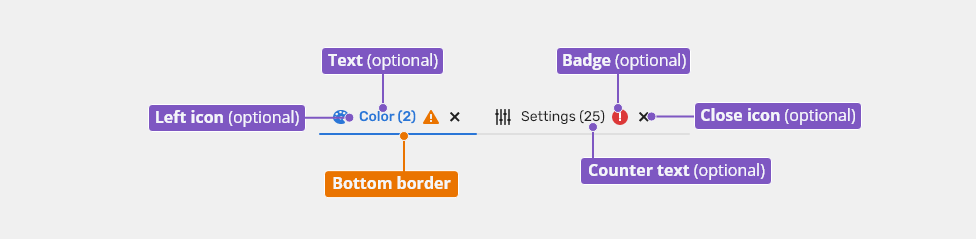
- Left icon (optional) - to be used on condensed spaces - icons represents visually content of the tab.
- Text (optional) - to be used by default, shortly describes content of the tab.
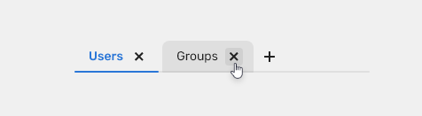
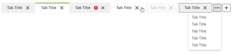
- Close icon (optional) - to be used on removable tab variants only.
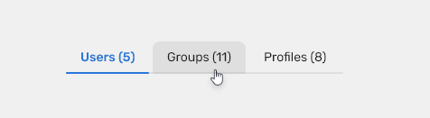
- Counter text (optional) - displays number of items (of table or list) inside the tab
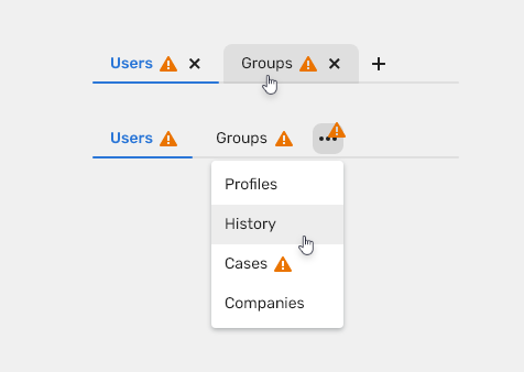
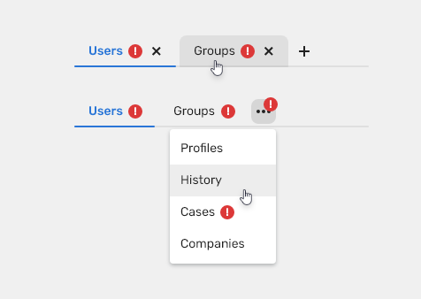
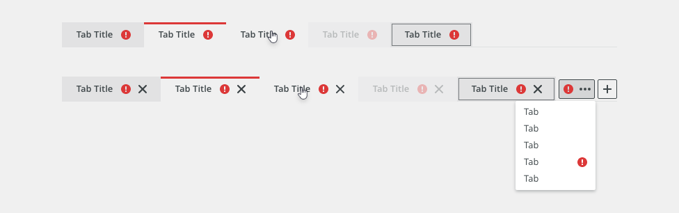
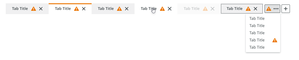
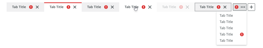
- Badge (optional) - is displayed only in a case of problem inside the tab
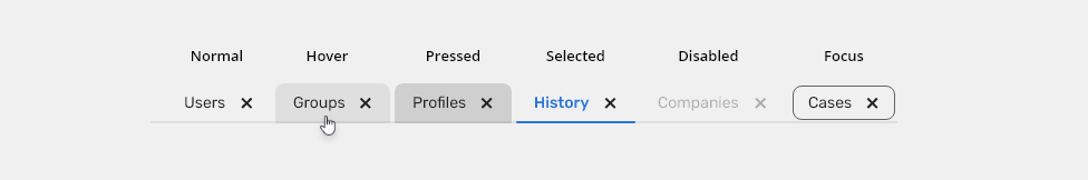
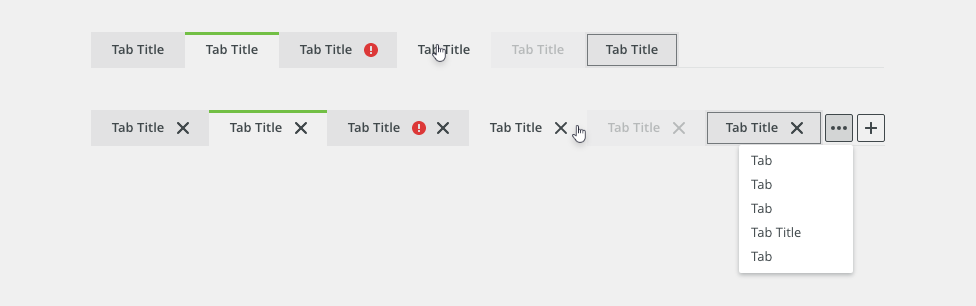
- Bottom border - helps to distinguish which tab is selected
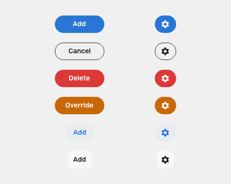
Variants
Default Tabs
Icon Only Tabs
Tabs With Counters
When tabs contain lists or tables where there is helpful to know amounts of items, the counters can be used.
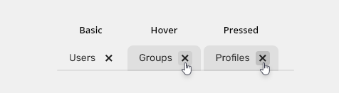
Removable Tabs
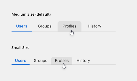
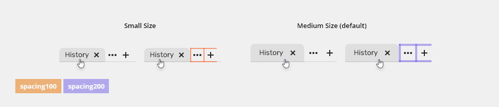
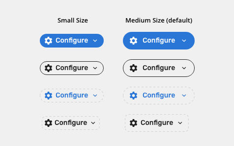
Tab Sizes
- Medium – default size
- Small – condensed variants (Technical applications, e.g. Scaler.)
Tabs Construction
Use Stack component to align each tab next to each other.
Tabs Behaviors
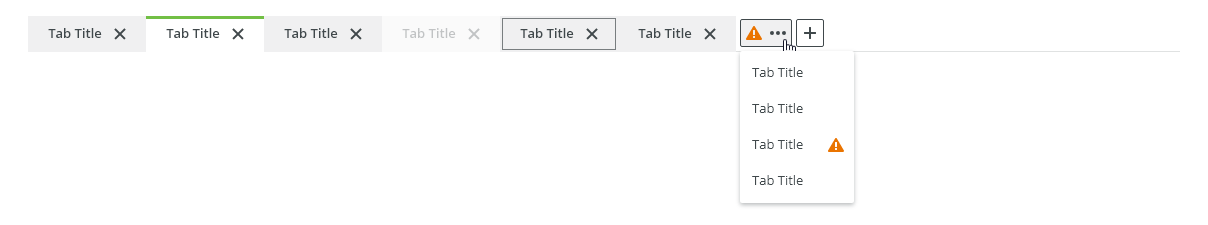
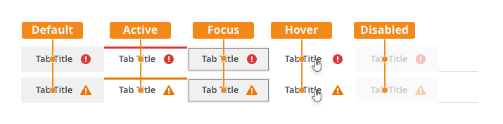
Warning
Use warning badges to indicate a higher level of urgency and importance.
Error
Use error to inform users about issues.
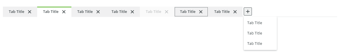
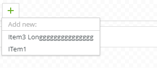
Adding Tabs (optional)
New tab can be added via the plus button.

Deleting Tabs (optional)
Tabs can be deleted via "X" icon on tab.

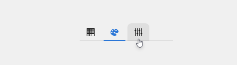
Overflow (optional)
If the tabs are longer than the parent element, tabs can be hidden in an overflow menu, triggered by a button or a keyboard key: <Enter> or <Space>.

Keyboard Interaction
| Tab | Initial focus is on the first tab. If the tabs component is already in focus, it moves focus to the next element which is the first element that accepts a user input in the page tab sequence. |
| Left Arrow | Moves focus to the previous tab item. If the focus is on the first tab item, it moves focus to the last tab item. |
| Right Arrow | Moves focus to the next tab item. If the focus is on the last tab item, it moves focus to the first tab item. |
| Space or Enter | Activates the tab item in focus. |
| Delete (optional) | When deletion is allowed, <Delete> closes the currently activated tab item. If any tab items remain, it moves the focus to the tab item following one that was closed. |
Related Components
Style
Tab Elements
Tab States

| Used In | Type | px | Token |
|---|---|---|---|
| Text color | Color | color-text-interactive-200 |
|
| Text font | Font | font-body |
|
| Close icon color | Color | color-icon-100 |
|
| Close icon size | Size | sizing-icon-200 |
|
| Background color | Color | color-bg-tab |
|
| Background corner radius - top left/right | Corner radius | 8 | radius-300 |
| Background corner radius - bottom left/right | Corner radius | 2 | radius-100 |
| Border width | Size | 2 | border-width-200 |
| Border color | Color | color-border-100 |
|
| Border opacity | Opacity | opacity-100 |
|
| Hover | |||
| Background color | Color | color-bg-tab-hover (1) |
|
| Pressed | |||
| Background color | Color | color-bg-tab-pressed |
|
| Selected | |||
| Background color | Color | color-bg-tab-selected |
|
| Text color | Color | color-text-interactive-300 |
|
| Bottom border width | Size | 2 | border-width-200 |
| Bottom border color | Color | color-border-500 |
|
| Disabled | |||
| Disabled (applied on the whole object) | Opacity | opacity-disabled |
|
| Focus | |||
| Focus border color | Color | color-focus-200 |
|
| Focus border width | Width | 1 | border-width-100 |
| Focus border corner radius | Corner radius | radius-button-200 |
|
| Focus inner spacing | Spacing | 2 | spacing-100 |
(1) Do not use hover style when the button is selected
Icon Tab States

| Used In | Type | px | Token |
|---|---|---|---|
| Icon color | Color | color-icon-100 |
|
| Icon size | Size | sizing-icon-200 |
|
| Background color | Color | color-bg-interactive-200 |
|
| Background corner radius - top left/right | Corner radius | 8 | radius-300 |
| Background corner radius - bottom left/right | Corner radius | 2 | radius-100 |
| Border width | Size | 2 | border-width-200 |
| Border color | Color | color-border-100 |
|
| Border opacity | Opacity | opacity-100 |
|
| Hover | |||
| Background color | Color | color-bg-interactive-200-hover (1) |
|
| Pressed | |||
| Background color | Color | color-bg-interactive-200-pressed |
|
| Selected | |||
| Background color | Color | color-bg-interactive-200 |
|
| Icon color | Color | color-icon-300 |
|
| Bottom border width | Size | 2 | border-width-200 |
| Bottom border color | Color | color-border-500 |
|
| Disabled | |||
| Disabled (applied on the whole object) | Opacity | opacity-disabled |
|
| Focus | |||
| Focus border color | Color | color-focus-200 |
|
| Focus border width | Width | 1 | border-width-100 |
| Focus border corner radius | Corner radius | radius-button-200 |
|
| Focus inner spacing | Spacing | 2 | spacing-100 |
(1) Do not use hover style when the button is selected
Overflow Menu Button and Plus Button

| Used In | Type | PX/Value | Token/Component |
|---|---|---|---|
| Overflow menu button | Toolbar button | 28 px | |
| Padding around buttons | Spacing | 4 px | spacing-200 |
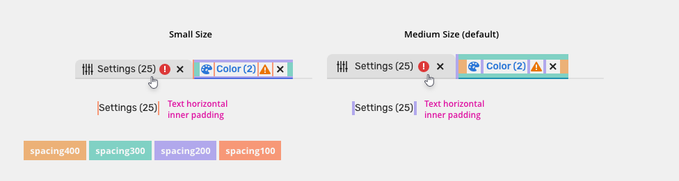
Spacing
Tabs
Max width of a text in tab is 160px.

| Used In | Type | px | Token |
|---|---|---|---|
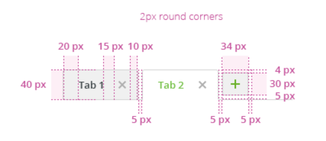
| Default left & right padding | Spacing | 12 | spacing-400 |
| Default top & bottom padding | Spacing | 8 | spacing-300 |
| Default size spacing between icons and text | Spacing | 4 | spacing-200 |
| Default padding between tabs | Spacing | 4 | spacing-200 |
| Condensed left & right padding | Spacing | 8 | spacing-300 |
| Condensed top & bottom padding | Spacing | 4 | spacing-200 |
| Condensed size spacing between icons and text | Spacing | 2 | spacing-100 |
| Condensed padding between tabs | Spacing | 2 | spacing-100 |
Overflow Menu Button and Plus Button

| Used In | Type | PX | Token |
|---|---|---|---|
| Default padding | Spacing | 4 | spacing-200 |
| Condensed padding | Spacing | 2 | spacing-100 |
Accessibility
Keyboard Activation
- Each tab must have a unique title that clearly describes tab panel content.
- Deciding When to Make Selection Automatically Follow Focus
- W3C WAI-ARIA Tab Design Pattern
Attachments:
 image2020-8-27_13-1-38.png (image/png)
 image2020-8-19_10-38-54.png (image/png)
 image2020-8-19_10-38-5.png (image/png)
 image2020-8-19_10-37-52.png (image/png)
 image2020-8-19_10-33-0.png (image/png)
 image2020-8-19_10-32-44.png (image/png)
 image2020-8-19_10-32-20.png (image/png)
 image2020-8-19_10-31-48.png (image/png)
 image2020-8-19_10-18-55.png (image/png)
 image2020-8-19_10-18-38.png (image/png)
 image2020-8-19_10-18-0.png (image/png)
 image2020-8-19_10-17-24.png (image/png)
 image2020-8-18_15-24-59.png (image/png)
 image2020-8-14_10-49-41.png (image/png)
image2020-8-14_10-41-45.png (image/png)
image2020-8-17_10-38-52.png (image/png)
image2020-8-14_10-49-41.png (image/png)
image2020-8-14_10-41-45.png (image/png)
image2020-8-17_10-38-52.png (image/png)
 image2020-8-13_13-0-18.png (image/png)
 image2020-8-13_12-58-8.png (image/png)
 image2020-8-11_10-49-57.png (image/png)
 image2020-8-11_10-47-25.png (image/png)
 image2020-8-11_10-44-38.png (image/png)
 image2020-8-4_11-31-34.png (image/png)
 image2020-8-4_10-9-3.png (image/png)
 image2020-8-4_9-25-6.png (image/png)
 image2020-8-4_9-24-45.png (image/png)
 image2020-8-4_9-21-16.png (image/png)
 image2020-8-3_17-5-59.png (image/png)
 image2020-8-3_17-2-25.png (image/png)
 image2020-8-3_16-57-14.png (image/png)
 image2020-8-3_16-54-54.png (image/png)
 image2020-8-3_16-54-22.png (image/png)
 image2020-8-3_14-52-49.png (image/png)
 image2020-8-3_14-47-17.png (image/png)
 image2020-8-3_13-27-16.png (image/png)
 image2020-8-3_13-26-47.png (image/png)
 image2020-8-3_13-22-30.png (image/png)
 image2020-8-3_13-21-4.png (image/png)
 image2020-8-3_13-17-23.png (image/png)
 image2020-8-3_12-58-6.png (image/png)
 image2020-8-3_12-57-45.png (image/png)
 DONT.png (image/png)
 DO.png (image/png)
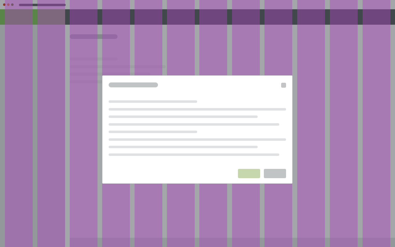
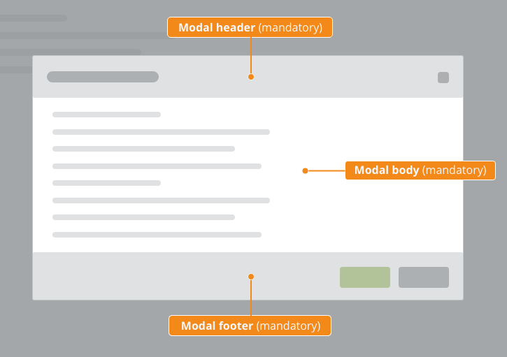
 Modal Dialog - parts.png (image/png)
 modal-footer.png (image/png)
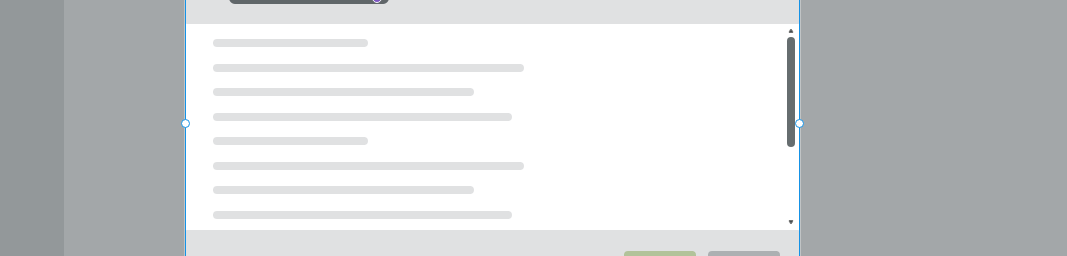
 modal-body.png (image/png)
 modal-header.png (image/png)
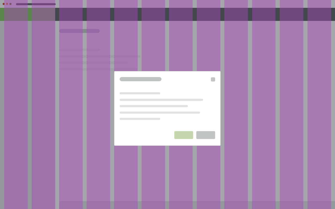
 Modal Dialog - paddings condensed.png (image/png)
 footer.png (image/png)
 Screenshot 2019-11-22 at 10.50.04.png (image/png)
 Mockup_basic – 8.png (image/png)
 Mockup_basic – 7.png (image/png)
 Mockup_basic – 6.png (image/png)
 Mockup_basic – 5.png (image/png)
 Mockup_basic – 4.png (image/png)
 Mockup_basic – 3.png (image/png)
 Screenshot 2019-11-21 at 10.48.26.png (image/png)
 Screenshot 2019-11-21 at 10.45.52.png (image/png)
 Screenshot 2019-11-21 at 10.44.57.png (image/png)
 Screenshot 2019-11-21 at 10.44.15.png (image/png)
 Screenshot 2019-11-21 at 10.40.03.png (image/png)
 Screenshot 2019-11-21 at 09.32.39.png (image/png)
 Screenshot 2019-11-21 at 09.28.07.png (image/png)
 image2019-11-18_10-16-18.png (image/png)
 image2019-11-18_9-19-21.png (image/png)
 Group 4.png (image/png)
 image2019-11-14_12-49-47.png (image/png)
 image2020-8-28_10-30-11.png (image/png)
 image2020-8-28_10-31-42.png (image/png)
 image2020-8-28_10-32-10.png (image/png)
 image2020-8-28_10-34-55.png (image/png)
 image2020-8-28_10-35-33.png (image/png)
 image2020-8-28_10-50-45.png (image/png)
 image2020-8-28_10-51-19.png (image/png)
 image2020-8-28_10-52-14.png (image/png)
 image2020-8-31_13-15-17.png (image/png)
 image2020-9-2_9-56-49.png (image/png)
 image2020-9-2_11-39-23.png (image/png)
 image2020-9-2_11-57-2.png (image/png)
 image2020-9-2_13-29-38.png (image/png)
 image2020-9-2_13-48-23.png (image/png)
 tabs-anatomy.png (image/png)
 tabs-anatomy.png (image/png)
 tab-content.png (image/png)
 tab-sizes.png (image/png)
 tabs-states.png (image/png)
 tab-buttons-content.png (image/png)
 tab-button-sizes.png (image/png)
 tab-button-sizes.png (image/png)
 tabs-error-warning.png (image/png)
 tabs-anatomy.png (image/png)
 tabs-warning.png (image/png)
 tabs-error.png (image/png)
 Tabs-density-default.png (image/png)
 Tabs-density-condensed.png (image/png)
 Tabs-button-add.png (image/png)
 Tabs-button-more.png (image/png)
 Tabs-delete-icon.png (image/png)
 tab-content.png (image/png)
 tab-sizes.png (image/png)
 tab-buttons-content.png (image/png)
 tab-button-sizes.png (image/png)
 tabs-states.png (image/png)
 tabs-error-warning.png (image/png)
 tabs-anatomy.png (image/png)
 tabs-warning.png (image/png)
 tabs-error.png (image/png)
 Tabs-density-default.png (image/png)
 Tabs-density-condensed.png (image/png)
 Tabs-button-add.png (image/png)
 Tabs-button-more.png (image/png)
 image2020-9-22_10-31-43.png (image/png)
 image2020-9-22_10-32-13.png (image/png)
 image2020-9-22_10-33-36.png (image/png)
 image2020-9-22_10-34-16.png (image/png)
 image2020-10-8_9-59-42.png (image/png)
 image2020-10-8_10-1-15.png (image/png)
 tabs-anatomy.png (image/png)
 Tabs-density-default.png (image/png)
 Tabs-density-condensed.png (image/png)
 tabs-warning.png (image/png)
 tabs-error.png (image/png)
 Tabs-button-add.png (image/png)
 Tabs-delete-icon.png (image/png)
 Tabs-button-more.png (image/png)
 tab-content.png (image/png)
 image2020-12-1_10-57-14.png (image/png)
image2020-12-1_10-59-46.png (image/png)
tabs-title.png (image/png)
tabs-anatomy.png (image/png)
image2020-12-1_10-57-14.png (image/png)
image2020-12-1_10-59-46.png (image/png)
tabs-title.png (image/png)
tabs-anatomy.png (image/png)
 tab-anatomy.png (image/png)
 tab-anatomy.png (image/png)
tabs-anatomy.png (image/png)
list-variant–default.png (image/png)
tab-anatomy.png (image/png)
tabs-anatomy.png (image/png)
list-variant–default.png (image/png)
 Text-tabs.png (image/png)
Icon-only-tabs.png (image/png)
Tabs-with-counter.png (image/png)
Erasable-tabs.png (image/png)
button-sizes.png (image/png)
Text-tabs.png (image/png)
Icon-only-tabs.png (image/png)
Tabs-with-counter.png (image/png)
Erasable-tabs.png (image/png)
button-sizes.png (image/png)
 Tabs-sizes.png (image/png)
button-behavior-minimum.png (image/png)
Tabs-sizes.png (image/png)
button-behavior-minimum.png (image/png)
 Tabs-warning-badge.png (image/png)
Tabs-error-badge.png (image/png)
Tabs-button-add.png (image/png)
Tabs-delete-icon.png (image/png)
Tabs-button-more.png (image/png)
tab-content.png (image/png)
Tabs-warning-badge.png (image/png)
Tabs-error-badge.png (image/png)
Tabs-button-add.png (image/png)
Tabs-delete-icon.png (image/png)
Tabs-button-more.png (image/png)
tab-content.png (image/png)
 tabs-states.png (image/png)
 tabs-states.png (image/png)
icon-tabs-states.png (image/png)
tab-buttons-content.png (image/png)
tab-sizes.png (image/png)
tabs-states.png (image/png)
icon-tabs-states.png (image/png)
tab-buttons-content.png (image/png)
tab-sizes.png (image/png)
 tab-button-sizes.png (image/png)
tab-content.png (image/png)
tab-sizes.png (image/png)
tab-button-sizes.png (image/png)
tab-content.png (image/png)
tab-sizes.png (image/png)