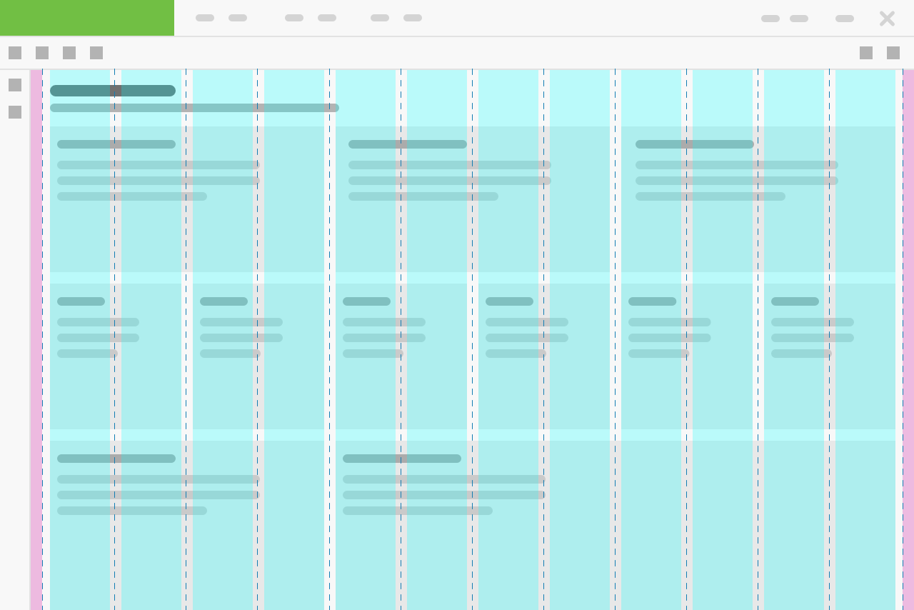
A stack is an abstract layout component which implements a flexbox to easily arrange its children components together with a defined space between them.
Component Status
 Design Kit: NOT RELEASED
 Bobwai component: bobwai--columns RELEASED

Usage
A stack is an abstract component for creating one-dimensional layouts which implements a flexbox to easily arrange its children components together with a defined space between them.

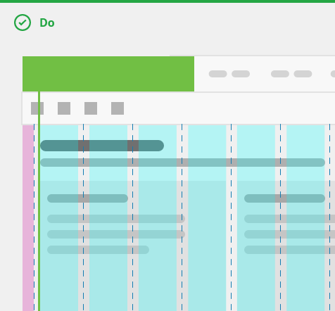
Use a stack
- for small layout to arrange components to a row which can wrap on small screen widths,
- to vertically center elements.

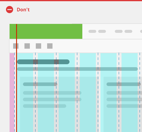
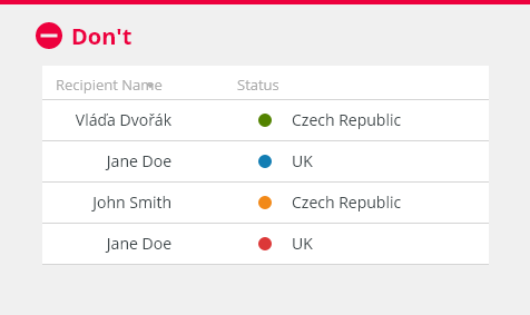
Do NOT use a stack
- for complex or unique arrangements of components,
- for page layouts.
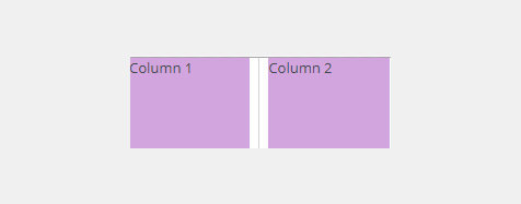
Stack (Flexbox) vs Grid
Stack (flexbox) is used for one dimensional layout, either a row or a column.
Grid is used for two-dimensional layouts, rows and columns at the same time.
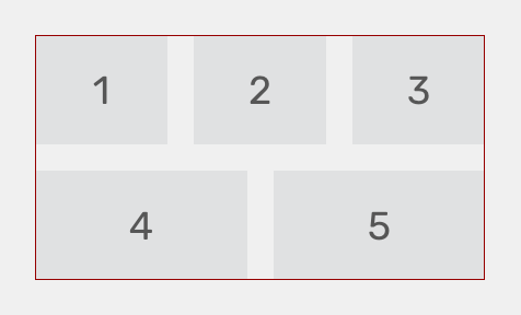
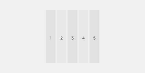
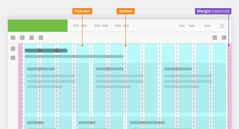
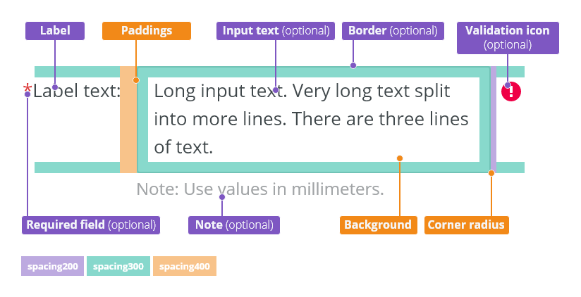
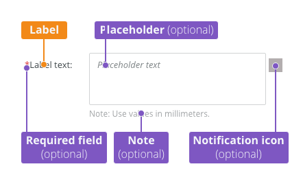
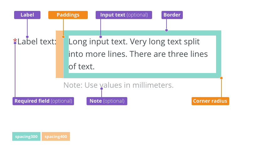
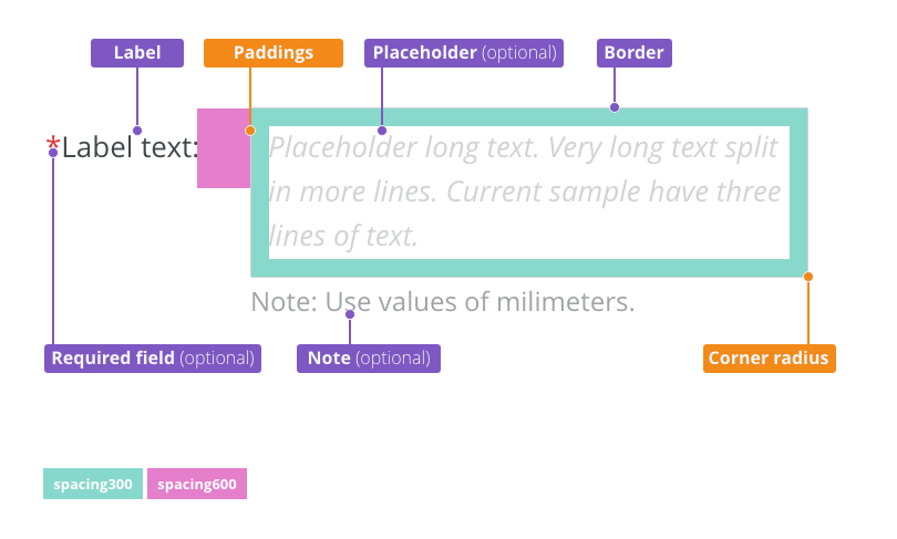
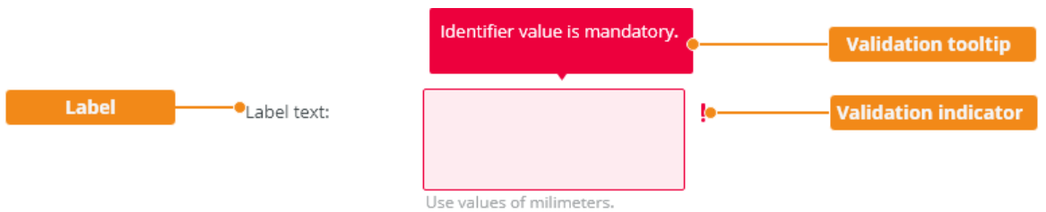
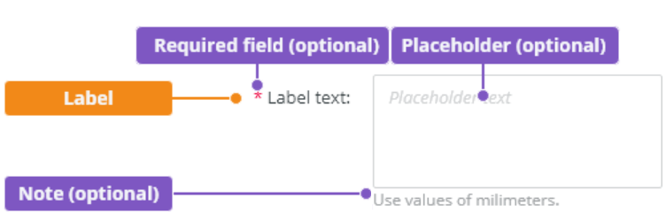
Anatomy

- Item - Stack arranges items in a row or a column.
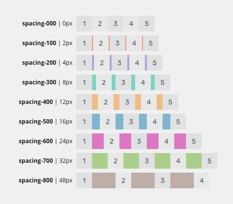
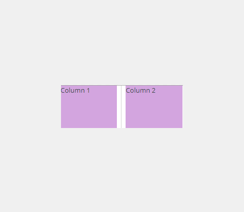
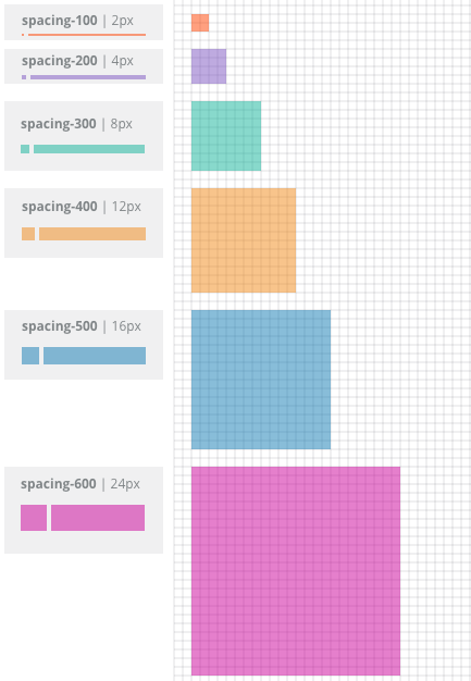
- Gutter - Gutters are the gaps between the items. Gutter widths are constant values (using predefined spacing tokens).
Directions
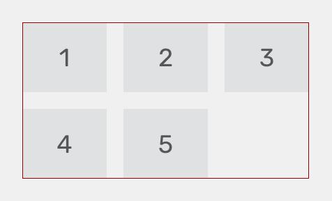
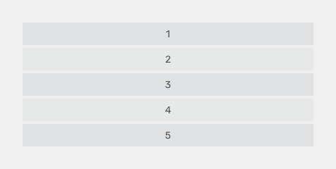
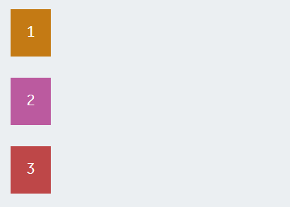
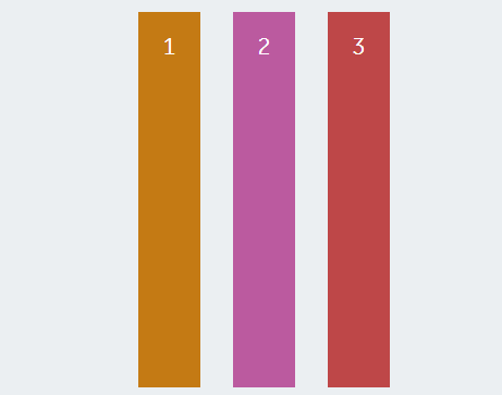
Vertical Stack (Column) - Default

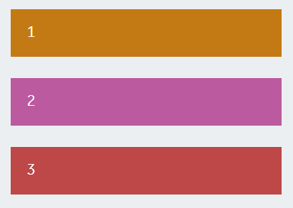
Horizontal Stack (Row)
Stack arranges items horizontally in a row.

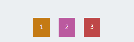
Spacing
Spacing helps arranging items side by side or below each other evenly.
Justify
Left - Default
Default horizontal alignment.

Center

Right

Vertical Alignment
Top - Default
Default vertical alignment.

Middle

Bottom

Stretch
Vertical
Recommended to use in list menus, dropdowns, side navigation.
Horizontal
Separator (Optional)
Adds dividers between stacked elements.

Nesting
Stacks can be nested inside one another to configure the layout of the application.

Examples
Toolbar - Vertical vs Horizontal

Style

| Used In | Type | px | Token |
|---|---|---|---|
| Separator | Color | color-border-300 (default) color-border-200 |
|
| Separator | Width | 1 | border-width-100 |
Attachments:
 image2021-1-29_11-13-25.png (image/png)
 image2021-1-29_11-13-13.png (image/png)
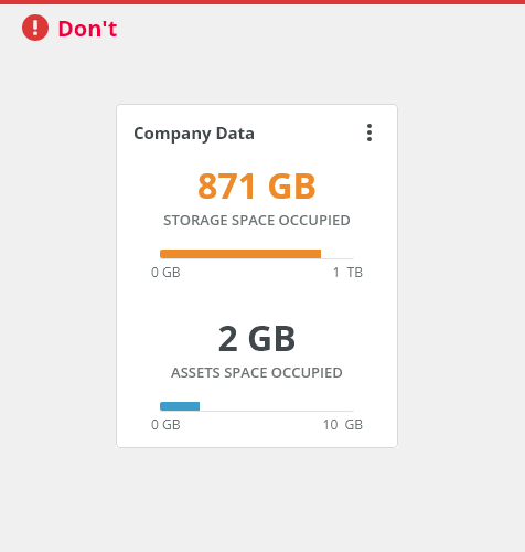
 Card - DONT.png (image/png)
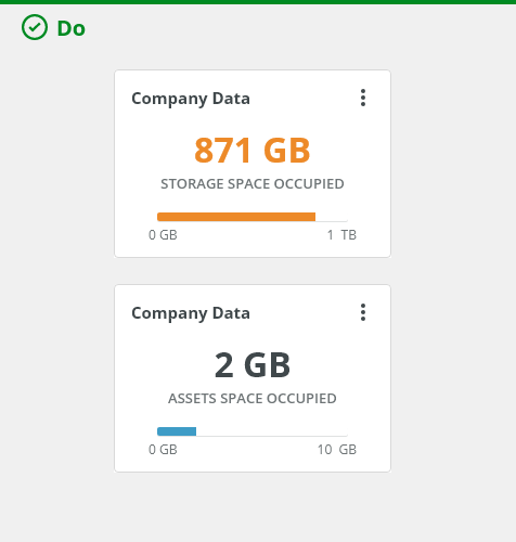
 Card - DO.png (image/png)
 image2021-1-28_18-8-24.png (image/png)
 image2021-1-28_18-8-10.png (image/png)
 image2021-1-28_18-6-19.png (image/png)
 image2021-1-28_18-5-54.png (image/png)
 image2021-1-13_12-48-55.png (image/png)
 image2021-1-11_15-14-23.png (image/png)
 device-large-desktop.png (image/png)
 device-notebook.png (image/png)
 device-desktop.png (image/png)
 device-smartphone.png (image/png)
 image2020-9-30_13-13-53.png (image/png)
 Layout-example-dashboard – 3.png (image/png)
 Layout-example-dashboard – 1.png (image/png)
 Layout-example-dashboard – 2.png (image/png)
 Grid-offset-layouts.png (image/png)
 grid-anatomy.png (image/png)
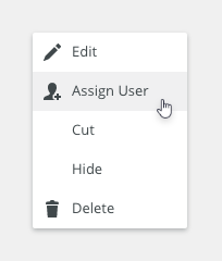
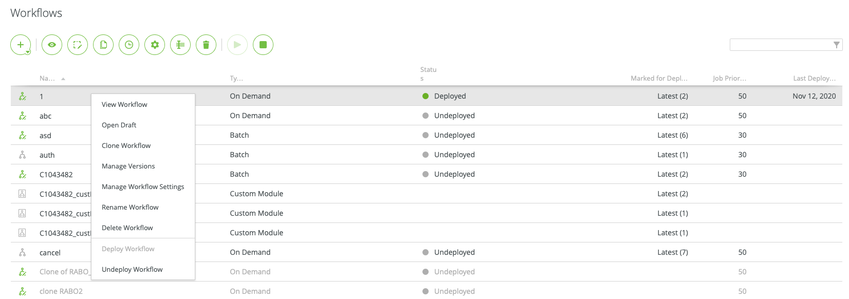
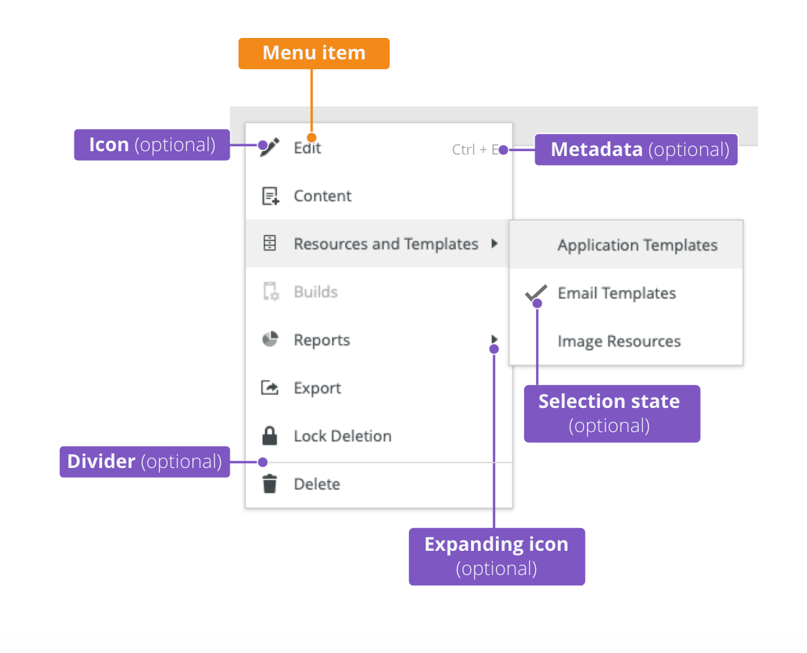
 Context-menu-dont-groups.png (image/png)
 Context-menu-do-groups.png (image/png)
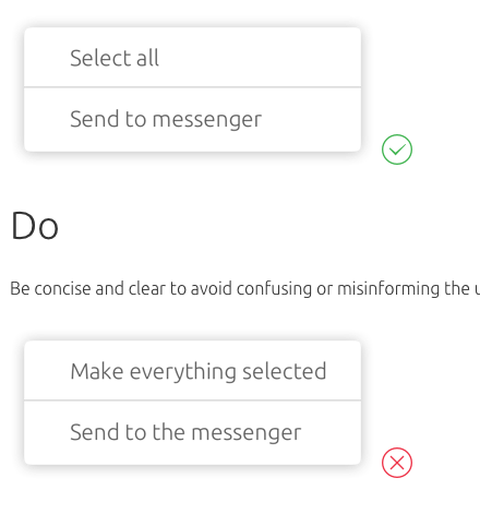
 Context-menu-dont-short.png (image/png)
 Context-menu-do-short.png (image/png)
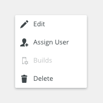
 Context-menu-states-disabled.png (image/png)
 Context-menu-groups.png (image/png)
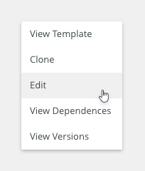
 Context-menu-variants-with-title.png (image/png)
 Context-menu-variants-text-icons.png (image/png)
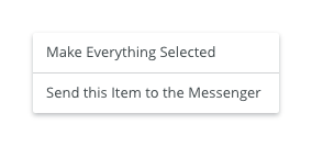
 Context-menu-variants-text-only.png (image/png)
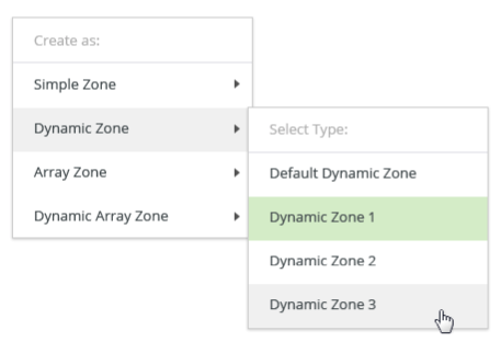
 Context-menu-type-multilevel.png (image/png)
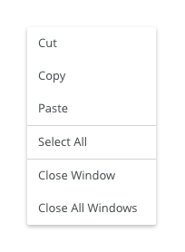
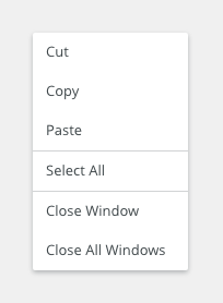
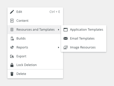 Context-menu-type-basic.png (image/png)
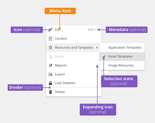
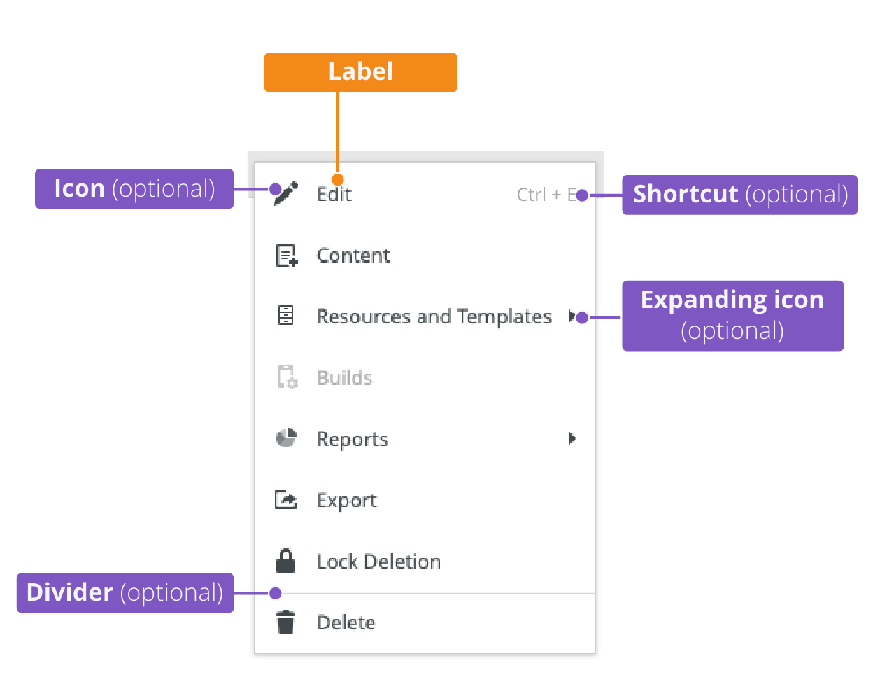
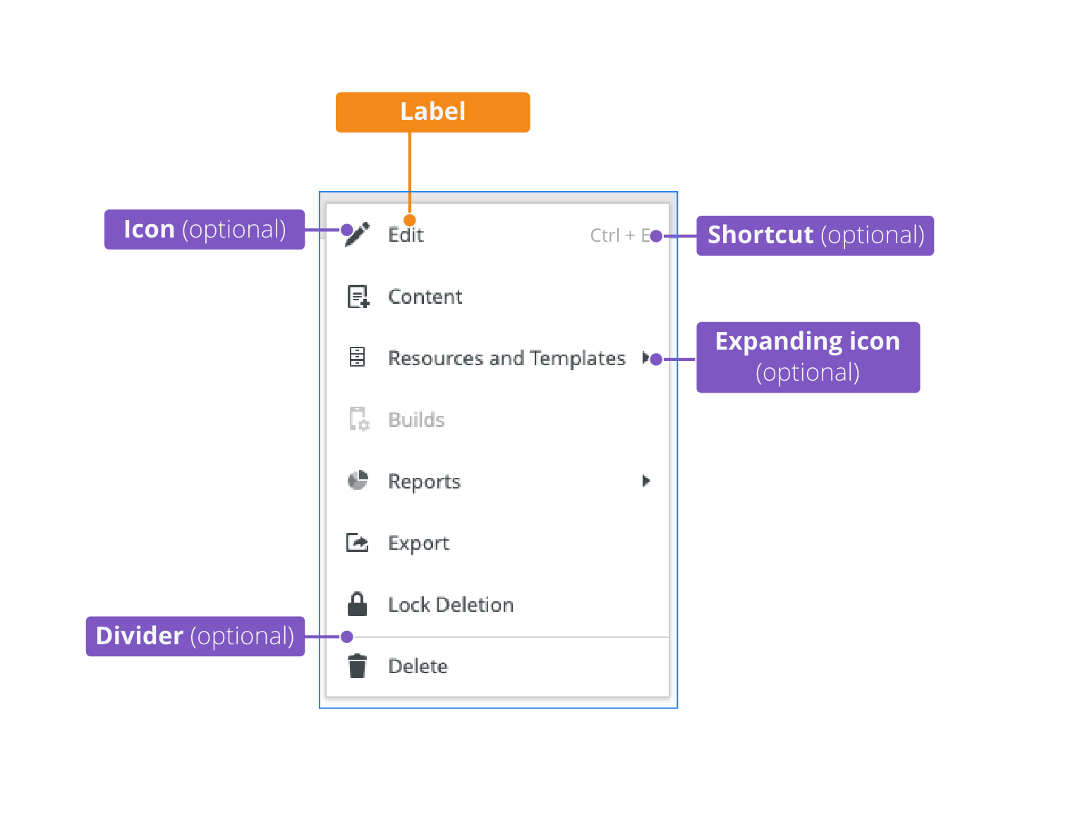
 context-menu-anatomy.png (image/png)
 Screenshot 2020-11-20 at 14.27.17.png (image/png)
 Screenshot 2020-11-19 at 09.57.10.png (image/png)
 Screenshot 2020-11-18 at 13.08.05.png (image/png)
 Screenshot 2020-11-18 at 13.08.21.png (image/png)
 Screenshot 2020-11-19 at 08.14.34.png (image/png)
 Screenshot 2020-11-19 at 08.14.25.png (image/png)
 Screenshot 2020-11-16 at 13.53.55.png (image/png)
 Screenshot 2020-11-18 at 13.22.39.png (image/png)
 Screenshot 2020-11-18 at 13.11.11.png (image/png)
 Screenshot 2020-11-18 at 12.49.34.png (image/png)
 Screenshot 2020-11-16 at 15.22.41.png (image/png)
 Screenshot 2020-11-16 at 15.19.01.png (image/png)
 Screenshot 2020-11-16 at 15.09.35.png (image/png)
 Screenshot 2020-11-16 at 14.58.54.png (image/png)
 Screenshot 2020-11-16 at 15.01.07.png (image/png)
 image2020-11-2_9-26-30.png (image/png)
 image2020-11-2_9-26-14.png (image/png)
 image2020-11-2_9-24-56.png (image/png)
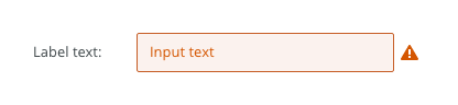
 text-area-variants-warning-icon.png (image/png)
 text-area-variants-error-icon.png (image/png)
 text-input-variants-warning-icon.png (image/png)
 text-area-density-small.png (image/png)
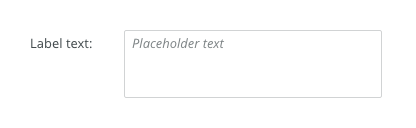 text-area-density-default.png (image/png)
 text-input-density-small.png (image/png)
 text-area-state-focus.png (image/png)
 text-area-state-readonly.png (image/png)
 text-area-state-disabled.png (image/png)
 text-area-state-selected.png (image/png)
 text-area-label-horizontal.png (image/png)
 text-area-style.png (image/png)
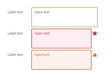
 text-area-validation.png (image/png)
 text-area-label-vertical.png (image/png)
 text-area-anatomy.png (image/png)
 textarea@2x.png (image/png)
 textarea-style@2x.png (image/png)
 image2020-10-26_13-26-26.png (image/png)
 image2020-10-26_13-24-0.png (image/png)
 image2020-10-26_13-22-55.png (image/png)
 image2020-10-26_13-22-16.png (image/png)
 image2020-10-26_13-21-57.png (image/png)
 image2020-10-23_15-38-49.png (image/png)
 image2020-10-2_14-42-44.png (image/png)
 image2020-10-2_14-25-33.png (image/png)
 image2020-10-2_14-25-18.png (image/png)
 image2020-10-2_14-34-9.png (image/png)
 image2020-10-2_14-33-47.png (image/png)
 image2020-10-2_14-21-26.png (image/png)
 image2020-10-2_14-20-58.png (image/png)
 image2020-10-2_14-21-11.png (image/png)
 image2020-10-2_14-20-45.png (image/png)
 image2020-10-5_11-37-46.png (image/png)
 image2020-10-5_10-55-2.png (image/png)
 image2020-10-5_10-54-40.png (image/png)
 image2020-10-5_10-54-33.png (image/png)
 image2020-10-5_10-53-29.png (image/png)
 image2020-10-5_10-52-58.png (image/png)
 image2020-10-2_13-46-8.png (image/png)
 image2020-10-2_13-45-41.png (image/png)
 image2020-10-2_15-23-33.png (image/png)
 image2020-10-5_10-26-47.png (image/png)
 image2020-10-5_10-26-24.png (image/png)
 image2020-10-5_10-25-57.png (image/png)
 image2020-10-5_10-17-0.png (image/png)
 image2020-11-27_9-53-18.png (image/png)
 image2020-11-27_10-59-3.png (image/png)
 image2020-11-27_12-13-3.png (image/png)
 image2020-11-27_12-20-20.png (image/png)
 image2020-11-27_12-24-3.png (image/png)
 image2020-11-27_15-3-39.png (image/png)
 image2020-11-27_15-4-12.png (image/png)
 image2020-11-27_15-14-27.png (image/png)
 image2020-11-27_15-19-14.png (image/png)
 image2020-11-27_15-46-5.png (image/png)
 image2020-11-30_14-3-56.png (image/png)
 image2020-11-30_14-8-32.png (image/png)
 image2020-11-30_14-17-56.png (image/png)
 image2020-11-30_14-32-1.png (image/png)
 image2020-12-1_10-56-37.png (image/png)
 image2020-12-1_10-57-14.png (image/png)
image2020-12-1_10-57-28.png (image/png)
image2020-12-1_10-57-14.png (image/png)
image2020-12-1_10-57-28.png (image/png)
 image2020-12-1_10-59-46.png (image/png)
image2019-11-22_12-49-3.png (image/png)
image2020-12-1_10-59-46.png (image/png)
image2019-11-22_12-49-3.png (image/png)
 image2020-10-20_14-36-2.png (image/png)
 image2019-11-22_12-53-40.png (image/png)
 image2020-12-21_9-41-3.png (image/png)
 image2020-12-21_10-6-52.png (image/png)
 image2020-12-21_10-12-35.png (image/png)
 image2020-12-21_10-16-58.png (image/png)
 image2020-12-21_10-17-7.png (image/png)
 image2020-12-21_10-17-18.png (image/png)
 image2019-11-22_13-37-58.png (image/png)
 image2019-11-22_9-40-18.png (image/png)
 image2020-12-9_10-17-2.png (image/png)
 image2020-12-30_8-47-39.png (image/png)
 image2020-12-30_8-57-28.png (image/png)
 image2020-12-30_8-58-33.png (image/png)
 image2020-12-30_9-0-47.png (image/png)
 image2020-12-30_9-0-57.png (image/png)
 image2020-12-30_9-1-9.png (image/png)
 image2020-12-30_9-20-27.png (image/png)
 image2020-12-30_9-20-55.png (image/png)
 image2020-12-30_9-21-34.png (image/png)
 image2020-12-30_9-22-0.png (image/png)
 image2020-12-30_9-23-12.png (image/png)
 image2020-12-30_10-53-14.png (image/png)
 image2020-12-30_10-53-21.png (image/png)
 image2020-12-30_10-53-40.png (image/png)
 image2020-12-30_10-54-2.png (image/png)
 image2020-12-30_10-54-13.png (image/png)
 image2020-12-30_10-54-24.png (image/png)
 image2021-3-15_14-6-9.png (image/png)
 image2021-3-15_14-17-7.png (image/png)
 image2021-3-15_14-20-49.png (image/png)
 image2021-3-15_14-21-12.png (image/png)
 image2021-3-15_14-21-37.png (image/png)
 image2021-3-15_14-24-4.png (image/png)
 image2021-3-15_14-26-57.png (image/png)
 image2021-3-15_14-27-24.png (image/png)
 image2021-3-15_14-31-39.png (image/png)
 image2021-3-15_14-32-26.png (image/png)
 image2021-3-15_14-32-50.png (image/png)
 image2021-3-15_14-33-42.png (image/png)
 image2021-3-15_14-34-11.png (image/png)
 image2021-4-16_9-24-38.png (image/png)
 Stack-title.png (image/png)
Stack-anatomy.png (image/png)
Stack-title.png (image/png)
Stack-anatomy.png (image/png)
 Stack-direction-vertical.png (image/png)
Stack-direction-horizontal.png (image/png)
Stack-spacing.png (image/png)
Stack-direction-vertical.png (image/png)
Stack-direction-horizontal.png (image/png)
Stack-spacing.png (image/png)
 Stack-spacing.png (image/png)
Stack-justify-left.png (image/png)
Stack-justify-center.png (image/png)
Stack-justify-right.png (image/png)
Stack-align-top.png (image/png)
Stack-align-middle.png (image/png)
Stack-align-bottom.png (image/png)
Stack-stretch-vertical.png (image/png)
Stack-stretch-horizontal.png (image/png)
Stack-dividers.png (image/png)
Toolbar-alignment-top-to-bottom.png (image/png)
Stack-spacing.png (image/png)
Stack-justify-left.png (image/png)
Stack-justify-center.png (image/png)
Stack-justify-right.png (image/png)
Stack-align-top.png (image/png)
Stack-align-middle.png (image/png)
Stack-align-bottom.png (image/png)
Stack-stretch-vertical.png (image/png)
Stack-stretch-horizontal.png (image/png)
Stack-dividers.png (image/png)
Toolbar-alignment-top-to-bottom.png (image/png)
 image2021-4-20_9-58-42.png (image/png)
 Stack-anatomy.png (image/png)
Stack-content.png (image/png)
Stack-flexbox.png (image/png)
Stack-grid.png (image/png)
image2021-6-2_10-52-11.png (image/png)
Stack-anatomy.png (image/png)
Stack-content.png (image/png)
Stack-flexbox.png (image/png)
Stack-grid.png (image/png)
image2021-6-2_10-52-11.png (image/png)