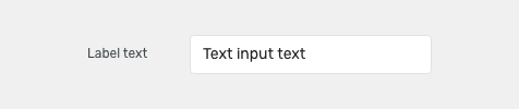
Text fields allow users to add short custom text entries.
Component Status
 Design Kit: RELEASED
 Bobwai component: bobwai--textbox RELEASED
Content Overview
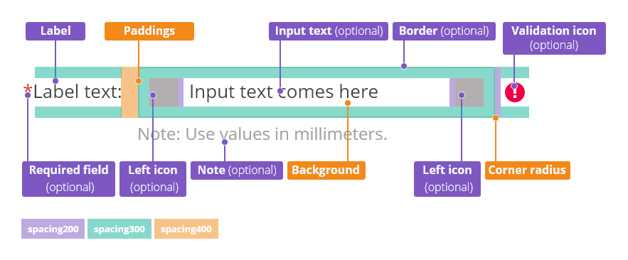
- Anatomy
- Label Position
- Types
- Default
- Password
- Variants
- Icons
- Density
- Behavior
- States
- Validation
- Responsivity
- Keyboard Interactions
- Editorial
- Related Components
Usage
For entering basic information (text or number), when the expected user input is a single line. Use the text area component for longer inputs.
Typically used within forms.
DO
Always use a label to describe a text field.
DO NOT
Do not use for longer inputs (multiple lines).
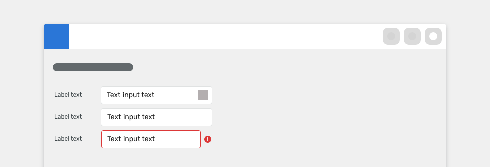
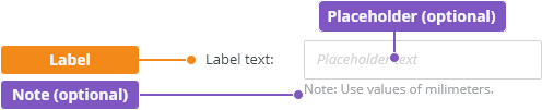
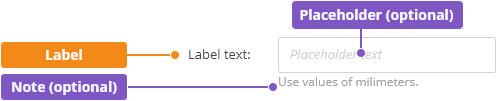
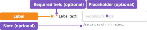
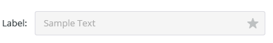
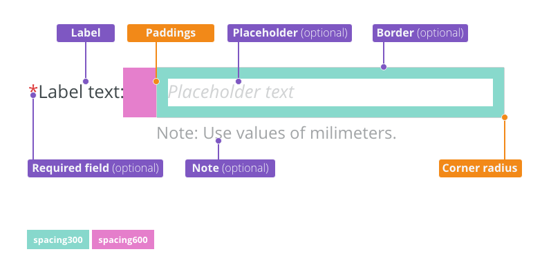
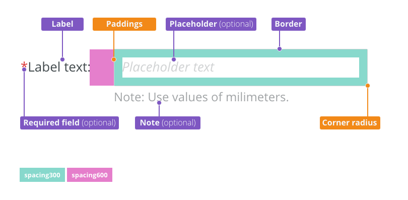
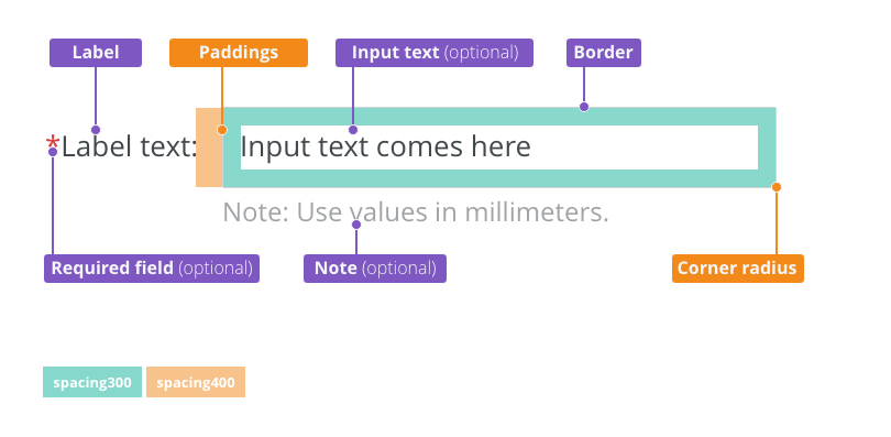
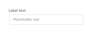
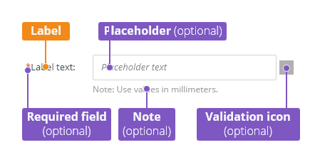
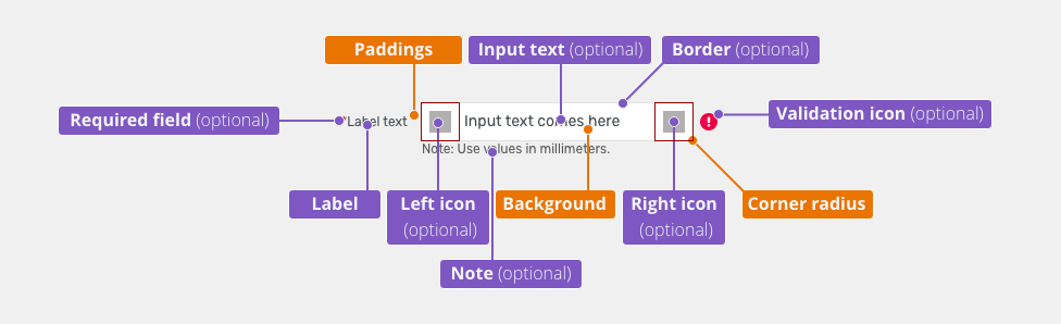
Anatomy

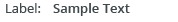
Label - Labels can be placed either on top or on the side of the field, depending on the alignment of the form.
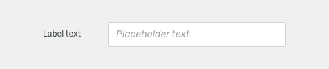
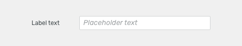
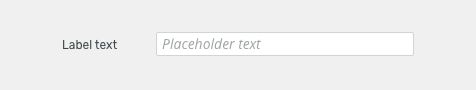
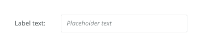
Placeholder (optional) - Is temporary and disappears once a user enters text.
Note (optional)
- Provides assistance on how to fill out a field. Used for essential information. Keep the text short and specific.
- Use hint for context or background information that is “nice to have".
Label Position
Labels can be placed either on top or on the side of the field.
Horizontal labels (default)
Most useful when the vertical space is limited.

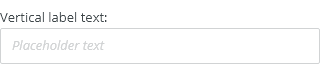
Vertical labels
Recommended for narrow spaces as panels or mobile devices.

Types
Default
-
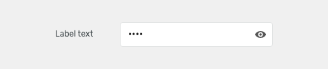
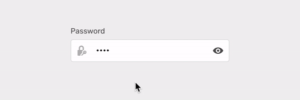
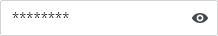
Password
Allows a user to enter or change the sensitive information.
Read more about Displaying and editing sensitive information.
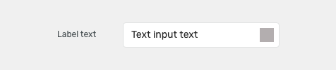
Variants
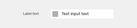
Icons
Left Icon
Left icon can be represented as:
- A basic icon with paddings - when it is not interactive icon
- Toolbar button - when there is an action on this icon
Right Icon
Right icon can be represented as:
- A basic icon with paddings - when it is not interactive icon
- Toolbar button - when there is an action on this icon

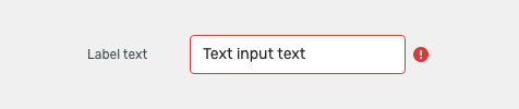
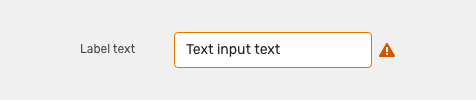
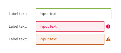
Error Icon (Invalid)
Indicates an error.

Warning icon
Indicates an attention.

Density
Default
Most of the use cases.
Small (Condensed)
Technical applications, e.g. Scaler.

XSmall
Inline renaming in modules.

Appearance
Width
The width of the field should match the length of the expected data input. Widths of fields are predefined by the grid.
Read more about how to use grid in forms.
Behavior
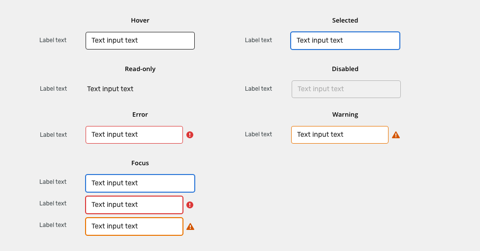
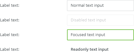
States
Read-only
Allows for content to be copied, but not interacted with or changed.

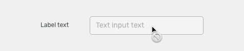
Disabled
Cannot be interacted with but remains visible to the user in a disabled visual style.

Icons
Icons can be represented as static icons or toolbar button (when it is interactive).
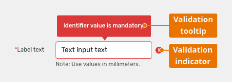
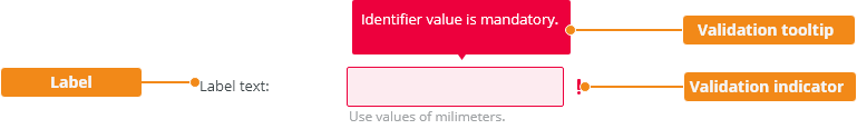
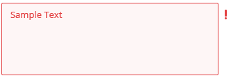
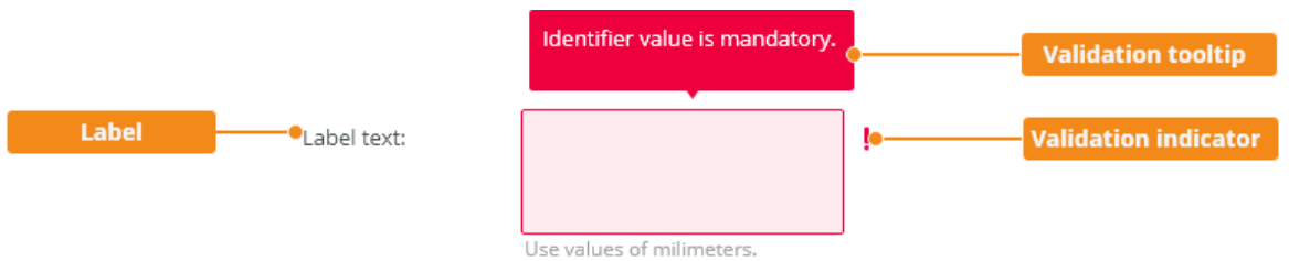
Validation
Client-side validation - It is recommended to validate the user’s data before the form submission. Fields are validated upon losing focus.
Typical client error validations are:
- Incorrectly formatted data
- Leaving a required field blank
- Leaving a required field incomplete
Server-side validation
Where the real-time validation is not possible or does not make sense, all fields are validated at the same time upon the page submission.
Responsivity
Text inputs support mobile responsive behavior:
By default, labels are aligned vertically for narrow containers (max width 400 px).
Horizontal labels can used for narrow containers when vertical space is limited.
Keyboard Interactions
| Key | Interaction |
|---|---|
| Tab | Tabbing into a text field selects the existing text in input. |
Editorial
- Labels - Use sentence case. Keep the text short and specific.
- Placeholders - An actual example of what the user should write.
Related Components
- Text area: bobwai–textarea - when the expected input is longer than one row or sentence.
Style

| Used in | Type | px | Token |
|---|---|---|---|
| Input Text | Color |
|
|
| Icons (left and right if static) | Color | color-icon-100 |
|
| Icons (left and right if interactive) | use toolbar button component | ||
| Icons (all) | Object sizes | sizing-icon-200 |
|
| Background | Color |
|
|
| Border | Color | color-border-input |
|
| Input Text | Font |
|
|
| Border | Border-width | 1 | border-width-100 |
| Border | Border-radius | 4 | radius-input-100 |
| Input text (Placeholder) | Font | font-placeholder |
|
| Input text (Placeholder) | Color | color-text-300 |
|
| Label & note | Color | color-text-100 |
|
| Label & note | Font | font-label | |
| Required field (asterisk sign) | Color | color-error |
Interactive States
| Used In | Type | PX | Token |
|---|---|---|---|
| Hover | |||
| Border | Color | color-border-100 |
|
| Selected/Focus | |||
| Border | Color | color-border-500 |
|
| Border | Border-width | 2 | border-width-200 |
| Disabled | |||
| Whole object | Opacity | opacity-disabled |
|
| Whole object | Cursor | cursor: not-allowed; |
|
| Read Only | |||
| Text | Font | font-body |
|
| Border | Border-width | 0 | border-width-none |
| Error | |||
| Background | Color | color-bg-input-error |
|
| Border | Color | color-border-error |
|
| Text | Color | color-text-error |
|
| Notification icon | Color | color-icon-error |
|
| Warning | |||
| Background | Color | color-bg-input-warning |
|
| Border | Color | color-border-warning |
|
| Text | Color | color-text-warning |
|
| Notification icon | Color | color-icon-warning |
|
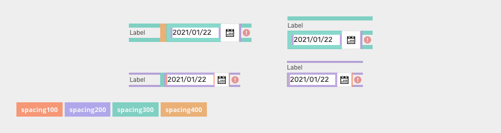
Spacing
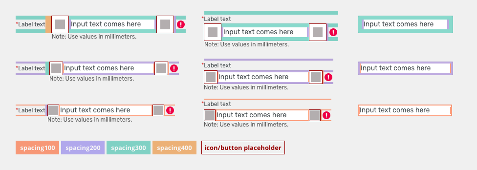
| Used in | Type | PX | Token |
|---|---|---|---|
| Minimal space between label and input | Spacing | 12 | spacing-400 |
| Default size padding | Spacing | 8 | spacing-300 |
Default size spacing between icon and text |
Spacing | 4 | spacing-200 |
| Default size space between input and notification icon | Spacing | 4 | spacing-200 |
| Small/condensed minimal space between label and input | Spacing | 8 | spacing-300 |
| Small/condensed size padding | Spacing | 4 | spacing-200 |
Small/condensed size spacing between icon and text |
Spacing | 2 | spacing-100 |
| Small/Condensed size space between input and notification icon | Spacing | 2 | spacing-100 |
| XSmall/supercondensed minimal space between label and input | Spacing | 4 | spacing-200 |
| XSmall/supercondensed size padding | Spacing | 2 | spacing-100 |
| XSmall/supercondensed size spacing between icon and text | Spacing | 2 | spacing-100 |
| XSmall/supercondensed size space between input and notification icon | Spacing | 2 | spacing-100 |
Accessibility
- Provide labels and instructions that are clear and concise.
- If the text input is a required field include the
aria-requiredproperty. - W3C Web Tutorial: Labeling Controls
- W3C Web Tutorial: Form Instructions
Attachments:
 image2020-8-27_13-54-30.png (image/png)
 image2020-8-27_14-54-43.png (image/png)
 image2020-8-27_14-57-37.png (image/png)
 image2020-8-27_15-13-35.png (image/png)
 image2020-9-29_15-47-57.png (image/png)
 image2020-10-2_13-45-41.png (image/png)
 image2020-10-2_13-46-8.png (image/png)
 image2020-10-2_14-20-22.png (image/png)
 image2020-10-2_14-20-45.png (image/png)
 image2020-10-2_14-20-58.png (image/png)
 image2020-10-2_14-21-11.png (image/png)
 image2020-10-2_14-21-26.png (image/png)
 image2020-10-2_14-25-18.png (image/png)
 image2020-10-2_14-25-33.png (image/png)
 image2020-10-2_14-33-25.png (image/png)
 image2020-10-2_14-33-47.png (image/png)
 image2020-10-2_14-34-9.png (image/png)
 image2020-10-2_14-40-47.png (image/png)
 image2020-10-2_14-41-16.png (image/png)
 image2020-10-2_14-42-13.png (image/png)
 image2020-10-2_14-42-44.png (image/png)
 image2020-10-2_14-45-20.png (image/png)
 image2020-10-2_14-59-30.png (image/png)
 image2020-10-2_15-1-29.png (image/png)
 image2020-10-2_15-2-20.png (image/png)
 image2020-10-2_15-23-33.png (image/png)
 image2020-10-5_8-50-57.png (image/png)
 image2020-10-5_8-51-17.png (image/png)
 image2020-10-5_10-20-43.png (image/png)
 image2020-10-5_10-21-2.png (image/png)
 image2020-10-5_10-21-21.png (image/png)
 image2020-10-5_10-56-10.png (image/png)
 image2020-10-5_10-57-1.png (image/png)
 image2020-10-5_11-0-17.png (image/png)
 image2020-10-5_11-0-31.png (image/png)
 image2020-10-23_15-38-49.png (image/png)
 image2020-10-26_11-51-3.png (image/png)
 image2020-10-26_11-51-40.png (image/png)
 image2020-10-26_11-52-12.png (image/png)
 image2020-10-26_11-52-43.png (image/png)
 image2020-10-26_11-54-0.png (image/png)
 image2020-10-26_11-54-35.png (image/png)
 image2020-10-26_11-55-33.png (image/png)
 textinput-style.png (image/png)
 textinput-style.png (image/png)
 textinput-style@2x.png (image/png)
 textinput@2x.png (image/png)
 textinput@2x.png (image/png)
 textinput@2x.png (image/png)
 text-input-anatomy.png (image/png)
 text-input-label-horizontal.png (image/png)
 text-input-label-vertical.png (image/png)
 text-input-type-default.png (image/png)
 text-input-type-password.png (image/png)
 text-input-variants-left-icon.png (image/png)
 text-input-variants-right-icon.png (image/png)
 text-input-variants-error-icon.png (image/png)
 text-input-variants-warning-icon.png (image/png)
 text-input-density-default.png (image/png)
 text-input-density-small.png (image/png)
 text-input-density-xsmall.png (image/png)
 text-input-state-readonly.png (image/png)
 text-input-state-disabled.png (image/png)
 text-input-validation.png (image/png)
 text-input-style.png (image/png)
 text-input-label-horizontal.png (image/png)
 text-input-state-disabled.png (image/png)
 text-input-state-readonly.png (image/png)
 text-input-variants-warning-icon.png (image/png)
 text-input-variants-error-icon.png (image/png)
 text-input-state-selected.png (image/png)
 text-input-state-focus.png (image/png)
 text-input-state-focus.png (image/png)
 text-input-anatomy.png (image/png)
 image2020-11-2_10-16-57.png (image/png)
 image2020-11-2_10-17-15.png (image/png)
 image2020-11-2_10-20-31.png (image/png)
 text-input-title.png (image/png)
text-input-anatomy.png (image/png)
button-variants-primary.png (image/png)
text-input-title.png (image/png)
text-input-anatomy.png (image/png)
button-variants-primary.png (image/png)
 text-input-type-default.png (image/png)
text-input-type-vertical.png (image/png)
text-input-type-password.png (image/png)
text-input-variants-left-icon.png (image/png)
text-input-variants-right-icon.png (image/png)
text-input-variants-error-icon.png (image/png)
text-input-variants-warning-icon.png (image/png)
text-input-density-default.png (image/png)
text-input-density-small.png (image/png)
text-input-density-xsmall.png (image/png)
text-input-type-default.png (image/png)
text-input-type-vertical.png (image/png)
text-input-type-password.png (image/png)
text-input-variants-left-icon.png (image/png)
text-input-variants-right-icon.png (image/png)
text-input-variants-error-icon.png (image/png)
text-input-variants-warning-icon.png (image/png)
text-input-density-default.png (image/png)
text-input-density-small.png (image/png)
text-input-density-xsmall.png (image/png)
 text-input-density-xsmall.png (image/png)
text-input-state-readonly.png (image/png)
text-input-state-disabled.png (image/png)
text-input-density-xsmall.png (image/png)
text-input-state-readonly.png (image/png)
text-input-state-disabled.png (image/png)
 text-input-validation.png (image/png)
 text-input-validation.png (image/png)
text-input-style.png (image/png)
text-input-validation.png (image/png)
text-input-style.png (image/png)
 text-input-style-states.png (image/png)
text-input-style-padding.png (image/png)
text-input-style-states.png (image/png)
text-input-style-padding.png (image/png)
 text-input-state-disabled.png (image/png)
Date_picker-input-spacing.png (image/png)
text-input-state-disabled.png (image/png)
Date_picker-input-spacing.png (image/png)
 text-input-style-padding.png (image/png)
 text-input-style.png (image/png)
 text-input-style-padding.png (image/png)
 input-icons.gif (image/gif)
text-input-style-padding.png (image/png)
text-input-style.png (image/png)
input-icons.gif (image/gif)
text-input-style-padding.png (image/png)
text-input-style.png (image/png)