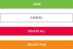
Button triggers an action.
Component Status
 Design kit: RELEASED
 Bobwai Component: bobwai–button IN DEVELOPMENT
Usage
Button allows users to perform a predefined action.

Use a button to
- submit a form,
- begin a new task,
- trigger a new UI element to appear on the page,
- specify a new or next step in a process.

- Do NOT use a button as a navigational element, use a link instead.
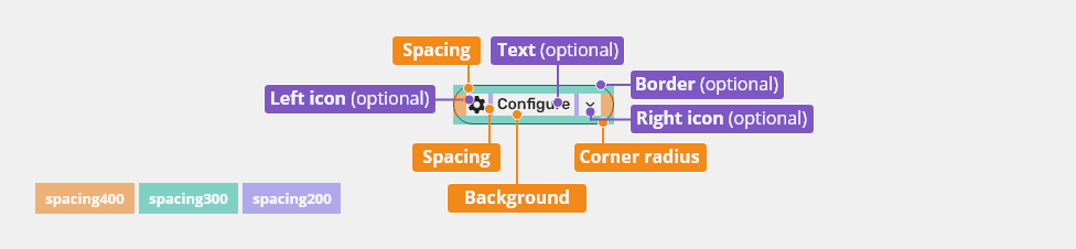
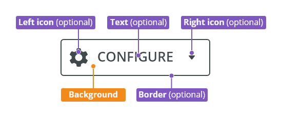
Anatomy

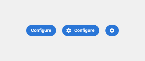
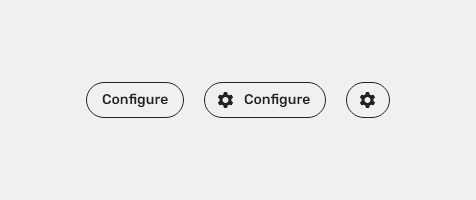
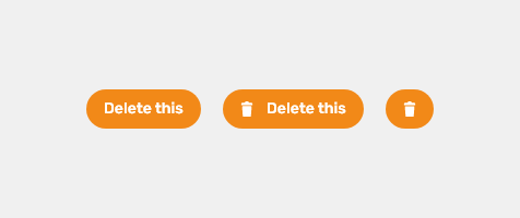
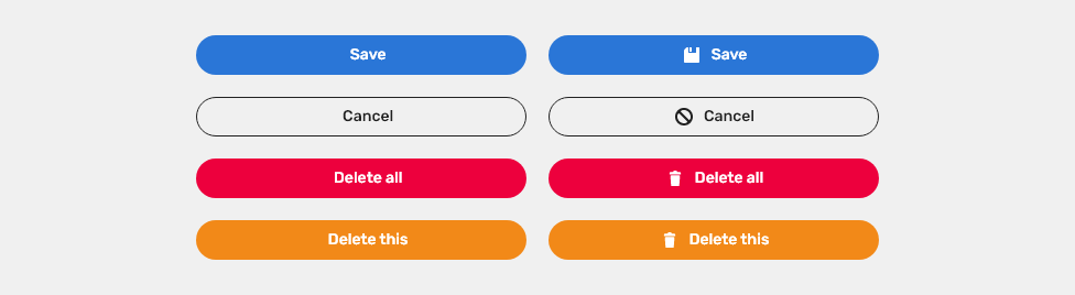
- Left icon (optional) - Icon signifiers can describe the type of button
- Label text (optional) - Short label that clearly describes an action. Label a button with a verb, e.g.“Copy”, or verb-phrase, e.g. “Copy Document”.
- Background
- Border (optional)
- Right icon (optional) - A dropdown arrow indicates that a button has a nested selection component.
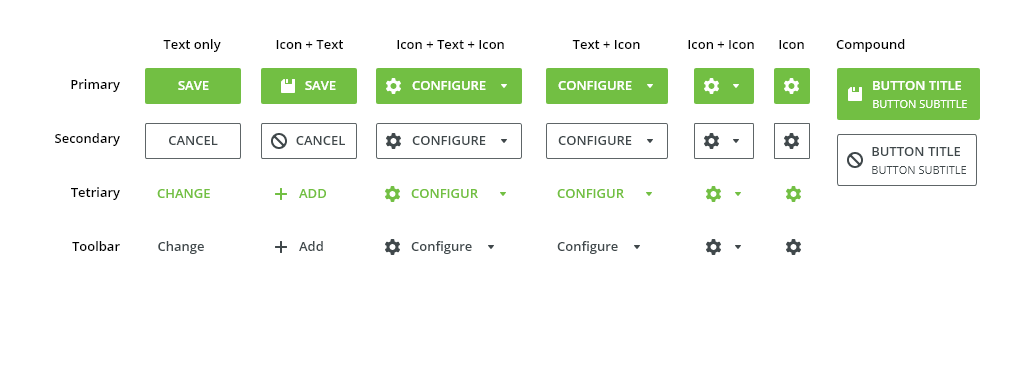
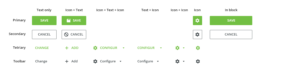
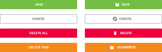
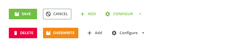
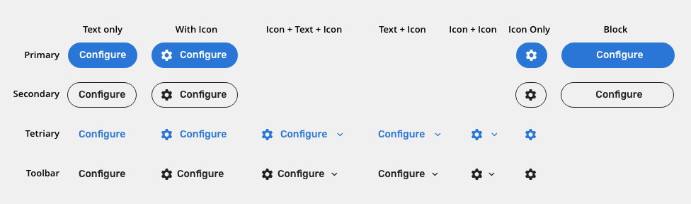
Types
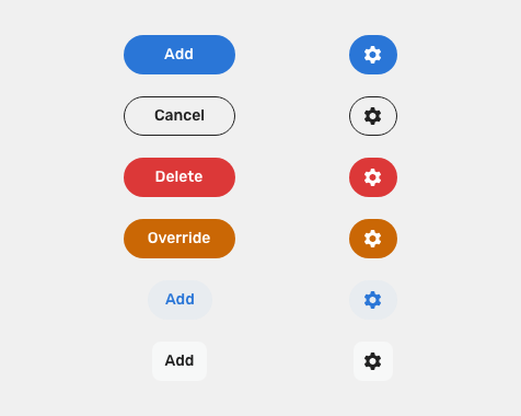
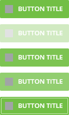
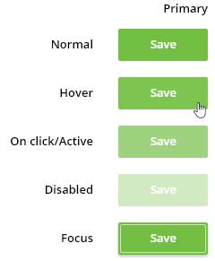
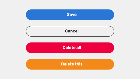
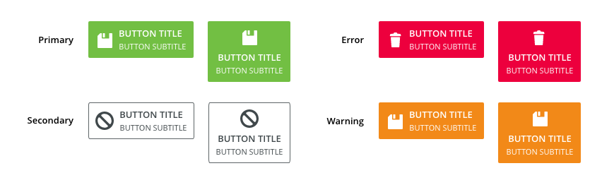
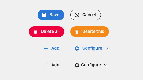
Primary
For highest-priority actions that are required to complete the task. Primary action should only be used once per component or screen.
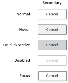
Secondary
For secondary non-critical actions like “Cancel”.
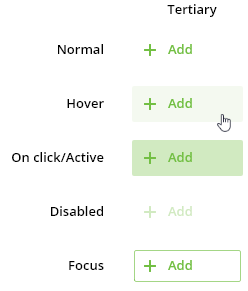
Tertiary
For less prominent actions to reduce distraction from the content. Typically used for actions in a subsection of a form.
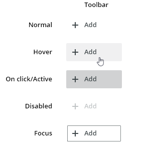
Toolbar
Used in toolbars.

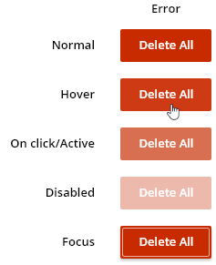
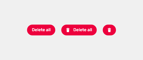
Danger
To indicate a potentially destructive action to the user. In combination with the default button, the danger button should be used as a primary button.

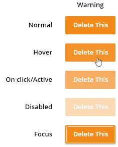
Warning
To indicate attention requirement. In combination with the default button, the warning button should be used as a primary button.
Variants

Button with Icon
Icon emphasizes the meaning of the button.

Block Buttons
Spans the full width of a parent object. Version with left-aligned icon is used for sign-in pages.

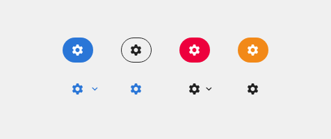
Icon-Only Button
Use for toolbars and places where text will not fit comfortably. For the icon-only button variant, a tooltip must be always used. Default icon size is small (20px).

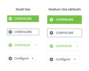
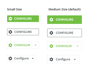
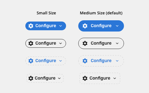
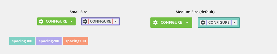
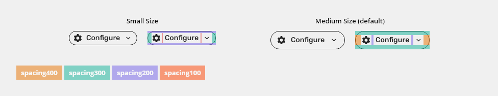
Sizes
- Small – condensed variants
- Medium – default size

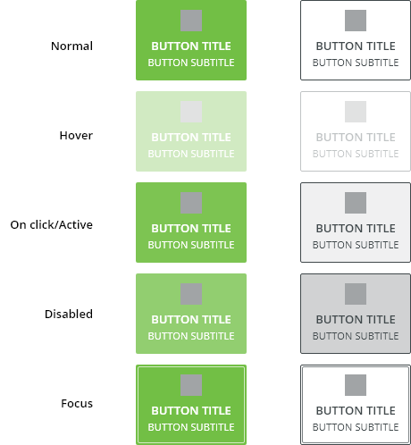
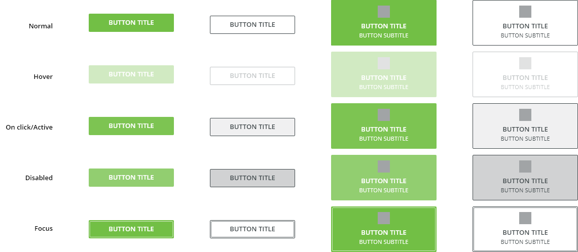
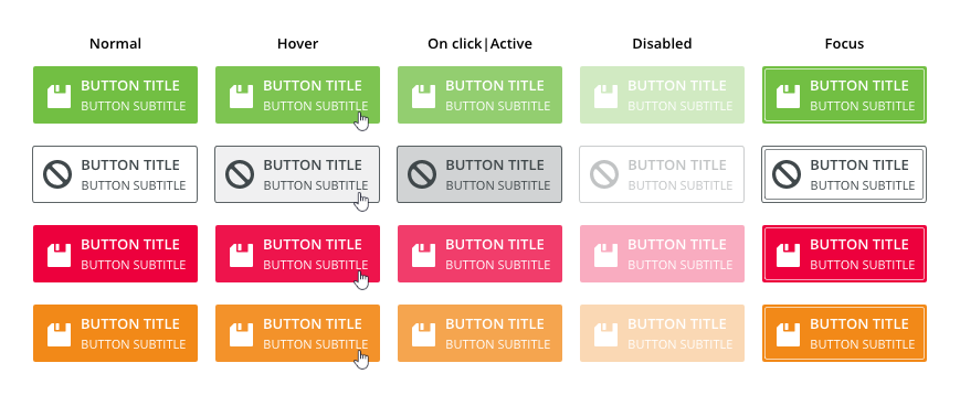
Behaviours
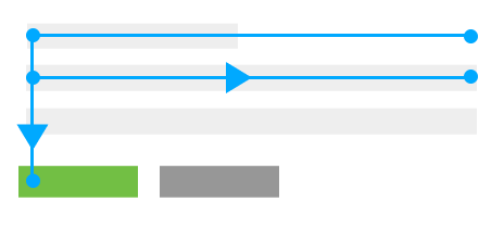
Minimum width
Primary and secondary buttons (variants with text) have predefined minimum width. This guarantees that small buttons retain an identifiable shape.
Tertiary and Toolbar buttons do not have a minimum width; their width depends exclusively on the length of the text. Nor the variants where there are only icons do not have minimum width applied.
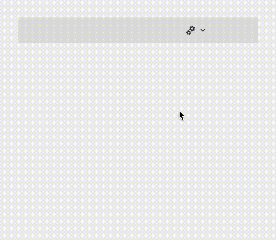
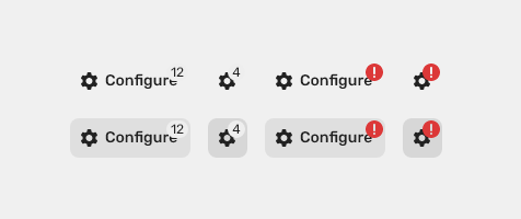
Button with Badge
Toolbar buttons may appear in combination with badges. They are used as visual indicators for annotating other information such as numeric values or status to a related object.

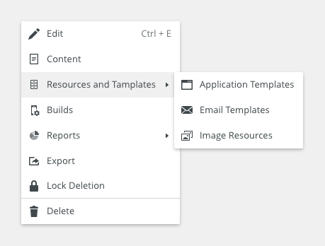
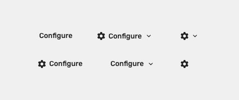
Menu button
Toolbar buttons may appear in combination with drop icon. This icon should be rotated when button invokes drop down menu.
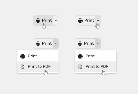
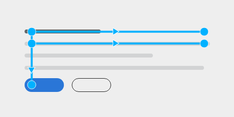
Split Button
A split button is button with two functions
- The main action on the left
- Dropdown with related actions
When to use
When more than 2 related actions are possible but the space is limited.
Placement of Buttons
Buttons can be aligned to the left or to the right depending on their environment.
Right Alignment - Constrained Container
The natural reading pattern in constrained areas, like modal windows panels and also in a wizard, is the Z-pattern.
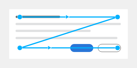
Left Alignment - Unconstrained Container
The F-pattern is a natural reading pattern for content in an unconstrained container, such as a form on a page.
Editorial
- Create a short label that clearly describes an action.
- Label a button with a verb, e.g.“Copy”, or verb-phrase, e.g. “Copy Document”.
- Do not use generic labels like "Ok," especially in the case of an error
- "Submit" and "Apply" buttons should always be primary buttons and positioned on the left.
- Button opening a new window should match with title of that window.
Learn more about creating UI strings.
Style
Button Elements
Primary Button

| Used In | Type | px | Token |
|---|---|---|---|
| Text color | Color | color-text-interactive-100 |
|
| Icon color | Color | color-icon-200 |
|
| Icon size | Size | sizing-icon-200 |
|
| Background color | Color | color-bg-interactive-100 |
|
| Background corner radius | Corner radius | 24 | radius-button-100 |
| Text font | Font | font-strong |
|
| Hover | |||
| Background color | Color | color-bg-interactive-100-hover |
|
| Pressed | |||
| Background color | Color | color-bg-interactive-100-pressed |
|
| Disabled | |||
| Disabled (applied on the whole object) | Opacity | opacity-disabled |
|
| Focus | |||
| Focus border color | Color | color-focus-100 |
|
| Focus border width | Width | 1 | border-width-100 |
| Focus border corner radius | Corner radius | 24 | radius-button-100 |
| Focus inner spacing | Spacing | 2 | spacing-100 |
Secondary Button

| Used In | Type | px | Token |
|---|---|---|---|
| Text color | Color | color-text-interactive-200 |
|
| Icon color | Color | color-icon-100 |
|
| Icon size | Size | sizing-icon-200 |
|
| Button border color | Color | color-border-100 |
|
| Button border corner radius | Corner radius | 24 | radius-button-100 |
| Button border width | Width | 1 | border-width-100 |
| Background color | Color | color-bg-interactive-200 |
|
| Text font | Font | font-strong |
|
| Hover | |||
| Background color | Color | color-bg-interactive-200-hover |
|
| Icon color | Color | color-icon-100-hover | |
| Text color | Color | color-text-interactive-200-hover |
|
| Pressed | |||
| Background color | Color | color-bg-interactive-200-pressed |
|
| Icon color | Color | color-icon-100-pressed | |
| Text color | Color | color-text-interactive-200-pressed |
|
| Disabled | |||
| Disabled (applied on the whole object) | Opacity | opacity-disabled |
|
| Focus | |||
| Focus border color | Color | color-focus-200 |
|
| Focus border width | Width | 1 | border-width-100 |
| Focus border corner radius | Corner radius | 24 | radius-button-100 |
| Focus inner spacing | Spacing | 2 | spacing-100 |
Tertiary Button

| Used In | Type | px | Token |
|---|---|---|---|
| Text color | Color | color-text-interactive-300 |
|
| Icon color | Color | color-icon-300 |
|
| Icon size | SIze | sizing-icon-200 |
|
| Background color | Color | color-bg-interactive-300 |
|
| Text font | Font | font-strong |
|
| Background corner radius | Corner radius | 24 | radius-button-100 |
| Hover | |||
| Background color | Color | color-bg-interactive-300-hover |
|
| Pressed | |||
| Background color | Color | color-bg-interactive-300-pressed |
|
| Disabled | |||
| Disabled (applied on the whole object) | Opacity | opacity-disabled |
|
| Focus | |||
| Focus border color | Color | color-focus-300 |
|
| Focus border width | Width | 1 | border-width-100 |
| Focus border corner radius | Corner radius | radius-button-100 |
|
| Focus inner spacing | Spacing | 2 | spacing-100 |
Toolbar Button
| Used In | Type | px | Token |
|---|---|---|---|
| Text color | Color | color-text-interactive-200 |
|
| Icon color | Color | color-icon-100 |
|
| Icon size | Size | sizing-icon-200 |
|
| Background color | Color | color-bg-interactive-200 |
|
| Text font | Font | font-strong |
|
| Background corner radius | Corner radius | 8 | radius-button-200 |
| Hover | |||
| Background color | Color | color-bg-interactive-200-hover (1) |
|
| Icon color | Color | color-icon-100-hover | |
| Text color | Color | color-text-interactive-200-hover |
|
| Pressed | |||
| Background color | Color | color-bg-interactive-200-pressed |
|
| Icon color | Color | color-icon-100-pressed | |
| Text color | Color | color-text-interactive-200-pressed |
|
| Selected | |||
| Background color | Color | color-bg-interactive-200-selected (1) |
|
| Icon color | Color | color-icon-100-selected | |
| Text color | Color | color-text-interactive-200-selected |
|
| Disabled | |||
| Disabled (applied on the whole object) | Opacity | opacity-disabled |
|
| Focus | |||
| Focus border color | Color | color-focus-200 |
|
| Focus border width | Width | 1 | border-width-100 |
| Focus border corner radius | Corner radius | 8 | radius-button-200 |
| Focus inner spacing | Spacing | 2 | spacing-100 |
(1) Do not use hover style when the button is selected.
Toolbar Split Button
| Used In | Type | px | Token |
|---|---|---|---|
| Text color | Color | color-text-interactive-200 |
|
| Icon color | Color | color-icon-100 |
|
| Icon size | Size | sizing-icon-200 |
|
| Background color | Color | color-bg-interactive-200 |
|
| Text font | Font | font-strong |
|
| Background corner radius | Corner radius | 8 | radius-button-200 |
| Hover | |||
| Background color | Color | color-bg-interactive-200-hover (1) |
|
| Icon color | Color | color-icon-100-hover | |
| Text color | Color | color-text-interactive-200-hover | |
| Hover border color | Color | color-bg-interactive-200-hover |
|
| Hover border width | Width | 1 | border-width-100 |
| Pressed | |||
| Background color | Color | color-bg-interactive-200-pressed |
|
| Icon color | Color | color-icon-100-pressed | |
| Text color | Color | color-text-interactive-200-pressed | |
| Pressed border color | Color | color-bg-interactive-200-pressed |
|
| Pressed border width | Width | 1 | border-width-100 |
| Selected | |||
| Background color | Color | color-bg-interactive-200-selected (1) |
|
| Icon color | Color | color-icon-100-selected | |
| Text color | Color | color-text-interactive-200-selected | |
| Selected border color | Color | color-bg-interactive-200-selected |
|
| Selected border width | Width | 1 | border-width-100 |
| Right icon rotation | Angle | angle-500 | |
| Disabled | |||
| Disabled (applied on the whole object) | Opacity | opacity-disabled |
|
| Focus | |||
| Focus border color | Color | color-focus-200 |
|
| Focus border width | Width | 1 | border-width-100 |
| Focus border corner radius | Corner radius | 8 | radius-button-200 |
| Focus inner spacing | Spacing | 2 | spacing-100 |
(1) Do not use hover style when the button is selected
Danger Button

| Used in | Type | px | Token |
|---|---|---|---|
| Text color | Color | color-text-interactive-100 |
|
| Icon color | Color | color-icon-200 |
|
| Icon size | Size | sizing-icon-200 |
|
| Background color | Color | color-bg-interactive-100-error |
|
| Background corner radius | Corner radius | 24 | radius-button-100 |
| Text font | Font | font-strong |
|
| Hover | |||
| Background color | Color | color-bg-interactive-100-error-hover |
|
| Pressed | |||
| Background color | Color | color-bg-interactive-100-error-pressed |
|
| Disabled | |||
| Disabled (applied on the whole object) | Opacity | opacity-disabled |
|
| Focus | |||
| Focus border color | Color | color-focus-100 |
|
| Focus border width | Width | 1 | border-width-100 |
| Focus border corner radius | Corner radius | 24 | radius-button-100 |
| Focus inner spacing | Spacing | 2 | spacing-100 |
Warning Button

| Used in | Type | px | Token |
|---|---|---|---|
| Text color | Color | color-text-interactive-100 |
|
| Icon color | Color | color-icon-200 |
|
| Icon size | Size | sizing-icon-200 |
|
| Background color | Color | color-bg-interactive-100-warning |
|
| Background corner radius | Corner radius | 24 | radius-button-100 |
| Text font | Font | font-strong |
|
| Hover | |||
| Background color | Color | color-bg-interactive-100-warning-hover |
|
| Pressed | |||
| Background color | Color | color-bg-interactive-100-warning-pressed |
|
| Disabled | |||
| Disabled (applied on the whole object) | Opacity | opacity-disabled |
|
| Focus | |||
| Focus border color | Color | color-focus-100 |
|
| Focus border width | Width | 1 | border-width-100 |
| Focus border corner radius | Corner radius | 24 | radius-button-100 |
| Focus inner spacing | Spacing | 2 | spacing-100 |
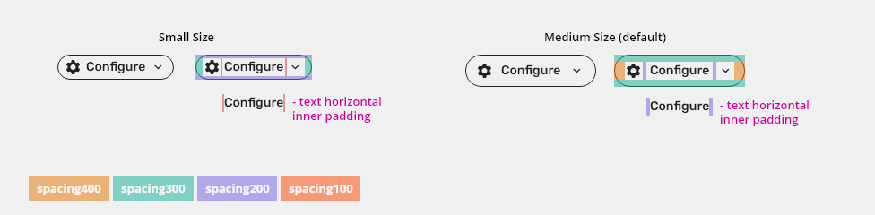
Spacing
Primary, Secondary, Tertiary, Danger and Warning buttons
| Used in | Type | px | Token |
|---|---|---|---|
| Default size upper and bottom padding | Spacing | 8 - 1 | spacing-300 - border-width-100 (1) |
| Default size left and right padding | Spacing | 12 - 1 | spacing-400 - border-width-100 (1) |
Default size spacing between icon and text |
Spacing | 4 | spacing-200 |
| Condensed size upper and bottom padding | Spacing | 4 - 1 | spacing-200 - border-width-100 (1) |
| Condensed size left and right padding | Spacing | 8 - 1 | spacing-300 - border-width-100 (1) |
Condensed size spacing between icon and text |
Spacing | 2 | spacing-100 |
(1) It is necessary to make size lower due to height of border.
Toolbar Button
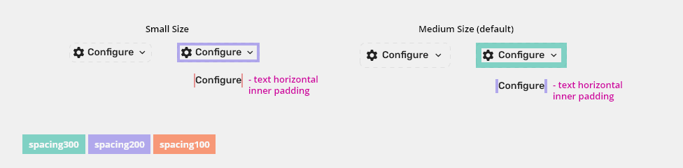
| Used in | Type | px | Token |
|---|---|---|---|
| Default size padding | Spacing | 8 | spacing-300 - border-width-100 |
| Condensed size padding | Spacing | 4 | spacing-200 - border-width-100 |
Toolbar Split Button
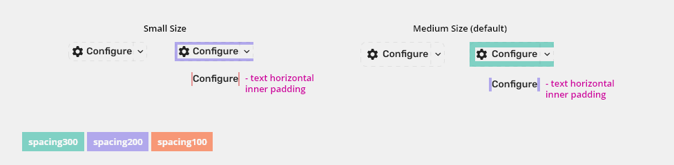
| Used in | Type | px | Token |
|---|---|---|---|
| Default size padding | Spacing | 8 | spacing-300 - border-width-100 |
| Condensed size padding | Spacing | 4 | spacing-200 - border-width-100 |
Block Buttons

Used In |
Type |
Px |
Token |
|---|---|---|---|
Minimal padding in default version |
Spacing |
8 - 1 |
spacing-300 - border-width-100 (1) |
Minimal padding in condensed version |
Spacing |
4 - 1 |
spacing-200 - border-width-100 (1) |
(1) It is necessary to make size lower due to height of border.
Accessibility
Do not use buttons as navigational elements. Instead, use links when the desired action is to take the user to a new page.
For example:
Use a HTML <button> element type for buttons. It is expected that a button can be triggered by pressing <Space>, <Enter>, or <Backspace>.
An <a> element cannot be triggered by pressing <Space>, only by pressing <Enter> or <Backspace>.
Attachments:
 image2019-7-22_15-47-44.png (image/png)
 image2019-7-22_15-48-19.png (image/png)
 image2019-7-22_15-49-16.png (image/png)
 image2019-7-22_16-3-0.png (image/png)
 image2019-7-22_16-4-4.png (image/png)
 image2019-7-22_16-5-7.png (image/png)
 image2019-7-24_11-21-59.png (image/png)
 image2019-7-24_11-22-24.png (image/png)
 image2019-7-24_11-24-13.png (image/png)
 image2019-7-24_11-30-34.png (image/png)
 image2019-7-24_11-34-13.png (image/png)
 image2019-7-24_11-37-19.png (image/png)
 image2019-7-24_11-37-36.png (image/png)
 image2019-7-24_11-37-53.png (image/png)
 Group 11.4 (1).png (image/png)
 Group 11.5 (1).png (image/png)
 button-states.png (image/png)
 button-blocks.png (image/png)
 image2020-7-14_14-13-53.png (image/png)
 image2020-7-14_14-15-21.png (image/png)
 image2020-7-14_14-17-23.png (image/png)
 image2020-7-14_14-18-3.png (image/png)
 image2020-7-14_14-18-54.png (image/png)
 image2020-7-14_14-20-56.png (image/png)
 image2020-7-14_14-21-30.png (image/png)
 image2020-7-14_15-4-54.png (image/png)
 image2020-7-14_15-18-5.png (image/png)
 image2020-7-15_9-34-20.png (image/png)
 image2020-7-15_10-47-9.png (image/png)
 image2020-7-1_9-51-16.png (image/png)
 image2020-7-1_9-51-41.png (image/png)
 image2020-7-1_10-13-56.png (image/png)
 image2020-7-1_11-0-8.png (image/png)
 image2020-7-1_11-7-21.png (image/png)
 image2020-7-1_10-57-18.png (image/png)
 image2020-7-15_11-7-33.png (image/png)
 image2020-7-15_11-7-50.png (image/png)
 image2020-7-15_11-8-7.png (image/png)
 image2020-7-15_11-8-30.png (image/png)
 image2020-7-15_11-8-51.png (image/png)
 image2020-7-15_11-9-8.png (image/png)
 image2020-7-15_11-9-17.png (image/png)
 image2020-7-15_11-10-39.png (image/png)
 image2020-7-16_16-37-3.png (image/png)
 image2020-7-16_16-43-12.png (image/png)
 image2020-7-16_16-44-52.png (image/png)
 image2020-7-16_16-46-40.png (image/png)
 image2020-7-16_16-50-13.png (image/png)
 button-variants-primary.png (image/png)
 button-variants-secondary.png (image/png)
 button-variants-tetriary.png (image/png)
 button-variants-toolbar.png (image/png)
 button-variants-error.png (image/png)
 button-variants-warning.png (image/png)
 button-content.png (image/png)
 button-sizes.png (image/png)
 button-icon-only.png (image/png)
 button-with-icon.png (image/png)
 button-states-primary.png (image/png)
 button-states-secondary.png (image/png)
 button-states-tertiary.png (image/png)
 button-states-toolbar.png (image/png)
 button-states-error.png (image/png)
 button-states-warning.png (image/png)
 buttons-in-block.png (image/png)
 buttons-in-block.png (image/png)
 button-compound-variants.png (image/png)
 buttons-in-block.png (image/png)
 alignment-z.png (image/png)
 alignment-f.png (image/png)
 button-variants.png (image/png)
 button-compound-variants.png (image/png)
 button-states-compound.png (image/png)
 button-states-compound.png (image/png)
 image2020-8-14_10-41-45.png (image/png)
image2020-8-14_10-49-41.png (image/png)
image2020-8-14_14-39-14.png (image/png)
image2020-8-14_10-41-45.png (image/png)
image2020-8-14_10-49-41.png (image/png)
image2020-8-14_14-39-14.png (image/png)
 image2020-8-14_14-40-25.png (image/png)
 image2020-8-14_14-45-44.png (image/png)
 image2020-8-14_14-46-0.png (image/png)
 image2020-8-14_15-3-13.png (image/png)
 image2020-8-14_15-3-27.png (image/png)
 image2020-8-14_15-4-29.png (image/png)
 image2020-8-14_15-6-34.png (image/png)
 image2020-8-14_15-18-34.png (image/png)
 image2020-8-14_16-16-47.png (image/png)
 image2020-8-17_8-39-24.png (image/png)
 image2020-8-17_9-11-24.png (image/png)
 image2020-8-17_9-13-16.png (image/png)
 button-content.png (image/png)
 image2020-10-9_14-6-44.png (image/png)
 button-content -style.png (image/png)
 Context-menu-type-multilevel.png (image/png)
 button-variants-primary.png (image/png)
 button-variants-secondary.png (image/png)
 button-variants-tetriary.png (image/png)
 button-variants-toolbar.png (image/png)
 button-variants-error.png (image/png)
 button-variants-warning.png (image/png)
 button-variants.png (image/png)
 button-variants.png (image/png)
 button-with-icon.png (image/png)
 button-with-icon.png (image/png)
 buttons-in-block.png (image/png)
 button-icon-only.png (image/png)
 button-sizes.png (image/png)
 alignment-z.png (image/png)
 alignment-f.png (image/png)
 button-content.png (image/png)
 button-states-primary.png (image/png)
 button-states-secondary.png (image/png)
 button-states-tertiary.png (image/png)
 button-states-toolbar.png (image/png)
 button-states-error.png (image/png)
 button-states-warning.png (image/png)
 buttons-in-block-2.png (image/png)
 button-sizes-prim-spec–1.png (image/png)
 button-content -style.png (image/png)
button-variants-primary.png (image/png)
button-variants-secondary.png (image/png)
button-variants-tetriary.png (image/png)
button-variants-toolbar.png (image/png)
button-content -style.png (image/png)
button-variants-primary.png (image/png)
button-variants-secondary.png (image/png)
button-variants-tetriary.png (image/png)
button-variants-toolbar.png (image/png)
 button-variants-error.png (image/png)
button-variants-warning.png (image/png)
button-variants.png (image/png)
button-variants-error.png (image/png)
button-variants-warning.png (image/png)
button-variants.png (image/png)
 button-with-icon.png (image/png)
 buttons-in-block.png (image/png)
button-icon-only.png (image/png)
buttons-in-block.png (image/png)
button-icon-only.png (image/png)
 button-sizes.png (image/png)
 alignment-z.png (image/png)
alignment-f.png (image/png)
button-content.png (image/png)
button-states-primary.png (image/png)
button-states-secondary.png (image/png)
button-states-tertiary.png (image/png)
button-states-toolbar.png (image/png)
alignment-z.png (image/png)
alignment-f.png (image/png)
button-content.png (image/png)
button-states-primary.png (image/png)
button-states-secondary.png (image/png)
button-states-tertiary.png (image/png)
button-states-toolbar.png (image/png)
 button-states-error.png (image/png)
button-states-warning.png (image/png)
button-sizes-prim-spec – 1.png (image/png)
button-states-error.png (image/png)
button-states-warning.png (image/png)
button-sizes-prim-spec – 1.png (image/png)
 buttons-in-block-2.png (image/png)
button-variants-toolbar.png (image/png)
button-variants.png (image/png)
button-with-icon.png (image/png)
button-icon-only.png (image/png)
buttons-in-block-2.png (image/png)
button-variants-toolbar.png (image/png)
button-variants.png (image/png)
button-with-icon.png (image/png)
button-icon-only.png (image/png)
 button-icon-only.png (image/png)
button-sizes.png (image/png)
button-states-toolbar.png (image/png)
button-sizes-toolbar-spec.png (image/png)
button-icon-only.png (image/png)
button-sizes.png (image/png)
button-states-toolbar.png (image/png)
button-sizes-toolbar-spec.png (image/png)
 button-behavior-minimum.png (image/png)
button-sizes-prim-spec.png (image/png)
button-behavior-minimum.png (image/png)
button-sizes-prim-spec.png (image/png)
 button-sizes-toolbar-spec.png (image/png)
 button-sizes-prim-spec.png (image/png)
button-sizes-toolbar-spec.png (image/png)
toolbar button with badge.png (image/png)
button-sizes-prim-spec.png (image/png)
button-sizes-toolbar-spec.png (image/png)
toolbar button with badge.png (image/png)
 Split button.png (image/png)
 split button-states-toolbar.png (image/png)
 split button-states-toolbar.png (image/png)
 split button-states-toolbar.png (image/png)
split button-sizes-toolbar-spec.png (image/png)
split button-states-toolbar.png (image/png)
split button-sizes-toolbar-spec.png (image/png)
 split button-sizes-toolbar-spec.png (image/png)
image2020-12-1_10-57-14.png (image/png)
image2020-12-1_10-59-46.png (image/png)
toolbar button with badge.png (image/png)
Split button.png (image/png)
button-arrow.gif (image/gif)
split button-sizes-toolbar-spec.png (image/png)
image2020-12-1_10-57-14.png (image/png)
image2020-12-1_10-59-46.png (image/png)
toolbar button with badge.png (image/png)
Split button.png (image/png)
button-arrow.gif (image/gif)