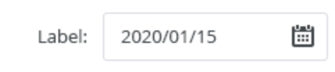
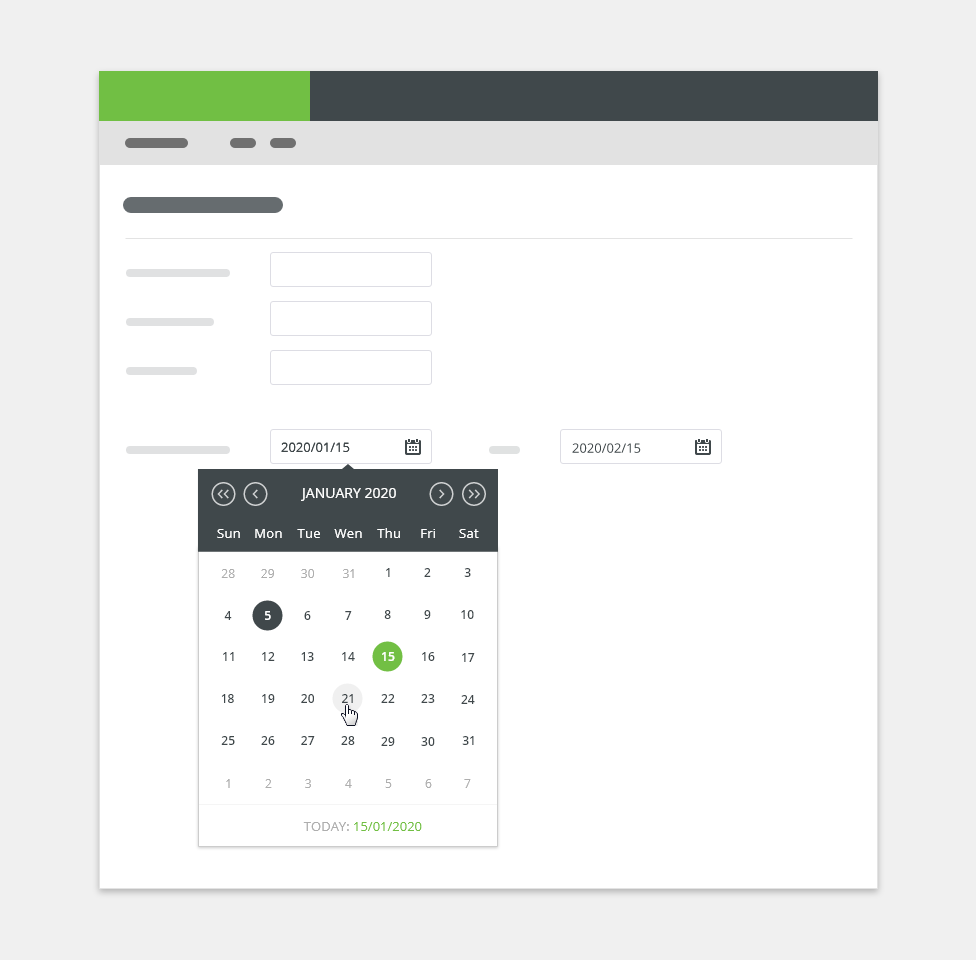
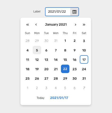
Date pickers allow users to select dates and times, or schedule a task.
Component Status
 Design Kit: RELEASED
 Bobwai component: bobwai--datepicker RELEASED
Usage
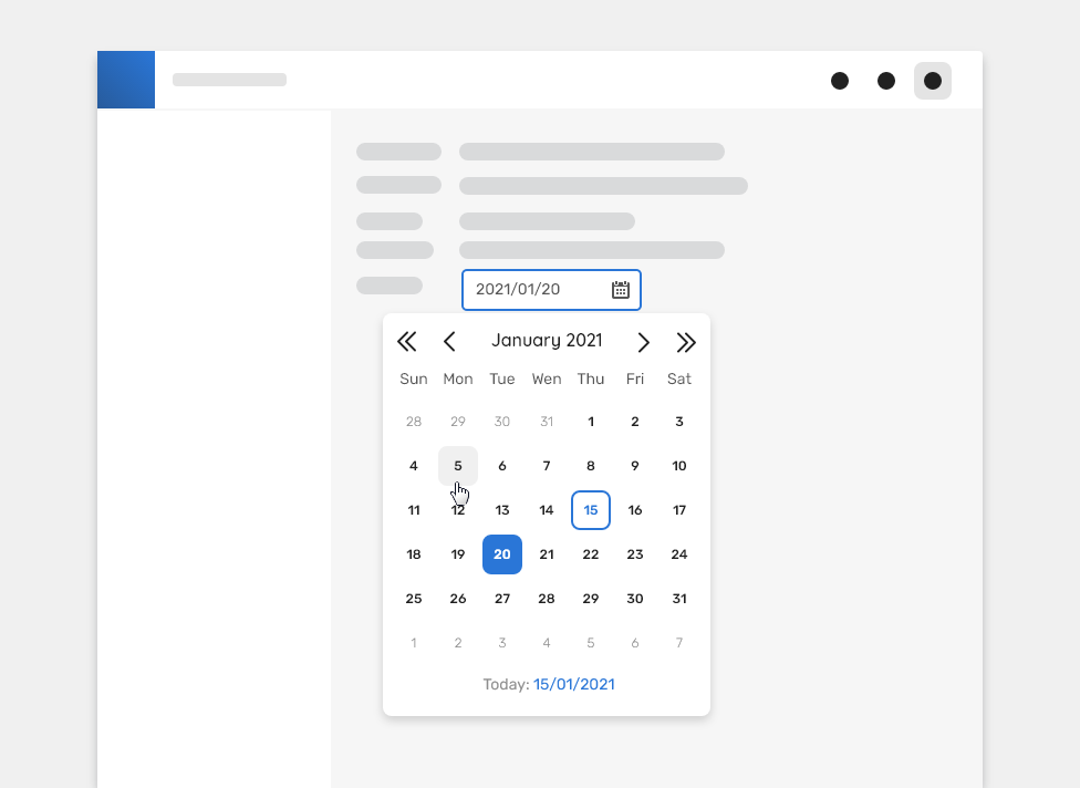
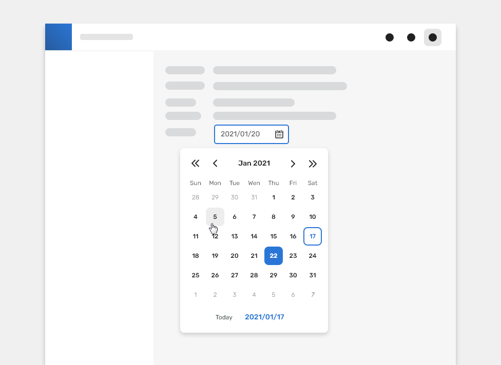
Use a calendar picker when the user needs to know a date’s relationship to other days. It allows the user to view and pick dates from a calendar widget.

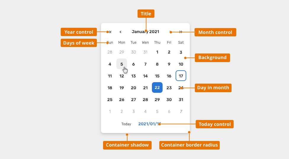
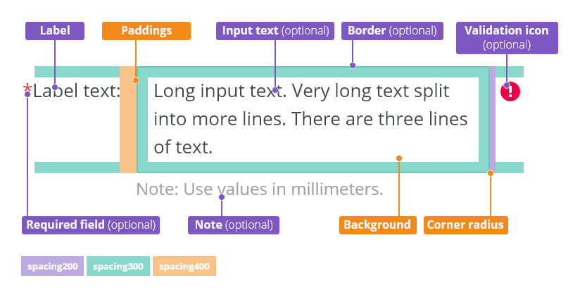
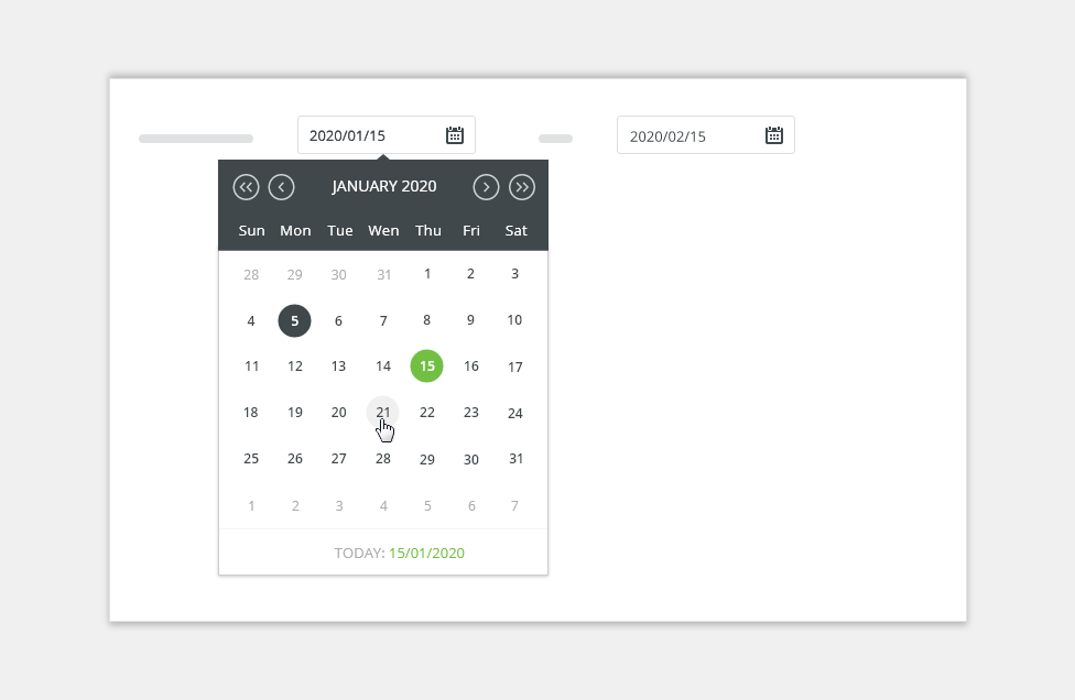
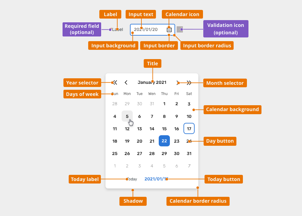
Anatomy
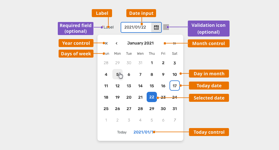
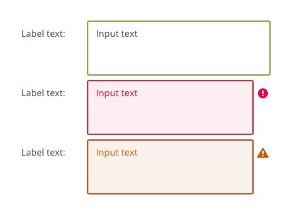
- Input:
- Label - describes input
- Date input - used to enter the date manually or invoke the calendar.
- Validation icon (optional) - informs whether the is any issue in the input
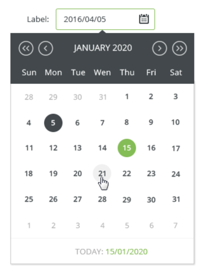
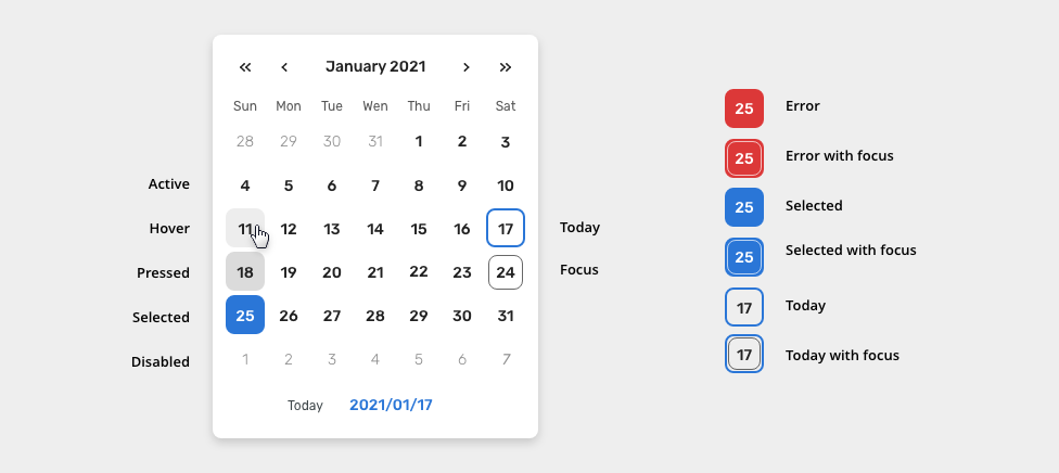
- Calendar:
- Title - the current month.
- Month control - allows to toggle between months
- Year control - allows to toggle between years
- Days of week - list of days in a week - can be set according country defaults
- Day in month
- Today date
- Selected date
- Today control - allows to set/jump to Today
Types
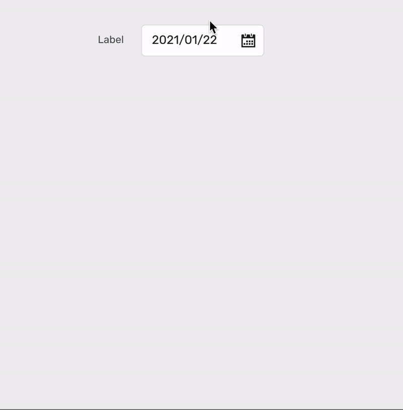
Single Date Input
Used when users need to select a single date input.

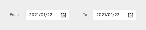
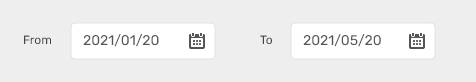
Date Range
Used when users need to select "From"/"To" dates.
Appearance
Default
Most of the use cases.
Condensed
Used for long forms and business applications (e.g. Scaler).

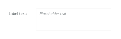
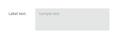
Placeholder
Empty state.

Behavior
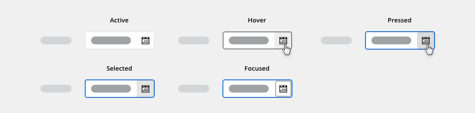
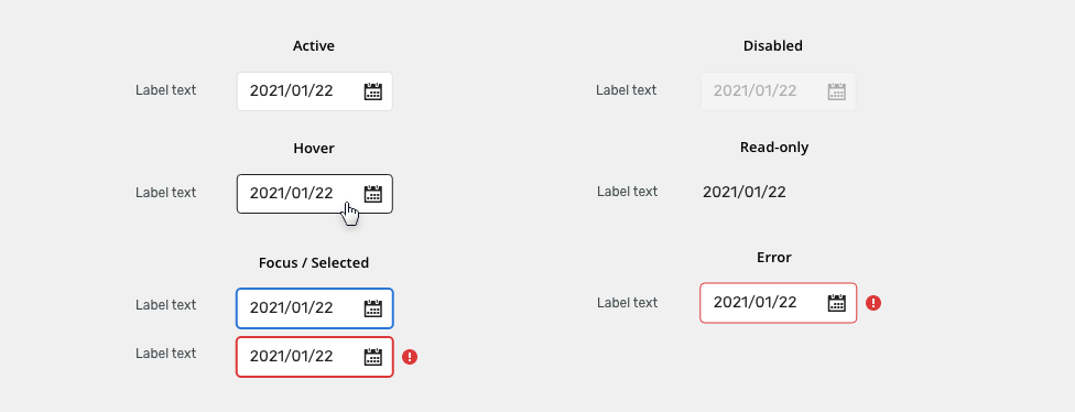
States
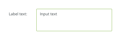
Focused
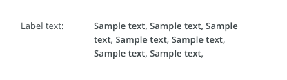
Allows for content to be copied, but not interacted with or changed.

Disabled
Cannot be interacted with but remains visible to users in a disabled visual style.

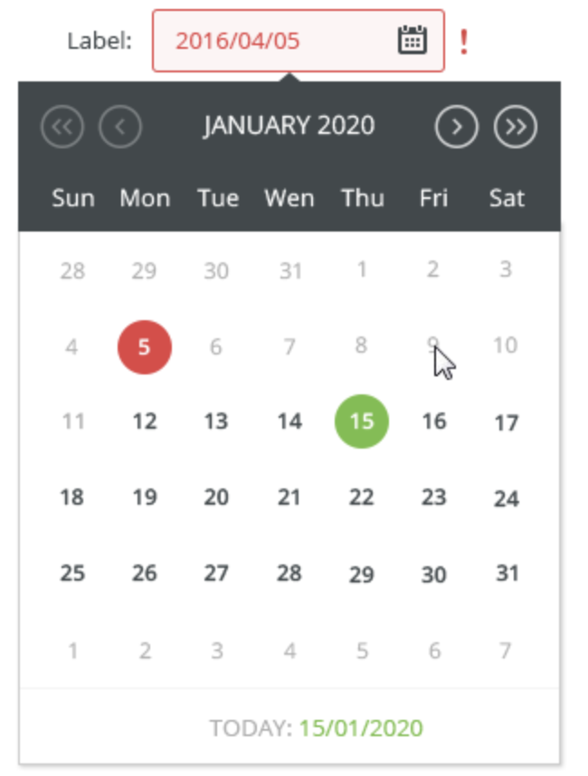
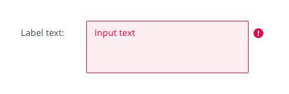
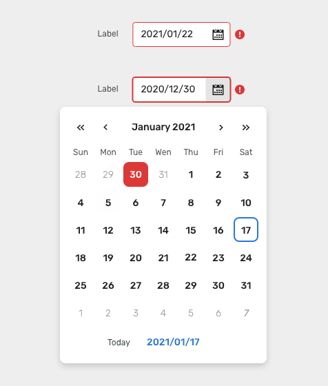
Error
Error state.
Client validationend validates format on client and aut

Interactions
Manual
- Users can use the input to manually type dates.

Spinners
- Users can use the calendar icon to open the calendar and use it to set the date.
- Only one month with the current date is shown when it is configured for the first time.
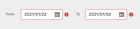
Range Input Validations
Value "From" cannot be higher than "To" value.
- Value "To" cannot be lower than "From" value.
Date Format
- Date picker’s format should be customized depending on e.g. location or language.
E.g. in US English, dates are written in month-day-year order. Slash “/” or hyphen “-“ are preferred separators.
Acceptable formats are: MM-DD-YYYY, MM-DD-YY, or YYYY-MM-DD. (“April 18, 2016” or “04/18/2016” or “04/18/16” or “2016/04/18”.)
Editorial
- Labels should be clear and descriptive.
- Range inputs should be properly labeled with a start and an end label.
Related Components
Time Picker - Use when asking users to input a specific time.
External Links
Names of the months in various languages
Style
Date-picker input

| Used in | Type | px | Token |
|---|---|---|---|
| Input Text | Color |
|
|
| Input Text | Font |
|
|
| Input text (Placeholder) | Font | font-placeholder |
|
| Input text (Placeholder) | Color | color-text-300 |
|
| Calendar icon | use toolbar button - icon only variant | ||
| Validation icon | Object sizes | sizing-icon-200 |
|
| Background | Color |
|
|
| Border | Color | color-border-input |
|
| Border | Border-width | 1 | border-width-100 |
| Border | Border-radius | 6 | radius-input-100 |
| Label & note | Color | color-text-200 |
|
| Label & note | Font | font-label | |
| Required field (asterisk sign) | Color | color-error |
States

| Used In | Type | PX | Token |
|---|---|---|---|
| Hover | |||
| Border | Color | color-border-100 |
|
| Selected/Focus | |||
| Border | Color | color-border-500 |
|
| Border | Border-width | 2 | border-width-200 |
| Disabled | |||
| Whole object | Opacity | opacity-disabled |
|
| Whole object | Cursor | cursor: not-allowed; |
|
| Read Only | |||
| Text | Font | font-body |
|
| Border | Border-width | 0 | border-width-none |
| Error | |||
| Background | Color | color-bg-input-error |
|
| Border | Color | color-border-error |
|
| Text | Color | color-text-error |
|
| Notification icon | Color | color-icon-error |
|
Icon/button states
use toolbar button - icon only variant
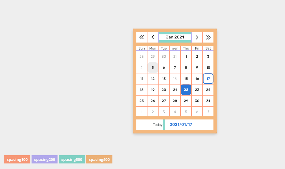
Spacing

| Used in | Type | PX | Token |
|---|---|---|---|
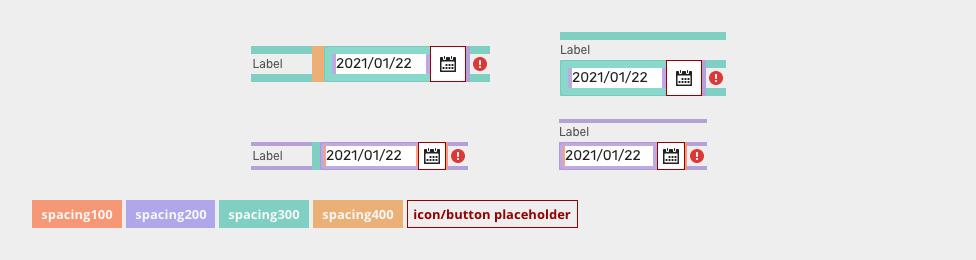
| Minimal space between label and input | Spacing | 12 | spacing-400 |
| Default size padding | Spacing | 8 | spacing-300 |
Default size spacing between icon and text |
Spacing | 4 | spacing-200 |
| Default size space between input and notification icon | Spacing | 4 | spacing-200 |
| Small/condensed minimal space between label and input | Spacing | 8 | spacing-300 |
| Small/condensed size padding | Spacing | 4 | spacing-200 |
Small/condensed size spacing between icon and text |
Spacing | 2 | spacing-100 |
| Small/Condensed size space between input and notification icon | Spacing | 2 | spacing-100 |
| XSmall/supercondensed minimal space between label and input | Spacing | 4 | spacing-200 |
| XSmall/supercondensed size padding | Spacing | 2 | spacing-100 |
| XSmall/supercondensed size spacing between icon and text | Spacing | 2 | spacing-100 |
| XSmall/supercondensed size space between input and notification icon | Spacing | 2 | spacing-100 |
Date-picker calendar
| Used in | Type | px | Token |
|---|---|---|---|
| Calendar background | color | color-bg-ui-100 |
|
| Calendar corner radius | corner radius | 6 | radius-button-200 |
| Shadow | shadow | shadow-200 |
|
| Title | font | font-strong |
|
| Title | color | color-text-100 |
|
| Year controls | style | use toolbar button - icon only variant | |
| Year controls | size | 36×36 | sizing-item-300 |
| Month controls | style | use toolbar button - icon only variant | |
| Month controls | size | 36×36 | sizing-item-300 |
| Days of week | font | font-label |
|
| Days of week | color | color-text-200 |
|
| Days of week width | size | 36 | sizing-item-300 |
| Today control (label) | font | font-label | |
| Today control (label) | color | color-text-200 |
|
| Today control (button) | style | use tertiary button |
Spacing

| Used in | Type | px | Token |
|---|---|---|---|
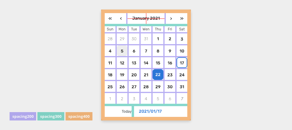
| Padding of container | spacing | 12 | spacing-400 |
| Margin on left and right of title (month) | spacing | 4 | spacing-200 |
| Margin on top of days and below the day section | spacing | 8 | spacing-300 |
| Margin between single days | spacing | 4 | spacing-400 |
| Space between today label and button | spacing | 8 | spacing-300 |
Date button states


| Used in | Type | px | Token |
|---|---|---|---|
| Date button | Size | 36x36 | sizing-item-300 |
| Date border radius | Corner radius | 8 | radius-button-200 |
| Date number font | Font | font-strong |
|
Active (default) |
|||
| Background color | Color | color-bg-interactive-200 |
|
| Text color | Color | color-text-interactive-200 |
|
Hover |
|||
| Background color | Color | color-bg-interactive-200-hover (1) |
|
| Text color | Color | color-text-interactive-200-hover |
|
Pressed |
|||
| Background color | Color | color-bg-interactive-200-pressed |
|
| Text color | Color | color-text-interactive-200-pressed |
|
| Selected | |||
| Background color | Color | color-bg-interactive-100 |
|
| Text color | Color | color-text-interactive-100 |
|
Error |
|||
| Background color | Color | color-bg-interactive-100-error |
|
| Text color | Color | color-text-interactive-100 |
|
Disabled |
|||
| Background color | Color | color-bg-interactive-200 |
|
| while object | Opacity | opacity-disabled |
|
| Text font | Font | font-body |
|
Today |
|||
| Border size | Border size | 2 | border-width-200 |
| Border color | Color | color-border-500 |
|
Focus |
|||
| Border size | Border size | 1 | border-width-100 |
| Border color | Color | color-focus-200 |
|
| Border color (error, selected) | Color | color-focus-100 |
|
| Focus border corner radius | Corner radius | radius-button-200 |
|
| Focus inner spacing | Spacing | 2 | spacing-100 |
(1) Do not use hover style when the button is selected, disabled or in error style.
Date button spacing

| Used in | Type | px | Token |
|---|---|---|---|
| Top and bottom padding | Spacing | 8 | spacing-300 |
Accessibility
- Provide labels and instructions that are clear and concise.
- If the text input is a required field include the
aria-requiredproperty and indicate that it is a required field and use the validation message for input errors. - W3C Web Tutorial: Labeling Controls
- W3C Web Tutorial: Form Instructions
Attachments:
 Snímek obrazovky 2020-11-18 v 13.37.45.png (image/png)
 Pickers.zip (application/zip)
Date_picker-anatomy.png (image/png)
Pickers.zip (application/zip)
Date_picker-anatomy.png (image/png)
 Snímek obrazovky 2020-11-25 v 9.51.18.png (image/png)
 Snímek obrazovky 2020-11-25 v 9.53.39.png (image/png)
 Snímek obrazovky 2020-11-25 v 9.53.29.png (image/png)
 image2020-11-30_14-8-32.png (image/png)
 image2020-11-27_12-13-3.png (image/png)
 image2020-11-27_12-24-3.png (image/png)
 image2020-12-1_10-57-14.png (image/png)
 image2020-12-1_10-59-46.png (image/png)
 image2020-11-30_14-17-56.png (image/png)
 Context-menu-type-multilevel.png (image/png)
 image2020-11-27_15-19-14.png (image/png)
 image2020-11-27_15-14-27.png (image/png)
 image2020-11-27_15-46-5.png (image/png)
 image2020-11-2_9-26-30.png (image/png)
 text-area-label-horizontal.png (image/png)
 text-area-state-selected.png (image/png)
 text-area-state-disabled.png (image/png)
 text-area-state-readonly.png (image/png)
 text-area-variants-error-icon.png (image/png)
 text-area-variants-warning-icon.png (image/png)
 text-area-state-focus.png (image/png)
 image2020-11-30_14-3-56.png (image/png)
 image2020-11-30_14-32-1.png (image/png)
 Date_picker-anatomy.png (image/png)
 Date_picker-label.png (image/png)
 Date_picker-small.png (image/png)
 Date_picker-label.png (image/png)
 Date_picker-placeholder.png (image/png)
 Date_picker-activate.png (image/png)
 Date_picker-disabled.png (image/png)
 Date_picker-range-screen.png (image/png)
 Date_picker-range.png (image/png)
 Date_picker-range-screen.png (image/png)
 Date_picker-error.png (image/png)
 Date_picker-error.png (image/png)
 Date_picker-error.png (image/png)
 Date_picker-error.png (image/png)
 image2021-2-3_14-53-32.png (image/png)
 Date_picker-anatomy.png (image/png)
 Data_picker-range-screen.png (image/png)
 Date_picker-label.png (image/png)
 Date_picker-range.png (image/png)
 Date_picker-small.png (image/png)
 Date_picker-placeholder.png (image/png)
 Date_picker-activate.png (image/png)
 Date_picker-disabled.png (image/png)
 Date_picker-error.png (image/png)
 Date_picker-error.png (image/png)
 Date_picker-spacing.png (image/png)
 Date_picker-anatomy.png (image/png)
 Data_picker-range-screen.png (image/png)
 Date_picker-anatomy.png (image/png)
 Date_picker-spacing.png (image/png)
 Data_picker-range-screen.png (image/png)
 Date_picker-anatomy.png (image/png)
 Date_picker-spacing.png (image/png)
 Data_picker-screen.png (image/png)
 Date_picker-anatomy.png (image/png)
 Date_picker-spacing.png (image/png)
 Date_picker-anatomy.png (image/png)
 Data_picker-screen.png (image/png)
 Date_picker-anatomy.png (image/png)
 Date_picker-label.png (image/png)
 Date_picker-range.png (image/png)
 Date_picker-label.png (image/png)
 Date_picker-small.png (image/png)
 Date_picker-placeholder.png (image/png)
 Date_picker-activate.png (image/png)
 Date_picker-disabled.png (image/png)
 Date_picker-error.png (image/png)
 Date_picker-spacing.png (image/png)
 Data_picker-screen.png (image/png)
 Data_picker-title.png (image/png)
 Date_picker-anatomy.png (image/png)
 Date_picker-input-type-single.png (image/png)
 Date_picker-input-type-range.png (image/png)
Date_picker-input-type-single.png (image/png)
Date_picker-appearance-small.png (image/png)
Date_picker-input-type-range.png (image/png)
Date_picker-input-type-single.png (image/png)
Date_picker-appearance-small.png (image/png)
 Date_picker-input-appearance-small.png (image/png)
Date_picker-input-appearance-placeholder.png (image/png)
Date_picker-input-state-focus.png (image/png)
Date_picker-input-state-disabled.png (image/png)
Date_picker-input-state-error.png (image/png)
Date_picker-input-appearance-small.png (image/png)
Date_picker-input-appearance-placeholder.png (image/png)
Date_picker-input-state-focus.png (image/png)
Date_picker-input-state-disabled.png (image/png)
Date_picker-input-state-error.png (image/png)
 Date_picker-input-interaction-manual.png (image/png)
Date_picker-input-interaction-spinners.png (image/png)
Date_picker-input-interaction-manual.png (image/png)
Date_picker-input-interaction-spinners.png (image/png)
 Date_picker-input-validation.png (image/png)
Date_picker-anatomy.png (image/png)
Date_picker-input-validation.png (image/png)
Date_picker-anatomy.png (image/png)
 Date_picker-content.png (image/png)
 date_picker-input-style-states.png (image/png)
 date_picker-input-style-states.png (image/png)
 date_picker-input-style-button-states.png (image/png)
date_picker-calendar-style-button-states.png (image/png)
date_picker-input-style-button-states.png (image/png)
date_picker-calendar-style-button-states.png (image/png)
 Date_picker-input-content.png (image/png)
 Date_picker-calendar-content.png (image/png)
 Date_picker-input-spacing.png (image/png)
 Date_picker-calendar-spacing.png (image/png)
 Data_picker-title.png (image/png)
Date_picker-anatomy.png (image/png)
Data_picker-title.png (image/png)
Date_picker-anatomy.png (image/png)
 Date_picker-calendar-content.png (image/png)
 date_picker-calendar-style-button-states.png (image/png)
 Date_picker-input-spacing.png (image/png)
 Date_picker-calendar-spacing.png (image/png)
 Date_picker-input-interaction-spinners.png (image/png)
 Date_picker-calendar-spacing.png (image/png)
Date_picker-input-content.png (image/png)
Date_picker-calendar-spacing.png (image/png)
Date_picker-input-content.png (image/png)
 Date_picker-input-spacing.png (image/png)
 Date_picker-anatomy.png (image/png)
 Date_picker-anatomy.png (image/png)
date_picker-input-style-states.png (image/png)
Date_picker-calendar-content.png (image/png)
calendar.gif (image/gif)
Date_picker-input-content.png (image/png)
Date_picker-input-spacing.png (image/png)
date_picker-calendar-style-button-states.png (image/png)
date_picker-calendar-buttons-content.png (image/png)
date_picker-calendar-buttons-spacing.png (image/png)
Date_picker-input-state-error.png (image/png)
Date_picker-anatomy.png (image/png)
date_picker-input-style-states.png (image/png)
Date_picker-calendar-content.png (image/png)
calendar.gif (image/gif)
Date_picker-input-content.png (image/png)
Date_picker-input-spacing.png (image/png)
date_picker-calendar-style-button-states.png (image/png)
date_picker-calendar-buttons-content.png (image/png)
date_picker-calendar-buttons-spacing.png (image/png)
Date_picker-input-state-error.png (image/png)