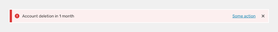
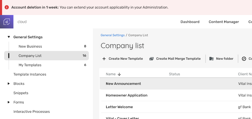
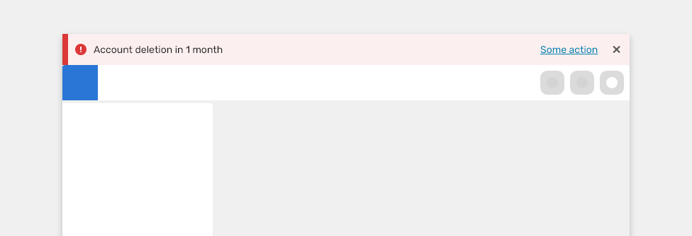
Banners are used for system or product level notifications that are not related to a task.
Component Status
 Design Kit: NOT RELEASED
 Bobwai component: bobwai--notification-bar RELEASED

Usage
System or product level notifications that are not specific to a task. They should be noticed and lead user to an action. They persist across other pages until user dismisses or resolves them.

Place the banners above the app header.
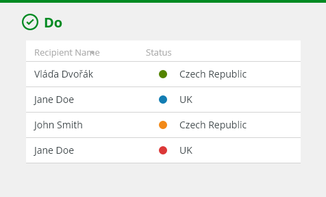
- Make the banners actionable if possible.
- Use them only for system level notifications.
- Use them to display notifications across several pages.

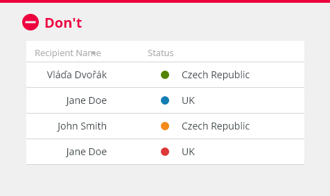
- Do not stack banner notifications.
- Do not cover the page content.
- Do not include multiple buttons.
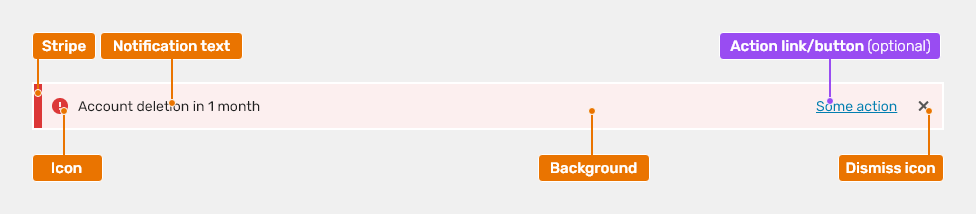
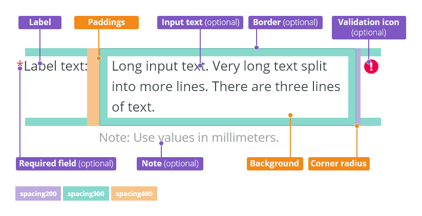
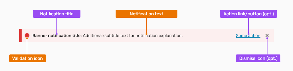
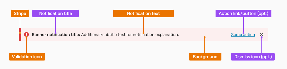
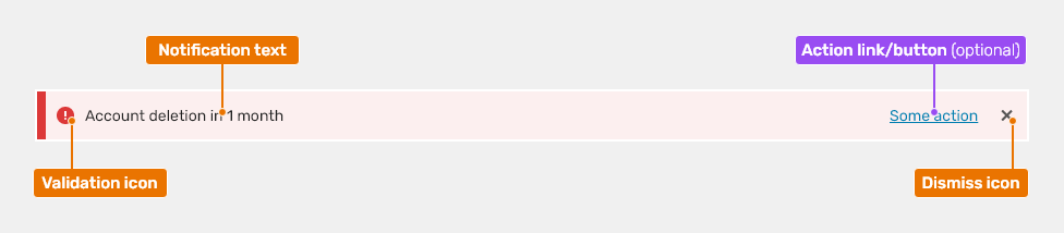
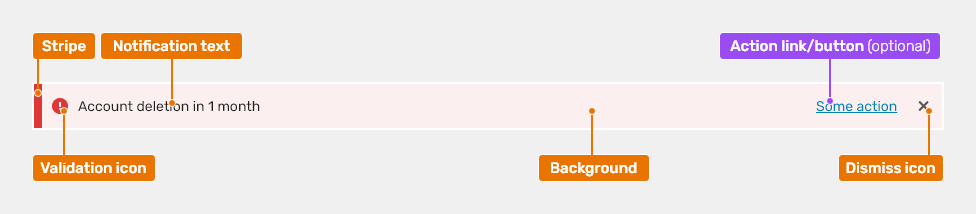
Anatomy
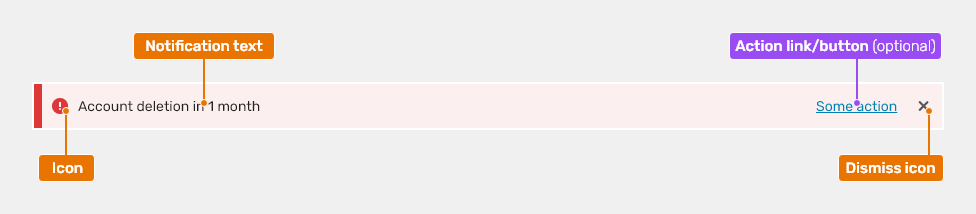
- Icon - The icon emphasizes the text and matches the semantics, whether it is an informative or a high priority notification.
- Notification text - Description of the issue.
- Action link/button (optional) - Primary action of the banner. Helps user to solve the issue.
- Dismiss icon - Icon that allows closing the banner.
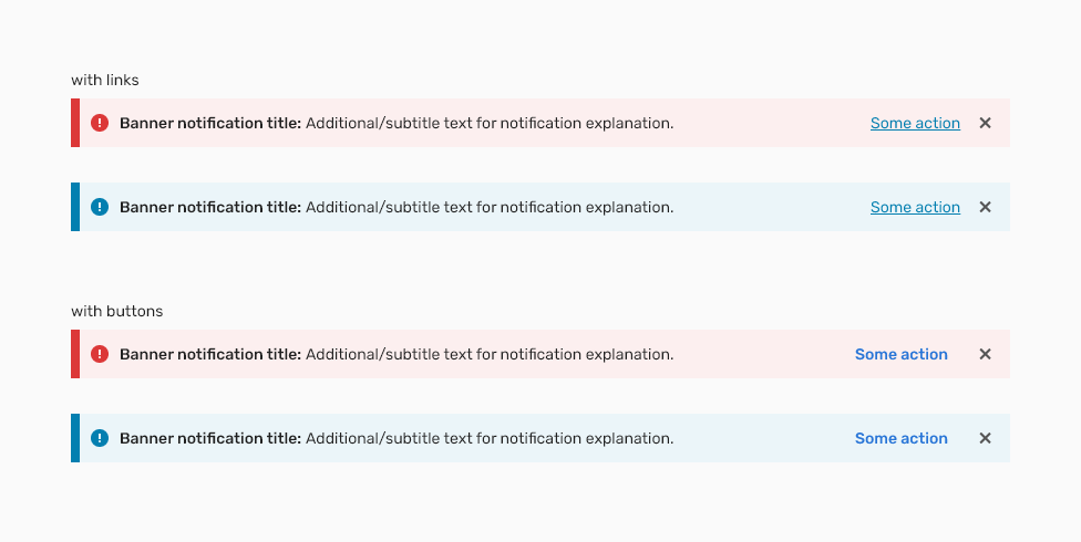
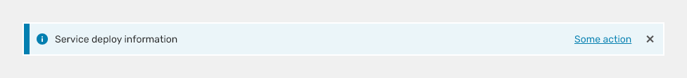
Types
High Priority

Low Priority
To display information which should be displayed permanently (e.g. for a trial version).

Keyboard Interactions
| Key | Interaction |
|---|---|
| Tab | Places the focus on the next interactive element, which is either a button or a close button. |
| Shift + Tab | Places the focus on the previous interactive element, which is either a button or a close button. |
| Space or Enter | If the focus is on the close button, dismisses the alert banner. If focus is on the button, executes the button action. |
| Esc | Dismisses the alert banner if possible. This is equivalent to selecting the close button. |
Editorial
- Keep the text short and concise.
- In extreme cases wrap to 2 lines max.
Related Components
Banner Style
| Used In | Type | PX | Token |
|---|---|---|---|
| Background | Color | red-100 (error type), |
|
| Stripe | Width | 8 | border-width-400 |
| Stripe | Color | color-error(error type), |
|
| Validation icon | Size | sizing-icon-200 |
|
| Validation icon | Color | color-icon-error (error type), color-icon-info (info type) |
|
| Notification text | Font | font-body |
|
| Notification text | Color | color-text-100 | |
| Border | Border-radius | 0 | radius-none |
| Dismiss icon | Size | sizing-icon-200 |
|
| Dismiss icon | Color | color-icon-100 |
| Used in | Icon name |
|---|---|
| Validation Icons | error-small (error type) info2-small (info type) |
| Dismiss icon | close-small |
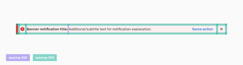
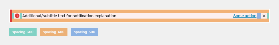
Spacing
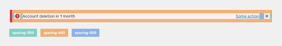
| Used in | Type | px | Value |
|---|---|---|---|
| Top and bottom spacing | spacing | 12 | spacing-400 |
| Left and right spacing | spacing | 8 | spacing-300 |
| Inner spacing before the notification text | spacing | 8 | spacing-300 |
| Inner spacing before the dismiss icon | spacing | 16 | spacing-500 |
Accessibility
- Provide labels and instructions that are clear and concise.
- If the text input is a required field include the
aria-requiredproperty and indicate that it is a required field and use the validation message for input errors. - W3C Web Tutorial: Labeling Controls
- W3C Web Tutorial: Form Instructions
Attachments:
 image2020-11-30_14-8-32.png (image/png)
 image2020-11-27_12-13-3.png (image/png)
 image2020-11-27_12-24-3.png (image/png)
 image2020-12-1_10-57-14.png (image/png)
image2020-12-1_10-59-46.png (image/png)
image2020-11-30_14-17-56.png (image/png)
image2020-12-1_10-57-14.png (image/png)
image2020-12-1_10-59-46.png (image/png)
image2020-11-30_14-17-56.png (image/png)
 Context-menu-type-multilevel.png (image/png)
 image2020-11-27_15-19-14.png (image/png)
 image2020-11-27_15-14-27.png (image/png)
 image2020-11-27_15-46-5.png (image/png)
 image2020-11-2_9-26-30.png (image/png)
 text-area-label-horizontal.png (image/png)
 text-area-state-selected.png (image/png)
 text-area-state-disabled.png (image/png)
 text-area-state-readonly.png (image/png)
 text-area-variants-error-icon.png (image/png)
 text-area-variants-warning-icon.png (image/png)
 text-area-state-focus.png (image/png)
 image2020-11-30_14-3-56.png (image/png)
 image2020-11-30_14-32-1.png (image/png)
 Banner notification – error.png (image/png)
 Banner notification.png (image/png)
 Banner.png (image/png)
 Banner.png (image/png)
 Banner.png (image/png)
 Banner – Anatomy.png (image/png)
 Banner - Usage.png (image/png)
 Banner.png (image/png)
 Banner - Types.png (image/png)
 Banner.png (image/png)
 Banner – Info.png (image/png)
 Banner – Info.png (image/png)
 Banner – Content.png (image/png)
 Banner – Content – Spacings.png (image/png)
 Banner – Content – Spacings.png (image/png)
 Banner.png (image/png)
 Banner – Anatomy.png (image/png)
 Banner - Types.png (image/png)
 Banner.png (image/png)
 Banner – Info.png (image/png)
 Banner – Content.png (image/png)
 Banner – Content – Spacings.png (image/png)
 banner-title.png (image/png)
 banner–anatomy.png (image/png)
 Banner.png (image/png)
 Banner–info.png (image/png)
 banner–content.png (image/png)
 banner-spacings.png (image/png)
 Banner.png (image/png)
 banner-title.png (image/png)
 banner-title.png (image/png)
banner–anatomy.png (image/png)
banner-title.png (image/png)
banner–anatomy.png (image/png)
 Banner.png (image/png)
Banner–info.png (image/png)
banner–anatomy.png (image/png)
Banner.png (image/png)
Banner–info.png (image/png)
banner–anatomy.png (image/png)
 banner–content.png (image/png)
 banner-content-spacings.png (image/png)
image2021-6-3_10-43-35.png (image/png)
image2021-6-11_14-9-15.png (image/png)
banner-content-spacings.png (image/png)
image2021-6-3_10-43-35.png (image/png)
image2021-6-11_14-9-15.png (image/png)