BACKGROUND INFORMATION
Workflow editors are used for creation of processing flows or approval workflows. They constitute an intuitive environment for building complex processes.
General Guidance
- Use the workflow editor pattern if users need to create an automated processing workflow or model a process, e.g. approval process.
- Workflow editor provides a business-user-friendly environment for process modelling, including data flow visalization and validation or monitoring tools.
Layout Configuration
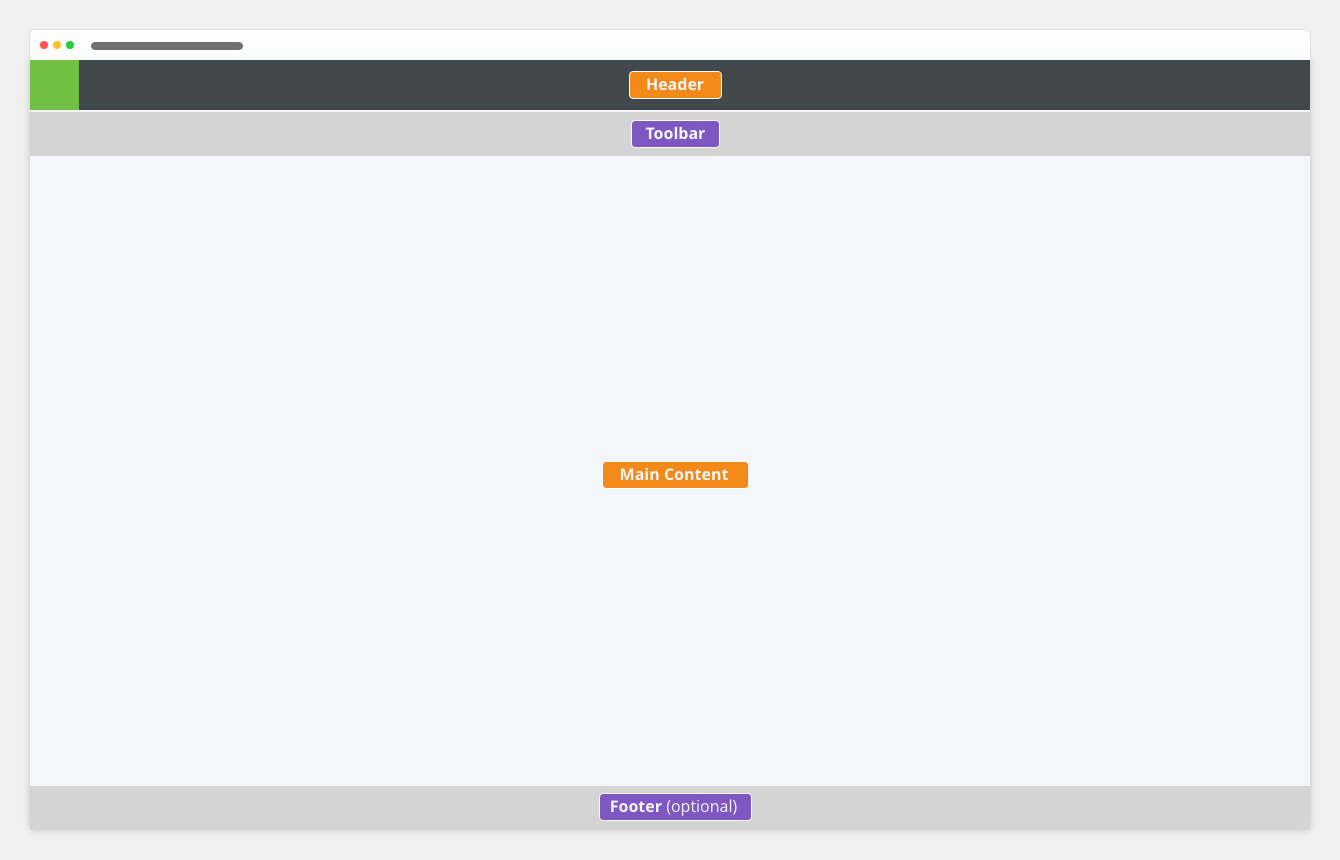
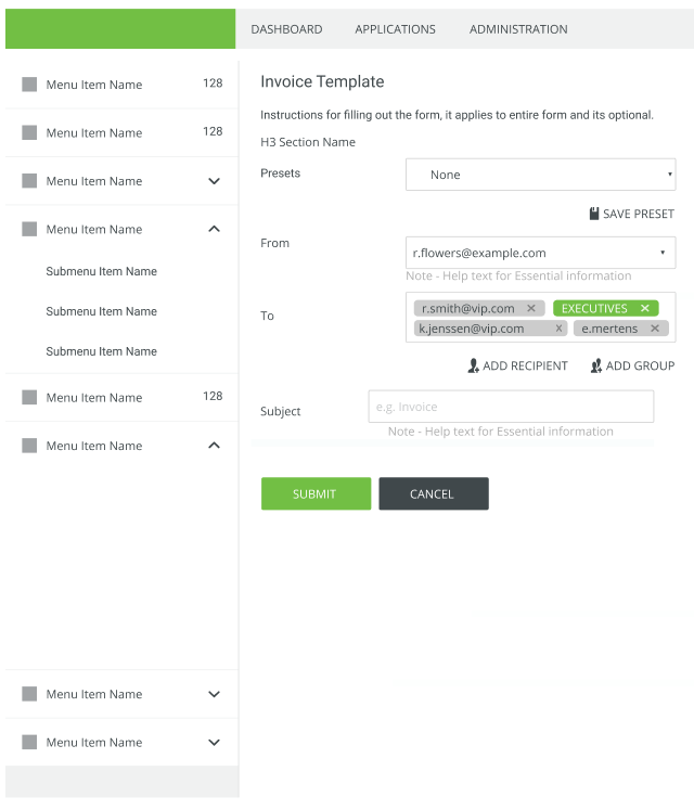
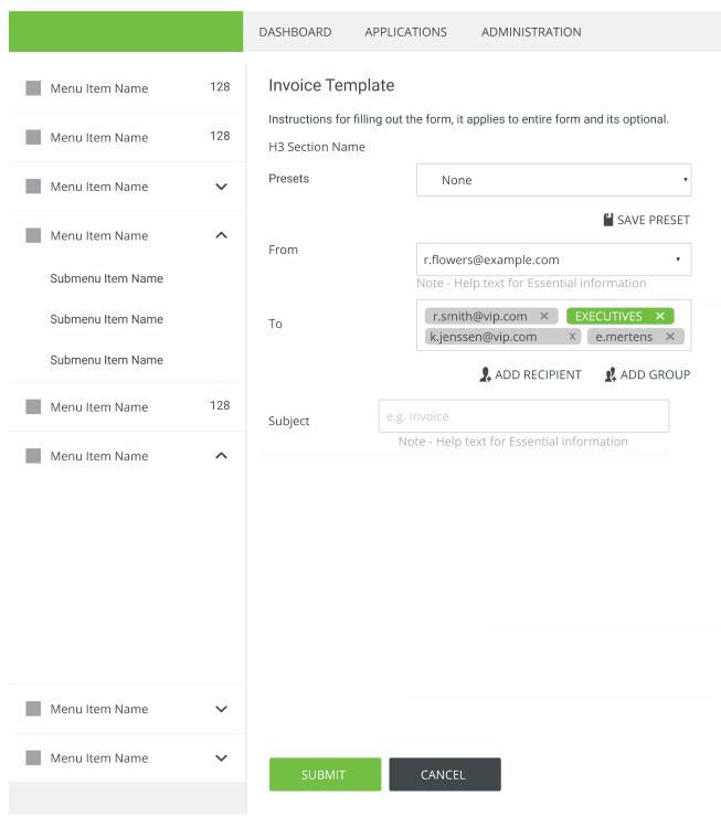
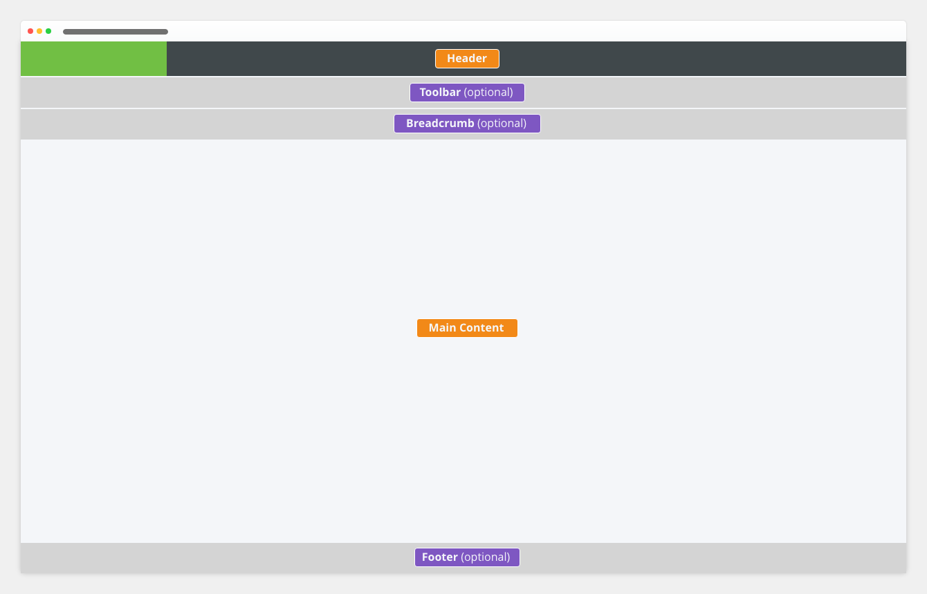
Workflow editor uses the full-screen layout in the following configuration:
- reduced application header
- no breadcrumb navigation
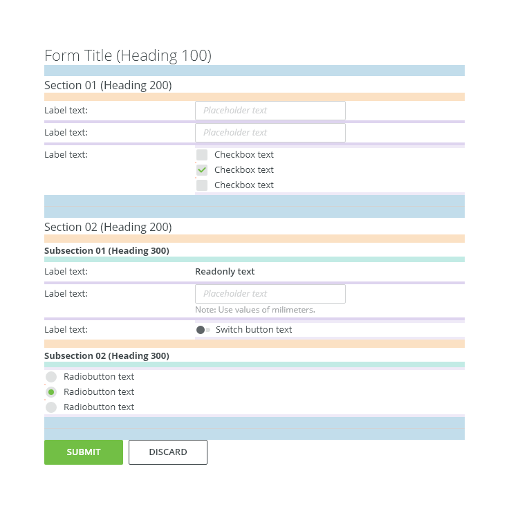
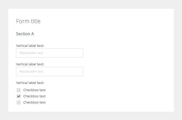
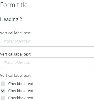
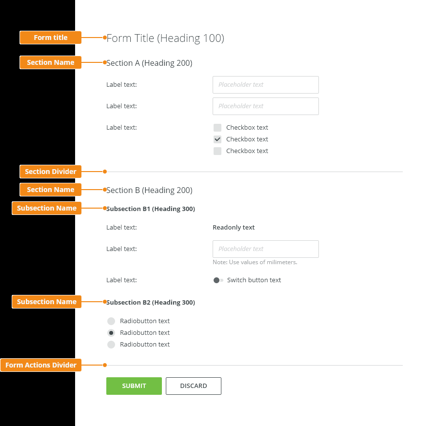
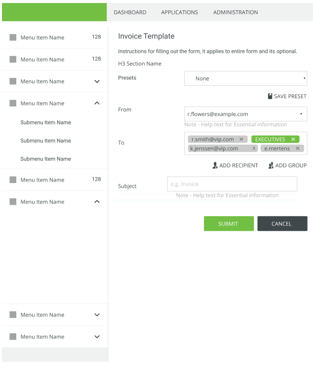
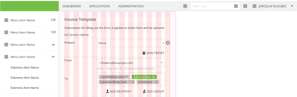
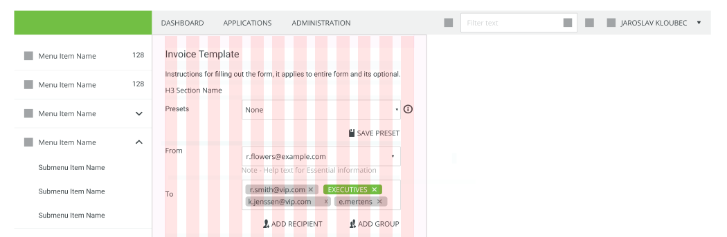
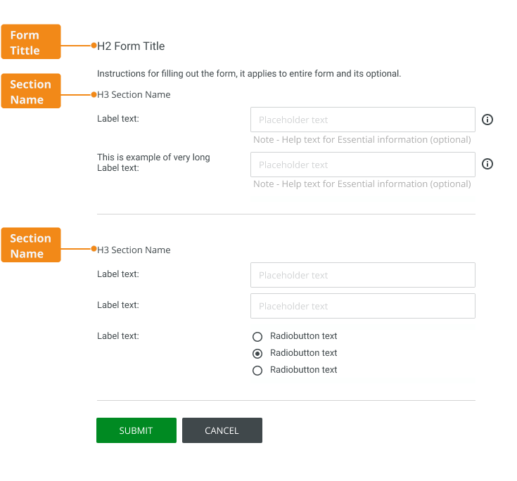
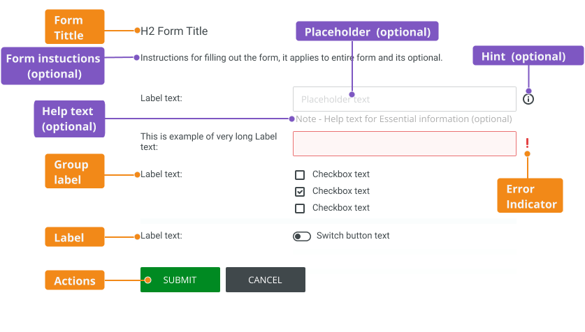
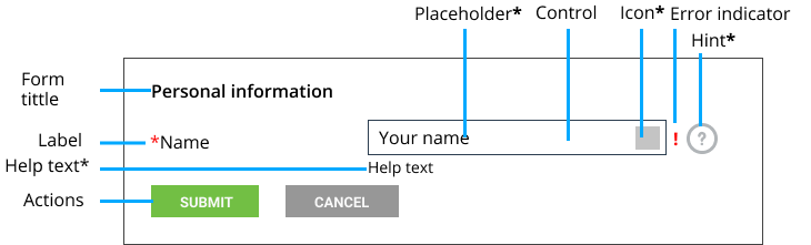
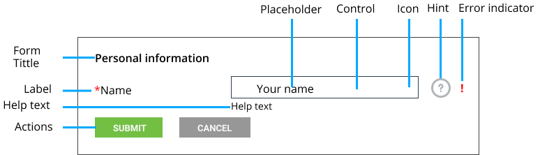
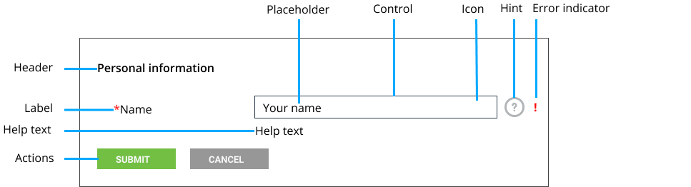
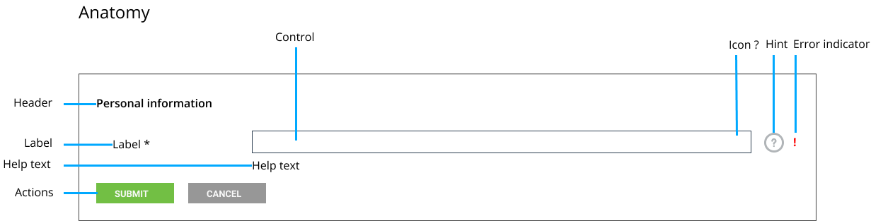
Anatomy
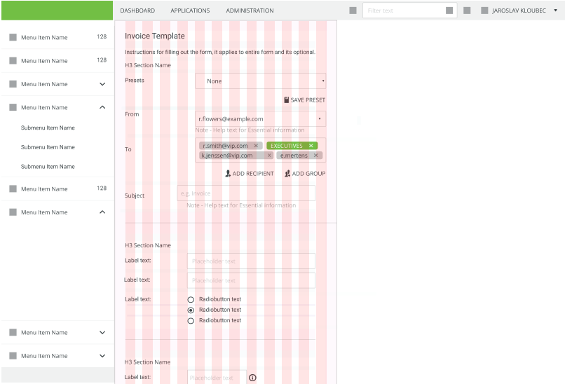
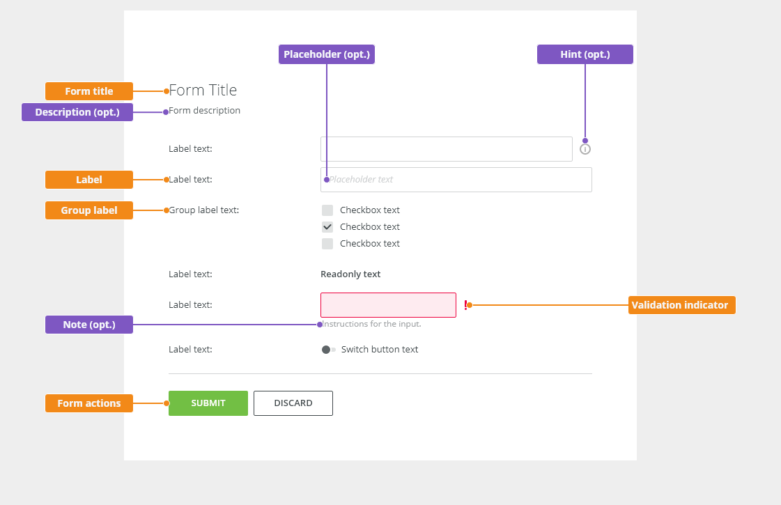
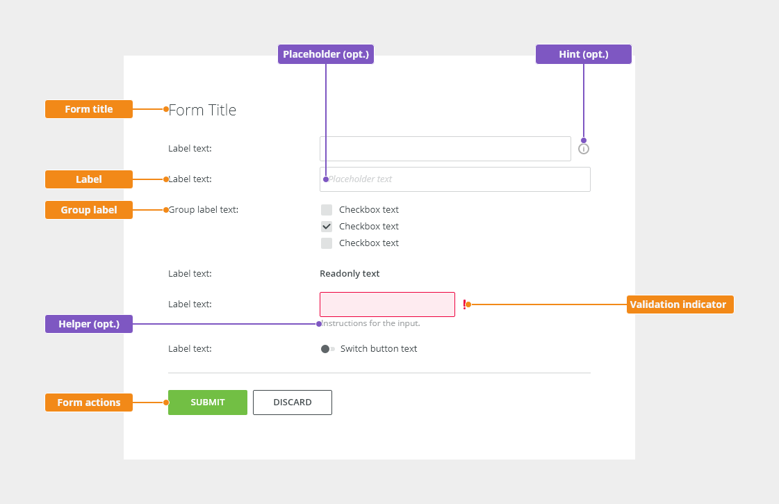
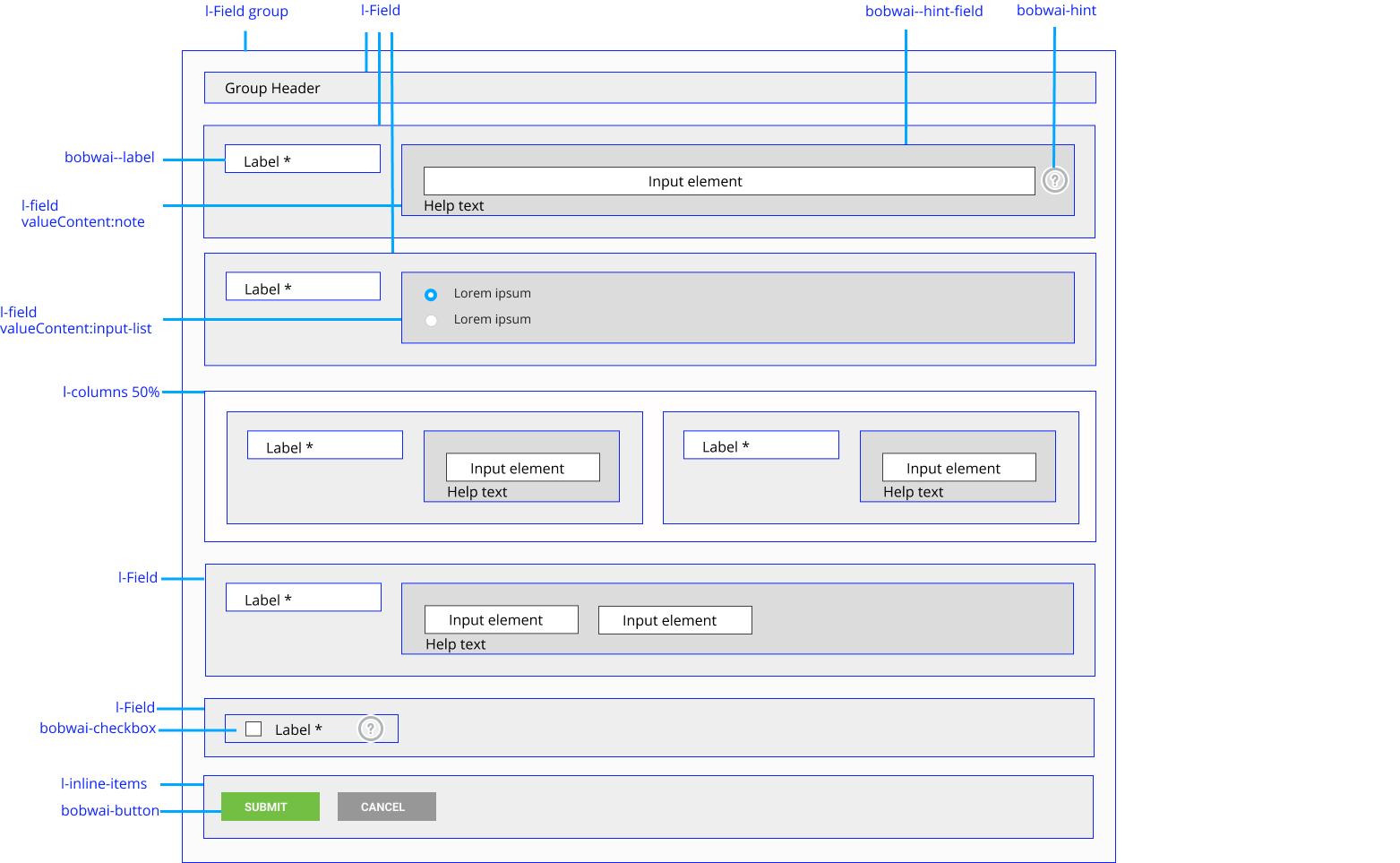
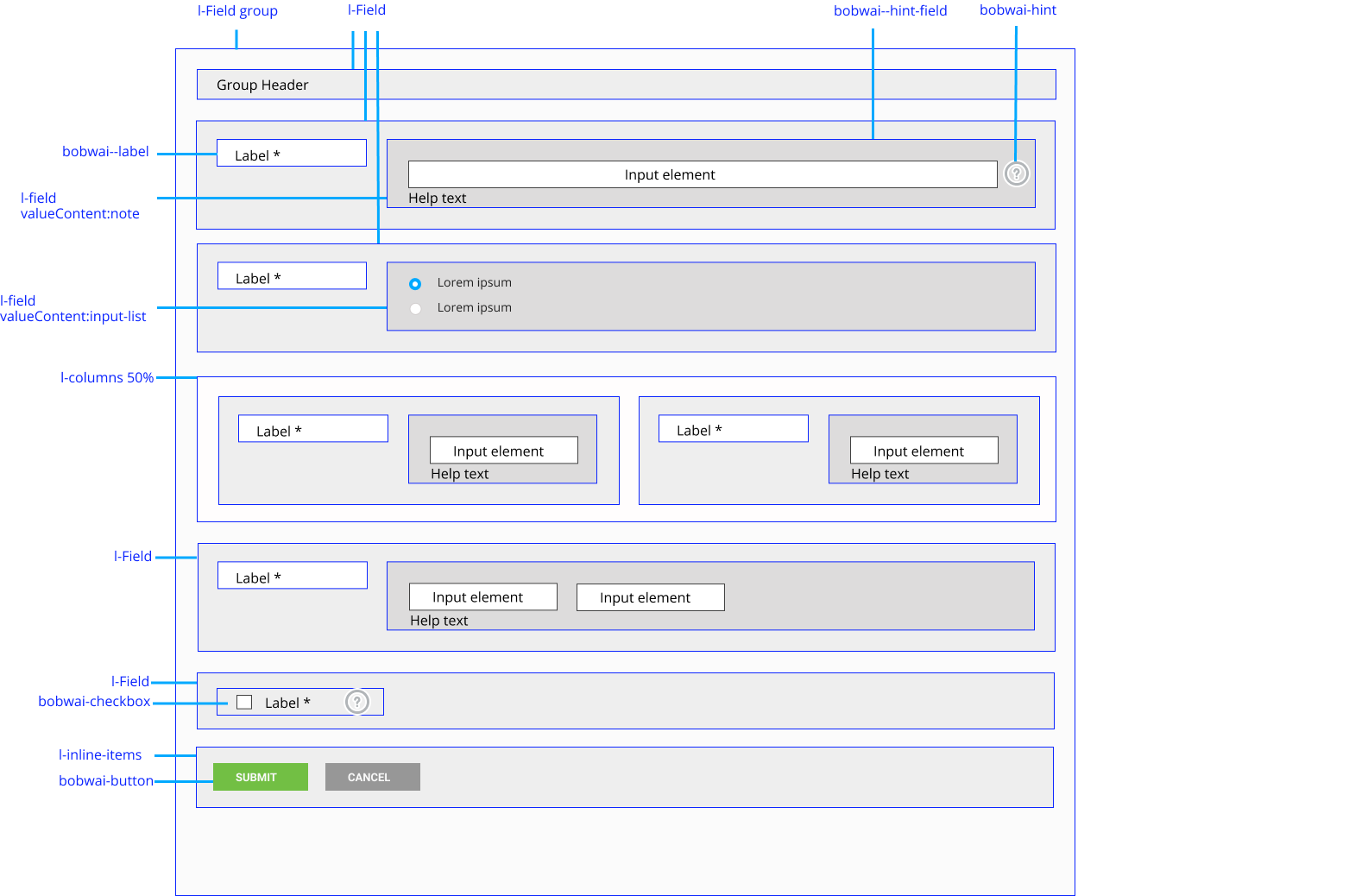
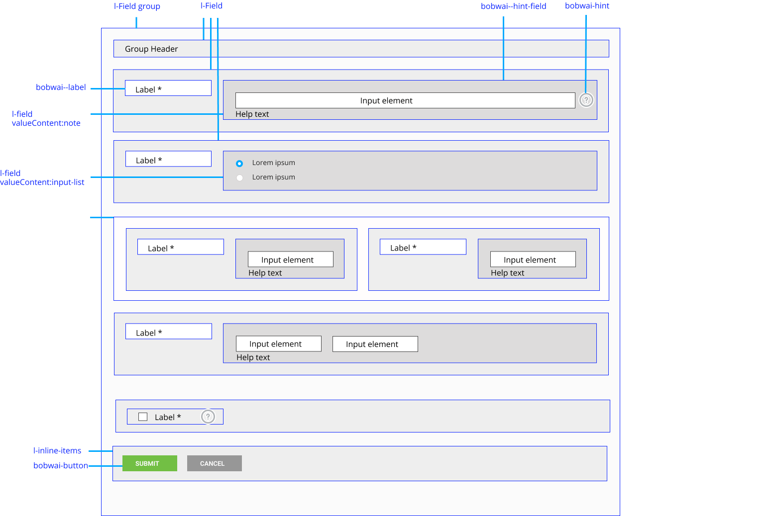
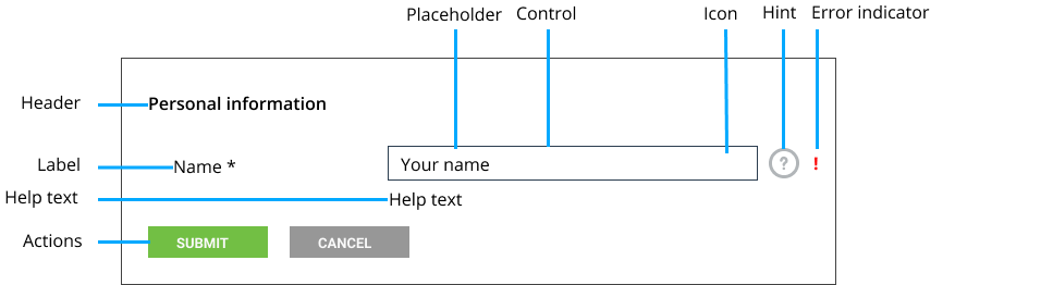
This is the basic workflow editor layout configuration.
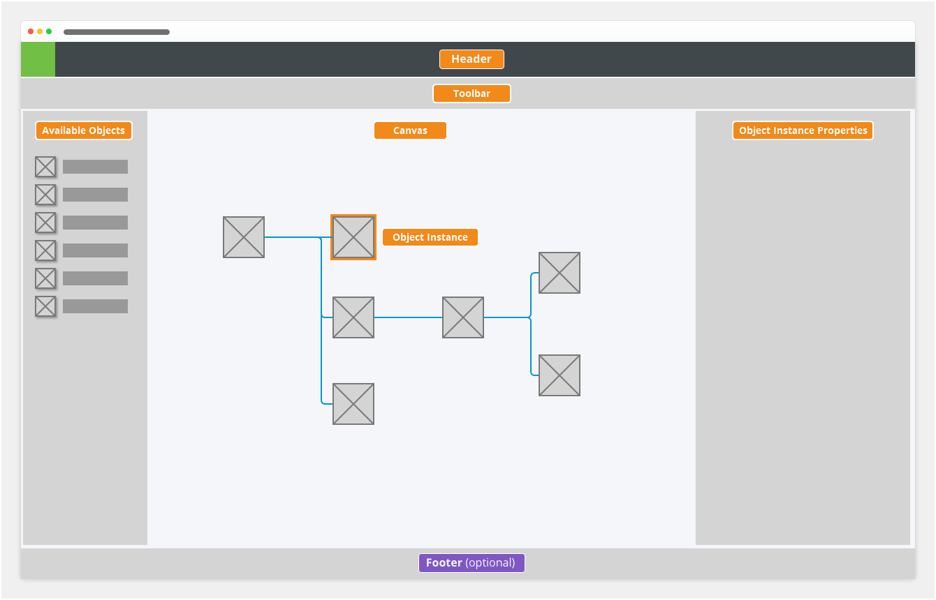
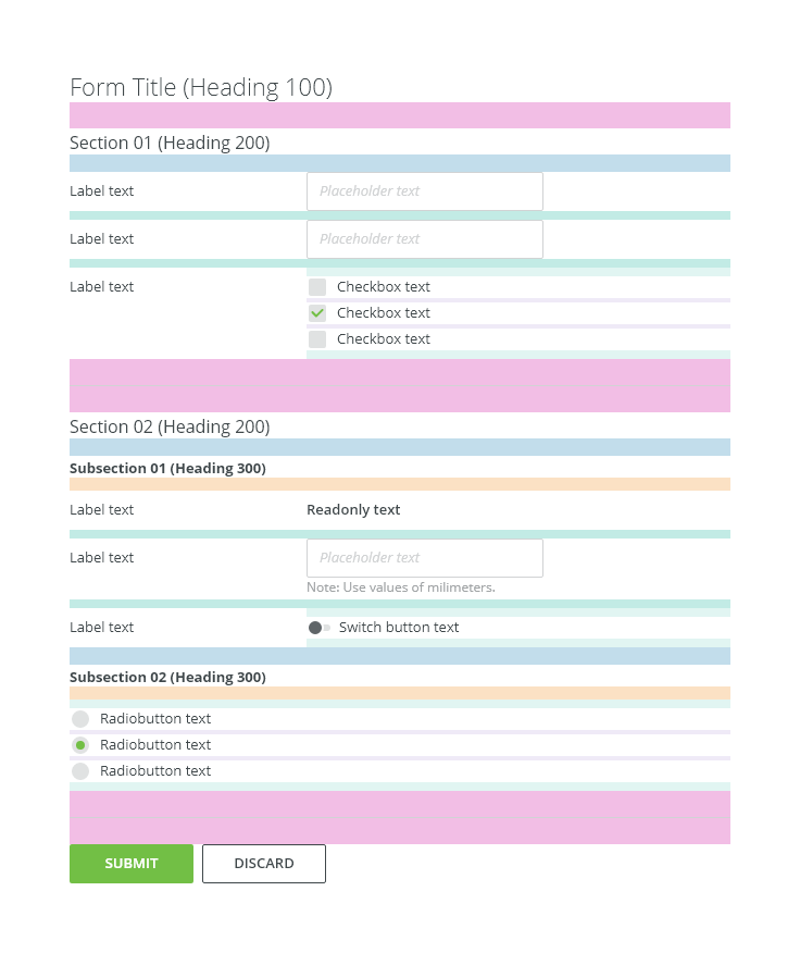
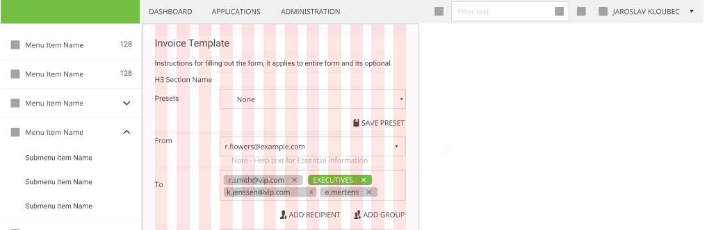
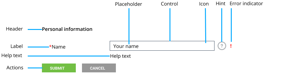
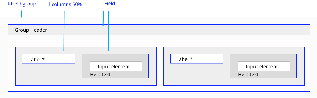
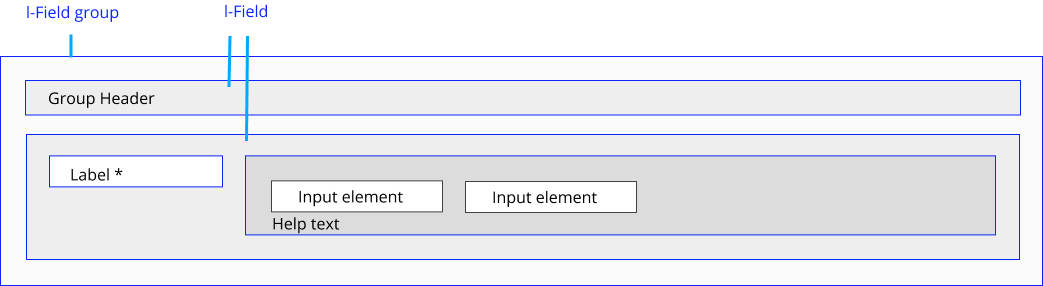
- Header - Describes the form as a whole. Forms can be grouped into a logical section with its group title.
- Toolbar (optional) - Context information applied to the entire form.
- Available objects - Describes the meaning of the corresponding input field.
- Canvas (optional) - An actual example of what the user should write (do not include additional text, such as "ex:" or "e.g.").
- Object instance (optional) - Provides assistance on how to fill out a field. Used for essential information. Keep the text short and specific.
Use hint for context or background information that is “nice to have". - Object instance properties (optional) - Additional explanation for a form field. A form control can have help text that will be displayed in a tooltip when hovering over or focusing an icon.
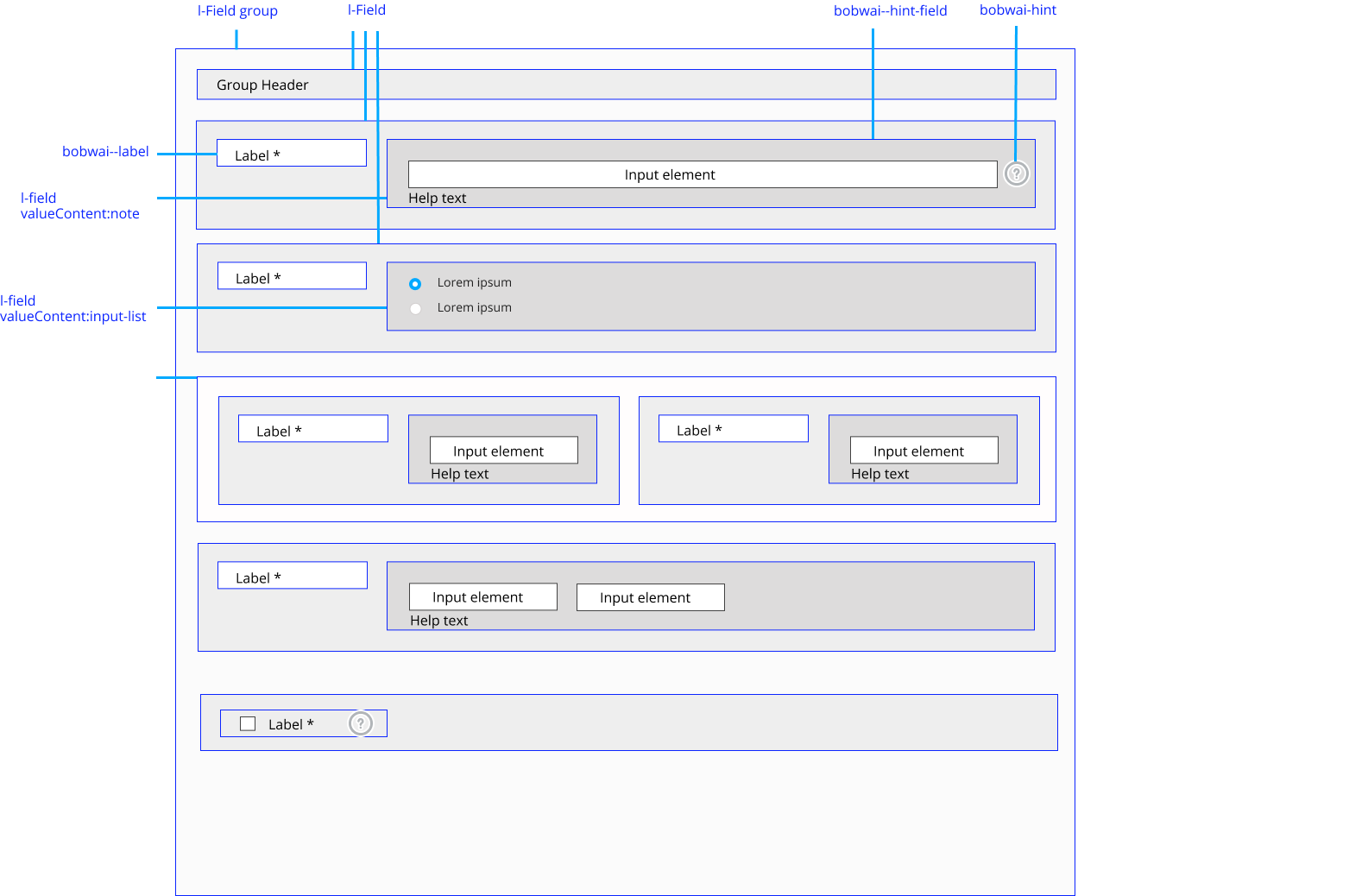
Header
bobwai component
This is about header.
View and Edit Mode

- Always use labels. If labels are not required by design make sure the label accessibly is visually hidden.
- Long labels are wrapped. (Text moves down to the next line.)
Do not use truncating with ellipsis for labels. Users will need to spend extra time decoding the meaning of the truncated labels.
Data Inputs
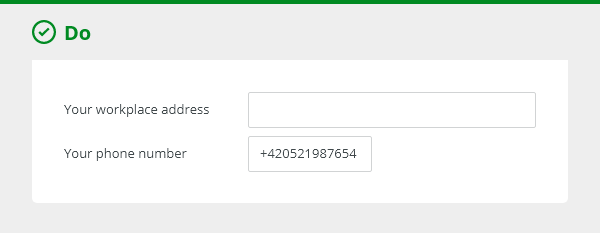
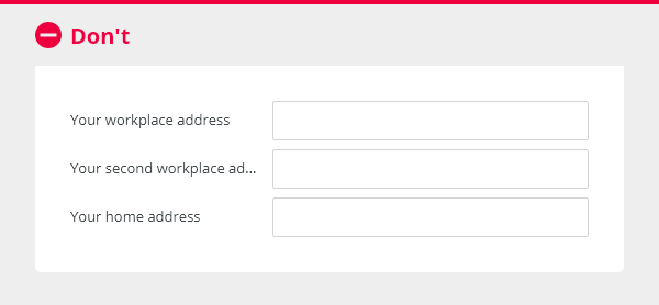
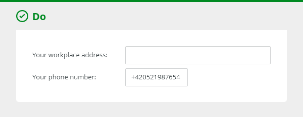
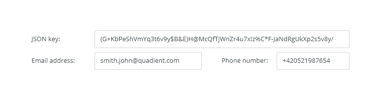
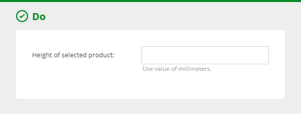
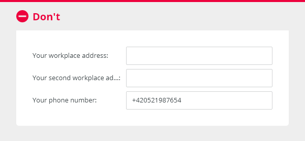
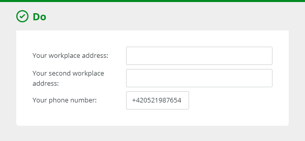
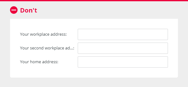
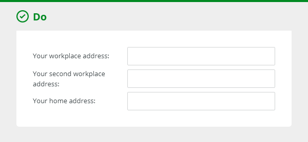
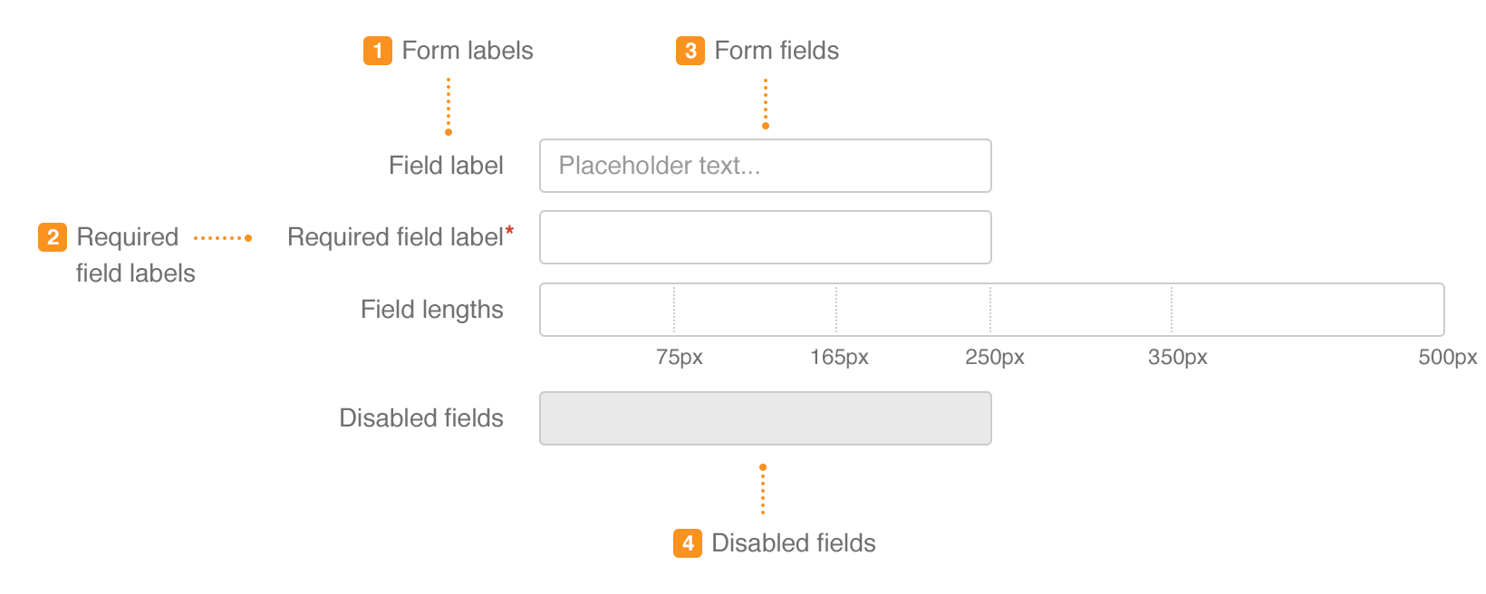
The field width should reflect the intended length.
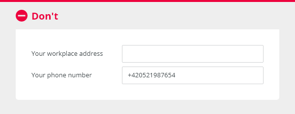
Do not create long inputs if the expected width is short.
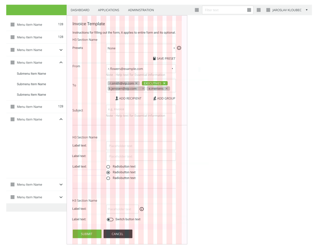
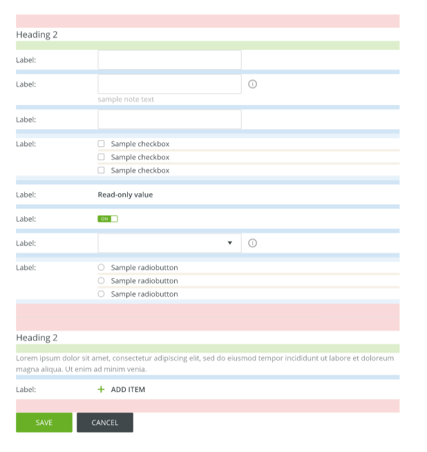
Basic Data Inputs
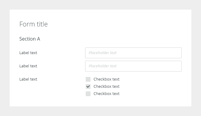
- Text input
- Combo box
Use a select input field for 5 and more options. When the default option is recommended, prefer the select input to radio buttons. - Radio button
When there are a few options to choose (up to 5), prefer radio buttons to a select input. The user does not have to click on anything to have an overview of all options. - Checkbox
Use a checkboxt to to select or deselect one or more choices. - Text area
Use text area to capture multiple lines of text.
Advanced Data Inputs
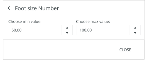
- Spinner
- Switch
Use Switch for selecting a true or false option. It represents a single state as on/off or show/hide.
Typical usage is in forms with instant update, without form submission buttons like Submit, OK.
DO NOT use for two opposing options from which you can select, e.g. List /Grid view. - Add delete item
Assistance
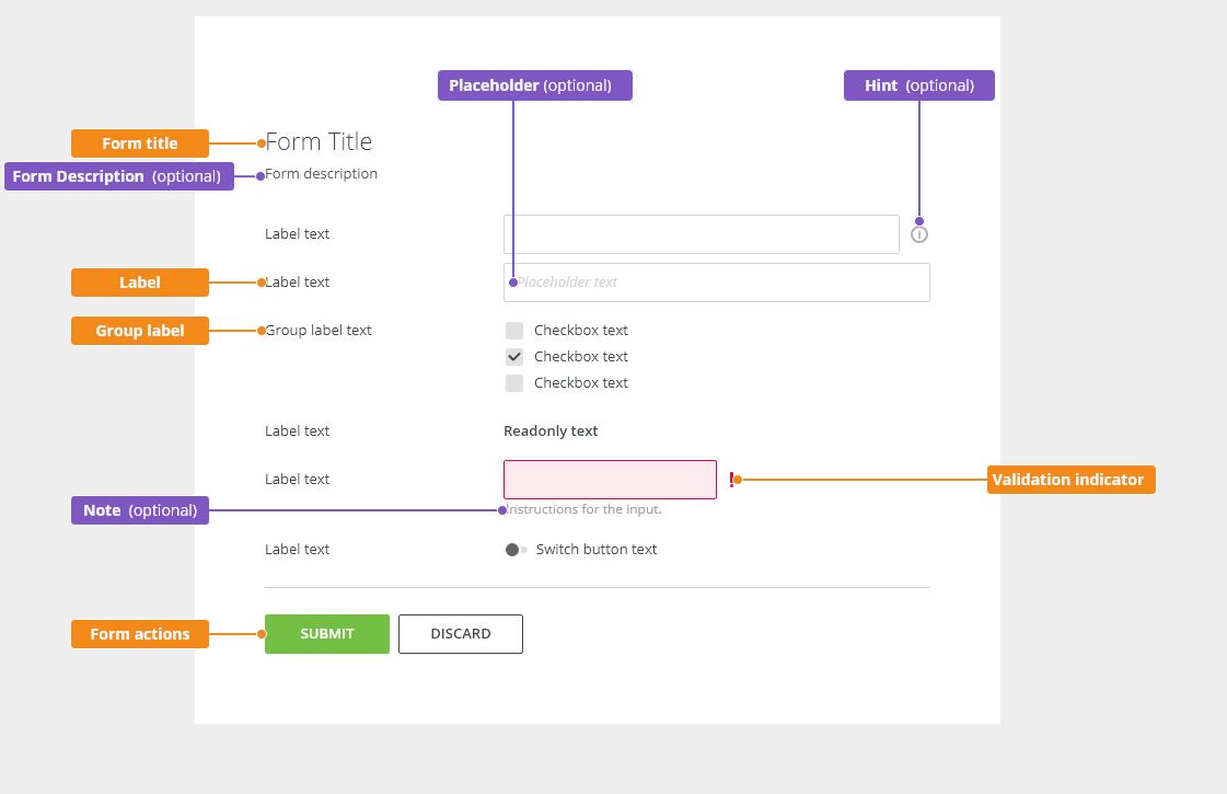
User Assistance and Usage of Microcopy in Forms
Use short and specific micro copy.
| Type | Usecase | Usage | Example | Style |
|---|---|---|---|---|
| Note | Essential information to understanding how to take action. | Value must be between 1 - 100 | Paragraph with WCAG contrast 4.5 : 1 for normal text | |
| Placeholder text | Example of what to enter. should not contain crucial information. Use only if necessary. | YYYY-MM-DD | ||
| Hint | Additional explanation for a form field unfamiliar to some users, Explains technical term or process | Default white tooltip | ||
| Static micro copy | Form instruction | Information applied to entire form | Fill out the form to register | Paragraph with WCAG contrast 4.5 : 1 for normal text |
| Section instruction | Information applied to form section | |||
| Field instruction | Use only if necessary to assist in-context information. | |||
| Pre submit info | Note related to submit actions typically Legal or irreversible action | |||
| Static notification messages | Warning | Paragraph with WCAG contrast 4.5 : 1 for normal text with warning icon |
Note

Note for Essential information on how to take an action.
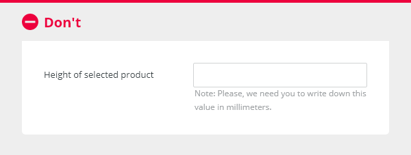
Do not write long multi-line notes, avoid overwhelming the user. Use sconsise microcopy.
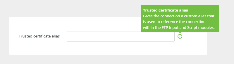
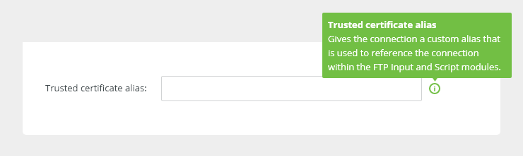
Hint
Tooltips are used for additional explanation. Do not use them for critical information,
Buttons
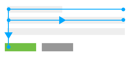
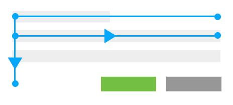
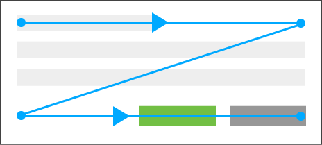
Alignment of Primary and Secondary Buttons
Right alignment (F Pattern) - constrained container.
Left alignment (Z Pattern) - full page.
Horizontal Alignment

Position buttons directly behind the form.

If the form is long, position the buttons in the sticky footer.

Do not position buttons at the bottom of the page.
Text Button Alignment
Tertiary text buttons are aligned to the left. An icon is recommended.
Form Layout Variants
Inspire products offer three types of forms:
- horizontal (default) - labels and controls of the fields are aligned horizontally.
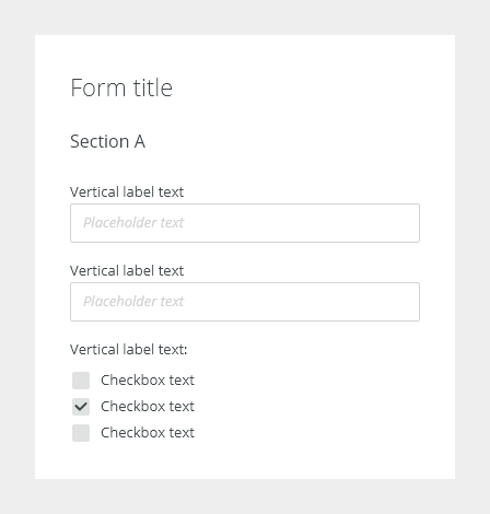
- vertical - labels and controls of the fields are aligned vertically.
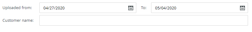
- inline - form fields rendered in one line (e.g. filters - advanced search).
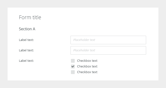
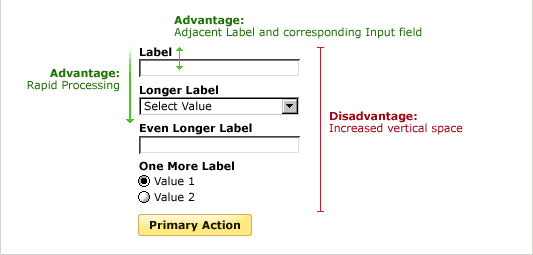
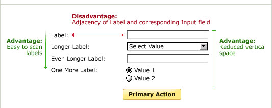
Horizontal
Horizontal forms are good for a quick scanning of labels and can be used in cases of limited vertical space. The space between the label and the input, however, can slow users down.

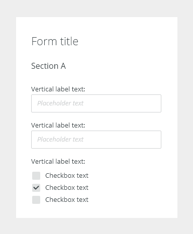
Vertical
Vertical forms are suitable for narrow containers, shorter forms, mobile experiences. They are better for scanning, reduce eye movement and processing time.
Inline
Long Forms
Consider the following principles when designing long forms:
Progressive Disclosure
Use progressive disclosure to reveal any additional content based on the user’s previous selection.
Accordion Forms
When content is sequential encourage users to continue scrolling to explore, over tabbed navigation which would break up the experience.
- Accordion forms allow users to dynamically expose and hide sections. They are suitable for forms with a limited space.
- Generally, is recommended not to use more than 7 accordions at a time.
- Make sure that form actions are applicable for the entire form.
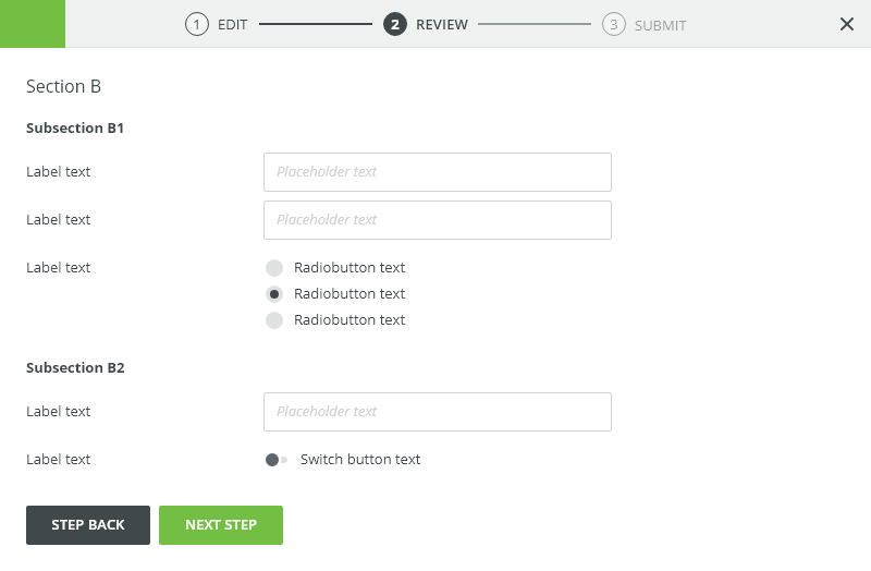
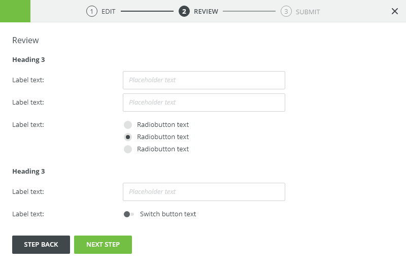
Multi-Step Forms
A multi-step form "Wizard" spreads the form fields across multiple screens.
Appearance
Density
- Default: Use for most of cases
- Condensed: typically used for technical personas when dealing with large amount of data.
Widths
Predefined widths optimized for one column layouts.
- Narrow: default for normal forms.
- Wide: use when expecting wider forms.
Deciding Where to Place a Form
| Form variant | Usage |
|---|---|
| Dedicated page | For more complex, longer or multi-step forms |
| Modal dialog | For critical, infrequent typically editing and management tasks. Dialogs are not ideal for larger than 5 inputs, accordions or tabs |
| Side modal | Processing of brief tasks or sub-tasks. Use side modal when tasks are too large for a floating panel or modal. |
| Side panel | For repeated user inputs which require reference to the affected information. |
Validation
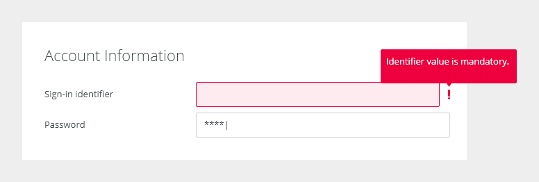
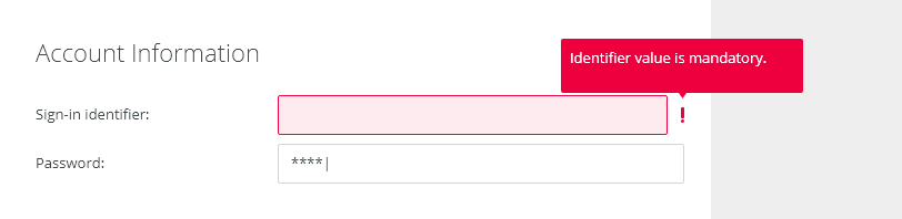
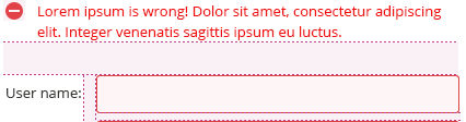
When a form or field submission fails, all fields responsible for the issue are shown with a red outline and an exclamation mark icon and are present until the entered values are invalid.
An error messages appears in a tooltips and are displayed on hover over input or the Error indicator.

Client-side validation - Its recommend validating the user’s data before form submission. Fields are validated after loses focus.
Typical client error validations are:
- Incorrectly formatting data
- Leaving a required field blank
- Leaving a required field incomplete
Server-side validation - where real-time validation is not possible or does not make sense, all fields are validated at the same time on page submission.
Editorial
Labels
Sentence case - only the first word is capitalized, except for proper nouns and other words which are generally capitalized based on a more specific rule.
Don’t use full sentences or complex punctuation (colons, semicolons, etc.).
Error Messages
Error messages should be short and relevant to the user in writing style. See also the chapter about writing error messages.
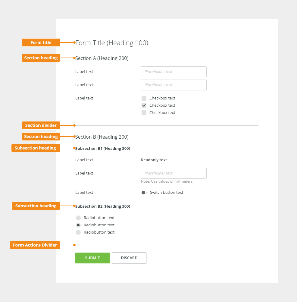
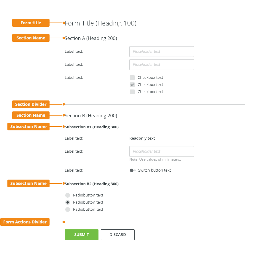
Form spacing
Default form:
Normal desinsity for most of cases.
Token |
PX |
Type |
Used In |
|---|---|---|---|
| spacing-200 | 4px | Margin | Vertical group item margin |
| spacing-300 | 8px | Margin | Form row margin, Vertical group margin |
spacing-400 |
12px |
Margin |
Subsection tittle margin |
| spacing-500 | 16px | Margin | Section tittle margin, Subsection divider |
| spacing-600 | 24px | Margin |
Section divider, Form tittle margin |
Condensed form
The condensed version is designed for Technical user
Token |
PX |
Type |
Used In |
|---|---|---|---|
| spacing-100 | 4px | Margin | Vertical group item margin |
| spacing-200 | 8px | Margin | Form row margin, Vertical group margin |
spacing-300 |
12px |
Margin |
Subsection tittle margin |
| spacing-400 | 16px | Margin | Section tittle margin, Subsection divider |
| spacing-500 | 24px | Margin |
Section divider, Form tittle margin |
Form Typography
Token |
Type |
Used In |
|---|---|---|
| font-heading100 | Fom title |
Page title |
| font-heading150 | Fom title |
Modal window heading, panel headings |
| font-heading200 | Sections heading | |
| font-heading300 | Subsections heading | |
| font-body, grey800 | Static micro copy as Form description | |
| font-body, grey800 | Note | |
| font-placeholder | Placeholder |
Form Color
Token |
Type |
Used In |
|---|---|---|
white |
background-color |
|
| basic | text color | headings, body text |
Widths
Form widths
Width for forms is defined by fixed grid for the particular breakpoint.
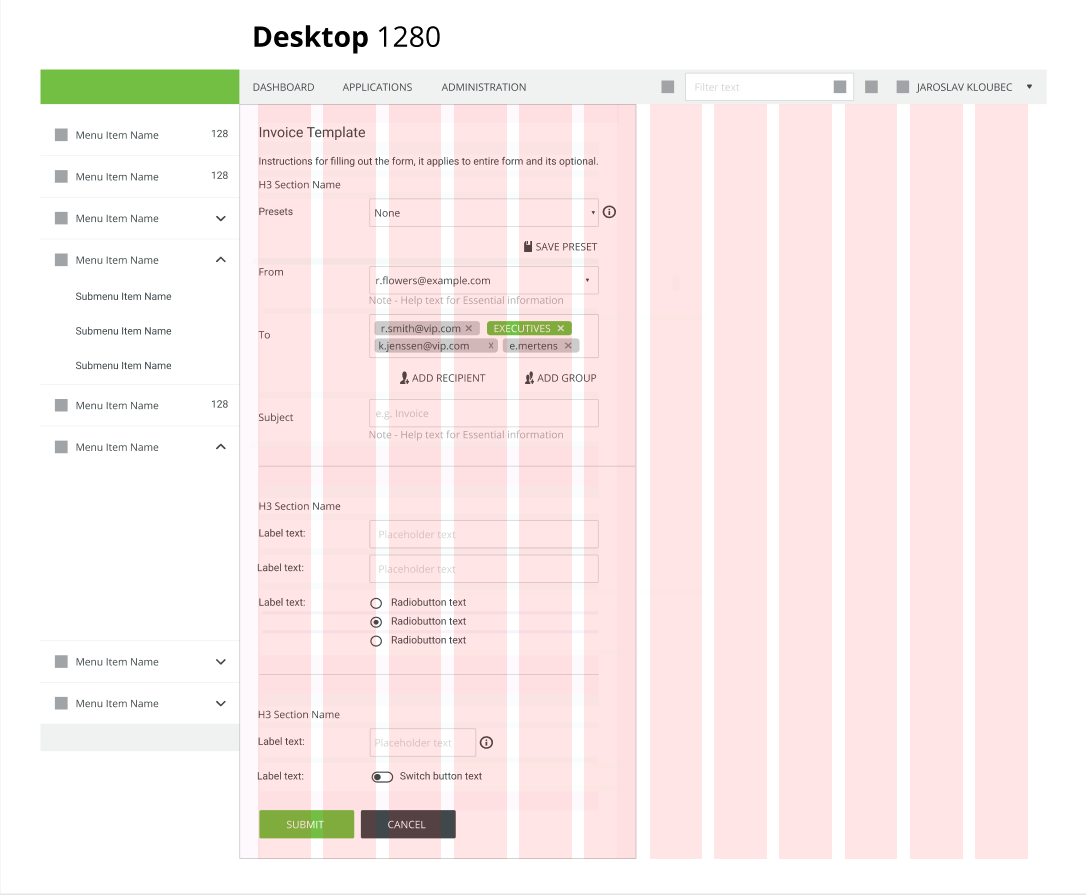
Desktop 1280px
Narrow: One half: max width 505px
Wide: Two thirds: max with 770px
Label widths
Label sizes based on fixed 12 columns grid. Recommended widths are medium and large; if expected input length is significantly long or short, adding or removing extra column is possible.
Medium: One fourth: Ratio of 3 columns for label and 9 columns for inputs.
Large: One third: Ratio of 4 columns for label and 8 columns for inputs.

| Token | Examples of use | |
|---|---|---|
coll2 |
Small | Use when expected labels are short. (E.g. From To) |
coll3 |
Medium | Default size for label |
coll4 |
Large |
When expecting longer labels |
| coll5 | Extra Large | Use with care, labels should not be too long, check writing guidelines for writing microcopy |
Accessibility
A form must be wrapped in a <form> element.
Labels - Every text input should have a descriptive and visible label, paired to each form control.
Hint - The icon comes in the form of a button icon so it can receive focus when a user tabs
Hiding labels - accessible way. Don't use display: none; and visibility: hidden;.because screenreaders could not access it. Use visually hidden snipped instead.
Focus - On entering the form, focus in the first field by default
Form groups -
https://www.w3schools.com/tags/tryit.asp?filename=tryhtml_fieldset
Attachments:
 image2020-7-1_11-7-21.png (image/png)
image2020-7-1_11-0-8.png (image/png)
image2020-7-1_10-57-18.png (image/png)
image2020-7-1_10-56-58.png (image/png)
image2020-7-1_11-7-21.png (image/png)
image2020-7-1_11-0-8.png (image/png)
image2020-7-1_10-57-18.png (image/png)
image2020-7-1_10-56-58.png (image/png)
 image2020-7-1_10-13-56.png (image/png)
image2020-7-1_10-12-35.png (image/png)
image2020-7-1_10-13-56.png (image/png)
image2020-7-1_10-12-35.png (image/png)
 image2020-7-1_9-51-41.png (image/png)
image2020-7-1_9-51-16.png (image/png)
image2020-7-1_9-45-22.png (image/png)
image2020-7-1_9-34-7.png (image/png)
image2020-7-1_9-33-51.png (image/png)
image2020-7-1_9-33-20.png (image/png)
image2020-7-1_9-24-48.png (image/png)
image2020-7-1_9-24-34.png (image/png)
image2020-7-1_9-23-14.png (image/png)
image2020-7-1_9-22-46.png (image/png)
image2020-7-1_9-22-4.png (image/png)
image2020-7-1_9-14-6.png (image/png)
image2020-7-1_9-11-52.png (image/png)
image2020-7-1_9-11-34.png (image/png)
image2020-7-1_9-10-21.png (image/png)
image2020-7-1_9-9-58.png (image/png)
image2020-7-1_9-6-57.png (image/png)
image2020-7-1_9-6-25.png (image/png)
image2020-7-1_9-6-13.png (image/png)
image2020-7-1_9-51-41.png (image/png)
image2020-7-1_9-51-16.png (image/png)
image2020-7-1_9-45-22.png (image/png)
image2020-7-1_9-34-7.png (image/png)
image2020-7-1_9-33-51.png (image/png)
image2020-7-1_9-33-20.png (image/png)
image2020-7-1_9-24-48.png (image/png)
image2020-7-1_9-24-34.png (image/png)
image2020-7-1_9-23-14.png (image/png)
image2020-7-1_9-22-46.png (image/png)
image2020-7-1_9-22-4.png (image/png)
image2020-7-1_9-14-6.png (image/png)
image2020-7-1_9-11-52.png (image/png)
image2020-7-1_9-11-34.png (image/png)
image2020-7-1_9-10-21.png (image/png)
image2020-7-1_9-9-58.png (image/png)
image2020-7-1_9-6-57.png (image/png)
image2020-7-1_9-6-25.png (image/png)
image2020-7-1_9-6-13.png (image/png)
 image2020-7-1_9-5-13.png (image/png)
 image2020-7-1_9-3-59.png (image/png)
 image2020-7-1_9-3-43.png (image/png)
 image2020-6-30_14-9-24.png (image/png)
 image2020-6-30_14-9-2.png (image/png)
 image2020-6-30_14-8-20.png (image/png)
 image2020-6-30_14-6-26.png (image/png)
 image2020-6-30_14-5-51.png (image/png)
 image2020-6-30_13-13-24.png (image/png)
 image2020-6-30_13-12-4.png (image/png)
 image2020-6-29_13-50-59.png (image/png)
 image2020-6-29_13-49-59.png (image/png)
 image2020-6-29_8-42-51.png (image/png)
 image2020-6-15_9-4-45.png (image/png)
 image2020-6-15_9-0-28.png (image/png)
 image2020-6-15_8-56-7.png (image/png)
 image2020-6-15_8-54-4.png (image/png)
 image2020-6-15_8-46-59.png (image/png)
 image2020-6-12_14-42-28.png (image/png)
 image2020-6-12_14-42-15.png (image/png)
 image2020-6-12_14-21-22.png (image/png)
 image2020-6-12_14-20-36.png (image/png)
 image2020-6-12_14-9-46.png (image/png)
 image2020-6-11_16-32-35.png (image/png)
 image2020-6-11_16-18-55.png (image/png)
 image2020-6-11_16-18-22.png (image/png)
 image2020-6-11_16-18-5.png (image/png)
 image2020-6-11_16-17-41.png (image/png)
 image2020-6-11_16-16-34.png (image/png)
 image2020-6-11_16-15-37.png (image/png)
 image2020-6-11_16-14-19.png (image/png)
 image2020-6-11_16-13-33.png (image/png)
 image2020-6-11_16-13-20.png (image/png)
 image2020-6-11_16-12-10.png (image/png)
 image2020-6-11_16-11-49.png (image/png)
 image2020-6-11_16-10-23.png (image/png)
 image2020-6-11_16-9-31.png (image/png)
 image2020-6-11_15-39-14.png (image/png)
 image2020-6-11_15-38-6.png (image/png)
 image2020-6-11_15-36-18.png (image/png)
 image2020-6-11_15-36-4.png (image/png)
 image 3.png (image/png)
 image2020-6-11_15-28-10.png (image/png)
 Basic Examples 01.png (image/png)
 Basic Examples 01 – Condensed.png (image/png)
 image2020-5-28_15-21-12.png (image/png)
 image2020-5-28_15-19-42.png (image/png)
 image2020-5-27_13-42-18.png (image/png)
 image2020-5-27_13-40-28.png (image/png)
 image2020-5-26_10-16-35.png (image/png)
 image2020-5-26_10-13-19.png (image/png)
 image2020-5-25_16-35-23.png (image/png)
 image2020-5-25_16-24-51.png (image/png)
 image2020-5-25_16-23-4.png (image/png)
 image2020-5-25_16-21-57.png (image/png)
 image2020-5-25_16-8-41.png (image/png)
 image2020-5-25_16-7-16.png (image/png)
 image2020-5-25_15-27-44.png (image/png)
 image2020-5-25_15-26-43.png (image/png)
 image2020-5-25_15-13-42.png (image/png)
 image2020-5-25_15-11-43.png (image/png)
 image2020-5-25_15-10-3.png (image/png)
 image2020-5-25_15-9-12.png (image/png)
 image2020-5-25_14-59-34.png (image/png)
 image2020-5-25_14-54-54.png (image/png)
 image2020-5-25_14-53-0.png (image/png)
 Group 42.png (image/png)
 image2020-5-5_9-7-11.png (image/png)
 image2020-5-5_9-6-22.png (image/png)
 image2020-5-5_9-6-11.png (image/png)
 Group 30 (1).png (image/png)
 Group 30.png (image/png)
 Group 29 (1).png (image/png)
 Group 28.png (image/png)
 image2020-3-12_10-2-46.png (image/png)
 image2020-3-12_9-36-59.png (image/png)
 image2020-2-19_13-31-16.png (image/png)
 image2020-2-19_13-17-30.png (image/png)
 Group 11.2 (13).png (image/png)
 sizes.jpg (image/jpeg)
 form-call-outs-01 (1).png (image/png)
 Group 11.9.png (image/png)
 Group 11.2 (12).png (image/png)
 Group 11.2 (11).png (image/png)
 Group 11.2 (10).png (image/png)
 Group 11.2 (9).png (image/png)
 Group 11.2 (7).png (image/png)
 Group 11.2 (6).png (image/png)
 Group 11.7 (1).png (image/png)
 Group 11.7.png (image/png)
 Group 11.3 (4).png (image/png)
 Group 6.4.png (image/png)
 Untitled-5i.jpg (image/jpeg)
 Untitled-1.jpg (image/jpeg)
 Group 11.3 (3).png (image/png)
 Group 11.3 (2).png (image/png)
 Group 11.3 (1).png (image/png)
 Group 11.2 (5).png (image/png)
 Group 11.2 (4).png (image/png)
 Group 11.2 (3).png (image/png)
 Group 11.3.png (image/png)
 Group 11.2 (2).png (image/png)
 Group 11.5 (1).png (image/png)
 Group 11.5.png (image/png)
 Group 11.4 (1).png (image/png)
 Group 11.4.png (image/png)
 Group 11.2 (1).png (image/png)
 Group 11.6.png (image/png)
 Group 11.7 (2).png (image/png)
 image2019-11-22_13-48-38.png (image/png)
 fullsceen-layout.png (image/png)
 wf-editor-in-fullsceen-layout.png (image/png)
wf-editor-anatomy.png (image/png)
wf-editor-in-fullsceen-layout.png (image/png)
wf-editor-anatomy.png (image/png)