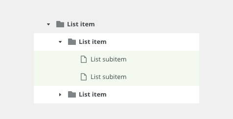
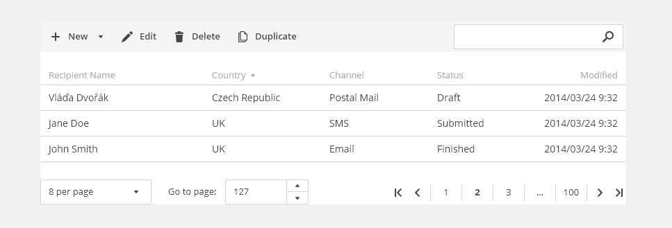
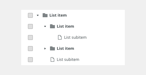
Tree list allows better orientation in a multi-level structure.
Component Status
 Design Kit: NOT RELEASED
 Bobwai component: bobwai--tree-list RELEASED
Content Overview

Usage
Trees are mostly used for navigation in the master list for a master-detail scenario in sidebars or file directory. It displays relationships between elements in the list for a better orientation.
Typical Usage
- Navigation - hierarchy structure of a multi-page content. Used in file system with dynamic number of items and levels of the structure.
- Outline - a list of objects displayed in the hierarchical structure allows navigation in objects.
- Hierarchical data visualization - a list for orientation in data, displaying allows editing of items.

- Use for hierarchical structure without complex additional data per item.
- Keep the list clear and simple.

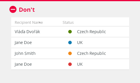
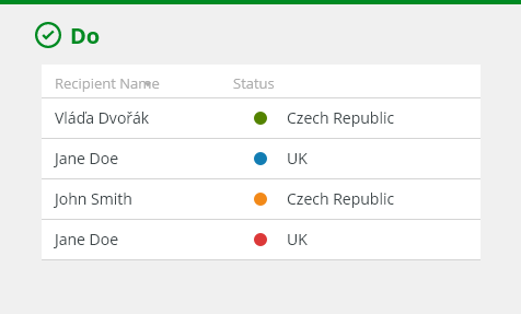
- Do not use if items are not structured hierarchically. Use a list instead.
- Do not use for large amounts of hierarchical structured data with additional data per item. Use a tree table instead.
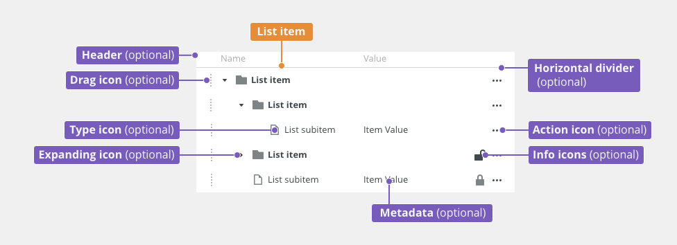
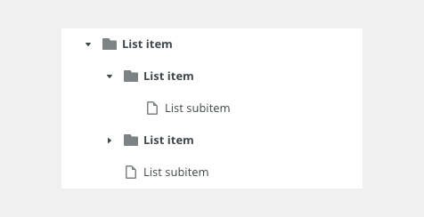
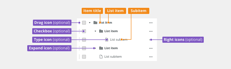
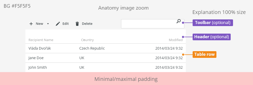
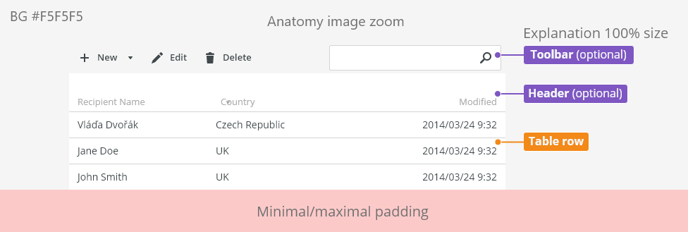
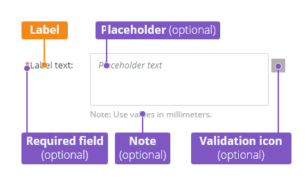
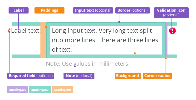
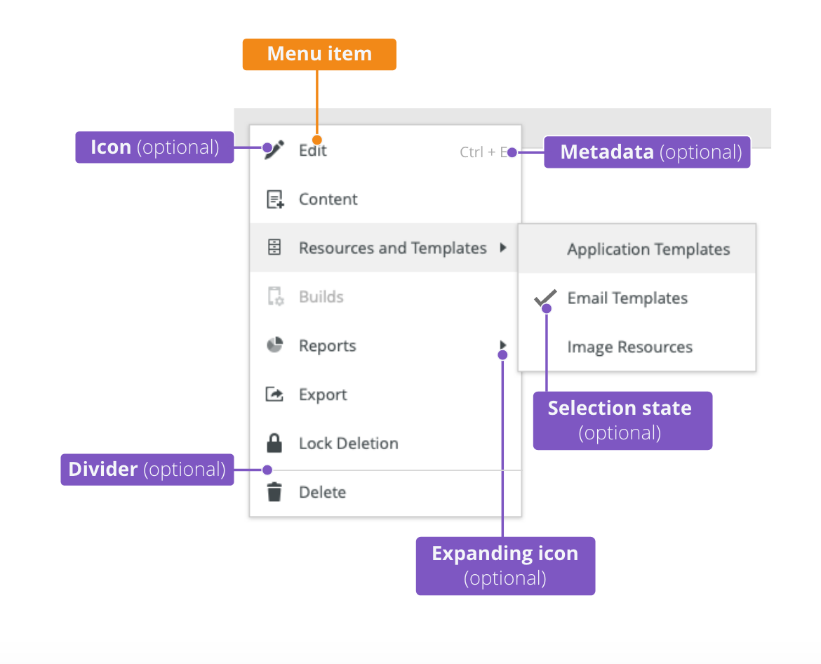
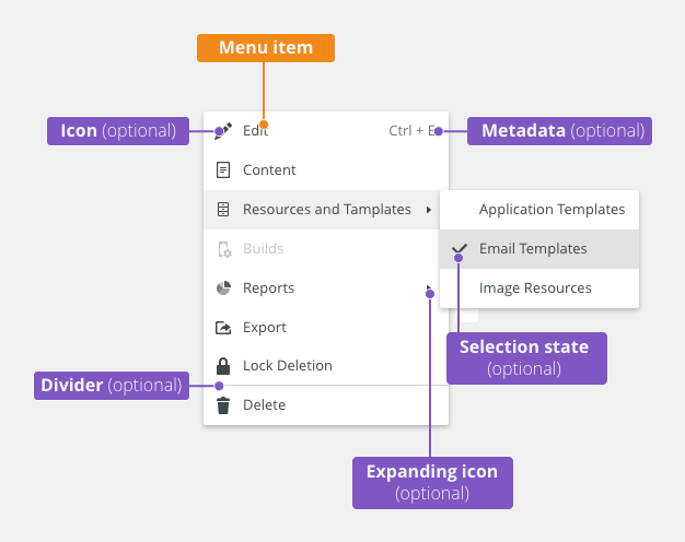
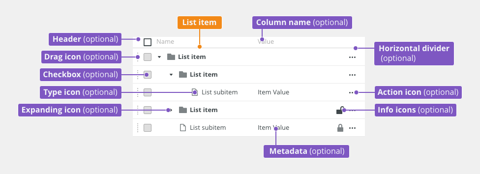
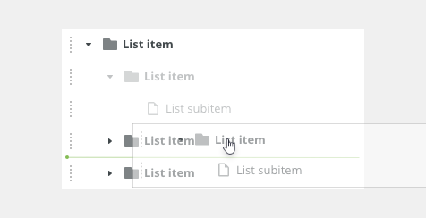
Anatomy

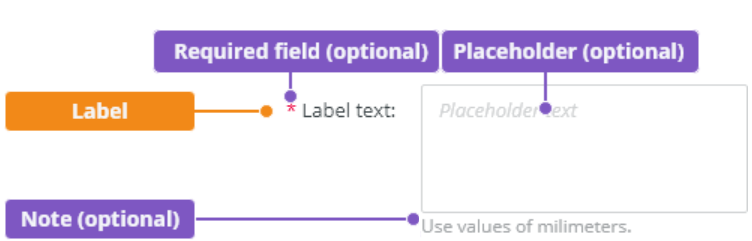
- List item - It can also be named a parent item or a tree trunk.
- Subitem - It can also be named a child or a branch. A subitem can contain other children or sub-branches/leaves.
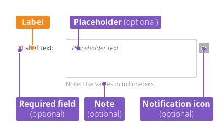
- Title (recommended) - Title describes the purpose of the tree list.
List Item
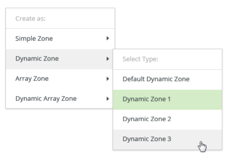
Types
- Single-select
- Multi-select
- Draggable
Single-Select
Simple list of items with a hierarchy structure.

Multi-Select
It is triggered by pressing <Ctrl> or <Shift> key and enables users to select more items in the list. It is possible to select more items only at the same level in the hierarchy of items.
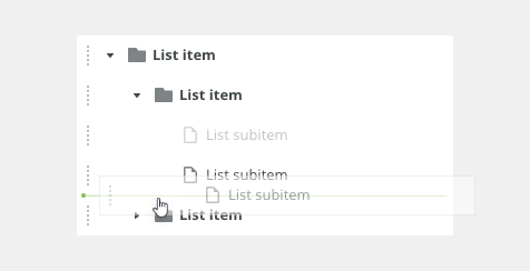
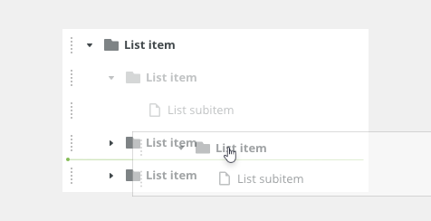
Draggable
Reordering Tree Items
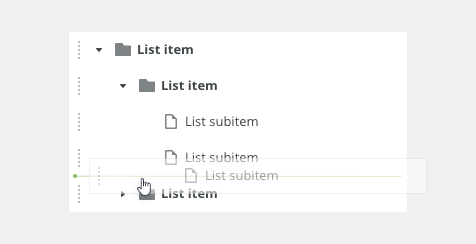
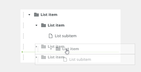
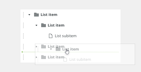
Draggable items are used when users need to sort items in the list according to their preference. Dragging is possible only at the same level of the list. When dragging parents, the shadow is displayed as collapsed by default.
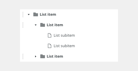
Disable the Drag and Drop Functionality
It is possible to disable dragging for selected items and not display the dragging icon for them.
Expanded Item Being Dragged (Shadow)
Another visual representation of dragging the expanded item for a better understanding of dragging, including subitems.
Variants
- Without icons
- With icons
- Icons for subitems only
Without Icons
Simple tree list without icons used.

With Icons
Used for showing different types of items. Icons can contribute to a better orientation in the tree list.

Icons for Subitems Only
Used for showing different types of subitems.

Appearance
Density
Use a consistent size of form components on the same page.
Default
Most of the use cases.
Condensed
Technical applications, e.g. Scaler.

Behavior
Expanding and Collapsing
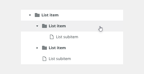
An item that contains one or more subitems can be expanded or collapsed using the expanding icon. Expanding and collapsing are triggered as a result of a user action.
Scrolling

Toolbar
Toolbar can be placed above the list. Common actions in the toolbar are, for example, Add, Clone, and Remove.

Filter

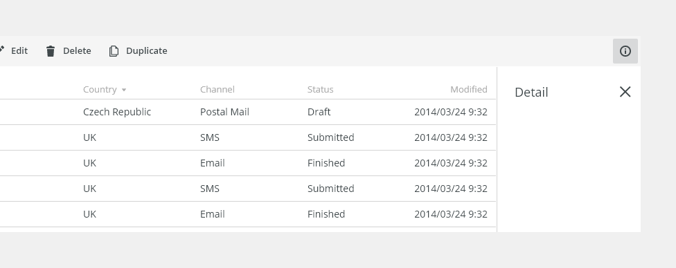
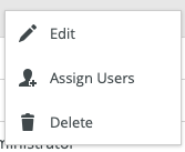
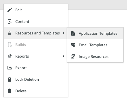
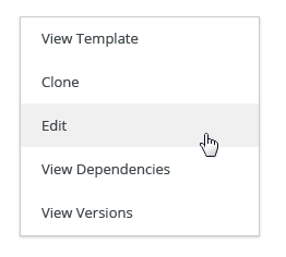
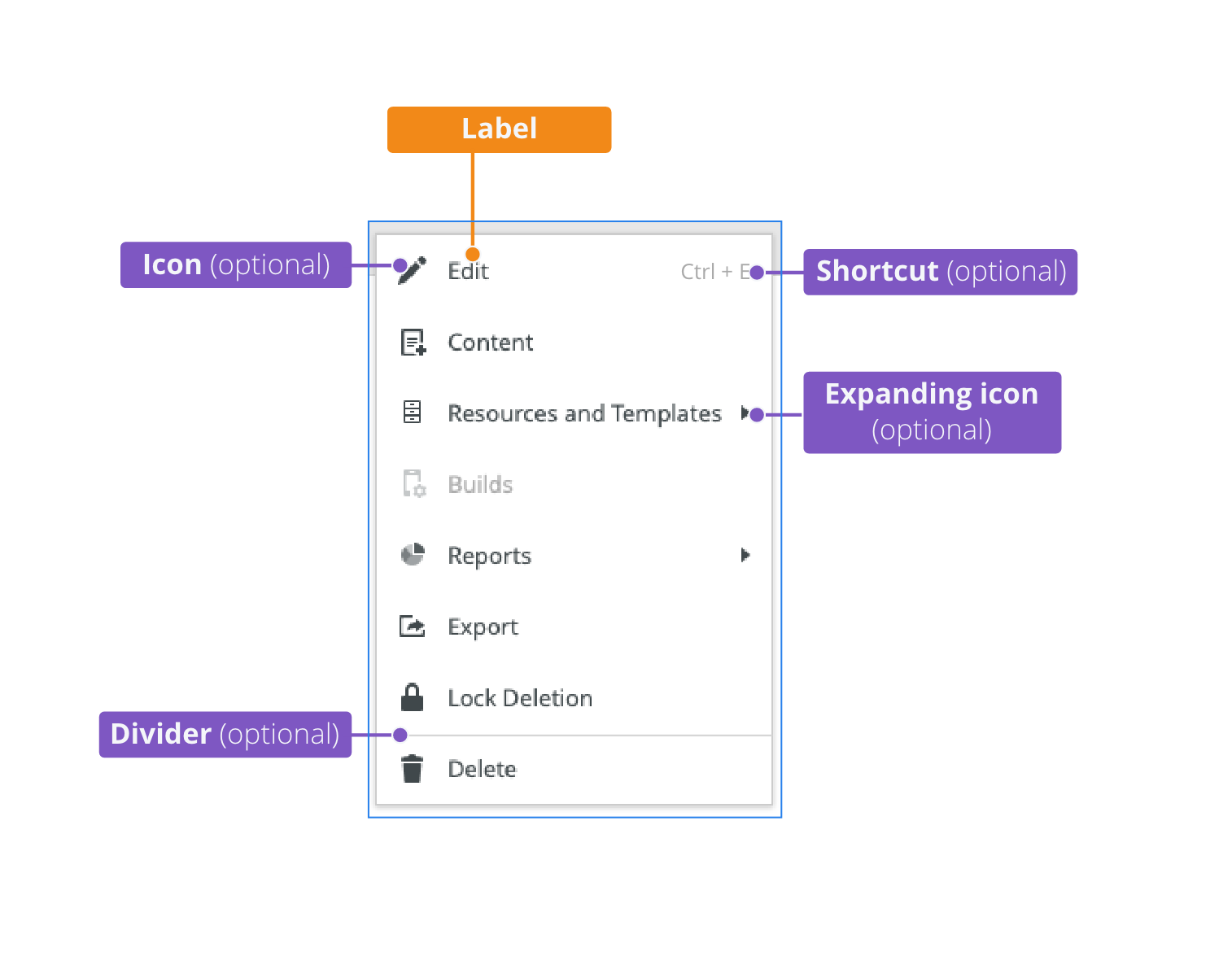
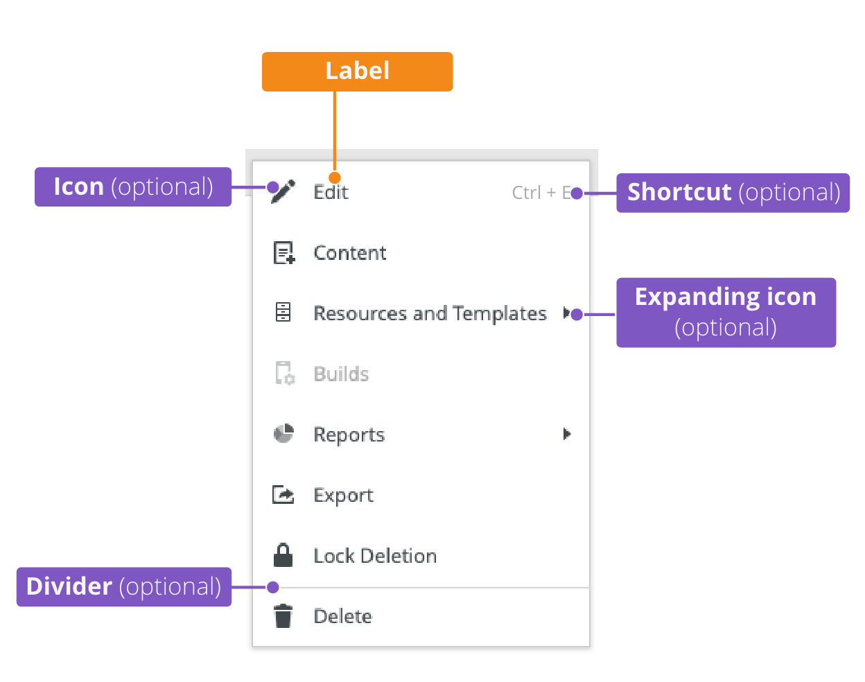
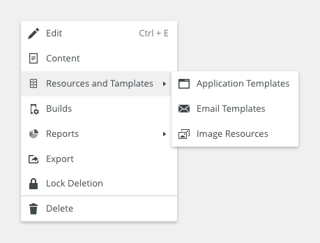
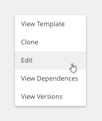
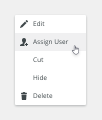
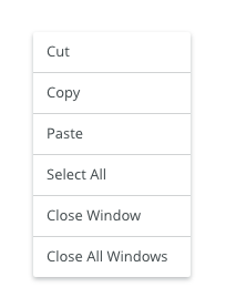
Context Menu
A context menu can be added to a tree as an alternative way to modify the focused elements. It is used like a secondary list of possible actions.

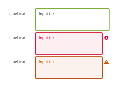
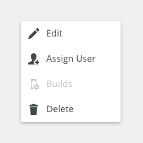
States
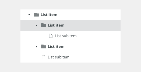
Hover
Selected
Loading

Disabled

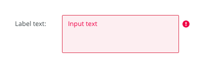
Error
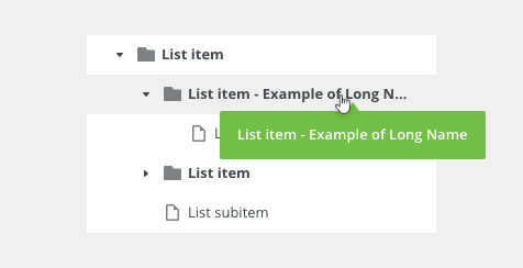
Text Overflow
Keyboard Interactions
Keys |
Interactions |
|---|---|
Arrows ⇦ ⇨ |
Collapse/expand the list item. |
Arrows ⇩⇧ |
Navigate to the previous/next list item. |
Esc |
Leaves the tree list. |
Enter ↵ |
Performs the default action for the focused node. |
Shift + ⇩⇧ |
Navigate previous/next row with multiselect. |
Editorial
- List items - Use sentence case.
Related Components
- Table (mandatory): bobwai--table
- Filter (optional): bobwai–filter
- Advanced filter (optional): bobwai--advanced-filter
- Tag filter (optional): bobwai--tag-filter
TO BE DONE
Interactive States
Default
Selected
Hover
Disabled
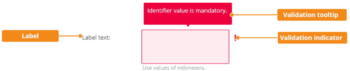
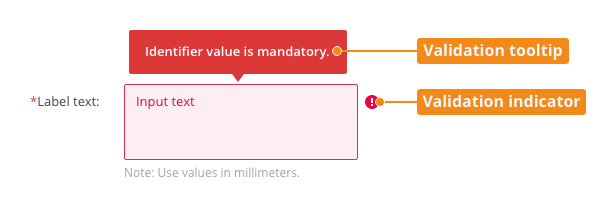
Error (Invalid)
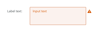
Warning
Focus
| Used In | Type | PX | Token |
|---|---|---|---|
| Text | Color |
|
|
| Background | Color |
|
|
| Border | Color | color-border-400 |
|
| Input Text | Font |
|
|
| Border | Border-width | 1 | border-width-100 |
| Border | Border-radius | 2 | radius-100 |
| Placeholder text | Font | font-placeholder |
|
| Placeholder text | Color | color-text-300 |
|
| Selected | |||
| Border | Color | color-border-500 |
|
| Disabled | |||
| Background | Color | opacity-disabled |
|
| Text | Opacity | opacity-disabled |
|
| Read Only | |||
| Text | Font | read-only |
|
| Border | Border-width | 0 | border-width-none |
| Focus | |||
| Border | Width | 2 | border-width-200 |
| Error | |||
| Background | Color | color-bg-input-error | |
| Border | Color | color-border-error | |
| Text | Color | color-text-error | |
| Validation icon | Color | color-icon-error | |
| Validation icon | Size | sizing-icon-200 | |
| Warning | |||
| Background | Color | color-bg-input-warning | |
| Border | Color | color-border-warning | |
| Text | Color | color-text-warning | |
| Validation icon | Color | color-icon-warning | |
| Validation icon | Size | sizing-icon-200 | |
| Spacing | |||
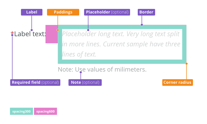
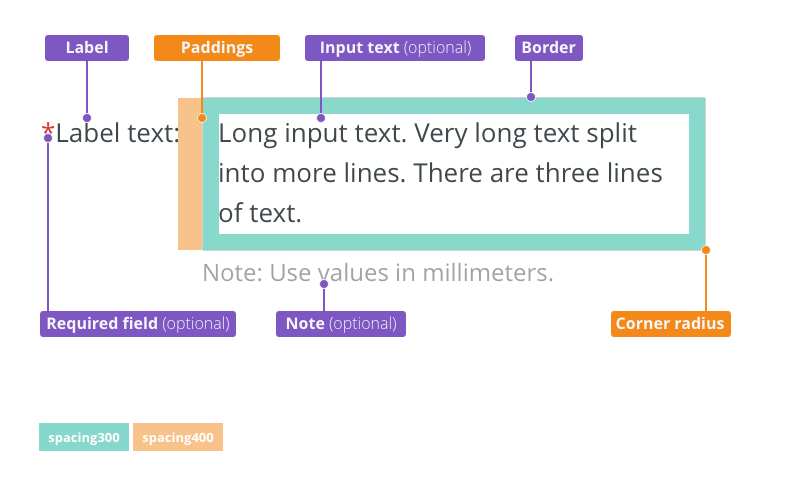
| Default size padding | Spacing | 8 | spacing-300 |
Default size spacing between icon and text |
Spacing | 4 | spacing-200 |
| Default size space between input and validation icon | Spacing | 4 | spacing-200 |
| Small/condensed size padding | Spacing | 4 | spacing-200 |
Small/condensed size spacing between icon and text |
Spacing | 2 | spacing-100 |
| Small/Condensed size space between input and validation icon | Spacing | 2 | spacing-100 |
Accessibility
- Treeview Design Pattern guidelines.
Attachments:
 image2020-12-1_10-59-46.png (image/png)
image2020-12-1_10-57-28.png (image/png)
image2020-12-1_10-59-46.png (image/png)
image2020-12-1_10-57-28.png (image/png)
 image2020-12-1_10-57-14.png (image/png)
image2020-12-1_10-56-37.png (image/png)
image2020-12-1_10-57-14.png (image/png)
image2020-12-1_10-56-37.png (image/png)
 image2020-11-30_14-32-1.png (image/png)
 image2020-11-30_14-17-56.png (image/png)
 image2020-11-30_14-8-32.png (image/png)
 image2020-11-30_14-3-56.png (image/png)
 image2020-11-27_15-46-5.png (image/png)
 image2020-11-27_15-19-14.png (image/png)
 image2020-11-27_15-14-27.png (image/png)
 image2020-11-27_15-4-12.png (image/png)
 image2020-11-27_15-3-39.png (image/png)
 image2020-11-27_12-24-3.png (image/png)
 image2020-11-27_12-20-20.png (image/png)
 image2020-11-27_12-13-3.png (image/png)
 image2020-11-27_10-59-3.png (image/png)
 image2020-11-27_9-53-18.png (image/png)
 image2020-10-5_10-17-0.png (image/png)
 image2020-10-5_10-25-57.png (image/png)
 image2020-10-5_10-26-24.png (image/png)
 image2020-10-5_10-26-47.png (image/png)
 image2020-10-2_15-23-33.png (image/png)
 image2020-10-2_13-45-41.png (image/png)
 image2020-10-2_13-46-8.png (image/png)
 image2020-10-5_10-52-58.png (image/png)
 image2020-10-5_10-53-29.png (image/png)
 image2020-10-5_10-54-33.png (image/png)
 image2020-10-5_10-54-40.png (image/png)
 image2020-10-5_10-55-2.png (image/png)
 image2020-10-5_11-37-46.png (image/png)
 image2020-10-2_14-20-45.png (image/png)
 image2020-10-2_14-21-11.png (image/png)
 image2020-10-2_14-20-58.png (image/png)
 image2020-10-2_14-21-26.png (image/png)
 image2020-10-2_14-33-47.png (image/png)
 image2020-10-2_14-34-9.png (image/png)
 image2020-10-2_14-25-18.png (image/png)
 image2020-10-2_14-25-33.png (image/png)
 image2020-10-2_14-42-44.png (image/png)
 image2020-10-23_15-38-49.png (image/png)
 image2020-10-26_13-21-57.png (image/png)
 image2020-10-26_13-22-16.png (image/png)
 image2020-10-26_13-22-55.png (image/png)
 image2020-10-26_13-24-0.png (image/png)
 image2020-10-26_13-26-26.png (image/png)
 textarea-style@2x.png (image/png)
 textarea@2x.png (image/png)
 text-area-anatomy.png (image/png)
 text-area-label-vertical.png (image/png)
 text-area-validation.png (image/png)
 text-area-style.png (image/png)
 text-area-label-horizontal.png (image/png)
 text-area-state-selected.png (image/png)
 text-area-state-disabled.png (image/png)
 text-area-state-readonly.png (image/png)
 text-area-state-focus.png (image/png)
 text-input-density-small.png (image/png)
 text-area-density-default.png (image/png)
 text-area-density-small.png (image/png)
 text-input-variants-warning-icon.png (image/png)
 text-area-variants-error-icon.png (image/png)
 text-area-variants-warning-icon.png (image/png)
 image2020-11-2_9-24-56.png (image/png)
 image2020-11-2_9-26-14.png (image/png)
 image2020-11-2_9-26-30.png (image/png)
 Screenshot 2020-11-16 at 15.01.07.png (image/png)
 Screenshot 2020-11-16 at 14.58.54.png (image/png)
 Screenshot 2020-11-16 at 15.09.35.png (image/png)
 Screenshot 2020-11-16 at 15.19.01.png (image/png)
 Screenshot 2020-11-16 at 15.22.41.png (image/png)
 Screenshot 2020-11-18 at 12.49.34.png (image/png)
 Screenshot 2020-11-18 at 13.11.11.png (image/png)
 Screenshot 2020-11-18 at 13.22.39.png (image/png)
 Screenshot 2020-11-16 at 13.53.55.png (image/png)
 Screenshot 2020-11-19 at 08.14.25.png (image/png)
 Screenshot 2020-11-19 at 08.14.34.png (image/png)
 Screenshot 2020-11-18 at 13.08.21.png (image/png)
 Screenshot 2020-11-18 at 13.08.05.png (image/png)
 Screenshot 2020-11-19 at 09.57.10.png (image/png)
 Screenshot 2020-11-20 at 14.27.17.png (image/png)
 context-menu-anatomy.png (image/png)
 Context-menu-type-basic.png (image/png)
 Context-menu-type-multilevel.png (image/png)
 Context-menu-variants-text-only.png (image/png)
 Context-menu-variants-text-icons.png (image/png)
 Context-menu-variants-with-title.png (image/png)
 Context-menu-groups.png (image/png)
 Context-menu-states-disabled.png (image/png)
 Context-menu-do-short.png (image/png)
 Context-menu-dont-short.png (image/png)
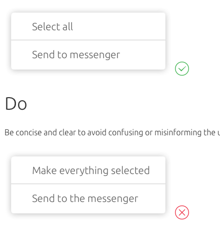
 Context-menu-do-groups.png (image/png)
 Context-menu-dont-groups.png (image/png)
 tree-title.png (image/png)
Tree-types-single-select.png (image/png)
tree-title.png (image/png)
Tree-types-single-select.png (image/png)
 Tree-types-multi-select.png (image/png)
 Tree-types-dragable.png (image/png)
 Tree-types-single-select.png (image/png)
Tree-types-multi-select.png (image/png)
Tree-types-single-select.png (image/png)
Tree-types-multi-select.png (image/png)
 Tree-types-dragable.png (image/png)
 Tree-variants-without-icons.png (image/png)
Tree-variants-with-icons.png (image/png)
Tree-variants-subitem-icons.png (image/png)
Tree-density-default.png (image/png)
Tree-density-condensed.png (image/png)
Tree-states-hover.png (image/png)
Tree-states-selected.png (image/png)
Tree-states-loading.png (image/png)
Tree-states-disabled.png (image/png)
tree-anatomy.png (image/png)
Tree-list-item.png (image/png)
Tree-variants-without-icons.png (image/png)
Tree-variants-with-icons.png (image/png)
Tree-variants-subitem-icons.png (image/png)
Tree-density-default.png (image/png)
Tree-density-condensed.png (image/png)
Tree-states-hover.png (image/png)
Tree-states-selected.png (image/png)
Tree-states-loading.png (image/png)
Tree-states-disabled.png (image/png)
tree-anatomy.png (image/png)
Tree-list-item.png (image/png)
 tree-trigger.png (image/png)
tree-toolbar.png (image/png)
tree-scroll.png (image/png)
Tree-variants-error.png (image/png)
Tree-text-overflow.png (image/png)
tree-style.png (image/png)
image2020-12-18_14-12-49.png (image/png)
tree-trigger.png (image/png)
tree-toolbar.png (image/png)
tree-scroll.png (image/png)
Tree-variants-error.png (image/png)
Tree-text-overflow.png (image/png)
tree-style.png (image/png)
image2020-12-18_14-12-49.png (image/png)
 image2020-12-20_19-52-12.png (image/png)
image2020-12-20_19-52-51.png (image/png)
image2021-1-5_14-15-59.png (image/png)
image2021-1-5_14-36-5.png (image/png)
image2020-12-20_19-52-12.png (image/png)
image2020-12-20_19-52-51.png (image/png)
image2021-1-5_14-15-59.png (image/png)
image2021-1-5_14-36-5.png (image/png)
 image2021-1-5_14-36-35.png (image/png)
 image2021-1-5_14-37-22.png (image/png)
 image2021-1-5_14-39-1.png (image/png)
 image2021-1-5_14-47-12.png (image/png)
image2021-1-7_16-51-54.png (image/png)
image2021-1-5_14-47-12.png (image/png)
image2021-1-7_16-51-54.png (image/png)
 Screenshot 2021-01-07 at 16.53.49.png (image/png)
 Screenshot 2021-01-07 at 16.53.26.png (image/png)
 Screenshot 2021-01-07 at 16.53.49.png (image/png)
 Screenshot 2021-01-07 at 16.53.57.png (image/png)
 Screenshot 2021-01-07 at 16.53.26.png (image/png)
 Screenshot 2021-01-07 at 16.54.42.png (image/png)
 image2021-1-8_14-29-33.png (image/png)
image2021-1-8_14-29-46.png (image/png)
image2021-1-8_14-29-33.png (image/png)
image2021-1-8_14-29-46.png (image/png)
 image2021-1-8_14-30-20.png (image/png)