Switch buttons are used to quickly switch between two opposing states.
Component Status
 Design Kit: RELEASED
 Bobwai component: bobwai--switch-button RELEASED
Content Overview
Usage
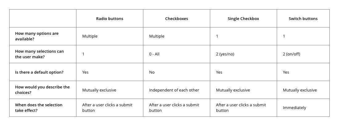
A chart to help you figure out when to use a switch button compared to related components like radio buttons and checkboxes. Chart source
| Radio Buttons | Checkboxes | Single Checkbox | Switch Buttons | |
|---|---|---|---|---|
| How many options are available? | Multiple | Multiple | 1 | 1 |
How many selections can the user make? |
1 | 0 - All | 2 (yes/no) | 2 (on/off) |
| Is there a default option? | Yes | No | Yes |
Yes |
| How would you describe the choices? | Mutually exclusive | Independent of each other | Mutually exclusive | Mutually exclusive |
| When does the selection take effect? | After a user clicks a submit button | After a user clicks a submit button | After a user clicks a submit button | Immediately |
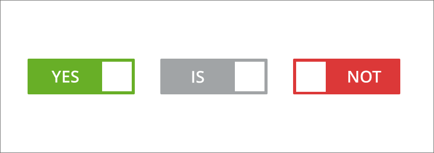
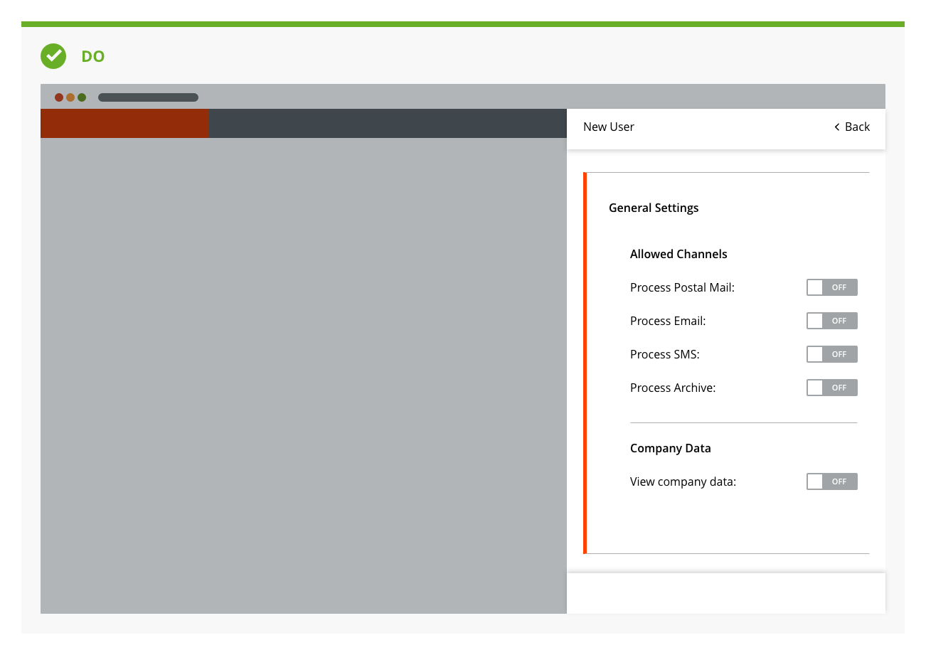
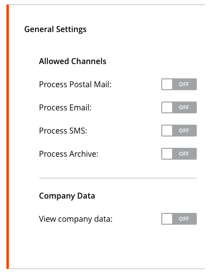
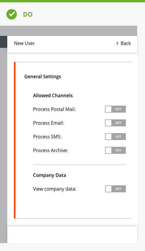
DO
Use when the user has an option between the on and off state.
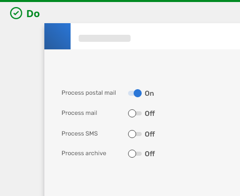
DO use switch buttons when confirmation
by buttons like Submit, Save are not required.
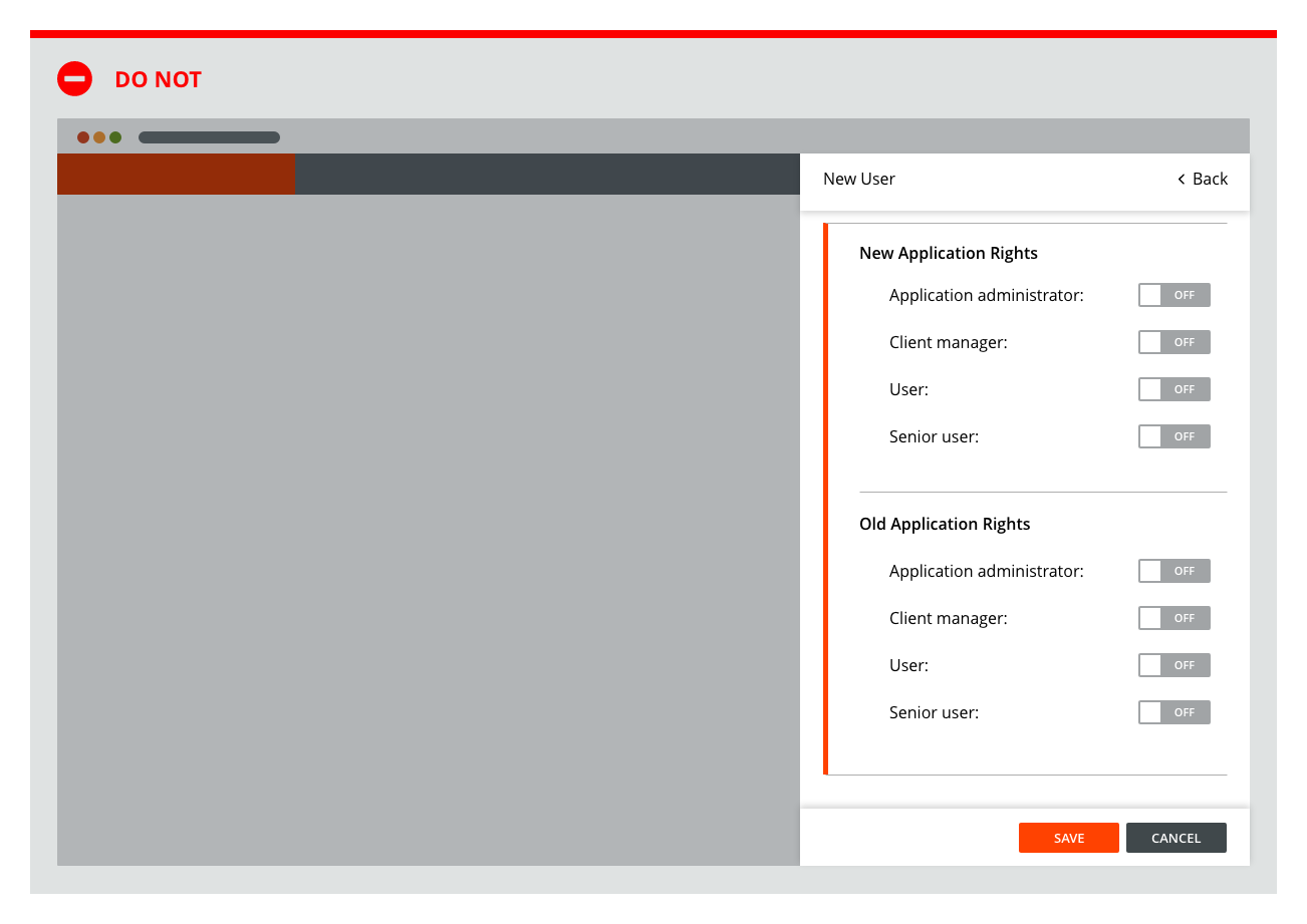
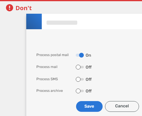
DO NOT
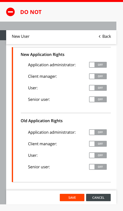
Do not use more than 3 words for labels.

DO NOT use switch buttons when applied settings need to
be confirmed by buttons like Submit, Save, use checkboxes instead.
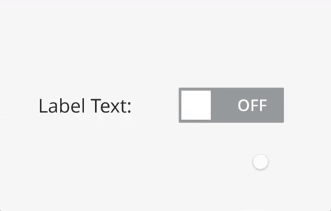
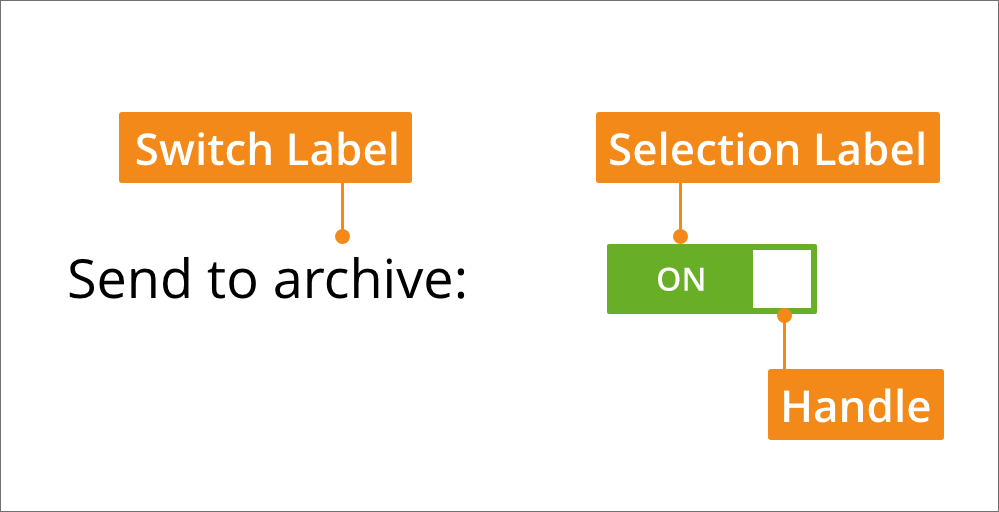
Anatomy

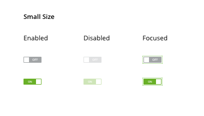
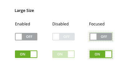
Variants
Default

Large

Editorial
- Switch Label - Use to make the action clear. Should be 3 words or less and should appear next to the switch button.
- Selection Label - Use to define the state of the switch such as On and Off.
Related Components
Radio button - When user can make only one selection, options are mutually exclusive and the effect takes place after the user selects a confirmation button.
Check box - When user can make multiple selections, options are independent of one another and the effect takes place after the user selects a confirmation button.
animation


Typography
| Used in | Type | Token |
|---|---|---|
| Selection label | font | font-body |
| Switch label | font | font-label |
Color
| Used in | Type | Token |
|---|---|---|
| Switch label | color | color-text-100 |
| Selection label | color | color-text-100 |
| Background (positive) | color | color-bg-switch-positive |
| Background (negative) | color | color-bg-switch-negative |
| Handle (positive) | color | color-bg-switch-handle-positive |
| Handle (negative) | color | color-bg-switch-handle-negative |
| Handle border (positive) | color | color-border-500 |
| Handle border (negative) | color | color-border-100 |
Borders
| Used in | px | Type | Token |
|---|---|---|---|
| switch (background) | 24 | radius | radius-600 |
| handle | 24 | radius | radius-600 |
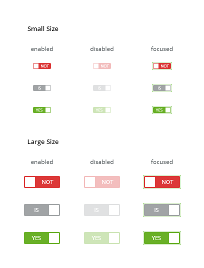
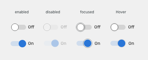
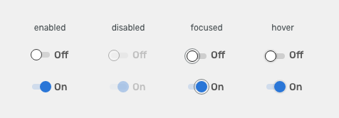
States

| Used in | Type | px | Token |
|---|---|---|---|
Hover |
|||
| Hover space | Color | color-bg-interactive-200-hover |
|
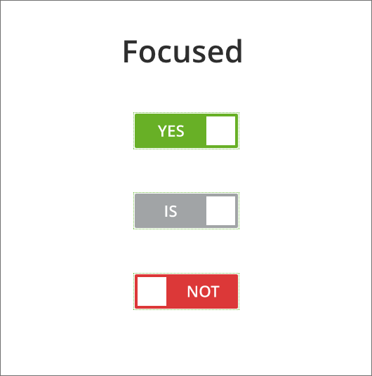
Focus |
|||
| Focus border | Border size | 1 | border-width-100 |
| Focus border | Color | color-focus-200 |
|
| Focus border | Corner-radius | 24 | radius-full |
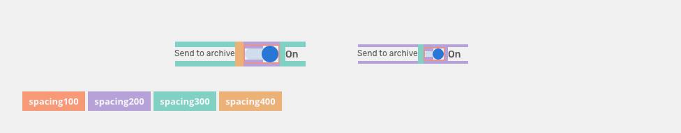
Spacing
| Used in | px | Type | Token |
|---|---|---|---|
| Switch minimal space between label and input (default) | 12 | spacing | spacing-400 |
| Switch minimal space between label and input (condensed) | 8 | spacing | spacing-300 |
| Switch top and bottom padding for labels (default) | 8 | spacing | spacing-300 |
| Switch top and bottom padding for labels (condensed) | 4 | spacing | spacing-200 |
| Switch space between input and selection label (default) | 8 | spacing | spacing-300 |
| Switch space between input and selection label (condensed) | 4 | spacing | spacing-200 |
| Top and bottom space for switch input (default & condensed) | 4 | spacing | spacing-200 |
| Hover/focus space | 2 | spacing | spacing-100 |
Sizes
| Used in | Type | px | Token |
|---|---|---|---|
| Background height (default) | Object size | 8 | sizing-item-030 |
| Background height (large) | Object size | 16 | sizing-item-050 |
| Background width (default) | Object size | 24 | sizing-item-100 |
| Background width (large) | Object size | 48 | sizing-item-400 |
| Handle height and width (default) | Object size | 16×16 | sizing-item-050 |
| Handle height and width (large) | Object size | 24×24 | sizing-item-100 |
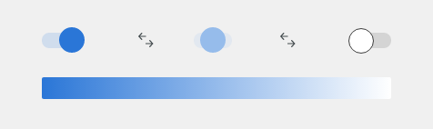
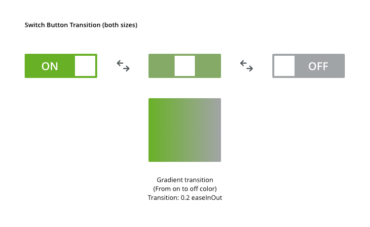
Behavior
- gradient when switching
- change of text when switching

| Used in | Type | ms | Token |
|---|---|---|---|
| Handle movement, Handle color change, Background color change | Duration | 190 | duration-250 |
| Handle movement, Handle color change, Background color change | Easing | easing-decelerated |
Accessibility
- The <Tab> key is used to move focus to each toggle control. Either the <Enter> or <Space> key can be used to toggle between a checked or unchecked positions.
- The ARIA state
aria-checked="true"is set when the toggle switch is checked or in the on position. When the toggle component is unchecked or in the off position, the ARIA state is set toaria-checked="false". - A toggle component identified as disabled is ignored in the tab order.
- Example of accesible switch button.
Attachments:
 switch-buttons-transition.png (image/png)
 switch-buttons.png (image/png)
 switch-buttons-transition.png (image/png)
 switch-buttons.png (image/png)
 giphy-20.gif (image/gif)
 focued.png (image/png)
 disabled.png (image/png)
 focused.png (image/png)
 disabled.png (image/png)
 enabled.png (image/png)
 toggle-anatomy.png (image/png)
 toggle-anatomy.png (image/png)
 Toggle-sm.png (image/png)
 Toggle-lg.png (image/png)
 toggle-anatomy.png (image/png)
 Toggle-sm.png (image/png)
 Toggle-lg.png (image/png)
 Gradient-toggle.png (image/png)
 Gradient-toggle.png (image/png)
 Toggle-disabled.png (image/png)
 Toggle-focused.png (image/png)
 Toggle-radio-checkbox-box.png (image/png)
 Toggle-radio-checkbox-box.png (image/png)
 toggle-anatomy.png (image/png)
 toggle-anatomy.png (image/png)
 Do-not-example-toggle.png (image/png)
 Do-not-example-toggle.png (image/png)
 toggle-anatomy.png (image/png)
 Do-example-toggle.png (image/png)
 Do-example-toggle.png (image/png)
 Do-example-toggle –sm.png (image/png)
 Do-not-example-toggle –sm.png (image/png)
 switch-buttons-sizes-small.png (image/png)
 switch-buttons-sizes-large.png (image/png)
 switch-buttons-style.png (image/png)
 switch-buttons-anatomy.png (image/png)
 switch-buttons-transition.png (image/png)
 switch-buttons-anatomy.png (image/png)
 switch-buttons-sizes-small.png (image/png)
 switch-buttons-sizes-large.png (image/png)
 switch-buttons-style.png (image/png)
 switch-buttons-transition.png (image/png)
 switch-buttons-sizes-large.png (image/png)
 image2020-11-11_9-14-20.png (image/png)
 image2020-11-11_9-14-46.png (image/png)
 image2020-11-11_9-20-12.png (image/png)
 image.png (image/png)
 switch-buttons-anatomy.png (image/png)
 Use - Single File.png (image/png)
 switch-buttons-sizes-small.png (image/png)
 switch-buttons-sizes-large.png (image/png)
 switch-buttons-style.png (image/png)
 switch-buttons-transition.png (image/png)
switch-buttons-anatomy.png (image/png)
switch-buttons-style.png (image/png)
switch-buttons-transition.png (image/png)
switch-buttons-anatomy.png (image/png)
switch-buttons-style.png (image/png)
 switch-buttons-do.png (image/png)
switch-buttons-dont.png (image/png)
switch-buttons-do.png (image/png)
switch-buttons-dont.png (image/png)
 switch-buttons-dont.png (image/png)
switch-buttons-style.png (image/png)
switch-buttons-dont.png (image/png)
switch-buttons-style.png (image/png)
 switch-buttons-spacing.png (image/png)
switch-buttons-sizes-small.png (image/png)
switch-buttons-sizes-large.png (image/png)
switch-buttons-spacing.png (image/png)
switch-buttons-sizes-small.png (image/png)
switch-buttons-sizes-large.png (image/png)
 switch-buttons-style.png (image/png)
switch-buttons-sizes-large.png (image/png)
switch-buttons-states2.png (image/png)
switch-button-animation.gif (image/gif)
switch-buttons-style.png (image/png)
switch-buttons-sizes-large.png (image/png)
switch-buttons-states2.png (image/png)
switch-button-animation.gif (image/gif)
 switch-button-animation.gif (image/gif)