A side modal helps with completing large and complex tasks or provides a large amount of information and related actions without losing the context of an underlying page. It is a panel that slides in and out from the right side of the screen.
Component Status
 Design Kit: RELEASED
 Bobwai Component: bobwai--side-modal RELEASED
Overview
Disables the page and focuses the attention on one task or piece of information via a side modal window which overlays the page.
DO
Use a side modal window
- for a large and complex task,
for a large set of information and actions (e.g. Settings),
- when subtasks are too heavy for a modal and we still want to keep the subtask in the context of the main task.
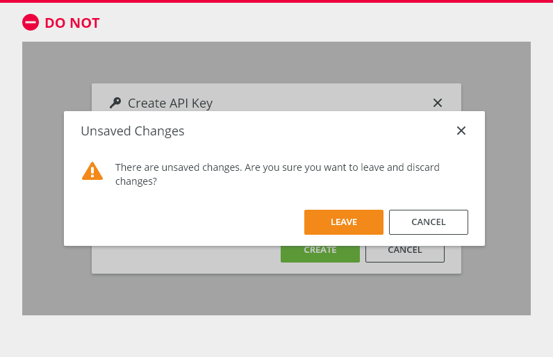
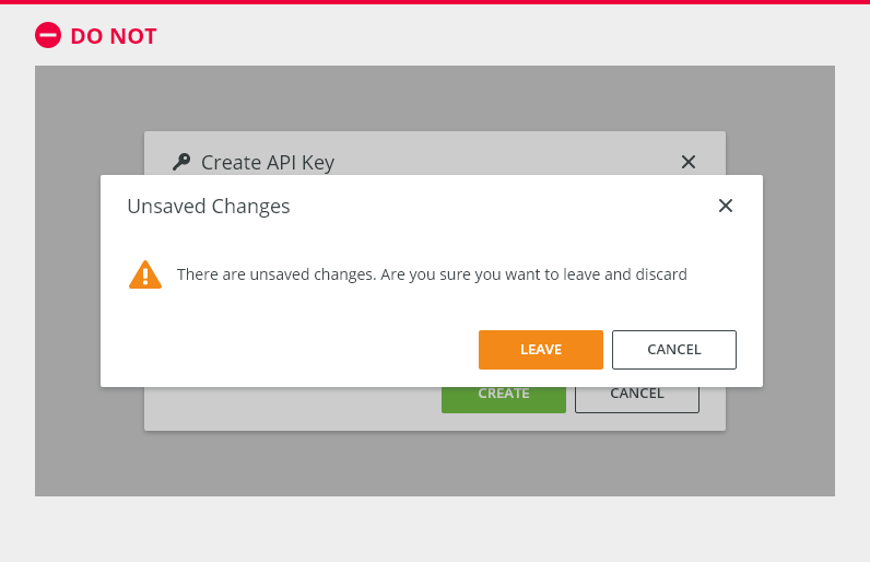
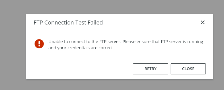
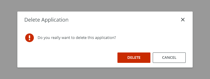
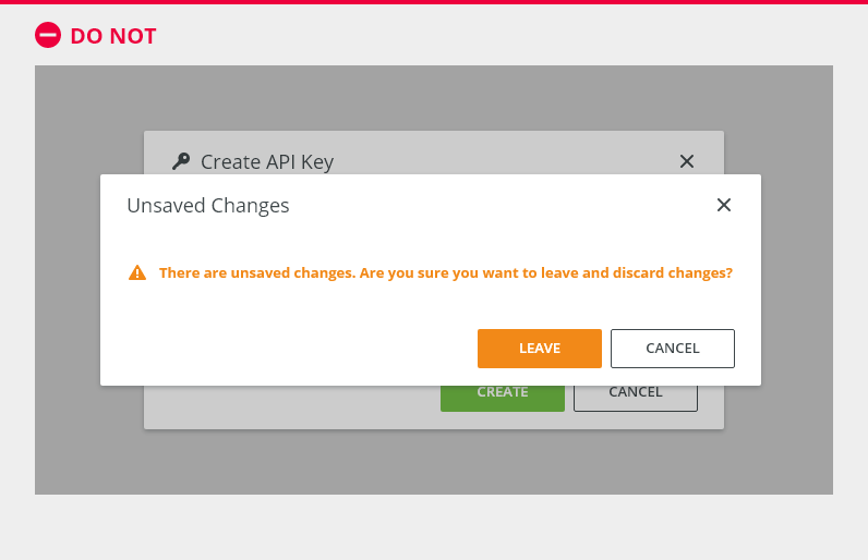
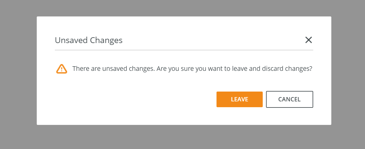
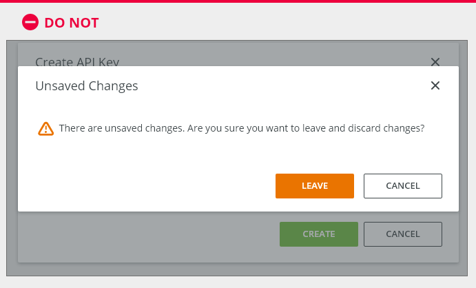
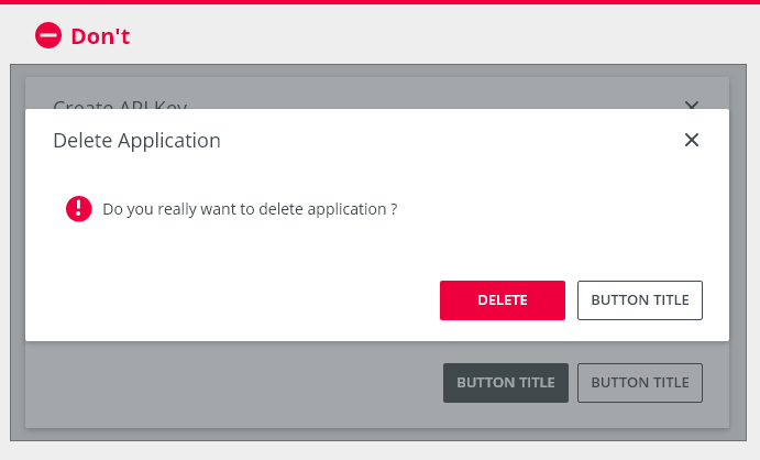
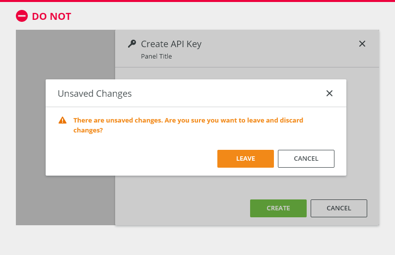
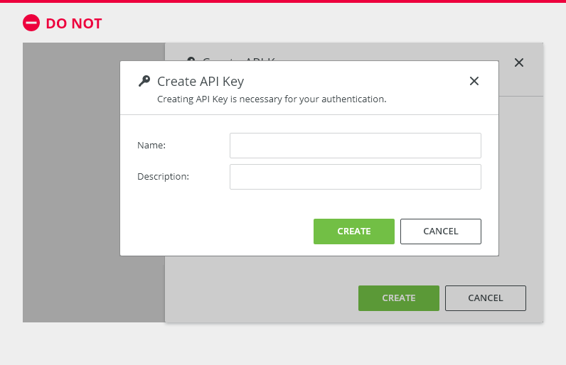
DO NOT
Do NOT use a side modal window
- to display critical information,
- to display a small amount of information.
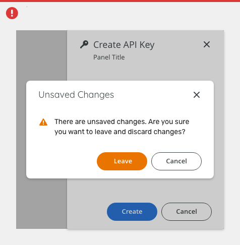
Do not open Input/Edit modal dialogs over side modal windows.
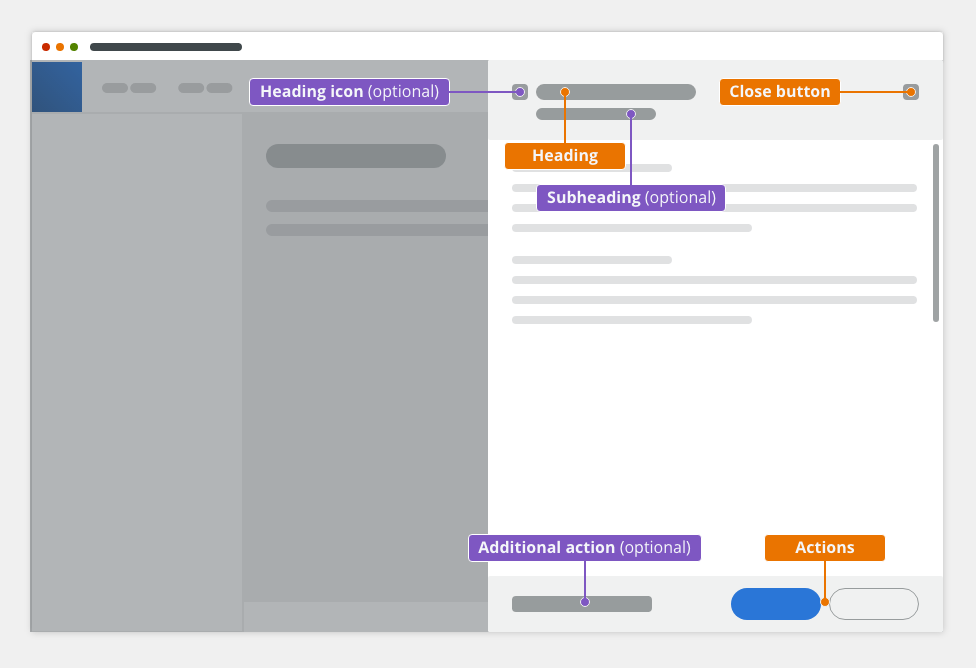
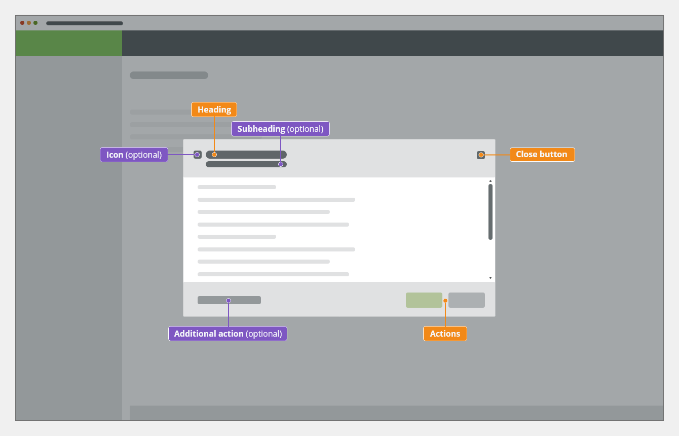
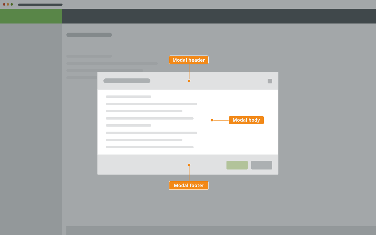
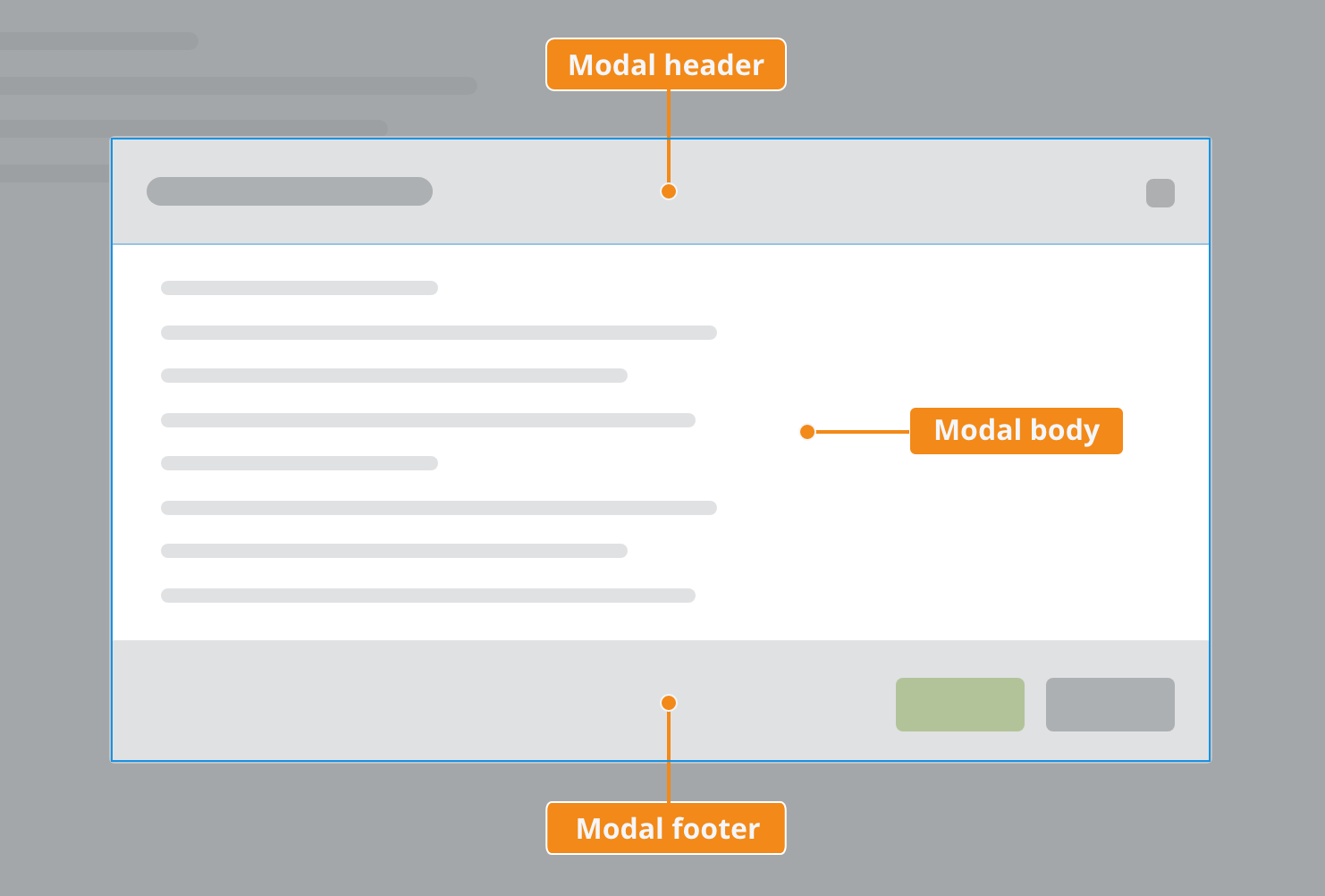
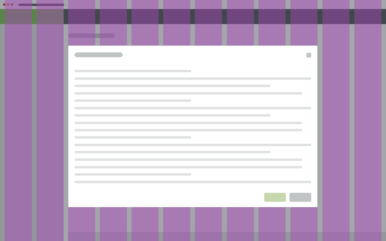
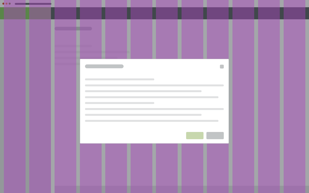
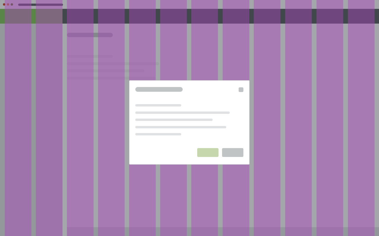
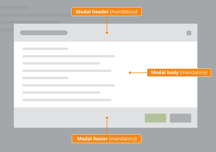
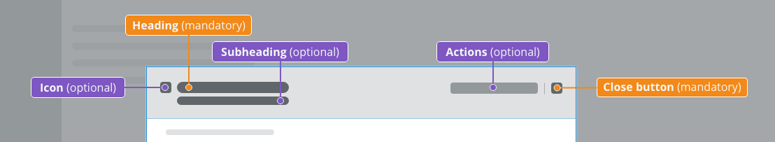
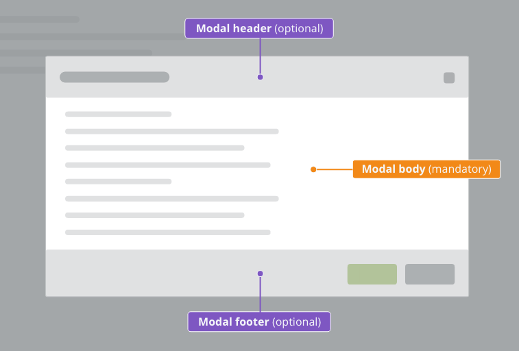
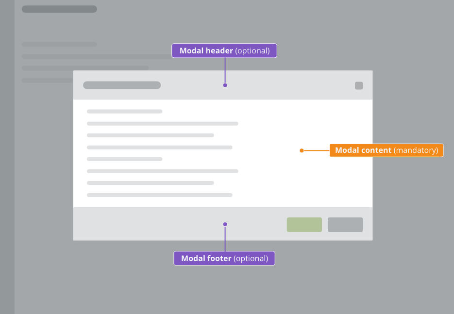
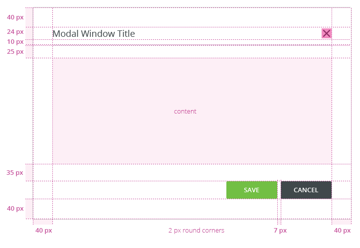
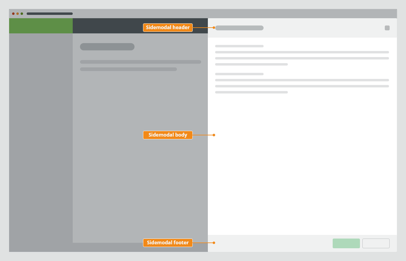
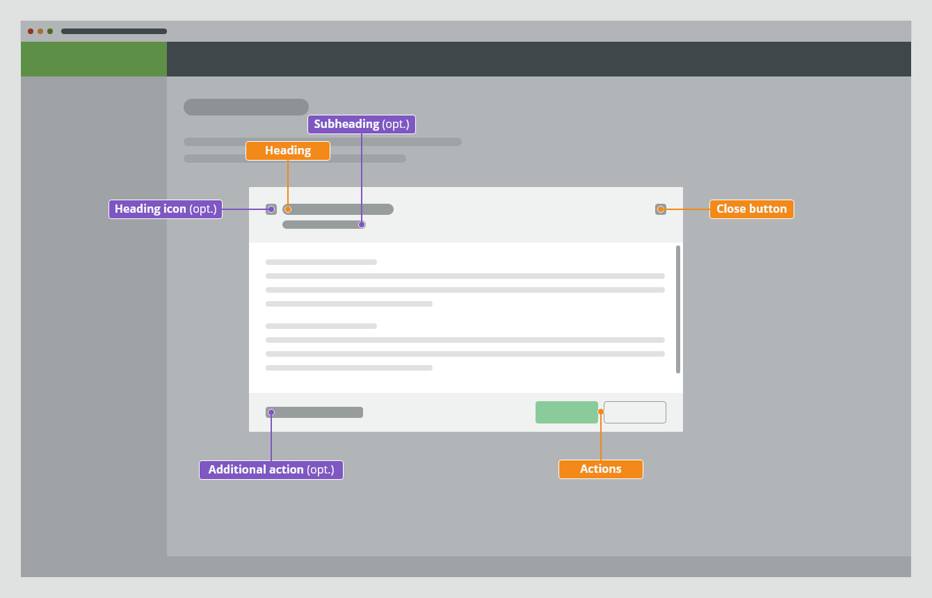
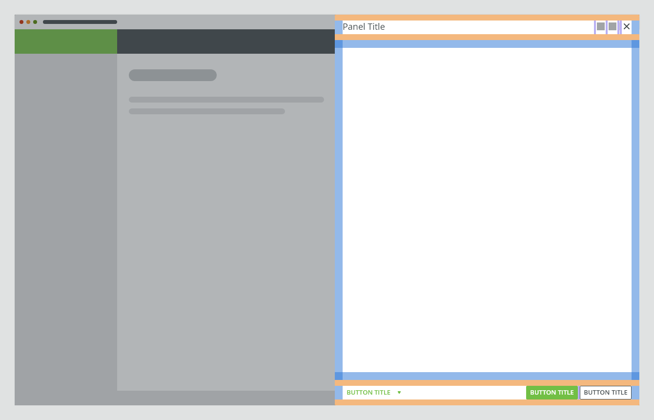
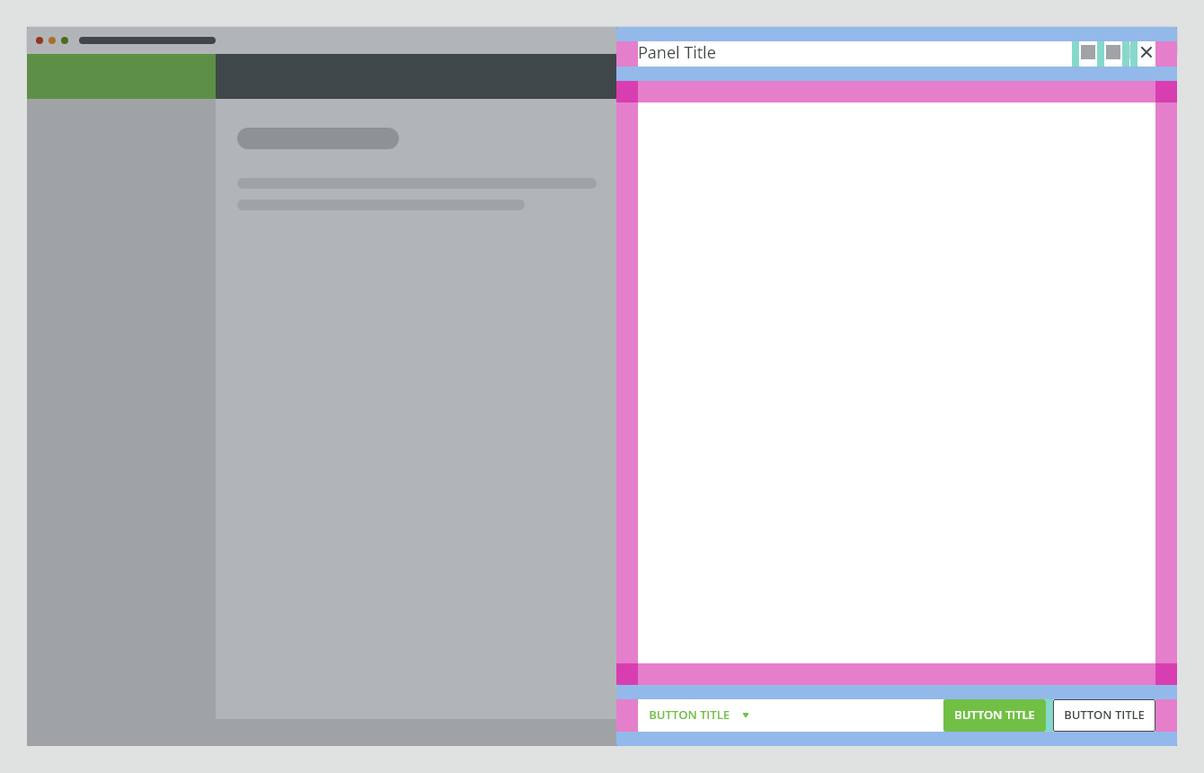
Anatomy
The side modal component consists of the following parts:
- Header
- Body
- Footer
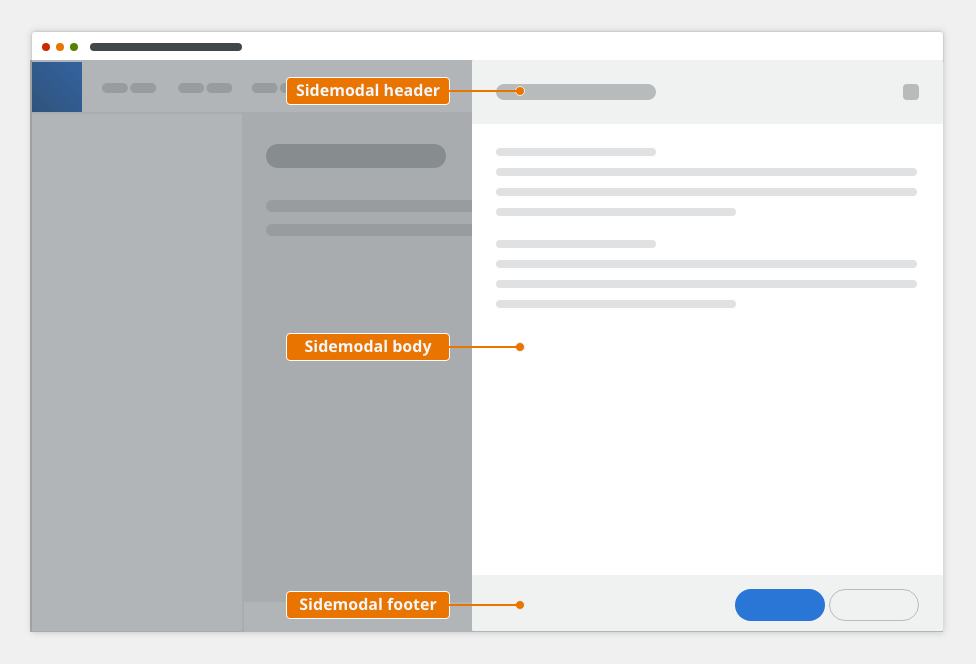
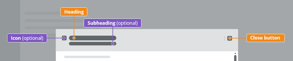
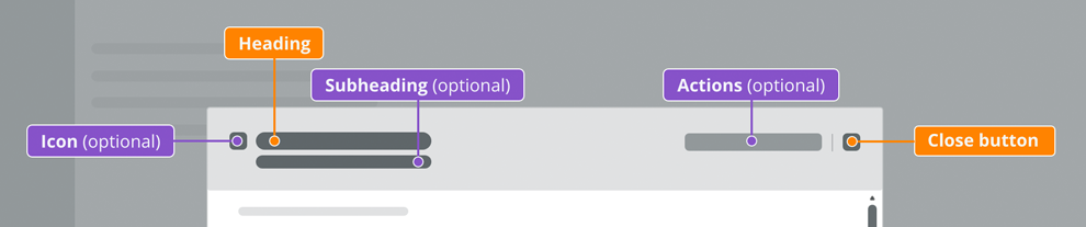
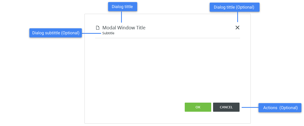
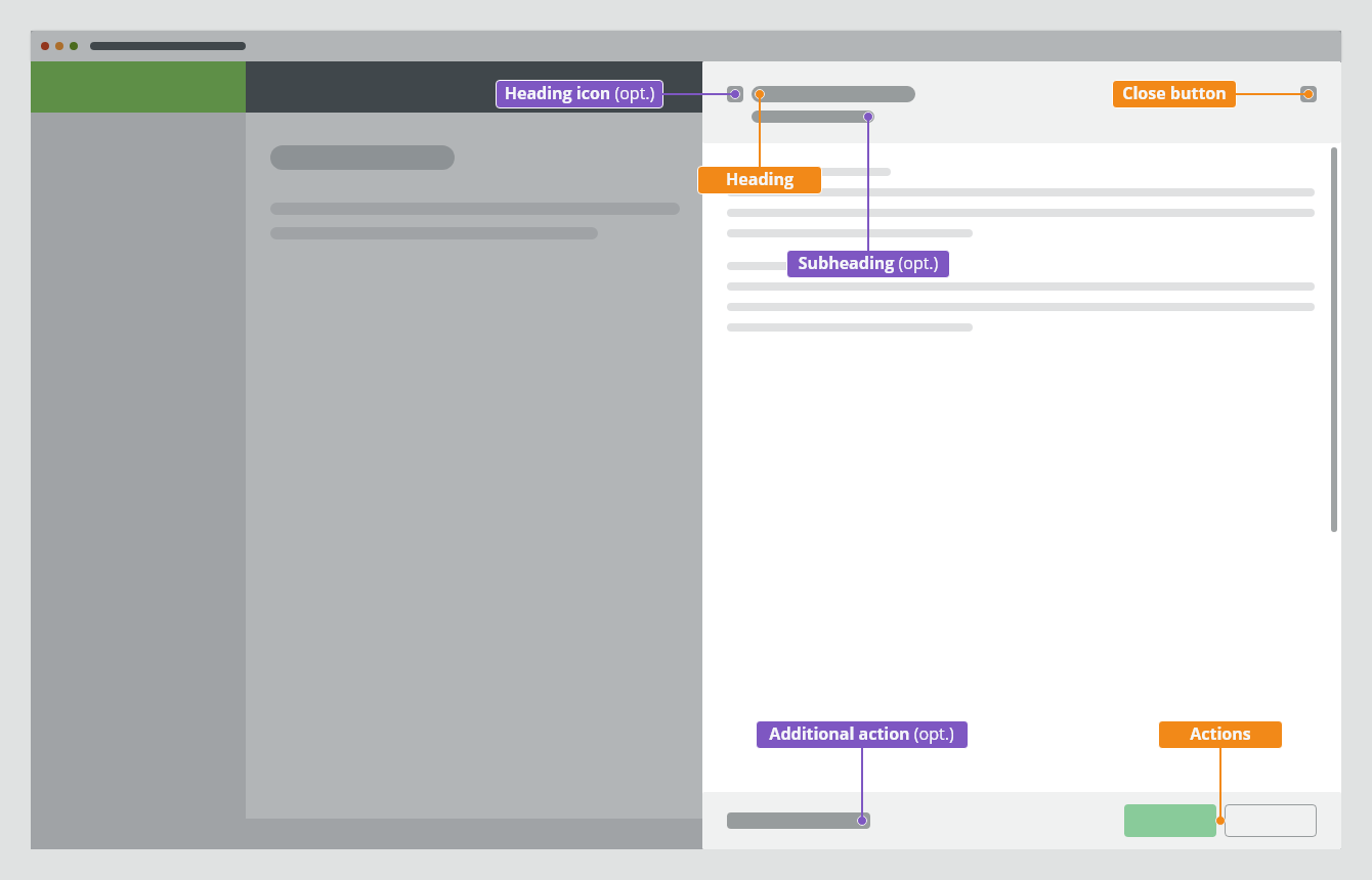
Header
The side modal header consists of:
- Icon (optional)
- Actions (optional)
- Heading: contains the title that reflects the action that launched the side modal → verb and noun (e.g. Upload Image). Overflow content is truncated with ellipsis.
- Subheading (optional)
- Close button “✕”
Body
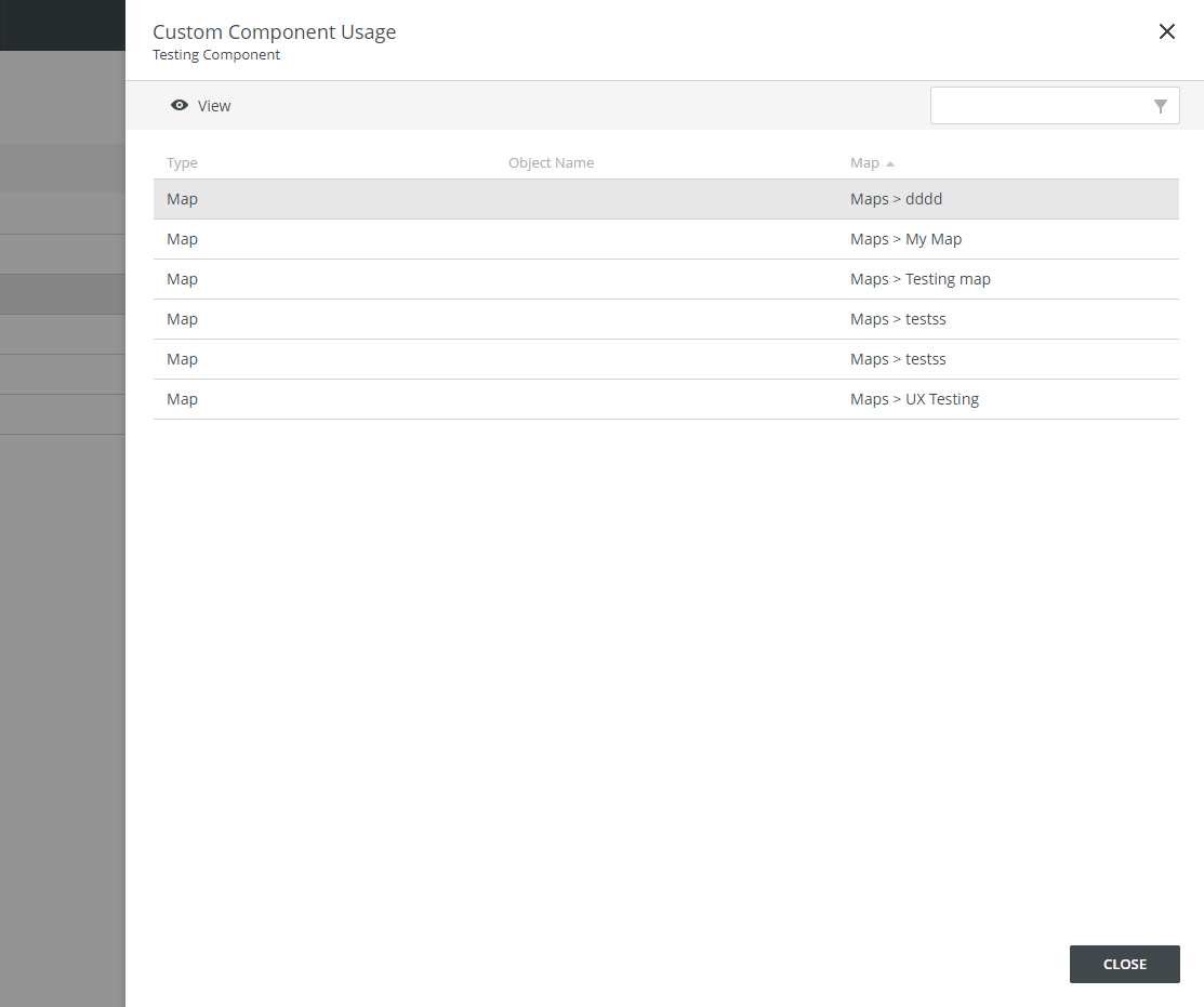
The side modal body contains a content. It typically includes a paragraph, a data table or a form.
Footer
The side modal footer contains actions and the option to cancel and close the dialog.
Types
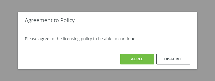
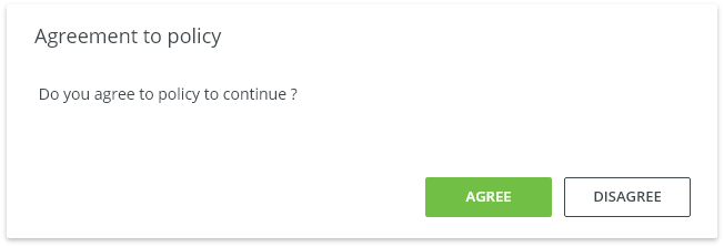
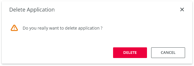
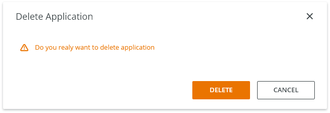
Confirmation
Use a confirmation side modal when asking the user to confirm a choice for a large form.
Typically, the confirmation modal requests a 'yes' or 'no' response, however, buttons with verb labels should be used instead (e.g. Create / Send / Save).
Typical Usage
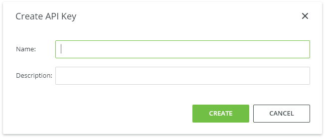
Input/Edit
Input/Edit side modals allow the user to change large amounts of data or settings without leaving the page.
Information
Use an information side modal with a large amount of information.
This type of side modal contains only information associated with the content of an underlying page.
Behavior
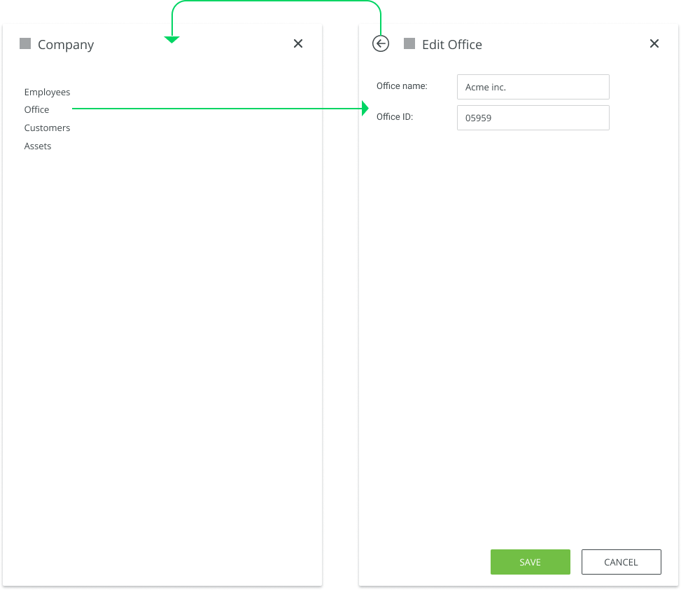
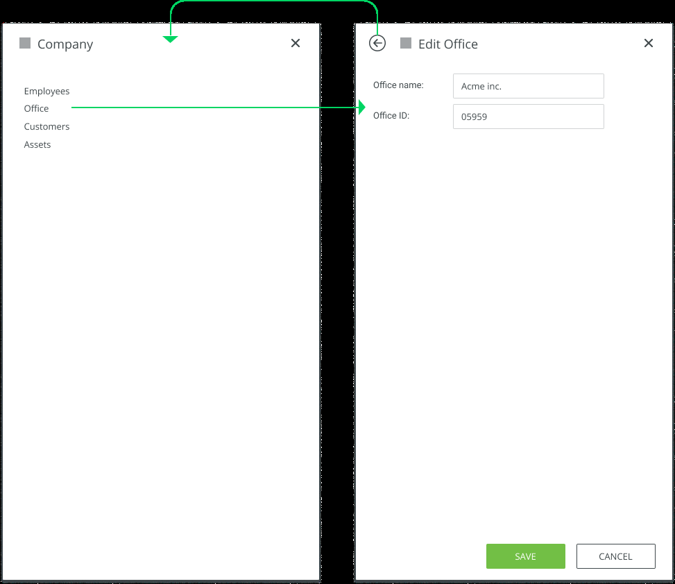
Drill Down Navigation
Exiting Possibilities
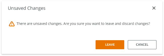
- Task completion - Complete the task (save changes) and close the side modal.
- Cancel button - Close the current level of side modal without submitting any data and return to the previous level.
- x - Close the side modal without submitting any data and return to the previous context.
- <Escape> key - Close the side modal without submitting any data and return to the previous context.
Trigger
A side modal is triggered as a result of a user action. Typical triggers are buttons, links, icons, or a keyboard key: <Enter> or <Space>.
Side modal slides from the right to the left side and is always attached to the right edge of the application window.
Focus
Once the side modal is open, initial focus is on the first element that accepts a user input. Focus should then remain trapped in the dialog until it is closed.
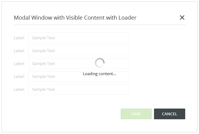
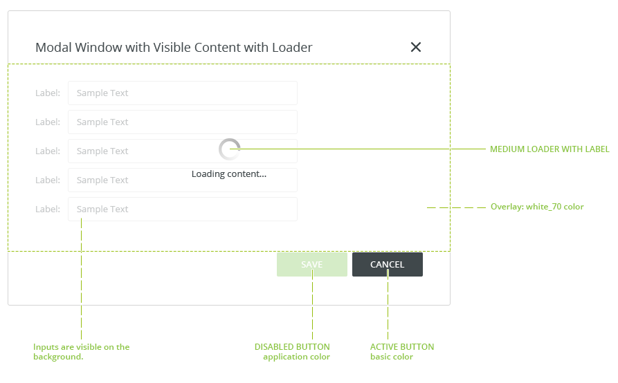
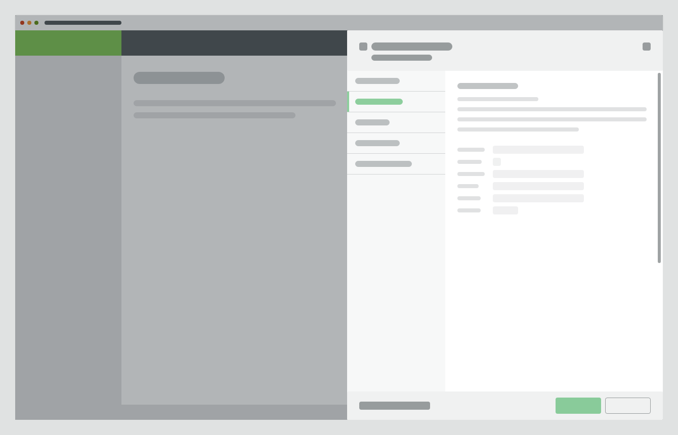
Loading
For actions that take longer than 1 second a loading spinner and overlay should appear on the top of the side modal.
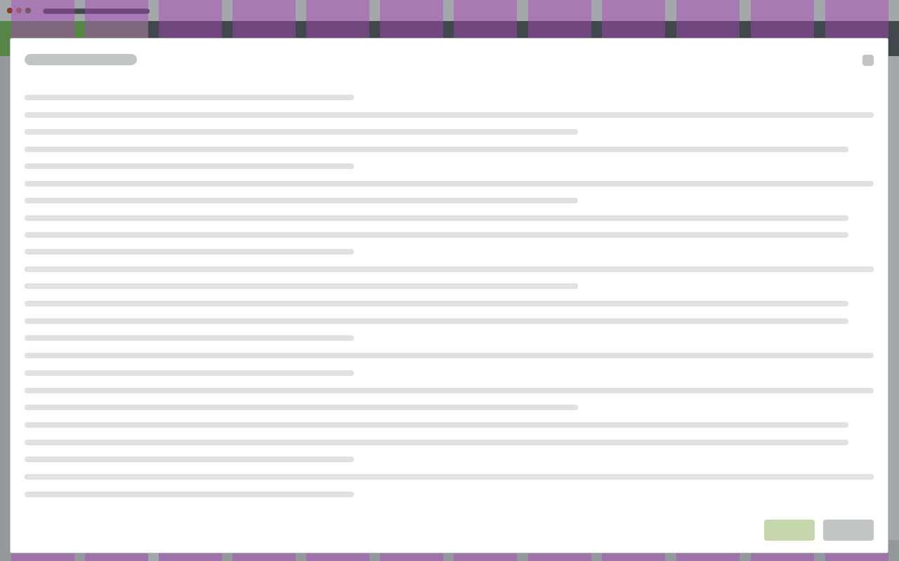
Scrolling
It is possible to scroll through the side modal content vertically, independent of the parent page content and interface. Users cannot scroll through the content horizontally.
Side modal header is fixed along the top. Content scrolls underneath, and a shadow is added to color-matched headers.
Side modal footer sticks to the bottom with a fixed height and a shadow is added.
Keyboard Interactions
KEY |
INTERACTION |
|---|---|
| Tab | Moves focus to next interactive element. If focus is on the last element interactive inside the dialog, moves focus to the first interactive element inside the dialog. |
| Shift + Tab | Moves focus to the previous interactive element inside the dialog. |
| Esc | Dismisses the dialog. Close the modal without submitting any data and return to the previous context. |
Related Components
- Modal - Use for short and non-frequent tasks.
- Full screen modal - Use for complex interaction (e.g. Workflow editor).
Style
Density
Default
Condensed
Width
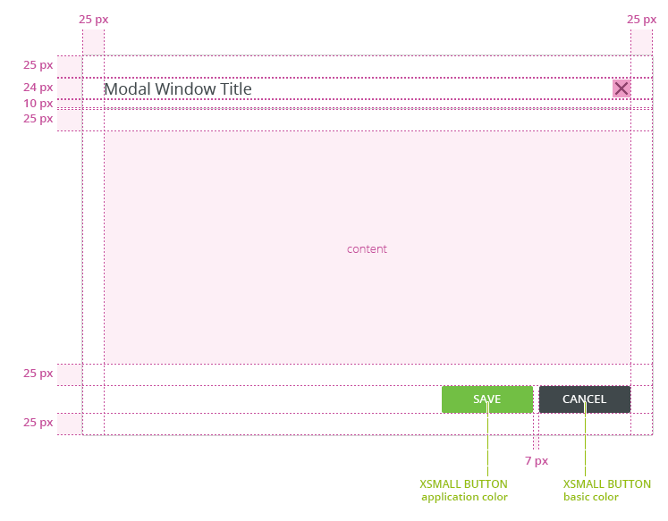
Side modal default width is 450px.
Typography
| Used In | Type | Token |
|---|---|---|
| Modal window heading, panel headings | Heading 1 Alt (H1) | font-heading150 |
| Subtitle body | Body | font-body |
Color
| Used In | Type | Token |
|---|---|---|
| Modal background | background-color | white |
| Heading, body text | text color | basic |
Spacing
| Density | Used In | Type | PX | Token |
|---|---|---|---|---|
| Default | Vertical space in header, vertical space in footer | Padding | 16 | spacing-500 |
| Condensed | Vertical space in header, vertical space in footer | Padding | 12 | spacing-400 |
Widths
Size |
Min width |
|---|---|
Default |
450px |
Accessibility
- When the modal is open, place focus on the first interactive element and trap the focus inside the modal.
- Add ARIA role
role=”dialog”to modal outer wrapper, usearia-labelledbyattribute in the same element for a short description. - Add an
aria-describedbyattribute for any further description if needed. - Add
aria-hidden=”true”attribute when the modal is hidden but present in DOM. - After closing the modal, return focus to the trigger element, usually a button or a link.
- W3C WAI-ARIA Dialog Design Pattern
Attachments:
 image2020-8-27_13-1-38.png (image/png)
 image2020-8-19_10-38-54.png (image/png)
 image2020-8-19_10-38-5.png (image/png)
 image2020-8-19_10-37-52.png (image/png)
 image2020-8-19_10-33-0.png (image/png)
 image2020-8-19_10-32-44.png (image/png)
 image2020-8-19_10-32-20.png (image/png)
 image2020-8-19_10-31-48.png (image/png)
 image2020-8-19_10-18-55.png (image/png)
 image2020-8-19_10-18-38.png (image/png)
 image2020-8-19_10-18-0.png (image/png)
 image2020-8-19_10-17-24.png (image/png)
 image2020-8-18_15-24-59.png (image/png)
 image2020-8-14_10-49-41.png (image/png)
image2020-8-14_10-41-45.png (image/png)
image2020-8-17_10-38-52.png (image/png)
image2020-8-14_10-49-41.png (image/png)
image2020-8-14_10-41-45.png (image/png)
image2020-8-17_10-38-52.png (image/png)
 image2020-8-13_13-0-18.png (image/png)
 image2020-8-13_12-58-8.png (image/png)
 image2020-8-11_10-49-57.png (image/png)
 image2020-8-11_10-47-25.png (image/png)
 image2020-8-11_10-44-38.png (image/png)
 image2020-8-4_11-31-34.png (image/png)
 image2020-8-4_10-9-3.png (image/png)
 image2020-8-4_9-25-6.png (image/png)
 image2020-8-4_9-24-45.png (image/png)
 image2020-8-4_9-21-16.png (image/png)
 image2020-8-3_17-5-59.png (image/png)
 image2020-8-3_17-2-25.png (image/png)
 image2020-8-3_16-57-14.png (image/png)
 image2020-8-3_16-54-54.png (image/png)
 image2020-8-3_16-54-22.png (image/png)
 image2020-8-3_14-52-49.png (image/png)
 image2020-8-3_14-47-17.png (image/png)
 image2020-8-3_13-27-16.png (image/png)
 image2020-8-3_13-26-47.png (image/png)
 image2020-8-3_13-22-30.png (image/png)
 image2020-8-3_13-21-4.png (image/png)
 image2020-8-3_13-17-23.png (image/png)
 image2020-8-3_12-58-6.png (image/png)
 image2020-8-3_12-57-45.png (image/png)
 DONT.png (image/png)
 DO.png (image/png)
 Modal Dialog - parts.png (image/png)
 modal-footer.png (image/png)
 modal-body.png (image/png)
 modal-header.png (image/png)
 Modal Dialog - paddings condensed.png (image/png)
 footer.png (image/png)
 Screenshot 2019-11-22 at 10.50.04.png (image/png)
 Mockup_basic – 8.png (image/png)
 Mockup_basic – 7.png (image/png)
 Mockup_basic – 6.png (image/png)
 Mockup_basic – 5.png (image/png)
 Mockup_basic – 4.png (image/png)
 Mockup_basic – 3.png (image/png)
 Screenshot 2019-11-21 at 10.48.26.png (image/png)
 Screenshot 2019-11-21 at 10.45.52.png (image/png)
 Screenshot 2019-11-21 at 10.44.57.png (image/png)
 Screenshot 2019-11-21 at 10.44.15.png (image/png)
 Screenshot 2019-11-21 at 10.40.03.png (image/png)
 Screenshot 2019-11-21 at 09.32.39.png (image/png)
 Screenshot 2019-11-21 at 09.28.07.png (image/png)
 image2019-11-18_10-16-18.png (image/png)
 image2019-11-18_9-19-21.png (image/png)
 Group 4.png (image/png)
 image2019-11-14_12-49-47.png (image/png)
 Sidemodal Dialog - parts.png (image/png)
 DONT – Overlaying Modals over Sidemodal.png (image/png)
 Modal Dialog - Header and footer.png (image/png)
 Modal Dialog - Header and footer.png (image/png)
 Sidemodal Dialog - Header and footer.png (image/png)
 image2020-9-18_10-15-24.png (image/png)
 image2020-9-18_10-23-32.png (image/png)
 MicrosoftTeams-image (3).png (image/png)
 Sidemodal Dialog - Body with Sidebar and Form.png (image/png)
 Sidemodal Dialog - paddings.png (image/png)
 Sidemodal Dialog - paddings condensed.png (image/png)
 image2020-10-20_10-39-27.png (image/png)
 image2020-10-20_10-39-52.png (image/png)
 Group 37.png (image/png)
image2020-10-23_15-8-22.png (image/png)
Group 37.png (image/png)
image2020-10-23_15-8-22.png (image/png)
 image2020-10-27_13-48-2.png (image/png)
Sidemodal Dialog - paddings.png (image/png)
image2020-10-27_13-48-2.png (image/png)
Sidemodal Dialog - paddings.png (image/png)
 Sidemodal Dialog - paddings condensed.png (image/png)
 image2021-2-23_15-19-4.png (image/png)
sidemodal-dont–overlaying.png (image/png)
sidemodal-dialog-anatomy.png (image/png)
sidemodal-dialog-content.png (image/png)
sidemodal-dialog-spacing.png (image/png)
sidemodal-dialog-spacing-condensed.png (image/png)
image2021-2-23_15-19-4.png (image/png)
sidemodal-dont–overlaying.png (image/png)
sidemodal-dialog-anatomy.png (image/png)
sidemodal-dialog-content.png (image/png)
sidemodal-dialog-spacing.png (image/png)
sidemodal-dialog-spacing-condensed.png (image/png)