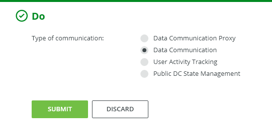
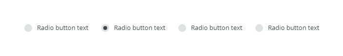
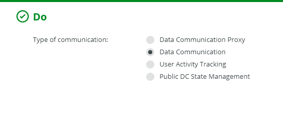
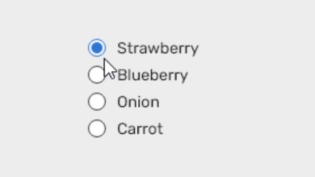
Radio buttons are used when only one selection from the options is allowed, i.e. for mutually exclusive options.
Component Status
 Design Kit: RELEASED
 Bobwai component: bobwai--radio-button RELEASED
Content Overview

Usage
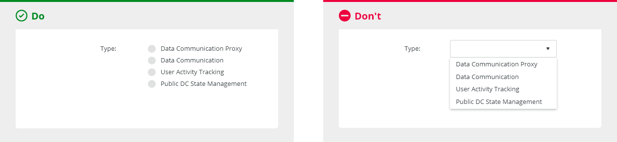
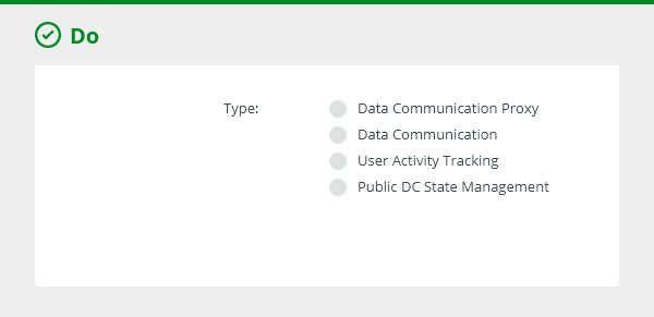
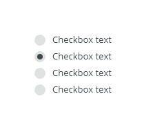
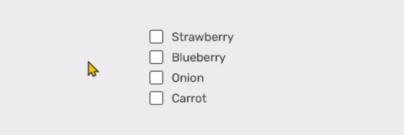
When users can select only one item from the options. Use the checkbox component for situations where zero or multiple options the group can be selected.
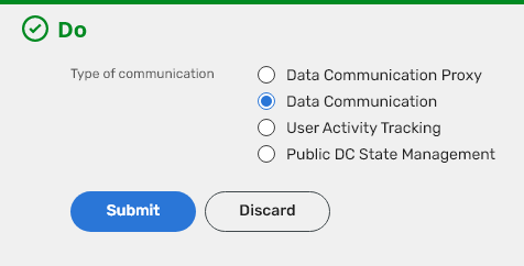
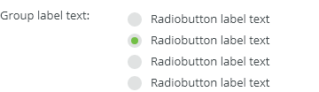
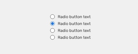
A set of radio buttons should have one option pre-selected by default (the most suitable choice in the given situation).
Always use a label to describe a set of radio buttons.
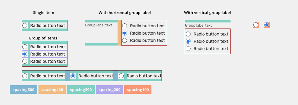
When possible, arrange the radio buttons sets vertically for easier reading.

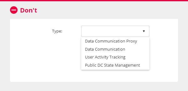
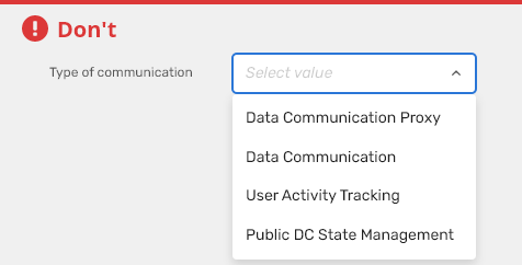
- Do not use, if a user can select none or multiple options from a list. Checkboxes should be used in that case.
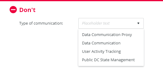
- Never display radio buttons without a default selection.
If there are only a few options to choose from up to about 5, display them immediately.
The user does not have to click on anything to have an overview of all the options and to choose faster.

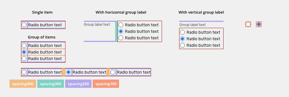
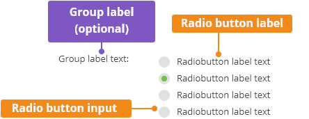
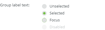
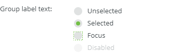
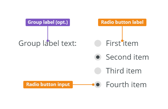
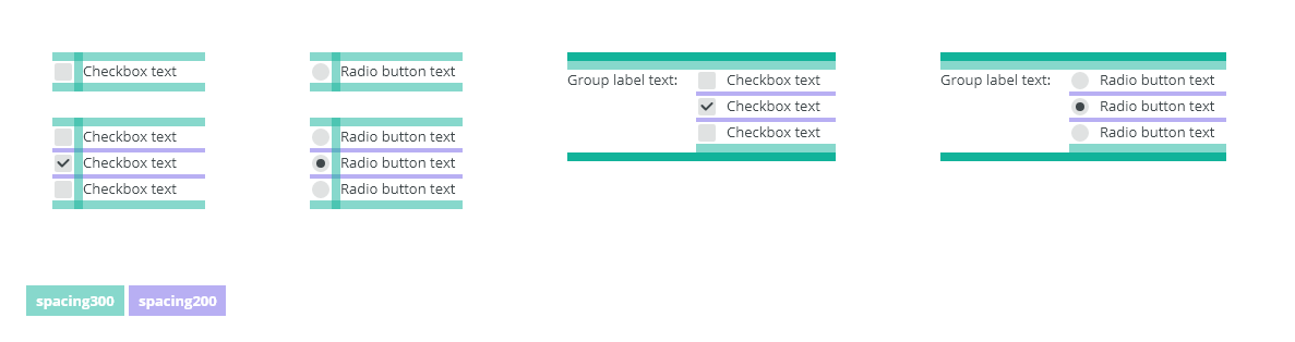
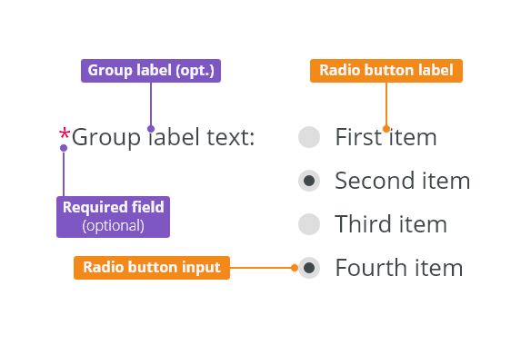
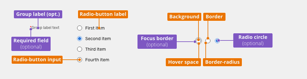
Anatomy

Group label (optional): Describes what needs to be selected.
Radio button label:
- Groups of radio buttons should always have a label that clearly describes what the list of options represents.
- Labels should be short and clear as to what will happen if the option is selected. Do not truncate the radio button label text with an ellipsis.
Radio button input: By default, one of the options is pre-selected.
Variants
Alignment
Radio button labels are positioned to the right of their inputs.
Vertical Alignment
It is recommended to create groups vertically for easier reading.

Horizontal Alignment
Horizontal
Behavior
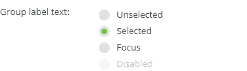
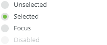
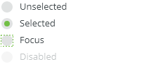
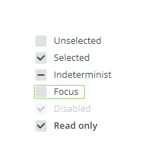
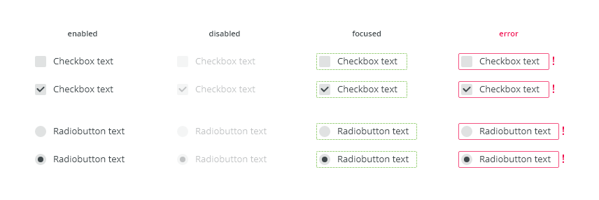
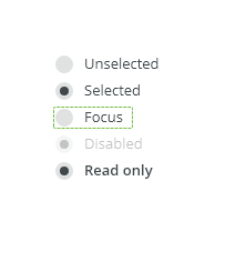
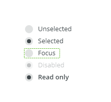
States

Read-only
Allows for content to be copied, but not interacted with or changed.

Disabled
Cannot be interacted with but remains visible to the user in a disabled visual style.

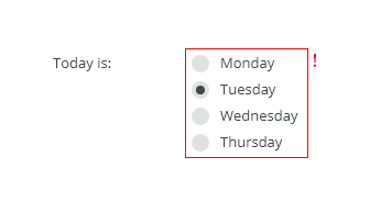
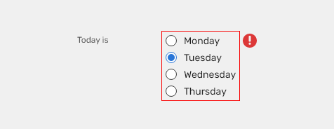
Validation
Client-side validation - It is recommend to validate the user data before form submission. Fields are validated upon losing focus.
Typical group client error validation is:
- Nothing has been selected.

Change of state / On Press animation
When radio is clicked, the background animation is used to enhance visibility of the change of the state.

Keyboard Interactions
Key |
Interaction |
|---|---|
| Tab | Users can navigate between radio button inputs by pressing <Tab> or <Shift>+<Tab>. |
| Left, Right, Up, and Down Arrow | Moves focus and selection to the previous or next radio button in the group. |
Editorial
Use sentence case for labels - Only the first word is capitalized, except for proper nouns and other words which are generally capitalized based on a more specific rule. Keep the text short and specific.
Related Components
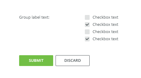
Checkbox - when there are multiple items to select in a list. Users can select zero, one, or any number of items.

Used In |
Type |
px | Token |
|---|---|---|---|
| Radio button labels | Font |
font-body |
|
| Radio button labels | Color | color-text-100 |
|
| Group label | Font | font-label |
|
| Group label | Color | color-text-200 |
|
| Hover space | Object Size | 20x20 | sizing-item-075 |
Unselected |
|||
| Hover space | Color | color-bg-interactive-200 |
|
| Background | Color | color-bg-interactive-400 |
|
| Border | Color | color-border-100 |
|
| Border | Border size | 1 | border-width-100 |
| Border-radius | Border radius | 24 | radius-full |
Selected |
|||
| Hover space | Color | color-bg-interactive-200 |
|
| Background | Color | color-bg-interactive-400 |
|
| Border | Color | color-border-500 |
|
| Border | Border size | 1 | border-width-100 |
| Border-radius | Border radius | 24 | radius-full |
| Radius circle | Color | color-border-500 | |
| Radius circle | Border radius | 24 | radius-full |
States
| Used in | Type | px | Token |
|---|---|---|---|
Hover |
|||
| Hover space | Color | color-bg-interactive-200-hover |
|
Pressed |
|||
| Hover space | Color | color-bg-interactive-200-pressed |
|
| Hover space | Object size | 28x28 | sizing-item-200 |
| Hover space expansion | Duration | duration-150 | |
| Hover space hide | fade | duration-150 | |
Read-only |
|||
| Radio button | Opacity | opacity-disabled | |
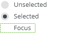
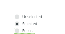
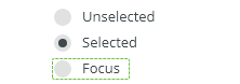
Focus |
|||
| Focus border | Border size | 1 | border-width-100 |
| Focus border | Color | color-focus-200 |
|
| Focus border | Corner-radius | 4 | radius-full |
Spacing

| Used in | type | px | Token |
|---|---|---|---|
| Paddings between items (vertical stack) | Spacing |
4 |
spacing-200 |
| Padding between items (horizontal stack) | Spacing | 16 | spacing-500 |
| Top and Bottom padding, space between inputs and labels | Spacing |
8 |
spacing-300 |
| Minimal space between group label and "input" | spacing | 12 | spacing-400 |
| Padding of radio | Spacing | 2 | spacing-100 |
| Padding inside radio (for circle) | Spacing | 2 | spacing-100 |
Condensed
| Used in | Type | px | Token |
|---|---|---|---|
| Paddings between items (vertical stack) | Spacing |
2 |
spacing-100 |
| Padding between items (horizontal stack) | Spacing | 12 | spacing-400 |
| Top and Bottom padding, space between inputs and labels | Spacing |
4 |
spacing-200 |
| Minimal space between group label and "input" | spacing | 8 | spacing-300 |
| Padding of radio | Spacing | 2 | spacing-100 |
| Padding inside radio (for circle) | Spacing | 2 | spacing-100 |
Accessibility
- Provide labels and instructions that are clear and concise.
- If the input is a required field include the
aria-requiredproperty and indicate that it is a required field and use the validation message for input errors. - Radio button labels are positioned to the right of their inputs.
- W3C WAI-ARIA Radio Group Design Pattern
Attachments:
 image2020-10-12_15-18-44.png (image/png)
 image2020-10-6_15-42-0.png (image/png)
 image2020-10-6_15-42-49.png (image/png)
 image2020-10-12_16-13-25.png (image/png)
 image2020-10-12_16-14-18.png (image/png)
 image2020-10-12_16-20-6.png (image/png)
 image2020-10-12_16-21-36.png (image/png)
 image2020-10-12_16-21-51.png (image/png)
 image2020-10-12_16-23-5.png (image/png)
 image2020-10-12_16-30-23.png (image/png)
 image2020-10-12_16-30-38.png (image/png)
 image2020-10-13_14-45-40.png (image/png)
 image2020-10-13_14-46-12.png (image/png)
 image2020-10-13_14-46-20.png (image/png)
 image2020-10-8_12-36-2.png (image/png)
 Checkboxes - DO.png (image/png)
 Checkboxes - DONT.png (image/png)
 Radiobuttons - DO.png (image/png)
 Radiobuttons - DONT.png (image/png)
 Radiobuttons - Anatomy.png (image/png)
 Radiobuttons - Vertical alignment.png (image/png)
 Radiobuttons - Horizontal alignment.png (image/png)
 Radiobuttons - States.png (image/png)
 Radiobuttons - Validation.png (image/png)
 Checkboxes, radiobuttons - All.png (image/png)
 Checkboxes, radiobuttons - Style.png (image/png)
 image2020-11-11_8-33-49.png (image/png)
 image2020-11-11_8-35-1.png (image/png)
 image2020-11-11_8-54-26.png (image/png)
 image2020-11-11_8-55-5.png (image/png)
 image2020-11-11_8-55-37.png (image/png)
 image2020-11-13_10-59-43.png (image/png)
 image2020-11-13_12-41-16.png (image/png)
 image2020-11-13_12-41-40.png (image/png)
 image2020-11-13_12-41-58.png (image/png)
 image2020-11-13_12-42-52.png (image/png)
 radiobutton-title.png (image/png)
 image2020-12-1_10-57-14.png (image/png)
image2020-12-1_10-59-46.png (image/png)
radiobuttons-do.png (image/png)
image2020-12-1_10-57-14.png (image/png)
image2020-12-1_10-59-46.png (image/png)
radiobuttons-do.png (image/png)
 radiobuttons-dont.png (image/png)
 radiobuttons-anatomy.png (image/png)
 radiobuttons-vertical-alignment.png (image/png)
 radiobuttons-horizontal alignment.png (image/png)
 radiobuttons-states.png (image/png)
 radiobuttons-readonly.png (image/png)
 radiobuttons-disabled.png (image/png)
 radiobuttons-validation.png (image/png)
 radiobuttons-style.png (image/png)
 radiobutton-title.png (image/png)
 radiobuttons-do.png (image/png)
 radiobutton-title.png (image/png)
 radiobuttons-do.png (image/png)
 radiobuttons-dont.png (image/png)
 radiobuttons-style.png (image/png)
 radiobuttons-validation.png (image/png)
 radiobuttons-validation.png (image/png)
 radiobuttons-style.png (image/png)
 radiobutton-title.png (image/png)
radiobuttons-do.png (image/png)
radiobuttons-dont.png (image/png)
radiobuttons-anatomy.png (image/png)
radiobutton-title.png (image/png)
radiobuttons-do.png (image/png)
radiobuttons-dont.png (image/png)
radiobuttons-anatomy.png (image/png)
 radiobuttons-vertical-alignment.png (image/png)
radiobuttons-horizontal alignment.png (image/png)
radiobuttons-states.png (image/png)
radiobuttons-vertical-alignment.png (image/png)
radiobuttons-horizontal alignment.png (image/png)
radiobuttons-states.png (image/png)
 radiobuttons-readonly.png (image/png)
radiobuttons-disabled.png (image/png)
radiobuttons-validation.png (image/png)
radiobuttons-group-style.png (image/png)
radiobuttons-readonly.png (image/png)
radiobuttons-disabled.png (image/png)
radiobuttons-validation.png (image/png)
radiobuttons-group-style.png (image/png)
 radiobuttons-style.png (image/png)
 radiobuttons-states.png (image/png)
 radiobuttons-anatomy.png (image/png)
radiobuttons-style.png (image/png)
radiobuttons-anatomy.png (image/png)
radiobuttons-style.png (image/png)
 radiobuttons-states.png (image/png)
 checkbox-pressed.gif (image/gif)
 radiobuttons-style.png (image/png)
radiobuttons-states.png (image/png)
radiobuttons-group-style.png (image/png)
radiobuttons-style.png (image/png)
radiobuttons-states.png (image/png)
radiobuttons-group-style.png (image/png)
 radiobuttons-group-style-condensed.png (image/png)
 radio.gif (image/gif)
 radio.gif (image/gif)
 radiobuttons-group-style.png (image/png)
radiobuttons-group-style-condensed.png (image/png)
radiobutton-animation.gif (image/gif)
radiobuttons-group-style.png (image/png)
radiobuttons-group-style-condensed.png (image/png)
radiobutton-animation.gif (image/gif)