Loading spinners are used when retrieving data or performing slow computations, and help to notify users that an action is in progress.
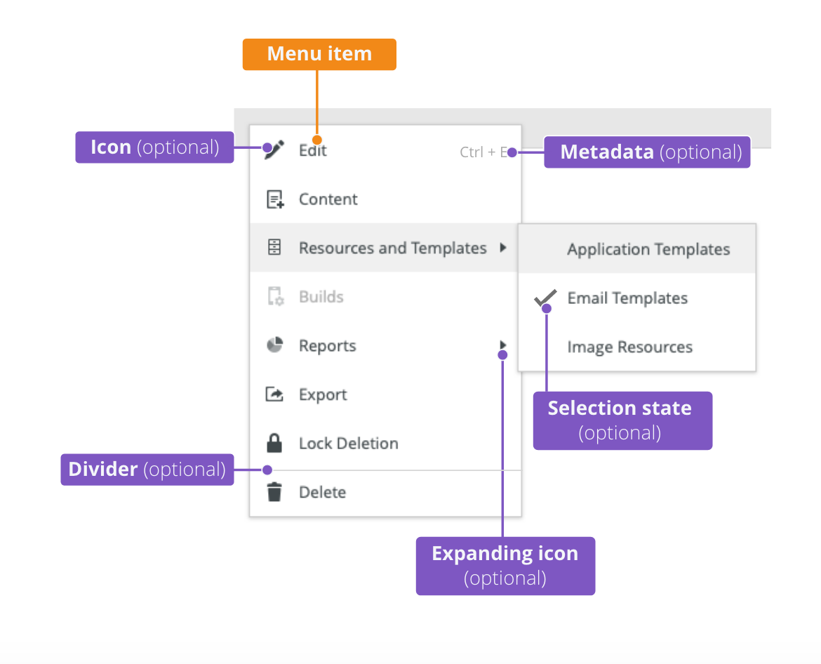
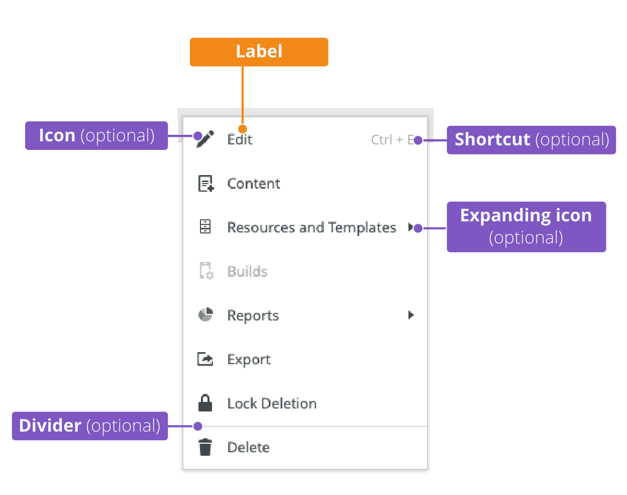
Component Status
 Design Kit: NOT RELEASED
 Bobwai component: bobwai--loader RELEASED

Usage
Loaders are used for notifying users that their request is being processed. Loaders are indeterminate, they do not tell users how long the process will take to load.
- Ideal response time is within 100 milliseconds (0.1 second).
- 10 seconds is the limit for the user’s attention. (Delays longer than 10 seconds are only acceptable during natural breaks in the user's work, for example when switching tasks.)
Use loader when the waiting time is anticipated to be longer than 1 second, otherwise it is distracting.
Do not use loader when the waiting time is anticipated to be longer than 5 seconds, use a progress bar instead.
- Show a time estimation of the website load.
- Explain why the user needs to wait.


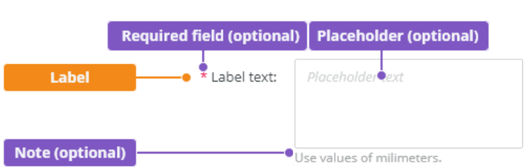
When using a label, it should be descriptive.


.

Use loader for a short process, less than 5 seconds.

Do not use progress indicator for a short process, less than 5 seconds.
Placement
Loaders are vertically and horizontally centered within the container AND the viewport by default.
Specific Area
For loading items in a specific area.
Full-screen
Full-screen loader is used when loading the whole page or when there is an ongoing high-performance computation.

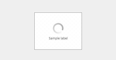
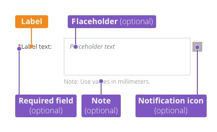
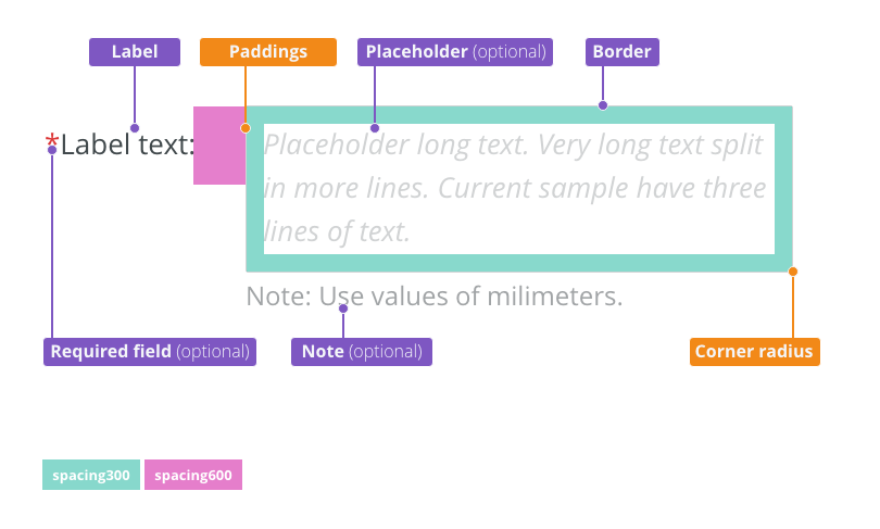
Label
Descriptive label can be added to the loader.
A vertically placed label is default.

A horizontally placed label is used in narrow spaces, e.g. in a table row.

Appearance
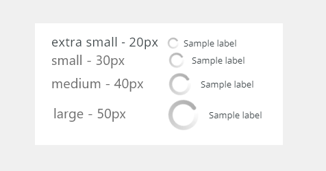
Sizes
Four sizes are available. They can be used either with labeled or non-labeled version.

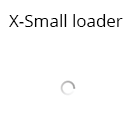
- Extra small: Use inside a tree
- Small: Use within elements such as tables or form fields, or when there are other space constraints.
- Medium: The default size which is used for most use cases.
- Large: Use for full screen.
Editorial
- Use the first capital for the label.
- Keep the label short and specific.
Related Components
- Progress bar bobwai--progress
Color Variants
Dark (Default)
Used on dark backgrounds or in overlays.

Light
Used on light backgrounds.

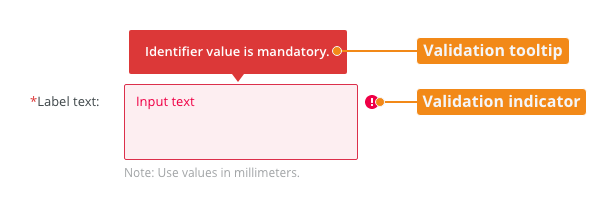
Accessibility
- Provide labels that are clear and concise.
- W3C Web Tutorial: Labeling Controls
Attachments:
 image2021-2-3_15-5-14.png (image/png)
image2021-1-21_16-17-11.png (image/png)
image2021-1-21_15-58-18.png (image/png)
image2021-1-21_15-57-31.png (image/png)
image2021-1-21_15-53-29.png (image/png)
image2021-1-21_13-55-56.png (image/png)
image2021-1-20_13-29-16.png (image/png)
image2021-1-20_13-28-31.png (image/png)
image2021-2-3_15-5-14.png (image/png)
image2021-1-21_16-17-11.png (image/png)
image2021-1-21_15-58-18.png (image/png)
image2021-1-21_15-57-31.png (image/png)
image2021-1-21_15-53-29.png (image/png)
image2021-1-21_13-55-56.png (image/png)
image2021-1-20_13-29-16.png (image/png)
image2021-1-20_13-28-31.png (image/png)
 image2021-1-20_9-29-50.png (image/png)
 image2021-1-20_9-29-24.png (image/png)
 image2021-1-14_15-50-8.png (image/png)
image2021-1-14_15-48-9.png (image/png)
image2021-1-14_15-47-5.png (image/png)
image2021-1-14_15-50-8.png (image/png)
image2021-1-14_15-48-9.png (image/png)
image2021-1-14_15-47-5.png (image/png)
 image2020-12-18_14-29-19.png (image/png)
image2020-12-18_14-29-1.png (image/png)
image2020-12-17_10-44-15.png (image/png)
image2020-12-18_14-29-19.png (image/png)
image2020-12-18_14-29-1.png (image/png)
image2020-12-17_10-44-15.png (image/png)
 image2020-12-17_10-13-24.png (image/png)
 image2020-12-17_10-13-14.png (image/png)
 image2020-12-17_10-13-0.png (image/png)
 image2020-12-17_10-12-25.png (image/png)
 image2020-12-17_9-55-4.png (image/png)
 image2020-12-17_9-53-1.png (image/png)
image2020-12-17_9-51-58.png (image/png)
image2020-12-17_9-53-1.png (image/png)
image2020-12-17_9-51-58.png (image/png)
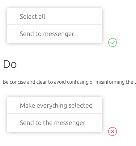
 Context-menu-dont-groups.png (image/png)
 Context-menu-do-groups.png (image/png)
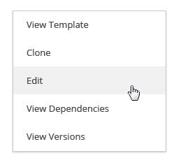
 Context-menu-dont-short.png (image/png)
 Context-menu-do-short.png (image/png)
 Context-menu-states-disabled.png (image/png)
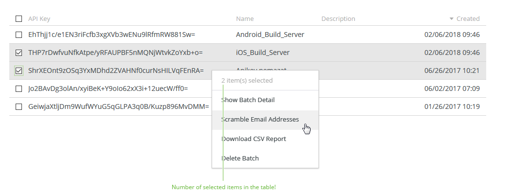
 Context-menu-groups.png (image/png)
 Context-menu-variants-with-title.png (image/png)
 Context-menu-variants-text-icons.png (image/png)
 Context-menu-variants-text-only.png (image/png)
 Context-menu-type-multilevel.png (image/png)
 Context-menu-type-basic.png (image/png)
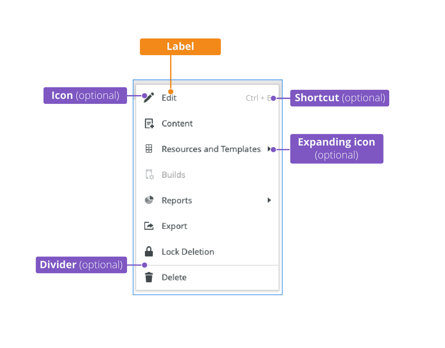
 context-menu-anatomy.png (image/png)
 Screenshot 2020-11-20 at 14.27.17.png (image/png)
 Screenshot 2020-11-19 at 09.57.10.png (image/png)
 Screenshot 2020-11-18 at 13.08.05.png (image/png)
 Screenshot 2020-11-18 at 13.08.21.png (image/png)
 Screenshot 2020-11-19 at 08.14.34.png (image/png)
 Screenshot 2020-11-19 at 08.14.25.png (image/png)
 Screenshot 2020-11-16 at 13.53.55.png (image/png)
 Screenshot 2020-11-18 at 13.22.39.png (image/png)
 Screenshot 2020-11-18 at 13.11.11.png (image/png)
 Screenshot 2020-11-18 at 12.49.34.png (image/png)
 Screenshot 2020-11-16 at 15.22.41.png (image/png)
 Screenshot 2020-11-16 at 15.19.01.png (image/png)
 Screenshot 2020-11-16 at 15.09.35.png (image/png)
 Screenshot 2020-11-16 at 14.58.54.png (image/png)
 Screenshot 2020-11-16 at 15.01.07.png (image/png)
 image2020-11-2_9-26-30.png (image/png)
 image2020-11-2_9-26-14.png (image/png)
 image2020-11-2_9-24-56.png (image/png)
 text-area-variants-warning-icon.png (image/png)
 text-area-variants-error-icon.png (image/png)
 text-input-variants-warning-icon.png (image/png)
 text-area-density-small.png (image/png)
 text-area-density-default.png (image/png)
 text-input-density-small.png (image/png)
 text-area-state-focus.png (image/png)
 text-area-state-readonly.png (image/png)
 text-area-state-disabled.png (image/png)
 text-area-state-selected.png (image/png)
 text-area-label-horizontal.png (image/png)
 text-area-style.png (image/png)
 text-area-validation.png (image/png)
 text-area-label-vertical.png (image/png)
 text-area-anatomy.png (image/png)
 textarea@2x.png (image/png)
 textarea-style@2x.png (image/png)
 image2020-10-26_13-26-26.png (image/png)
 image2020-10-26_13-24-0.png (image/png)
 image2020-10-26_13-22-55.png (image/png)
 image2020-10-26_13-22-16.png (image/png)
 image2020-10-26_13-21-57.png (image/png)
 image2020-10-23_15-38-49.png (image/png)
 image2020-10-2_14-42-44.png (image/png)
 image2020-10-2_14-25-33.png (image/png)
 image2020-10-2_14-25-18.png (image/png)
 image2020-10-2_14-34-9.png (image/png)
 image2020-10-2_14-33-47.png (image/png)
 image2020-10-2_14-21-26.png (image/png)
 image2020-10-2_14-20-58.png (image/png)
 image2020-10-2_14-21-11.png (image/png)
 image2020-10-2_14-20-45.png (image/png)
 image2020-10-5_11-37-46.png (image/png)
 image2020-10-5_10-55-2.png (image/png)
 image2020-10-5_10-54-40.png (image/png)
 image2020-10-5_10-54-33.png (image/png)
 image2020-10-5_10-53-29.png (image/png)
 image2020-10-5_10-52-58.png (image/png)
 image2020-10-2_13-46-8.png (image/png)
 image2020-10-2_13-45-41.png (image/png)
 image2020-10-2_15-23-33.png (image/png)
 image2020-10-5_10-26-47.png (image/png)
 image2020-10-5_10-26-24.png (image/png)
 image2020-10-5_10-25-57.png (image/png)
 image2020-10-5_10-17-0.png (image/png)
 image2020-11-27_9-53-18.png (image/png)
 image2020-11-27_10-59-3.png (image/png)
 image2020-11-27_12-13-3.png (image/png)
 image2020-11-27_12-20-20.png (image/png)
 image2020-11-27_12-24-3.png (image/png)
 image2020-11-27_15-3-39.png (image/png)
 image2020-11-27_15-4-12.png (image/png)
 image2020-11-27_15-14-27.png (image/png)
 image2020-11-27_15-19-14.png (image/png)
 image2020-11-27_15-46-5.png (image/png)
 image2020-11-30_14-3-56.png (image/png)
 image2020-11-30_14-8-32.png (image/png)
 image2020-11-30_14-17-56.png (image/png)
 image2020-11-30_14-32-1.png (image/png)
 image2020-12-1_10-56-37.png (image/png)
 image2020-12-1_10-57-14.png (image/png)
image2020-12-1_10-57-28.png (image/png)
image2020-12-1_10-57-14.png (image/png)
image2020-12-1_10-57-28.png (image/png)
 image2020-12-1_10-59-46.png (image/png)