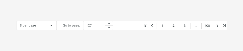
Pagination is used when splitting content into multiple pages. It contains elements for movement in the page sequence (next/previous page).
Component Status
 Design Kit: RELEASED
 Bobwai component: bobwai--pager RELEASED

Usage
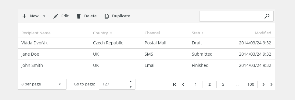
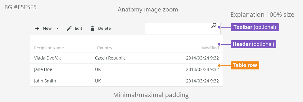
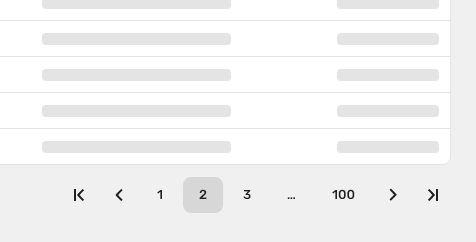
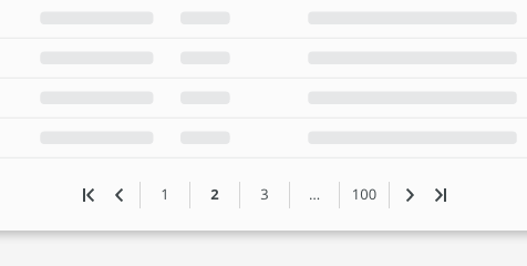
Pagination is positioned below a table or a list. Use pagination when there are 25 elements or more per page.
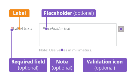
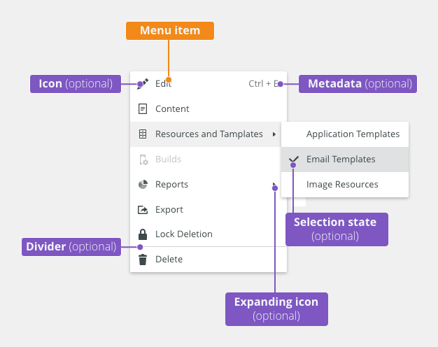
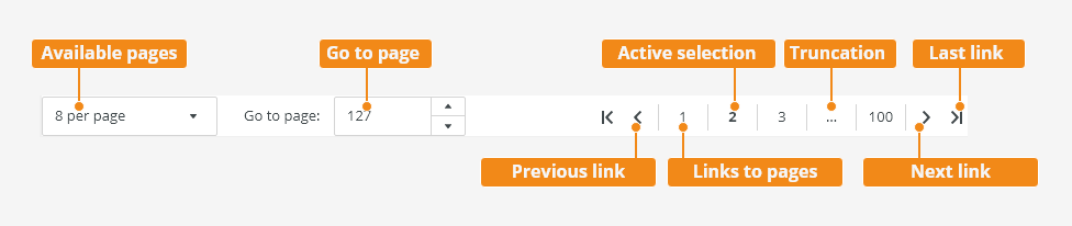
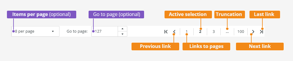
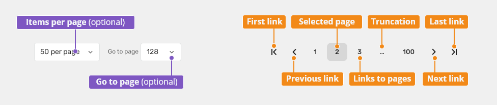
Anatomy

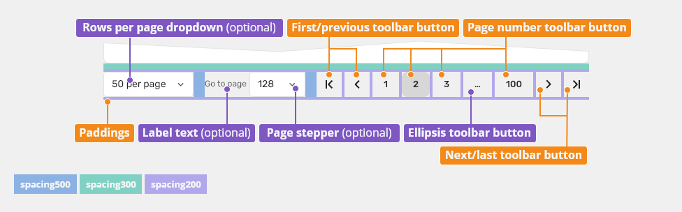
- Items per page - The dropdown allows users to set items per page.
- Go to page - The spinner allows users to jump to a specific page.
- First page link - Allows user to navigate to the first page.
- Previous page link - Allows users to navigate to the previous page.
- Active selection - Indicator of the current page.
- Truncation - When the number of pages exceeds 5 pages, an ellipsis is used to truncate the remaining pages.
- Next page link - Allows users to navigate to the next page.
- Last page link - Allows users to navigate to the last page.
Variants
Pagination can be customized based on the user needs.
Full Version (Default)
For a table with a large amount of data.

Basic (Links Only)
For a table with a small amount of data, typically static data.

Behavior
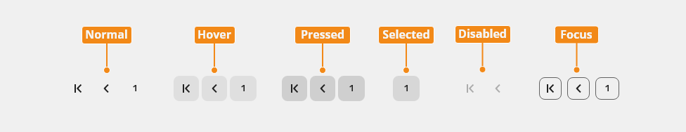
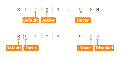
States
Enabled
Default state.

Hover

Pressed

Focused

Disabled

Selected

Keyboard Interactions
Key |
Interaction |
|---|---|
| <Tab> and <Shift> + <Tab> | Tab keys allow moving among the pager controls. |
| Arrows ⇦ ⇨ | Increasing / decreasing the value in a dropdown or a spinner. |
| Up Arrow ⇧ | Navigates to different options within the menu. Allows increasing the value in a dropdown or a spinner. |
| Down Arrow ⇩ | Navigates to different options within the menu. Allows increasing the value in a dropdown or a spinner. |
| <Enter> | Opens the menu and confirms the select item. |
| <Esc> | Closes the menu. |
Related Components
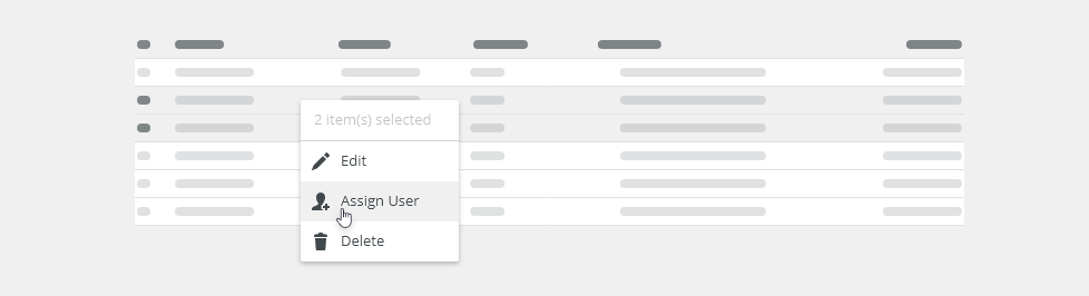
- Table: bobwai–table - Tables are used to organize and display data efficiently using rows and columns.

Interactive States
Toolbar Button
| Used In | Type | px | Token |
|---|---|---|---|
| Text color | Color | color-text-interactive-200 |
|
| Icon color | Color | color-icon-100 |
|
| Icon size | Size | sizing-icon-200 |
|
| Background color | Color | color-bg-interactive-200 |
|
| Text font | Font | font-strong |
|
| Background corner radius | Corner radius | 8 | radius-button-200 |
| Hover | |||
| Background color | Color | color-bg-interactive-200-hover (1) |
|
| Pressed | |||
| Background color | Color | color-bg-interactive-200-pressed |
|
| Selected | |||
| Background color | Color | color-bg-interactive-200-selected (1) |
|
| Disabled | |||
| Disabled (applied on the whole object) | Opacity | opacity-disabled |
|
| Focus | |||
| Focus border color | Color | color-focus-200 |
|
| Focus border width | Width | 1 | border-width-100 |
| Focus border corner radius | Corner radius | radius-button-200 |
|
| Focus inner spacing | Spacing | 2 | spacing-100 |
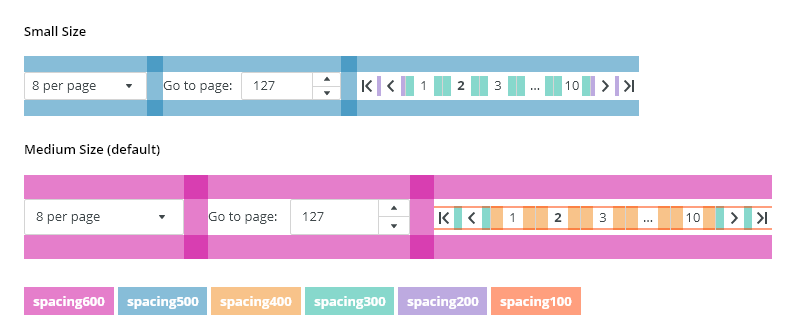
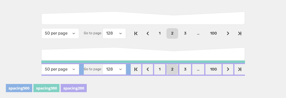
Spacing and Density

Default Size
| Used In | Type | PX | Token |
|---|---|---|---|
| Vertical space at the top of pagination | padding-top | 8 | spacing-300 |
| Horizontal space on the right of inputs | padding-right | 16 | spacing-500 |
| Vertical space in the pagination | padding-top, padding-bottom | 4 | spacing-200 |
| Horizontal space between toolbar buttons | padding-left, padding-right | 4 | spacing-200 |
Accessibility
- Provide labels and instructions that are clear and concise.
- add
role=navigationandaria-labelto make it clearer that navigation is intended for the pagination. - Navigation Design Pattern guidelines.
Pagination is used when splitting content into multiple pages. It contains elements for movement in the page sequence (next/previous page).
Component Status
Design Kit: RELEASED
Bobwai component: bobwai--pager RELEASED
Usage
Pagination is positioned below a table or a list. Use pagination when there are 25 elements or more per page.
Anatomy
- Items per page - The dropdown allows users to set items per page.
- Go to page - The spinner allows users to jump to a specific page.
- First page link - Allows user to navigate to the first page.
- Previous page link - Allows users to navigate to the previous page.
- Active selection - Indicator of the current page.
- Truncation - When the number of pages exceeds 5 pages, an ellipsis is used to truncate the remaining pages.
- Next page link - Allows users to navigate to the next page.
- Last page link - Allows users to navigate to the last page.
Variants
Pagination can be customized based on the user needs.
Full Version (Default)
For a table with a large amount of data.
Basic (Links Only)
For a table with a small amount of data, typically static data.
Behavior
States
Enabled
Default state.
Hover
Pressed
Focused
Disabled
Selected
Keyboard Interactions
Key |
Interaction |
|---|---|
| <Tab> and <Shift> + <Tab> | Tab keys allow moving among the pager controls. |
| Arrows ⇦ ⇨ | Increasing / decreasing the value in a dropdown or a spinner. |
| Up Arrow ⇧ | Navigates to different options within the menu. Allows increasing the value in a dropdown or a spinner. |
| Down Arrow ⇩ | Navigates to different options within the menu. Allows increasing the value in a dropdown or a spinner. |
| <Enter> | Opens the menu and confirms the select item. |
| <Esc> | Closes the menu. |
Related Components
- Table: bobwai–table - Tables are used to organize and display data efficiently using rows and columns.
Interactive States
Toolbar Button
| Used In | Type | px | Token |
|---|---|---|---|
| Text color | Color | color-text-interactive-200 |
|
| Icon color | Color | color-icon-100 |
|
| Icon size | Size | sizing-icon-200 |
|
| Background color | Color | color-bg-interactive-200 |
|
| Text font | Font | font-strong |
|
| Background corner radius | Corner radius | 8 | radius-button-200 |
| Hover | |||
| Background color | Color | color-bg-interactive-200-hover (1) |
|
| Pressed | |||
| Background color | Color | color-bg-interactive-200-pressed |
|
| Selected | |||
| Background color | Color | color-bg-interactive-200-selected (1) |
|
| Disabled | |||
| Disabled (applied on the whole object) | Opacity | opacity-disabled |
|
| Focus | |||
| Focus border color | Color | color-focus-200 |
|
| Focus border width | Width | 1 | border-width-100 |
| Focus border corner radius | Corner radius | radius-button-200 |
|
| Focus inner spacing | Spacing | 2 | spacing-100 |
Spacing and Density
Default Size
| Used In | Type | PX | Token |
|---|---|---|---|
| Vertical space at the top of pagination | padding-top | 8 | spacing-300 |
| Horizontal space on the right of inputs | padding-right | 16 | spacing-500 |
| Vertical space in the pagination | padding-top, padding-bottom | 4 | spacing-200 |
| Horizontal space between toolbar buttons | padding-left, padding-right | 4 | spacing-200 |
Accessibility
- Provide labels and instructions that are clear and concise.
- add
role=navigationandaria-labelto make it clearer that navigation is intended for the pagination. - Navigation Design Pattern guidelines.
Attachments:
 image2020-12-1_10-59-46.png (image/png)
 image2020-12-1_10-57-28.png (image/png)
 image2020-12-1_10-57-14.png (image/png)
 image2020-12-1_10-56-37.png (image/png)
 image2020-11-30_14-32-1.png (image/png)
 image2020-11-30_14-17-56.png (image/png)
 image2020-11-30_14-8-32.png (image/png)
 image2020-11-30_14-3-56.png (image/png)
 image2020-11-27_15-46-5.png (image/png)
 image2020-11-27_15-19-14.png (image/png)
 image2020-11-27_15-14-27.png (image/png)
 image2020-11-27_15-4-12.png (image/png)
 image2020-11-27_15-3-39.png (image/png)
 image2020-11-27_12-24-3.png (image/png)
 image2020-11-27_12-20-20.png (image/png)
 image2020-11-27_12-13-3.png (image/png)
 image2020-11-27_10-59-3.png (image/png)
 image2020-11-27_9-53-18.png (image/png)
 image2020-10-5_10-17-0.png (image/png)
 image2020-10-5_10-25-57.png (image/png)
 image2020-10-5_10-26-24.png (image/png)
 image2020-10-5_10-26-47.png (image/png)
 image2020-10-2_15-23-33.png (image/png)
 image2020-10-2_13-45-41.png (image/png)
 image2020-10-2_13-46-8.png (image/png)
 image2020-10-5_10-52-58.png (image/png)
 image2020-10-5_10-53-29.png (image/png)
 image2020-10-5_10-54-33.png (image/png)
 image2020-10-5_10-54-40.png (image/png)
 image2020-10-5_10-55-2.png (image/png)
 image2020-10-5_11-37-46.png (image/png)
 image2020-10-2_14-20-45.png (image/png)
 image2020-10-2_14-21-11.png (image/png)
 image2020-10-2_14-20-58.png (image/png)
 image2020-10-2_14-21-26.png (image/png)
 image2020-10-2_14-33-47.png (image/png)
 image2020-10-2_14-34-9.png (image/png)
 image2020-10-2_14-25-18.png (image/png)
 image2020-10-2_14-25-33.png (image/png)
 image2020-10-2_14-42-44.png (image/png)
 image2020-10-23_15-38-49.png (image/png)
 image2020-10-26_13-21-57.png (image/png)
 image2020-10-26_13-22-16.png (image/png)
 image2020-10-26_13-22-55.png (image/png)
 image2020-10-26_13-24-0.png (image/png)
 image2020-10-26_13-26-26.png (image/png)
 textarea-style@2x.png (image/png)
 textarea@2x.png (image/png)
 text-area-anatomy.png (image/png)
 text-area-label-vertical.png (image/png)
 text-area-validation.png (image/png)
 text-area-style.png (image/png)
 text-area-label-horizontal.png (image/png)
 text-area-state-selected.png (image/png)
 text-area-state-disabled.png (image/png)
 text-area-state-readonly.png (image/png)
 text-area-state-focus.png (image/png)
 text-input-density-small.png (image/png)
 text-area-density-default.png (image/png)
 text-area-density-small.png (image/png)
 text-input-variants-warning-icon.png (image/png)
 text-area-variants-error-icon.png (image/png)
 text-area-variants-warning-icon.png (image/png)
 image2020-11-2_9-24-56.png (image/png)
 image2020-11-2_9-26-14.png (image/png)
 image2020-11-2_9-26-30.png (image/png)
 Screenshot 2020-11-16 at 15.01.07.png (image/png)
 Screenshot 2020-11-16 at 14.58.54.png (image/png)
 Screenshot 2020-11-16 at 15.09.35.png (image/png)
 Screenshot 2020-11-16 at 15.19.01.png (image/png)
 Screenshot 2020-11-16 at 15.22.41.png (image/png)
 Screenshot 2020-11-18 at 12.49.34.png (image/png)
 Screenshot 2020-11-18 at 13.11.11.png (image/png)
 Screenshot 2020-11-18 at 13.22.39.png (image/png)
 Screenshot 2020-11-16 at 13.53.55.png (image/png)
 Screenshot 2020-11-19 at 08.14.25.png (image/png)
 Screenshot 2020-11-19 at 08.14.34.png (image/png)
 Screenshot 2020-11-18 at 13.08.21.png (image/png)
 Screenshot 2020-11-18 at 13.08.05.png (image/png)
 Screenshot 2020-11-19 at 09.57.10.png (image/png)
 Screenshot 2020-11-20 at 14.27.17.png (image/png)
 context-menu-anatomy.png (image/png)
 Context-menu-type-basic.png (image/png)
 Context-menu-type-multilevel.png (image/png)
 Context-menu-variants-text-only.png (image/png)
 Context-menu-variants-text-icons.png (image/png)
 Context-menu-variants-with-title.png (image/png)
 Context-menu-groups.png (image/png)
 Context-menu-states-disabled.png (image/png)
 Context-menu-do-short.png (image/png)
 Context-menu-dont-short.png (image/png)
 Context-menu-do-groups.png (image/png)
 Context-menu-dont-groups.png (image/png)
 image2020-12-9_13-26-21.png (image/png)
 image2020-12-9_13-41-54.png (image/png)
 image2020-12-9_13-57-5.png (image/png)
 image2020-12-9_14-2-47.png (image/png)
 image2020-12-10_9-59-20.png (image/png)
 image2020-12-10_10-0-3.png (image/png)
 image2020-12-10_10-0-54.png (image/png)
 image2020-12-10_10-1-18.png (image/png)
 image2020-12-10_10-4-48.png (image/png)
 image2020-12-10_10-21-19.png (image/png)
 pagination-title.png (image/png)
 pagination-anatomy.png (image/png)
 Pagination-variants-links-only.png (image/png)
 Pagination-variants-links-only-centered.png (image/png)
 Pagination-variants-full.png (image/png)
 pagination-states-enabled.png (image/png)
 pagination-states-hover.png (image/png)
 pagination-states-disabled.png (image/png)
 pagination-states-selected.png (image/png)
 pagination-styles.png (image/png)
 footer-states.png (image/png)
 footer-sizes.png (image/png)
 Pagination-density.png (image/png)
 pagination-states.png (image/png)
 image2021-1-8_9-57-12.png (image/png)
 pagination-title.png (image/png)
pagination-anatomy.png (image/png)
Pagination-variants-full.png (image/png)
Pagination-variants-links-only.png (image/png)
pagination-states-enabled.png (image/png)
pagination-states-hover.png (image/png)
pagination-states-disabled.png (image/png)
pagination-states-selected.png (image/png)
pagination-states-pressed.png (image/png)
pagination-states-focus.png (image/png)
pagination-styles.png (image/png)
pagination-title.png (image/png)
pagination-anatomy.png (image/png)
Pagination-variants-full.png (image/png)
Pagination-variants-links-only.png (image/png)
pagination-states-enabled.png (image/png)
pagination-states-hover.png (image/png)
pagination-states-disabled.png (image/png)
pagination-states-selected.png (image/png)
pagination-states-pressed.png (image/png)
pagination-states-focus.png (image/png)
pagination-styles.png (image/png)
 pagination-states.png (image/png)
Pagination-density.png (image/png)
pagination-states.png (image/png)
Pagination-density.png (image/png)
 Pagination-density.png (image/png)
pagination-styles.png (image/png)
Pagination-density.png (image/png)
pagination-styles.png (image/png)
 pagination-styles.png (image/png)