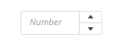
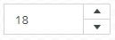
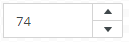
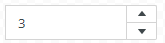
Stepper is used for entering numeric values or listing through records. It uses controls for increasing or decreasing the value by the defined step.
Component Status
 Design Kit: RELEASED
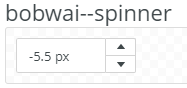
 Bobwai component: bobwai--spinner RELEASED

Usage
For entering numeric values by users. Values can be either inserted by typing or using arrow controls. Use it for making small, incremental changes that require only a few clicks and provide a default value.

Use number inputs when small value changes are expected.
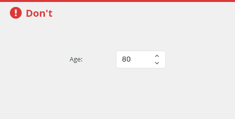
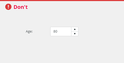
Do not use number inputs when large value changes are expected.
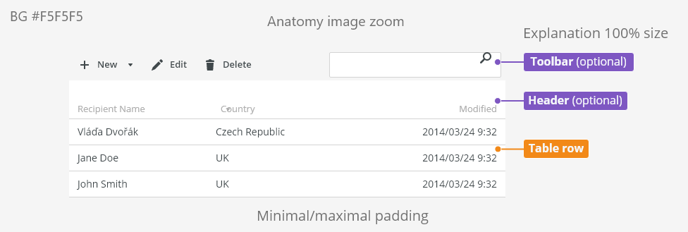
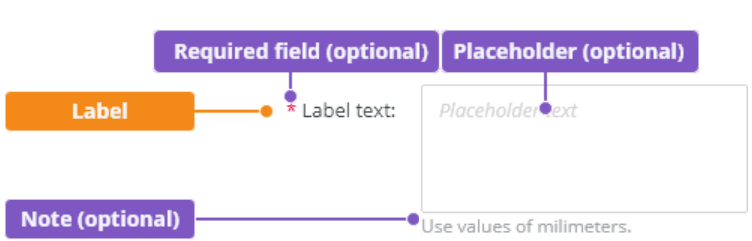
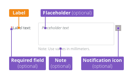
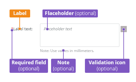
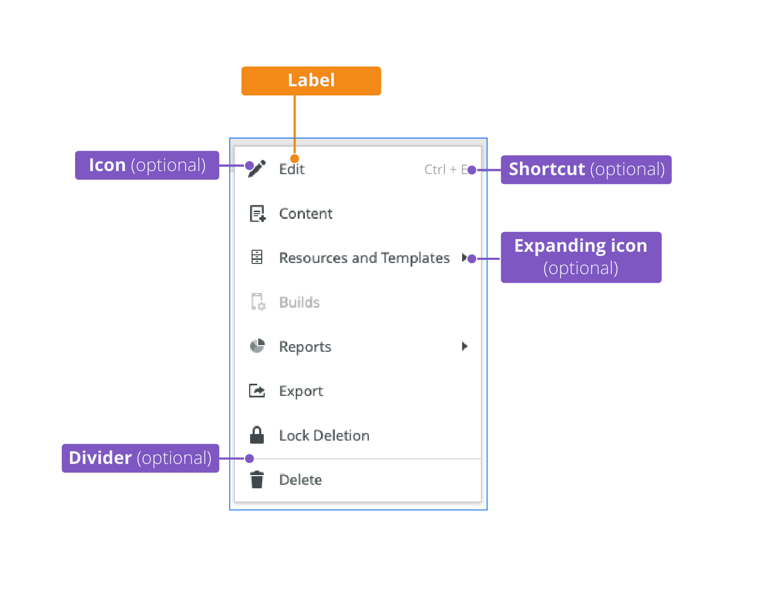
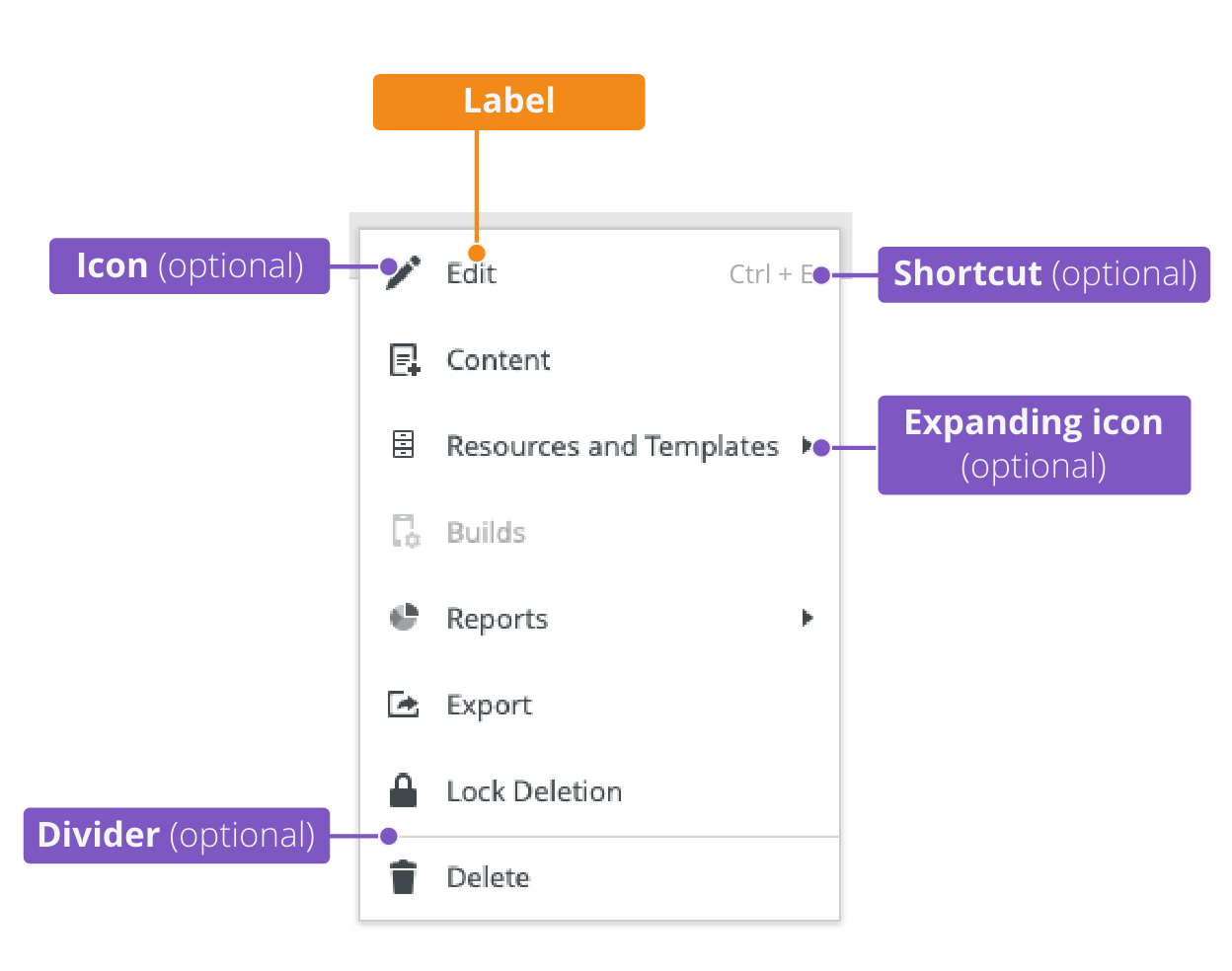
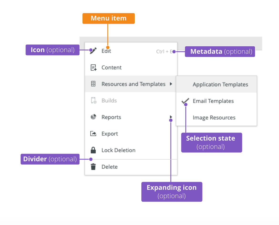
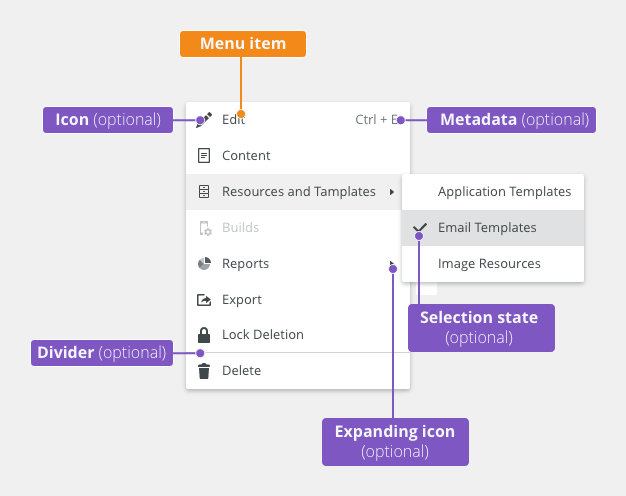
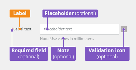
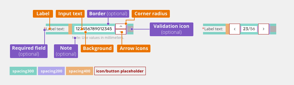
Anatomy

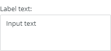
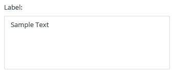
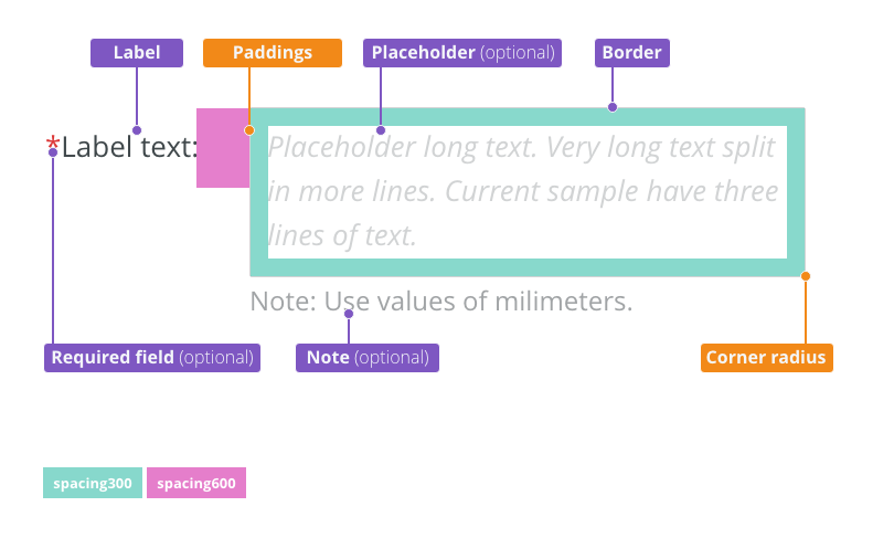
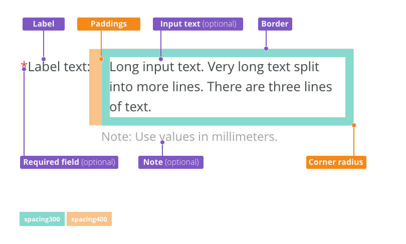
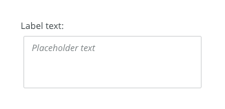
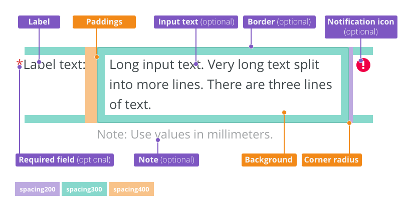
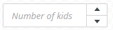
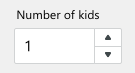
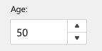
- Label - Labels can be placed either on top or on the side of the field, depending on the alignment of the form.
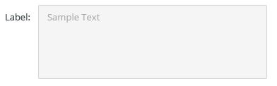
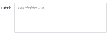
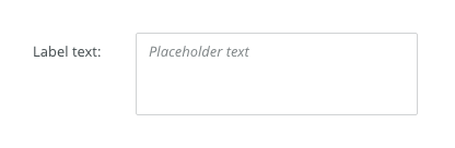
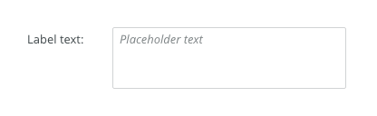
- Placeholder (optional) - Is temporary and disappears once the user enters text.
- Note (optional) - Provides assistance on how to fill out a field. Used for essential information. Keep the text short and specific.
Label Position
Labels can be placed either on top or on the side of the field.
- Horizontal labels (default) - Most useful when the vertical space is limited.

-
- Vertical labels - Recommended for narrow spaces as panels or mobile devices.

Types
Vertical Stepper
For entering numeric values by users. Values can be either inserted by typing or using arrow controls.

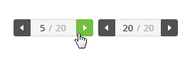
Horizontal Stepper
For listing through multiple records. Users can move between them either by typing the record number or using arrow controls.

Appearance
Width
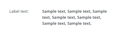
The input field's width should match the length of the expected value that is inserted.
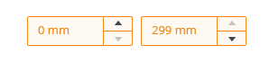
Prefix and Suffix
The field with Prefix or suffix clarifies the format of the required input, and explicitly tell users that they don’t need to enter any units.
Units should preferably be written in labels. Use units included in fields if the unit type in label does not make sense or in narrow spaces.
Suffix

Label
Density of Vertical Stepper
Default
Most of the use cases.

Condensed
Technical applications, e.g. Scaler.

Behavior
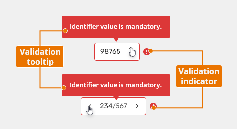
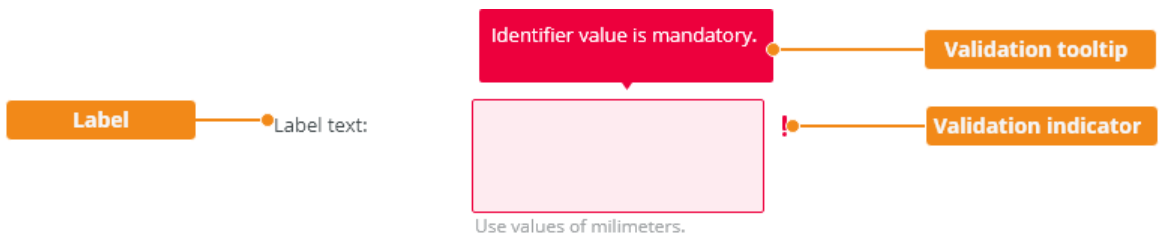
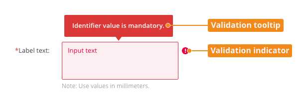
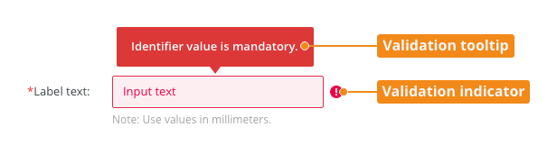
Validation
Client-side validation - It is recommended to validate the user data before the form submission. Validation is auto-correcting values that are out of the allowed range.
Typical client error validations are:
- Inserting a number higher than the maximum.
- Inserting a number lower than the minimum.
- Leaving a required field blank.
- Inserting a non-numeric character.
Server-side validation - Where the real-time validation is not possible or does not make sense, all fields are validated at the same time upon the page submission.
Keyboard Interactions
| Key | Interaction |
|---|---|
| Tab | Tabbing into a stepper selects the existing number in the input. |
Arrows ⇦ ⇨ |
Moving between decimals. |
Arrows ⇩⇧ |
Increasing / decreasing the value. |
| Enter | Confirms the select item. |
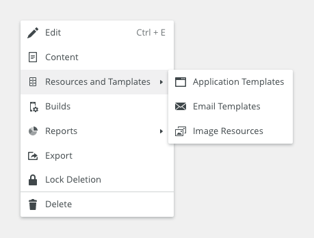
Related Components
Unit spinner bobwai--unit-spinner - Vertical spinner with data unit convention.
Style

Widths
| Width | Token | Example |
|---|---|---|
Vertical stepper |
||
| 88px | spinner100 |
|
| 104px | spinner200 |
|
| 120px | spinner300 (default) |
|
| 136px | spinner400 |
|
| 152px | spinner500 |
|
| 168px | spinner600 |
|
| 184px | spinner700 |
|
Horizontal stepper |
||
| 106px | spinner100 |
|
| 120px | spinner200 (default) |
|
| 135px | spinner300 |
|
| 150px | spinner400 |
|
| 165px | spinner500 |
|
| 180px | spinner600 |
|
| 195px | spinner700 |
|


Vertical Stepper: States
Default
Used in most use cases.

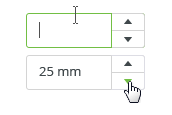
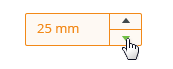
Hover

Selected
Values can be either inserted manually or using relevant arrows.

Disabled
Values cannot be edited by clicking either on text input or arrows.

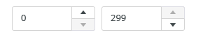
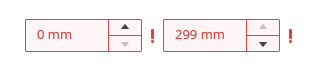
Disabled controls
Minimal or maximal values for users to insert can be set. When users are not allowed to set a lower or a higher value, relevant arrows turn to "disabled" state.

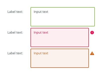
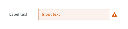
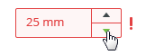
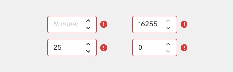
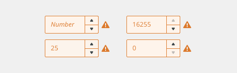
Error (Invalid)
Indicates an error.

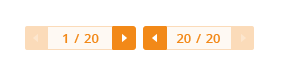
Horizontal Stepper: States
Default
Used in most use cases. Typically there is a count of all records displayed, too.
-
When on the first or the last record, relevant control turns to "disabled" state.

Active
Values can be changed either manually or using relevant arrows.

Disabled
Values cannot be edited by clicking either on the text input or the arrows.

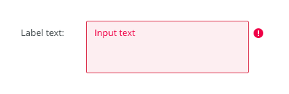
Error
Indicates an error.

Accessibility
- Provide labels and instructions that are clear and concise.
- If the number input is a required field include the
aria-requiredproperty and indicate that it is a required field and use the validation message for input errors. - W3C Web Tutorial: Labeling Controls
- W3C Web Tutorial: Form Instructions
Attachments:
 image2020-12-1_10-59-46.png (image/png)
 image2020-12-1_10-57-28.png (image/png)
 image2020-12-1_10-57-14.png (image/png)
 image2020-12-1_10-56-37.png (image/png)
 image2020-11-30_14-32-1.png (image/png)
 image2020-11-30_14-17-56.png (image/png)
 image2020-11-30_14-8-32.png (image/png)
 image2020-11-30_14-3-56.png (image/png)
 image2020-11-27_15-46-5.png (image/png)
 image2020-11-27_15-19-14.png (image/png)
 image2020-11-27_15-14-27.png (image/png)
 image2020-11-27_15-4-12.png (image/png)
 image2020-11-27_15-3-39.png (image/png)
 image2020-11-27_12-24-3.png (image/png)
 image2020-11-27_12-20-20.png (image/png)
 image2020-11-27_12-13-3.png (image/png)
 image2020-11-27_10-59-3.png (image/png)
 image2020-11-27_9-53-18.png (image/png)
 image2020-10-5_10-17-0.png (image/png)
 image2020-10-5_10-25-57.png (image/png)
 image2020-10-5_10-26-24.png (image/png)
 image2020-10-5_10-26-47.png (image/png)
 image2020-10-2_15-23-33.png (image/png)
 image2020-10-2_13-45-41.png (image/png)
 image2020-10-2_13-46-8.png (image/png)
 image2020-10-5_10-52-58.png (image/png)
 image2020-10-5_10-53-29.png (image/png)
 image2020-10-5_10-54-33.png (image/png)
 image2020-10-5_10-54-40.png (image/png)
 image2020-10-5_10-55-2.png (image/png)
 image2020-10-5_11-37-46.png (image/png)
 image2020-10-2_14-20-45.png (image/png)
 image2020-10-2_14-21-11.png (image/png)
 image2020-10-2_14-20-58.png (image/png)
 image2020-10-2_14-21-26.png (image/png)
 image2020-10-2_14-33-47.png (image/png)
 image2020-10-2_14-34-9.png (image/png)
 image2020-10-2_14-25-18.png (image/png)
 image2020-10-2_14-25-33.png (image/png)
 image2020-10-2_14-42-44.png (image/png)
 image2020-10-23_15-38-49.png (image/png)
 image2020-10-26_13-21-57.png (image/png)
 image2020-10-26_13-22-16.png (image/png)
 image2020-10-26_13-22-55.png (image/png)
 image2020-10-26_13-24-0.png (image/png)
 image2020-10-26_13-26-26.png (image/png)
 textarea-style@2x.png (image/png)
 textarea@2x.png (image/png)
 text-area-anatomy.png (image/png)
 text-area-label-vertical.png (image/png)
 text-area-validation.png (image/png)
 text-area-style.png (image/png)
 text-area-label-horizontal.png (image/png)
 text-area-state-selected.png (image/png)
 text-area-state-disabled.png (image/png)
 text-area-state-readonly.png (image/png)
 text-area-state-focus.png (image/png)
 text-input-density-small.png (image/png)
 text-area-density-default.png (image/png)
 text-area-density-small.png (image/png)
 text-input-variants-warning-icon.png (image/png)
 text-area-variants-error-icon.png (image/png)
 text-area-variants-warning-icon.png (image/png)
 image2020-11-2_9-24-56.png (image/png)
 image2020-11-2_9-26-14.png (image/png)
 image2020-11-2_9-26-30.png (image/png)
 Screenshot 2020-11-16 at 15.01.07.png (image/png)
 Screenshot 2020-11-16 at 14.58.54.png (image/png)
 Screenshot 2020-11-16 at 15.09.35.png (image/png)
 Screenshot 2020-11-16 at 15.19.01.png (image/png)
 Screenshot 2020-11-16 at 15.22.41.png (image/png)
 Screenshot 2020-11-18 at 12.49.34.png (image/png)
 Screenshot 2020-11-18 at 13.11.11.png (image/png)
 Screenshot 2020-11-18 at 13.22.39.png (image/png)
 Screenshot 2020-11-16 at 13.53.55.png (image/png)
 Screenshot 2020-11-19 at 08.14.25.png (image/png)
 Screenshot 2020-11-19 at 08.14.34.png (image/png)
 Screenshot 2020-11-18 at 13.08.21.png (image/png)
 Screenshot 2020-11-18 at 13.08.05.png (image/png)
 Screenshot 2020-11-19 at 09.57.10.png (image/png)
 Screenshot 2020-11-20 at 14.27.17.png (image/png)
 context-menu-anatomy.png (image/png)
 Context-menu-type-basic.png (image/png)
 Context-menu-type-multilevel.png (image/png)
 Context-menu-variants-text-only.png (image/png)
 Context-menu-variants-text-icons.png (image/png)
 Context-menu-variants-with-title.png (image/png)
 Context-menu-groups.png (image/png)
 Context-menu-states-disabled.png (image/png)
 Context-menu-do-short.png (image/png)
 Context-menu-dont-short.png (image/png)
 Context-menu-do-groups.png (image/png)
 Context-menu-dont-groups.png (image/png)
 image2020-12-10_16-9-15.png (image/png)
 text-input-label-horizontal.png (image/png)
 text-input-label-vertical.png (image/png)
 image2020-12-10_16-4-14.png (image/png)
 image2020-12-10_16-4-41.png (image/png)
 image2020-12-10_16-5-16.png (image/png)
 text-input-validation.png (image/png)
 vertical_placeholder.png (image/png)
 v_min_max.png (image/png)
 v_active.png (image/png)
 v_disabled.png (image/png)
 v_error.png (image/png)
 v_error_2.png (image/png)
 v_warning.png (image/png)
 v_warning_2.png (image/png)
 h_normal.png (image/png)
 h_min_max.png (image/png)
 h_active.png (image/png)
 h_noneditable_input.png (image/png)
 h_disabled.png (image/png)
 h_error.png (image/png)
 h_error_2.png (image/png)
 h_warning.png (image/png)
 v_warning_2.png (image/png)
 h_warning_2.png (image/png)
 spinner-anatomy.png (image/png)
 spinner-title.png (image/png)
 Spinner-label-horizontal.png (image/png)
 Spinner-label-vertical.png (image/png)
 Spinner-variant-vertical.png (image/png)
 Spinner-variant-horizontal.png (image/png)
 Spinner-density-default.png (image/png)
 Spinner-density-condensed.png (image/png)
 Spinner-density-condensed.png (image/png)
 Spinner-vertical100.png (image/png)
 Spinner-vertical200.png (image/png)
 Spinner-vertical300.png (image/png)
 Spinner-vertical300.png (image/png)
 Spinner-vertical400.png (image/png)
 Spinner-vertical500.png (image/png)
 Spinner-vertical700.png (image/png)
 Spinner-vertical500.png (image/png)
 Spinner-vertical400.png (image/png)
 Spinner-vertical500.png (image/png)
 Spinner-vertical600.png (image/png)
 Spinner-horizontal100.png (image/png)
 Spinner-horizontal200.png (image/png)
 Spinner-horizontal300.png (image/png)
 Spinner-horizontal400.png (image/png)
 Spinner-horizontal500.png (image/png)
 Spinner-horizontal600.png (image/png)
 Spinner-horizontal700.png (image/png)
 Spinner-validation.png (image/png)
 spinner-style.png (image/png)
 Spinner-validation.png (image/png)
 Spinner-states-vertical-normal.png (image/png)
 Spinner-states-vertical-minmax.png (image/png)
 Spinner-states-vertical-active.png (image/png)
 Spinner-states-vertical-hover.png (image/png)
 Spinner-states-vertical-disabled.png (image/png)
 Spinner-states-vertical-error.png (image/png)
 Spinner-states-vertical-error.png (image/png)
 Spinner-states-vertical-warning.png (image/png)
 image2020-12-18_14-15-46.png (image/png)
 image2020-12-18_14-16-8.png (image/png)
 image2020-12-18_14-16-31.png (image/png)
 image2020-12-18_14-19-11.png (image/png)
 image2020-12-18_14-19-57.png (image/png)
 image2020-12-18_14-20-9.png (image/png)
 image2021-1-12_9-6-55.png (image/png)
 do-pocet-deti.png (image/png)
 dont-vek.png (image/png)
 dont-vek.png (image/png)
 do-pocet-deti.png (image/png)
 image2021-1-13_16-50-56.png (image/png)
 image2021-1-13_16-51-9.png (image/png)
 image2021-1-18_9-9-4.png (image/png)
 image2021-1-21_10-19-31.png (image/png)
 image2021-1-26_17-6-53.png (image/png)
 image2021-1-29_10-23-2.png (image/png)
 spinner-title.png (image/png)
 spinner-do.png (image/png)
spinner-dont.png (image/png)
spinner-anatomy.png (image/png)
Spinner-label-vertical.png (image/png)
Spinner-variant-vertical.png (image/png)
Spinner-variant-horizontal.png (image/png)
Spinner-states-vertical-normal – 1.png (image/png)
Spinner-label-horizontal.png (image/png)
Spinner-density-default.png (image/png)
Spinner-density-condensed.png (image/png)
Spinner-validation.png (image/png)
spinner-style.png (image/png)
spinner-do.png (image/png)
spinner-dont.png (image/png)
spinner-anatomy.png (image/png)
Spinner-label-vertical.png (image/png)
Spinner-variant-vertical.png (image/png)
Spinner-variant-horizontal.png (image/png)
Spinner-states-vertical-normal – 1.png (image/png)
Spinner-label-horizontal.png (image/png)
Spinner-density-default.png (image/png)
Spinner-density-condensed.png (image/png)
Spinner-validation.png (image/png)
spinner-style.png (image/png)
 spinner-style.png (image/png)
 Spinner-vertical100.png (image/png)
Spinner-vertical200.png (image/png)
Spinner-vertical300.png (image/png)
Spinner-vertical400.png (image/png)
Spinner-vertical500.png (image/png)
Spinner-vertical600.png (image/png)
Spinner-vertical700.png (image/png)
Spinner-horizontal100.png (image/png)
Spinner-horizontal200.png (image/png)
Spinner-horizontal300.png (image/png)
Spinner-horizontal400.png (image/png)
Spinner-horizontal500.png (image/png)
Spinner-horizontal700.png (image/png)
Spinner-horizontal600.png (image/png)
Spinner-states-vertical-normal.png (image/png)
Spinner-states-vertical-hover.png (image/png)
Spinner-vertical100.png (image/png)
Spinner-vertical200.png (image/png)
Spinner-vertical300.png (image/png)
Spinner-vertical400.png (image/png)
Spinner-vertical500.png (image/png)
Spinner-vertical600.png (image/png)
Spinner-vertical700.png (image/png)
Spinner-horizontal100.png (image/png)
Spinner-horizontal200.png (image/png)
Spinner-horizontal300.png (image/png)
Spinner-horizontal400.png (image/png)
Spinner-horizontal500.png (image/png)
Spinner-horizontal700.png (image/png)
Spinner-horizontal600.png (image/png)
Spinner-states-vertical-normal.png (image/png)
Spinner-states-vertical-hover.png (image/png)
 Spinner-states-vertical-active.png (image/png)
Spinner-states-vertical-disabled.png (image/png)
Spinner-states-vertical-active.png (image/png)
Spinner-states-vertical-disabled.png (image/png)
 Spinner-states-vertical-minmax.png (image/png)
Spinner-states-vertical-error.png (image/png)
Spinner-states-horizontal-minmax.png (image/png)
Spinner-states-vertical-minmax.png (image/png)
Spinner-states-vertical-error.png (image/png)
Spinner-states-horizontal-minmax.png (image/png)
 Spinner-states-horizontal-hover.png (image/png)
 Spinner-states-horizontal-minmax.png (image/png)
Spinner-states-vertical-disabled.png (image/png)
Spinner-states-horizontal-disabled.png (image/png)
Spinner-states-horizontal-error.png (image/png)
spinner-title.png (image/png)
spinner-style.png (image/png)
Spinner-states-vertical-hover.png (image/png)
Spinner-states-horizontal-hover.png (image/png)
Spinner-states-horizontal-minmax.png (image/png)
Spinner-states-vertical-disabled.png (image/png)
Spinner-states-horizontal-disabled.png (image/png)
Spinner-states-horizontal-error.png (image/png)
spinner-title.png (image/png)
spinner-style.png (image/png)
Spinner-states-vertical-hover.png (image/png)
Spinner-states-horizontal-hover.png (image/png)