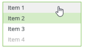
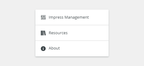
Lists are vertical groups of related content optimized for easy scanning.
Component Status
 Design Kit: NOT RELEASED
 Bobwai component: bobwai--list-item RELEASED

Content Overview
Usage
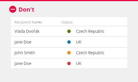
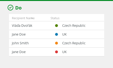
Lists should be sorted in a logical way to make content easy to scan.

To organize and display simple data.
- To display name-value pairs.

- Do not use a list for displaying complex datasets: Consider using a table instead.
- Do not use a list for navigation. Use a side bar item as navigation instead.
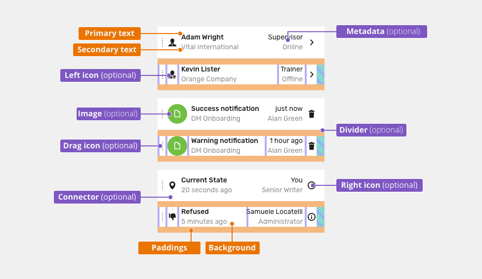
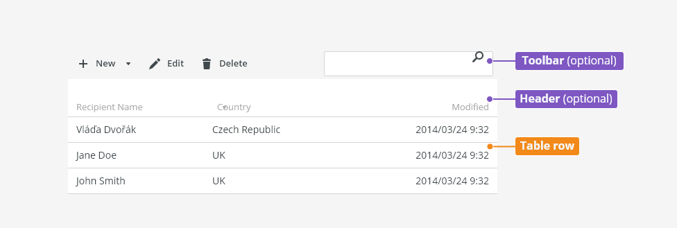
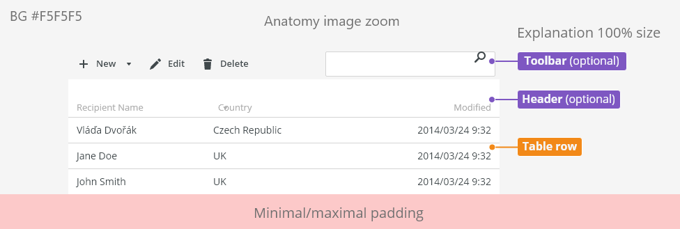
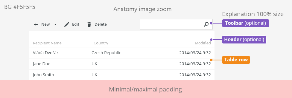
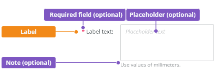
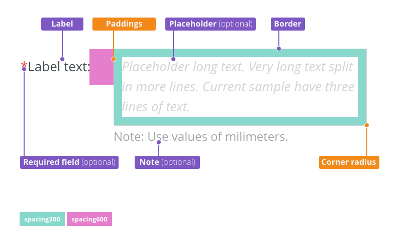
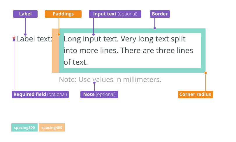
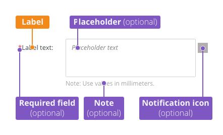
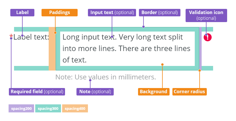
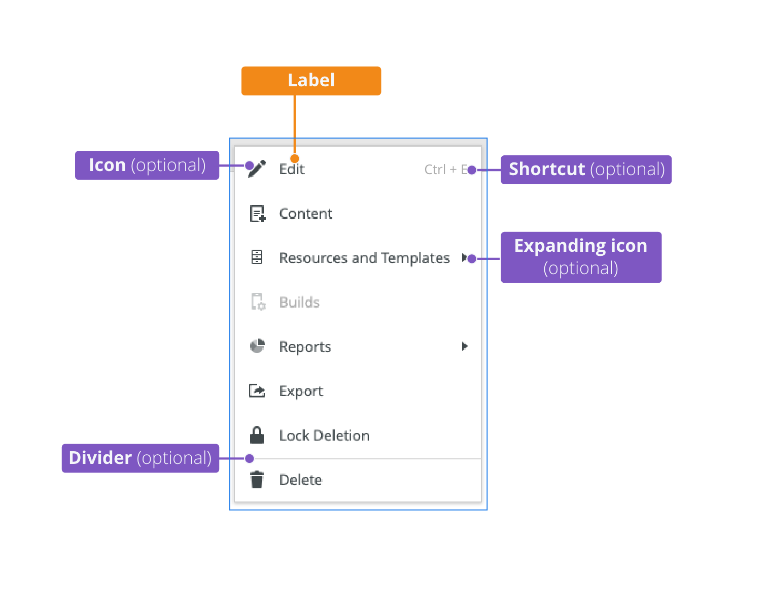
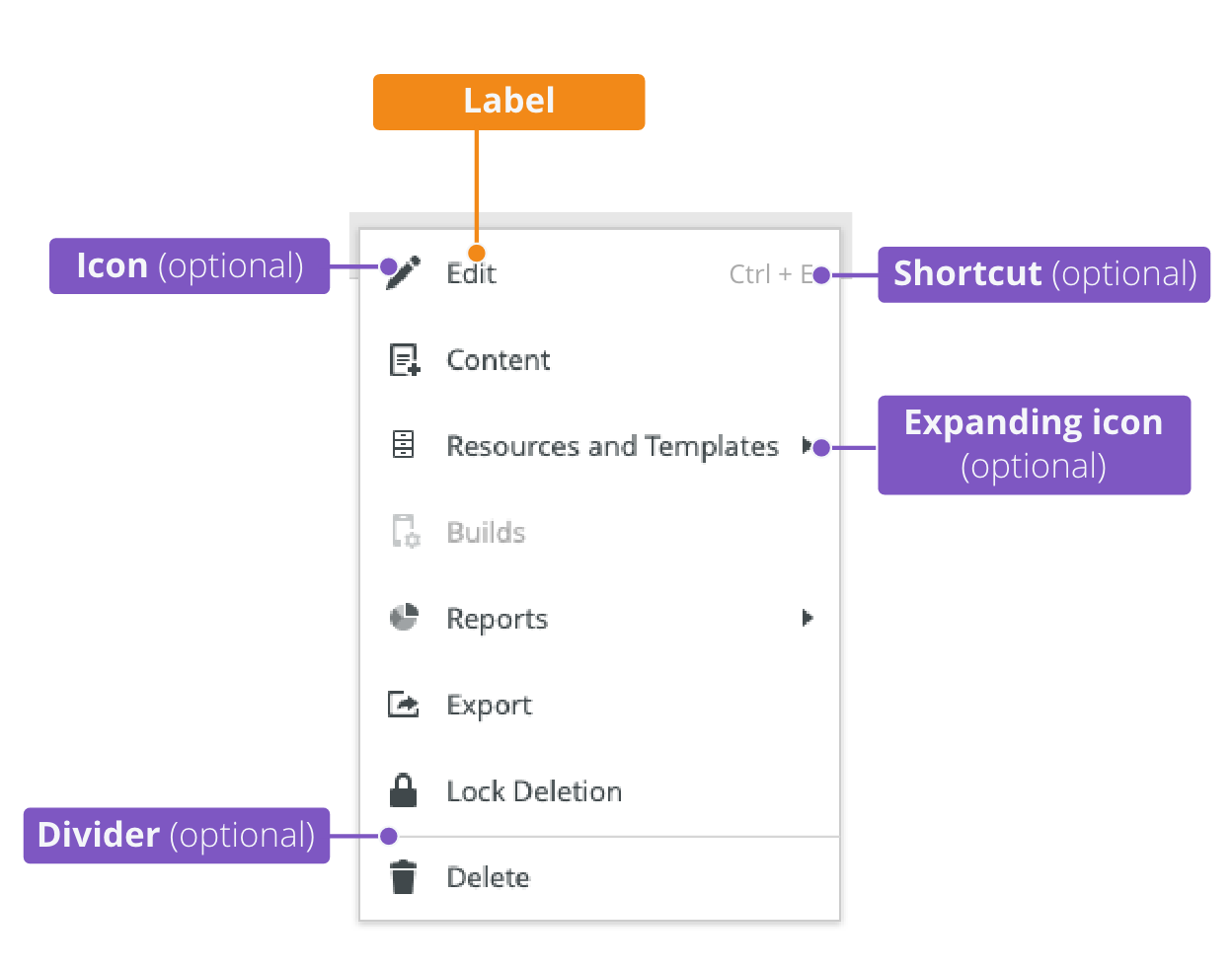
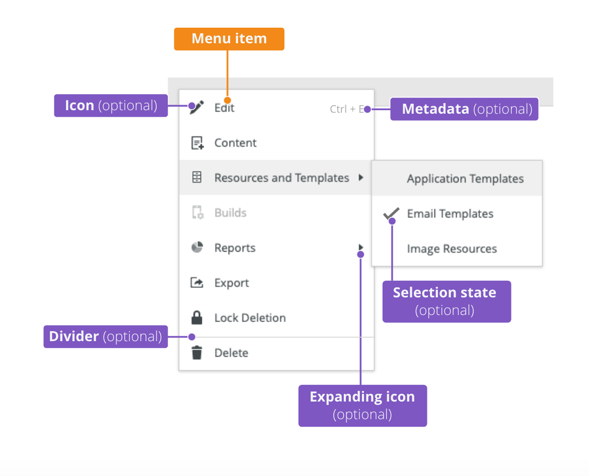
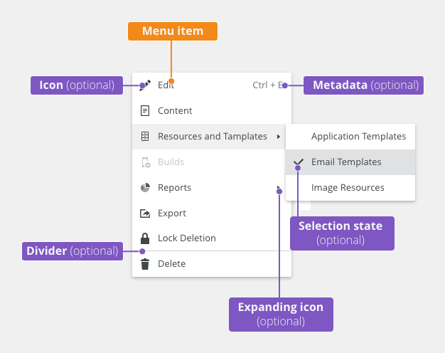
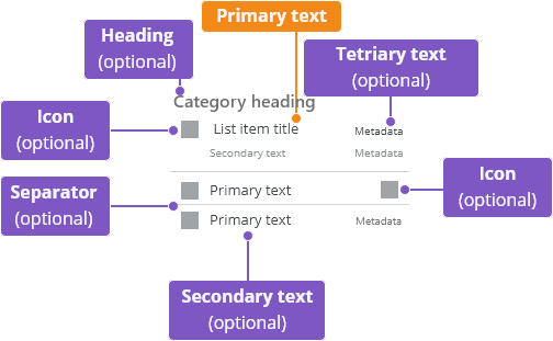
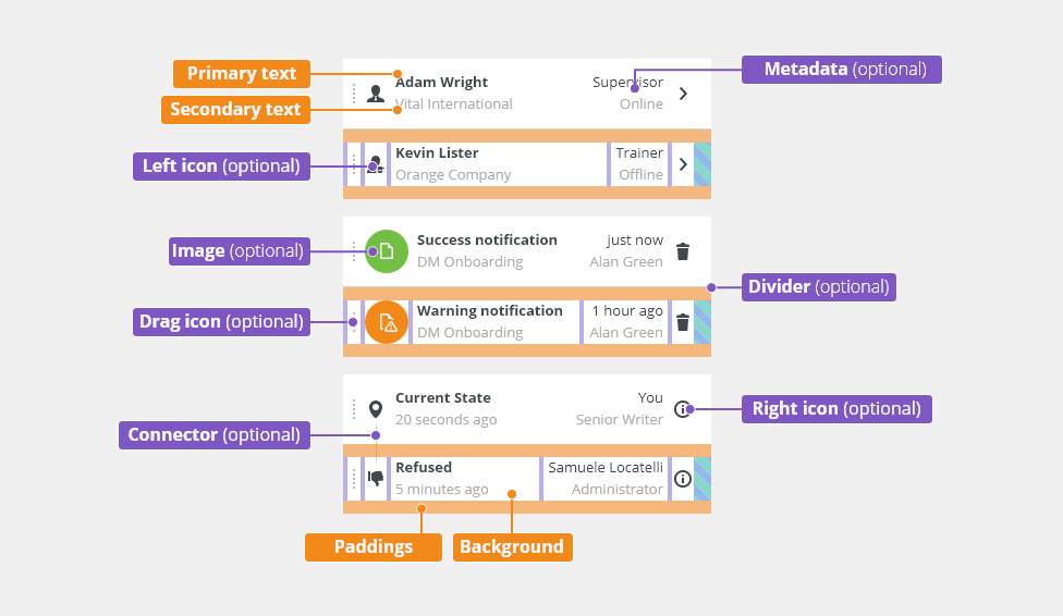
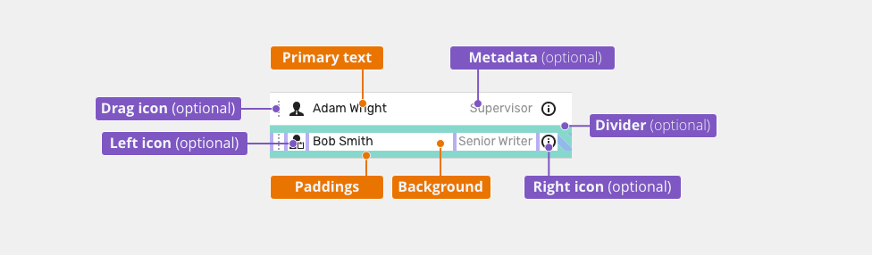
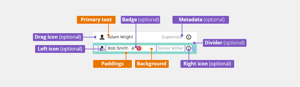
Anatomy
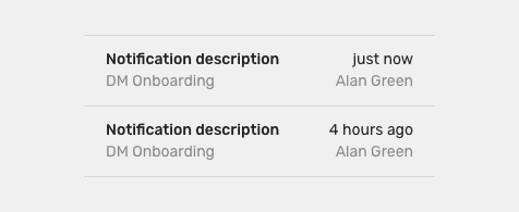
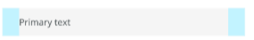
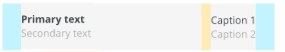
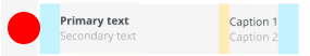
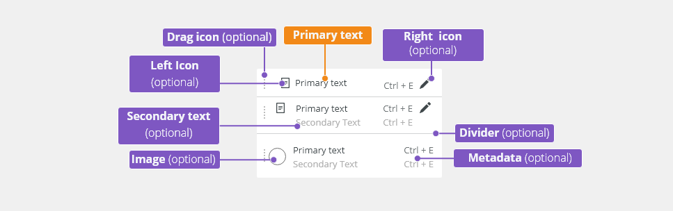
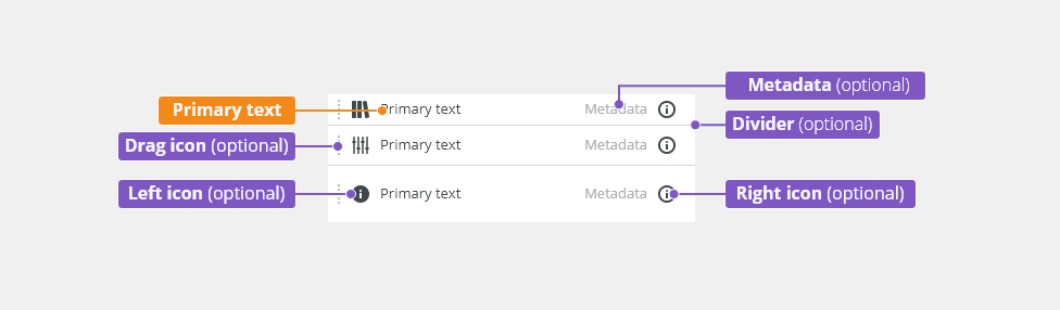
Single-line List
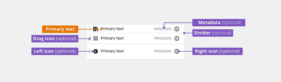
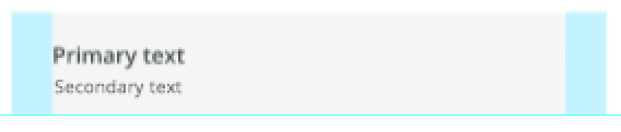
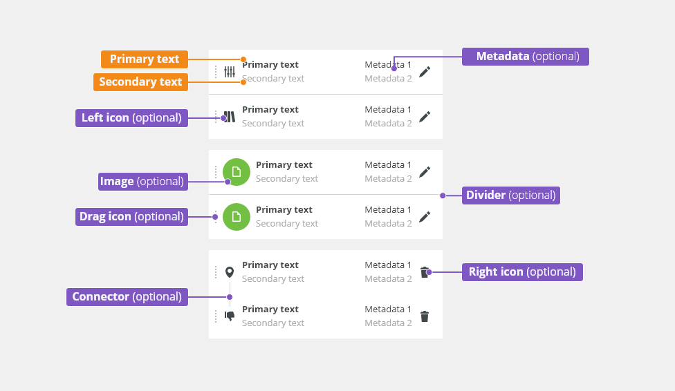
Double-line List

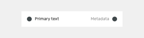
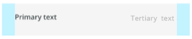
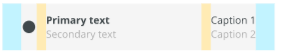
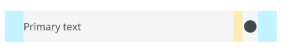
- Primary text
- Secondary text (optional) - description text to provide additional content-related information
- Left icon (optional) - Adding meaning to items and increasing scannability.
- Image (optional) - Adding visual context and increasing scannability.
- Metadata (optional) - Describes the attributes and characteristics.
- Right icon (optional) - Additional list control or meta icon.
- Divider (optional) - Line that groups content in lists.
Variants
Default List
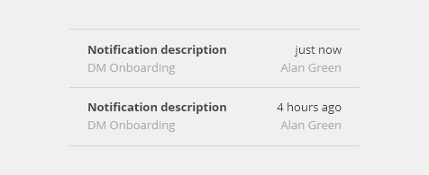
Double-line List
Description and additional information
- Use a description text to provide additional content-related information.
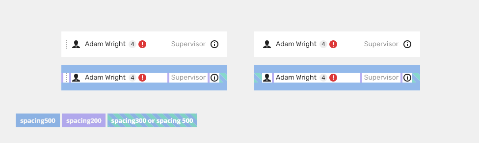
Metadata
Typically used for keyboard shortcuts.
Single row with metadata.
Two rows with metadata.
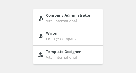
Image
Additional visual context and increase of scannability
Typically used for:
- Avatar
- Product logo

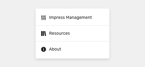
Left Icon
Left icon adds meaning to items and increases scannability.
Typically used for:
- Move handle
- Type identification

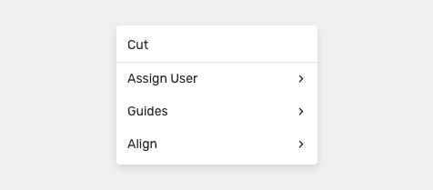
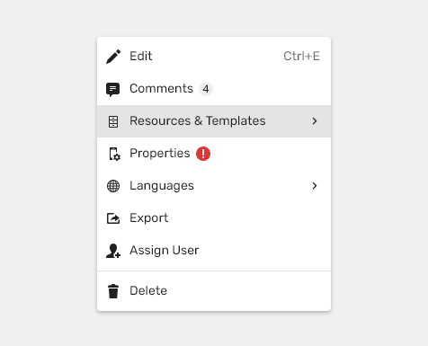
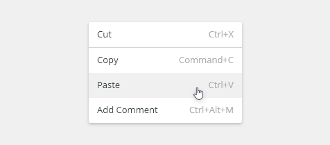
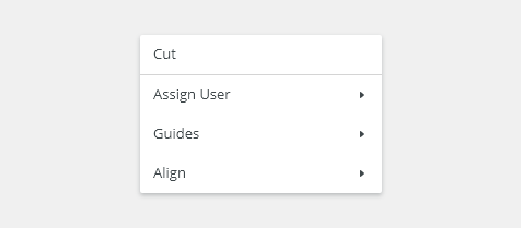
Right Icon
With Badges (DRAFT)
Divider
Line that groups content in lists.
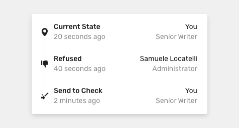
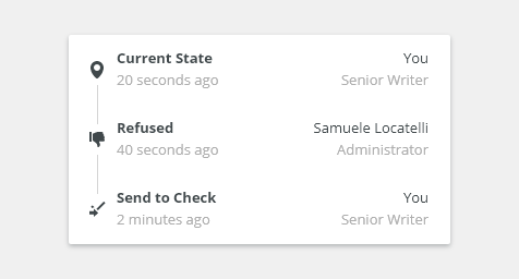
Connector
Vertical line used as a timeline.
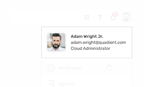
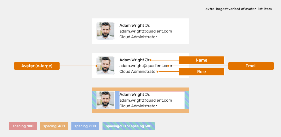
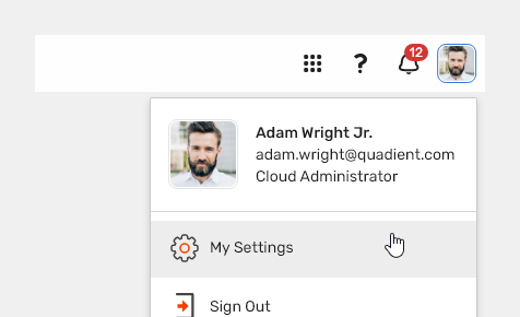
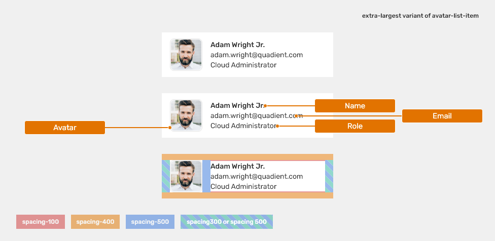
Avatar list item
Item used for user summary.
Appearance
Density
Large
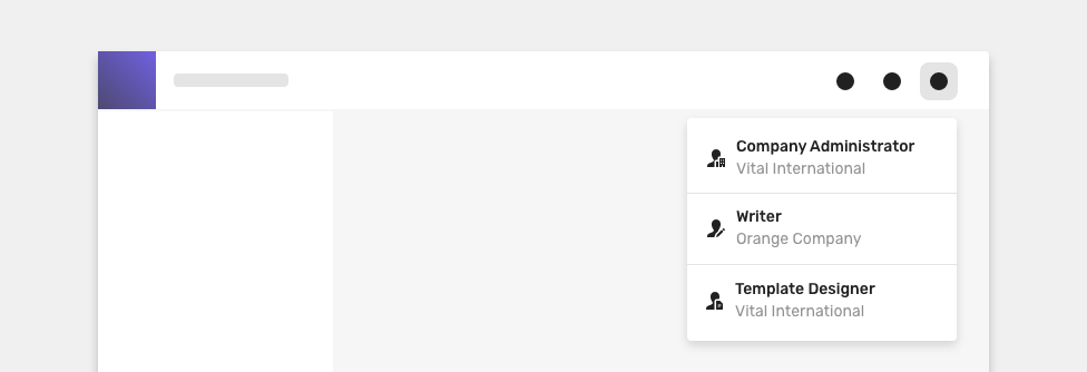
Typically used for app header dropdowns.
TODO proverit
Medium Default
Most of the use-cases.

Condensed
Technical applications, e.g. Scaler.

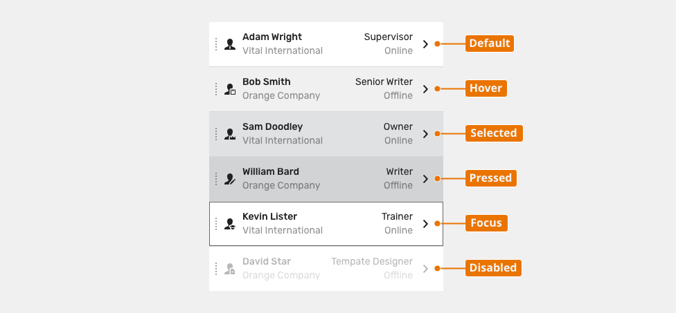
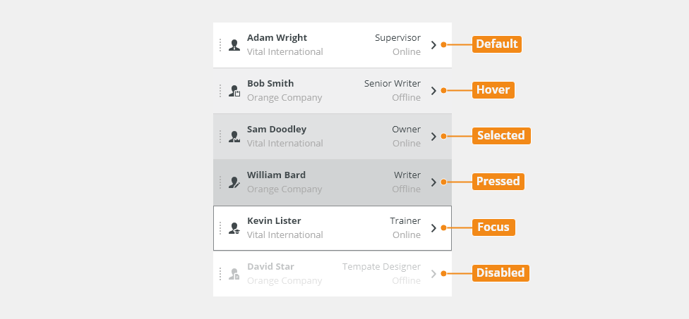
Behavior
States
Read-Only
Allows content to be copied, but not interacted with or changed.

Disabled
Cannot be interacted with but remains visible to the user in a disabled visual style.
Keyboard Interactions
| Key | Interaction |
|---|---|
| Arrow Keys | Arrow keys allow to move in the context menu. |
| Enter | Confirms the select item. |
| Esc | Esc closes the context menu. |
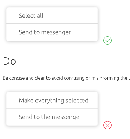
Editorial
Keep the text short and specific.
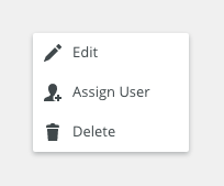
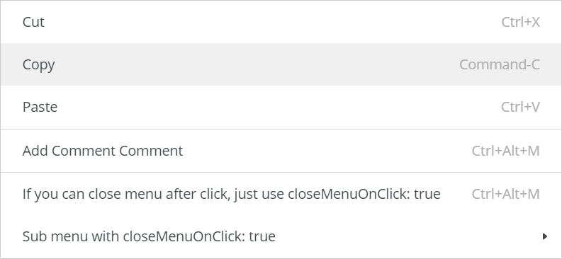
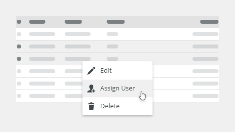
Related Components
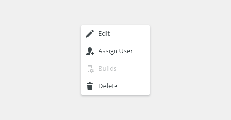
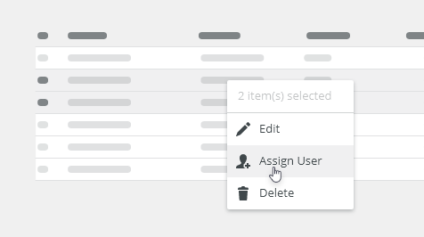
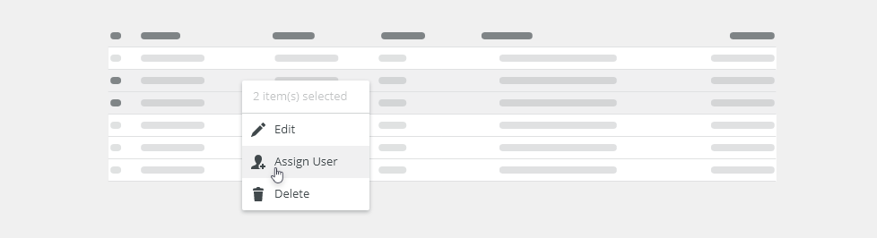
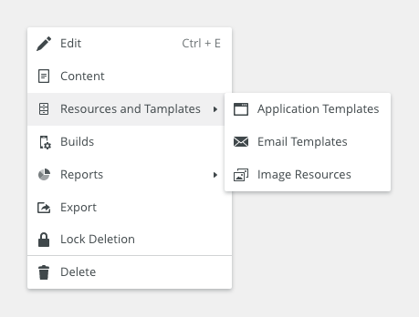
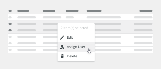
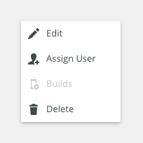
- Context menu: bobwai--context-menu - Menu which opens on right-click or overflow menu button.
- Unordered list: bobwai--bulleted-list - Basic list.
- Dropdown: bobwai–combobox - Combination of a filter and a dropdown with a list of options.
- Navigation bar: bobwai-side bar - Secondary navigation.
Style: Single-line List
Elements

States

| Used In | Type | px | Token |
|---|---|---|---|
| Primary text color | Color | color-text-100 | |
| Metadata text color | Color | color-text-300 | |
| Icon color | Color | color-icon-100 | |
| Icon size | Size | sizing-icon-200 | |
| Background color | Color | color-bg-interactive-400 | |
| Text font | Font | font-body | |
| Drag icon color | Color | color-icon-400 | |
| Divider width | Border width | 1 | border-width-100 |
| Divider color | Color | color-border-200 | |
| Hover | |||
| Background color | Color | color-bg-interactive-400-hover | |
| Selected | |||
| Background color | Color | color-bg-interactive-400-selected | |
| Pressed | |||
| Background color | Color | color-bg-interactive-400-pressed | |
| Disabled | |||
| Disabled (applied on the whole object) | Opacity | opacity-disabled | |
| Focus | |||
| Focus border | Color | color-focus-200 | |
| Focus border width | Border width | 1 | border-width-100 |
| Focus border corner radius | Corner Radius | 2 | radius-100 |
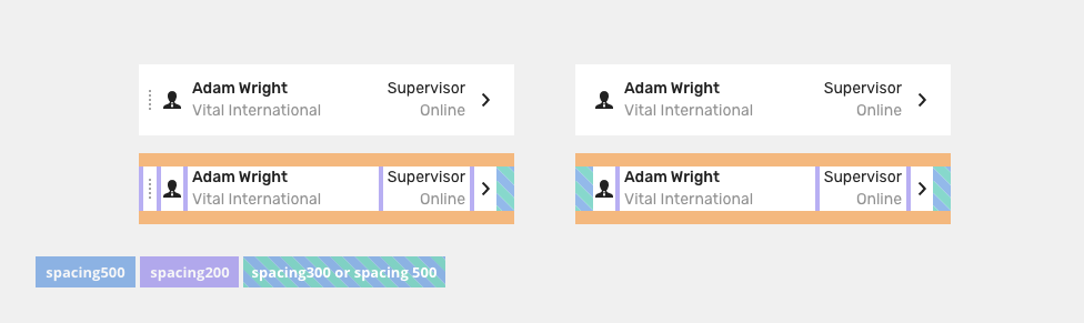
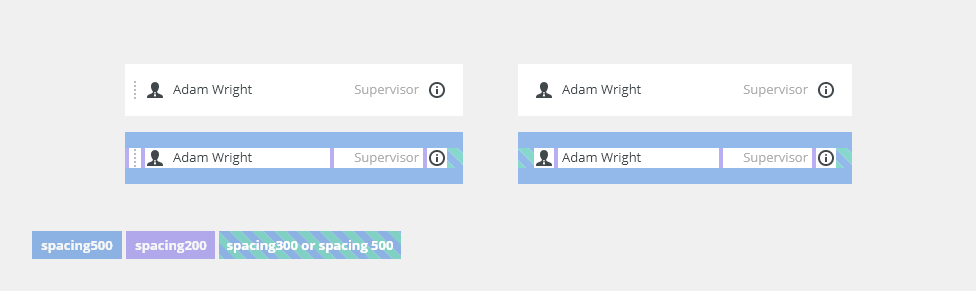
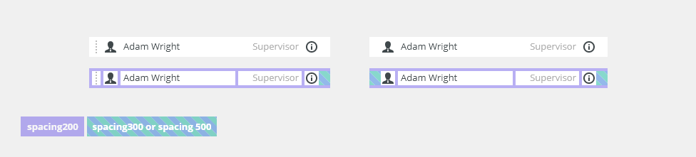
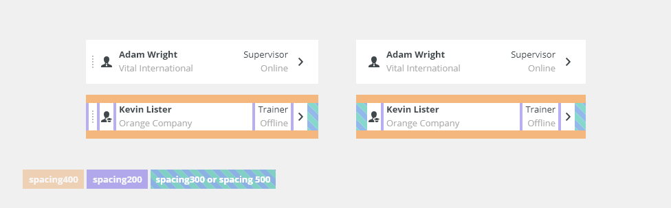
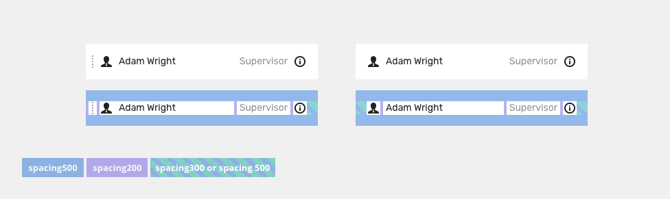
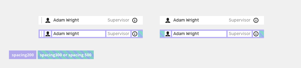
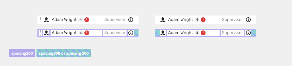
Spacing
Large

| Used in | Type | px | Token |
|---|---|---|---|
| Default size padding | Spacing | 16 | spacing-500 |
Default size spacing between icon and text |
Spacing | 4 | spacing-200 |
| Variable size of side padding | Spacing | 8 | spacing-300 |
| Spacing | 16 | spacing-500 |
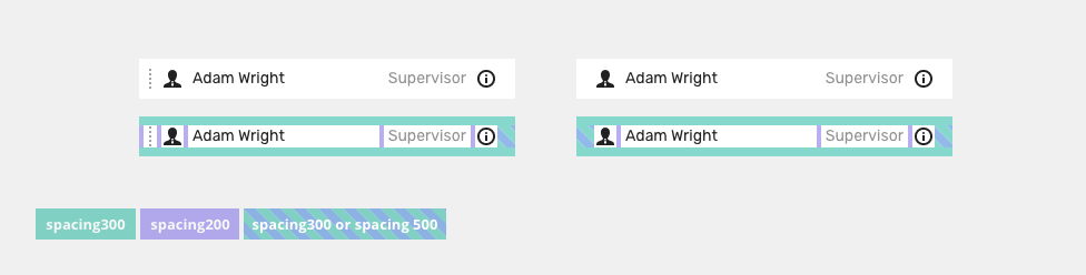
Medium

| Used in | Type | px | Token |
|---|---|---|---|
| Default size padding | Spacing | 8 | spacing-300 |
Default size spacing between icon and text |
Spacing | 4 | spacing-200 |
| Variable size of side padding | Spacing | 8 | spacing-300 |
| Spacing | 16 | spacing-500 |
Small

| Used in | Type | px | Token |
|---|---|---|---|
| Default size padding | Spacing | 4 | spacing-200 |
Default size spacing between icon and text |
Spacing | 4 | spacing-200 |
| Variable size of side padding | Spacing | 8 | spacing-300 |
| Spacing | 16 | spacing-500 |
Style: Double-line List
Elements
States
| Used In | Type | px | Token |
|---|---|---|---|
| Primary text color | Color | color-text-100 | |
| Primary text font | Font | font-heading-300 | |
| Secondary text color | Color | color-text-300 | |
| Metadata text color | Color | color-text-100 | |
| Color | color-text-300 | ||
| Text font | Font | font-body | |
| Icon color | Color | color-icon-100 | |
| Icon size | Size | sizing-icon-200 | |
| Background color | Color | color-bg-interactive-400 | |
| Drag icon color | Color | color-icon-400 |
|
| Divider width | Border width | 1 | border-width-100 |
| Image size | Size | sizing-icon-400 | |
| Divider color | Color | color-border-200 | |
| Connector width | Border width | 1 | border-width-100 |
| Connector color | Color | color-border-200 | |
| Hover | |||
| Background color | Color | color-bg-interactive-400-hover | |
| Selected | |||
| Background color | Color | color-bg-interactive-400-selected | |
| Pressed | |||
| Background color | Color | color-bg-interactive-400-pressed | |
| Disabled | |||
| Disabled (applied on the whole object) | Opacity | opacity-disabled | |
| Focus | |||
| Focus border | Color | color-focus-200 | |
| Focus border width | Border width | 1 | border-width-100 |
| Focus border corner radius | Corner Radius | 2 | radius-100 |
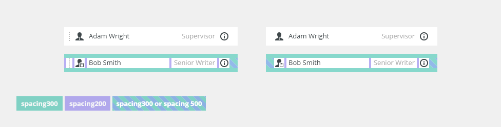
Spacing
| Used in | Type | px | Token |
|---|---|---|---|
| Default size padding | Spacing | 12 | spacing-400 |
Default size spacing between icon and text |
Spacing | 4 | spacing-200 |
| Variable size of side padding | Spacing | 8 | spacing-300 |
| Spacing | 16 | spacing-500 |
Style: Avatar List
Elements
States
Avatar list items have analogical principals for states as list items.
| Used In | Type | px | Token |
|---|---|---|---|
| Avatar | Item size | sizing-item-500 |
|
| Text font (Name) | Font | font-strong |
|
| Text font (Email) | Font | font-body |
|
| Text font (Role) | Font | font-body |
|
| Hover | |||
| Background color | Color | color-bg-interactive-400-hover |
|
| Selected | |||
| Background color | Color | color-bg-interactive-400-selected |
|
| Pressed | |||
| Background color | Color | color-bg-interactive-400-pressed |
|
| Disabled | |||
| Disabled (applied on the whole object) | Opacity | opacity-disabled |
|
| Focus | |||
| Focus border | Color | color-focus-200 |
|
| Focus border width | Border width | 1 | border-width-100 |
| Focus border corner radius | Corner Radius | 2 | radius-100 |
Spacing
Left and right padding should be same in all items of the list.
| Used in | Type | px | Token |
|---|---|---|---|
| Default size padding (top and bottom) | Spacing | 12 | spacing-400 |
Default size spacing between icon and text |
Spacing | 16 | spacing-500 |
| Variable size of side paddings | Spacing | 8 | spacing-300 |
| Spacing | 16 | spacing-500 |
Accessibility
- WAI-ARIA best practices for listbox.
- W3C Content Structure tutorial covers the usage of lists.
Attachments:
 image2020-12-1_10-59-46.png (image/png)
image2020-12-1_10-57-28.png (image/png)
image2020-12-1_10-59-46.png (image/png)
image2020-12-1_10-57-28.png (image/png)
 image2020-12-1_10-57-14.png (image/png)
image2020-12-1_10-56-37.png (image/png)
image2020-12-1_10-57-14.png (image/png)
image2020-12-1_10-56-37.png (image/png)
 image2020-11-30_14-32-1.png (image/png)
 image2020-11-30_14-17-56.png (image/png)
 image2020-11-30_14-8-32.png (image/png)
 image2020-11-30_14-3-56.png (image/png)
 image2020-11-27_15-46-5.png (image/png)
 image2020-11-27_15-19-14.png (image/png)
 image2020-11-27_15-14-27.png (image/png)
 image2020-11-27_15-4-12.png (image/png)
 image2020-11-27_15-3-39.png (image/png)
 image2020-11-27_12-24-3.png (image/png)
 image2020-11-27_12-20-20.png (image/png)
 image2020-11-27_12-13-3.png (image/png)
 image2020-11-27_10-59-3.png (image/png)
 image2020-11-27_9-53-18.png (image/png)
 image2020-10-5_10-17-0.png (image/png)
 image2020-10-5_10-25-57.png (image/png)
 image2020-10-5_10-26-24.png (image/png)
 image2020-10-5_10-26-47.png (image/png)
 image2020-10-2_15-23-33.png (image/png)
 image2020-10-2_13-45-41.png (image/png)
 image2020-10-2_13-46-8.png (image/png)
 image2020-10-5_10-52-58.png (image/png)
 image2020-10-5_10-53-29.png (image/png)
 image2020-10-5_10-54-33.png (image/png)
 image2020-10-5_10-54-40.png (image/png)
 image2020-10-5_10-55-2.png (image/png)
 image2020-10-5_11-37-46.png (image/png)
 image2020-10-2_14-20-45.png (image/png)
 image2020-10-2_14-21-11.png (image/png)
 image2020-10-2_14-20-58.png (image/png)
 image2020-10-2_14-21-26.png (image/png)
 image2020-10-2_14-33-47.png (image/png)
 image2020-10-2_14-34-9.png (image/png)
 image2020-10-2_14-25-18.png (image/png)
 image2020-10-2_14-25-33.png (image/png)
 image2020-10-2_14-42-44.png (image/png)
 image2020-10-23_15-38-49.png (image/png)
 image2020-10-26_13-21-57.png (image/png)
 image2020-10-26_13-22-16.png (image/png)
 image2020-10-26_13-22-55.png (image/png)
 image2020-10-26_13-24-0.png (image/png)
 image2020-10-26_13-26-26.png (image/png)
 textarea-style@2x.png (image/png)
 textarea@2x.png (image/png)
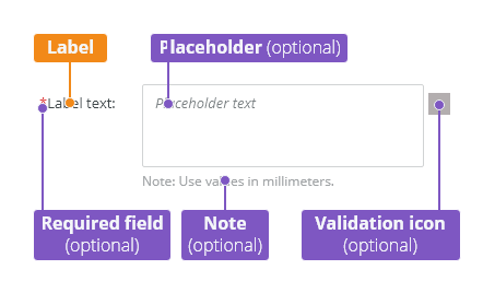
 text-area-anatomy.png (image/png)
 text-area-label-vertical.png (image/png)
 text-area-validation.png (image/png)
 text-area-style.png (image/png)
 text-area-label-horizontal.png (image/png)
 text-area-state-selected.png (image/png)
 text-area-state-disabled.png (image/png)
 text-area-state-readonly.png (image/png)
 text-area-state-focus.png (image/png)
 text-input-density-small.png (image/png)
 text-area-density-default.png (image/png)
 text-area-density-small.png (image/png)
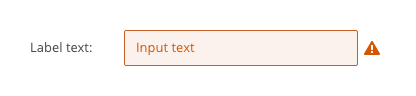
 text-input-variants-warning-icon.png (image/png)
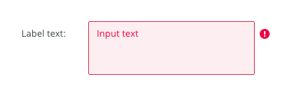
 text-area-variants-error-icon.png (image/png)
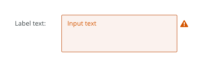
 text-area-variants-warning-icon.png (image/png)
 image2020-11-2_9-24-56.png (image/png)
 image2020-11-2_9-26-14.png (image/png)
 image2020-11-2_9-26-30.png (image/png)
 Screenshot 2020-11-16 at 15.01.07.png (image/png)
 Screenshot 2020-11-16 at 14.58.54.png (image/png)
 Screenshot 2020-11-16 at 15.09.35.png (image/png)
 Screenshot 2020-11-16 at 15.19.01.png (image/png)
 Screenshot 2020-11-16 at 15.22.41.png (image/png)
 Screenshot 2020-11-18 at 12.49.34.png (image/png)
 Screenshot 2020-11-18 at 13.11.11.png (image/png)
 Screenshot 2020-11-18 at 13.22.39.png (image/png)
 Screenshot 2020-11-16 at 13.53.55.png (image/png)
 Screenshot 2020-11-19 at 08.14.25.png (image/png)
 Screenshot 2020-11-19 at 08.14.34.png (image/png)
 Screenshot 2020-11-18 at 13.08.21.png (image/png)
 Screenshot 2020-11-18 at 13.08.05.png (image/png)
 Screenshot 2020-11-19 at 09.57.10.png (image/png)
 Screenshot 2020-11-20 at 14.27.17.png (image/png)
 context-menu-anatomy.png (image/png)
 Context-menu-type-basic.png (image/png)
 Context-menu-type-multilevel.png (image/png)
 Context-menu-variants-text-only.png (image/png)
 Context-menu-variants-text-icons.png (image/png)
 Context-menu-variants-with-title.png (image/png)
 Context-menu-groups.png (image/png)
 Context-menu-states-disabled.png (image/png)
 Context-menu-do-short.png (image/png)
 Context-menu-dont-short.png (image/png)
 Context-menu-do-groups.png (image/png)
 Context-menu-dont-groups.png (image/png)
 image2020-9-25_10-10-4.png (image/png)
 image2020-9-24_16-6-51.png (image/png)
 image2020-9-24_16-18-22.png (image/png)
 image2020-9-23_9-54-16.png (image/png)
 image2020-9-23_10-17-52.png (image/png)
 image2020-9-23_10-24-23.png (image/png)
 image2020-9-25_11-4-55.png (image/png)
 image2020-9-23_9-55-10.png (image/png)
 image2020-9-25_10-47-30.png (image/png)
 image2020-9-23_10-25-22.png (image/png)
 image2020-12-2_12-53-34.png (image/png)
 image2020-12-2_12-56-32.png (image/png)
 image2020-12-2_12-59-19.png (image/png)
 image2020-12-2_13-0-8.png (image/png)
 image2020-12-2_13-1-8.png (image/png)
 image2020-12-3_11-43-3.png (image/png)
 image2020-12-3_11-43-59.png (image/png)
 image2020-12-3_13-37-16.png (image/png)
 list-title.png (image/png)
 one-row-list-anatomy.png (image/png)
 two-row-list-anatomy.png (image/png)
 Default list.png (image/png)
 Two line list.png (image/png)
 Single row with metadata.png (image/png)
 Two rows with metadata.png (image/png)
 List with image.png (image/png)
 Left icon.png (image/png)
 Right icon.png (image/png)
 Separator.png (image/png)
 Connector.png (image/png)
 image2020-12-14_10-38-38.png (image/png)
 image2020-12-14_10-39-35.png (image/png)
 image2020-12-14_10-40-23.png (image/png)
 image2020-12-14_14-31-46.png (image/png)
 image2020-12-14_14-33-16.png (image/png)
 image2020-12-14_14-34-48.png (image/png)
 image2020-12-14_14-36-39.png (image/png)
 image2020-12-14_14-36-56.png (image/png)
 image2020-12-14_14-37-19.png (image/png)
 one-row-list-content.png (image/png)
 one-row-list-states.png (image/png)
 one-row-list-large-spacing.png (image/png)
 one-row-list-medium-spacing.png (image/png)
 one-row-list-small-spacing.png (image/png)
 two-row-list-content.png (image/png)
 two-row-list-states.png (image/png)
 two-row-list-spacing.png (image/png)
 list-title.png (image/png)
list-anatomy-one-row.png (image/png)
list-anatomy-two-row.png (image/png)
list-variant–default.png (image/png)
list-variant-double-line.png (image/png)
list-variant-default-metadata.png (image/png)
list-variant-double-line-metadata.png (image/png)
list-variant-image.png (image/png)
list-variant-left-icon.png (image/png)
list-variant-right-icon.png (image/png)
list-variant-separator.png (image/png)
list-variant-connector.png (image/png)
list-density-large.png (image/png)
list-density-medium.png (image/png)
list-density-small.png (image/png)
list-states-disabled.png (image/png)
list-title.png (image/png)
list-anatomy-one-row.png (image/png)
list-anatomy-two-row.png (image/png)
list-variant–default.png (image/png)
list-variant-double-line.png (image/png)
list-variant-default-metadata.png (image/png)
list-variant-double-line-metadata.png (image/png)
list-variant-image.png (image/png)
list-variant-left-icon.png (image/png)
list-variant-right-icon.png (image/png)
list-variant-separator.png (image/png)
list-variant-connector.png (image/png)
list-density-large.png (image/png)
list-density-medium.png (image/png)
list-density-small.png (image/png)
list-states-disabled.png (image/png)
 list-states-disabled.png (image/png)
list-content-one-row.png (image/png)
list-states-disabled.png (image/png)
list-content-one-row.png (image/png)
 list-states-one-row.png (image/png)
list-spacing-one-row-large.png (image/png)
list-states-one-row.png (image/png)
list-spacing-one-row-large.png (image/png)
 list-spacing-one-row-medium.png (image/png)
 list-spacing-one-row-small.png (image/png)
 list-content-two-rows.png (image/png)
list-states-two-row.png (image/png)
list-spacing-two-row-large.png (image/png)
Context-menu-badges.png (image/png)
list-content-two-rows.png (image/png)
list-states-two-row.png (image/png)
list-spacing-two-row-large.png (image/png)
Context-menu-badges.png (image/png)
 one-row-list-content – 2.png (image/png)
 one-row-list-large-spacing – 2.png (image/png)
 one-row-list-medium-spacing – 2.png (image/png)
 one-row-list-small-spacing – 2.png (image/png)
 Badges.png (image/png)
one-row-list-content – 2.png (image/png)
one-row-list-large-spacing – 2.png (image/png)
one-row-list-medium-spacing – 2.png (image/png)
one-row-list-small-spacing – 2.png (image/png)
image2021-5-5_15-27-52.png (image/png)
Badges.png (image/png)
one-row-list-content – 2.png (image/png)
one-row-list-large-spacing – 2.png (image/png)
one-row-list-medium-spacing – 2.png (image/png)
one-row-list-small-spacing – 2.png (image/png)
image2021-5-5_15-27-52.png (image/png)
 image2021-5-5_19-48-46.png (image/png)
 image2021-5-5_19-49-30.png (image/png)
image2021-5-6_10-11-45.png (image/png)
image2021-5-5_19-49-30.png (image/png)
image2021-5-6_10-11-45.png (image/png)