Layout definitions are fundamentals of a consistent experience across applications and screen sizes.
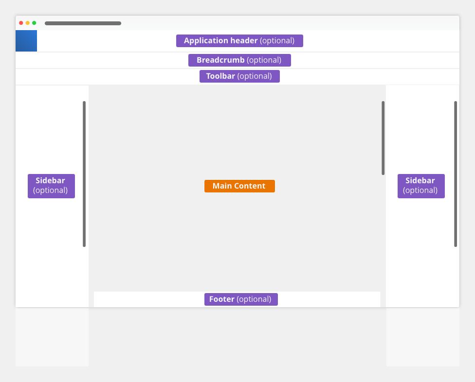
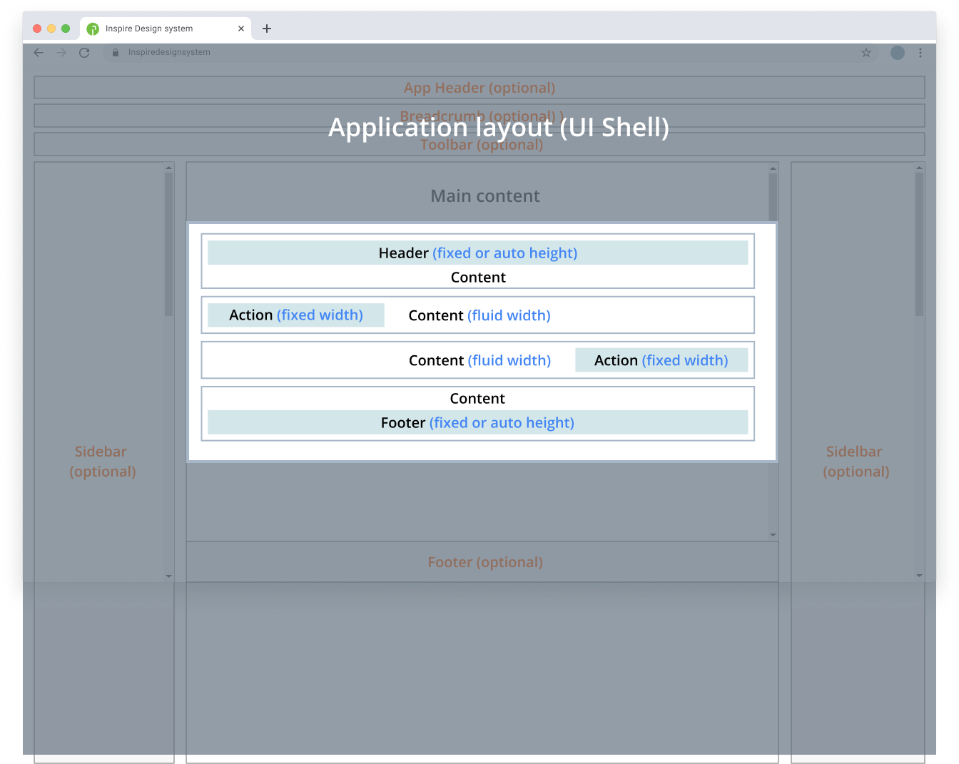
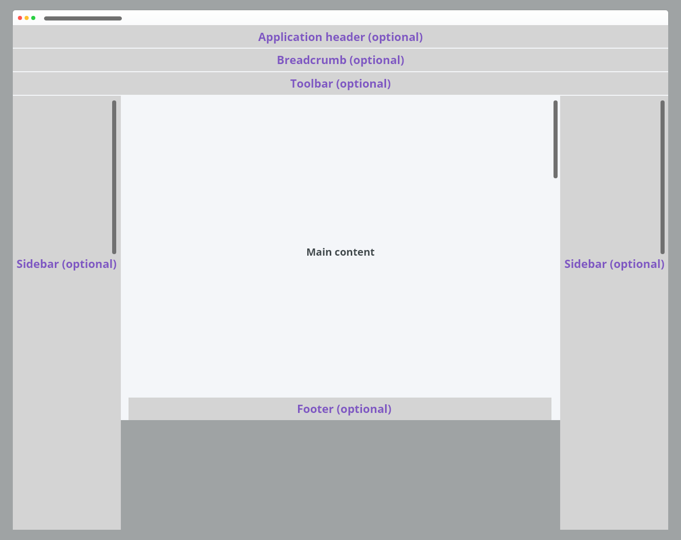
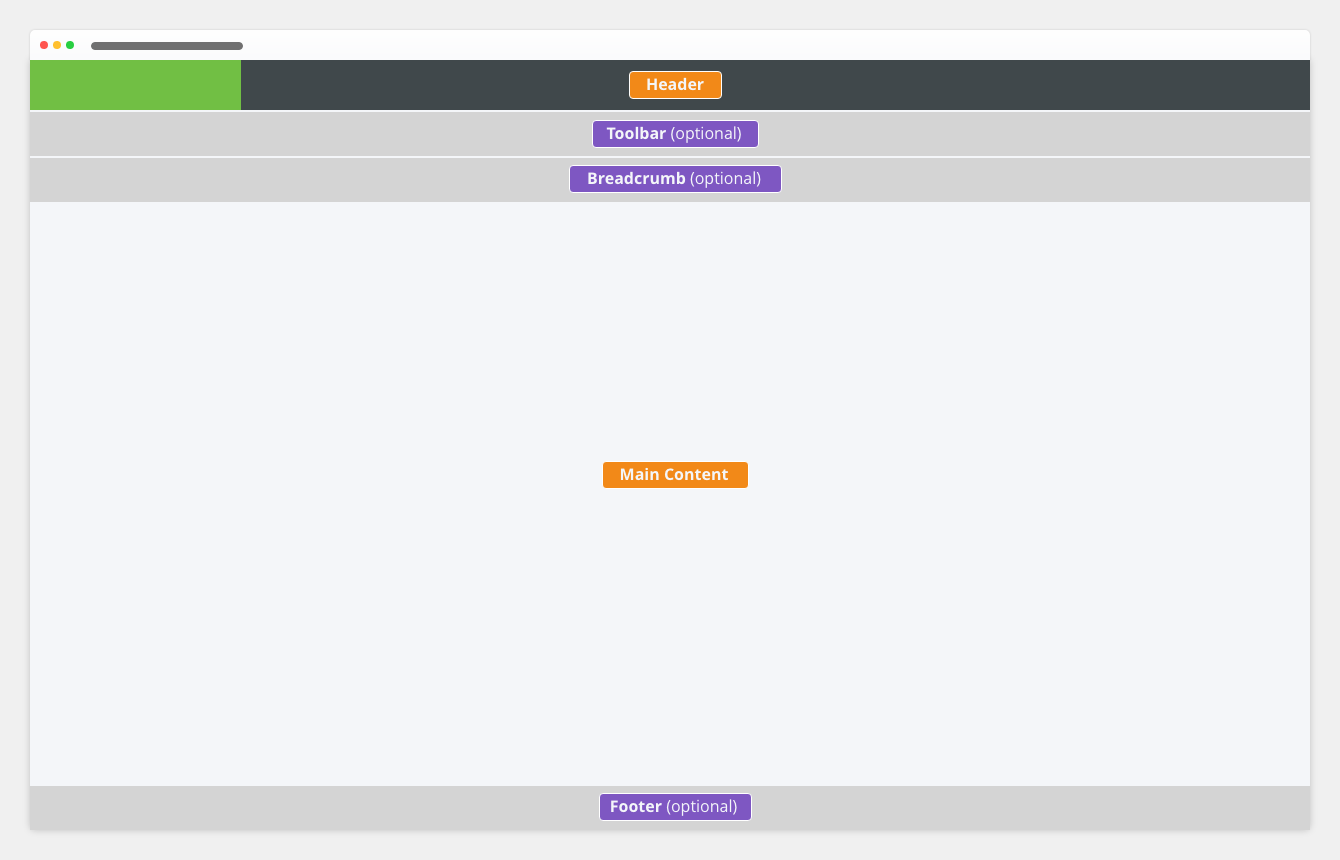
Application Layout (UI Shell)
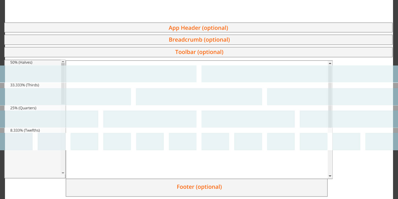
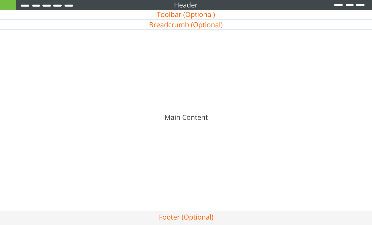
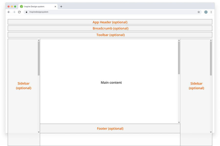
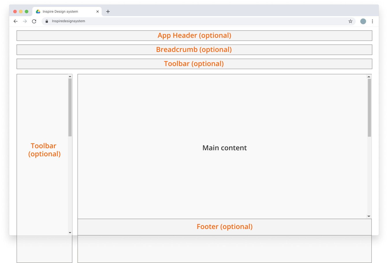
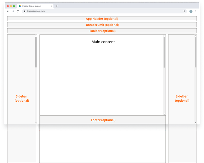
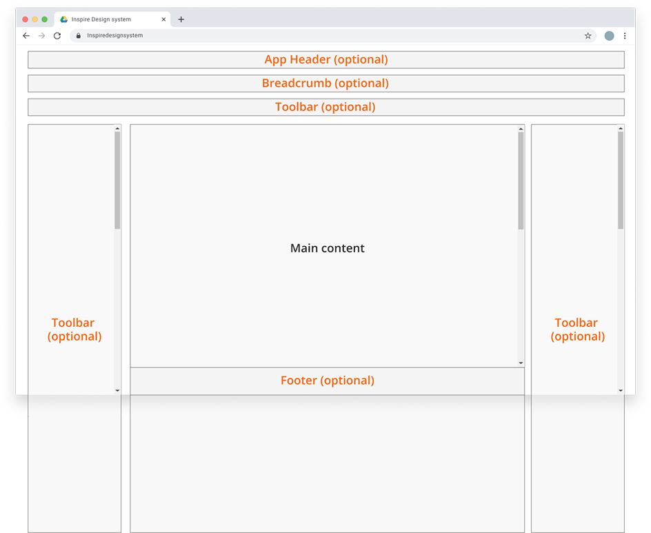
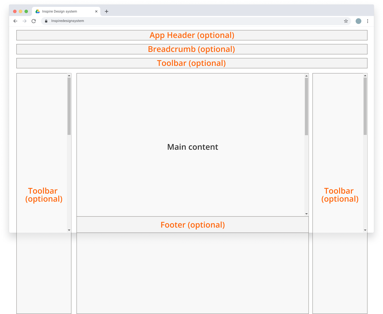
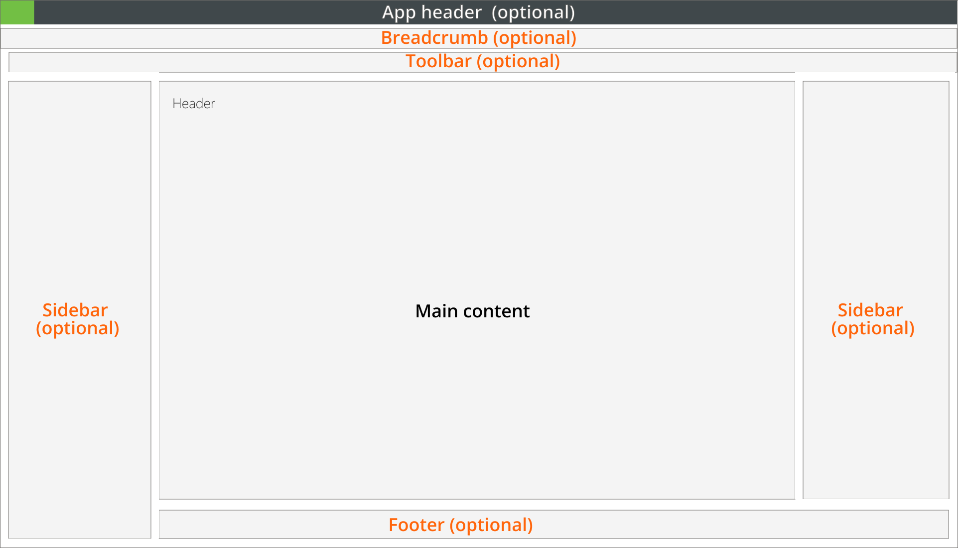
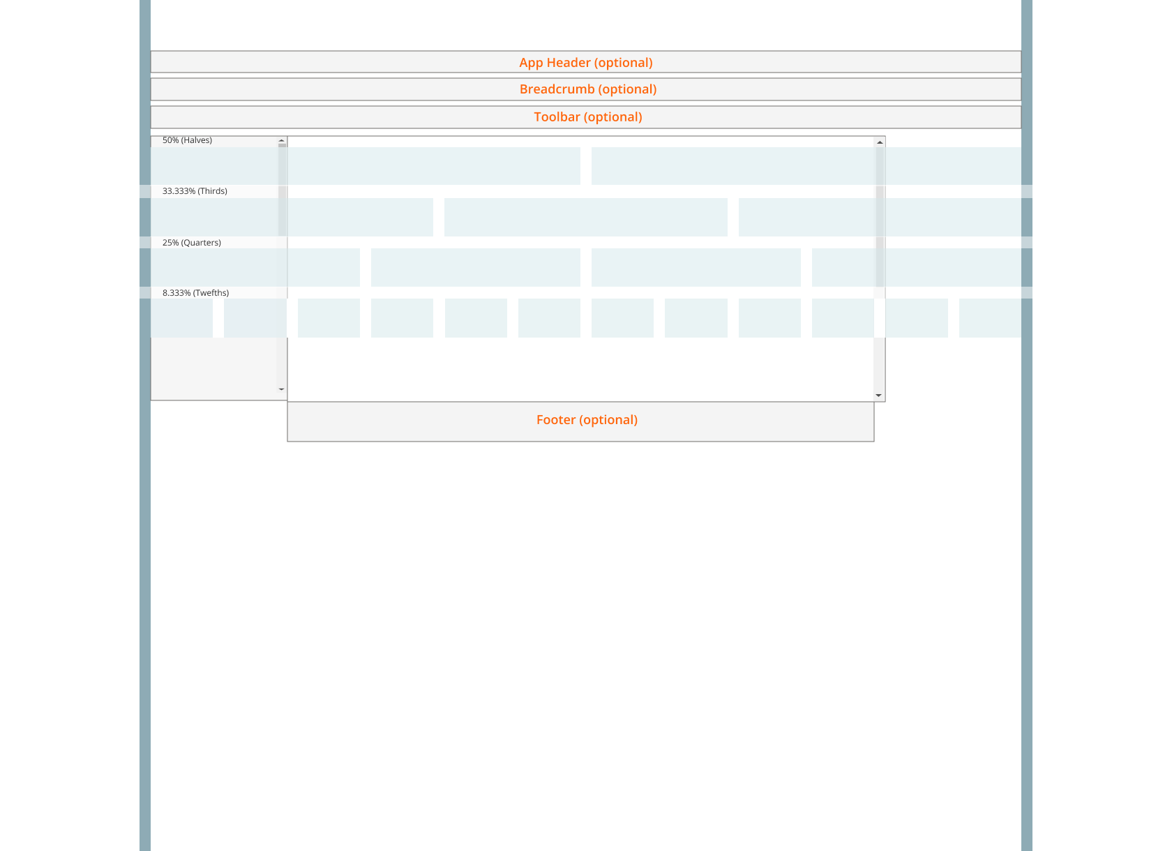
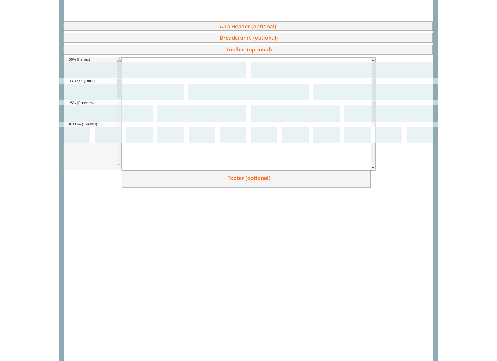
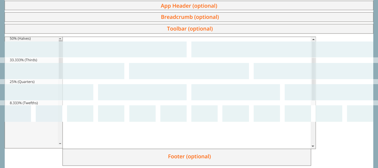
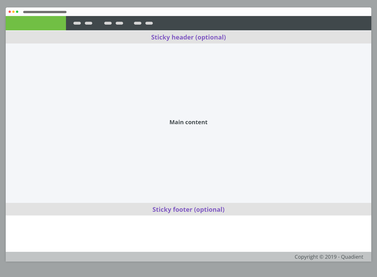
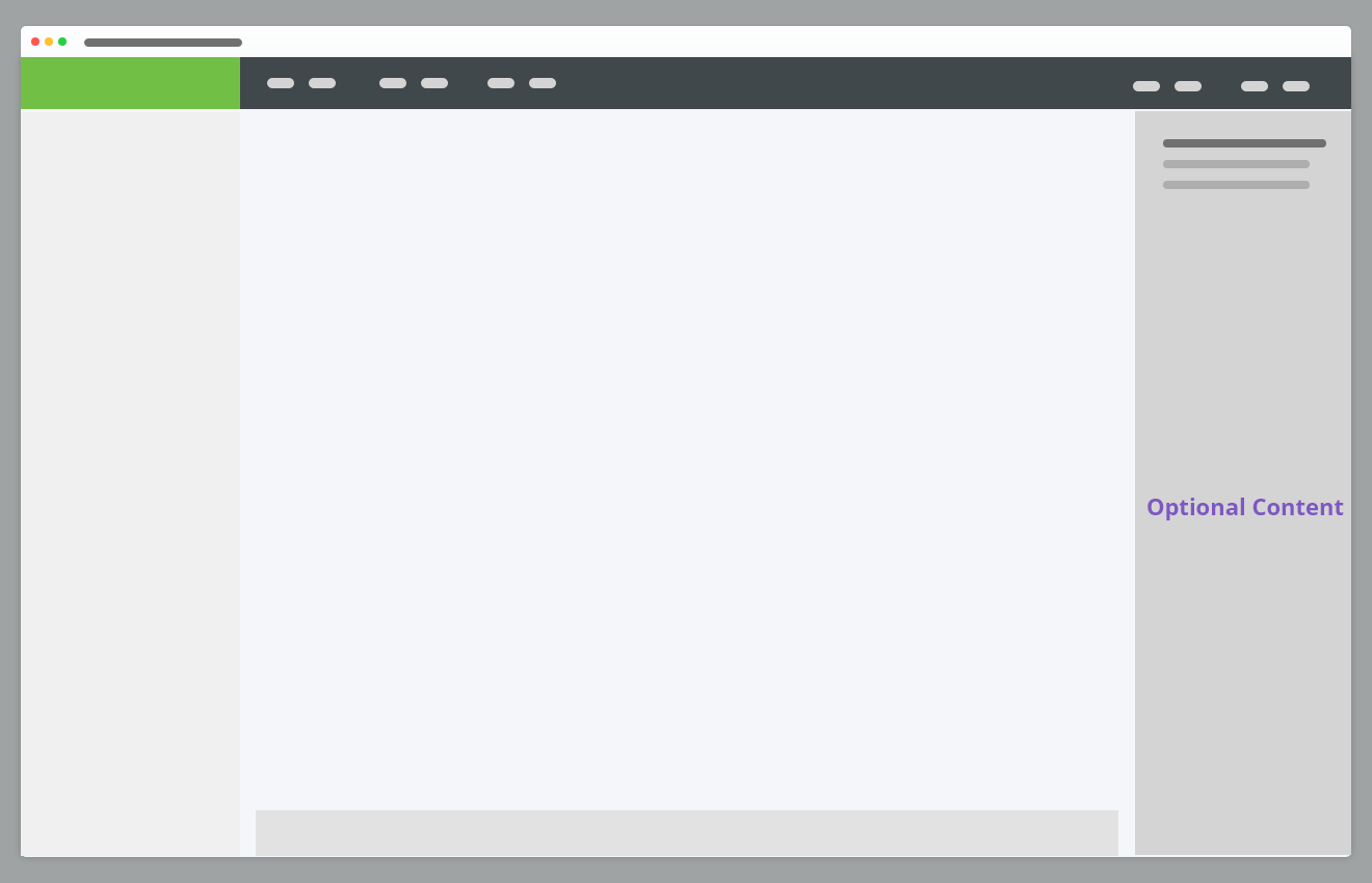
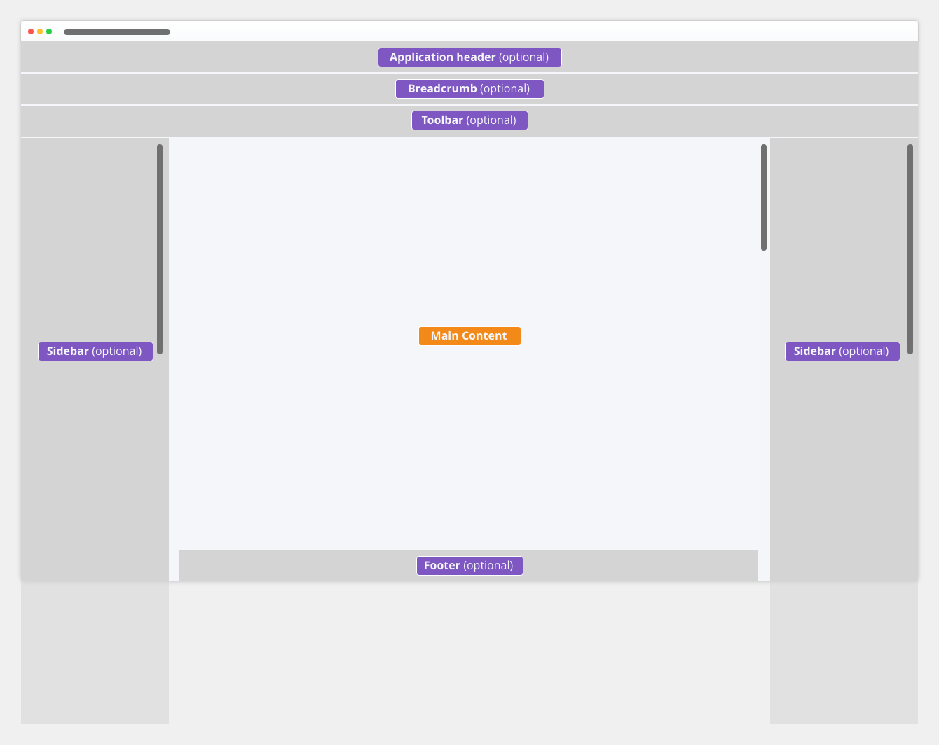
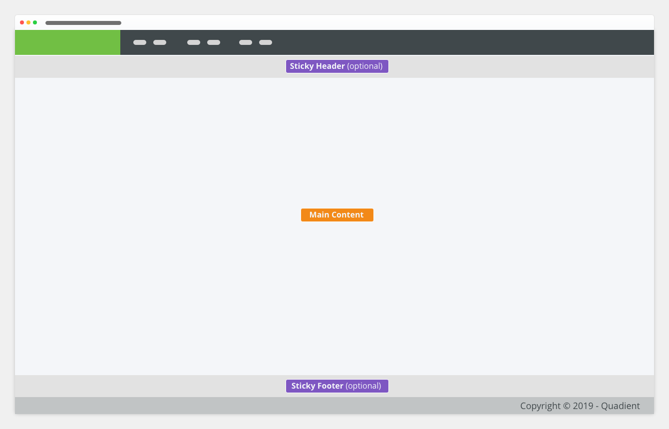
Application layout is an outer frame of the UI and consists of the structured page containers (e.g. application header, sidebars, main content and footer).
Application header: l-view-app-header
Application breadcrumb: l-view-app-breadcrumb
Application toolbar: l-view-app-toolbar
Main content: l-view-main
Scrollbar is created if content overflows the height of the main content zone.
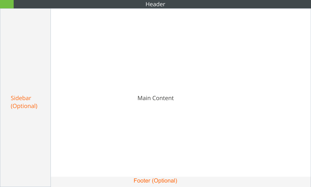
Sidebar: l-view-sidebar
The height of the sidebar is 100% of the viewport, its width is fixed.
Scrollbar is created if content overflows the height of the sidebar zone.
Footer: bobwai–footer
Footer is fixed to the bottom of an application and has the same width as the main content zone.
.
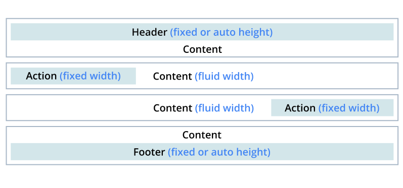
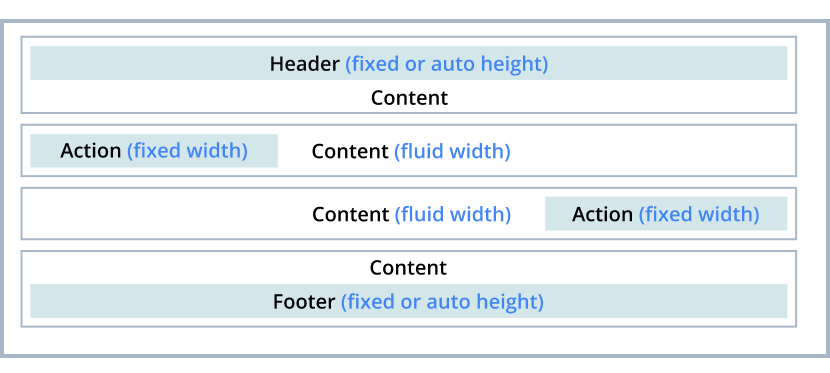
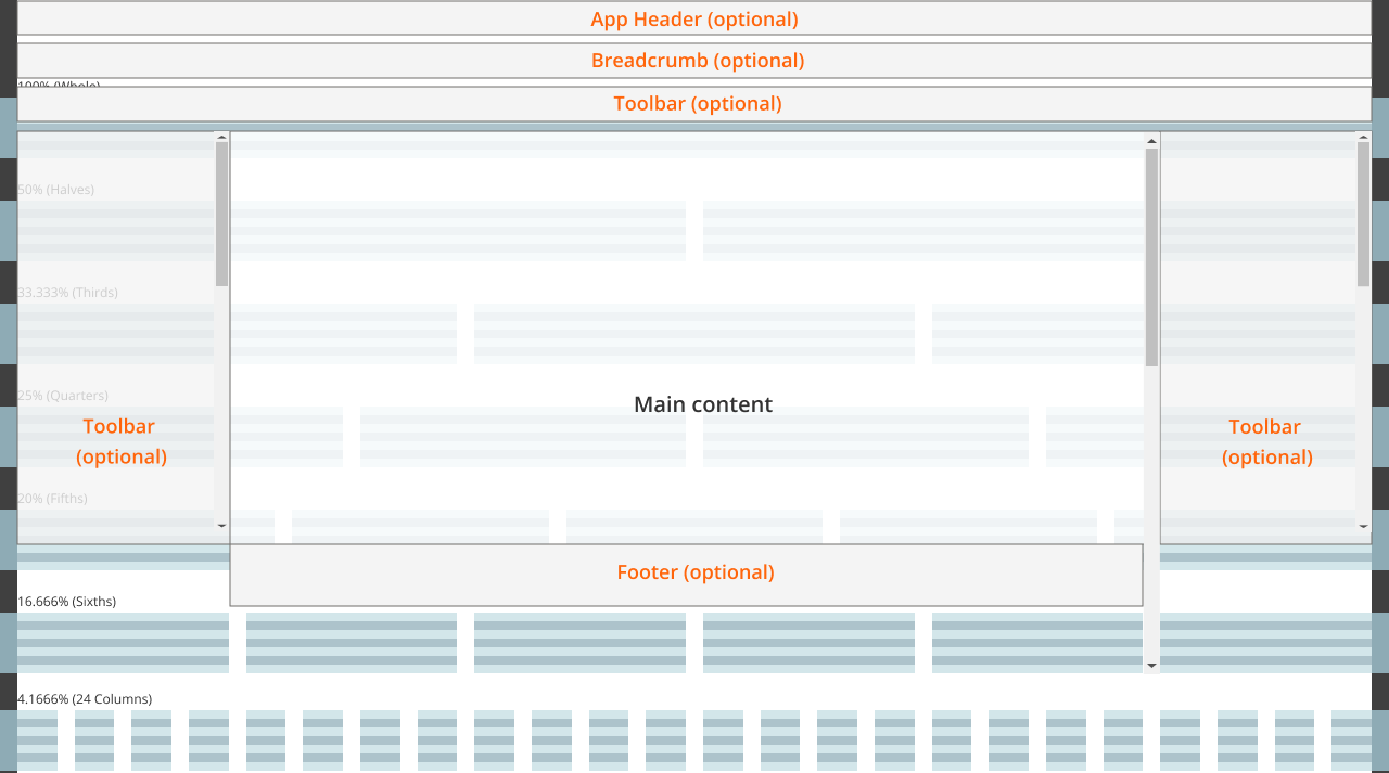
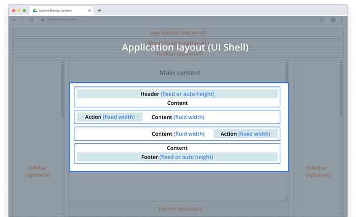
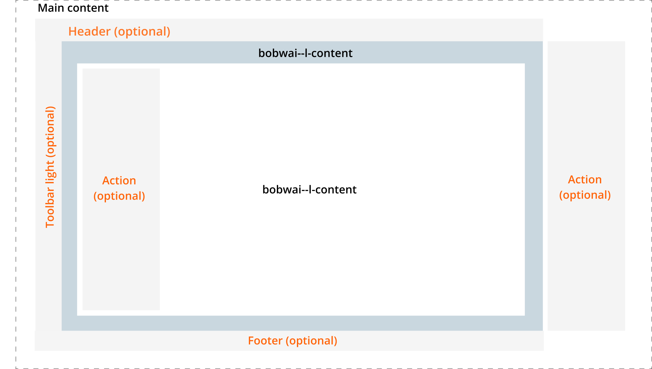
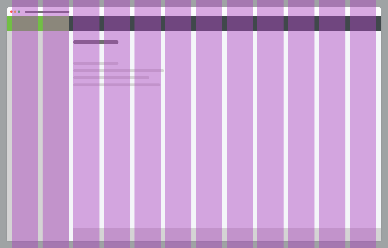
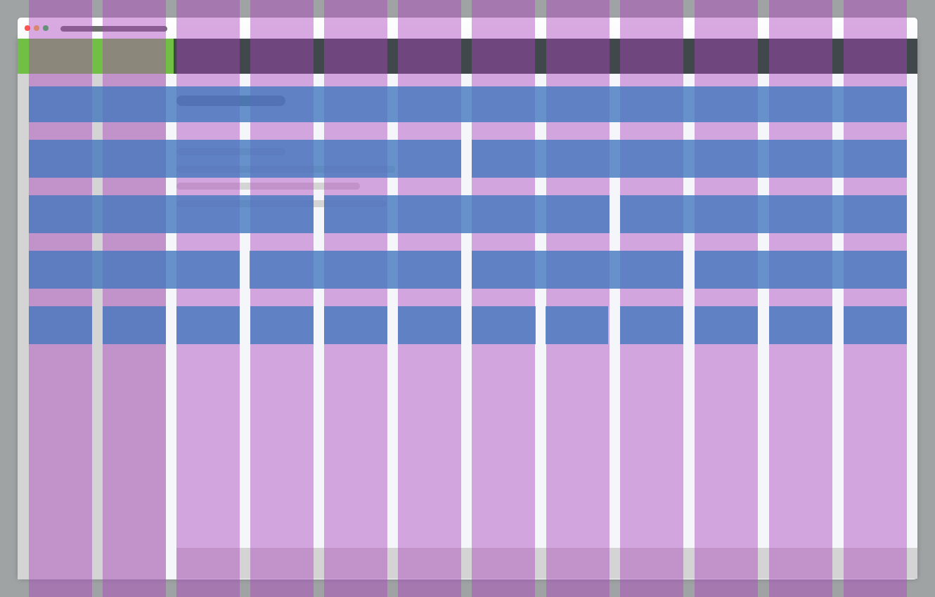
Basic Layout Components
Basic Layout components are used to create the basic structure of a page inside an application layout.
Adding the layout components (typically inside the main content zone) splits the zone vertically or horizontally.
|
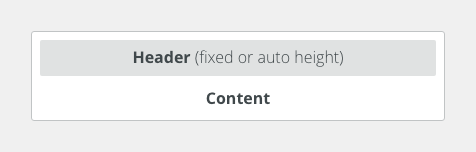
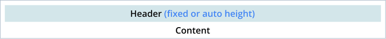
Content-with header Usage: To split an area into two vertical containers Parameters:
|
|
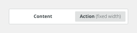
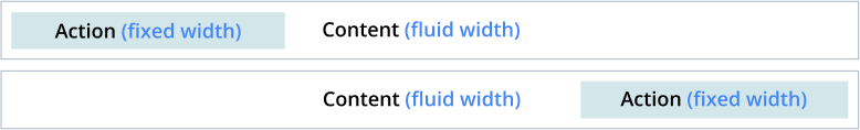
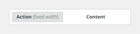
Content-with actions Usage: To split an area into two horizontal containers with fixed (predefined) and fluid width, typically for creating columns. Parameters:
|
|
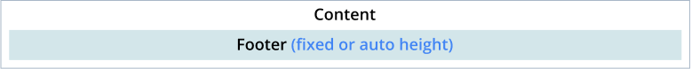
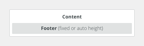
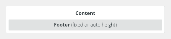
Content-with footer Usage: To split an area into two vertical containers. Parameters:
|
|


Typical Layout Configurations
The Inspire UI layout page can be configured based on supported use-cases. The currently supported configurations are a full-screen layout and a two-column layout.
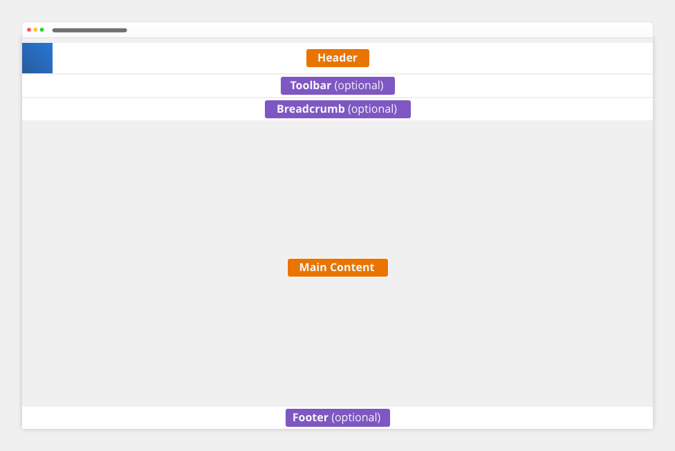
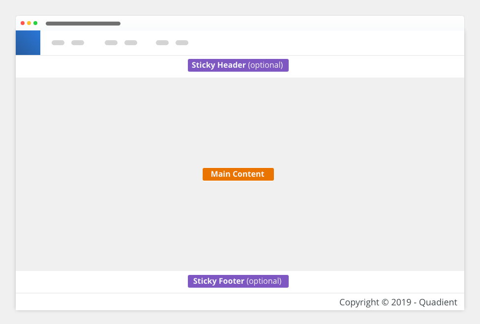
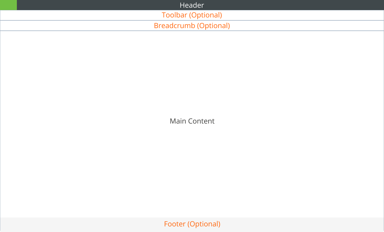
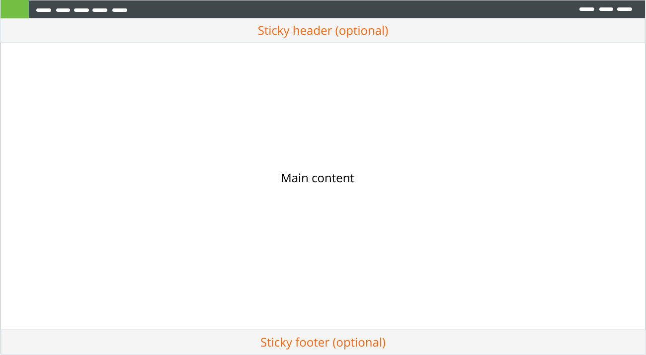
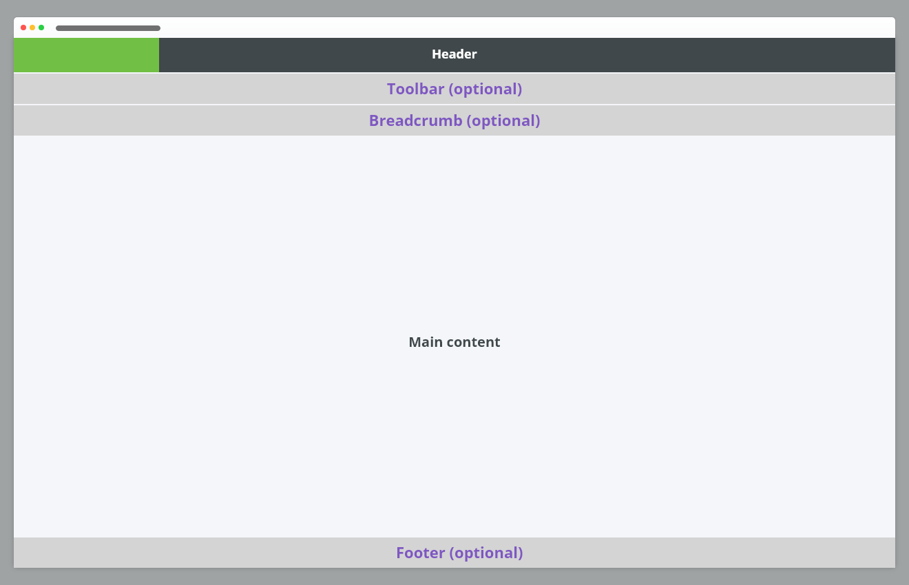
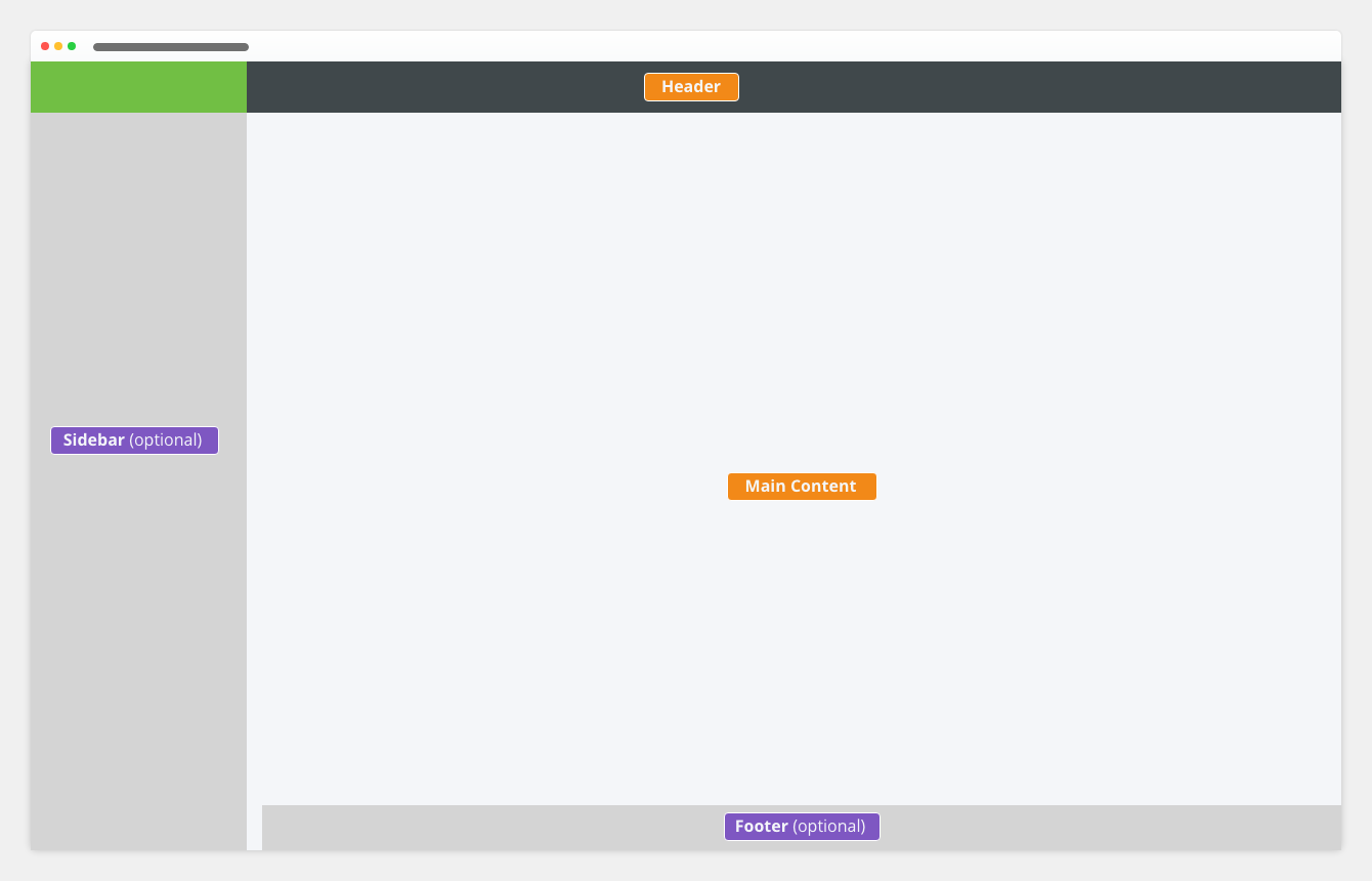
Full-Screen Layout
One column layout with the fixed height of 100% viewport.
Usage: To encourage users to focus on the actual page content. Additional information and actions are still available via optional content areas as toolbars and panels.
For editors, dashboards.
Application header: bobwai--l-view-app-header
Application toolbar (optional): bobwai--l-toolbar
Application breadcrumb (optional): bobwai--l-view-app-breadcrumb
Main content: bobwai--l-view-main
Footer (optional): bobwai--footer
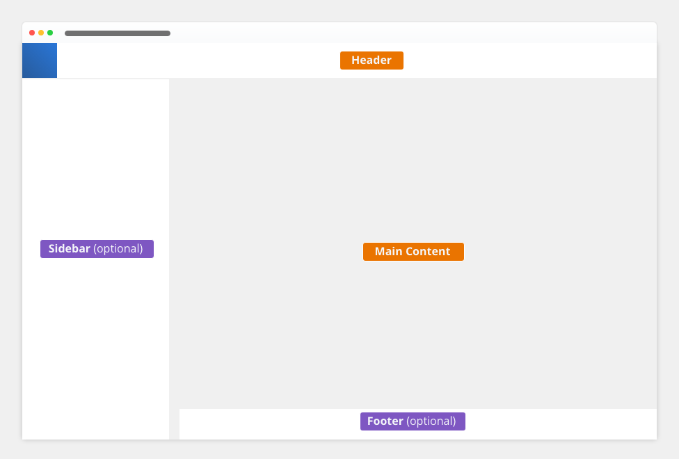
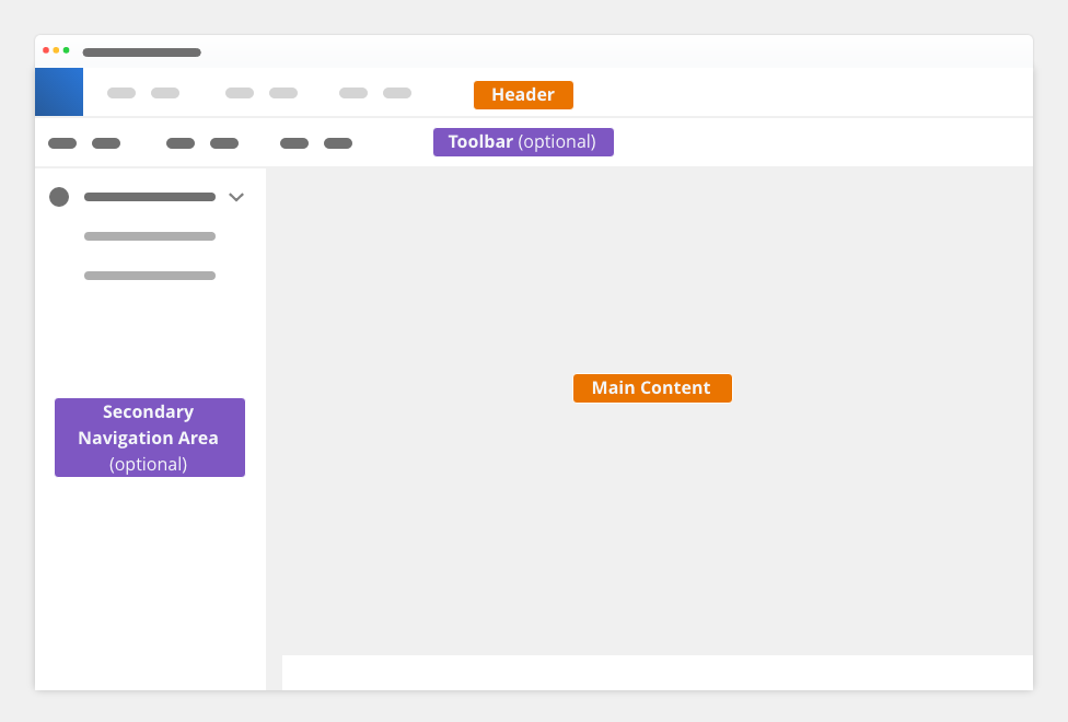
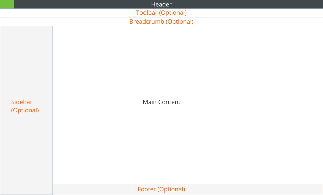
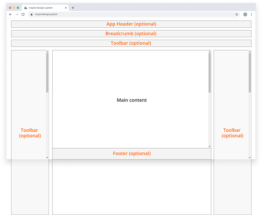
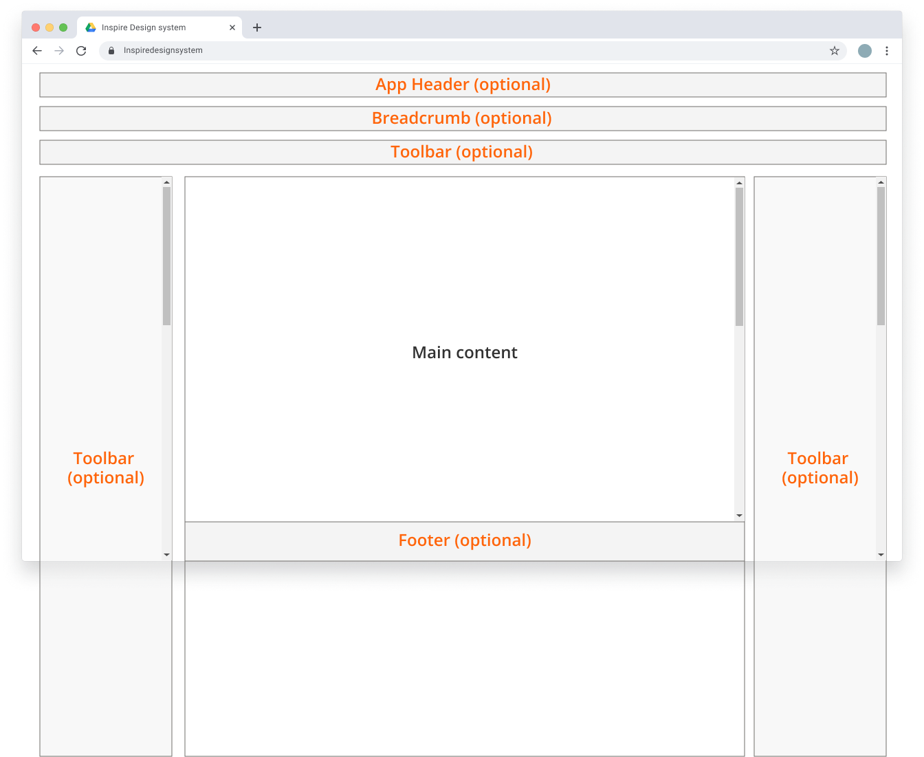
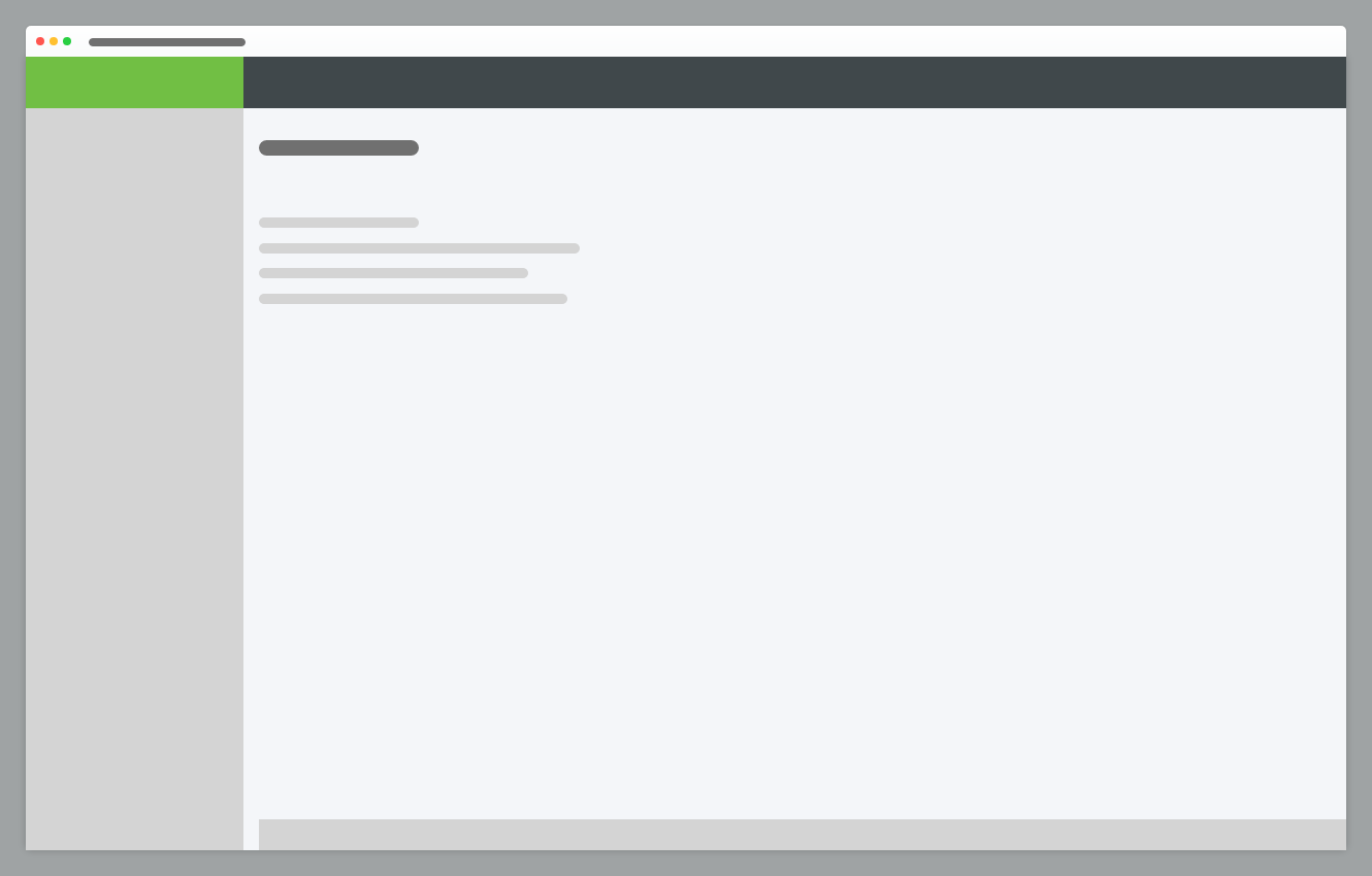
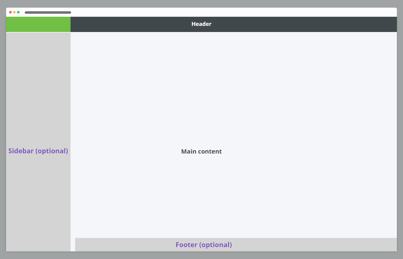
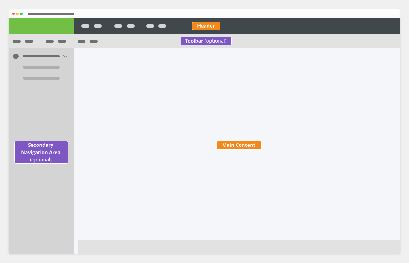
Two-Column Layout
Two columns (sidebar and main content) with the fixed height of 100% of the viewport. Each column has its own scrollbar.
Usage: To place a secondary navigation to a left sidebar.
Application header: bobwai--l-view-app-header
Application sidebar: bobwai--l-view-sidebar
Main content: bobwai--l-view-main
Footer (optional): bobwai--footer
UI Parts
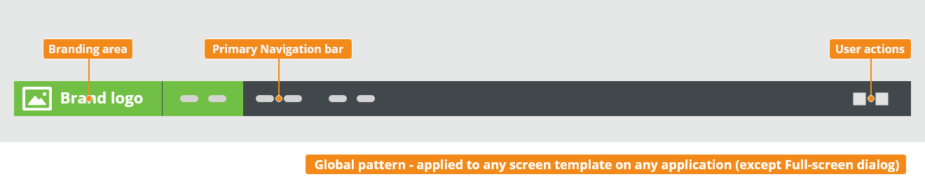
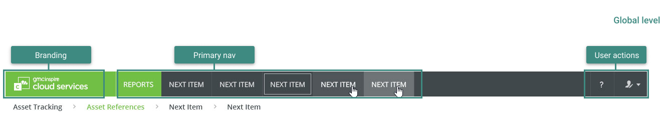
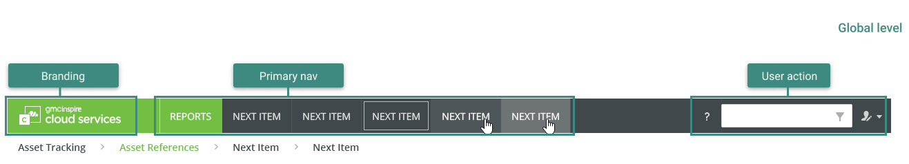
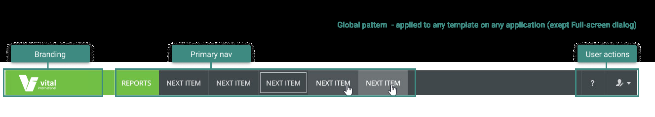
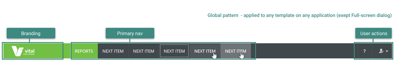
Application Header
Inspire application headers consist of constant areas such as branding, primary navigation, user actions, etc.
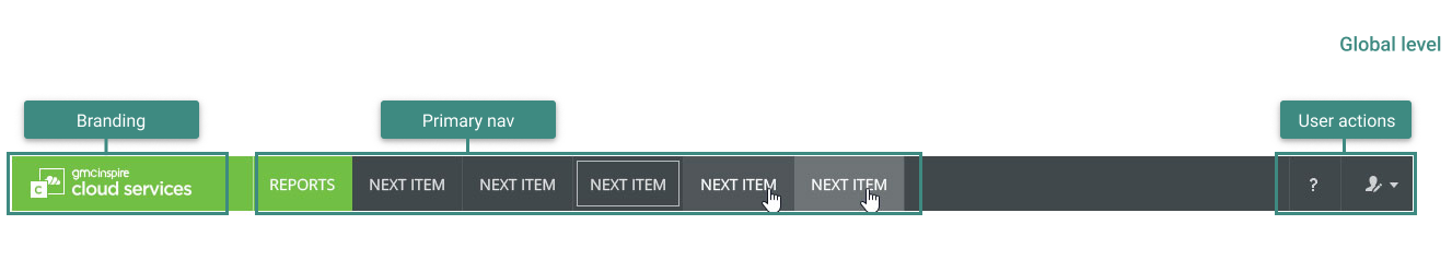
Default Application Header
Usage: Default header type for all Inspire products.
Branding Area
- Inspire product logo
Primary Navigation bar
- contains one or more navigation links
User Menu
- typically contains settings, help and user options
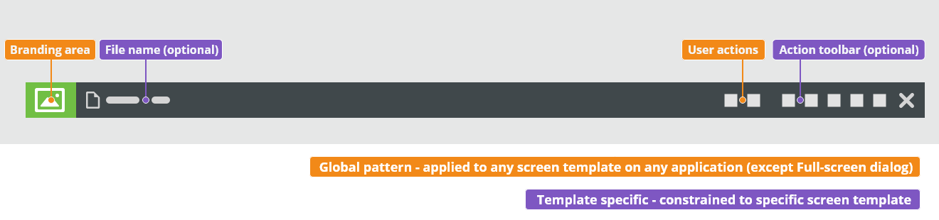
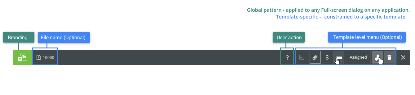
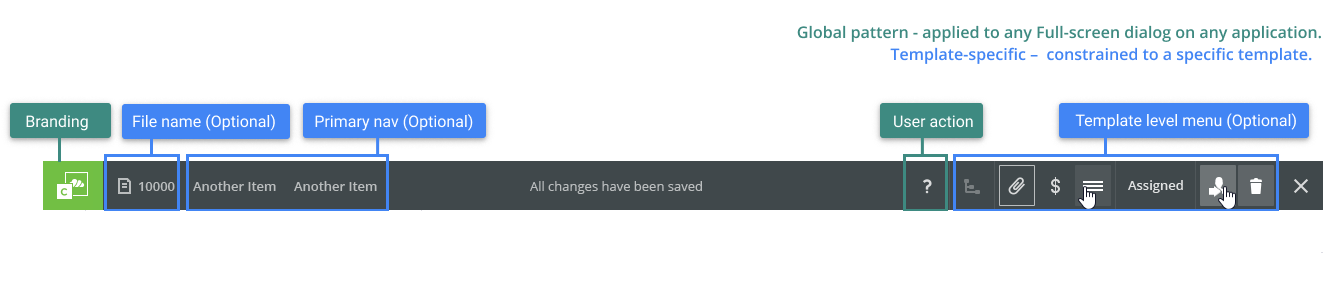
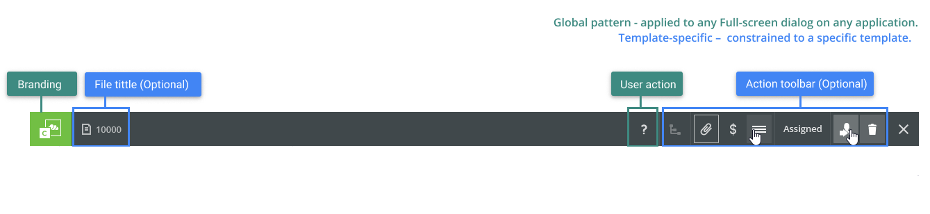
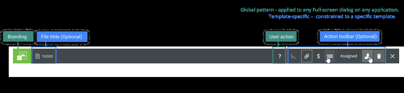
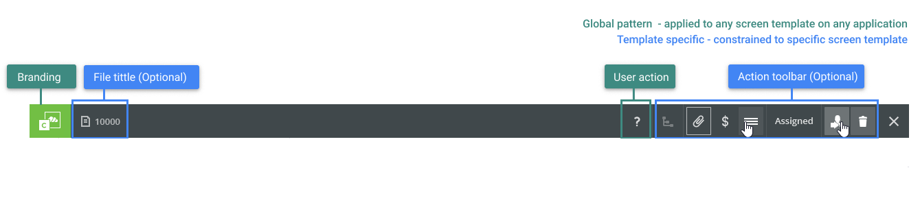
Full-Screen Dialog Header
Usage: Full-screen dialogs (for complex user tasks e.g. the workflow editor). In some products (Interactive, Scaler) opens in a new tab from legacy reasons.
Do not open a new full-screen dialog over an existing one. This can cause the loss of context and create navigational issues for the user.
Branding Area
- Inspire product logo (narrow)
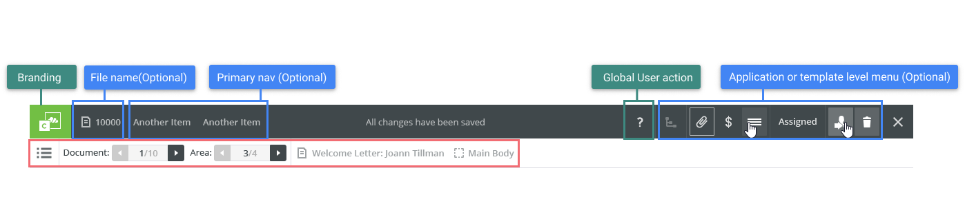
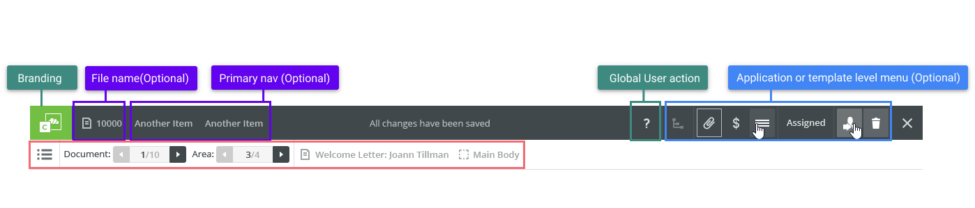
File Name (optional)
- contains the file name
User Actions (global level)
- contains global level actions (applied to any screen template on any application); typically Help
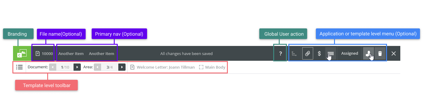
Action Toolbar (template level)
- contains template specific actions (constrained to actual screen template, e.g. workflow editor).
Dismissal Icon
- closes the application
Breadcrumb (Optional)
Usage: Secondary navigation for large amount of hierarchically organized content consisting of more than two levels.

Header Toolbar (Optional)
Header toolbar is placed below the header. The toolbar enables the user to change the UI or trigger an action.
Usage: Actions in full-screen layout on a template level.
Use proximity to separate groups of action, separate navigation and commands.

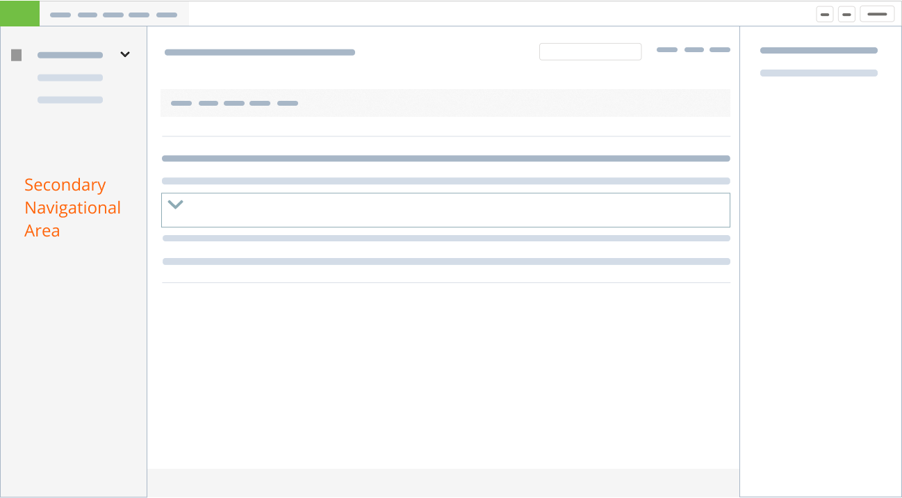
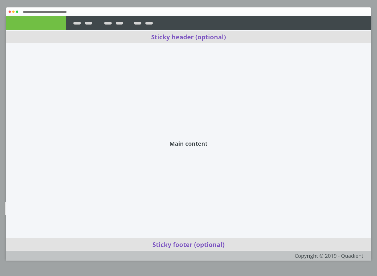
Main Content
Main container for content.
Parameters:
sticky header (optional)
by adding component bobwai--l-content-with-header- sticky footer (optional)
by adding component bobwai--l-content-with-footer
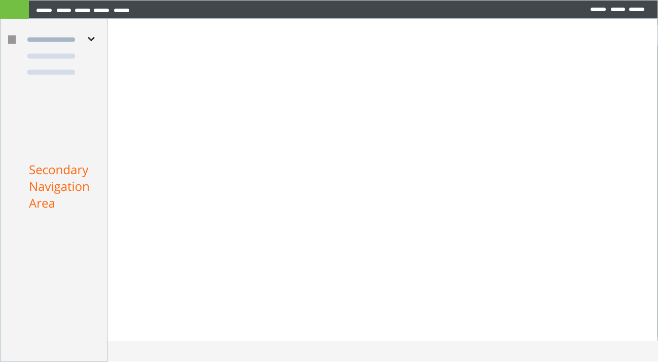
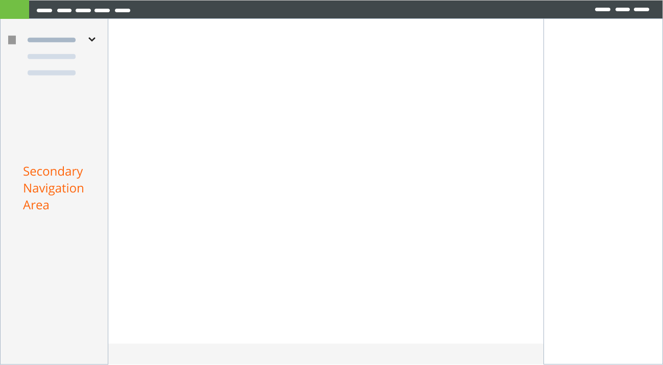
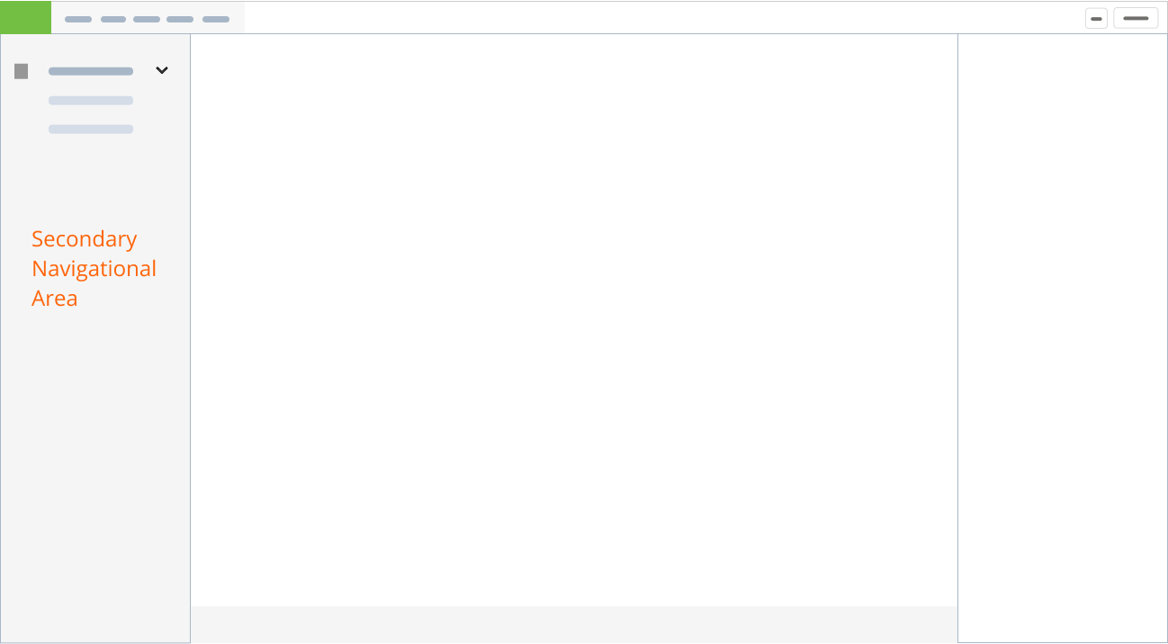
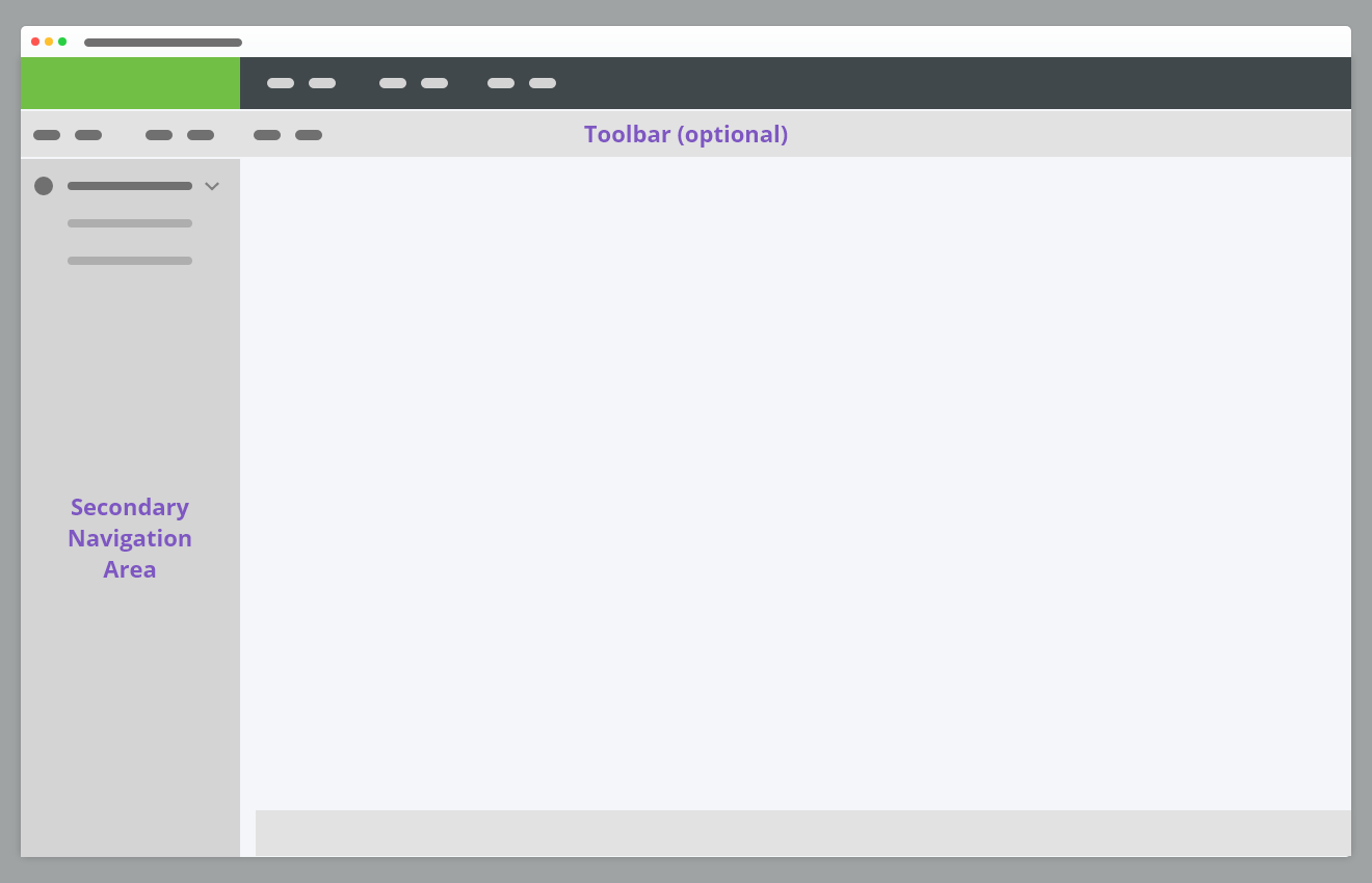
Left UI Shell Sidebar: Two-column Layout
Usage: Left UI shell column is used only in a two-column layout. Secondary navigation containing the maximum of two levels serves also as an entry point into applications. If more levels are needed, use tabs within a page. Can be used for a tree.
Parameters:
- fixed width
- visibility: no collapsible
- can contain collapsible sections
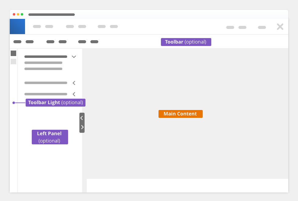
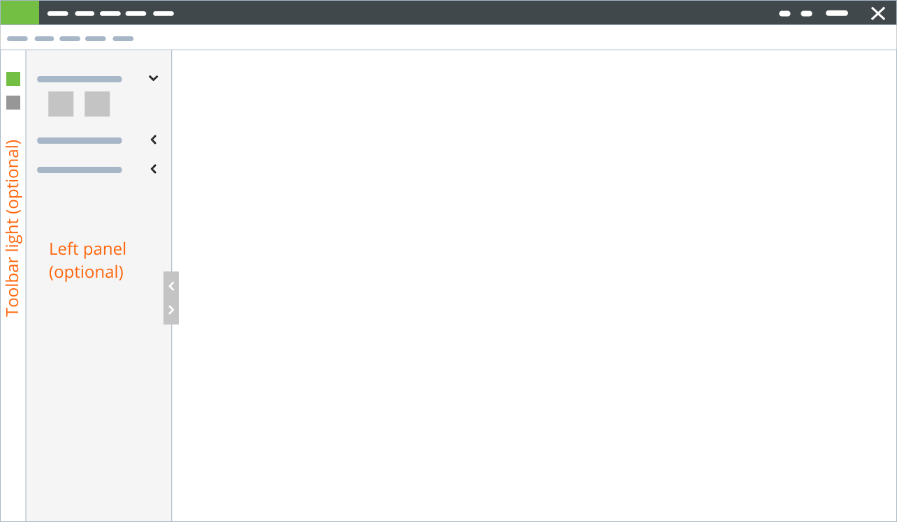
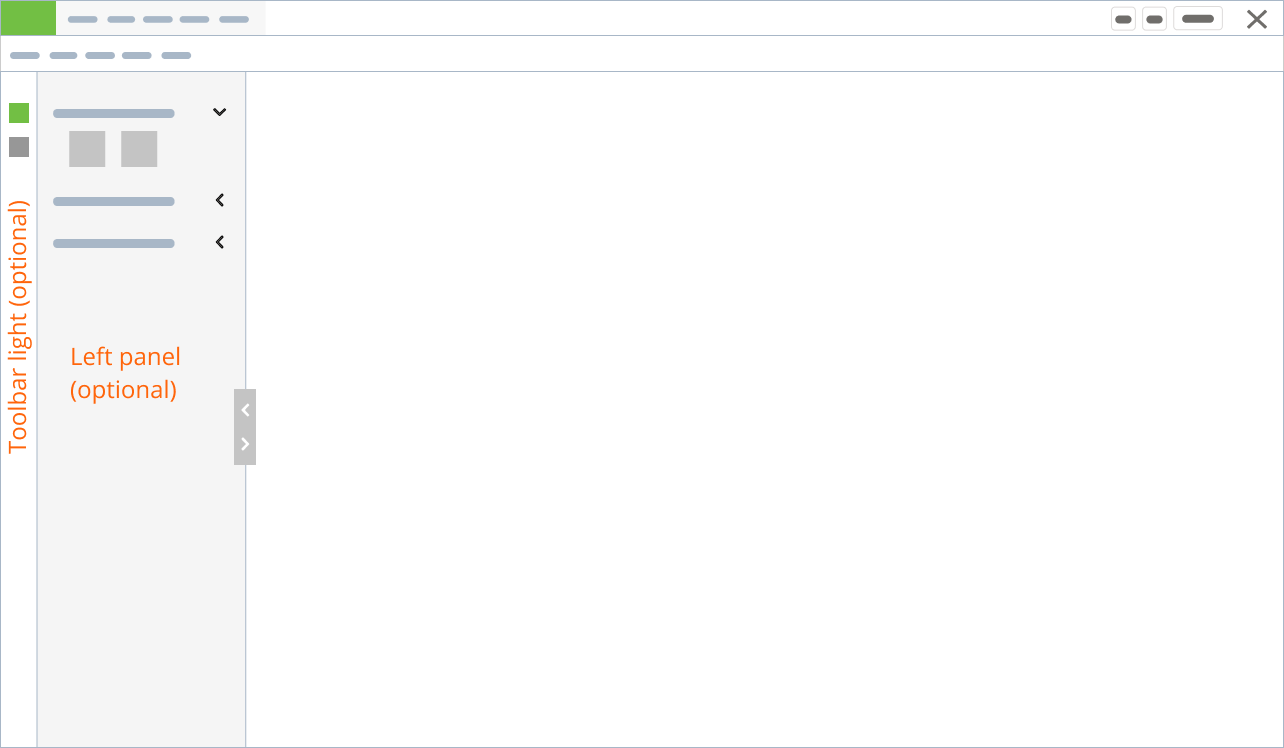
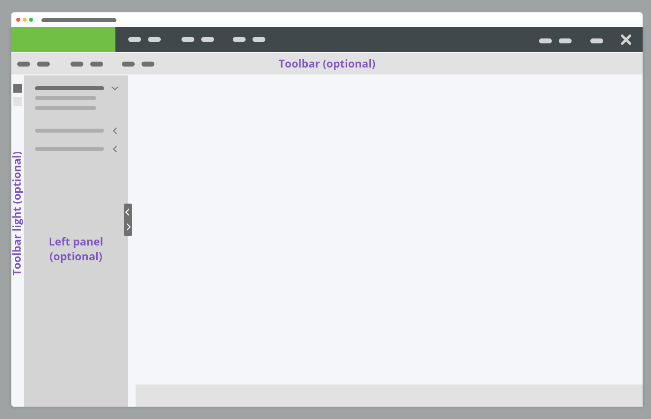
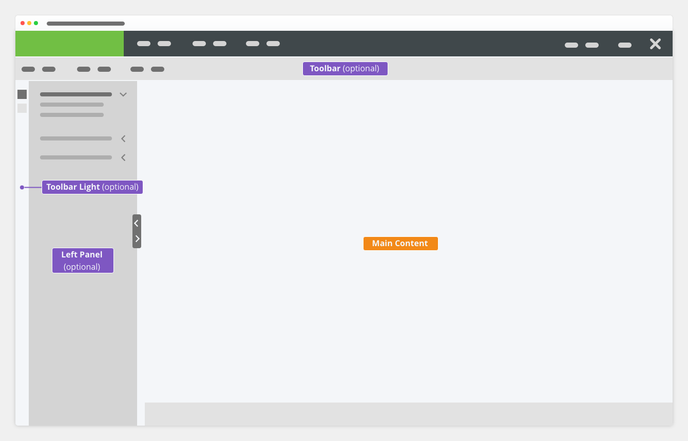
Left Panels: Full-Screen Layout
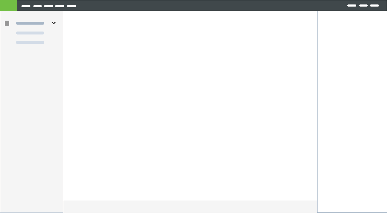
Toolbar Light (Optional)
Usage: Secondary navigation.
Parameters:
- fixed width
Left Panel (Optional)
Panels have a hierarchy from left to right. The left panel serves as navigation or tasks to main content.
Usage: Supplemental information or tasks for main content, secondary navigation or tree.
Parameters:
- visibility: collapsible – panel is invoked by toggle button
- can contain collapsible sections
- reflow (pushing the content): yes
- resizable width with movable splitter bobwai--content-with-resizable-sidebar
- fixed with bobwai--content-action
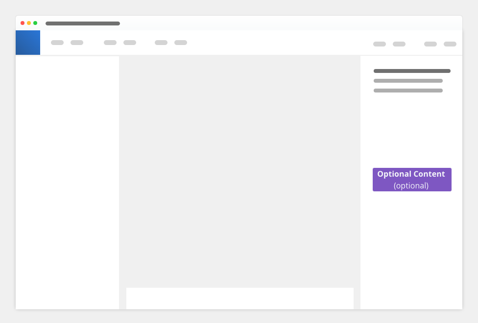
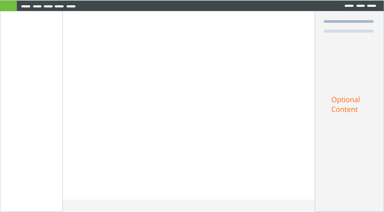
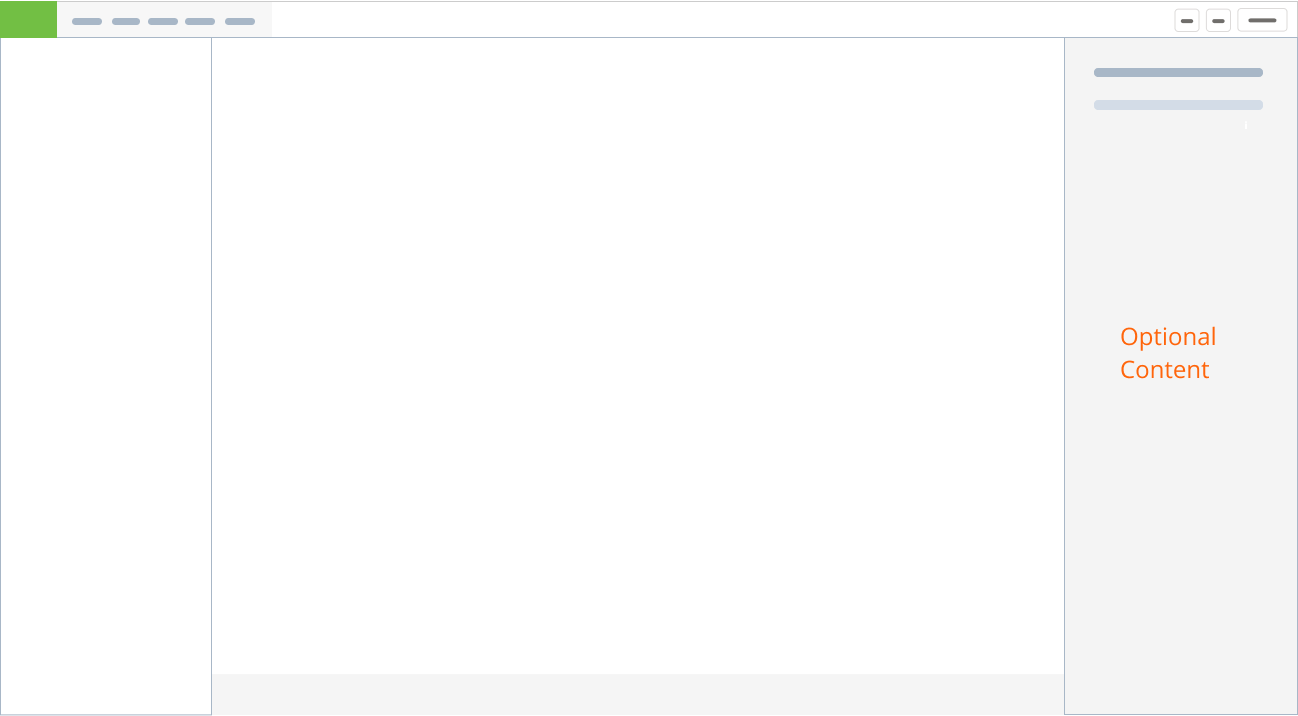
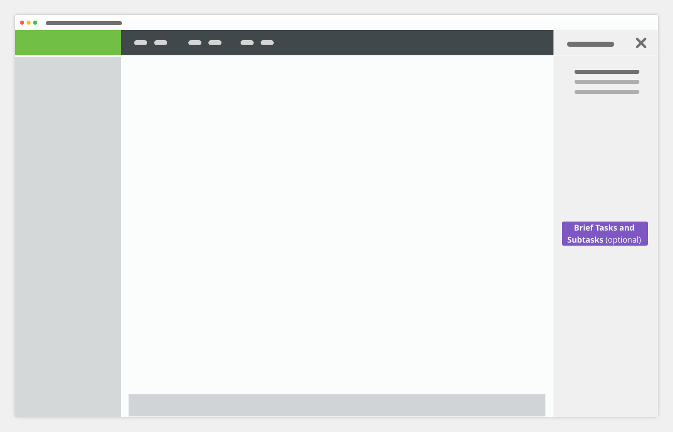
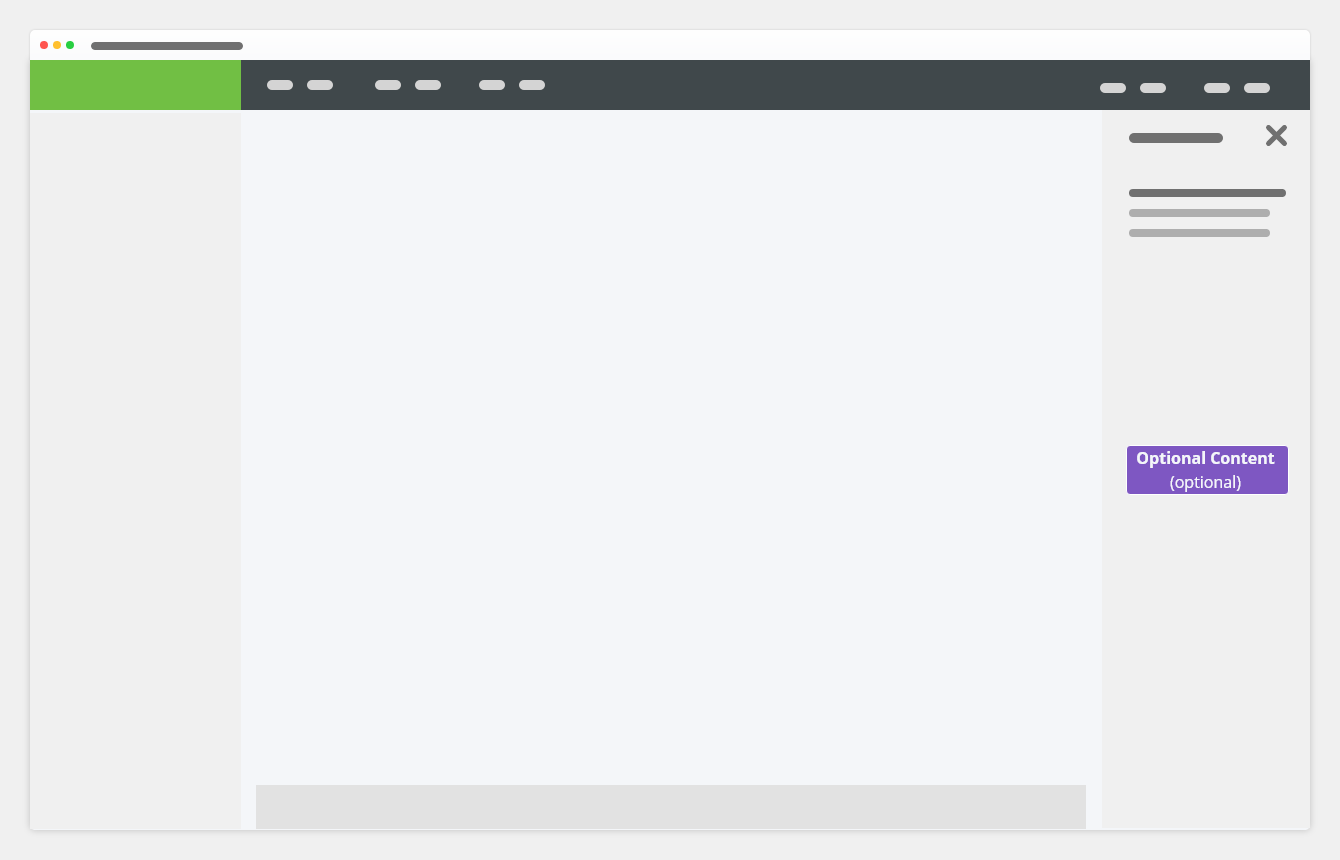
Right Panel
Right Panel (Optional)
Right UI Shell Sidebar
Depricated : do not use
Usage: Display an optional content in the following cases:
- while interacting with other applications or templates (editors)
- while displaying additional information of a selected object in the main content or a canvas content (master detail pattern)
- content related to tasks, not limited to a currently selected object
Parameters:
- reflow (pushing the content): yes
- visibility: collapsible – panel is invoked by toggle button
- resizable: no
Footer (Optional)
Usage: For copyright or actions that apply to the whole page.
Attachments:
 Desktop-(-_1280px)-(2).jpg (image/jpeg)
 Group 3 (2).png (image/png)
 Group 3 (1).png (image/png)
 right.png (image/png)
 Group 2 (5).png (image/png)
 Group 3.png (image/png)
 grid.jpg (image/jpeg)
 header01.jpg (image/jpeg)
Untitled-3jj.jpg (image/jpeg)
breadcrumb.jpg (image/jpeg)
header01.jpg (image/jpeg)
Untitled-3jj.jpg (image/jpeg)
breadcrumb.jpg (image/jpeg)
 Group 6 (1).png (image/png)
 Group 6.png (image/png)
 Group 3 (3).png (image/png)
 Group 2 (7).png (image/png)
 Group 2 (6).png (image/png)
 Group 2 (2).png (image/png)
 Group 2 (17).png (image/png)
 Default header (2).png (image/png)
 Default header (1).png (image/png)
 image2019-9-13_10-9-47.png (image/png)
 Group 2.1 (3).png (image/png)
 Group 5 (1).png (image/png)
 Group 4 (2).png (image/png)
 Group 2.1 (2).png (image/png)
 Group 2 (16).png (image/png)
 Group 5.png (image/png)
 Group 4 (1).png (image/png)
 right (8).png (image/png)
 right (7).png (image/png)
 right (6).png (image/png)
 Group 3 (9).png (image/png)
 Group 3 (8).png (image/png)
 Group 3 (7).png (image/png)
 right (5).png (image/png)
 right (4).png (image/png)
 right (3).png (image/png)
 right (2).png (image/png)
 right (1).png (image/png)
 Group-2-(14).jpg (image/jpeg)
 image2019-9-12_9-2-40.png (image/png)
 Group (29).png (image/png)
 Desktop-(-_1280px)-(1).png (image/png)
 grid.png (image/png)
 app-frame.png (image/png)
 layout-component.png (image/png)
 appframe.png (image/png)
 Group (22).png (image/png)
 Group (21).png (image/png)
 Group (20).png (image/png)
 XXXL_ 1920-2559.png (image/png)
 Group (12).png (image/png)
 device-desktop.png (image/png)
 device-large-desktop.png (image/png)
 device-notebook.png (image/png)
 device-smartphone.png (image/png)
 device-desktop.png (image/png)
 Desktop ( _1280px) (4).png (image/png)
 Desktop ( _1280px) (3).png (image/png)
 image2019-10-18_14-26-37.png (image/png)
 image2019-10-18_14-27-20.png (image/png)
 image2019-10-18_14-31-16.png (image/png)
 image2019-10-18_14-33-46.png (image/png)
 Desktop-(-_1280px)-(4).png (image/png)
 image2019-10-18_15-0-50.png (image/png)
 image2019-10-29_8-11-45.png (image/png)
 Group 3 (3).png (image/png)
 footer.png (image/png)
 image2019-11-6_9-46-37.png (image/png)
 Group 2 (1).png (image/png)
 Group 3 (4).png (image/png)
 Group 2 (4).png (image/png)
 Group 2 (5).png (image/png)
 Fullscreen layout.png (image/png)
 Left panels Fullscreen layout.png (image/png)
 Left UI Shell sidebar Two-column layout.png (image/png)
 Left panels Fullscreen layout.png (image/png)
 Right panel.png (image/png)
 Group 4 (1).svg (image/svg+xml)
 Group 4 (1).png (image/png)
 Application layout.png (image/png)
 Drawer - Side modal_main-content.png (image/png)
 Fullscreen layout.png (image/png)
 grid.png (image/png)
 horizontal_grid.png (image/png)
 Left panels Fullscreen layout.png (image/png)
 Left UI Shell sidebar Two-column layout.png (image/png)
 Mockup_basic.png (image/png)
 Right panel.png (image/png)
 Two-column layout.png (image/png)
 Fullscreen layout.png (image/png)
 Two-column layout.png (image/png)
 Full-screen dialog header.png (image/png)
Default Application header.png (image/png)
Left UI Shell sidebar Two-column layout.png (image/png)
Full-screen dialog header.png (image/png)
Default Application header.png (image/png)
Left UI Shell sidebar Two-column layout.png (image/png)
 Left panels Fullscreen layout.png (image/png)
 Right panel.png (image/png)
 Drawer - Side modal.png (image/png)
 footer.png (image/png)
 grid.png (image/png)
 application-layout.png (image/png)
 application-layout.png (image/png)
 application-layout.png (image/png)
 fullsceen-layout.png (image/png)
 fullsceen-layout.png (image/png)
 drawer-side-modal-main-content.png (image/png)
 left-ui-shell-sidebar-two-column-layout.png (image/png)
 left-panels-fullscreen-layout.png (image/png)
 drawer-side-modal.png (image/png)
 drawer-side-modal-main-content.png (image/png)
 image2020-8-19_14-32-13.png (image/png)
 two-column-layout.png (image/png)
 layout-content-with-header.png (image/png)
 layout-content-with-actions-left.png (image/png)
 layout-content-with-actions-right.png (image/png)
 layout-content-with-footer.png (image/png)
 image2020-11-5_13-1-55.png (image/png)
 layout-title.png (image/png)
layouts-application.png (image/png)
layout-content-with-header.png (image/png)
layout-content-with-footer.png (image/png)
layout-content-with-actions-left.png (image/png)
layout-content-with-actions-right.png (image/png)
layouts-fullsceen.png (image/png)
layouts-two-column.png (image/png)
layouts-drawer-side-modal-main-content.png (image/png)
layout-title.png (image/png)
layouts-application.png (image/png)
layout-content-with-header.png (image/png)
layout-content-with-footer.png (image/png)
layout-content-with-actions-left.png (image/png)
layout-content-with-actions-right.png (image/png)
layouts-fullsceen.png (image/png)
layouts-two-column.png (image/png)
layouts-drawer-side-modal-main-content.png (image/png)
 layouts-left-ui-shell-sidebar-two-column.png (image/png)
layouts-left-panels-fullscreen.png (image/png)
layouts-right-panel.png (image/png)
layouts-drawer-side-modal-main-content.png (image/png)
layouts-left-ui-shell-sidebar-two-column.png (image/png)
layouts-left-panels-fullscreen.png (image/png)
layouts-right-panel.png (image/png)
layouts-drawer-side-modal-main-content.png (image/png)
 layouts-drawer-side-modal-main-content.png (image/png)