A grid allows consistent layout that dynamically changes based on the size of the screen.
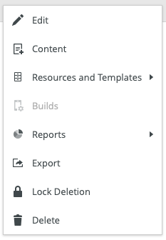
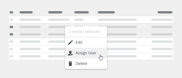
Component Status
 Design Kit: NOT RELEASED
 Bobwai component: bobwai--columns RELEASED

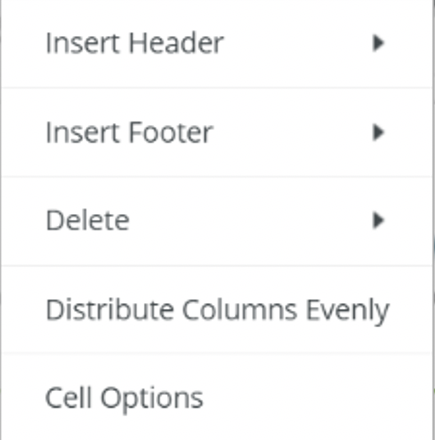
Usage
Responsive 12 unit grid with percentage-based columns and fixed margins and gutters is used to adjust our screens to fit content within the available screen space.
Rather than designing to specific screen sizes, use responsive design that presents a fluid approach that makes the most of available screen space on any device.
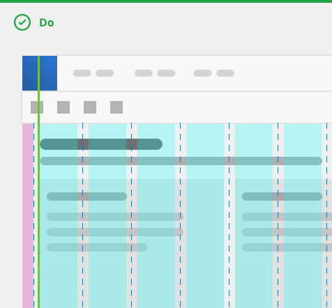
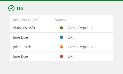
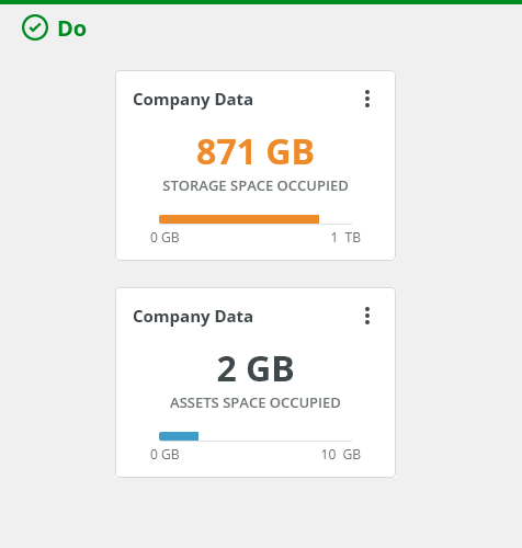
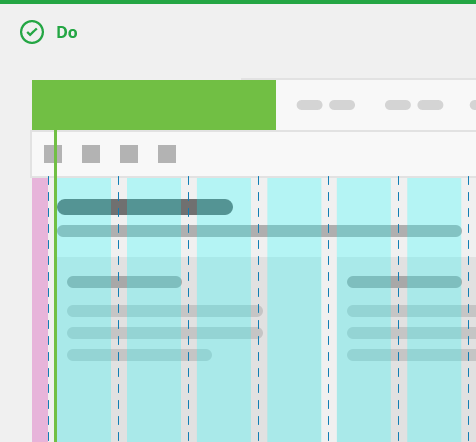
Do align components within containers to the columns.
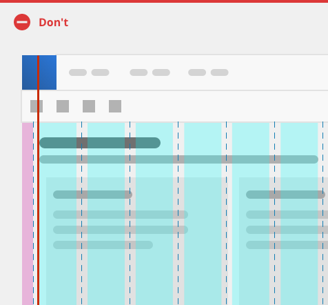
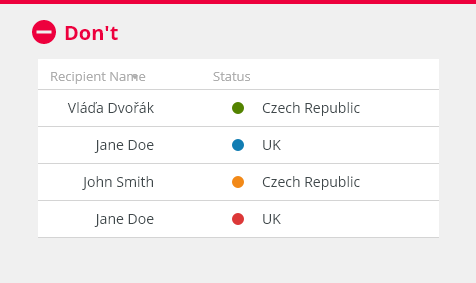
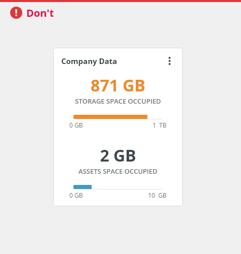
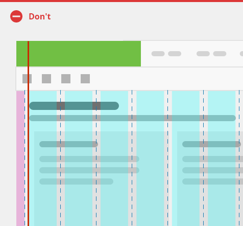
Do not aling type into the gutter.
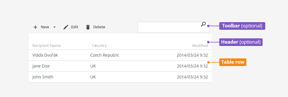
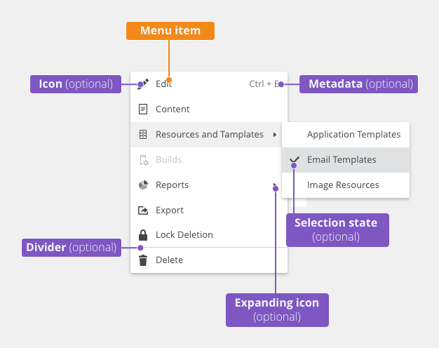
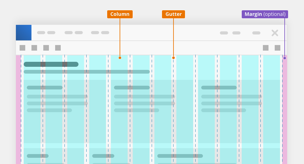
Anatomy

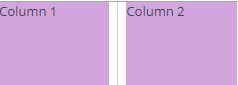
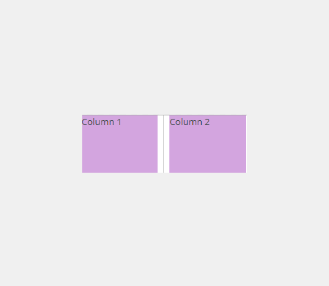
- Column - Responsive grid contains 12 columns.
- Gutter - Gutters are the gaps between the columns. Gutter widths are fixed values (16 px, 24 px, etc.) based on breakpoints.
- Margin (optional) - Margins are spaces on both sides of the grid.
Types
Fluid
Percentage-based column widths, gutters and margins remain constant in size.

Fixed
Layout of the page is constrained by fixed pixel based on the maximum width.
Suitable for content-specific pages like forms and for maximum readability of the page content in large and high-definition screens.

Variants
Separator

Offset
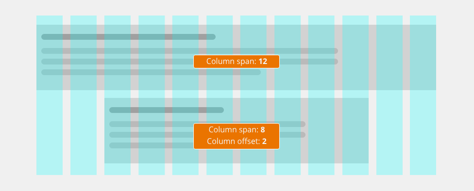
The page content can occupy a smaller region in the center of the page. Offset of 2 columns on both sides of the 12 column layout will result in an 8 column layout.
Examples
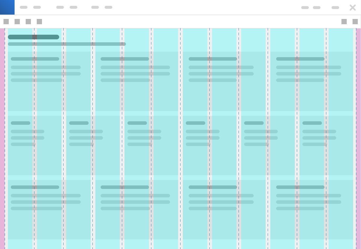
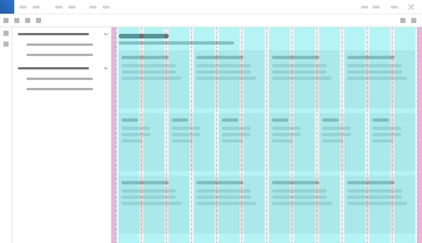
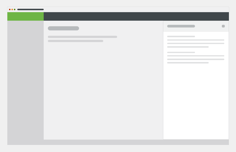
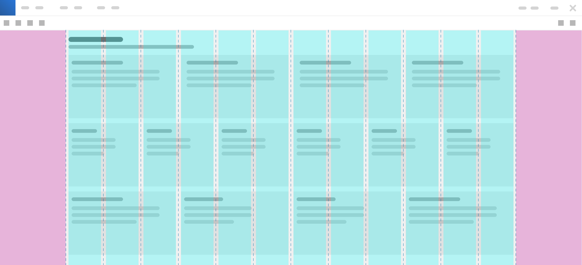
Dashboard
Fluid grid - up to 1440px.
Fixed grid - 1440px or larger.

2-Column Layout
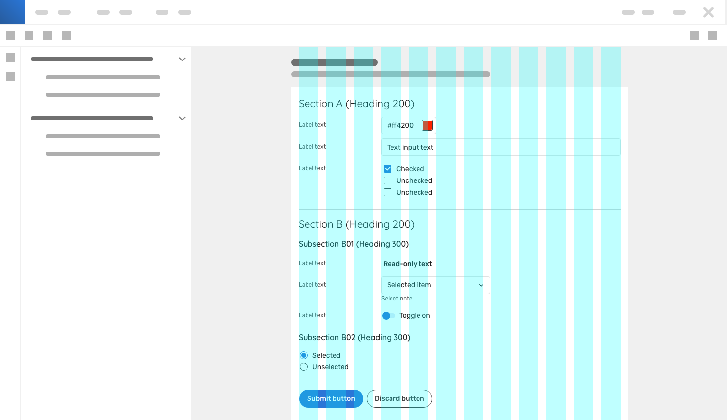
Forms
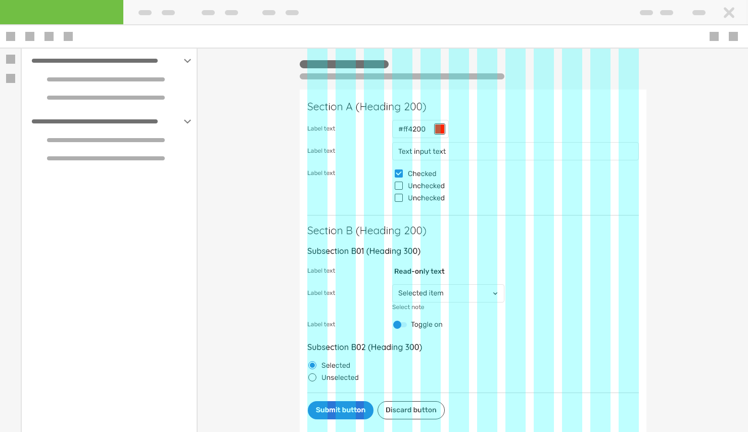
Widths of forms are controlled by a fixed grid. For example: Ratio of 3 columns for label and 9 columns for inputs. Read more about usage of grids in forms.
Breakpoints
| Device | Breakpoint | # of cols | Gutter width | |
|
Mobile |
0px or larger | 4 | Gutters 16px | |
|
Tablet |
736px or larger |
8 | Gutters 16px | |
|
Desktop |
1280px or larger | 12 | Gutters 16px ? | |
|
Large Desktop |
1440px or larger |
12 | Gutters 16px ? | |


Attachments:
 image2020-12-30_10-54-24.png (image/png)
 image2020-12-30_10-54-13.png (image/png)
 image2020-12-30_10-54-2.png (image/png)
 image2020-12-30_10-53-40.png (image/png)
 image2020-12-30_10-53-21.png (image/png)
 image2020-12-30_10-53-14.png (image/png)
 image2020-12-30_9-23-12.png (image/png)
 image2020-12-30_9-22-0.png (image/png)
 image2020-12-30_9-21-34.png (image/png)
 image2020-12-30_9-20-55.png (image/png)
 image2020-12-30_9-20-27.png (image/png)
 image2020-12-30_9-1-9.png (image/png)
 image2020-12-30_9-0-57.png (image/png)
 image2020-12-30_9-0-47.png (image/png)
 image2020-12-30_8-58-33.png (image/png)
 image2020-12-30_8-57-28.png (image/png)
 image2020-12-30_8-47-39.png (image/png)
 image2020-12-9_10-17-2.png (image/png)
 image2019-11-22_9-40-18.png (image/png)
 image2019-11-22_13-37-58.png (image/png)
 image2020-12-21_10-17-18.png (image/png)
 image2020-12-21_10-17-7.png (image/png)
 image2020-12-21_10-16-58.png (image/png)
 image2020-12-21_10-12-35.png (image/png)
 image2020-12-21_10-6-52.png (image/png)
 image2020-12-21_9-41-3.png (image/png)
 image2019-11-22_12-53-40.png (image/png)
 image2020-10-20_14-36-2.png (image/png)
 image2019-11-22_12-49-3.png (image/png)
 image2020-12-1_10-59-46.png (image/png)
 image2020-12-1_10-57-28.png (image/png)
 image2020-12-1_10-57-14.png (image/png)
 image2020-12-1_10-56-37.png (image/png)
 image2020-11-30_14-32-1.png (image/png)
 image2020-11-30_14-17-56.png (image/png)
 image2020-11-30_14-8-32.png (image/png)
 image2020-11-30_14-3-56.png (image/png)
 image2020-11-27_15-46-5.png (image/png)
 image2020-11-27_15-19-14.png (image/png)
 image2020-11-27_15-14-27.png (image/png)
 image2020-11-27_15-4-12.png (image/png)
 image2020-11-27_15-3-39.png (image/png)
 image2020-11-27_12-24-3.png (image/png)
 image2020-11-27_12-20-20.png (image/png)
 image2020-11-27_12-13-3.png (image/png)
 image2020-11-27_10-59-3.png (image/png)
 image2020-11-27_9-53-18.png (image/png)
 image2020-10-5_10-17-0.png (image/png)
 image2020-10-5_10-25-57.png (image/png)
 image2020-10-5_10-26-24.png (image/png)
 image2020-10-5_10-26-47.png (image/png)
 image2020-10-2_15-23-33.png (image/png)
 image2020-10-2_13-45-41.png (image/png)
 image2020-10-2_13-46-8.png (image/png)
 image2020-10-5_10-52-58.png (image/png)
 image2020-10-5_10-53-29.png (image/png)
 image2020-10-5_10-54-33.png (image/png)
 image2020-10-5_10-54-40.png (image/png)
 image2020-10-5_10-55-2.png (image/png)
 image2020-10-5_11-37-46.png (image/png)
 image2020-10-2_14-20-45.png (image/png)
 image2020-10-2_14-21-11.png (image/png)
 image2020-10-2_14-20-58.png (image/png)
 image2020-10-2_14-21-26.png (image/png)
 image2020-10-2_14-33-47.png (image/png)
 image2020-10-2_14-34-9.png (image/png)
 image2020-10-2_14-25-18.png (image/png)
 image2020-10-2_14-25-33.png (image/png)
 image2020-10-2_14-42-44.png (image/png)
 image2020-10-23_15-38-49.png (image/png)
 image2020-10-26_13-21-57.png (image/png)
 image2020-10-26_13-22-16.png (image/png)
 image2020-10-26_13-22-55.png (image/png)
 image2020-10-26_13-24-0.png (image/png)
 image2020-10-26_13-26-26.png (image/png)
 textarea-style@2x.png (image/png)
 textarea@2x.png (image/png)
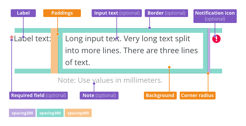
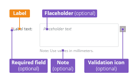
 text-area-anatomy.png (image/png)
 text-area-label-vertical.png (image/png)
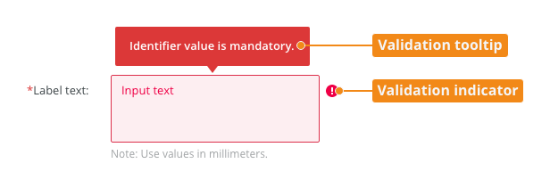
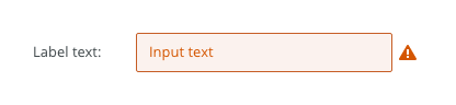
 text-area-validation.png (image/png)
 text-area-style.png (image/png)
 text-area-label-horizontal.png (image/png)
 text-area-state-selected.png (image/png)
 text-area-state-disabled.png (image/png)
 text-area-state-readonly.png (image/png)
 text-area-state-focus.png (image/png)
 text-input-density-small.png (image/png)
 text-area-density-default.png (image/png)
 text-area-density-small.png (image/png)
 text-input-variants-warning-icon.png (image/png)
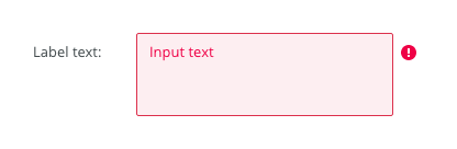
 text-area-variants-error-icon.png (image/png)
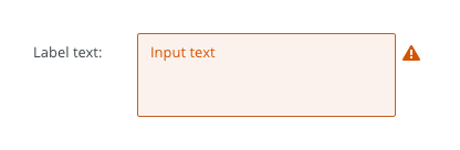
 text-area-variants-warning-icon.png (image/png)
 image2020-11-2_9-24-56.png (image/png)
 image2020-11-2_9-26-14.png (image/png)
 image2020-11-2_9-26-30.png (image/png)
 Screenshot 2020-11-16 at 15.01.07.png (image/png)
 Screenshot 2020-11-16 at 14.58.54.png (image/png)
 Screenshot 2020-11-16 at 15.09.35.png (image/png)
 Screenshot 2020-11-16 at 15.19.01.png (image/png)
 Screenshot 2020-11-16 at 15.22.41.png (image/png)
 Screenshot 2020-11-18 at 12.49.34.png (image/png)
 Screenshot 2020-11-18 at 13.11.11.png (image/png)
 Screenshot 2020-11-18 at 13.22.39.png (image/png)
 Screenshot 2020-11-16 at 13.53.55.png (image/png)
 Screenshot 2020-11-19 at 08.14.25.png (image/png)
 Screenshot 2020-11-19 at 08.14.34.png (image/png)
 Screenshot 2020-11-18 at 13.08.21.png (image/png)
 Screenshot 2020-11-18 at 13.08.05.png (image/png)
 Screenshot 2020-11-19 at 09.57.10.png (image/png)
 Screenshot 2020-11-20 at 14.27.17.png (image/png)
 context-menu-anatomy.png (image/png)
 Context-menu-type-basic.png (image/png)
 Context-menu-type-multilevel.png (image/png)
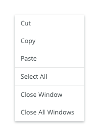
 Context-menu-variants-text-only.png (image/png)
 Context-menu-variants-text-icons.png (image/png)
 Context-menu-variants-with-title.png (image/png)
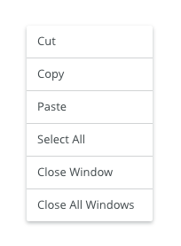
 Context-menu-groups.png (image/png)
 Context-menu-states-disabled.png (image/png)
 Context-menu-do-short.png (image/png)
 Context-menu-dont-short.png (image/png)
 Context-menu-do-groups.png (image/png)
 Context-menu-dont-groups.png (image/png)
 Layout-example-dashboard – 1.png (image/png)
 grid-anatomy.png (image/png)
 Grid-offset-layouts.png (image/png)
 Layout-example-dashboard – 2.png (image/png)
 Layout-example-dashboard – 1.png (image/png)
 Layout-example-dashboard – 3.png (image/png)
 image2020-9-30_13-13-53.png (image/png)
 device-smartphone.png (image/png)
device-desktop.png (image/png)
device-notebook.png (image/png)
device-large-desktop.png (image/png)
image2021-1-11_15-14-23.png (image/png)
device-smartphone.png (image/png)
device-desktop.png (image/png)
device-notebook.png (image/png)
device-large-desktop.png (image/png)
image2021-1-11_15-14-23.png (image/png)
 image2021-1-13_12-48-55.png (image/png)
 image2021-1-28_18-5-54.png (image/png)
 image2021-1-28_18-6-19.png (image/png)
 image2021-1-28_18-8-10.png (image/png)
 image2021-1-28_18-8-24.png (image/png)
 Card - DO.png (image/png)
 Card - DONT.png (image/png)
 image2021-1-29_11-13-13.png (image/png)
 image2021-1-29_11-13-25.png (image/png)
 Grid-do.png (image/png)
Grid-dont.png (image/png)
grid-anatomy.png (image/png)
Grid-do.png (image/png)
Grid-dont.png (image/png)
grid-anatomy.png (image/png)
 grid-anatomy.png (image/png)
Grid-type-fixed.png (image/png)
grid-anatomy.png (image/png)
Grid-type-fixed.png (image/png)
 Grid-type-fluid.png (image/png)
Grid-type-fixed.png (image/png)
Grid-variants-separator.png (image/png)
Grid-offset-layouts.png (image/png)
Layout-example-m-dashboard.png (image/png)
Layout-example-l-dashboard.png (image/png)
Grid-type-fluid.png (image/png)
Grid-type-fixed.png (image/png)
Grid-variants-separator.png (image/png)
Grid-offset-layouts.png (image/png)
Layout-example-m-dashboard.png (image/png)
Layout-example-l-dashboard.png (image/png)
 Layout-example-with-panel.png (image/png)
Layout-example-form.png (image/png)
Layout-example-l-dashboard.png (image/png)
Layout-example-with-panel.png (image/png)
Layout-example-form.png (image/png)
Layout-example-l-dashboard.png (image/png)
 Layout-example-l-dashboard.png (image/png)
grid-title.png (image/png)
Layout-example-l-dashboard.png (image/png)
grid-title.png (image/png)