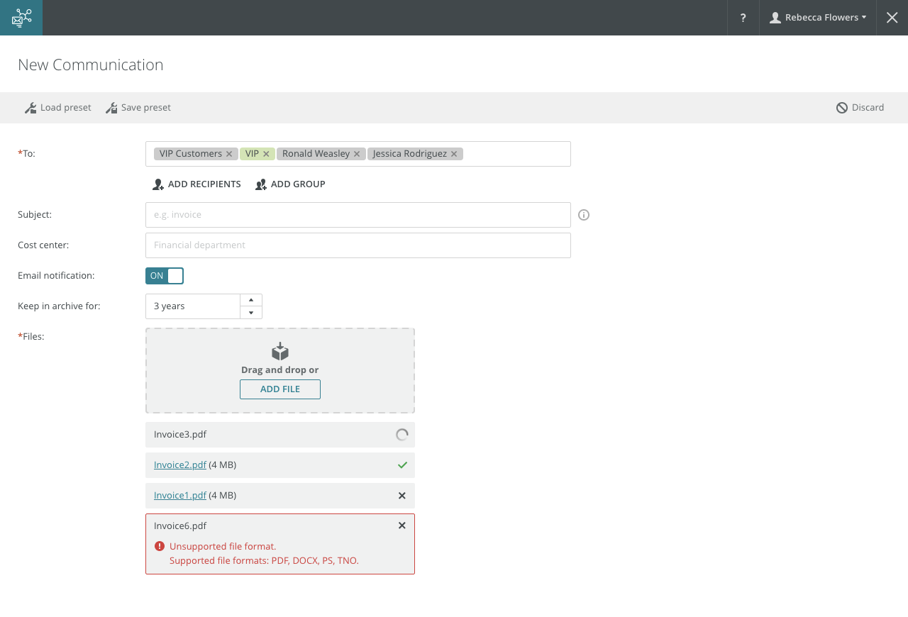
File inputs allow users to add a single file or multiple files to the system.
Component Status
 Design Kit: NOT RELEASED
 Bobwai component: bobwai--file-selection NOT RELEASED
Usage
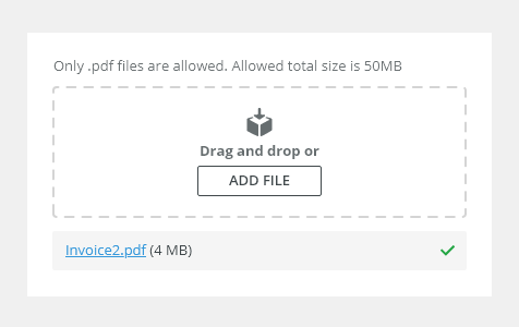
For adding user content, like data files or images, to the system (remote storage). Typically used within forms.
Single File

Multiple Files

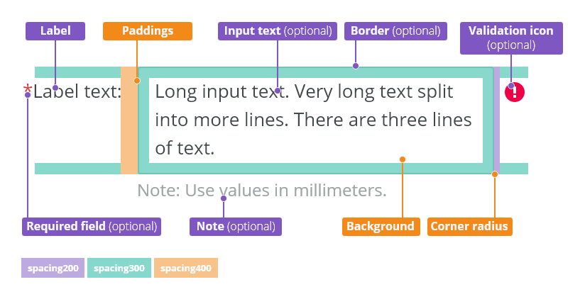
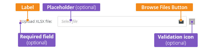
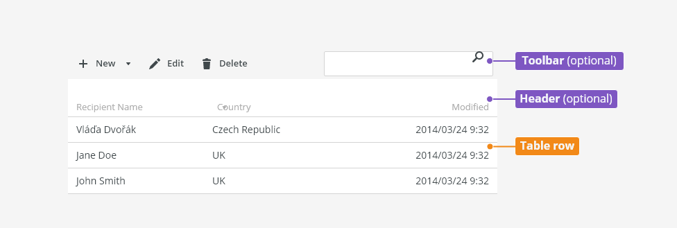
Anatomy
Single File
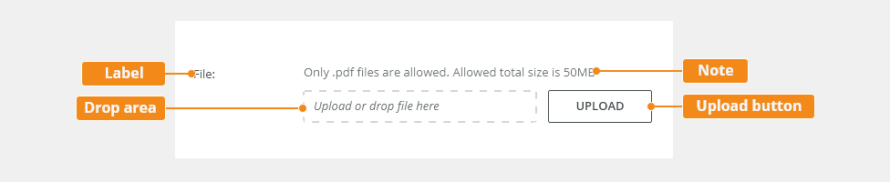
- Label - Labels can be placed either on top or on the side of the field, depending on the alignment of the form.
- Upload button - The button which opens the Open File dialog upon clicking.
- Note - A permanent recommendation, file restrictions (e.g. formats, size).
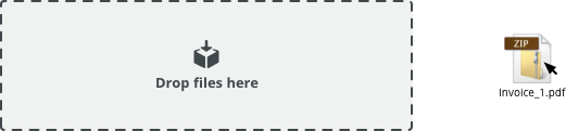
- Drop area - The area where the file can be dropped.
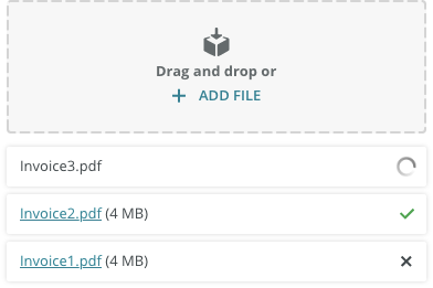
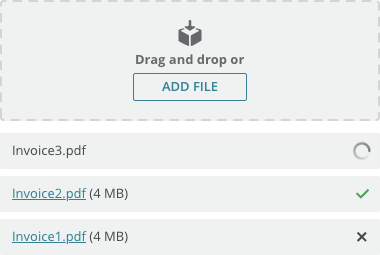
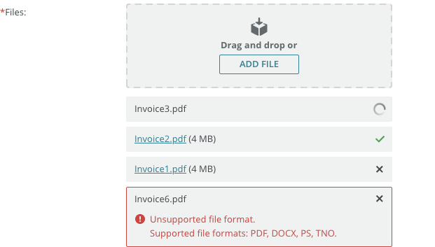
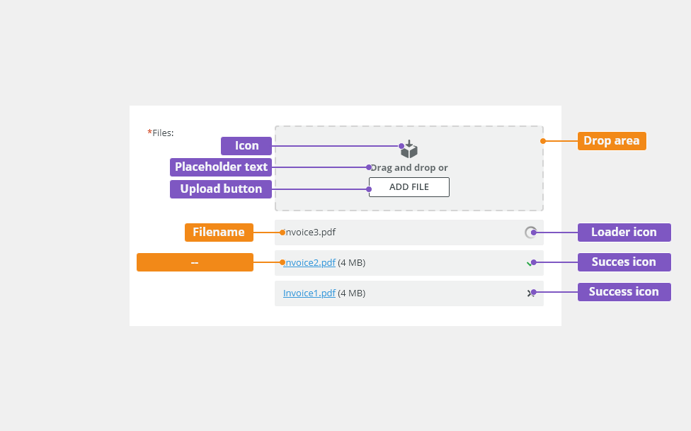
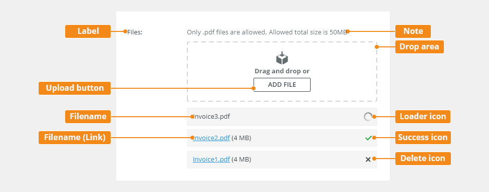
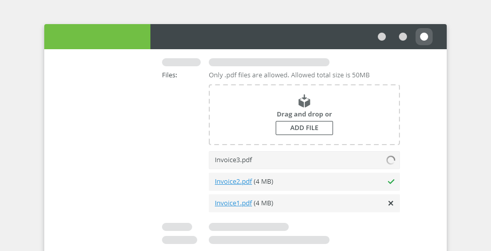
Multiple Files

- Label - Labels can be placed either on top or on the side of the field, depending on the alignment of the form.
- Note - A permanent recommendation, file restrictions (e.g. formats, size).
- Drop area - The area where the file(s) can be dropped.
- Upload button - The button which opens the Open File dialog upon clicking.
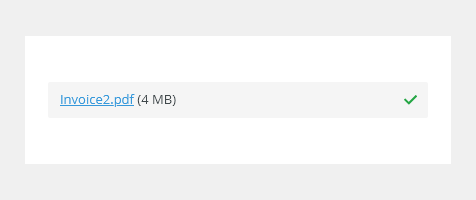
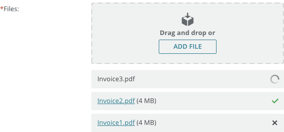
- Filename - The name of the file that is being uploaded.
- Filename (link) - The name of the file which can be opened/downloaded.
- Loader/success/delete icon
Types
Single File
Used when users need to upload a single file.

Multiple Files
Used when users need to upload multiple files.
Variants
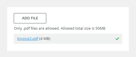
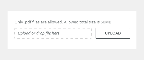
Multiple File Upload - No Drag and Drop
Used when users need to upload multiple files and cannot use the "drag and drop" functionality.
Behavior
Loading States
File Is Ready
The file was uploaded and is ready.

File Is Uploaded
The file was uploaded successfully.
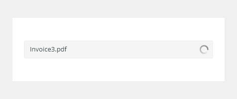
Loading File
The file is loading.
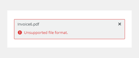
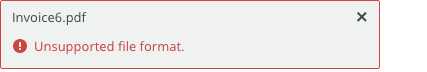
File Is Invalid
The file does not meet the required criteria.
Sorting of Uploaded Files
Add the new file at the top of the list so that users can see that it was uploaded or if there was an error.
Single File - File Change
Once the file is uploaded, the button text Upload changes to Change.
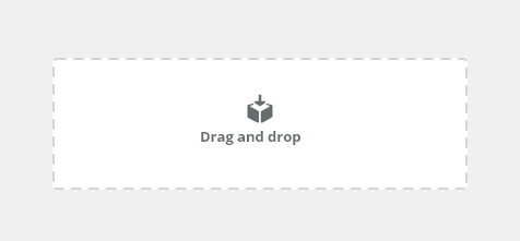
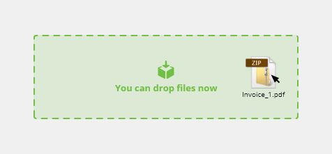
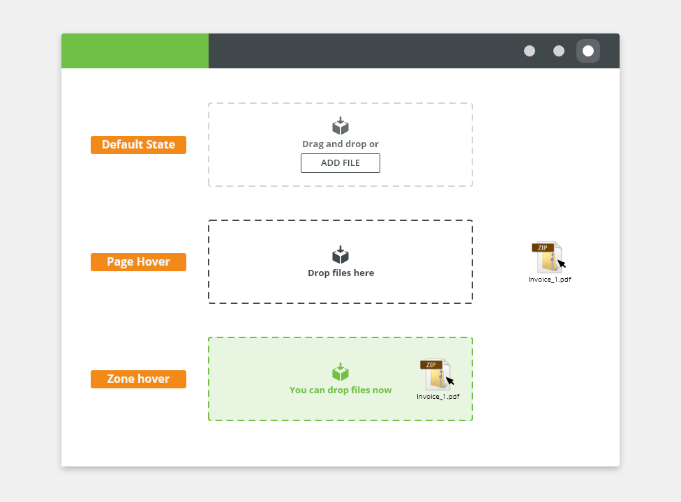
Drag and Drop
Default
Hover over page
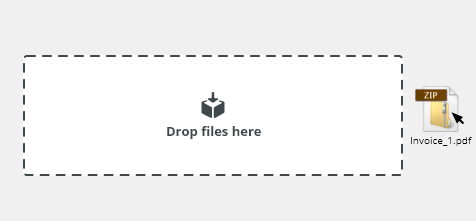
Hover over drop area
Editorial
Use sentence casing for labels and descriptions.
Related Components
- Task queue - bobwai--task-queue
- File Browser - bobwai--file-browser
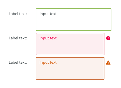
Interactive States
Default
Selected

Disabled

Read-only
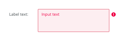
Error (Invalid)
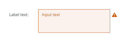
Warning
Focus
| Used In | Type | PX | Token |
|---|---|---|---|
| Text | Color |
|
|
| Background | Color |
|
|
| Border | Color | color-border-400 |
|
| Input Text | Font |
|
|
| Border | Border-width | 1 | border-width-100 |
| Border | Border-radius | 2 | radius-100 |
| Placeholder text | Font | font-placeholder |
|
| Placeholder text | Color | color-text-300 |
|
| Selected | |||
| Border | Color | color-border-500 |
|
| Disabled | |||
| Background | Color | opacity-disabled |
|
| Text | Opacity | opacity-disabled |
|
| Read Only | |||
| Text | Font | read-only |
|
| Border | Border-width | 0 | border-width-none |
| Focus | |||
| Border | Width | 2 | border-width-200 |
| Error | |||
| Background | Color | color-bg-input-error | |
| Border | Color | color-border-error | |
| Text | Color | color-text-error | |
| Validation icon | Color | color-icon-error | |
| Validation icon | Size | sizing-icon-200 | |
| Warning | |||
| Background | Color | color-bg-input-warning | |
| Border | Color | color-border-warning | |
| Text | Color | color-text-warning | |
| Validation icon | Color | color-icon-warning | |
| Validation icon | Size | sizing-icon-200 | |
| Spacing | |||
| Default size padding | Spacing | 8 | spacing-300 |
Default size spacing between icon and text |
Spacing | 4 | spacing-200 |
| Default size space between input and validation icon | Spacing | 4 | spacing-200 |
| Small/condensed size padding | Spacing | 4 | spacing-200 |
Small/condensed size spacing between icon and text |
Spacing | 2 | spacing-100 |
| Small/Condensed size space between input and validation icon | Spacing | 2 | spacing-100 |
Accessibility
- Provide labels and instructions that are clear and concise.
- If the text input is a required field include the
aria-requiredproperty and indicate that it is a required field and use the validation message for input errors. - W3C Web Tutorial: Labeling Controls
- W3C Web Tutorial: Form Instructions
Attachments:
 file_input.png (image/png)
 text-input-density-default.png (image/png)
 text-input-density-small.png (image/png)
 image2020-11-30_14-8-32.png (image/png)
 image2020-11-27_12-13-3.png (image/png)
 image2020-11-27_12-24-3.png (image/png)
 image2020-12-1_10-57-14.png (image/png)
 image2020-12-1_10-59-46.png (image/png)
 image2020-11-30_14-17-56.png (image/png)
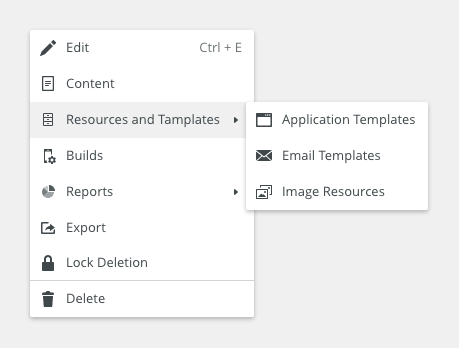
 Context-menu-type-multilevel.png (image/png)
 image2020-11-27_15-19-14.png (image/png)
 image2020-11-27_15-14-27.png (image/png)
 image2020-11-27_15-46-5.png (image/png)
 image2020-11-2_9-26-30.png (image/png)
text-area-label-horizontal.png (image/png)
text-area-state-selected.png (image/png)
text-area-state-disabled.png (image/png)
text-area-state-readonly.png (image/png)
text-area-variants-error-icon.png (image/png)
text-area-variants-warning-icon.png (image/png)
text-area-state-focus.png (image/png)
image2020-11-30_14-3-56.png (image/png)
image2020-11-2_9-26-30.png (image/png)
text-area-label-horizontal.png (image/png)
text-area-state-selected.png (image/png)
text-area-state-disabled.png (image/png)
text-area-state-readonly.png (image/png)
text-area-variants-error-icon.png (image/png)
text-area-variants-warning-icon.png (image/png)
text-area-state-focus.png (image/png)
image2020-11-30_14-3-56.png (image/png)
 image2020-11-30_14-32-1.png (image/png)
 image2020-12-11_10-38-52.png (image/png)
 image2020-12-11_10-48-52.png (image/png)
 image2020-12-11_10-49-39.png (image/png)
 image2020-12-11_10-56-25.png (image/png)
 image2020-12-11_11-5-54.png (image/png)
 image2020-12-11_11-6-21.png (image/png)
 image2020-12-14_14-40-17.png (image/png)
 image2021-1-13_9-55-48.png (image/png)
 image2021-1-13_9-58-47.png (image/png)
 image2021-1-13_9-59-31.png (image/png)
 image2021-1-13_10-2-0.png (image/png)
 image2021-1-13_10-4-25.png (image/png)
 image2021-1-13_10-6-37.png (image/png)
 image2021-1-13_10-6-49.png (image/png)
 image2021-1-13_10-6-59.png (image/png)
 image2021-1-13_10-10-52.png (image/png)
 image2021-1-13_10-13-25.png (image/png)
 image2021-1-13_10-13-45.png (image/png)
 image2021-1-13_10-14-24.png (image/png)
 image2021-1-13_10-15-40.png (image/png)
 image2021-1-13_10-17-34.png (image/png)
 image2021-1-13_10-18-8.png (image/png)
 image2021-1-13_10-19-41.png (image/png)
 image2021-1-13_10-20-4.png (image/png)
 File input - Anatomy.png (image/png)
 File input - Single File.png (image/png)
 File input - Multi File.png (image/png)
 File input - Single File - Anatomy.png (image/png)
 File input - Multi File - Anatomy.png (image/png)
 File input - Single File - Anatomy.png (image/png)
 File input - Multi File - Anatomy.png (image/png)
 File input - Multi File.png (image/png)
 Use - Multifile.png (image/png)
 Use - Multiple no drop.png (image/png)
 Use - Single File.png (image/png)
 State - Loading File.png (image/png)
State - File uploaded.png (image/png)
State - File is ready.png (image/png)
State - File is invalid.png (image/png)
File input - Multi File - Anatomy.png (image/png)
File input - Single File - Anatomy.png (image/png)
File input - Multi File.png (image/png)
File input - Single File.png (image/png)
Use - Multifile.png (image/png)
Use - Multiple no drop.png (image/png)
Use - Single File.png (image/png)
Drag Anatomy.png (image/png)
State - Loading File.png (image/png)
State - File uploaded.png (image/png)
State - File is ready.png (image/png)
State - File is invalid.png (image/png)
File input - Multi File - Anatomy.png (image/png)
File input - Single File - Anatomy.png (image/png)
File input - Multi File.png (image/png)
File input - Single File.png (image/png)
Use - Multifile.png (image/png)
Use - Multiple no drop.png (image/png)
Use - Single File.png (image/png)
Drag Anatomy.png (image/png)
 image2021-1-22_15-39-50.png (image/png)
image2021-1-22_15-40-16.png (image/png)
image2021-1-22_15-41-45.png (image/png)
image2021-1-22_15-39-50.png (image/png)
image2021-1-22_15-40-16.png (image/png)
image2021-1-22_15-41-45.png (image/png)