Combination of an input field and a dropdown with a list of options. Users can select one option or filter.
Component Status
 Design Kit: RELEASED
 Bobwai component: bobwai--combobox RELEASED
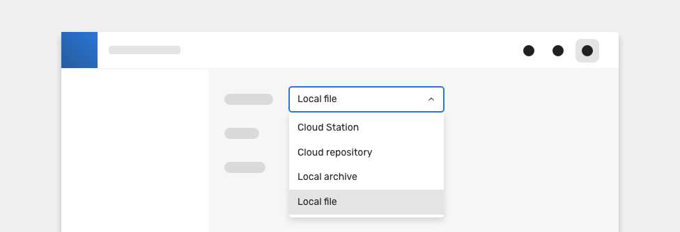
Usage
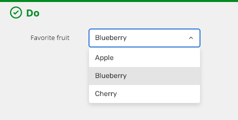
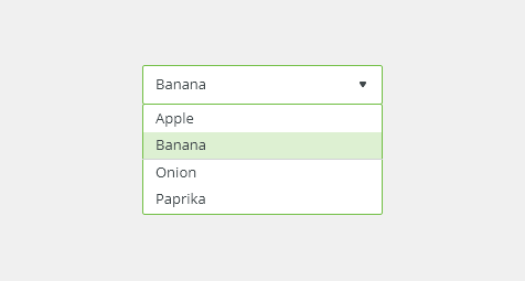
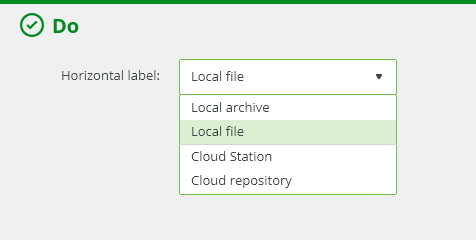
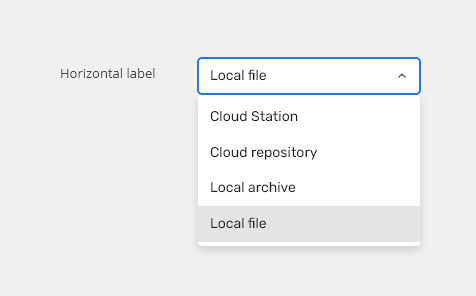
It is recommended to present the options in alphabetical order.

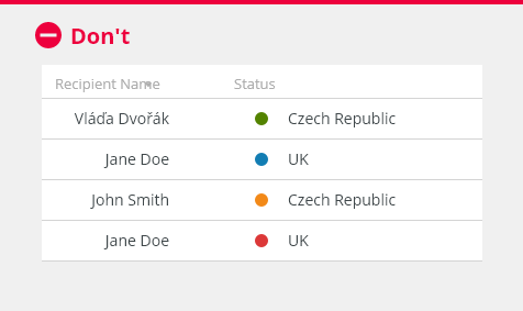
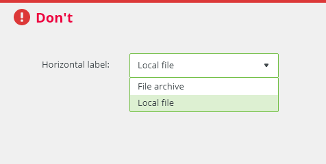
Never use if a user can select just between two options from a list. Radio buttons should be used in that case.
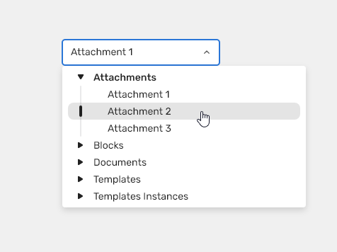
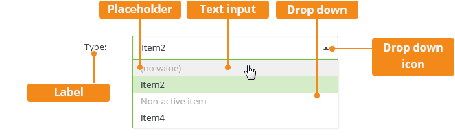
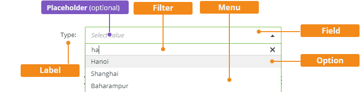
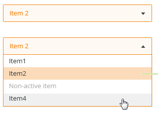
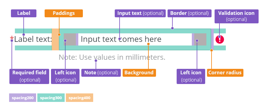
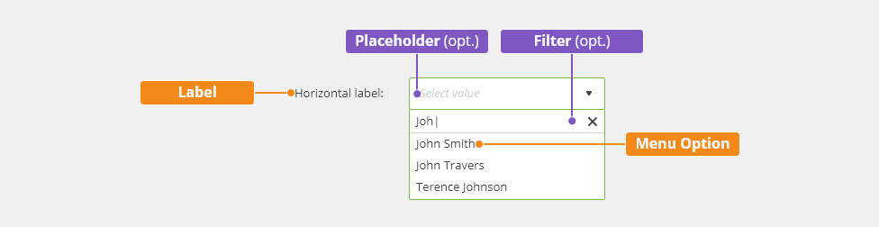
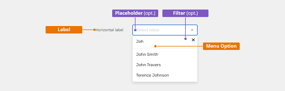
Anatomy
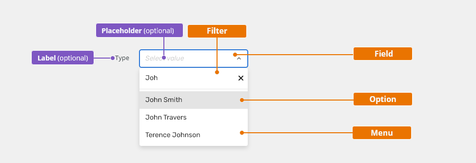
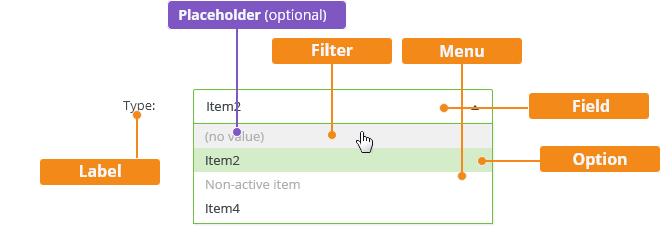
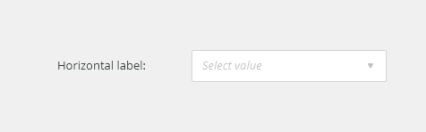
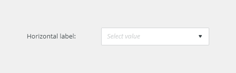
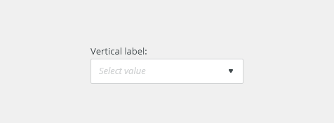
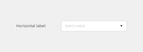
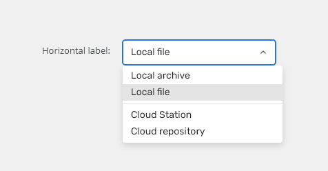
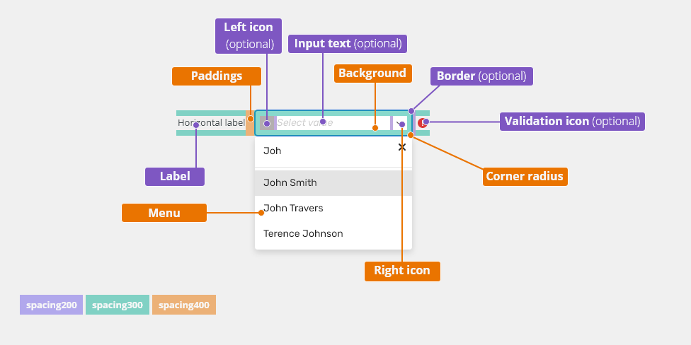
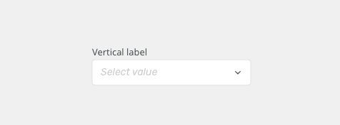
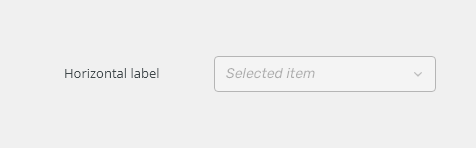
- Label - Labels inform users what to expect in the list of dropdown options. Labels can be placed either on top or to the left side.
- Field
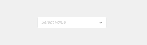
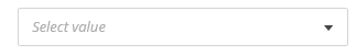
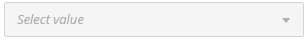
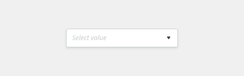
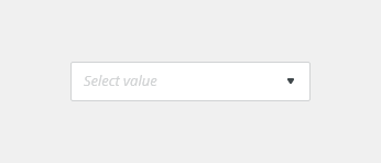
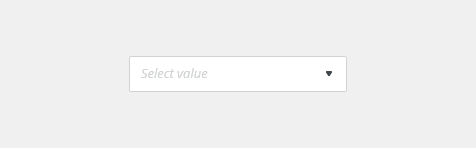
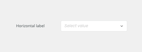
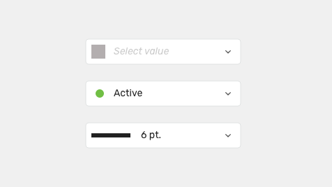
- Placeholder is presented if no selection has been made.
- Dropdown icon.
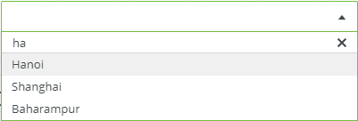
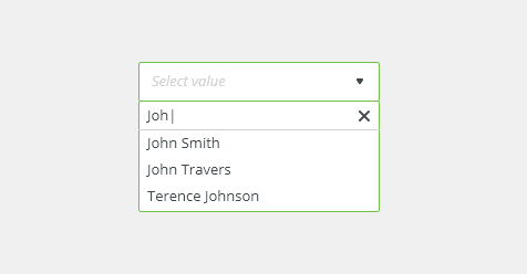
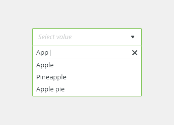
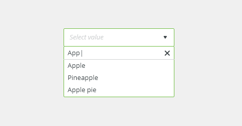
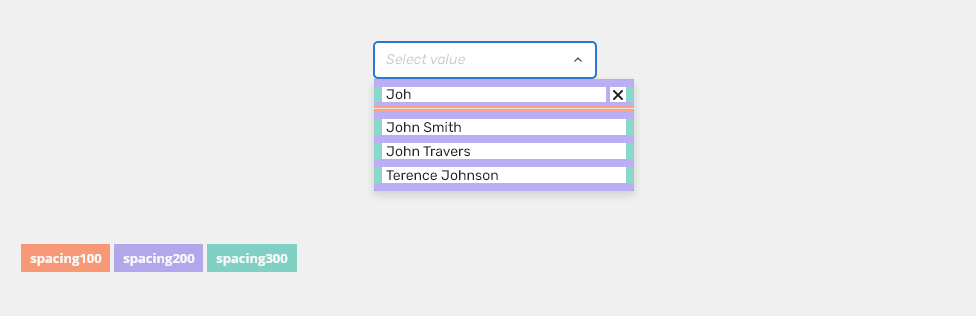
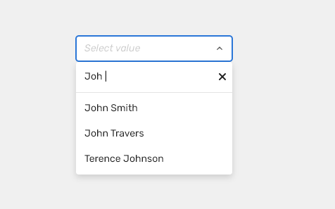
- Filter - Matches the string as characters are typed. The selected value can be cleared with the “x” icon.
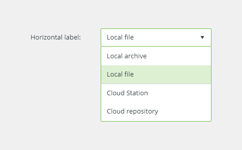
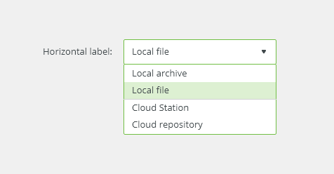
- Menu
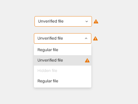
- The list can contain icon signifier which describes the type of input.
- Longer text is truncated by an ellipsis, together with a tooltip to show the whole string on hover.
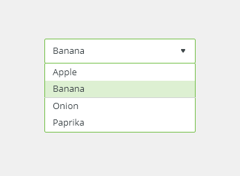
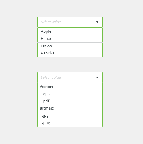
- Option - A list of multiple options to select from a menu. It is recommended to present the options in alphabetical order.
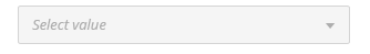
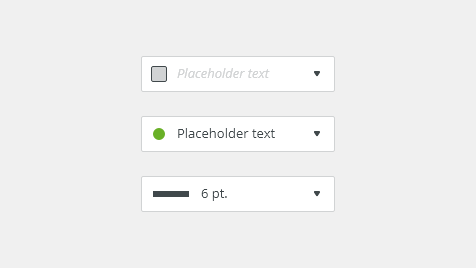
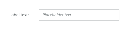
Placeholder
It is recommended to use placeholder so that users understand the purpose.
Read more about writing user assistance in forms.
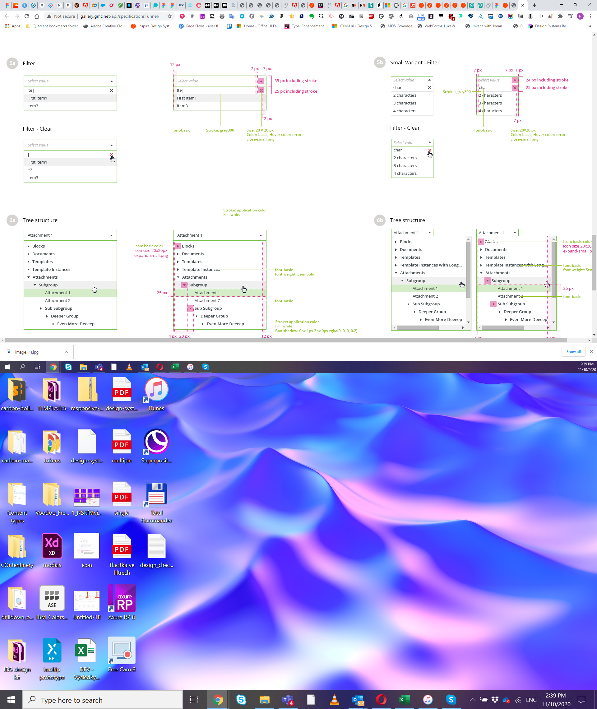
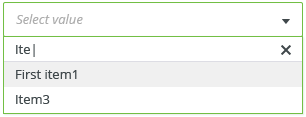
Filter
Filter is by default in every dropdown. It is hidden when dropdown is opened and appears when users star typing.

Menu
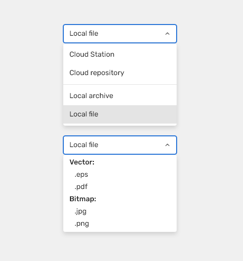
List
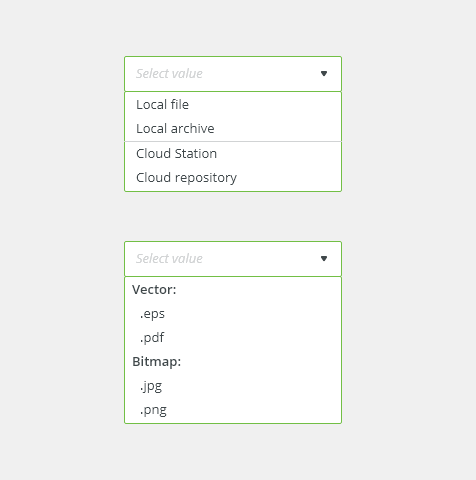
Lists consist of related options vertically grouped together.

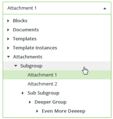
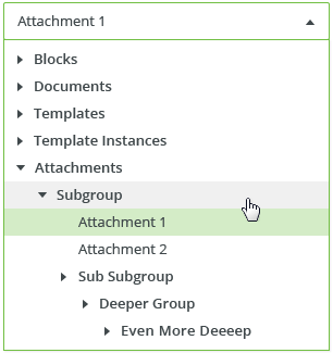
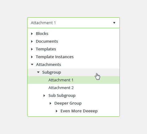
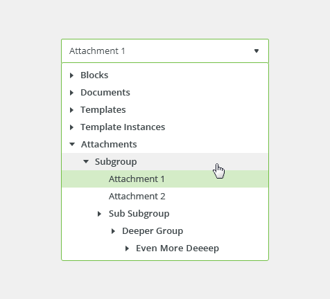
Tree
A tree is a visualization of a structure of parent-child relationship between nodes. Each branch can be expanded or collapsed.
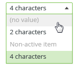
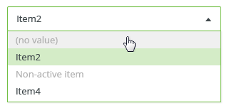
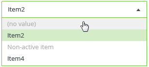
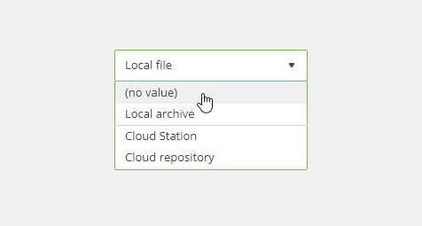
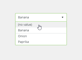
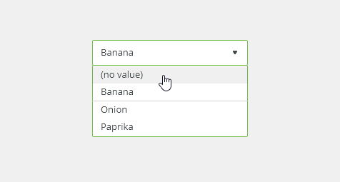
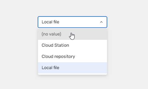
Option with No value (Optional)
For deselecting option from the menu.

Appearance
Alignment
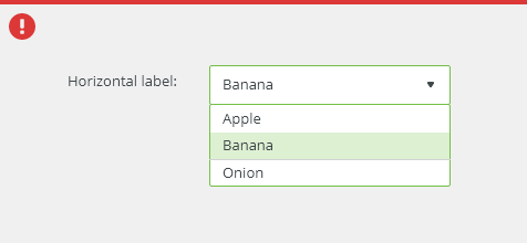
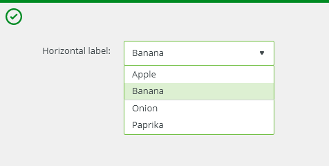
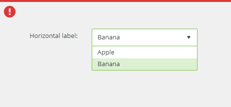
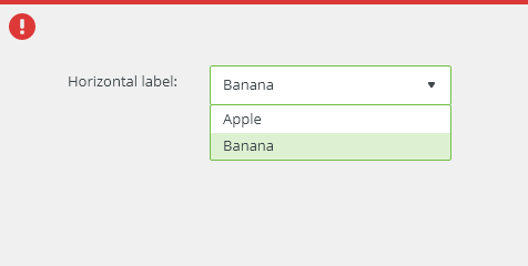
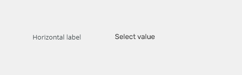
Vertical Alignment

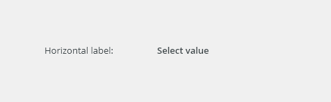
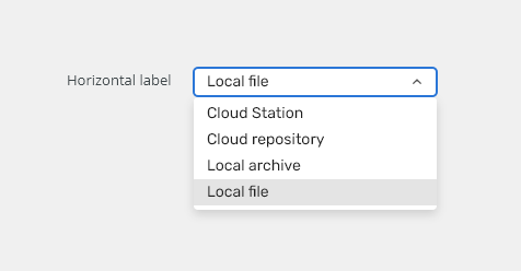
Horizontal Alignment

Density
Use a consistent size of form components on the same page.
Default
Most of the use cases.
Condensed
Technical applications, e.g. Scaler, and places with limited space.

Grouping
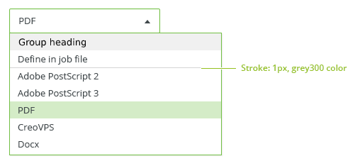
Options within a list can be grouped together with meaningful headings. (Use divider + disabled style for heading.)
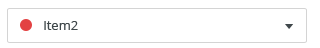
Icons
Icon and text

Width
Field Width
The width of the field should match the length of the expected data input. Widths of fields are predefined by the grid.
Read more about how to use grid in forms.
Menu Width
Menu has minimum width according to its fields and maximum width according to the size of the window.
Behavior
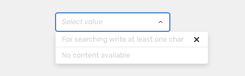
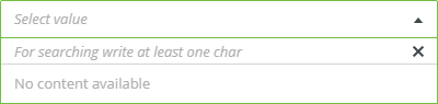
External Filtering
Use ror large amount of data. No data are loaded when dropdown is opened, relevant options will be loaded when user starts typing.
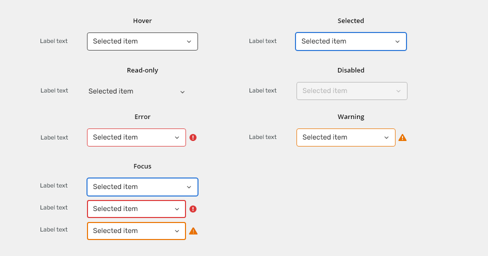
States
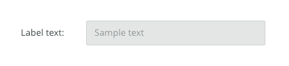
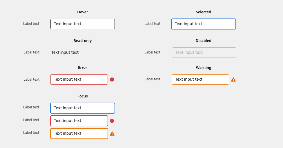
Read-only
Allows for content to be copied, but not interacted with or changed.

Disabled
Cannot be interacted with but remains visible to the user in a disabled visual style.

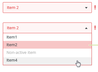
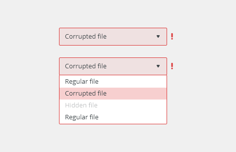
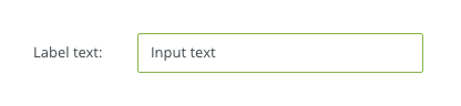
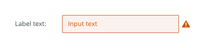
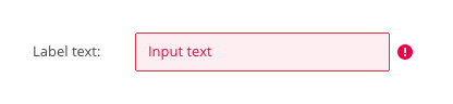
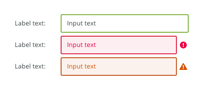
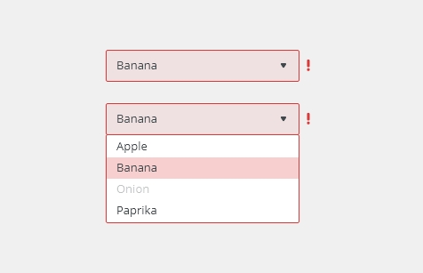
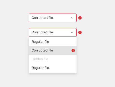
Error
Indicates an error.

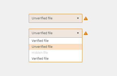
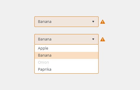
Warning

Validation
Client-side validation - It is recommend to validate the user data before the form submission. Fields are validated upon losing focus.
Typical client error validations are:
- Nothing has been selected.
- Selected option is no longer exist or is invalid
Editorial
- Keep the list items short and concise.
- Labels - Always use a label to describe a dropdown. Use sentence case. Keep the text short and specific.
Keyboard Interactions
| KEY | INTERACTION |
|---|---|
| Typing | If the menu is already open, filtering options in menu. |
The Up and The Down Arrow Key |
If the menu is not yet open, the down arrow opens the menu. Move through selection of options in the menu. |
| Space, Enter | Confirms the option. |
| Esc | If the menu is open, closes the menu. |
Related Components
Radio button - when only one selection from the group is allowed and there are few (e.g. just two) options to choose from.

Menu - List Item
| Used in | Type | px | Token |
|---|---|---|---|
| Input Text | Color |
|
|
| Icons (left and right) | Color | color-icon-100 |
|
| Icons (all) | Object sizes | sizing-icon-200 |
|
| Background | Color |
|
|
| Border | Color | color-border-input |
|
| Input Text | Font |
|
|
| Border | Border-width | 1 | border-width-100 |
| Border | Border-radius | 4 | radius-input-100 |
| Input text (Placeholder) | Font | font-placeholder |
|
| Input text (Placeholder) | Color | color-text-300 |
|
| Label & note | Color | color-text-100 |
|
| Label & note | Font | font-label | |
| Required field (asterisk sign) | Color | color-error |
Interactive States

| Used In | Type | PX | Token |
|---|---|---|---|
| Hover | |||
| Border | Color | color-border-100 |
|
| Selected/Focus | |||
| Border | Color | color-border-500 |
|
| Border | Border-width | 2 | border-width-200 |
| Disabled | |||
| Whole object | Opacity | opacity-disabled |
|
| Whole object | Cursor | cursor: not-allowed; |
|
| Read Only | |||
| Text | Font | font-body |
|
| Border | Border-width | 0 | border-width-none |
| Error | |||
| Background | Color | color-bg-input-error |
|
| Border | Color | color-border-error |
|
| Border (when selected/focused) | Border-width | 2 | border-width-200 |
| Text | Color | color-text-error |
|
| Notification icon | Color | color-icon-error |
|
| Warning | |||
| Background | Color | color-bg-input-warning |
|
| Border | Color | color-border-warning |
|
| Border (when selected/focused) | Border-width | 2 | border-width-200 |
| Text | Color | color-text-warning |
|
| Notification icon | Color | color-icon-warning |
|
Spacing
| Used in | Type | PX | Token |
|---|---|---|---|
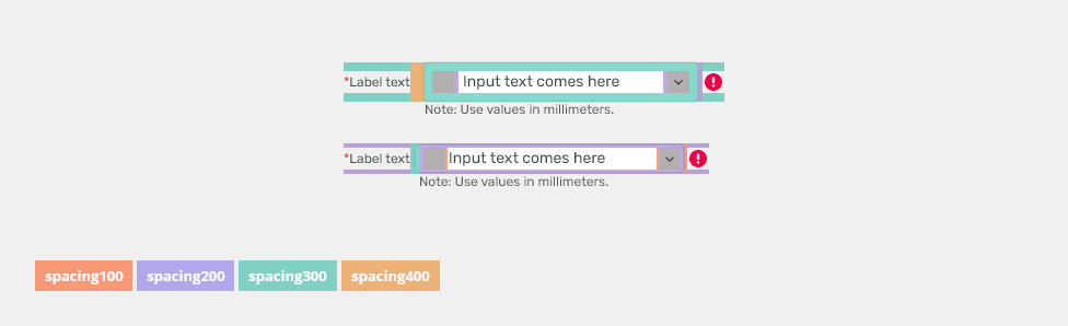
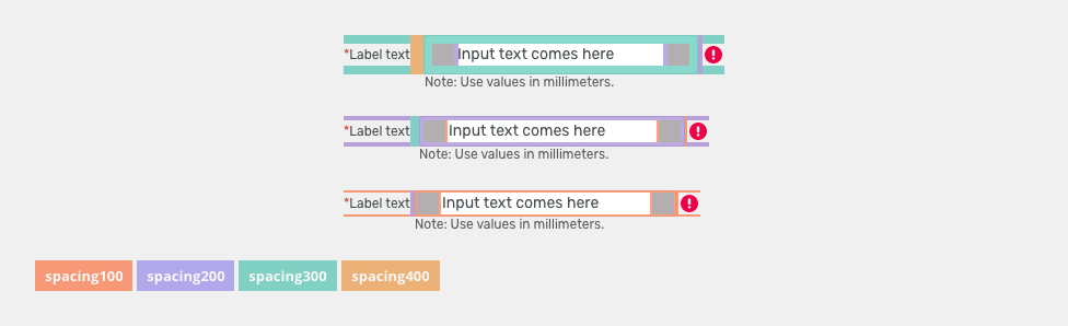
| Default size padding | Spacing | 8 | spacing-300 |
Default size spacing between icon and text |
Spacing | 4 | spacing-200 |
| Default size space between input and notification icon | Spacing | 4 | spacing-200 |
| Small/condensed size padding | Spacing | 4 | spacing-200 |
Small/condensed size spacing between icon and text |
Spacing | 2 | spacing-100 |
| Small/Condensed size space between input and notification icon | Spacing | 2 | spacing-100 |
| XSmall/supercondensed size padding | Spacing | 2 | spacing-100 |
| XSmall/supercondensed size spacing between icon and text | Spacing | 2 | spacing-100 |
| XSmall/supercondensed size space between input and notification icon | Spacing | 2 | spacing-100 |
Accessibility
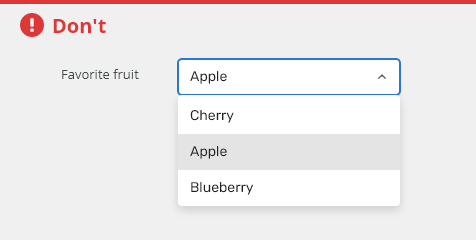
- Avoid very long option names.
- Avoid options that contain headings and interactive elements such as links, buttons, or checkboxes.
- W3C WAI-ARIA Authoring Practices Listbox Design Pattern
Attachments:
 image2020-10-14_10-26-48.png (image/png)
 image2020-10-14_10-27-14.png (image/png)
 image2020-10-14_11-3-44.png (image/png)
 image2020-10-15_11-19-41.png (image/png)
 image2020-10-15_14-5-49.png (image/png)
 image2020-10-15_14-57-59.png (image/png)
 image2020-10-16_9-23-11.png (image/png)
 image2020-11-4_7-3-50.png (image/png)
 image2020-11-4_7-4-54.png (image/png)
 image2020-11-4_7-47-20.png (image/png)
 image2020-11-4_7-47-34.png (image/png)
 image2020-11-4_7-47-50.png (image/png)
 image2020-11-4_8-20-55.png (image/png)
 image2020-11-10_9-39-53.png (image/png)
 image2020-11-10_9-44-15.png (image/png)
 image2020-11-10_10-7-9.png (image/png)
 image2020-11-10_10-7-57.png (image/png)
 image2020-11-10_12-47-44.png (image/png)
 image2020-11-10_13-55-28.png (image/png)
 text-input-state-readonly.png (image/png)
 image2020-11-10_14-24-5.png (image/png)
 image2020-11-10_14-25-39.png (image/png)
 image2020-11-10_14-39-2.png (image/png)
 image2020-11-10_14-40-20.png (image/png)
 image2020-11-10_14-40-35.png (image/png)
 image2020-11-10_14-41-41.png (image/png)
 image2020-11-10_14-42-3.png (image/png)
 image2020-11-10_14-43-20.png (image/png)
 image2020-11-16_9-45-35.png (image/png)
 Dropdown - Placeholder.png (image/png)
 Dropdown - Filter.png (image/png)
 Dropdown - List.png (image/png)
 Dropdown - Tree.png (image/png)
 Dropdown - No value.png (image/png)
 Dropdown - Vertical.png (image/png)
 Dropdown - Horizontal.png (image/png)
 Dropdown - Groups.png (image/png)
 Dropdown - Icon.png (image/png)
 Dropdown - Readonly.png (image/png)
 Dropdown - Disabled.png (image/png)
 Dropdown - Error.png (image/png)
 Dropdown - Warning.png (image/png)
 text-input-label-horizontal.png (image/png)
 text-input-state-selected.png (image/png)
 text-input-state-disabled.png (image/png)
 text-input-variants-warning-icon.png (image/png)
 text-input-variants-error-icon.png (image/png)
 text-input-state-focus.png (image/png)
 image2020-11-2_10-17-15.png (image/png)
 image2020-11-27_12-13-3.png (image/png)
 image2020-11-27_12-24-3.png (image/png)
 image2020-11-27_15-19-14.png (image/png)
 image2020-12-1_9-13-49.png (image/png)
 image2020-12-1_9-14-11.png (image/png)
 image2020-12-1_9-14-27.png (image/png)
 image2020-12-1_9-14-44.png (image/png)
 image2020-12-1_9-17-13.png (image/png)
 image2020-12-1_9-38-35.png (image/png)
 image2020-12-1_9-39-43.png (image/png)
 image2020-12-1_9-40-16.png (image/png)
 image2020-12-1_9-41-46.png (image/png)
 image2020-12-1_9-42-39.png (image/png)
 image2020-12-1_9-43-17.png (image/png)
 image2020-12-1_9-44-32.png (image/png)
 image2020-12-1_9-45-28.png (image/png)
 image2020-12-1_9-46-58.png (image/png)
 image2020-12-1_9-47-36.png (image/png)
 image2020-12-1_9-49-42.png (image/png)
 image2020-12-1_9-50-23.png (image/png)
 image2020-12-1_9-55-26.png (image/png)
 image2020-12-1_10-0-34.png (image/png)
 image2020-12-1_10-0-51.png (image/png)
 image2020-12-1_10-3-26.png (image/png)
 image2020-12-1_10-11-17.png (image/png)
 image2020-12-1_10-30-1.png (image/png)
 Dropdown - Intro.png (image/png)
 Dropdown - DO.png (image/png)
 Dropdown - DONT.png (image/png)
 Dropdown - Anatomy.png (image/png)
 Dropdown - Placeholder.png (image/png)
 Dropdown - Filter.png (image/png)
 Dropdown - List.png (image/png)
 Dropdown - Tree.png (image/png)
 Dropdown - No value.png (image/png)
 Dropdown - Vertical.png (image/png)
 Dropdown - Horizontal.png (image/png)
 Dropdown - Density Default.png (image/png)
 Dropdown - Density Condensed.png (image/png)
 Dropdown - Groups.png (image/png)
 Dropdown - Icon.png (image/png)
 Dropdown - Readonly.png (image/png)
 Dropdown - Readonly.png (image/png)
 Dropdown - Disabled.png (image/png)
 Dropdown - Error.png (image/png)
 Dropdown - Warning.png (image/png)
 Dropdown-Intro.png (image/png)
 Dropdown-DO.png (image/png)
 Dropdown-DONT.png (image/png)
 Combobox-input-anatomy.png (image/png)
 Dropdown-Placeholder.png (image/png)
 Dropdown-Filter.png (image/png)
 Dropdown-List.png (image/png)
 Dropdown-Tree.png (image/png)
 Dropdown-Tree.png (image/png)
Dropdown-No value.png (image/png)
Dropdown-Tree.png (image/png)
Dropdown-No value.png (image/png)
 Dropdown-Vertical.png (image/png)
 Dropdown-Horizontal.png (image/png)
 Dropdown-Density-Default.png (image/png)
 Dropdown-Density-Condensed.png (image/png)
 Dropdown-Groups.png (image/png)
 Dropdown-Icon.png (image/png)
 Dropdown-Readonly.png (image/png)
 Dropdown-Disabled.png (image/png)
 Dropdown-Error.png (image/png)
 Dropdown-Warning.png (image/png)
 Dropdown-Filter-external.png (image/png)
 Dropdown-Filter-external.png (image/png)
Dropdown-spacings.png (image/png)
Dropdown-Filter-external.png (image/png)
Dropdown-spacings.png (image/png)
 text-input-style-states.png (image/png)
 text-input-style-padding.png (image/png)
 Dropdown-spacings.png (image/png)
 Dropdown-spacings.png (image/png)
 Dropdown-spacings.png (image/png)
 Dropdown-usage.png (image/png)
 Dropdown-states.png (image/png)
 Dropdown-style-padding.png (image/png)
 Dropdown-spacings-menu.png (image/png)
 Dropdown-spacings-menu.png (image/png)
 Dropdown-usage.png (image/png)
 Dropdown-DO.png (image/png)
 Dropdown-DONT.png (image/png)
 Combobox-input-anatomy.png (image/png)
 Dropdown-Placeholder.png (image/png)
 Dropdown-Filter.png (image/png)
 Dropdown-Density-Default.png (image/png)
 Dropdown-No value.png (image/png)
 Dropdown-Vertical.png (image/png)
 Dropdown-Horizontal.png (image/png)
 Dropdown-Density-Default.png (image/png)
Dropdown-Density-Condensed.png (image/png)
Dropdown-Groups.png (image/png)
Dropdown-Density-Default.png (image/png)
Dropdown-Density-Condensed.png (image/png)
Dropdown-Groups.png (image/png)
 Dropdown-Icon.png (image/png)
 Dropdown-Readonly.png (image/png)
Dropdown-Disabled.png (image/png)
Dropdown-Readonly.png (image/png)
Dropdown-Disabled.png (image/png)
 Dropdown-Groups.png (image/png)
 Dropdown-Error.png (image/png)
Dropdown-Warning.png (image/png)
Dropdown-style-padding.png (image/png)
Dropdown-spacings.png (image/png)
Dropdown-usage.png (image/png)
Dropdown-Error.png (image/png)
Dropdown-Warning.png (image/png)
Dropdown-style-padding.png (image/png)
Dropdown-spacings.png (image/png)
Dropdown-usage.png (image/png)
 Dropdown-DO.png (image/png)
Dropdown-DONT.png (image/png)
Dropdown-Anatomy.png (image/png)
Dropdown-DO.png (image/png)
Dropdown-DONT.png (image/png)
Dropdown-Anatomy.png (image/png)
 Combobox-input-anatomy.png (image/png)
 Dropdown-Filter.png (image/png)
Combobox-input-anatomy.png (image/png)
Dropdown-No value.png (image/png)
Dropdown-Groups.png (image/png)
Dropdown-Disabled.png (image/png)
Dropdown-states.png (image/png)
Dropdown-title.png (image/png)
Dropdown-Placeholder.png (image/png)
Dropdown-Vertical.png (image/png)
Dropdown-Horizontal.png (image/png)
Dropdown-Icon.png (image/png)
Dropdown-Filter.png (image/png)
Combobox-input-anatomy.png (image/png)
Dropdown-No value.png (image/png)
Dropdown-Groups.png (image/png)
Dropdown-Disabled.png (image/png)
Dropdown-states.png (image/png)
Dropdown-title.png (image/png)
Dropdown-Placeholder.png (image/png)
Dropdown-Vertical.png (image/png)
Dropdown-Horizontal.png (image/png)
Dropdown-Icon.png (image/png)