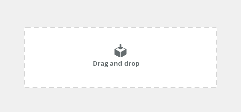
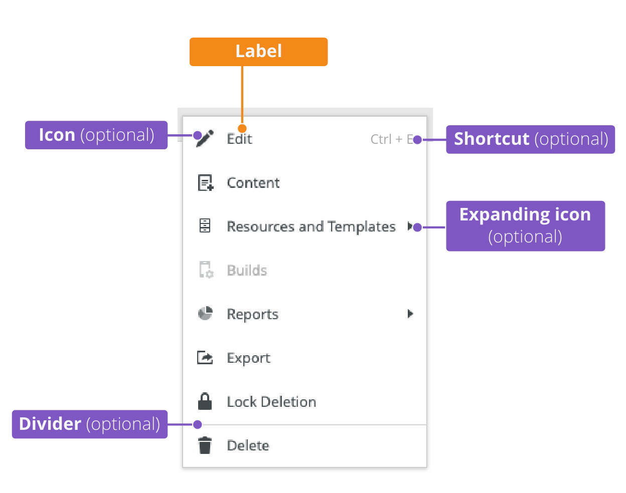
Drop areas visually indicate where users may drag and drop components.
Component Status
 Design Kit: NOT RELEASED
 Bobwai component: bobwai--drop-area RELEASED
Usage
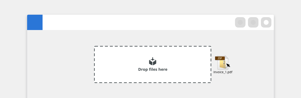
Allows users to move files by dragging and dropping them into an area on a page.
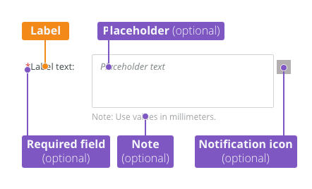
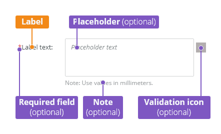
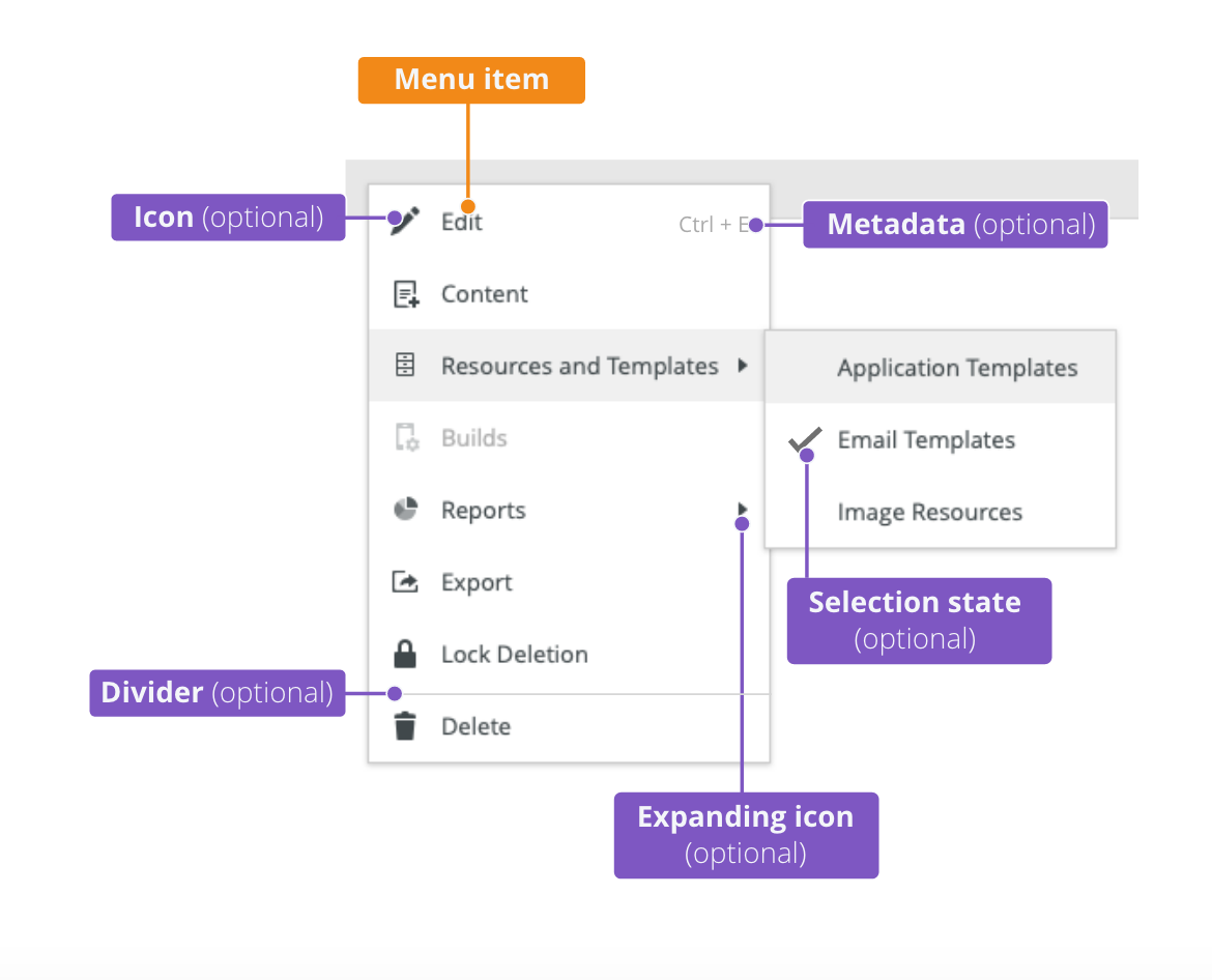
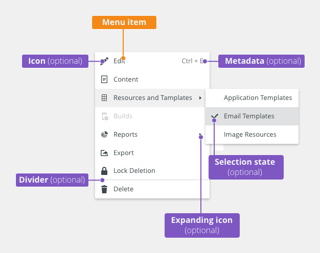
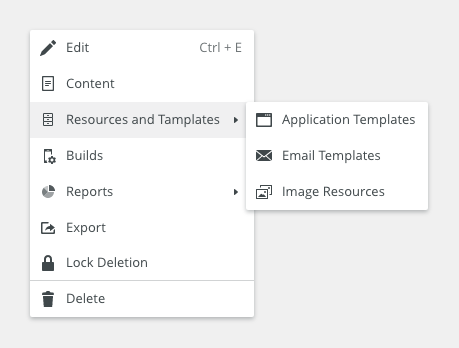
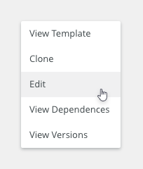
Anatomy
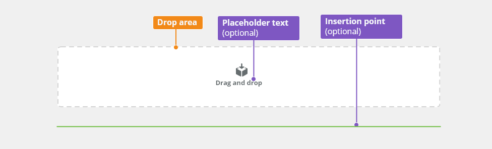
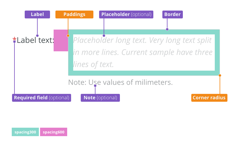
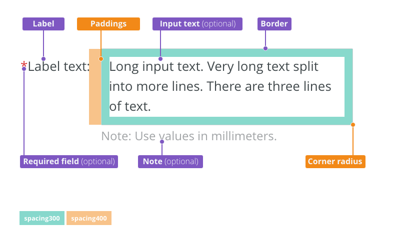
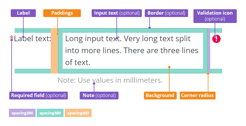
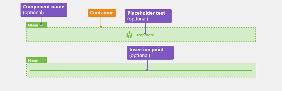
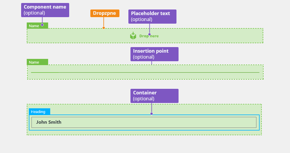
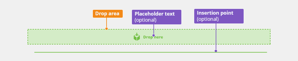
- Drop area - outlines the area where users can drag and drop a component.
- Placeholder (optional) - adds a description.
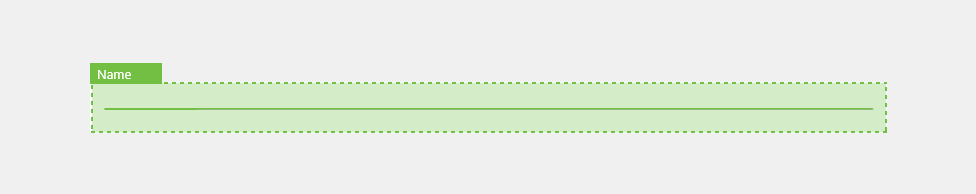
- Insertion point - outlines the exact slot where the component is being placed.
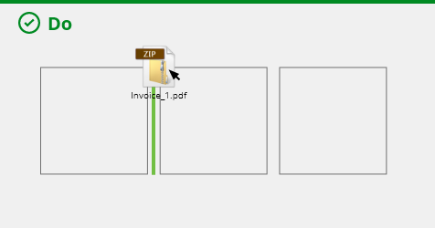
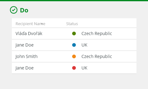
Use an insertion point to indicate a slot between components.
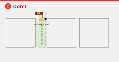
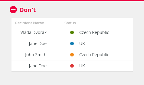
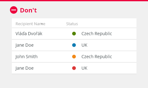
Do not use a drop area to indicate a slot between components. Use an insertion point instead.
Behavior
States
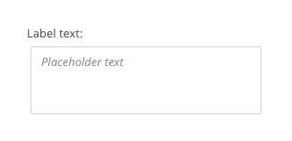
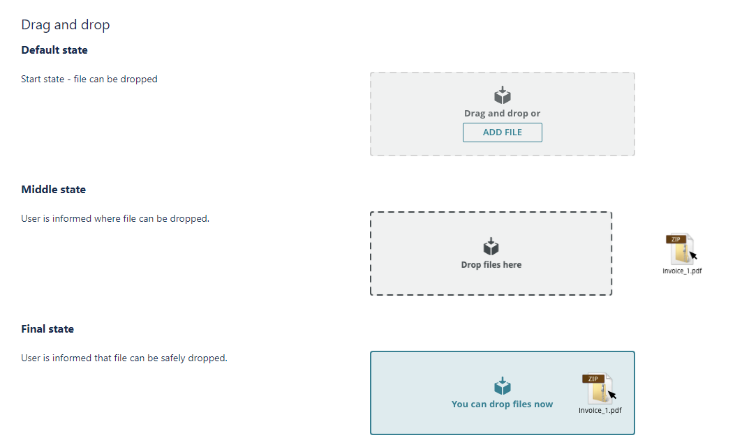
Default
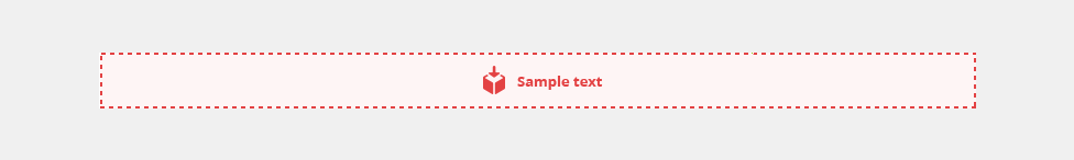
Default state of the drop area.
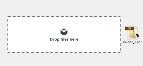
Hover over Page (Optional)
This state can be used to indicate where the drop area is placed on the screen.
When user drags an item on the page the drop area is highlighted. It can be useful when one or a small amount of drop areas are presented on the screen.
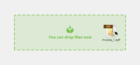
Hover over Drop Area
Hover state of the drop area indicates that the dragged item can be dropped.
Disabled
Cannot be interacted with but remains visible to the user in a disabled visual style.

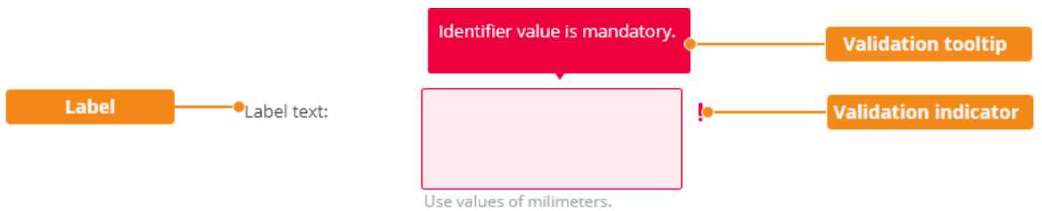
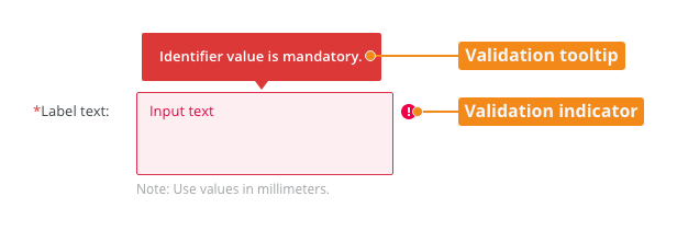
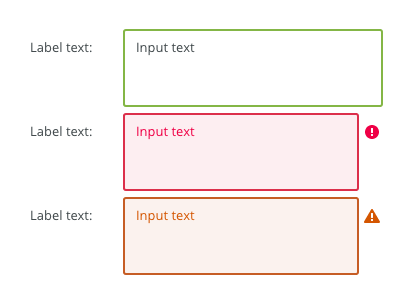
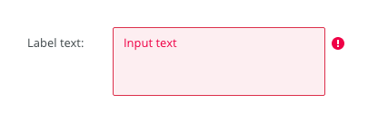
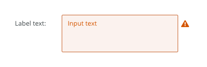
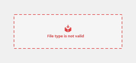
Error
When possible, use client-side validation errors for an instant feedback. Error state of a drop area indicates that the dragged item will not be accepted when dropped.

Editorial
- Use sentence case for labels.
- Keep the text short and specific.
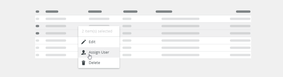
Related Components
- Loader: bobwai--loader To provide feedback during file upload.
Accessibility
Drop areas visually indicate where users may drag and drop components.
Component Status
Design Kit: NOT RELEASED
Bobwai component: bobwai--drop-area RELEASED
Usage
Allows users to move files by dragging and dropping them into an area on a page.
Anatomy
- Drop area - outlines the area where users can drag and drop a component.
- Placeholder (optional) - adds a description.
- Insertion point - outlines the exact slot where the component is being placed.
Use an insertion point to indicate a slot between components.
Do not use a drop area to indicate a slot between components. Use an insertion point instead.
Behavior
States
Default
Default state of the drop area.
Hover over Page (Optional)
This state can be used to indicate where the drop area is placed on the screen.
When user drags an item on the page the drop area is highlighted. It can be useful when one or a small amount of drop areas are presented on the screen.
Hover over Drop Area
Hover state of the drop area indicates that the dragged item can be dropped.
Disabled
Cannot be interacted with but remains visible to the user in a disabled visual style.
Error
When possible, use client-side validation errors for an instant feedback. Error state of a drop area indicates that the dragged item will not be accepted when dropped.
Editorial
- Use sentence case for labels.
- Keep the text short and specific.
Related Components
- Loader: bobwai--loader To provide feedback during file upload.
Accessibility
Attachments:
 image2020-12-1_10-59-46.png (image/png)
 image2020-12-1_10-57-28.png (image/png)
 image2020-12-1_10-57-14.png (image/png)
 image2020-12-1_10-56-37.png (image/png)
 image2020-11-30_14-32-1.png (image/png)
 image2020-11-30_14-17-56.png (image/png)
 image2020-11-30_14-8-32.png (image/png)
 image2020-11-30_14-3-56.png (image/png)
 image2020-11-27_15-46-5.png (image/png)
 image2020-11-27_15-19-14.png (image/png)
 image2020-11-27_15-14-27.png (image/png)
 image2020-11-27_15-4-12.png (image/png)
 image2020-11-27_15-3-39.png (image/png)
 image2020-11-27_12-24-3.png (image/png)
 image2020-11-27_12-20-20.png (image/png)
 image2020-11-27_12-13-3.png (image/png)
 image2020-11-27_10-59-3.png (image/png)
 image2020-11-27_9-53-18.png (image/png)
 image2020-10-5_10-17-0.png (image/png)
 image2020-10-5_10-25-57.png (image/png)
 image2020-10-5_10-26-24.png (image/png)
 image2020-10-5_10-26-47.png (image/png)
 image2020-10-2_15-23-33.png (image/png)
 image2020-10-2_13-45-41.png (image/png)
 image2020-10-2_13-46-8.png (image/png)
 image2020-10-5_10-52-58.png (image/png)
 image2020-10-5_10-53-29.png (image/png)
 image2020-10-5_10-54-33.png (image/png)
 image2020-10-5_10-54-40.png (image/png)
 image2020-10-5_10-55-2.png (image/png)
 image2020-10-5_11-37-46.png (image/png)
 image2020-10-2_14-20-45.png (image/png)
 image2020-10-2_14-21-11.png (image/png)
 image2020-10-2_14-20-58.png (image/png)
 image2020-10-2_14-21-26.png (image/png)
 image2020-10-2_14-33-47.png (image/png)
 image2020-10-2_14-34-9.png (image/png)
 image2020-10-2_14-25-18.png (image/png)
 image2020-10-2_14-25-33.png (image/png)
 image2020-10-2_14-42-44.png (image/png)
 image2020-10-23_15-38-49.png (image/png)
 image2020-10-26_13-21-57.png (image/png)
 image2020-10-26_13-22-16.png (image/png)
 image2020-10-26_13-22-55.png (image/png)
 image2020-10-26_13-24-0.png (image/png)
 image2020-10-26_13-26-26.png (image/png)
 textarea-style@2x.png (image/png)
 textarea@2x.png (image/png)
 text-area-anatomy.png (image/png)
 text-area-label-vertical.png (image/png)
 text-area-validation.png (image/png)
 text-area-style.png (image/png)
 text-area-label-horizontal.png (image/png)
 text-area-state-selected.png (image/png)
 text-area-state-disabled.png (image/png)
 text-area-state-readonly.png (image/png)
 text-area-state-focus.png (image/png)
 text-input-density-small.png (image/png)
 text-area-density-default.png (image/png)
 text-area-density-small.png (image/png)
 text-input-variants-warning-icon.png (image/png)
 text-area-variants-error-icon.png (image/png)
 text-area-variants-warning-icon.png (image/png)
 image2020-11-2_9-24-56.png (image/png)
 image2020-11-2_9-26-14.png (image/png)
 image2020-11-2_9-26-30.png (image/png)
 Screenshot 2020-11-16 at 15.01.07.png (image/png)
 Screenshot 2020-11-16 at 14.58.54.png (image/png)
 Screenshot 2020-11-16 at 15.09.35.png (image/png)
 Screenshot 2020-11-16 at 15.19.01.png (image/png)
 Screenshot 2020-11-16 at 15.22.41.png (image/png)
 Screenshot 2020-11-18 at 12.49.34.png (image/png)
 Screenshot 2020-11-18 at 13.11.11.png (image/png)
 Screenshot 2020-11-18 at 13.22.39.png (image/png)
 Screenshot 2020-11-16 at 13.53.55.png (image/png)
 Screenshot 2020-11-19 at 08.14.25.png (image/png)
 Screenshot 2020-11-19 at 08.14.34.png (image/png)
 Screenshot 2020-11-18 at 13.08.21.png (image/png)
 Screenshot 2020-11-18 at 13.08.05.png (image/png)
 Screenshot 2020-11-19 at 09.57.10.png (image/png)
 Screenshot 2020-11-20 at 14.27.17.png (image/png)
 context-menu-anatomy.png (image/png)
 Context-menu-type-basic.png (image/png)
 Context-menu-type-multilevel.png (image/png)
 Context-menu-variants-text-only.png (image/png)
 Context-menu-variants-text-icons.png (image/png)
 Context-menu-variants-with-title.png (image/png)
 Context-menu-groups.png (image/png)
 Context-menu-states-disabled.png (image/png)
 Context-menu-do-short.png (image/png)
 Context-menu-dont-short.png (image/png)
 Context-menu-do-groups.png (image/png)
 Context-menu-dont-groups.png (image/png)
 image2020-12-18_8-59-46.png (image/png)
 image2020-12-18_9-13-17.png (image/png)
 image2020-12-21_6-48-2.png (image/png)
 image2020-12-21_6-50-49.png (image/png)
 image2020-12-21_6-52-2.png (image/png)
 image2020-12-21_6-57-12.png (image/png)
 image2020-12-21_12-48-50.png (image/png)
 image2020-12-21_13-9-6.png (image/png)
 image2020-12-21_13-10-25.png (image/png)
 image2020-12-21_14-40-56.png (image/png)
 image2020-12-21_15-5-39.png (image/png)
 image2021-1-14_13-36-15.png (image/png)
 image2021-1-15_9-5-33.png (image/png)
 image2021-1-15_9-15-26.png (image/png)
 image2021-1-15_10-38-35.png (image/png)
 image2021-1-22_15-32-27.png (image/png)
 image2021-1-22_15-32-57.png (image/png)
 image2021-1-22_15-33-8.png (image/png)
 image2021-1-22_15-39-50.png (image/png)
image2021-1-22_15-40-16.png (image/png)
image2021-1-22_15-41-45.png (image/png)
image2021-1-22_15-46-46.png (image/png)
image2021-1-22_16-27-15.png (image/png)
image2021-1-22_15-39-50.png (image/png)
image2021-1-22_15-40-16.png (image/png)
image2021-1-22_15-41-45.png (image/png)
image2021-1-22_15-46-46.png (image/png)
image2021-1-22_16-27-15.png (image/png)
 image2021-1-22_16-28-40.png (image/png)
image2021-1-22_16-40-4.png (image/png)
image2021-1-27_10-7-39.png (image/png)
image2021-1-27_10-8-3.png (image/png)
drop-area-title.png (image/png)
image2021-1-22_16-28-40.png (image/png)
image2021-1-22_16-40-4.png (image/png)
image2021-1-27_10-7-39.png (image/png)
image2021-1-27_10-8-3.png (image/png)
drop-area-title.png (image/png)