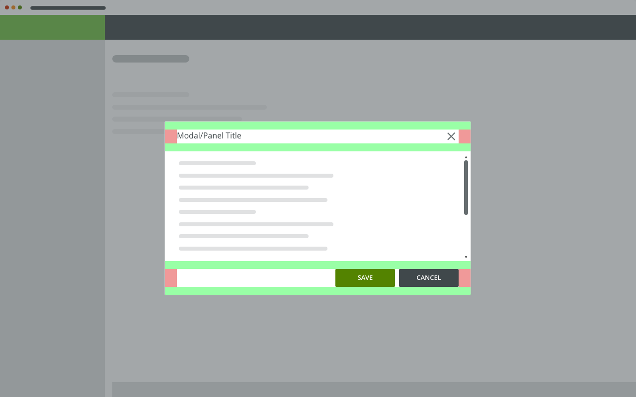
An optional panel that provides supplemental information or actions that relate to the main content while staying in context, invoked by an icon, typically in related a toolbar or a header.
Component Status
 Design Kit: RELEASED
 Bobwai Component: Bobwai-composition IN DEVELOPMENT
Usage

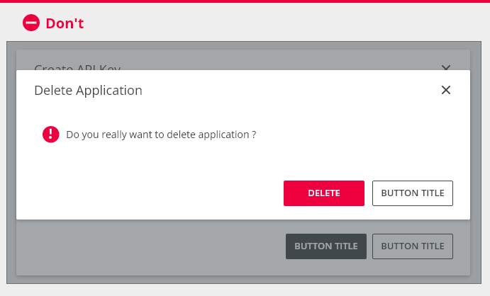
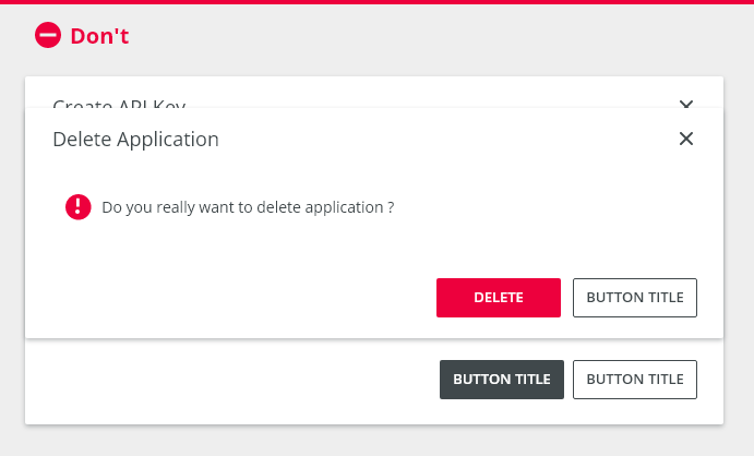
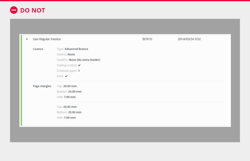
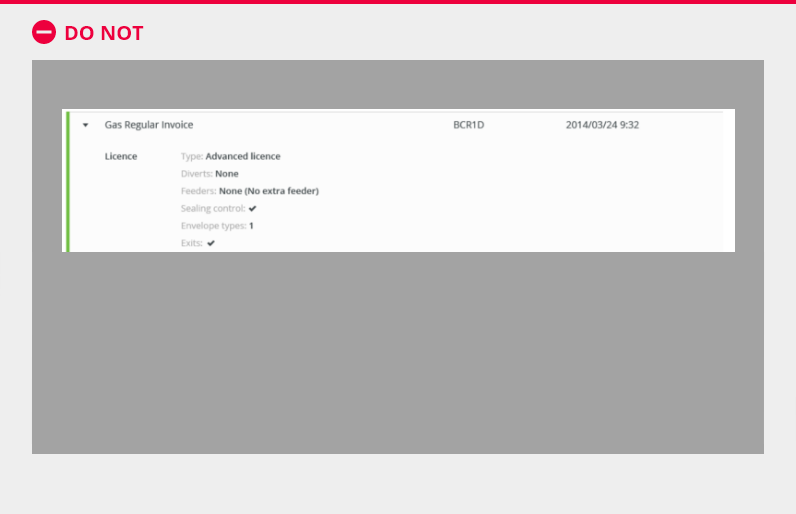
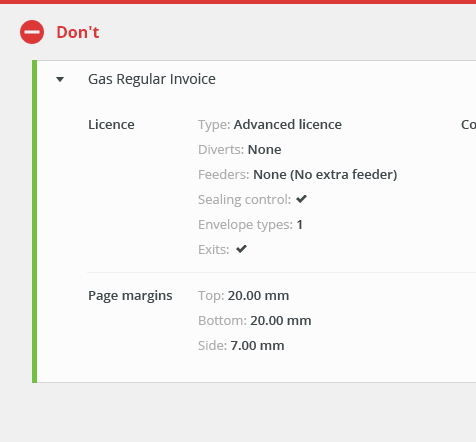
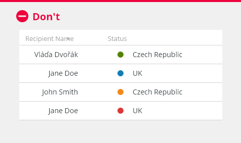
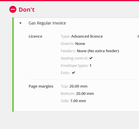
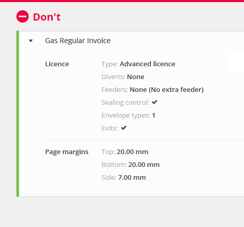
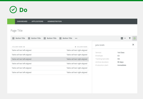
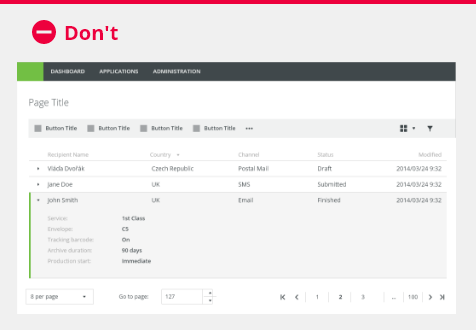
Do not use a collapsible row in a table for displaying large amount of data.

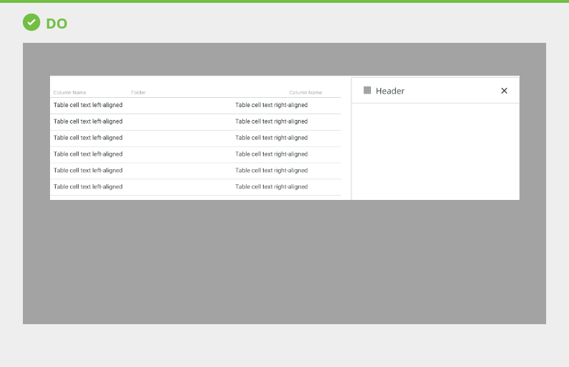
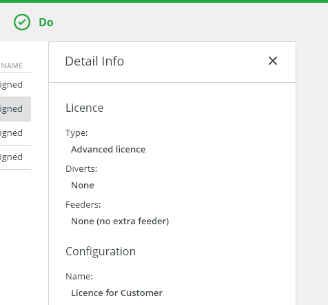
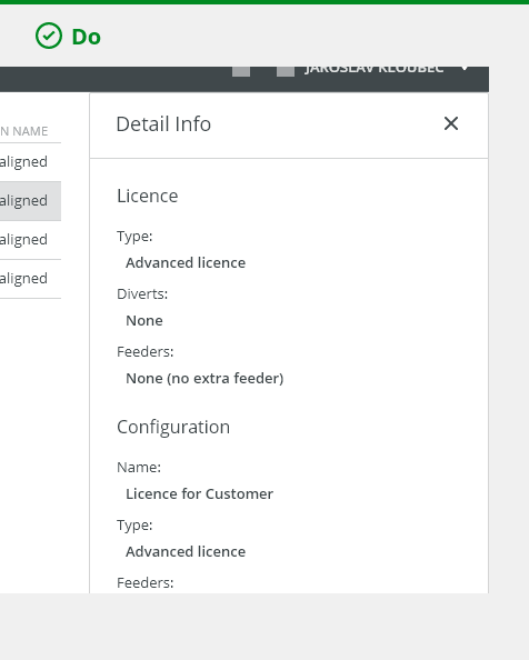
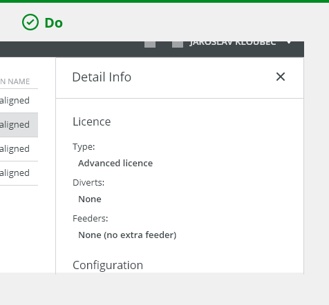
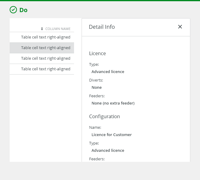
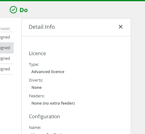
Use a detail panel for displaying larger amount of data.
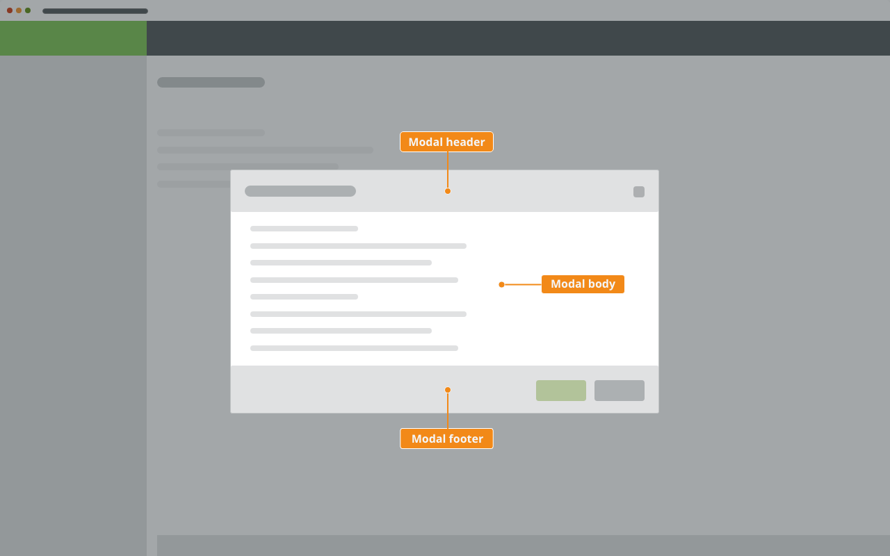
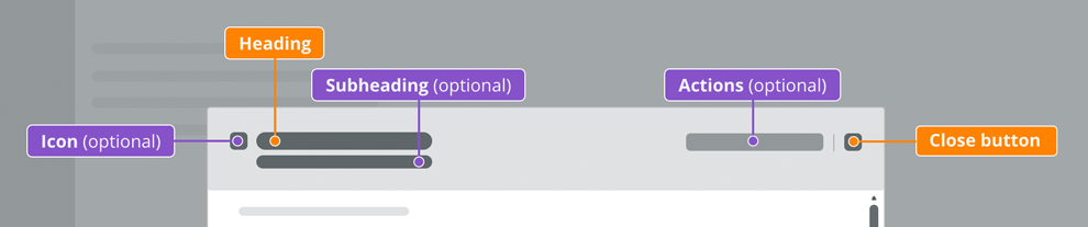
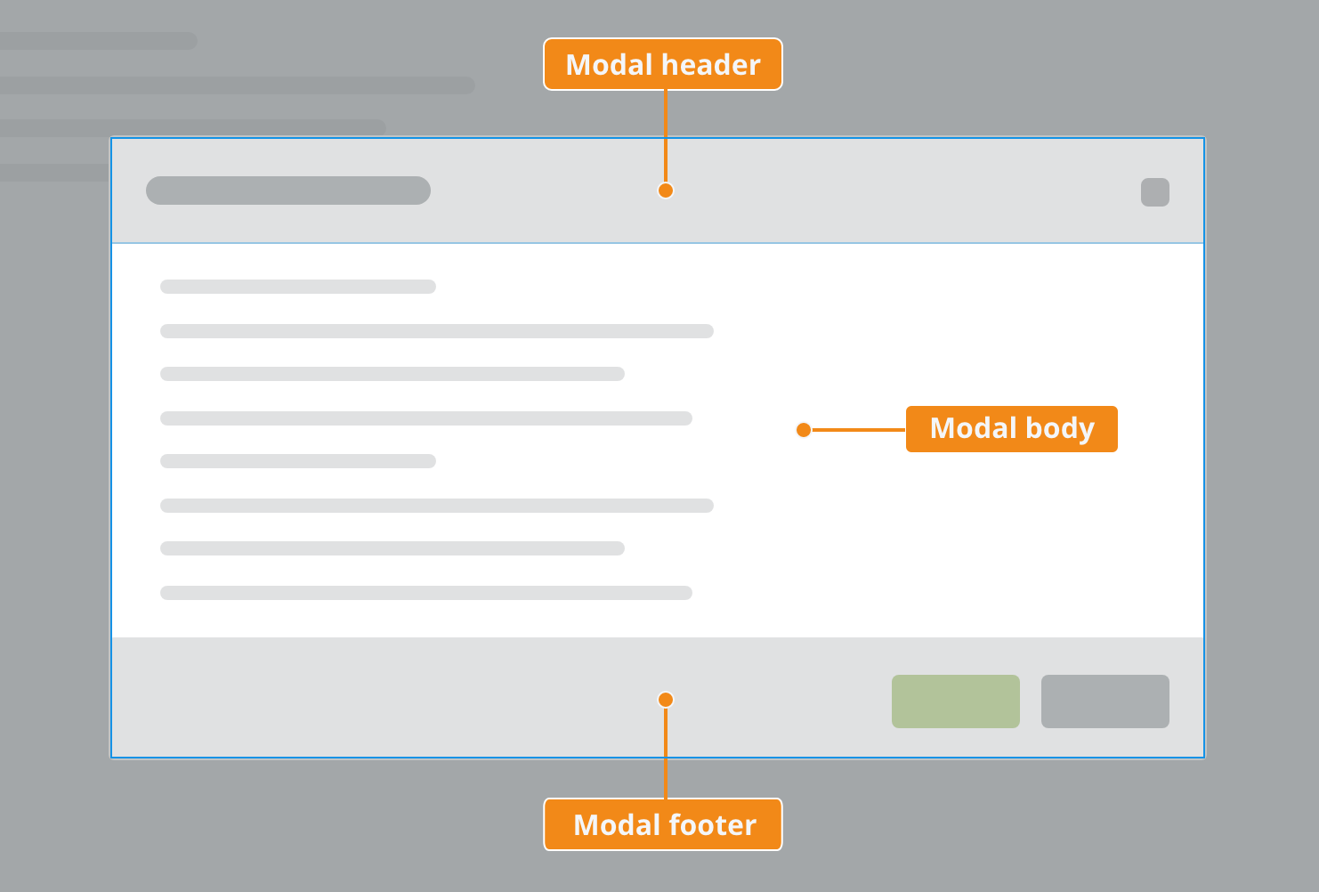
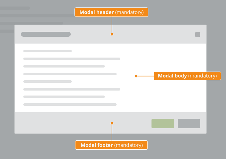
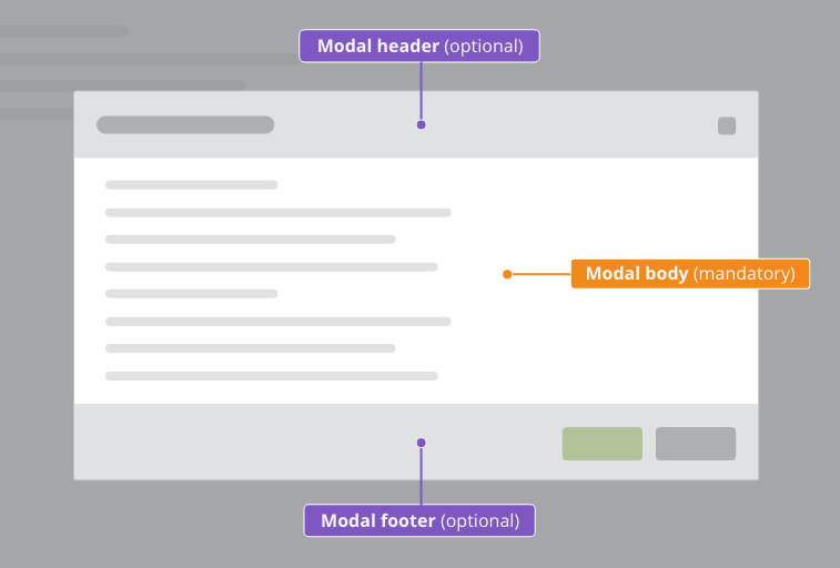
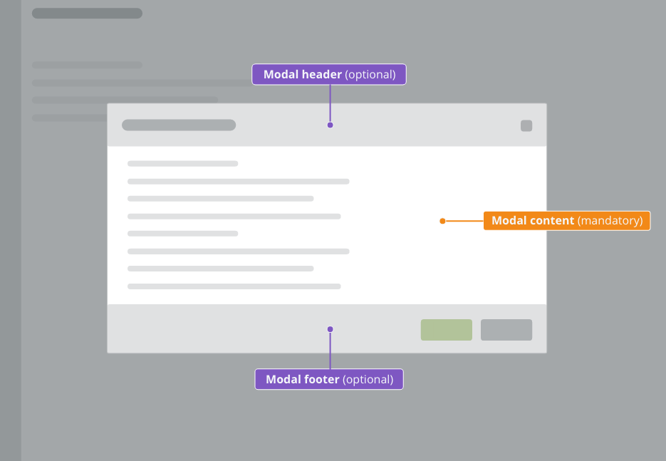
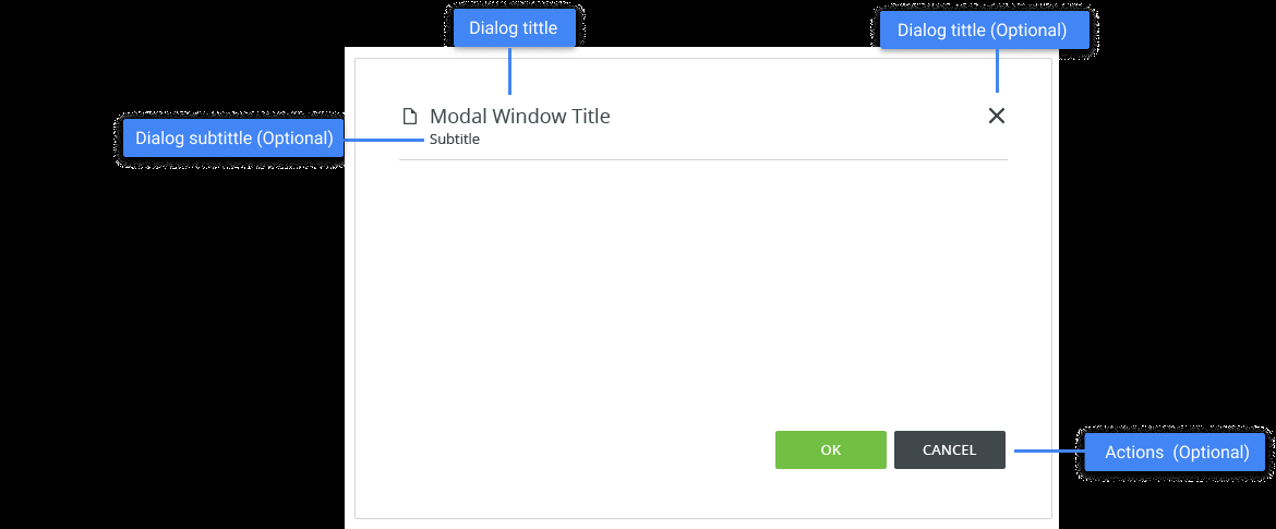
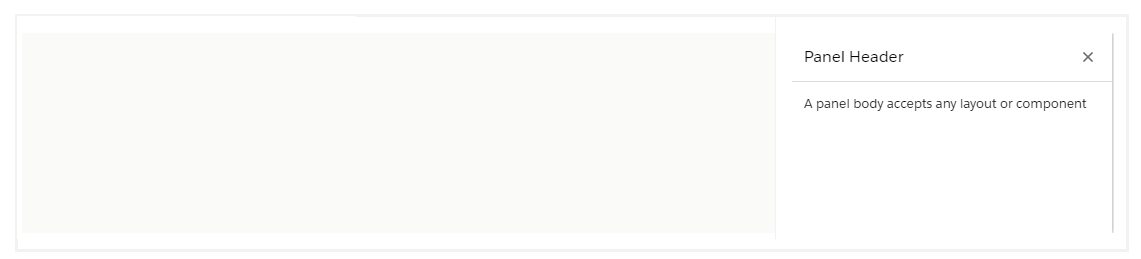
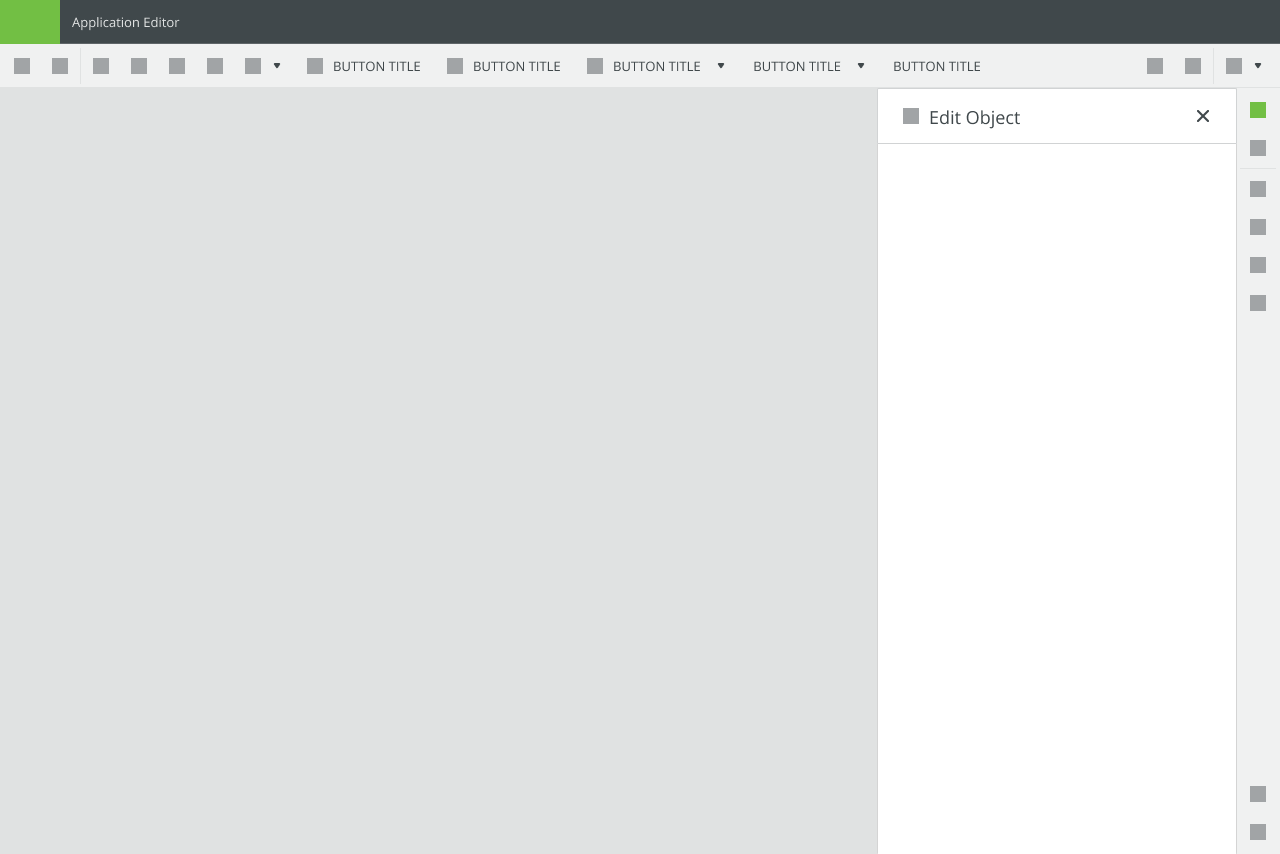
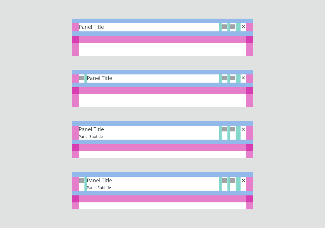
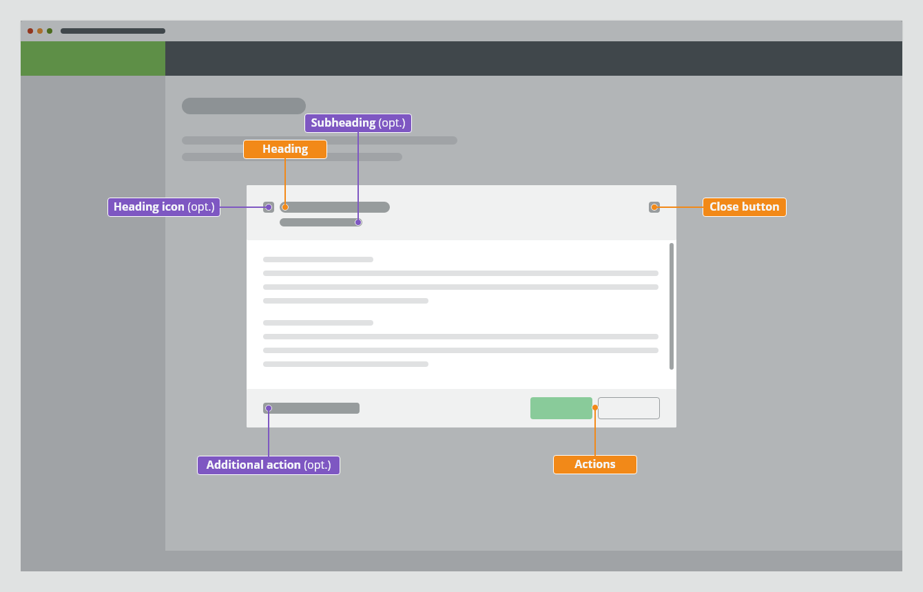
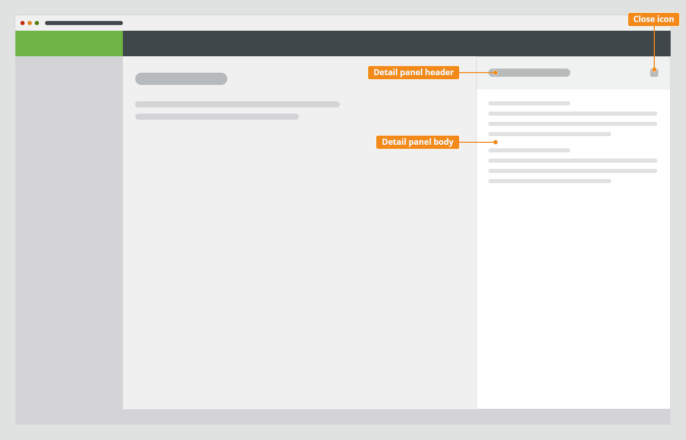
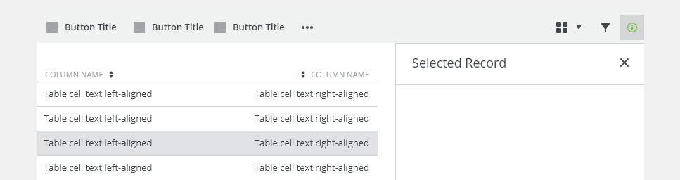
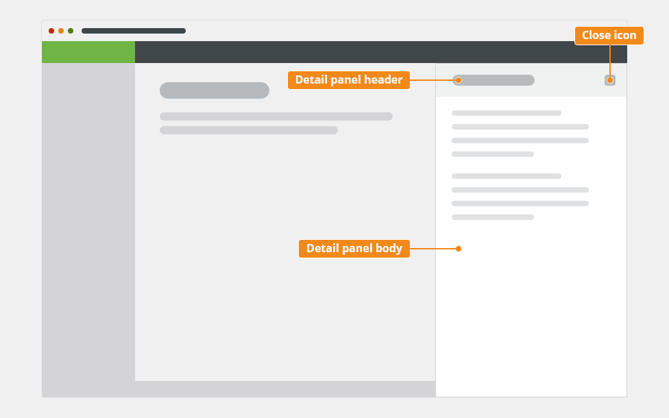
Anatomy
The detail panel component consists of the following parts:
- Header
- Body
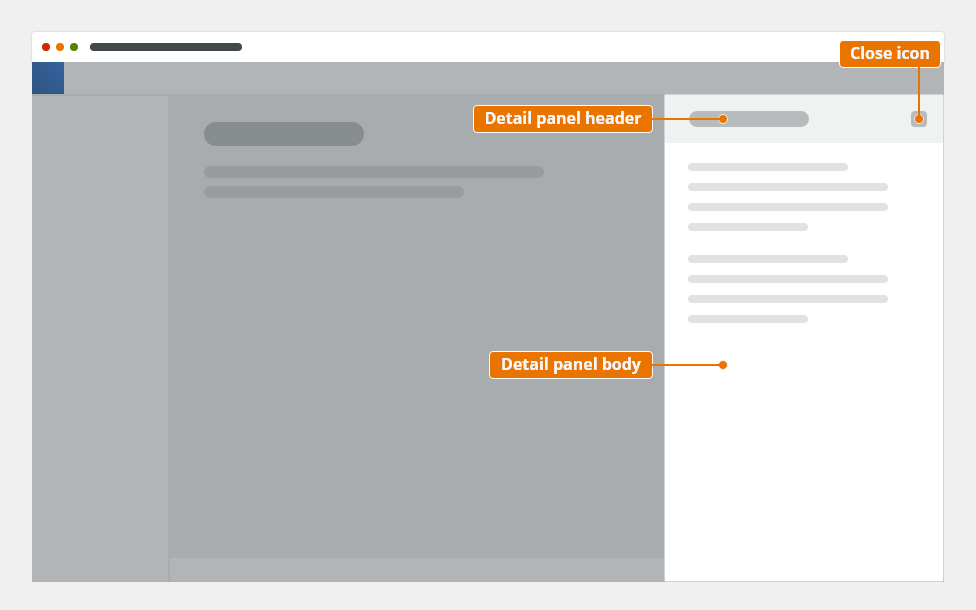
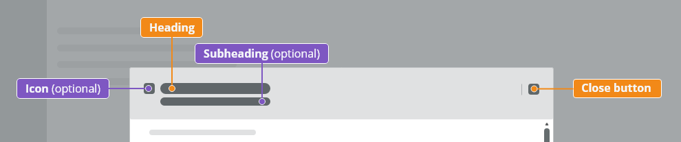
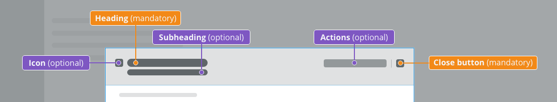
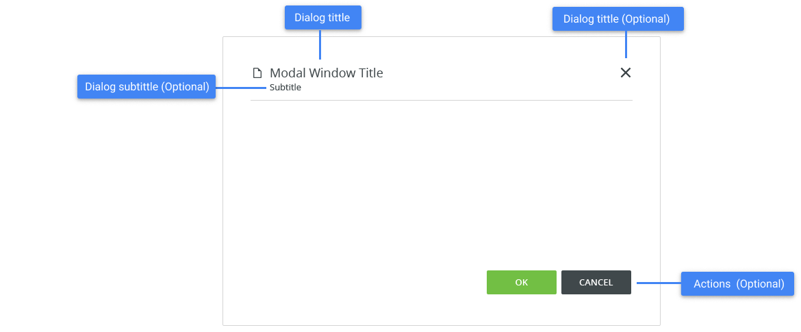
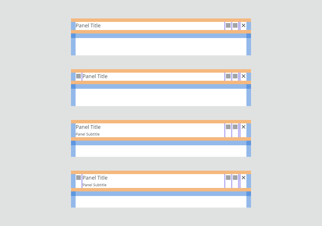
Header
The panel header consists of:
- Icon (optional)
- Heading: contains the title. Overflow content is truncated with an ellipsis.
- Subheading (optional)
- Close button “✕”
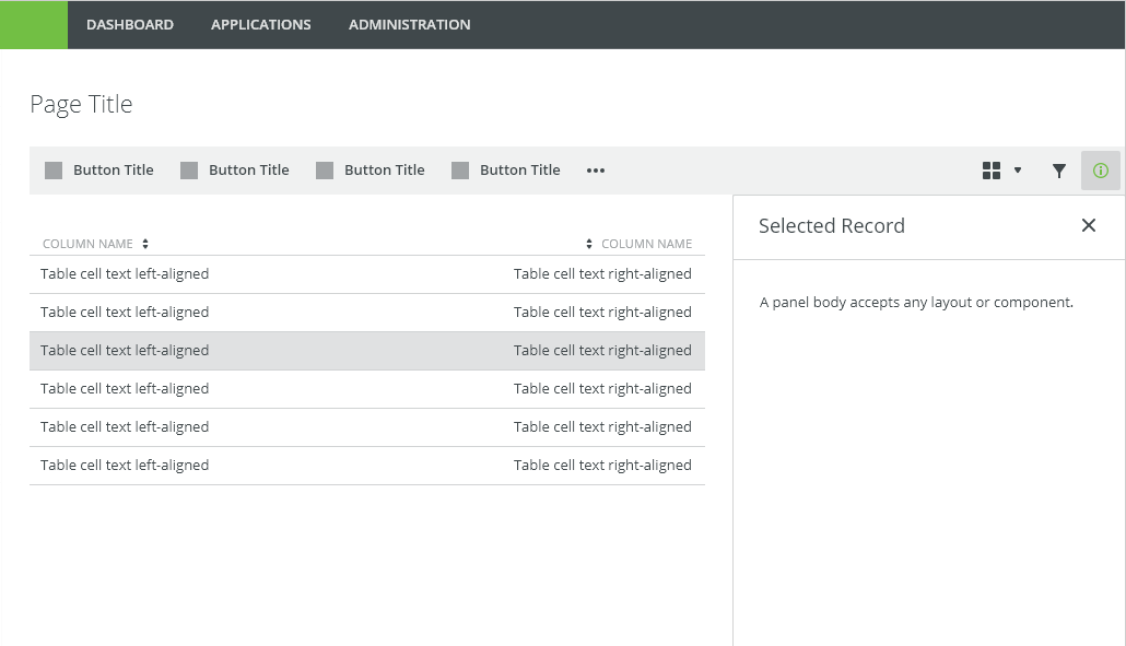
Body
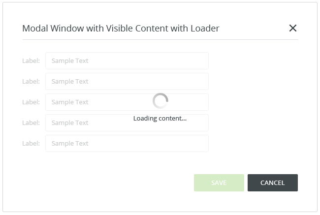
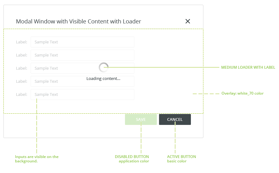
The panel body contains a content. It typically includes a paragraph, data table, form or warning/error/info message.
Types
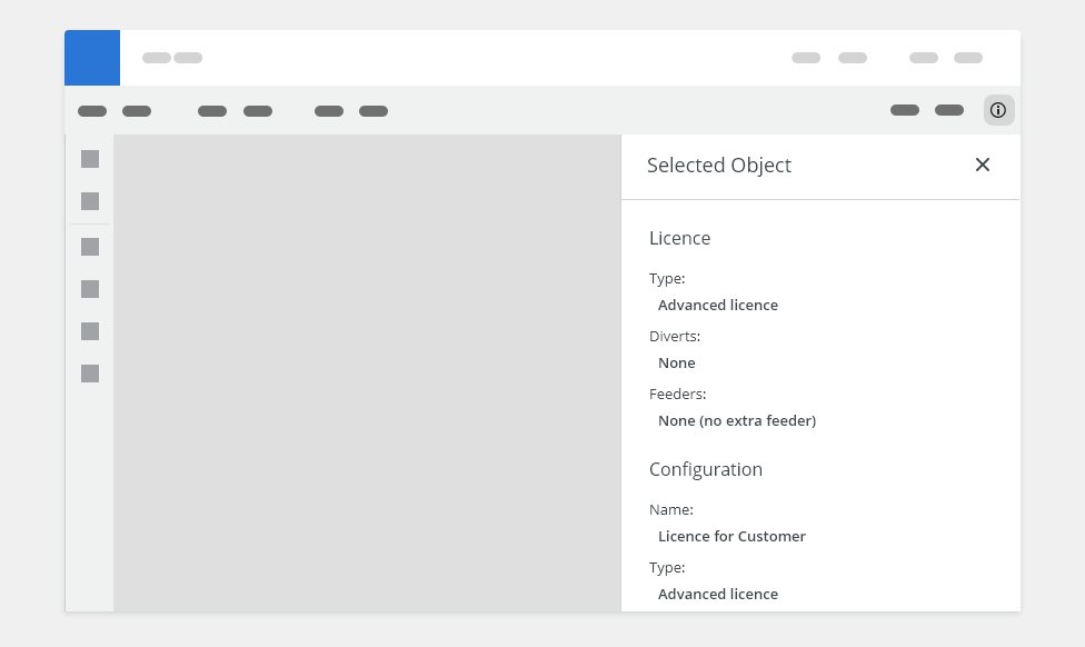
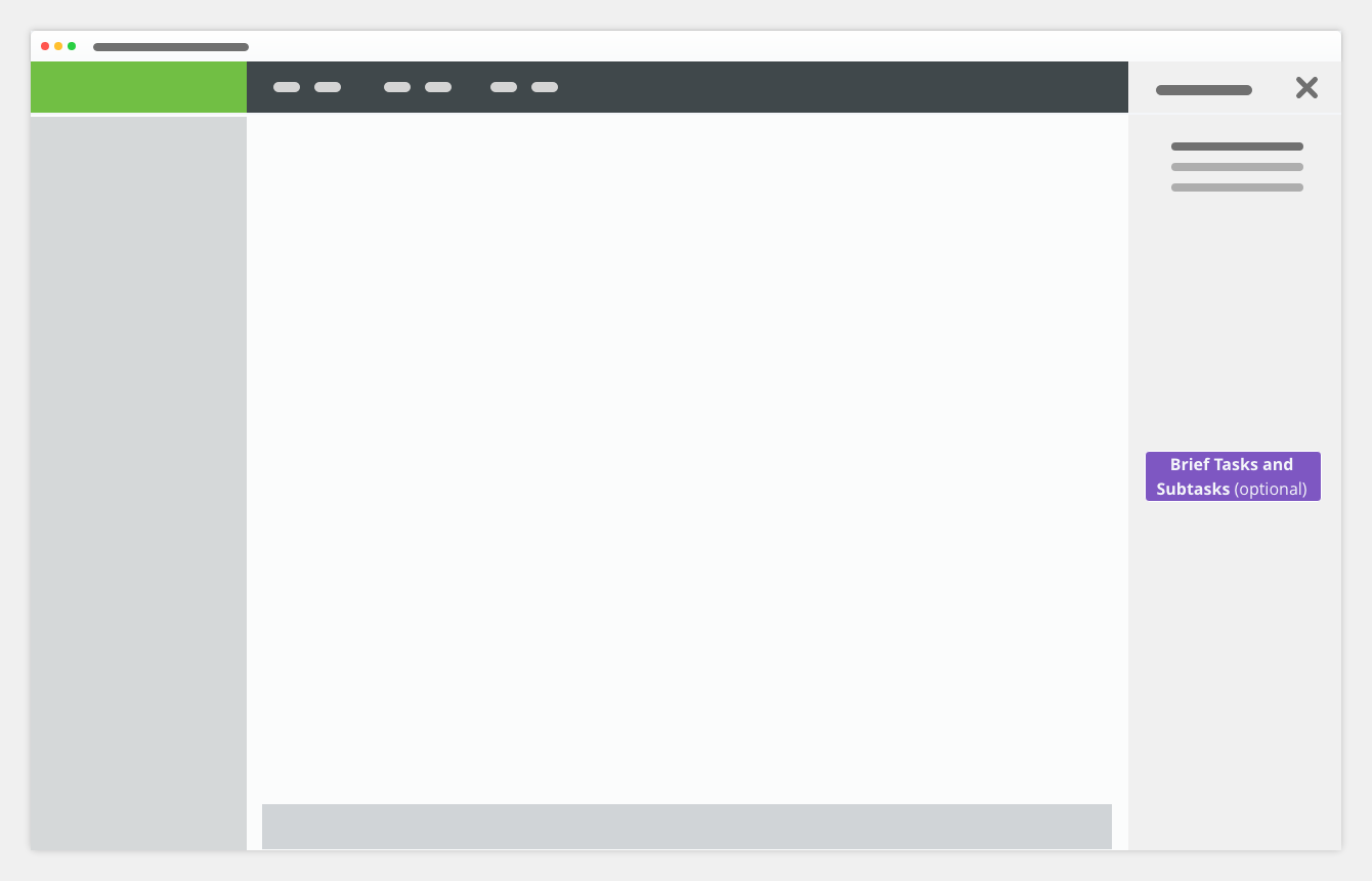
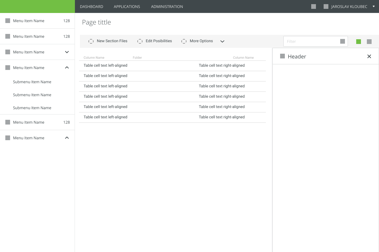
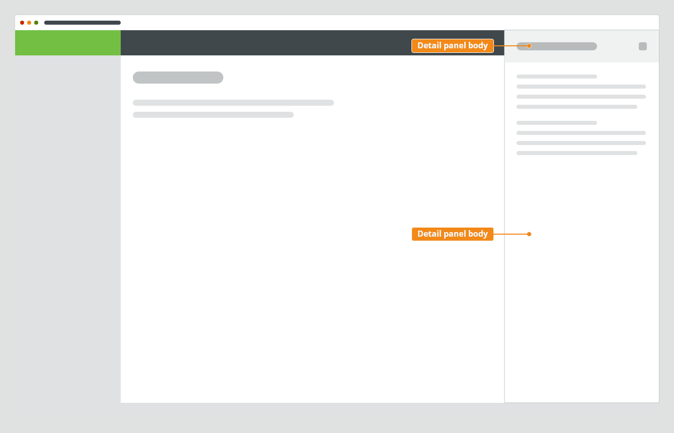
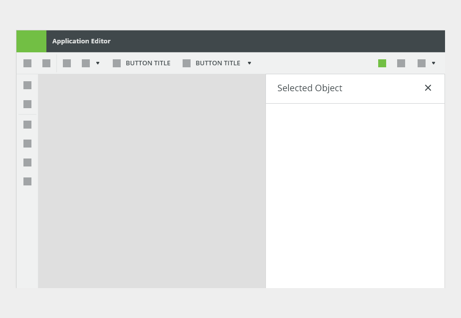
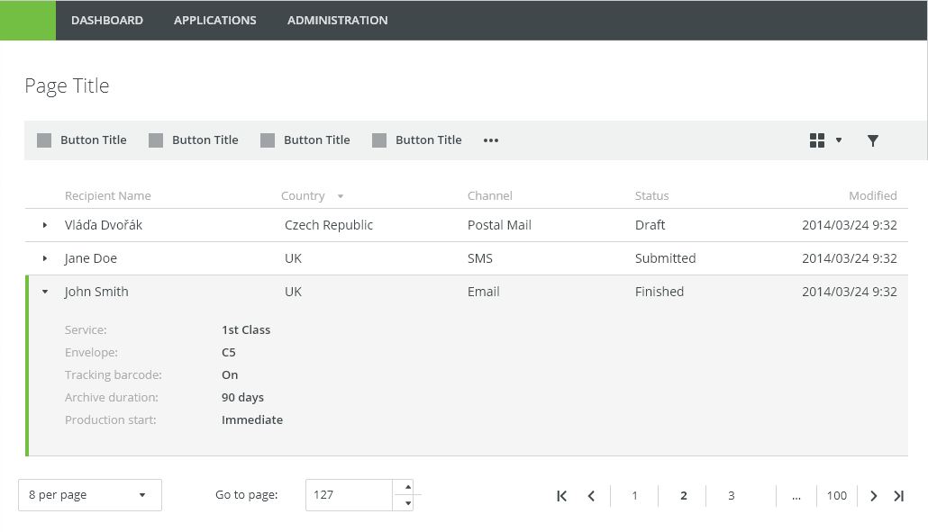
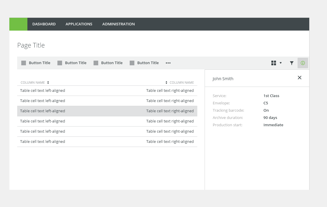
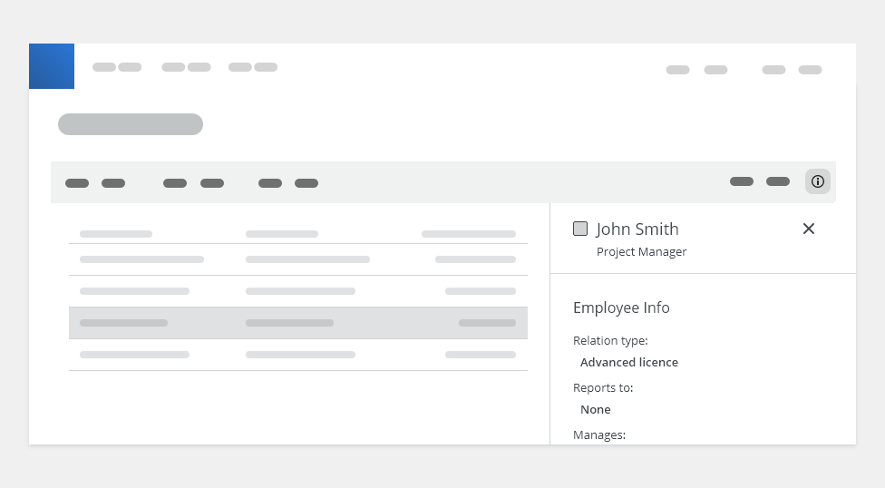
Displaying Details in Canvas
Displaying additional information of a selected object in a canvas:
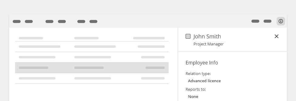
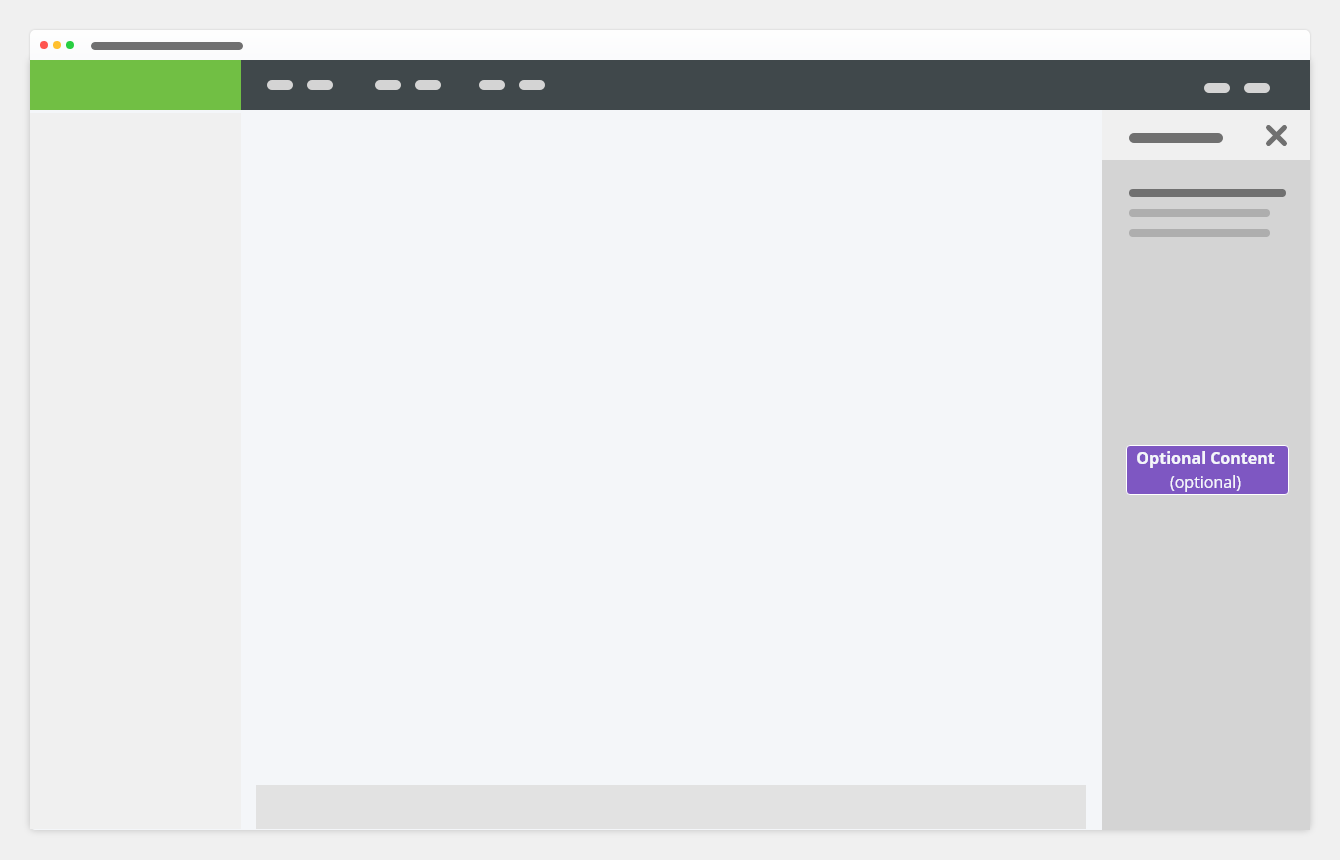
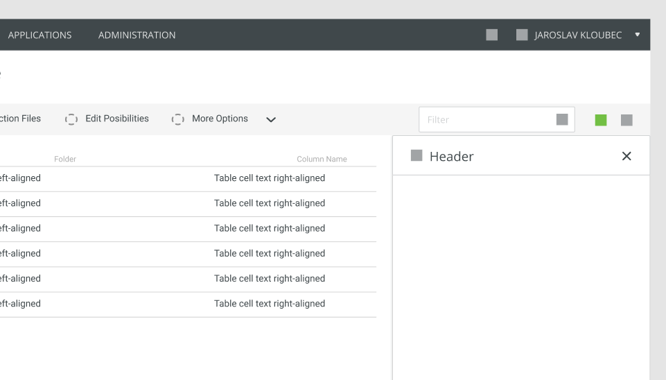
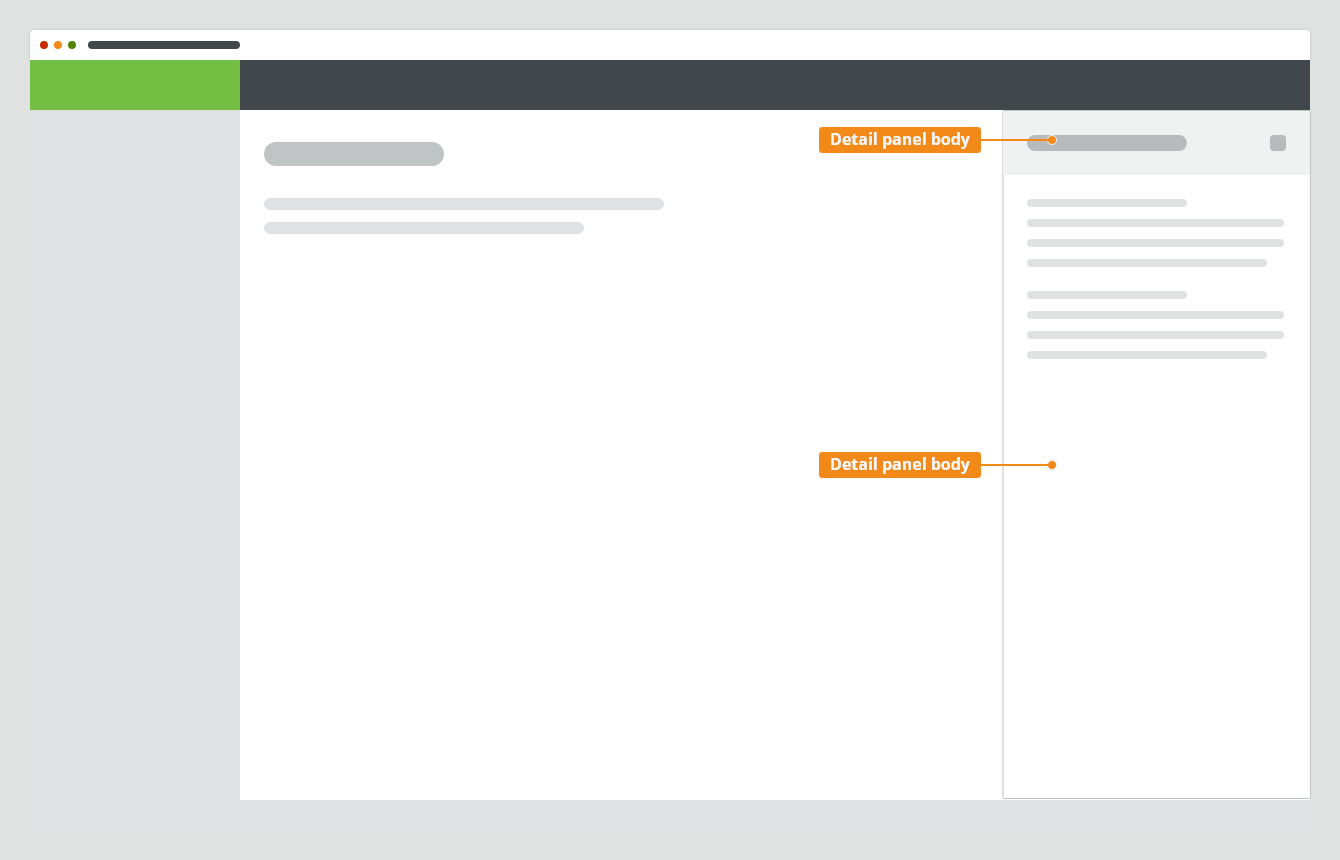
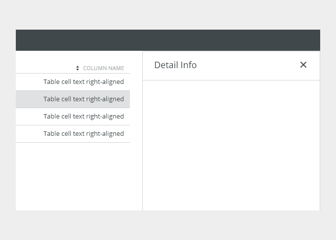
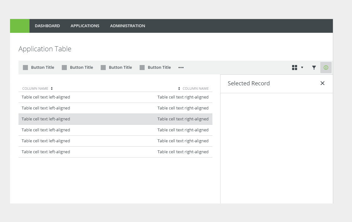
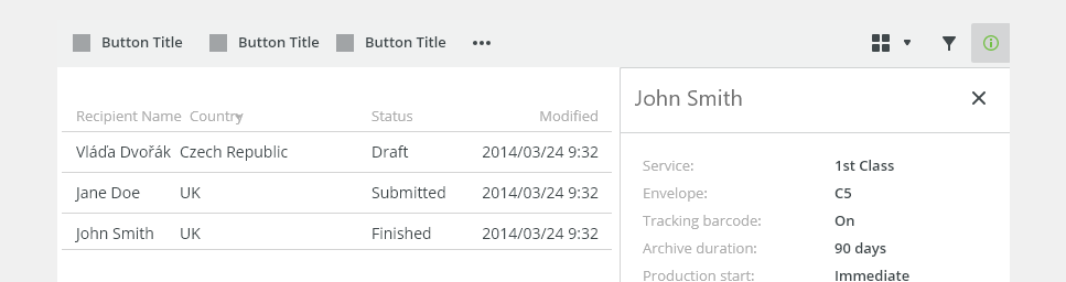
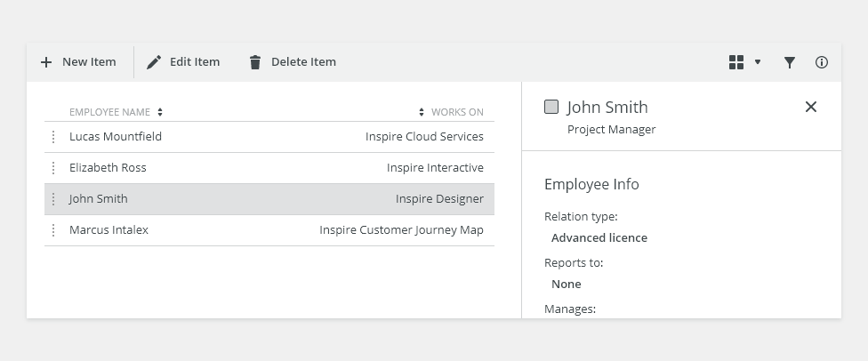
Displaying Details in Table
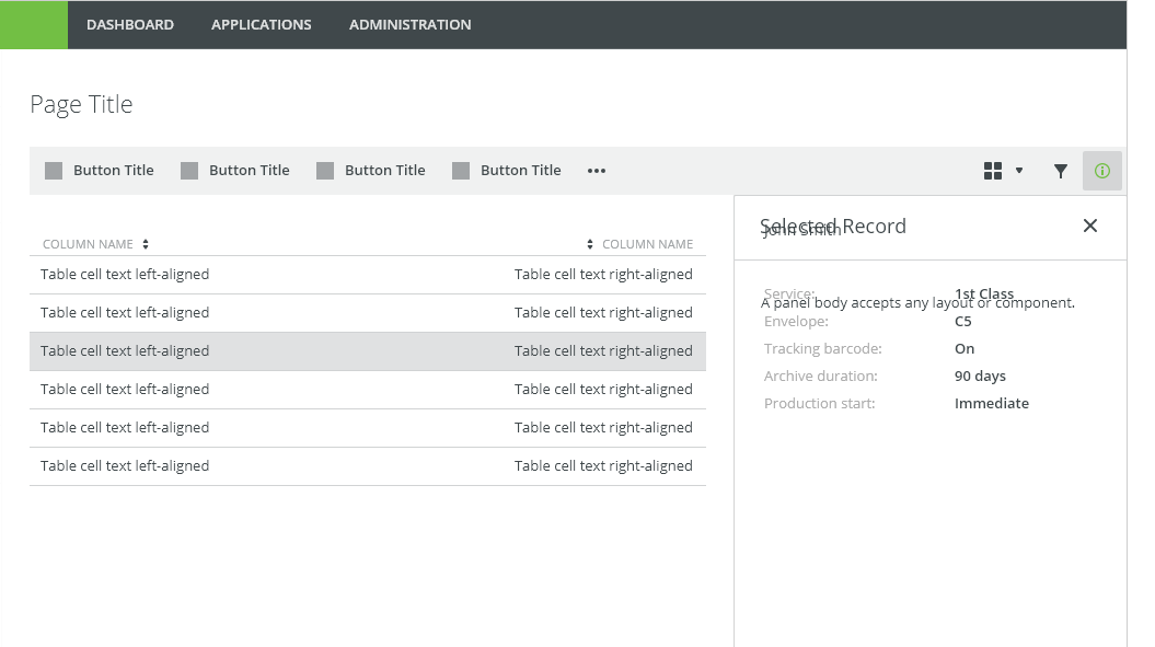
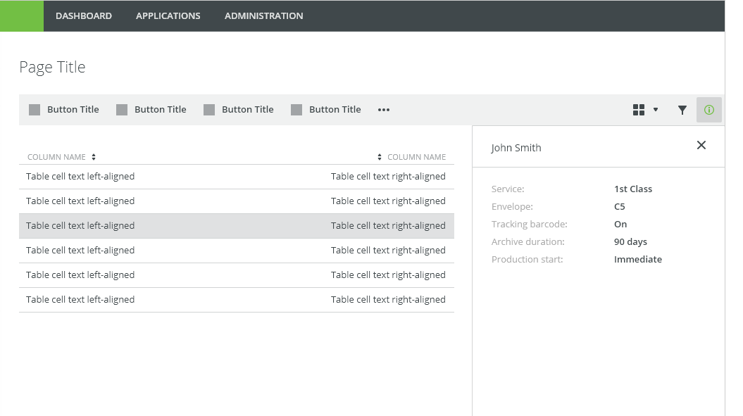
Displaying additional information of a selected table row in the main content or a canvas content.
Detail panel is reflowing the content, not overlaying it.

Appearance
Density
- Medium (default)
- Small (condensed) - technical applications, e.g. Scaler.
Width
Default Builder panel width is 320px, but can be resizable by using bobwai–splitter component.
Behavior
Detail panel is non modal container pushing canvas content. The panel slides in from the side of the page and pushes the page content, it does not overlay the content.
Expand and Collapse Control
Panels are triggered as a result of a user action. Typical triggers are buttons, links, or icons or a keyboard key <Enter> or <Space> in the associated toolbar or the application header.
Keyboard Interactions
KEY |
INTERACTION |
|---|---|
| Tab | Moves focus to next interactive element. If focus is on the last element interactive inside the panel, moves focus to the first interactive element inside the panel. |
| Shift + Tab | Moves focus to the previous interactive element inside the panel. |
| Esc | Dismisses the panel. Close the panel without submitting any data and return to the previous context. |
Related Components
- Modal - Use for short and non-frequent tasks.
- Side modal - Use for editing larger content.
Density
Default

Condensed

Typography
| Used In | Type | Token |
|---|---|---|
| Modal window heading, panel headings | Heading 1 Alt (H1) | font-heading150 |
| Subtitle body | Body | font-body |
Color
| Used In | Type | Token |
|---|---|---|
| Modal background | background-color | white |
| Heading, body text | text color | basic |
Spacing
| Density | Used In | Type | PX | Token |
|---|---|---|---|---|
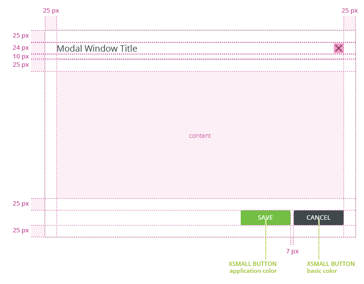
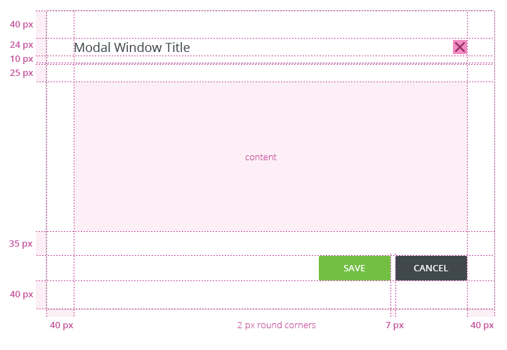
| Default | Horizontal space in header, horizontal space in footer | Padding | 16 | spacing-500 |
| Condensed | Horizontal space in header, horizontal space in footer | Padding | 12 | spacing-400 |
Widths
Size |
Min Width |
Max Width |
|---|---|---|
S |
||
| M | ||
| L |
Accessibility
- When the panel is open, place focus on the first interactive element and trap the focus inside the panel.
- Add ARIA role
role=”dialog”to modal outer wrapper, usearia-labelledbyattribute in the same element for a short description. - Add an
aria-describedbyattribute for any further description if needed. - Add
aria-hidden=”true”attribute when the panel is hidden but present in DOM. - After closing the panel, return focus to the trigger element, usually a button or a link.
- W3C WAI-ARIA Dialog Design Pattern
Attachments:
 image2020-8-11_10-49-57.png (image/png)
 image2020-8-11_10-47-25.png (image/png)
 image2020-8-11_10-44-38.png (image/png)
 image2020-8-4_11-31-34.png (image/png)
 image2020-8-4_10-9-3.png (image/png)
 image2020-8-4_9-25-6.png (image/png)
 image2020-8-4_9-24-45.png (image/png)
 image2020-8-4_9-21-16.png (image/png)
 image2020-8-3_17-5-59.png (image/png)
 image2020-8-3_17-2-25.png (image/png)
 image2020-8-3_16-57-14.png (image/png)
 image2020-8-3_16-54-54.png (image/png)
 image2020-8-3_16-54-22.png (image/png)
 image2020-8-3_14-52-49.png (image/png)
 image2020-8-3_14-47-17.png (image/png)
 image2020-8-3_13-27-16.png (image/png)
 image2020-8-3_13-26-47.png (image/png)
 image2020-8-3_13-22-30.png (image/png)
 image2020-8-3_13-21-4.png (image/png)
 image2020-8-3_13-17-23.png (image/png)
 image2020-8-3_12-58-6.png (image/png)
 image2020-8-3_12-57-45.png (image/png)
 DONT.png (image/png)
 DO.png (image/png)
 Modal Dialog - parts.png (image/png)
 modal-footer.png (image/png)
 modal-body.png (image/png)
 modal-header.png (image/png)
 Modal Dialog - paddings condensed.png (image/png)
 footer.png (image/png)
 Screenshot 2019-11-22 at 10.50.04.png (image/png)
 Mockup_basic – 8.png (image/png)
 Mockup_basic – 7.png (image/png)
 Mockup_basic – 6.png (image/png)
 Mockup_basic – 5.png (image/png)
 Mockup_basic – 4.png (image/png)
 Mockup_basic – 3.png (image/png)
 Screenshot 2019-11-21 at 10.48.26.png (image/png)
 Screenshot 2019-11-21 at 10.45.52.png (image/png)
 Screenshot 2019-11-21 at 10.44.57.png (image/png)
 Screenshot 2019-11-21 at 10.44.15.png (image/png)
 Screenshot 2019-11-21 at 10.40.03.png (image/png)
 Screenshot 2019-11-21 at 09.32.39.png (image/png)
 Screenshot 2019-11-21 at 09.28.07.png (image/png)
 image2019-11-18_10-16-18.png (image/png)
 image2019-11-18_9-19-21.png (image/png)
 Group 4.png (image/png)
 image2019-11-14_12-49-47.png (image/png)
 image2020-8-12_11-59-17.png (image/png)
 drawer-side-modal.png (image/png)
 image2020-8-17_15-22-1.png (image/png)
 image2020-8-14_10-41-45.png (image/png)
image2020-8-14_10-49-41.png (image/png)
image2020-8-19_15-18-5.png (image/png)
image2020-8-14_10-41-45.png (image/png)
image2020-8-14_10-49-41.png (image/png)
image2020-8-19_15-18-5.png (image/png)
 image2020-8-19_15-51-14.png (image/png)
 image2020-8-19_15-52-16.png (image/png)
 image2020-8-19_15-53-52.png (image/png)
 image2020-8-19_15-58-15.png (image/png)
 image2020-9-29_14-16-41.png (image/png)
 image2020-9-29_14-29-56.png (image/png)
 image2020-11-9_10-59-10.png (image/png)
 image2020-11-9_12-45-33.png (image/png)
 image2020-11-9_12-45-55.png (image/png)
 image2020-11-9_12-47-10.png (image/png)
 Detail Panel - DONT.png (image/png)
 Detail Panel - DO.png (image/png)
 Detail Panel - Anatomy.png (image/png)
 Detail Panel - Header.png (image/png)
 Detail Panel - Canvas.png (image/png)
 Detail Panel - Table.png (image/png)
 Header - Content - Style.png (image/png)
 Header Condensed - Content - Style.png (image/png)
 Header - Content - Style.png (image/png)
Header Condensed - Content - Style.png (image/png)
image2020-11-13_11-29-1.png (image/png)
Header - Content - Style.png (image/png)
Header Condensed - Content - Style.png (image/png)
image2020-11-13_11-29-1.png (image/png)
 image2020-11-13_11-30-38.png (image/png)
 Detail Panel - DO.png (image/png)
 Detail Panel - DONT.png (image/png)
 image2020-11-16_13-29-44.png (image/png)
 DONT – Overlaying Modals.png (image/png)
 Modal Dialog - Header and footer.png (image/png)
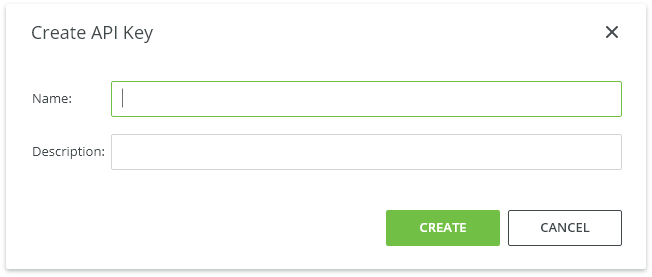
 Typical Usage.png (image/png)
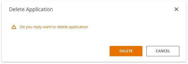
 Warning.png (image/png)
 Danger.png (image/png)
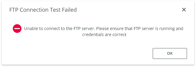
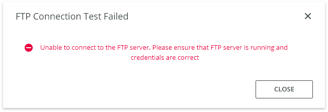
 Unable to Connect.png (image/png)
 Action Required.png (image/png)
 image2020-9-22_17-42-32.png (image/png)
 image2020-9-22_17-43-0.png (image/png)
 image2020-9-22_17-43-25.png (image/png)
 Typical Usage – Focus.png (image/png)
 image2020-10-8_9-45-17.png (image/png)
 image2020-11-20_11-58-53.png (image/png)
 image2020-11-20_11-59-16.png (image/png)
 Detail Panel - Canvas.png (image/png)
 Detail Panel - Table.png (image/png)
 image2020-11-27_12-24-3.png (image/png)
 image2020-11-30_6-55-28.png (image/png)
 image2020-11-30_6-55-32.png (image/png)
 image2020-11-30_6-55-53.png (image/png)
 image2020-11-30_7-0-21.png (image/png)
 image2020-11-30_7-2-53.png (image/png)
 Context-menu-type-multilevel.png (image/png)
 image2020-12-1_13-32-38.png (image/png)
 image2020-12-1_13-37-51.png (image/png)
 image2020-12-1_13-42-20.png (image/png)
 image2020-12-1_13-42-56.png (image/png)
 image2020-12-1_13-48-55.png (image/png)
 image2020-12-1_14-27-1.png (image/png)
 image2020-12-1_14-38-5.png (image/png)
 image2020-12-1_14-40-36.png (image/png)
 image2020-12-1_14-42-50.png (image/png)
 image2020-12-1_14-45-29.png (image/png)
 image2020-12-1_14-46-2.png (image/png)
 image2020-12-1_15-5-13.png (image/png)
 image2020-12-1_15-5-35.png (image/png)
 image2020-12-1_15-22-11.png (image/png)
 Detail Panel - Intro.png (image/png)
 Detail Panel - DO.png (image/png)
 Detail Panel - DONT.png (image/png)
Detail Panel - DO.png (image/png)
Detail Panel - DONT.png (image/png)
Detail Panel - DO.png (image/png)
 Detail Panel - Header.png (image/png)
 Detail Panel - Canvas.png (image/png)
 Detail Panel - Table.png (image/png)
 Detail Panel - Anatomy.png (image/png)
 Detail Panel - Canvas.png (image/png)
 Detail Panel - DO.png (image/png)
 Detail Panel - Intro.png (image/png)
 Detail Panel - DO.png (image/png)
Detail Panel - Header.png (image/png)
Detail Panel - DO.png (image/png)
Detail Panel - Header.png (image/png)
 Detail Panel - Canvas.png (image/png)
 Detail Panel - Table.png (image/png)
 detailpanel-anatomy.png (image/png)
detailpanel-header.png (image/png)
detailpanel-intro.png (image/png)
detailpanel-anatomy.png (image/png)
detailpanel-header.png (image/png)
detailpanel-intro.png (image/png)
 detailpanel-intro.png (image/png)
Detail Panel - Canvas.png (image/png)
Detail Panel - Table.png (image/png)
detailpanel-intro.png (image/png)
Detail Panel - Canvas.png (image/png)
Detail Panel - Table.png (image/png)