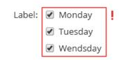
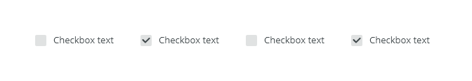
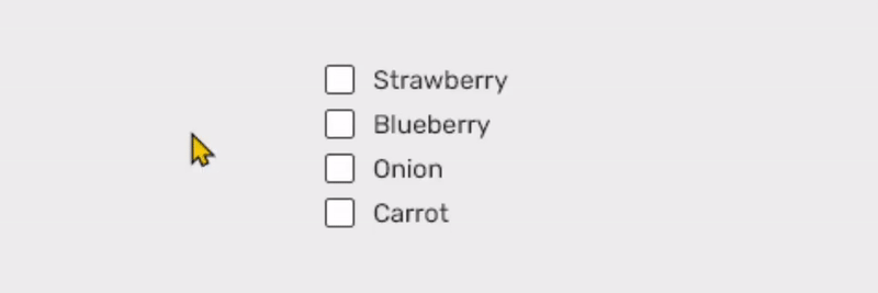
Checkboxes are used when there are multiple items to select in a list. Users can select zero, one, or any number of items.
Component Status
 Design Kit: RELEASED
 Bobwai component: bobwai--checkbox RELEASED
Content Overview
Usage
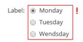
When users can select multiple choices, not for mutually exclusive choices. Use the radio button for situations where only one selection from the group is allowed.
Checkbox can be used
- in forms where single binary yes/no choice is provided
- filtering and batch action in tables and filters,
- to indicate whether users agree to the terms and conditions,
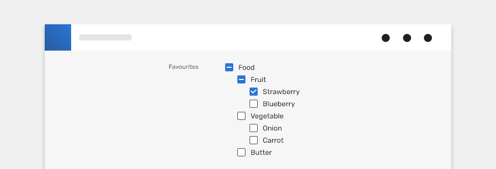
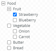
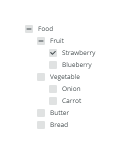
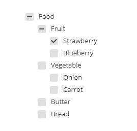
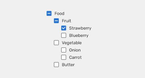
- in lists with parent and child relationships: a parent checkbox is used to make a bulk selection of all list items (sub-selections).
- Always use a label to describe a checkbox, or a set of checkboxes.
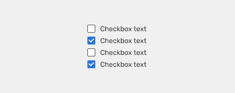
- When possible, arrange the checkbox sets vertically for easier reading.

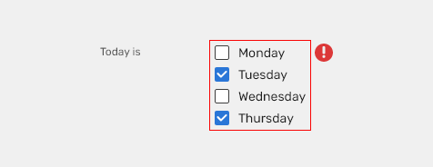
- Do not use, if a user can select only one option from a list. Radio buttons should be used instead of checkboxes.

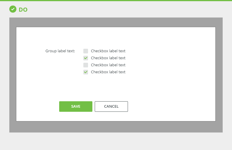
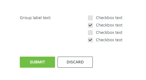
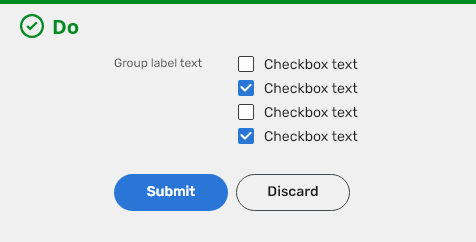
- DO use checkboxes when applied settings need to be confirmed by buttons like Submit, Save.
- DO use checkboxes when a single binary yes/no choice is provided.

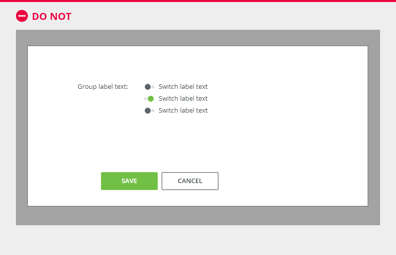
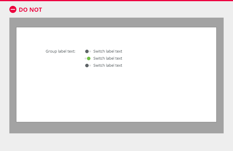
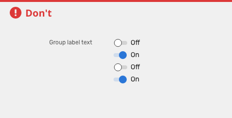
- DO NOT use checkboxes without submission buttons like Submit, OK. Use Switches with instant update, without buttons.
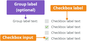
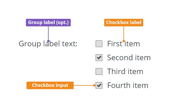
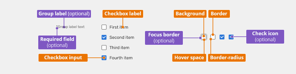
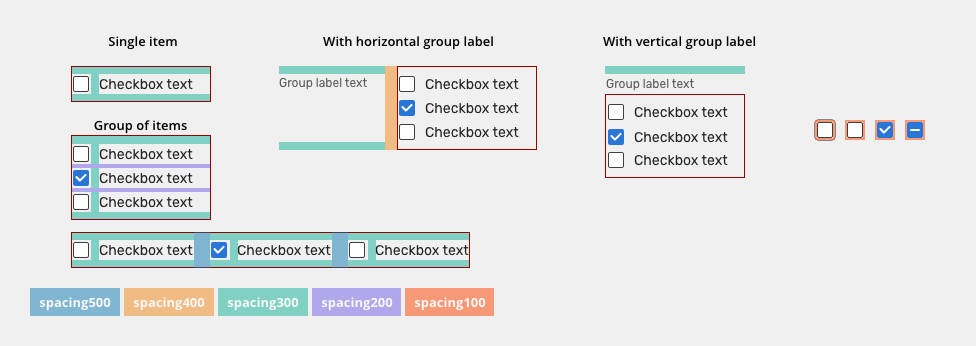
Anatomy

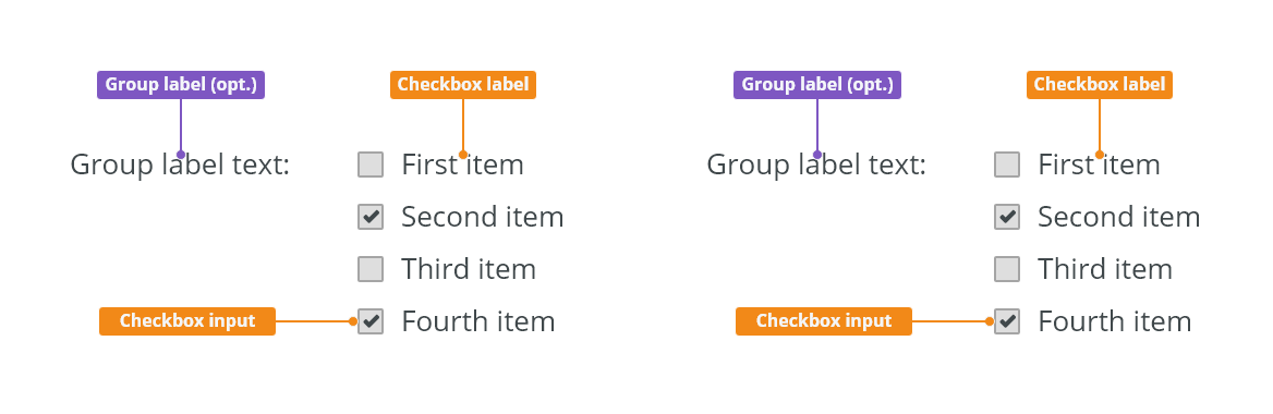
- Group label (optional) - Describes what needs to be selected.
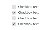
- Checkbox label
- Describes the information you want to select or unselect.
- Checkboxes should always have a label.
- Labels should be short and clear as to what will happen if the option is selected. Do not truncate checkbox label text with an ellipsis.
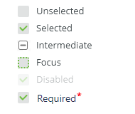
- Checkbox input - A checkbox input indicating the appropriate state. By default it is unselected.
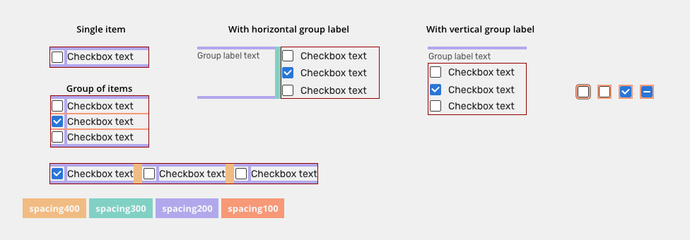
Variants
Alignment
Checkbox labels are positioned to the right of their inputs.
Vertical Alignment
It is recommended to create groups vertically for easier reading.
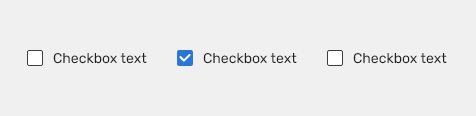
Horizontal Alignment
Horizontal Alignment
Behavior
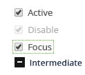
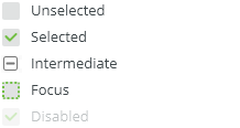
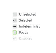
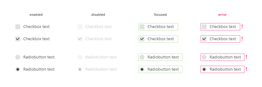
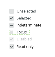
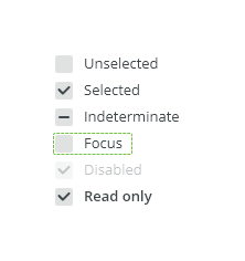
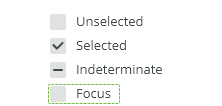
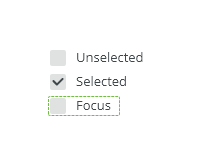
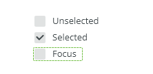
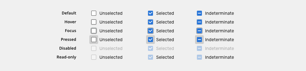
States

Indeterminate
Use the indeterminate state when the checkbox contains a sublist of selections, some of which are selected, and some unselected. e.g. in checkbox groups or in table header ("select all" checkbox).

Read-only
Allows for content to be copied, but not interacted with or changed.

Disabled
Cannot be interacted with but remains visible to the user in a disabled visual style.

Validation
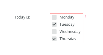
Client-side validation - It is recommend to validate the user data before the form submission. Fields are validated upon losing focus.
Typical group client error validations are:
- Nothing has been selected.
- Too much has been selected.
- Not enough has been selected.
Change of state / On Press animation
When check is clicked, the background animation is used to enhance visibility of the change of the state.

Keyboard Interactions
Key |
Interaction |
|---|---|
| Tab | Users can navigate between checkbox inputs by pressing <Tab> or <Shift>+<Tab>. |
| Space key | Toggles the checkbox between selected and not selected. If the checkbox is in an intermediate state initially, the checkbox becomes selected first. |
Editorial
- Labels - Use sentence case. Keep the text short and specific.
Related Components
Radio button - when only one selection from the group is allowed.
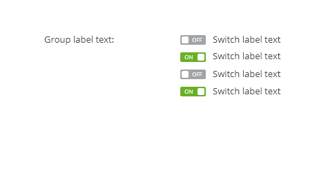
Switch button - are used to quickly switch between two opposing states.
Style

Used In |
Type |
px | Token |
|---|---|---|---|
| Checkbox labels | Font |
font-body |
|
| Checkbox labels | Color | color-text-100 |
|
| Group label | Font | font-label |
|
| Group label | Color | color-text-200 |
|
| Checkbox size | Object Size | 16x16 | |
| Hover space | Object Size | 20x20 | sizing-item-075 |
Unchecked |
|||
| Hover space | Color | color-bg-interactive-200 |
|
| Background | Color | color-bg-interactive-400 |
|
| Border | Color | color-border-100 |
|
| Border | Border size | 1 | border-width-100 |
| Border-radius | Border radius | 2 | radius-100 |
Checked + Indeterminate |
|||
| Hover space | Color | color-bg-interactive-200 |
|
| Background | Color | color-bg-interactive-100 |
|
| Border | Color | color-border-500 |
|
| Border | Border size | 1 | border-width-100 |
| Border-radius | Border radius | 2 | radius-100 |
| Check icon | Color | color-icon-200 |
|
States
| Used in | Type | px | Token |
|---|---|---|---|
Hover |
|||
| Hover space | Color | color-bg-interactive-200-hover |
|
Pressed |
|||
| Hover space | Color | color-bg-interactive-200-pressed |
|
| Hover space | Object size | 28x28 | sizing-item-200 |
| Hover space expansion | Duration | duration-150 | |
| Hover space hide | fade | duration-150 | |
Disabled |
|||
| Whole component | Opacity | opacity-disabled |
|
Read-only |
|||
| Checkbox | Opacity | opacity-disabled | |
Focus |
|||
| Focus border | Border size | 1 | border-width-100 |
| Focus border | Color | color-focus-200 |
|
| Focus border | Corner-radius | 4 | radius-200 |
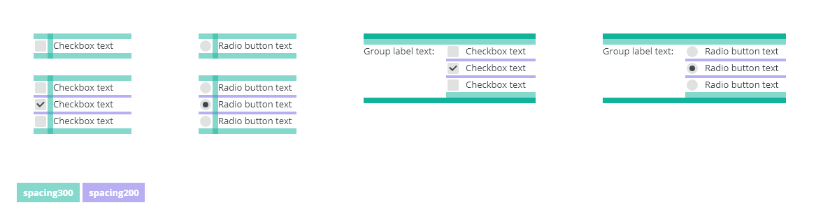
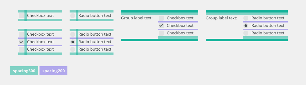
Spacing

Used In |
PX | Type |
Token |
|---|---|---|---|
| Paddings between items (vertical stack) | 4 |
Spacing |
spacing-200 |
| Paddings between items (horizontal stack) | 16 | Spacing | spacing-500 |
| Top and Bottom padding, space between inputs and labels | 8 |
Spacing |
spacing-300 |
| Minimal space between group label and "input" | 12 | spacing | spacing-400 |
| Padding of check box | 2 | Spacing | spacing-100 |
Condensed
| Paddings between items (vertical stack) | 2 |
Spacing |
spacing-100 |
| Paddings between items (horizontal stack) | 12 | Spacing | spacing-500 |
| Top and Bottom padding, space between inputs and labels | 4 |
Spacing |
spacing-200 |
| Minimal space between group label and "input" | 8 |
Spacing | spacing-300 |
| Padding of check box | 2 |
Spacing | spacing-100 |
Accessibility
- Provide labels and instructions that are clear and concise.
- If the input is a required field include the
aria-requiredproperty and indicate that it is a required field and use the validation message for input errors. - When the checkbox is selected the ARIA state is set to
aria-checked="true"and when it is deselectedaria-checked="false". - An indeterminable checkbox has an ARIA state that is set to
aria-checked="mixed"until it is selected or deselected by the user. - W3C WAI-ARIA Authoring Practices Checkbox Design Pattern
Attachments:
 image2020-10-6_14-3-9.png (image/png)
 image2020-10-6_14-15-2.png (image/png)
 image2020-10-6_14-28-31.png (image/png)
 image2020-10-6_15-6-17.png (image/png)
 image2020-10-6_15-6-31.png (image/png)
 image2020-10-6_15-42-0.png (image/png)
 image2020-10-6_15-42-4.png (image/png)
 image2020-10-6_15-42-49.png (image/png)
 image2020-10-8_12-35-40.png (image/png)
 image2020-10-8_12-36-2.png (image/png)
 image2020-10-9_15-23-26.png (image/png)
 image2020-10-29_10-11-45.png (image/png)
 image2020-10-29_10-16-0.png (image/png)
 Checkboxes, radiobuttons - DO.png (image/png)
 Checkboxes, radiobuttons - DONT.png (image/png)
 Checkboxes, radiobuttons - Anatomy.png (image/png)
 Checkboxes, radiobuttons - Vertical alignment.png (image/png)
 Checkboxes, radiobuttons - Horizontal alignment.png (image/png)
 Checkboxes, radiobuttons - States.png (image/png)
 Checkboxes, radiobuttons - Indeterminate state.png (image/png)
 Checkboxes, radiobuttons - Validation.png (image/png)
 Checkboxes, radiobuttons - Style.png (image/png)
 Checkboxes, radiobuttons - All.png (image/png)
 Checkboxes - Anatomy.png (image/png)
 image2020-11-9_10-40-28.png (image/png)
 Checkboxes - DO.png (image/png)
 Checkboxes, radiobuttons - Style.png (image/png)
 Checkboxes, radiobuttons - All.png (image/png)
 Checkboxes - States.png (image/png)
 image2020-11-13_12-46-9.png (image/png)
 image2020-11-13_12-41-58.png (image/png)
 image2020-11-13_12-41-40.png (image/png)
 image2020-11-13_12-47-46.png (image/png)
 image2020-11-13_12-47-49.png (image/png)
 image2020-11-13_12-48-4.png (image/png)
 image2020-11-13_12-49-58.png (image/png)
 image2020-11-13_14-18-59.png (image/png)
 image2020-11-13_14-20-22.png (image/png)
 image2020-11-13_14-21-24.png (image/png)
 image2020-11-13_14-22-24.png (image/png)
 image2020-12-1_10-57-14.png (image/png)
image2020-12-1_10-59-46.png (image/png)
checkboxes-do.png (image/png)
image2020-12-1_10-57-14.png (image/png)
image2020-12-1_10-59-46.png (image/png)
checkboxes-do.png (image/png)
 checkboxes-dont.png (image/png)
 checkboxes-anatomy.png (image/png)
 checkboxes-vertical-alignment.png (image/png)
 checkboxes-horizontal-alignment.png (image/png)
 checkboxes-states.png (image/png)
 checkboxes-indeterminate-state.png (image/png)
 checkboxes-validation.png (image/png)
 checkboxes-readonly.png (image/png)
 checkboxes-disabled.png (image/png)
 checkboxes-radiobuttons-style.png (image/png)
 checkbox-title.png (image/png)
 checkboxes-style.png (image/png)
 checkbox-title.png (image/png)
 checkboxes-do.png (image/png)
 checkboxes-dont.png (image/png)
 checkboxes-anatomy.png (image/png)
 checkboxes-vertical-alignment.png (image/png)
 checkboxes-horizontal-alignment.png (image/png)
 checkboxes-states.png (image/png)
 checkboxes-indeterminate-state.png (image/png)
 checkboxes-readonly.png (image/png)
 checkboxes-disabled.png (image/png)
 checkboxes-validation.png (image/png)
 checkboxes-style.png (image/png)
 checkbox-title.png (image/png)
 checkboxes-do.png (image/png)
 checkbox-title.png (image/png)
 checkboxes-do.png (image/png)
 checkboxes-dont.png (image/png)
 checkboxes-style.png (image/png)
 checkboxes-validation.png (image/png)
 checkboxes-anatomy.png (image/png)
 checkboxes-style.png (image/png)
 checkboxes-spacing.png (image/png)
 checkboxes-style.png (image/png)
 checkboxes-states.png (image/png)
 checkboxes-states.png (image/png)
 checkboxes-states.png (image/png)
 checkboxes-spacing.png (image/png)
 checkboxes-spacing.png (image/png)
 checkboxes-spacing-condensed.png (image/png)
 checkbox-title.png (image/png)
checkboxes-do.png (image/png)
checkboxes-dont.png (image/png)
checkbox-title.png (image/png)
checkboxes-do.png (image/png)
checkboxes-dont.png (image/png)
 checkboxes-anatomy.png (image/png)
checkboxes-vertical-alignment.png (image/png)
checkboxes-horizontal-alignment.png (image/png)
checkboxes-states.png (image/png)
checkboxes-anatomy.png (image/png)
checkboxes-vertical-alignment.png (image/png)
checkboxes-horizontal-alignment.png (image/png)
checkboxes-states.png (image/png)
 checkboxes-indeterminate-state.png (image/png)
checkboxes-readonly.png (image/png)
checkboxes-disabled.png (image/png)
checkboxes-validation.png (image/png)
checkboxes-style.png (image/png)
checkboxes-states.png (image/png)
checkboxes-indeterminate-state.png (image/png)
checkboxes-readonly.png (image/png)
checkboxes-disabled.png (image/png)
checkboxes-validation.png (image/png)
checkboxes-style.png (image/png)
checkboxes-states.png (image/png)
 checkboxes-spacing.png (image/png)
 checkboxes-dont.png (image/png)
checkboxes-states.png (image/png)
checkbox-pressed.mp4 (video/mp4)
checkbox-pressed.gif (image/gif)
checkboxes-dont.png (image/png)
checkboxes-states.png (image/png)
checkbox-pressed.mp4 (video/mp4)
checkbox-pressed.gif (image/gif)
 checkbox.gif (image/gif)
 checkboxes-spacing.png (image/png)
checkboxes-spacing-condensed.png (image/png)
checkbox-animation.gif (image/gif)
checkboxes-spacing.png (image/png)
checkboxes-spacing-condensed.png (image/png)
checkbox-animation.gif (image/gif)