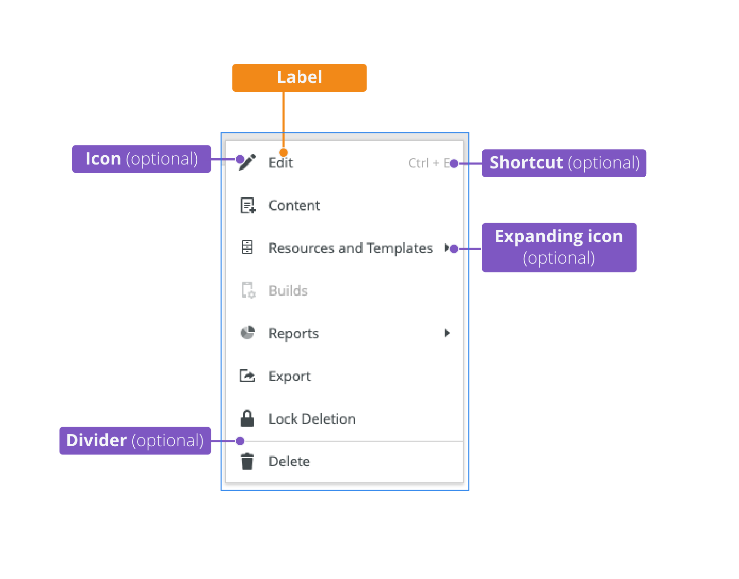
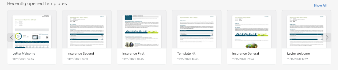
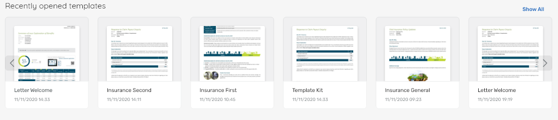
Carousels display and help users scroll through a group of related items that can contain images and text.
Component Status
 Design Kit: NOT RELEASED
 Bobwai component: @bobwai/carousel RELEASED

Usage
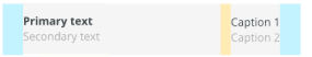
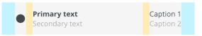
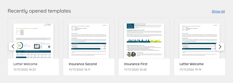
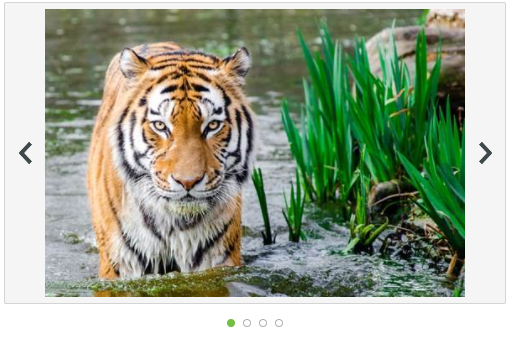
Carousels display a list of similar items and allows to scroll horizontally among items by two pagination buttons (previous and next). Items can contain various components (e.g. thumbnails, cards) including a link to the related screen.
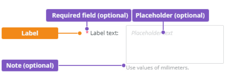
Carousels must have a heading and can optionally have a link to a screen displaying all items.
- Use carousels when there are many items to show, so that users can focus only on a few items at once.
- Items should be related to a particular category. Do not use carousels for unrelated items.
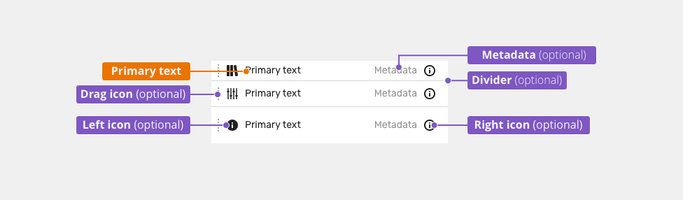
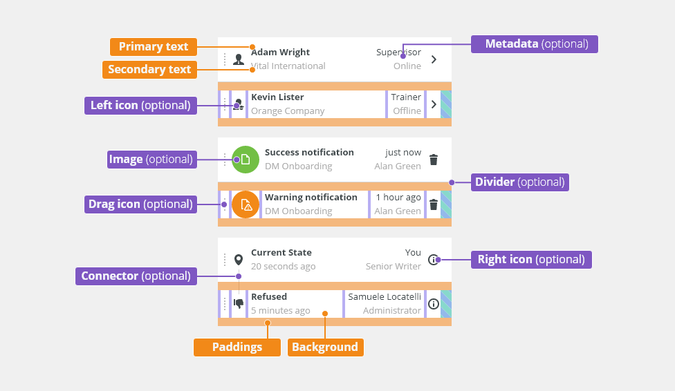
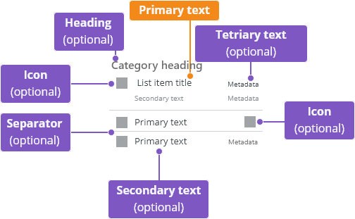
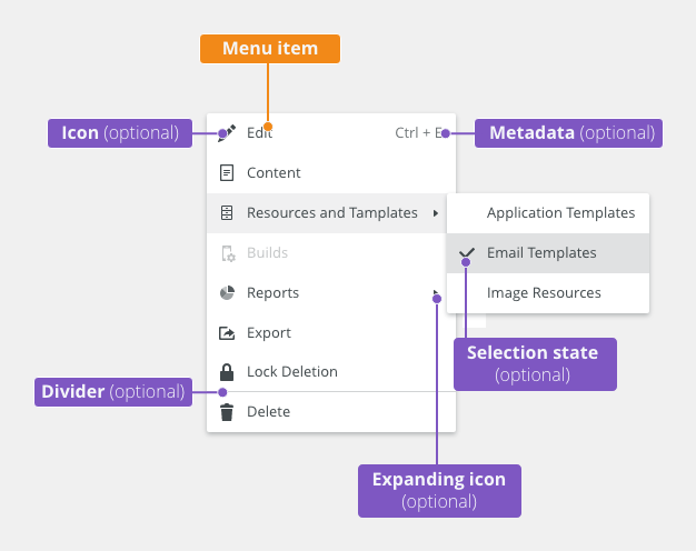
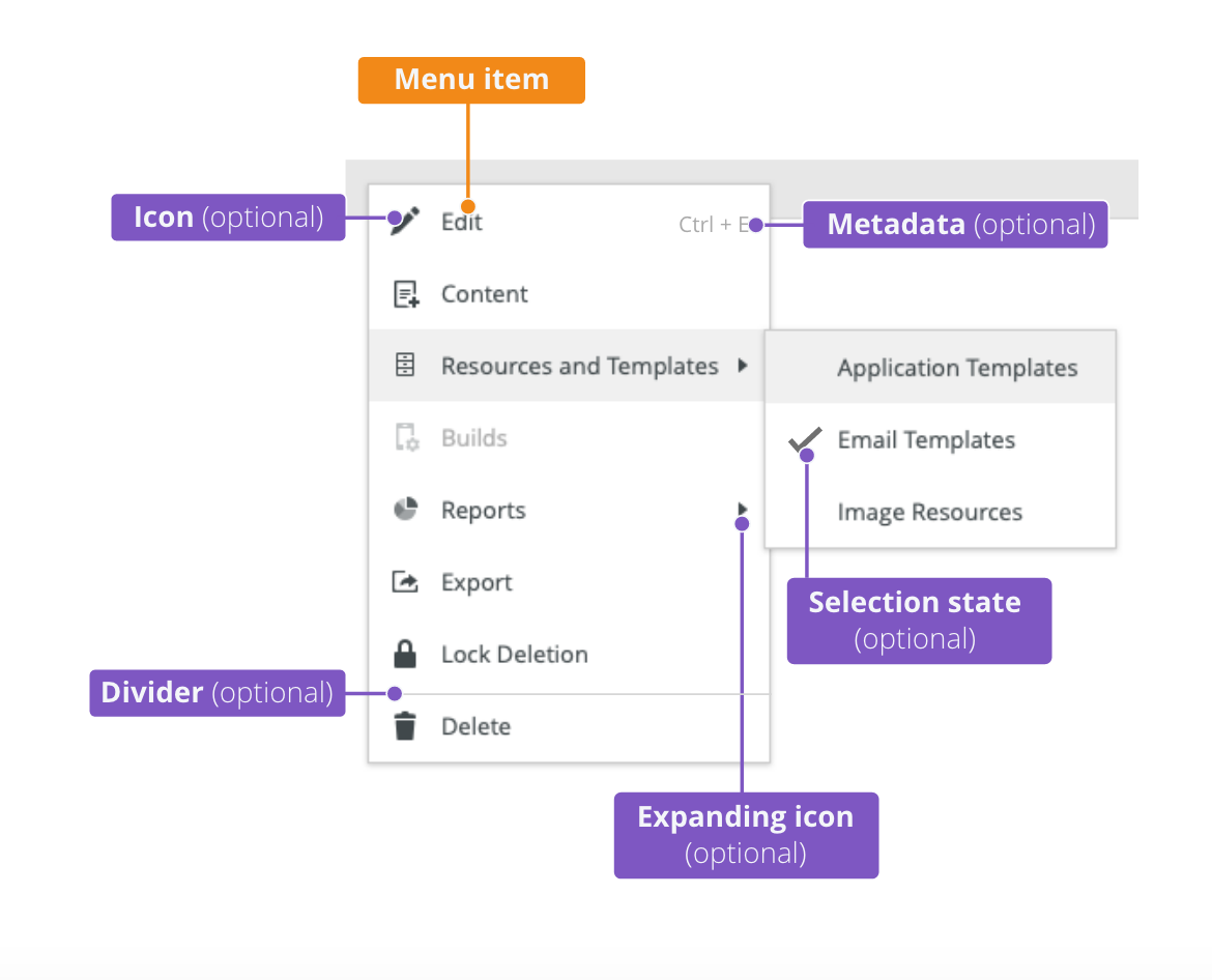
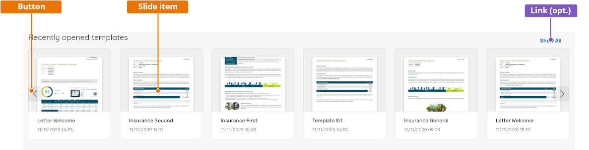
Anatomy
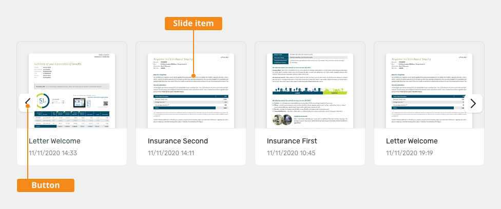
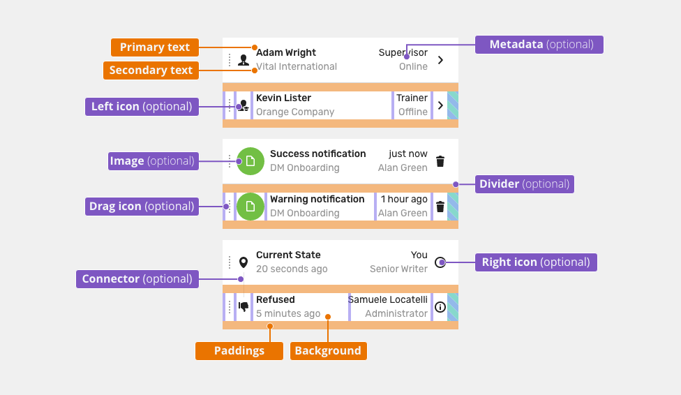
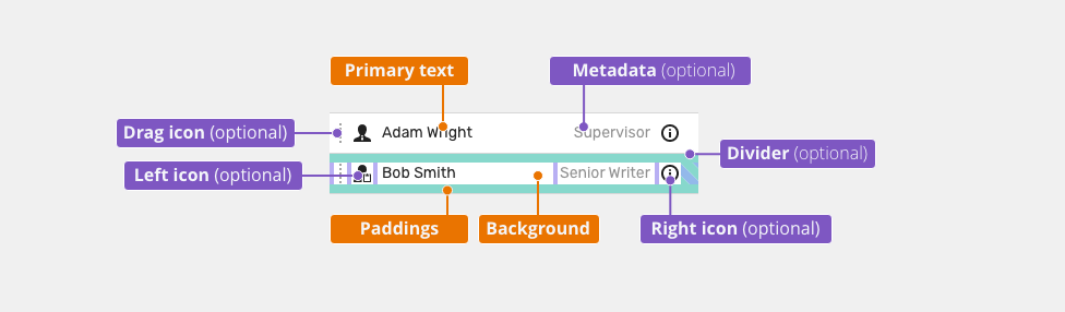
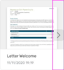
- Left button - scrolling to the next image or card.
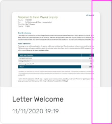
- Slide item - typically an image or a card.
- Right button - scrolling to the previous image or card.
Behavior
- Carrousels let the users navigate through a collection of slides in a sequential order (which are not looped).
- Left button is not present on beginning.
- Auto-play functionality is not supported.
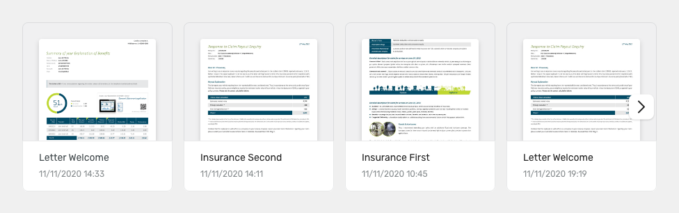
- The right button is not present at the end.

Responsivity
Carousels support both components - with fixed as well as percental based width.
Keyboard Interactions
| Key | Interaction |
|---|---|
| <Tab> and <Shift> + <Tab> | Tab keys allow moving focus in and out of the carousel. |
| <Left Arrow> | Moves focus to the previous thumbnail. |
| <Right Arrow> | Moves focus to the next thumbnail. |
| <Enter> | Toggles the action (open). |
Editorial
Keep the text short and specific.
Style
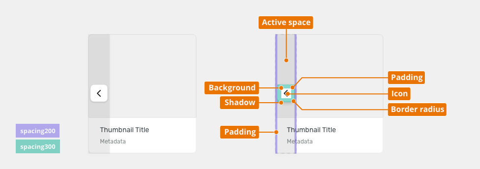
Carousel Buttons

| Used in | Type | px | Token |
|---|---|---|---|
| Background | color | color-bg-ui-100 | |
| Shadow | shadow | shadow-100 | |
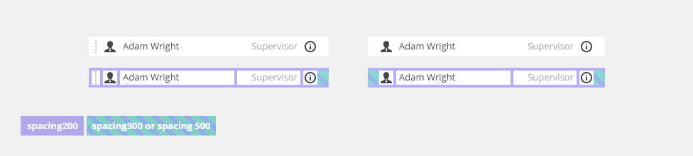
| Padding (area) | spacing | 4 | spacing-200 |
| Padding (button) | spacing | 8 | spacing-300 |
| Border radius | radius | 8 | radius-button-200 |
| Icon | color | color-icon-100 | |
| Icon | size | sizing-icon-200 | |
| Active space | color | color-bg-interactive-200 |
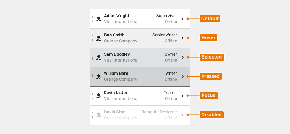
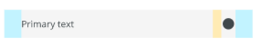
Carousel Button States
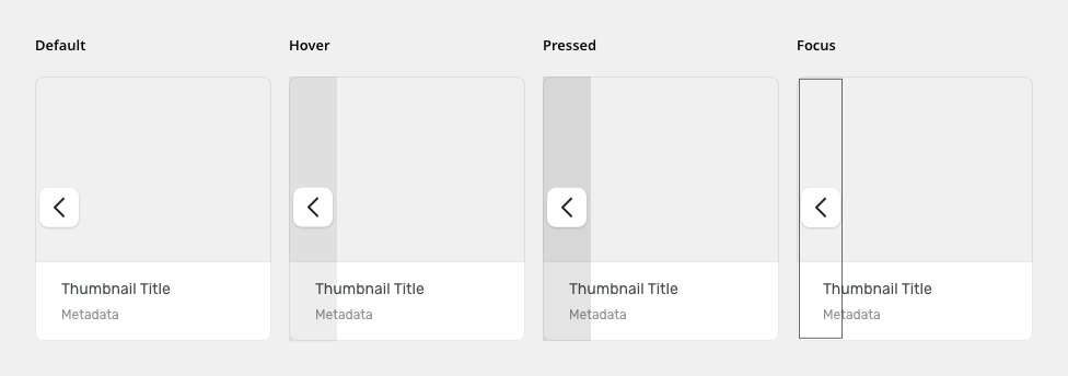
| Used in | Type | px | Token |
|---|---|---|---|
| Hover | |||
| Active space | color | color-bg-interactive-200-hover | |
| Pressed | |||
| Active space | color | color-bg-interactive-200-pressed | |
| Focus | |||
| Focus border | color | color-focus-200 | |
| Focus border | border size | 1 | border-width-100 |
| Focus border | spacing | 2 | spacing-100 |
Multiple Slides
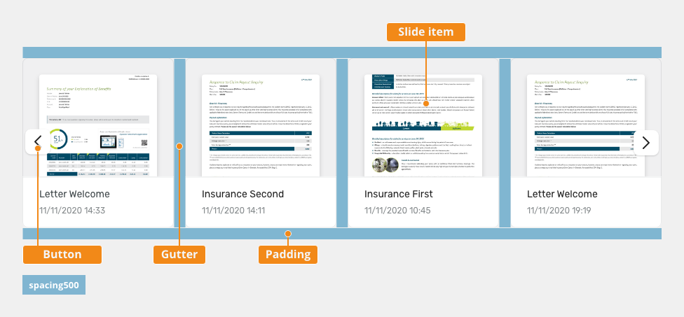
| Used in | Type | px | Token |
|---|---|---|---|
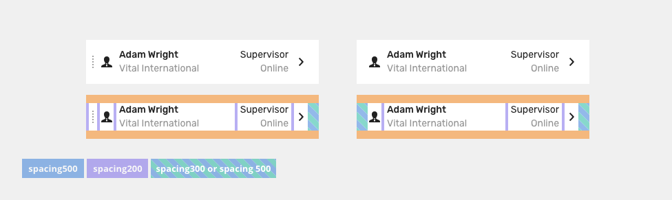
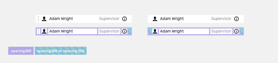
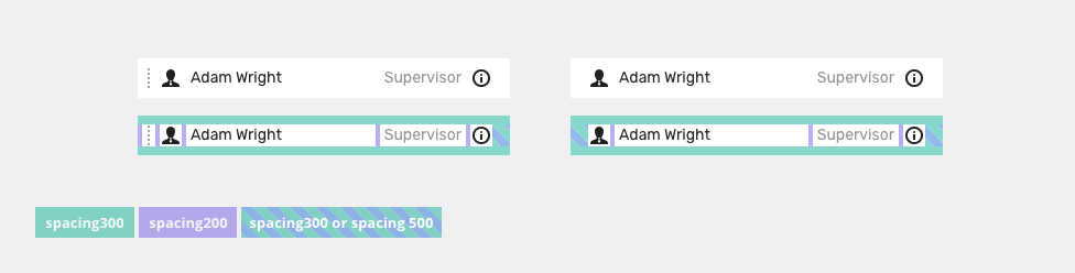
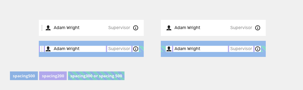
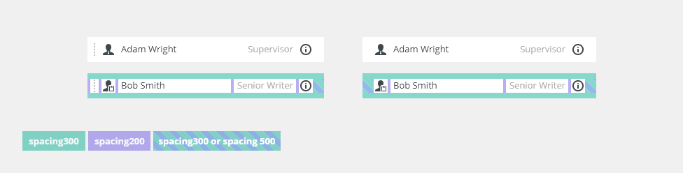
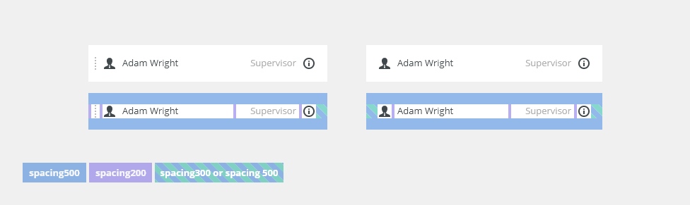
| Padding | spacing | 16 | spacing-500 |
| Gutter | spacing | 16 | spacing-500 |
Attachments:
 list-spacing-two-row-large.png (image/png)
 list-states-two-row.png (image/png)
 list-content-two-rows.png (image/png)
 list-spacing-one-row-small.png (image/png)
 list-spacing-one-row-medium.png (image/png)
 list-spacing-one-row-large.png (image/png)
 list-states-one-row.png (image/png)
 list-content-one-row.png (image/png)
 list-states-disabled.png (image/png)
 list-density-small.png (image/png)
 list-density-medium.png (image/png)
 list-density-large.png (image/png)
 list-variant-connector.png (image/png)
 list-variant-separator.png (image/png)
 list-variant-right-icon.png (image/png)
 list-variant-left-icon.png (image/png)
 list-variant-image.png (image/png)
 list-variant-double-line-metadata.png (image/png)
 list-variant-default-metadata.png (image/png)
 list-variant-double-line.png (image/png)
 list-variant–default.png (image/png)
 list-anatomy-two-row.png (image/png)
 list-anatomy-one-row.png (image/png)
 list-title.png (image/png)
 two-row-list-spacing.png (image/png)
 two-row-list-states.png (image/png)
 two-row-list-content.png (image/png)
 one-row-list-small-spacing.png (image/png)
 one-row-list-medium-spacing.png (image/png)
 one-row-list-large-spacing.png (image/png)
 one-row-list-states.png (image/png)
 one-row-list-content.png (image/png)
 image2020-12-14_14-37-19.png (image/png)
 image2020-12-14_14-36-56.png (image/png)
 image2020-12-14_14-36-39.png (image/png)
 image2020-12-14_14-34-48.png (image/png)
 image2020-12-14_14-33-16.png (image/png)
 image2020-12-14_14-31-46.png (image/png)
 image2020-12-14_10-40-23.png (image/png)
 image2020-12-14_10-39-35.png (image/png)
 image2020-12-14_10-38-38.png (image/png)
 Connector.png (image/png)
 Separator.png (image/png)
 Right icon.png (image/png)
 Left icon.png (image/png)
 List with image.png (image/png)
 Two rows with metadata.png (image/png)
 Single row with metadata.png (image/png)
 Two line list.png (image/png)
 Default list.png (image/png)
 two-row-list-anatomy.png (image/png)
 one-row-list-anatomy.png (image/png)
 image2020-12-3_13-37-16.png (image/png)
 image2020-12-3_11-43-59.png (image/png)
 image2020-12-3_11-43-3.png (image/png)
 image2020-12-2_13-1-8.png (image/png)
 image2020-12-2_13-0-8.png (image/png)
 image2020-12-2_12-59-19.png (image/png)
 image2020-12-2_12-56-32.png (image/png)
 image2020-12-2_12-53-34.png (image/png)
 image2020-9-23_10-25-22.png (image/png)
 image2020-9-25_10-47-30.png (image/png)
 image2020-9-23_9-55-10.png (image/png)
 image2020-9-25_11-4-55.png (image/png)
 image2020-9-23_10-24-23.png (image/png)
 image2020-9-23_10-17-52.png (image/png)
 image2020-9-23_9-54-16.png (image/png)
 image2020-9-24_16-18-22.png (image/png)
 image2020-9-24_16-6-51.png (image/png)
 image2020-9-25_10-10-4.png (image/png)
 Context-menu-dont-groups.png (image/png)
 Context-menu-do-groups.png (image/png)
 Context-menu-dont-short.png (image/png)
 Context-menu-do-short.png (image/png)
 Context-menu-states-disabled.png (image/png)
 Context-menu-groups.png (image/png)
 Context-menu-variants-with-title.png (image/png)
 Context-menu-variants-text-icons.png (image/png)
 Context-menu-variants-text-only.png (image/png)
 Context-menu-type-multilevel.png (image/png)
 Context-menu-type-basic.png (image/png)
 context-menu-anatomy.png (image/png)
 Screenshot 2020-11-20 at 14.27.17.png (image/png)
 Screenshot 2020-11-19 at 09.57.10.png (image/png)
 Screenshot 2020-11-18 at 13.08.05.png (image/png)
 Screenshot 2020-11-18 at 13.08.21.png (image/png)
 Screenshot 2020-11-19 at 08.14.34.png (image/png)
 Screenshot 2020-11-19 at 08.14.25.png (image/png)
 Screenshot 2020-11-16 at 13.53.55.png (image/png)
 Screenshot 2020-11-18 at 13.22.39.png (image/png)
 Screenshot 2020-11-18 at 13.11.11.png (image/png)
 Screenshot 2020-11-18 at 12.49.34.png (image/png)
 Screenshot 2020-11-16 at 15.22.41.png (image/png)
 Screenshot 2020-11-16 at 15.19.01.png (image/png)
 Screenshot 2020-11-16 at 15.09.35.png (image/png)
 Screenshot 2020-11-16 at 14.58.54.png (image/png)
 Screenshot 2020-11-16 at 15.01.07.png (image/png)
 image2020-11-2_9-26-30.png (image/png)
 image2020-11-2_9-26-14.png (image/png)
 image2020-11-2_9-24-56.png (image/png)
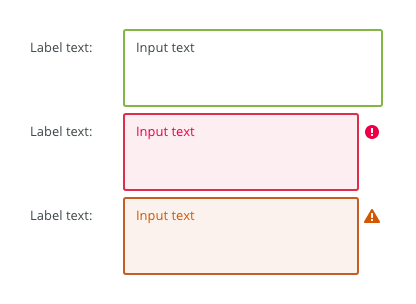
 text-area-variants-warning-icon.png (image/png)
 text-area-variants-error-icon.png (image/png)
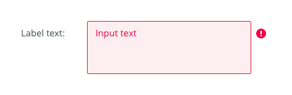 text-input-variants-warning-icon.png (image/png)
 text-area-density-small.png (image/png)
 text-area-density-default.png (image/png)
 text-input-density-small.png (image/png)
 text-area-state-focus.png (image/png)
 text-area-state-readonly.png (image/png)
 text-area-state-disabled.png (image/png)
 text-area-state-selected.png (image/png)
 text-area-label-horizontal.png (image/png)
 text-area-style.png (image/png)
 text-area-validation.png (image/png)
 text-area-label-vertical.png (image/png)
 text-area-anatomy.png (image/png)
 textarea@2x.png (image/png)
 textarea-style@2x.png (image/png)
 image2020-10-26_13-26-26.png (image/png)
 image2020-10-26_13-24-0.png (image/png)
 image2020-10-26_13-22-55.png (image/png)
 image2020-10-26_13-22-16.png (image/png)
 image2020-10-26_13-21-57.png (image/png)
 image2020-10-23_15-38-49.png (image/png)
 image2020-10-2_14-42-44.png (image/png)
 image2020-10-2_14-25-33.png (image/png)
 image2020-10-2_14-25-18.png (image/png)
 image2020-10-2_14-34-9.png (image/png)
 image2020-10-2_14-33-47.png (image/png)
 image2020-10-2_14-21-26.png (image/png)
 image2020-10-2_14-20-58.png (image/png)
 image2020-10-2_14-21-11.png (image/png)
 image2020-10-2_14-20-45.png (image/png)
 image2020-10-5_11-37-46.png (image/png)
 image2020-10-5_10-55-2.png (image/png)
 image2020-10-5_10-54-40.png (image/png)
 image2020-10-5_10-54-33.png (image/png)
 image2020-10-5_10-53-29.png (image/png)
 image2020-10-5_10-52-58.png (image/png)
 image2020-10-2_13-46-8.png (image/png)
 image2020-10-2_13-45-41.png (image/png)
 image2020-10-2_15-23-33.png (image/png)
 image2020-10-5_10-26-47.png (image/png)
 image2020-10-5_10-26-24.png (image/png)
 image2020-10-5_10-25-57.png (image/png)
 image2020-10-5_10-17-0.png (image/png)
 image2020-11-27_9-53-18.png (image/png)
 image2020-11-27_10-59-3.png (image/png)
 image2020-11-27_12-13-3.png (image/png)
 image2020-11-27_12-20-20.png (image/png)
 image2020-11-27_12-24-3.png (image/png)
 image2020-11-27_15-3-39.png (image/png)
 image2020-11-27_15-4-12.png (image/png)
 image2020-11-27_15-14-27.png (image/png)
 image2020-11-27_15-19-14.png (image/png)
 image2020-11-27_15-46-5.png (image/png)
 image2020-11-30_14-3-56.png (image/png)
 image2020-11-30_14-8-32.png (image/png)
 image2020-11-30_14-17-56.png (image/png)
 image2020-11-30_14-32-1.png (image/png)
 image2020-12-1_10-56-37.png (image/png)
 image2020-12-1_10-57-14.png (image/png)
 image2020-12-1_10-57-28.png (image/png)
 image2020-12-1_10-59-46.png (image/png)
 image2021-2-25_11-25-25.png (image/png)
 image2021-2-25_11-27-43.png (image/png)
 image2021-2-25_12-11-6.png (image/png)
 image2021-2-25_12-14-44.png (image/png)
 image2021-3-1_10-36-57.png (image/png)
 image2021-3-1_10-37-12.png (image/png)
 image2021-3-1_10-37-25.png (image/png)
 image2021-3-1_10-37-59.png (image/png)
 carousel-button-anatomy.png (image/png)
 carousel-button-anatomy.png (image/png)
 carousel-title.png (image/png)
 carousel-anatomy.png (image/png)
 carousel-anatomy_begin-of-slides.png (image/png)
 carousel-anatomy_end-of-slides.png (image/png)
 carousel-title.png (image/png)
 carousel-anatomy_short-wide.png (image/png)
 carousel-content.png (image/png)
 carousel-anatomy_short-wide.png (image/png)
 carousel-anatomy.png (image/png)
carousel-anatomy_short-wide.png (image/png)
carousel-anatomy.png (image/png)
carousel-anatomy_short-wide.png (image/png)
 carousel-anatomy_begin-of-slides.png (image/png)
carousel-anatomy_end-of-slides.png (image/png)
carousel-anatomy_short-wide.png (image/png)
carousel-button-anatomy.png (image/png)
carousel-anatomy_begin-of-slides.png (image/png)
carousel-anatomy_end-of-slides.png (image/png)
carousel-anatomy_short-wide.png (image/png)
carousel-button-anatomy.png (image/png)
 carousel-button-anatomy.png (image/png)
 carousel-button-states.png (image/png)
 carousel-content.png (image/png)
carousel-button-states.png (image/png)
carousel-button-anatomy.png (image/png)
image2021-5-28_14-57-47.png (image/png)
carousel-content.png (image/png)
carousel-button-states.png (image/png)
carousel-button-anatomy.png (image/png)
image2021-5-28_14-57-47.png (image/png)