Cards group information into flexible containers that allow users to browse a collection of related items and actions.
Component Status
 Design Kit: NOT RELEASED
 Bobwai component: NOT RELEASED
Content Overview
Usage
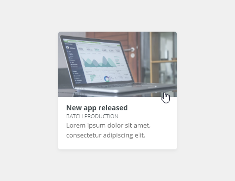
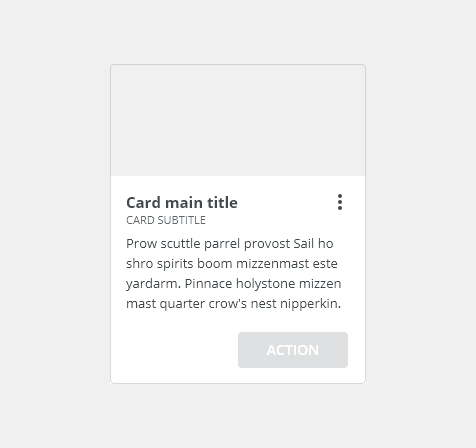
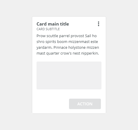
A card is a container for a few short, related pieces of information. Cards are used as an entry point of grouped several different (but related) pieces of information with a link to additional details.

- Use to provide summaries of many different kinds of content.

- Do not use for grouping a large set of related information, instead, use a widget component.
- Do not use for hierarchy order of the content (tables organize and order content better).
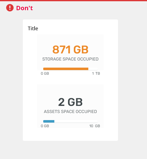
- Do not use for gallery of images, use thumbnails instead.
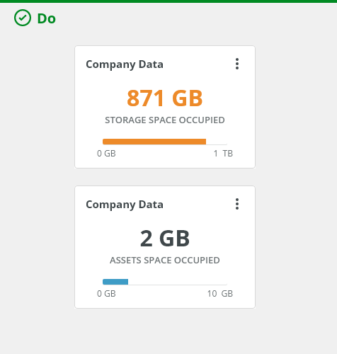
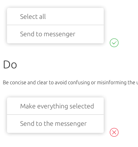
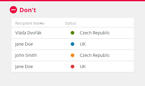
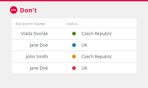
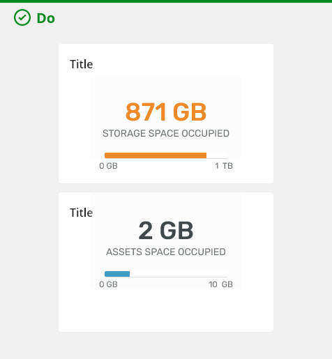
Do present single ideas in one card.
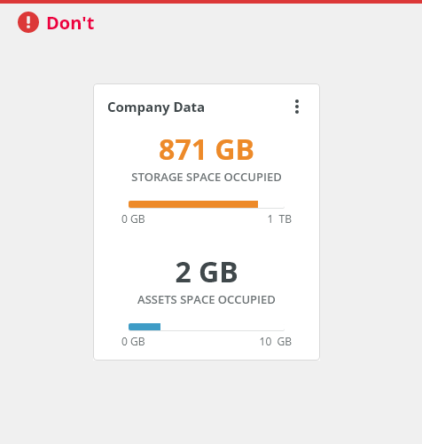
Do not present multiple ideas in one card. Instead, present each idea in its own card.
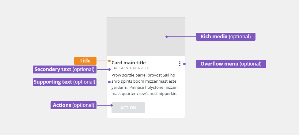
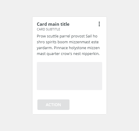
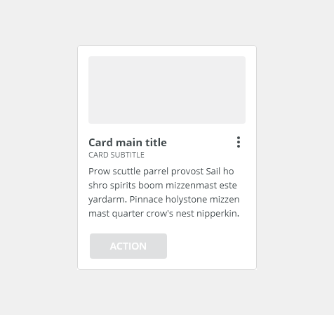
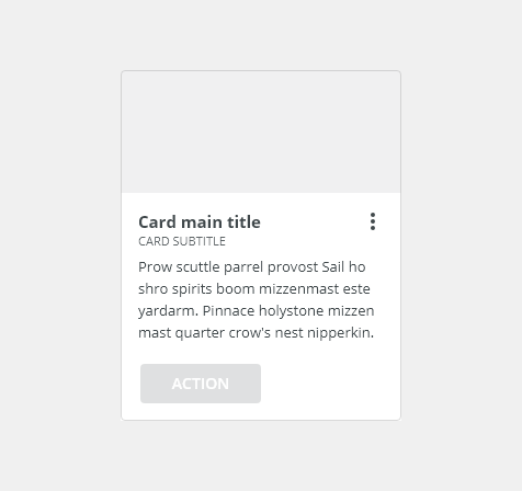
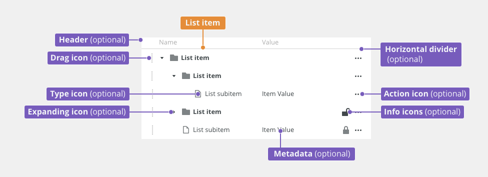
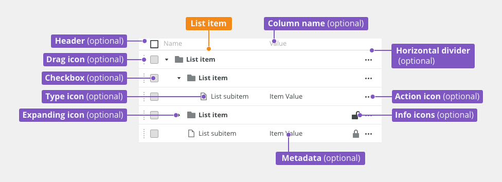
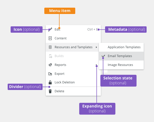
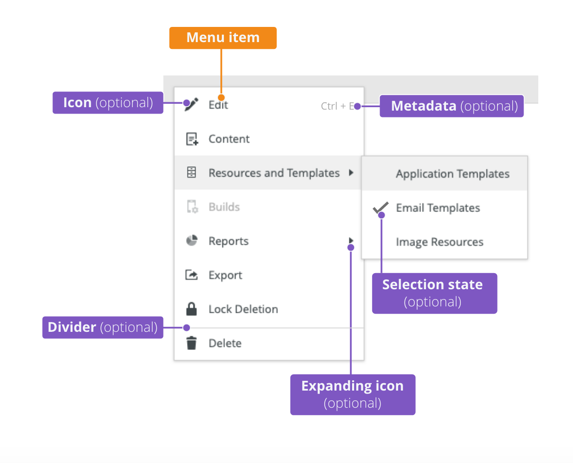
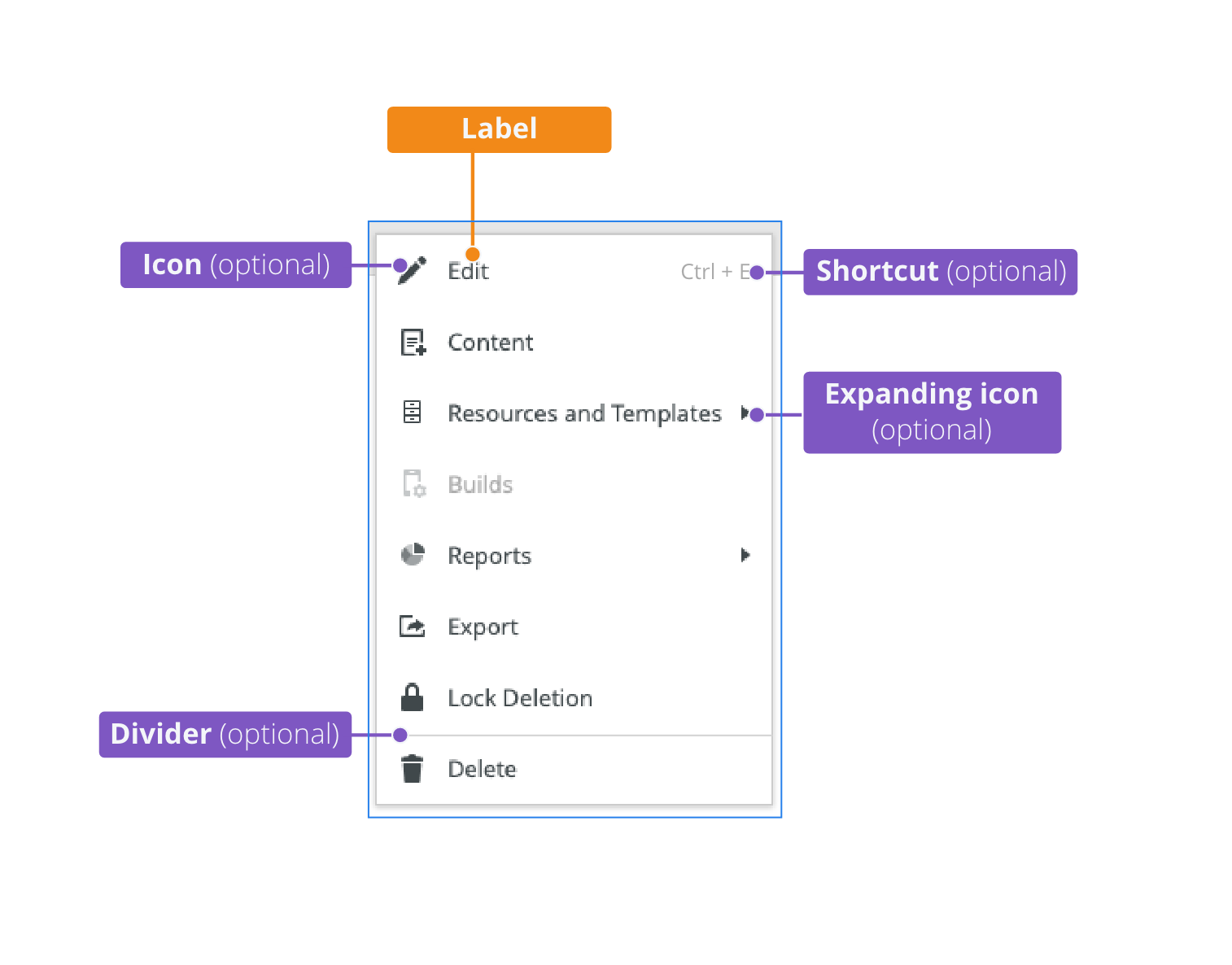
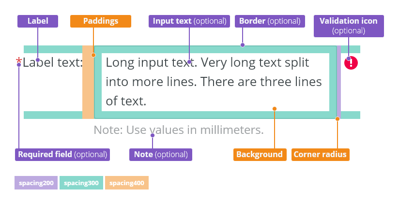
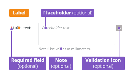
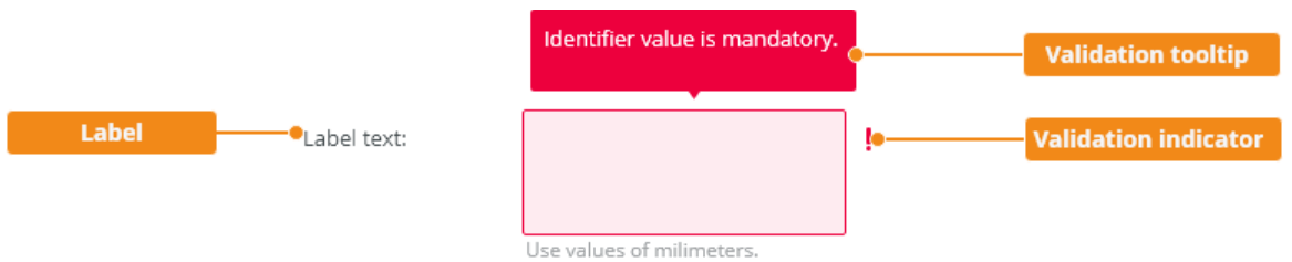
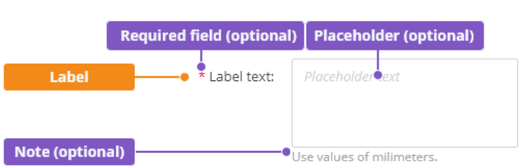
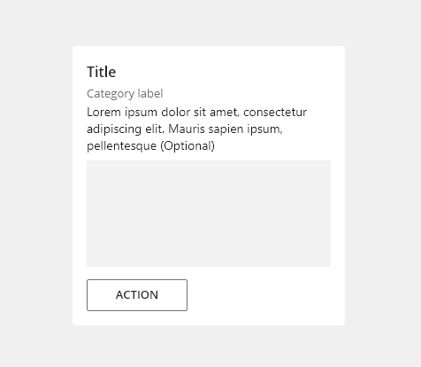
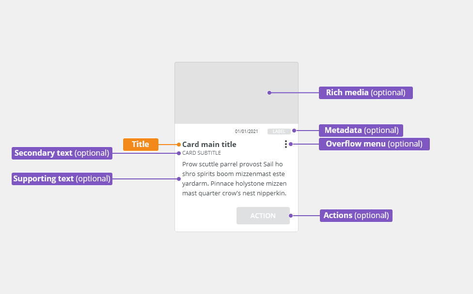
Anatomy
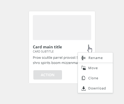
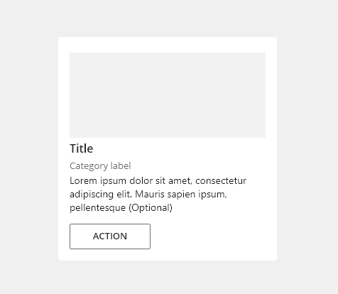
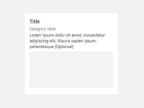
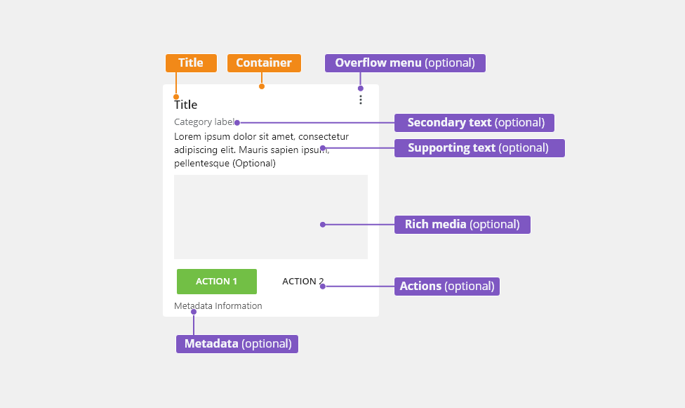
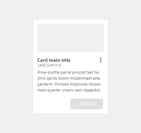
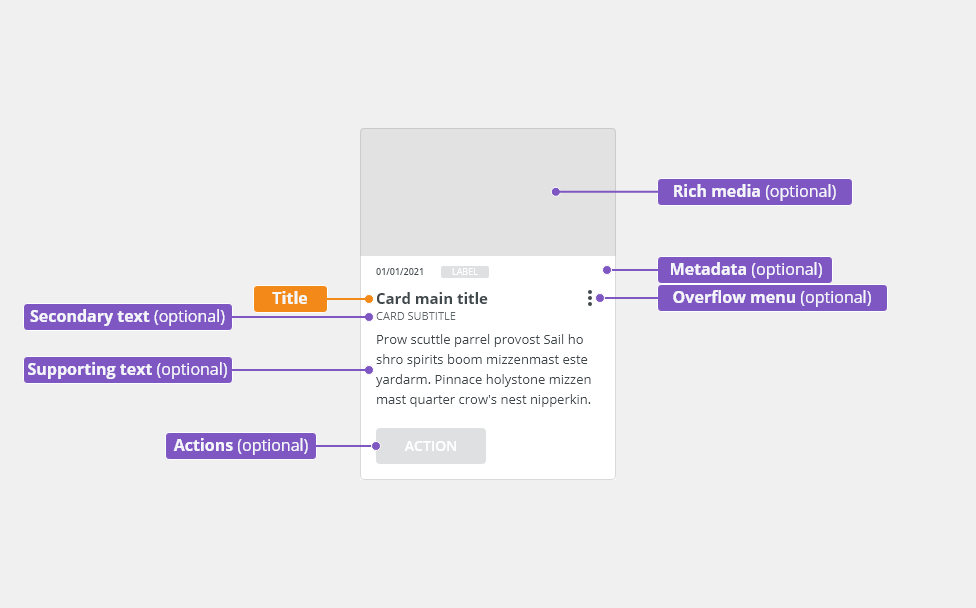
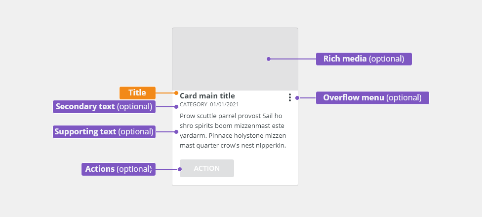
Card container - Standard cards background container.
- Title - Briefly summarizes the card content.
- Secondary text (optional) - Classifies the card to show its relationship to similar sets of information.
- Supporting text (optional) - Provides additional text to clarify or establish the card content. This element should not contain multiple paragraphs or links.
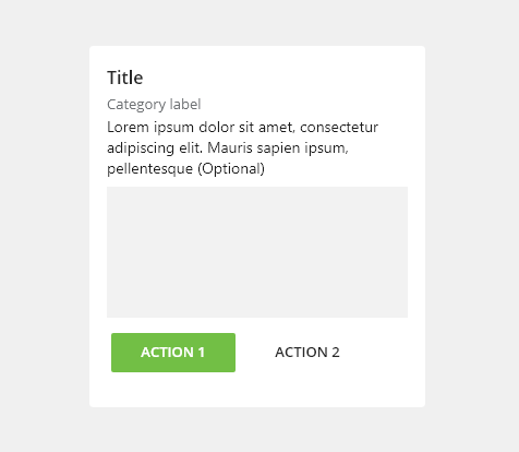
- Rich media (optional) - Displays content such as images, data tables, or charts.
- Action(optional) - Displays a single interactive UI component such as a button or a link.
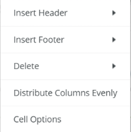
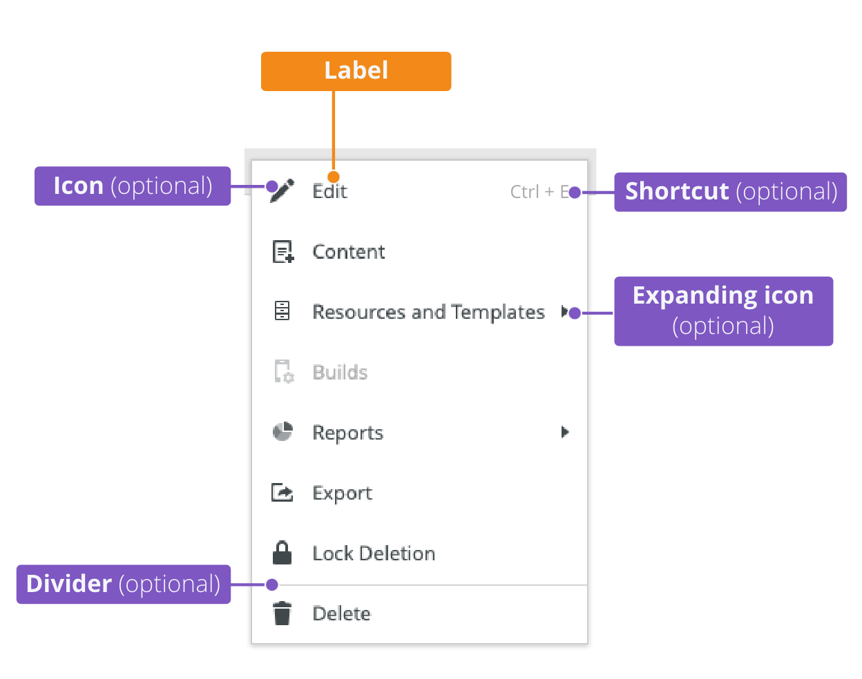
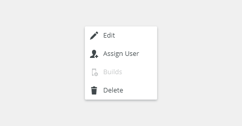
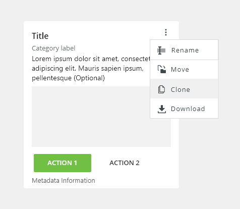
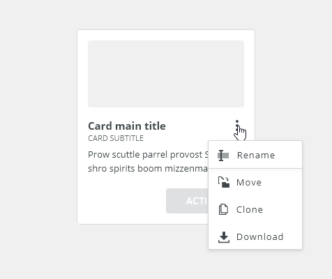
Overflow menu (optional) - Hidden menu with actions.
Types
Cards are typically used in the following cases:
Discovery and first-time use cards
- List card
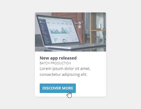
Discovery and First-Time Use Cards
To help first-time users and others discover additional features and capabilities of the product.
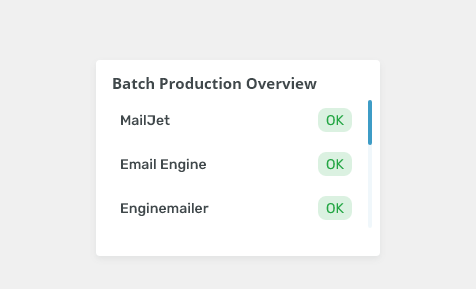
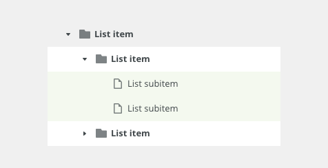
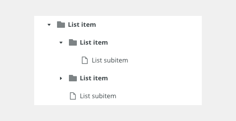
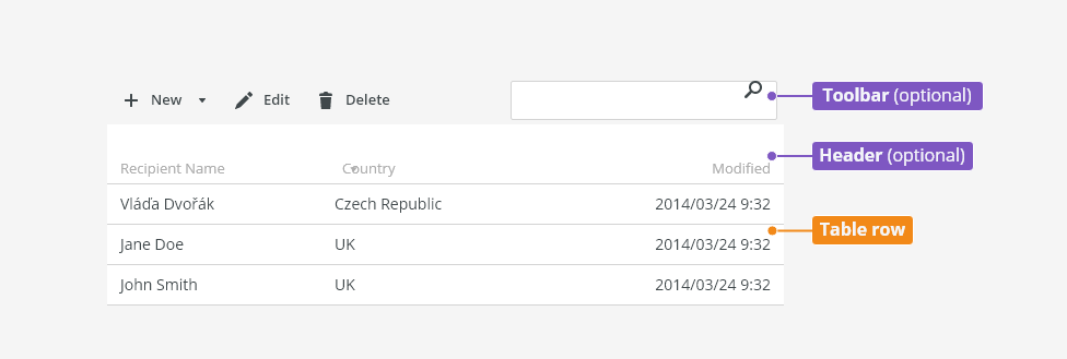
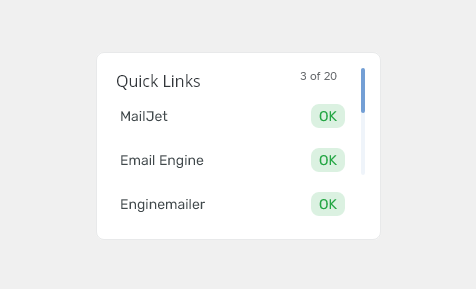
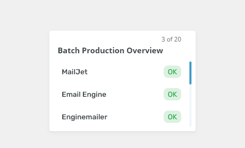
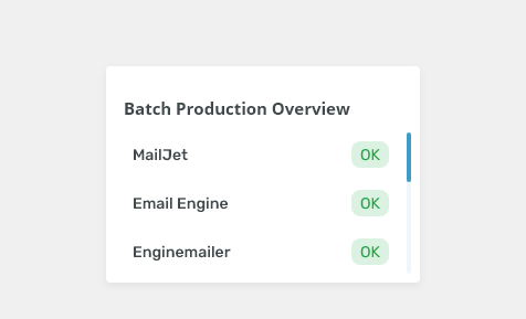
List Card
List cards contain list item components that users can view, take actions, or navigate to the related content.
Variants
Text First
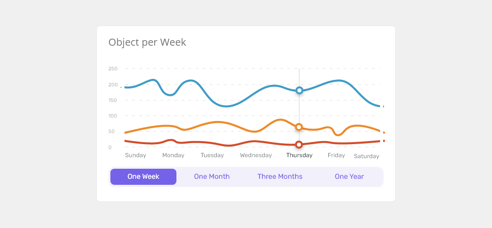
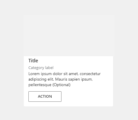
Rich Media First
Use when the rich media should be the initial focal point for a user’s attention.
Full Bleed Image
Appearance
Width
Cards have no fixed width so they will adopt the width of the parent element.
Height
The card height depends on the content of the card. Cards that are in a group should have the same height.
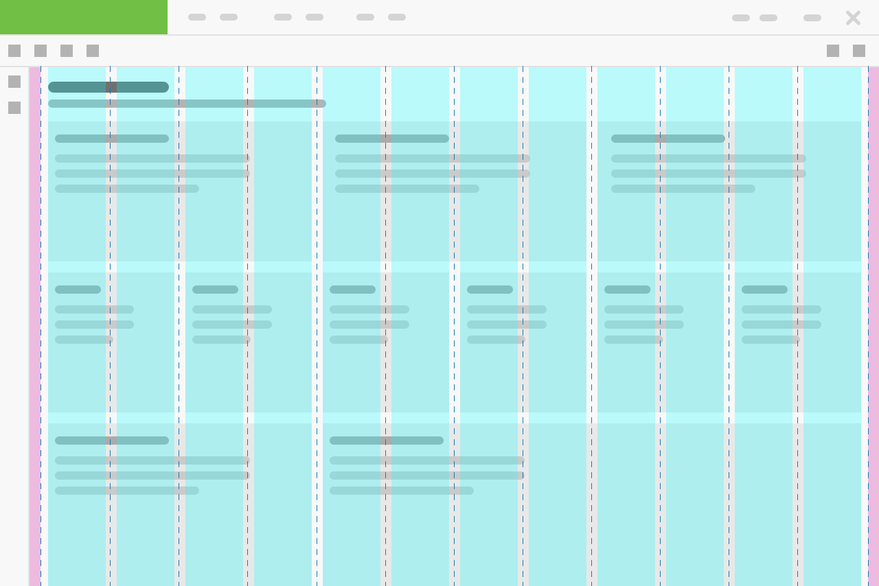
Layout
A group of cards is always arranged in a responsive grid layout. Cards have the same height and width as the rest of the cards in the group (typically a row).
Behavior
Clickable Cards
The primary action area of a card is typically the card itself.
Buttons in Cards
- If there is only one action (that is not opening or viewing the card), use a button to communicate that action.
- When using a call-to-action (CTA), use a secondary button, unless it is the most important action a on the page. Primary buttons should be reserved for the most important action on the page.
- For more than two supplemental actions, use an overflow menu instead.
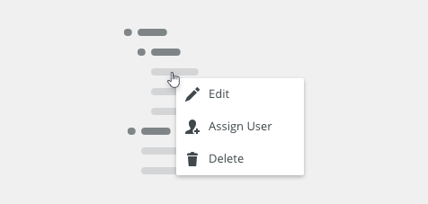
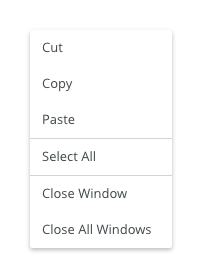
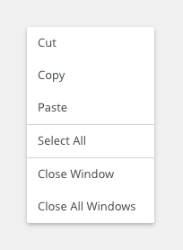
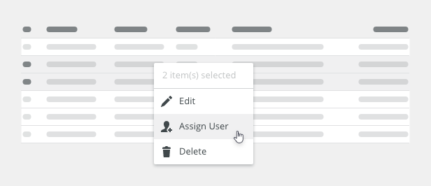
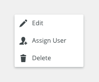
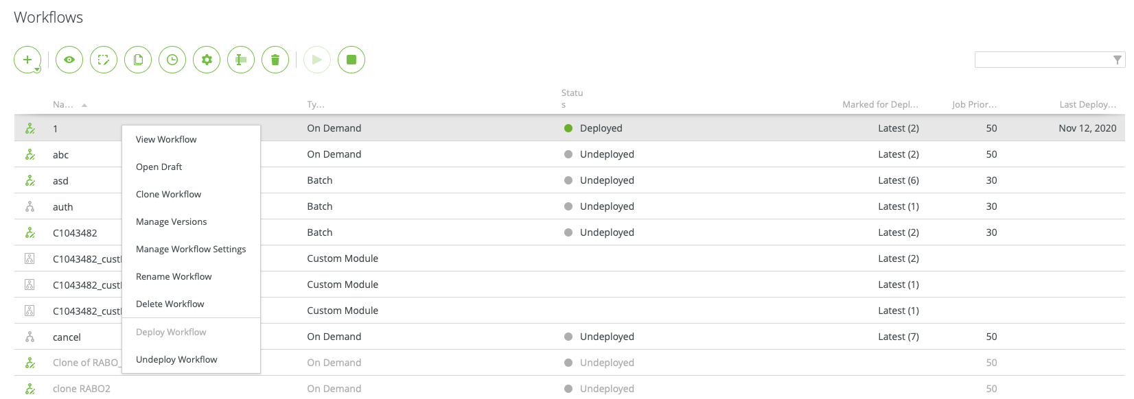
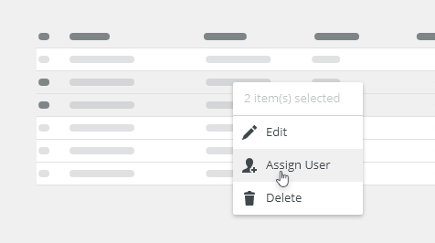
Overflow Menu
Overflow menus contain related actions. They are placed in the upper-right or lower-right corner of a card.
UI Controls
UI controls can be included within a rich media area of the card to allow the user to interact with the card content. UI controls may be in the form of buttons, tabs.
Scrolling
Text Overflow
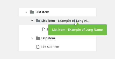
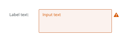
Overflowing text is truncated by ellipsis and the full value is displayed in a tooltip on hover.
Keyboard Interactions
Keys |
Interactions |
|---|---|
| Tab | Move to the next card. |
Arrows ⇦ ⇨ |
Move focus within the card to focusable items within the card. |
Return or Enter ↵ |
Enter triggers the link. If the card is not clickable but has buttons, the action is performed. |
Shift + Tab |
Move to the previous card. |
Editorial
- Title - Use sentence case.
Related Components
- Table bobwai--table
- List bobwai--list-item
Accessibility
- Provide labels and instructions that are clear and concise.
Attachments:
 image2020-12-20_19-52-51.png (image/png)
 image2020-12-20_19-52-12.png (image/png)
 image2020-12-18_14-12-49.png (image/png)
 tree-style.png (image/png)
 Tree-text-overflow.png (image/png)
 Tree-variants-error.png (image/png)
 tree-scroll.png (image/png)
 tree-toolbar.png (image/png)
 tree-trigger.png (image/png)
 Tree-list-item.png (image/png)
 tree-anatomy.png (image/png)
 Tree-states-disabled.png (image/png)
 Tree-states-loading.png (image/png)
 Tree-states-selected.png (image/png)
 Tree-states-hover.png (image/png)
 Tree-density-condensed.png (image/png)
 Tree-density-default.png (image/png)
 Tree-variants-subitem-icons.png (image/png)
 Tree-variants-with-icons.png (image/png)
 Tree-variants-without-icons.png (image/png)
 Tree-types-dragable.png (image/png)
 Tree-types-multi-select.png (image/png)
 Tree-types-single-select.png (image/png)
 tree-title.png (image/png)
 Context-menu-dont-groups.png (image/png)
 Context-menu-do-groups.png (image/png)
 Context-menu-dont-short.png (image/png)
 Context-menu-do-short.png (image/png)
 Context-menu-states-disabled.png (image/png)
 Context-menu-groups.png (image/png)
 Context-menu-variants-with-title.png (image/png)
 Context-menu-variants-text-icons.png (image/png)
 Context-menu-variants-text-only.png (image/png)
 Context-menu-type-multilevel.png (image/png)
 Context-menu-type-basic.png (image/png)
 context-menu-anatomy.png (image/png)
 Screenshot 2020-11-20 at 14.27.17.png (image/png)
 Screenshot 2020-11-19 at 09.57.10.png (image/png)
 Screenshot 2020-11-18 at 13.08.05.png (image/png)
 Screenshot 2020-11-18 at 13.08.21.png (image/png)
 Screenshot 2020-11-19 at 08.14.34.png (image/png)
 Screenshot 2020-11-19 at 08.14.25.png (image/png)
 Screenshot 2020-11-16 at 13.53.55.png (image/png)
 Screenshot 2020-11-18 at 13.22.39.png (image/png)
 Screenshot 2020-11-18 at 13.11.11.png (image/png)
 Screenshot 2020-11-18 at 12.49.34.png (image/png)
 Screenshot 2020-11-16 at 15.22.41.png (image/png)
 Screenshot 2020-11-16 at 15.19.01.png (image/png)
 Screenshot 2020-11-16 at 15.09.35.png (image/png)
 Screenshot 2020-11-16 at 14.58.54.png (image/png)
 Screenshot 2020-11-16 at 15.01.07.png (image/png)
 image2020-11-2_9-26-30.png (image/png)
 image2020-11-2_9-26-14.png (image/png)
 image2020-11-2_9-24-56.png (image/png)
 text-area-variants-warning-icon.png (image/png)
 text-area-variants-error-icon.png (image/png)
 text-input-variants-warning-icon.png (image/png)
 text-area-density-small.png (image/png)
 text-area-density-default.png (image/png)
 text-input-density-small.png (image/png)
 text-area-state-focus.png (image/png)
 text-area-state-readonly.png (image/png)
 text-area-state-disabled.png (image/png)
 text-area-state-selected.png (image/png)
 text-area-label-horizontal.png (image/png)
 text-area-style.png (image/png)
 text-area-validation.png (image/png)
 text-area-label-vertical.png (image/png)
 text-area-anatomy.png (image/png)
 textarea@2x.png (image/png)
 textarea-style@2x.png (image/png)
 image2020-10-26_13-26-26.png (image/png)
 image2020-10-26_13-24-0.png (image/png)
 image2020-10-26_13-22-55.png (image/png)
 image2020-10-26_13-22-16.png (image/png)
 image2020-10-26_13-21-57.png (image/png)
 image2020-10-23_15-38-49.png (image/png)
 image2020-10-2_14-42-44.png (image/png)
 image2020-10-2_14-25-33.png (image/png)
 image2020-10-2_14-25-18.png (image/png)
 image2020-10-2_14-34-9.png (image/png)
 image2020-10-2_14-33-47.png (image/png)
 image2020-10-2_14-21-26.png (image/png)
 image2020-10-2_14-20-58.png (image/png)
 image2020-10-2_14-21-11.png (image/png)
 image2020-10-2_14-20-45.png (image/png)
 image2020-10-5_11-37-46.png (image/png)
 image2020-10-5_10-55-2.png (image/png)
 image2020-10-5_10-54-40.png (image/png)
 image2020-10-5_10-54-33.png (image/png)
 image2020-10-5_10-53-29.png (image/png)
 image2020-10-5_10-52-58.png (image/png)
 image2020-10-2_13-46-8.png (image/png)
 image2020-10-2_13-45-41.png (image/png)
 image2020-10-2_15-23-33.png (image/png)
 image2020-10-5_10-26-47.png (image/png)
 image2020-10-5_10-26-24.png (image/png)
 image2020-10-5_10-25-57.png (image/png)
 image2020-10-5_10-17-0.png (image/png)
 image2020-11-27_9-53-18.png (image/png)
 image2020-11-27_10-59-3.png (image/png)
 image2020-11-27_12-13-3.png (image/png)
 image2020-11-27_12-20-20.png (image/png)
 image2020-11-27_12-24-3.png (image/png)
 image2020-11-27_15-3-39.png (image/png)
 image2020-11-27_15-4-12.png (image/png)
 image2020-11-27_15-14-27.png (image/png)
 image2020-11-27_15-19-14.png (image/png)
 image2020-11-27_15-46-5.png (image/png)
 image2020-11-30_14-3-56.png (image/png)
 image2020-11-30_14-8-32.png (image/png)
 image2020-11-30_14-17-56.png (image/png)
 image2020-11-30_14-32-1.png (image/png)
 image2020-12-1_10-56-37.png (image/png)
 image2020-12-1_10-57-14.png (image/png)
image2020-12-1_10-57-28.png (image/png)
image2020-12-1_10-57-14.png (image/png)
image2020-12-1_10-57-28.png (image/png)
 image2020-12-1_10-59-46.png (image/png)
image2021-1-4_15-1-24.png (image/png)
image2020-12-1_10-59-46.png (image/png)
image2021-1-4_15-1-24.png (image/png)
 image2021-1-4_15-5-8.png (image/png)
 image2021-1-4_15-11-22.png (image/png)
 image2021-1-4_15-14-29.png (image/png)
 image2021-1-4_15-17-16.png (image/png)
 image2021-1-4_15-24-28.png (image/png)
 image2021-1-6_12-7-39.png (image/png)
 image2021-1-6_12-11-13.png (image/png)
 image2021-1-6_12-13-32.png (image/png)
 image2021-1-8_15-42-20.png (image/png)
 Layout-example-dashboard – 2.png (image/png)
 image2021-1-11_14-15-28.png (image/png)
 image2021-1-11_14-16-40.png (image/png)
 Card - Anatomy.png (image/png)
 Card - DO.png (image/png)
Card - DONT.png (image/png)
Card - With button.png (image/png)
Card - DO.png (image/png)
Card - DONT.png (image/png)
Card - With button.png (image/png)
 Card - Analytics.png (image/png)
Card - List.png (image/png)
Card - Analytics.png (image/png)
Card - List.png (image/png)
 Card - Variant 02.png (image/png)
 Card - Variant 01.png (image/png)
 Card - Variant 03.png (image/png)
 Card - No button.png (image/png)
Card - With button.png (image/png)
Card - Overflow Menu.png (image/png)
Card - No button.png (image/png)
Card - With button.png (image/png)
Card - Overflow Menu.png (image/png)
 image2021-1-18_13-56-57.png (image/png)
 image2021-1-18_13-57-34.png (image/png)
 image2021-1-18_13-58-40.png (image/png)
image2021-1-18_14-1-52.png (image/png)
image2021-1-18_14-2-3.png (image/png)
image2021-1-18_13-58-40.png (image/png)
image2021-1-18_14-1-52.png (image/png)
image2021-1-18_14-2-3.png (image/png)
 image2021-1-18_14-2-39.png (image/png)
image2021-1-18_14-2-58.png (image/png)
image2021-1-18_14-16-28.png (image/png)
image2021-1-25_10-36-40.png (image/png)
image2021-1-18_14-2-39.png (image/png)
image2021-1-18_14-2-58.png (image/png)
image2021-1-18_14-16-28.png (image/png)
image2021-1-25_10-36-40.png (image/png)
 image2021-1-25_10-56-25.png (image/png)
image2021-1-27_12-47-37.png (image/png)
image2021-1-25_10-56-25.png (image/png)
image2021-1-27_12-47-37.png (image/png)