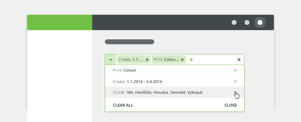
Advanced filter allows a user to add or remove data items from a displayed data set.
Component Status
 Design Kit: NOT RELEASED
 Bobwai component: bobwai--advanced-filter RELEASED
Usage
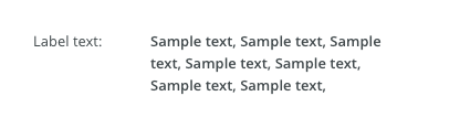
Filtering allows users to narrow down visible items when working with a large data set. Filters can help a user find something they are looking for by displaying available options within a certain set of criteria, and make a decision when faced with a large number of options.


Use an advanced filter when the user is presented with a large data set.
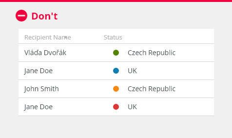
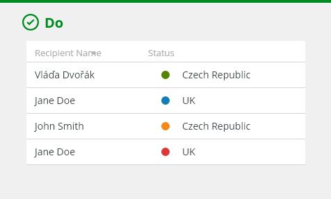
- Ensure the filter categories are clear and relevant to the data set.

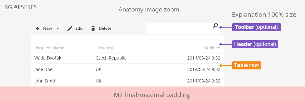
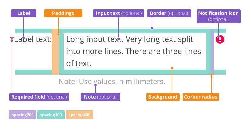
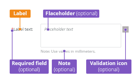
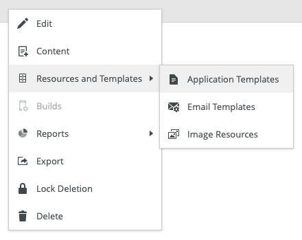
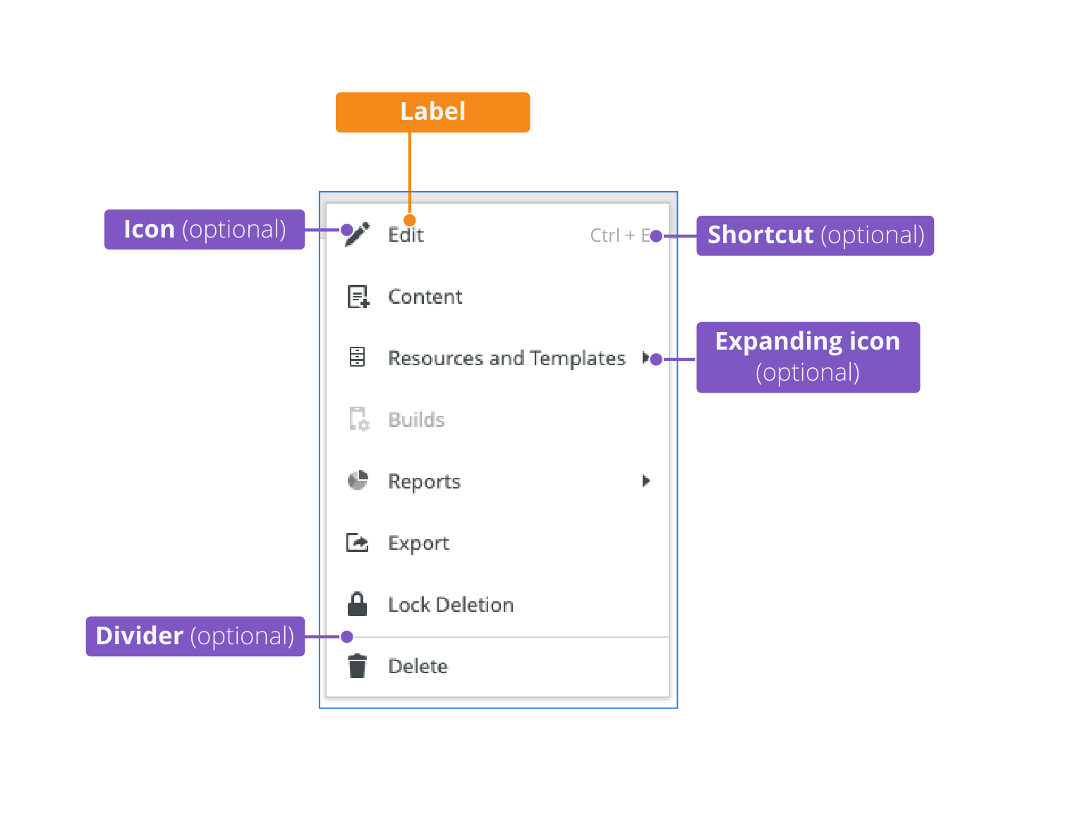
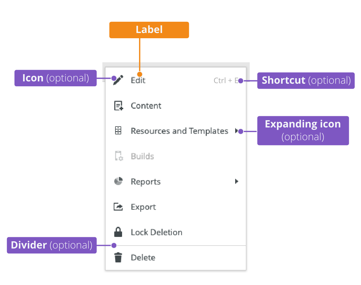
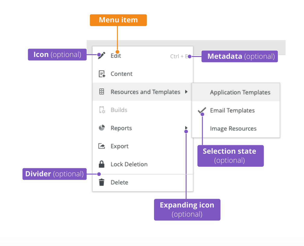
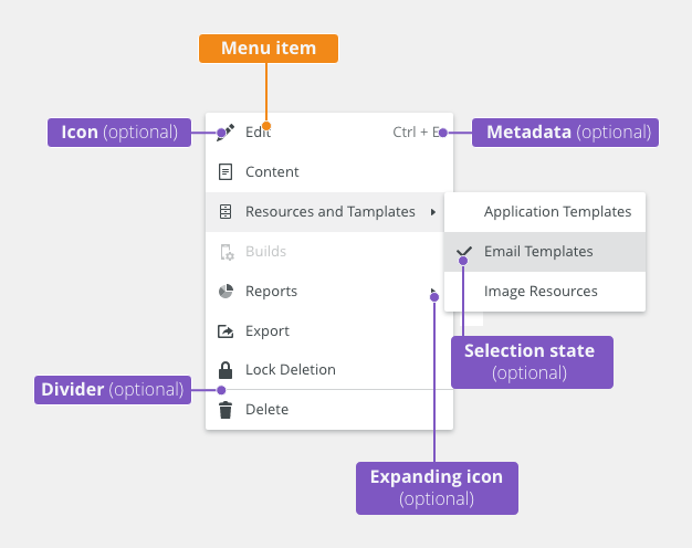
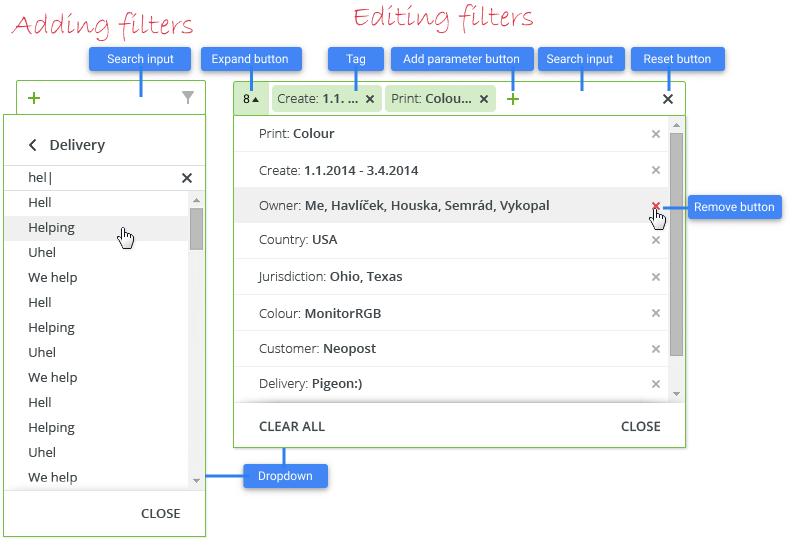
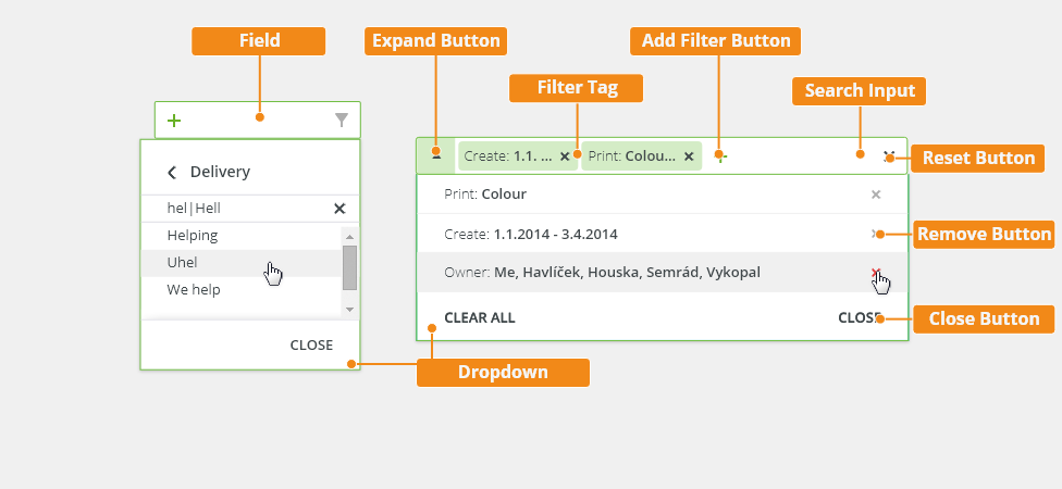
Anatomy
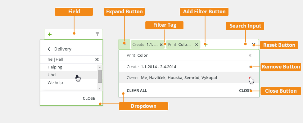
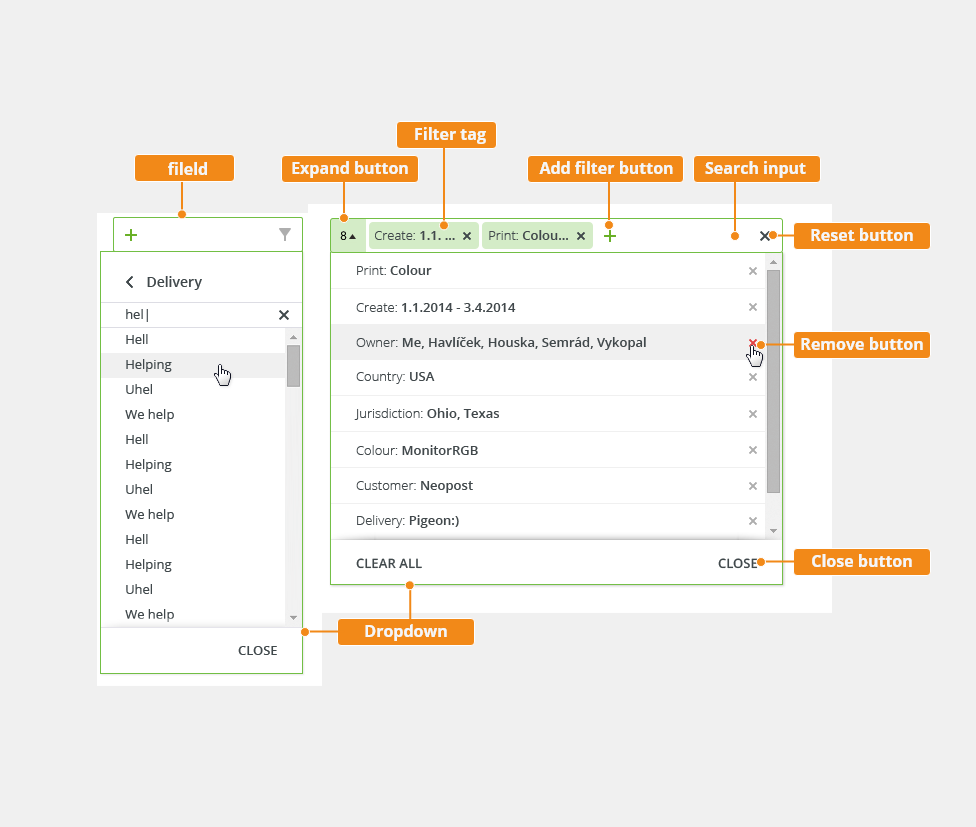
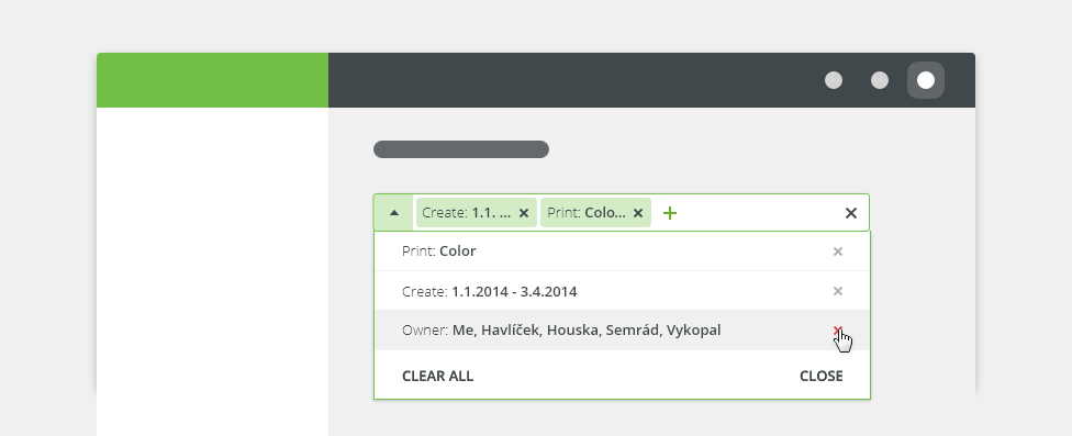
- Field - The area where users can add filters to their query.
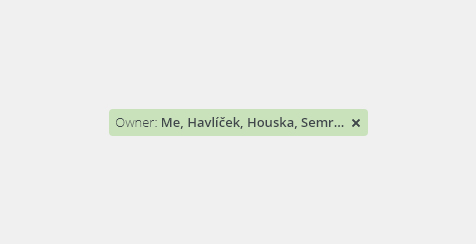
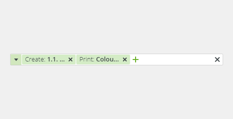
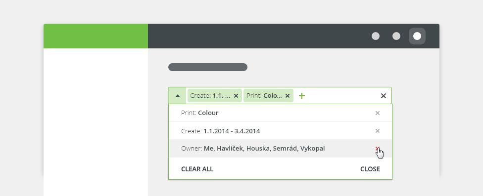
- Expand Button - Displays a list of the applied filters, displays a number of applied filter tags when the width of filter tags is larger than the filter field.
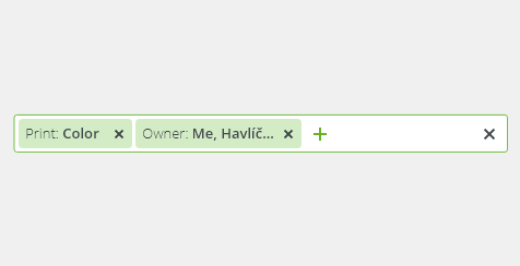
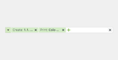
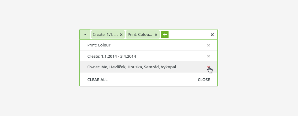
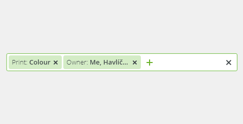
- Filter Tag - An applied filter the user has selected.
- Add Filter Button - Displays the categories of filters the user can select from.
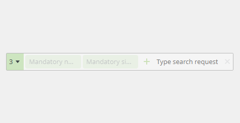
- Search Input - An area available for the user to type in a search request.
- Reset Button - Clears all of the selected filters.
- Remove Button - Removes a filter from the list and/or the field.
- Close Button - Hides the dropdown.
- Dropdown - Displays the filters and filter categories.
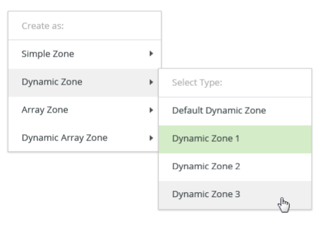
Types
Filters with Instant Updates (Default)
Give users control to respond to visual feedback (if it is needed to add another filter to find what they are looking for).
- The trigger is the individual selection and the filter manipulates the data in real time.
- This method returns results after each individual selection is made.
Filters with Batch Updates
Batch filtering is a suitable solution when the product has a lot of data, for slow data-return speeds and for processes that take longer time to mentally process.
- All filters are applied together at the end of the selection process.
- The data set only refreshes once, upon a user action, typically triggered by a pressed button.

Selection Methods
| Selection Method | Description |
|---|---|
| Single selection | The user can pick only one attribute to modify the data results. |
| Multi-selection | The user can pick more than one attribute to modify the data results. |
| Text value | Filters to display items that fall within the searched keyword. |
| Numeric value | Filters to display items that fall within the designated number. |
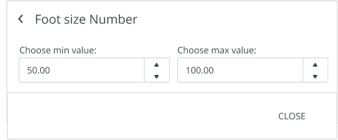
| Numeric range | Filters to display items that fall within the designated numeric range. |
Boolean Value On/Off |
The user can set the true/false option or show/hide option to filter the data. |
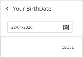
| Date | Filters to display items that fall within a selected date. |
| Date range | Filters to display items that fall within a selected date range. |
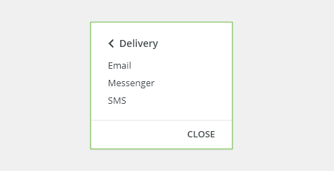
Single Selection
The user can select just a single option out of the list with a fixed set of values to filter the data.
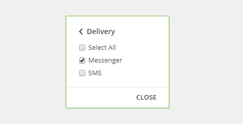
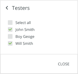
Multi-Selection
The user can pick more than one attribute out of the list to filter the data.
Text Value
The user can type a text attribute using a single search field to filter the data.

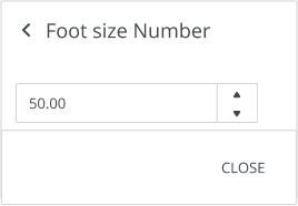
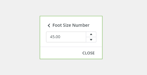
Numeric Value

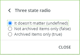
Boolean Value On/Off
The user can set the true/false option or show/hide option to filter the data.

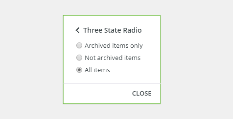
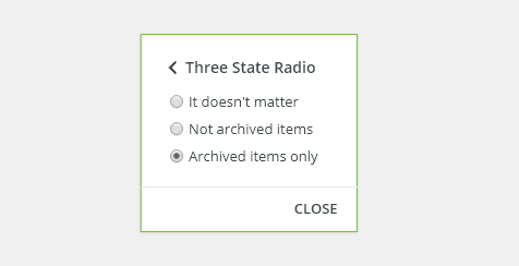
The user can set the true/false/any (undefined) option to filter the data.
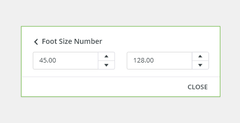
Numeric Range
The user can set a numeric value range to filter the data.
Date

Date Range

Appearance
Density
Default
Most of the use cases.
Condensed
Technical applications, e.g. Scaler.
Width
It is recommended to use the full width when expecting a large data set so the user can benefit from having an overview and have a quick access to filters.
Placement
Place the filter above the listed results (data tables, lists, or trees).
Responsivity
The filter bar flexes in size to adapt to the view size.
Behavior
Resetting Filters
Each category should have a way to clear all applied filters at once without having to interact with each individual item. Clearing filters returns the filters to their original default starting state.
If multiple categories have been applied to the same data set then there should also be a way to dismiss all filters across all categories at once.
Text Overflow
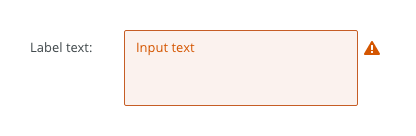
When the item text is too long for the available horizontal space, it is truncated by ellipsis and the full value is displayed in a tooltip on hover.
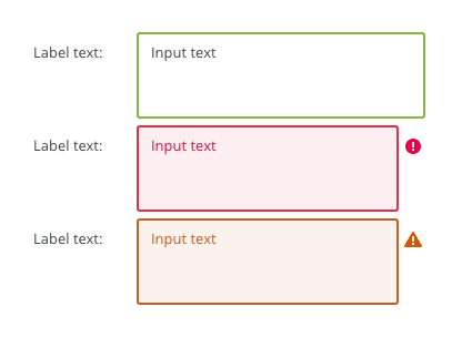
States
Default
Default filter tag.
Mandatory Tag

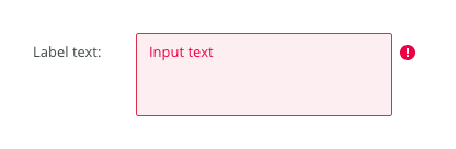
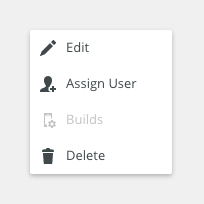
Disabled
Cannot be interacted with but remains visible to the user in a disabled visual style.
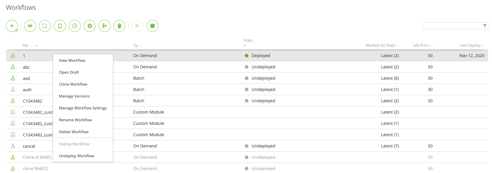
Navigation
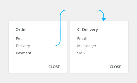
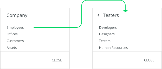
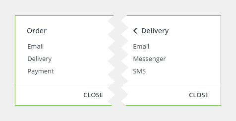
Users can navigate by using the drill down navigation. Users can select an item to see more of its details.
The selected item is replaced by the details view for the item with a back link in top-left corner which will take the users back to the list of items.
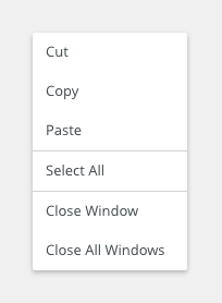
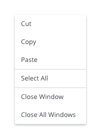
Keyboard Interactions
Key |
Interaction |
|---|---|
| <Tab> and <Shift> + <Tab> | Tab keys allow moving the focus in and out of the toolbar. |
| <Up Arrow> and <Down Arrow> | Navigate to different options within the menu. |
| <Enter> | Opens the menu and confirms the select item. |
| <Esc> | Closes the menu. |
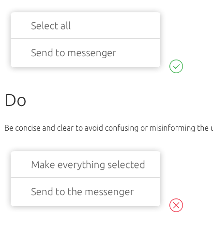
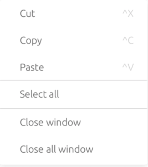
Editorial
- Use sentence case for the menu items.
- Keep the text short and specific.
Related Components
- Table (mandatory) bobwai--table
- Filter (optional) bobwai–filter
Accessibility
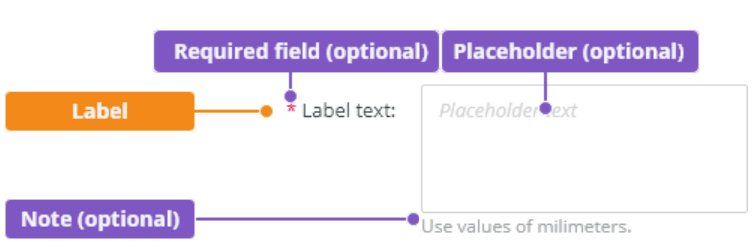
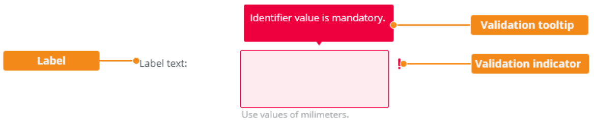
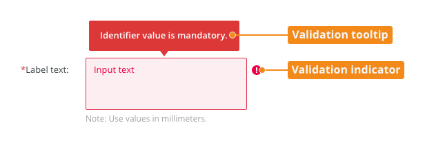
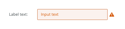
- Provide labels and instructions that are clear and concise.
- If the text input is a required field include the
aria-requiredproperty and indicate that it is a required field and use the validation message for input errors. - W3C Web Tutorial: Labeling Controls
- W3C Web Tutorial: Form Instructions
- Guidance for Design pattern for toolbar
Attachments:
 image2020-12-1_10-59-46.png (image/png)
image2020-12-1_10-57-28.png (image/png)
image2020-12-1_10-59-46.png (image/png)
image2020-12-1_10-57-28.png (image/png)
 image2020-12-1_10-57-14.png (image/png)
image2020-12-1_10-56-37.png (image/png)
image2020-12-1_10-57-14.png (image/png)
image2020-12-1_10-56-37.png (image/png)
 image2020-11-30_14-32-1.png (image/png)
 image2020-11-30_14-17-56.png (image/png)
 image2020-11-30_14-8-32.png (image/png)
 image2020-11-30_14-3-56.png (image/png)
 image2020-11-27_15-46-5.png (image/png)
 image2020-11-27_15-19-14.png (image/png)
 image2020-11-27_15-14-27.png (image/png)
 image2020-11-27_15-4-12.png (image/png)
 image2020-11-27_15-3-39.png (image/png)
 image2020-11-27_12-24-3.png (image/png)
 image2020-11-27_12-20-20.png (image/png)
 image2020-11-27_12-13-3.png (image/png)
 image2020-11-27_10-59-3.png (image/png)
 image2020-11-27_9-53-18.png (image/png)
 image2020-10-5_10-17-0.png (image/png)
 image2020-10-5_10-25-57.png (image/png)
 image2020-10-5_10-26-24.png (image/png)
 image2020-10-5_10-26-47.png (image/png)
 image2020-10-2_15-23-33.png (image/png)
 image2020-10-2_13-45-41.png (image/png)
 image2020-10-2_13-46-8.png (image/png)
 image2020-10-5_10-52-58.png (image/png)
 image2020-10-5_10-53-29.png (image/png)
 image2020-10-5_10-54-33.png (image/png)
 image2020-10-5_10-54-40.png (image/png)
 image2020-10-5_10-55-2.png (image/png)
 image2020-10-5_11-37-46.png (image/png)
 image2020-10-2_14-20-45.png (image/png)
 image2020-10-2_14-21-11.png (image/png)
 image2020-10-2_14-20-58.png (image/png)
 image2020-10-2_14-21-26.png (image/png)
 image2020-10-2_14-33-47.png (image/png)
 image2020-10-2_14-34-9.png (image/png)
 image2020-10-2_14-25-18.png (image/png)
 image2020-10-2_14-25-33.png (image/png)
 image2020-10-2_14-42-44.png (image/png)
 image2020-10-23_15-38-49.png (image/png)
 image2020-10-26_13-21-57.png (image/png)
 image2020-10-26_13-22-16.png (image/png)
 image2020-10-26_13-22-55.png (image/png)
 image2020-10-26_13-24-0.png (image/png)
 image2020-10-26_13-26-26.png (image/png)
 textarea-style@2x.png (image/png)
 textarea@2x.png (image/png)
 text-area-anatomy.png (image/png)
 text-area-label-vertical.png (image/png)
 text-area-validation.png (image/png)
 text-area-style.png (image/png)
 text-area-label-horizontal.png (image/png)
 text-area-state-selected.png (image/png)
 text-area-state-disabled.png (image/png)
 text-area-state-readonly.png (image/png)
 text-area-state-focus.png (image/png)
 text-input-density-small.png (image/png)
 text-area-density-default.png (image/png)
 text-area-density-small.png (image/png)
 text-input-variants-warning-icon.png (image/png)
 text-area-variants-error-icon.png (image/png)
 text-area-variants-warning-icon.png (image/png)
 image2020-11-2_9-24-56.png (image/png)
 image2020-11-2_9-26-14.png (image/png)
 image2020-11-2_9-26-30.png (image/png)
 Screenshot 2020-11-16 at 15.01.07.png (image/png)
 Screenshot 2020-11-16 at 14.58.54.png (image/png)
 Screenshot 2020-11-16 at 15.09.35.png (image/png)
 Screenshot 2020-11-16 at 15.19.01.png (image/png)
 Screenshot 2020-11-16 at 15.22.41.png (image/png)
 Screenshot 2020-11-18 at 12.49.34.png (image/png)
 Screenshot 2020-11-18 at 13.11.11.png (image/png)
 Screenshot 2020-11-18 at 13.22.39.png (image/png)
 Screenshot 2020-11-16 at 13.53.55.png (image/png)
 Screenshot 2020-11-19 at 08.14.25.png (image/png)
 Screenshot 2020-11-19 at 08.14.34.png (image/png)
 Screenshot 2020-11-18 at 13.08.21.png (image/png)
 Screenshot 2020-11-18 at 13.08.05.png (image/png)
 Screenshot 2020-11-19 at 09.57.10.png (image/png)
 Screenshot 2020-11-20 at 14.27.17.png (image/png)
 context-menu-anatomy.png (image/png)
 Context-menu-type-basic.png (image/png)
 Context-menu-type-multilevel.png (image/png)
 Context-menu-variants-text-only.png (image/png)
 Context-menu-variants-text-icons.png (image/png)
 Context-menu-variants-with-title.png (image/png)
 Context-menu-groups.png (image/png)
 Context-menu-states-disabled.png (image/png)
 Context-menu-do-short.png (image/png)
 Context-menu-dont-short.png (image/png)
 Context-menu-do-groups.png (image/png)
 Context-menu-dont-groups.png (image/png)
 Group 18.png (image/png)
 Group 37.png (image/png)
 Group 29.png (image/png)
 Group 27.png (image/png)
 Group 41.png (image/png)
 Group 38.png (image/png)
 image2020-6-19_12-36-22.png (image/png)
 Group 42.png (image/png)
 Group 31.png (image/png)
 Group 40 (1).png (image/png)
 image2020-6-19_12-40-16.png (image/png)
 image2020-6-19_12-39-21.png (image/png)
 image2020-6-19_11-47-31.png (image/png)
 image2020-6-19_11-45-11.png (image/png)
 image2020-6-19_11-49-21.png (image/png)
 Group 36.png (image/png)
 image2020-12-7_6-56-2.png (image/png)
 image2020-12-18_9-54-32.png (image/png)
 Advance-filter_usage.png (image/png)
 Advance-filter_anatomy.png (image/png)
 Advance-filter_single-selection.png (image/png)
Advance-filter_multi-selection – 1.png (image/png)
Advance-filter_single-selection.png (image/png)
Advance-filter_multi-selection – 1.png (image/png)
 Advance-filter_multi-selection.png (image/png)
Advance-filter_text-value.png (image/png)
Advance-filter_multi-selection – 1.png (image/png)
Advance-filter_boolean-value.png (image/png)
Advance-filter_Three-state-value.png (image/png)
Advance-filter_multi-selection.png (image/png)
Advance-filter_text-value.png (image/png)
Advance-filter_multi-selection – 1.png (image/png)
Advance-filter_boolean-value.png (image/png)
Advance-filter_Three-state-value.png (image/png)
 Advance-filter_numeric-range.png (image/png)
Advance-filter_date.png (image/png)
Advance-filter_date-range.png (image/png)
Advance-filter_density-default.png (image/png)
Advance-filter_numeric-range.png (image/png)
Advance-filter_date.png (image/png)
Advance-filter_date-range.png (image/png)
Advance-filter_density-default.png (image/png)
 Advance-filter_density-condensed.png (image/png)
 Advance-filter_tag-state-default.png (image/png)
Advance-filter_tag-state-mandatory.png (image/png)
Advance-filter_tag-state-disabled.png (image/png)
Advance-filter_navigation.png (image/png)
Advance-filter_tag-state-default.png (image/png)
Advance-filter_tag-state-mandatory.png (image/png)
Advance-filter_tag-state-disabled.png (image/png)
Advance-filter_navigation.png (image/png)
 image2021-2-1_6-55-5.png (image/png)
image2021-2-1_10-57-31.png (image/png)
image2021-2-1_10-59-53.png (image/png)
image2021-2-1_6-55-5.png (image/png)
image2021-2-1_10-57-31.png (image/png)
image2021-2-1_10-59-53.png (image/png)
 image2021-2-2_8-50-26.png (image/png)
 image2021-2-2_9-20-33.png (image/png)
image2021-2-4_14-54-24.png (image/png)
image2021-2-4_15-0-16.png (image/png)
image2021-2-2_9-20-33.png (image/png)
image2021-2-4_14-54-24.png (image/png)
image2021-2-4_15-0-16.png (image/png)
 image2021-2-4_15-0-33.png (image/png)
 image2021-2-4_15-0-50.png (image/png)
 image2021-2-4_15-4-22.png (image/png)
image2021-2-4_15-6-26.png (image/png)
image2021-2-4_15-10-10.png (image/png)
image2021-2-4_15-4-22.png (image/png)
image2021-2-4_15-6-26.png (image/png)
image2021-2-4_15-10-10.png (image/png)