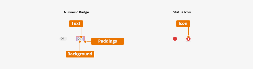
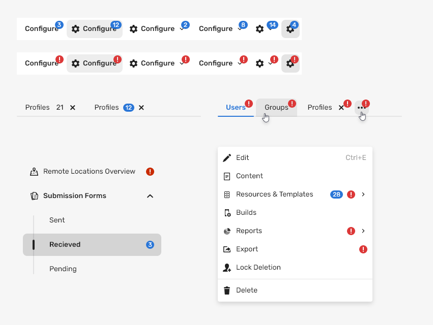
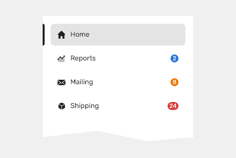
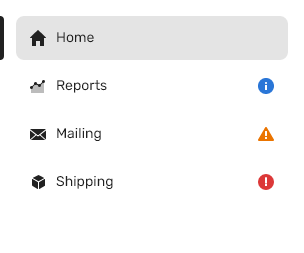
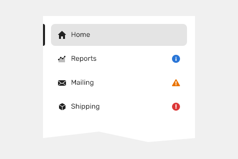
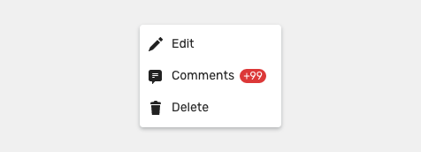
A badge is a visual indicator for annotating other information such as numeric values or status to a related object.
Component Status
 Design Kit: IN DEVELOPMENT
 Bobwai Component: bobwai–badge RELEASED

Usage
A badge is used to highlight the summary of how many items are within an asset or they mark the status of an item. Badge are static; users cannot select them.
Types
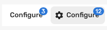
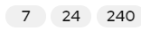
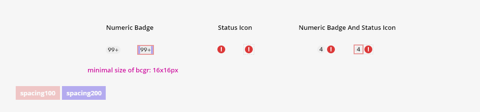
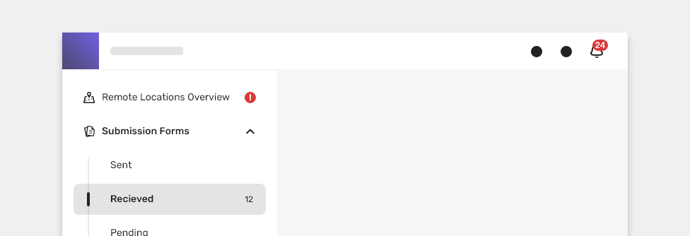
Numeric Badge

Numerical indicators on icons, signifying that something changed since the last interaction or showing a number of available objects.
Typical usage:
- indicates the number of unread items
- indicates new or updated information
- indicates the number of available objects - visual representation for icons

- Display a numeric badge when there is one or more new items.
- Do use text only for a number of available objects:

- Do not use the numeric badge if there are no new items.
- Do not use the badge for a number of available objects on text:
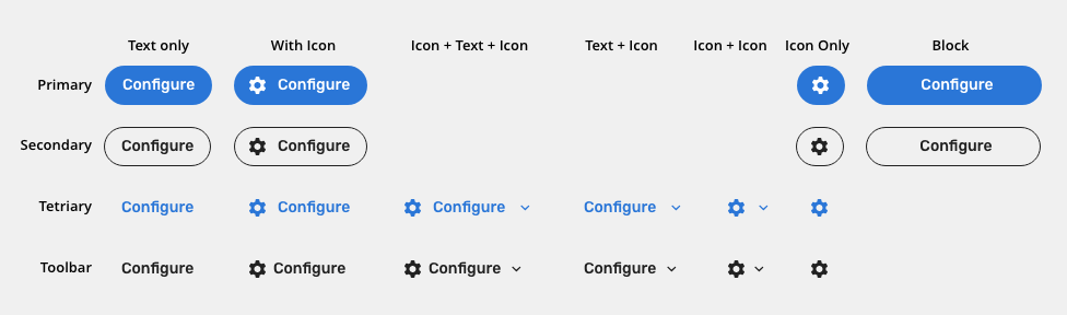
Variants
Overlay
Positioned top right to an icon

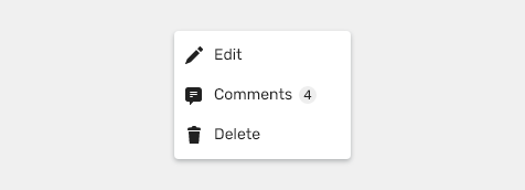
Inline
Positioned next to a text
States
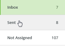
Neutral
Counts number of available objects (e.g., Attachments)

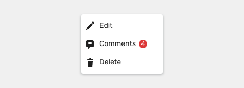
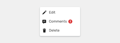
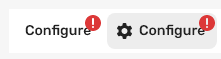
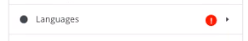
Important
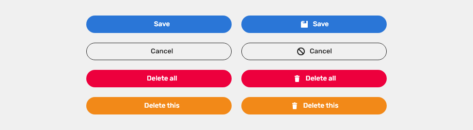
Important badge brings attention to information that needs to stand out. For example notifications.
Primary red color is preferred to indicate attention, but in cases where a badge needs to indicate semantic colors (e.g., info, warning, error), red color can be used as negative (e.g., error, alert, rejected, failed).

Semantic colors
- Informative (e.g., active, in use, live, published)
- Notice (e.g., warning, needs approval, pending, processing)
- Negative (e.g., error, alert, rejected, failed)

Behavior
A badge has no interaction. It is not clickable or removable.
Max value
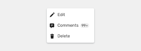
It is recommended to limit the number to maximum 2 characters. More than two will be displayed as 99+.
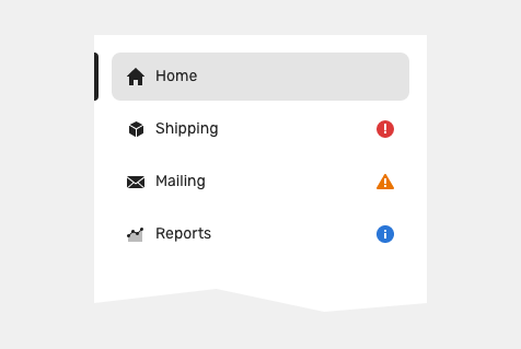
Status Icon

Status or items that require the user’s attention.
Typical usage:
- Highlights a status of tabs or menu content.
Variants
Overlay
Positioned top right to an icon

Inline
Positioned next to a text
States
- Informative (e.g., active, in use, live, published)
- Notice (e.g., warning, needs approval, pending, processing)
- Negative (e.g., error, alert, rejected, failed)
Related Components
- Validations are tied to a user’s action or input.
- Notifications are focused on system-related events.
Style
Elements
| Used In | Type | px | Token |
|---|---|---|---|
| Text color | Color | color-text-100 |
|
| Text font | Font | font-label |
|
| Background color | Color | color-bg-ui-300 |
|
| Background corner radius | Corner radius | radius-pill |
|
| Icon size | Size | sizing-icon-200 | |
| Icon color | Color | color-error |
Numeric Badge States

Default
| Used In | Type | Token |
|---|---|---|
| Text color | Color | color-text-100 |
| Background color | Color | color-bg-ui-300 |
Important
| Used In | Type | Token |
|---|---|---|
| Text color | Color | color-text-400 |
| Background color | Color | color-error |
Status Icon States

Error
| Used In | Type | Token |
|---|---|---|
| Icon color | Color | color-error |
Warning
| Used In | Type | Token |
|---|---|---|
| Icon color | Color | color-warning |
Info
| Used In | Type | Token |
|---|---|---|
| Icon color | Color | color-info |
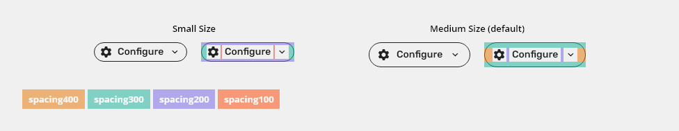
Spacing

| Used in | Type | px | Token |
|---|---|---|---|
| Upper and bottom padding | Spacing | 2 | spacing-100 |
| Left and right padding | Spacing | 2 | spacing-100 |
Left and right spacing between text edge of background |
Spacing | 4 | spacing-200 |
| Icon size | Size | sizing-icon-200 |
Accessibility
Attachments:
 button-sizes-toolbar-spec.png (image/png)
 button-sizes-prim-spec.png (image/png)
 button-behavior-minimum.png (image/png)
 button-states-toolbar.png (image/png)
 button-sizes.png (image/png)
 button-icon-only.png (image/png)
 button-with-icon.png (image/png)
 button-variants.png (image/png)
 button-variants-toolbar.png (image/png)
 buttons-in-block-2.png (image/png)
 button-sizes-prim-spec – 1.png (image/png)
 button-states-warning.png (image/png)
 button-states-error.png (image/png)
 button-states-tertiary.png (image/png)
 button-states-secondary.png (image/png)
 button-states-primary.png (image/png)
 button-content.png (image/png)
 alignment-f.png (image/png)
 alignment-z.png (image/png)
 buttons-in-block.png (image/png)
 button-variants-warning.png (image/png)
 button-variants-error.png (image/png)
 button-variants-tetriary.png (image/png)
 button-variants-secondary.png (image/png)
 button-variants-primary.png (image/png)
 button-content -style.png (image/png)
 button-sizes-prim-spec–1.png (image/png)
 Context-menu-type-multilevel.png (image/png)
 image2020-10-9_14-6-44.png (image/png)
 image2020-8-17_9-13-16.png (image/png)
 image2020-8-17_9-11-24.png (image/png)
 image2020-8-17_8-39-24.png (image/png)
 image2020-8-14_16-16-47.png (image/png)
 image2020-8-14_15-18-34.png (image/png)
 image2020-8-14_15-6-34.png (image/png)
 image2020-8-14_15-4-29.png (image/png)
 image2020-8-14_15-3-27.png (image/png)
 image2020-8-14_15-3-13.png (image/png)
 image2020-8-14_14-46-0.png (image/png)
 image2020-8-14_14-45-44.png (image/png)
 image2020-8-14_14-40-25.png (image/png)
 image2020-8-14_14-39-14.png (image/png)
 image2020-8-14_10-49-41.png (image/png)
image2020-8-14_10-41-45.png (image/png)
button-states-compound.png (image/png)
image2020-8-14_10-49-41.png (image/png)
image2020-8-14_10-41-45.png (image/png)
button-states-compound.png (image/png)
 button-compound-variants.png (image/png)
 image2020-7-16_16-50-13.png (image/png)
 image2020-7-16_16-46-40.png (image/png)
 image2020-7-16_16-44-52.png (image/png)
 image2020-7-16_16-43-12.png (image/png)
 image2020-7-16_16-37-3.png (image/png)
 image2020-7-15_11-10-39.png (image/png)
 image2020-7-15_11-9-17.png (image/png)
 image2020-7-15_11-9-8.png (image/png)
 image2020-7-15_11-8-51.png (image/png)
 image2020-7-15_11-8-30.png (image/png)
 image2020-7-15_11-8-7.png (image/png)
 image2020-7-15_11-7-50.png (image/png)
 image2020-7-15_11-7-33.png (image/png)
 image2020-7-1_10-57-18.png (image/png)
 image2020-7-1_11-7-21.png (image/png)
 image2020-7-1_11-0-8.png (image/png)
 image2020-7-1_10-13-56.png (image/png)
 image2020-7-1_9-51-41.png (image/png)
 image2020-7-1_9-51-16.png (image/png)
 image2020-7-15_10-47-9.png (image/png)
 image2020-7-15_9-34-20.png (image/png)
 image2020-7-14_15-18-5.png (image/png)
 image2020-7-14_15-4-54.png (image/png)
 image2020-7-14_14-21-30.png (image/png)
 image2020-7-14_14-20-56.png (image/png)
 image2020-7-14_14-18-54.png (image/png)
 image2020-7-14_14-18-3.png (image/png)
 image2020-7-14_14-17-23.png (image/png)
 image2020-7-14_14-15-21.png (image/png)
 image2020-7-14_14-13-53.png (image/png)
 button-blocks.png (image/png)
 button-states.png (image/png)
 Group 11.5 (1).png (image/png)
 Group 11.4 (1).png (image/png)
 image2019-7-24_11-37-53.png (image/png)
 image2019-7-24_11-37-36.png (image/png)
 image2019-7-24_11-37-19.png (image/png)
 image2019-7-24_11-34-13.png (image/png)
 image2019-7-24_11-30-34.png (image/png)
 image2019-7-24_11-24-13.png (image/png)
 image2019-7-24_11-22-24.png (image/png)
 image2019-7-24_11-21-59.png (image/png)
 image2019-7-22_16-5-7.png (image/png)
 image2019-7-22_16-4-4.png (image/png)
 image2019-7-22_16-3-0.png (image/png)
 image2019-7-22_15-49-16.png (image/png)
 image2019-7-22_15-48-19.png (image/png)
 image2019-7-22_15-47-44.png (image/png)
 image2021-3-1_15-21-36.png (image/png)
 MicrosoftTeams-image (60).png (image/png)
 validations&conters.png (image/png)
 image2021-3-3_12-40-52.png (image/png)
 image2021-3-3_12-41-0.png (image/png)
 image2021-3-3_12-43-14.png (image/png)
 image2021-3-3_12-44-20.png (image/png)
 image2021-3-3_12-44-55.png (image/png)
 image2021-3-3_12-45-4.png (image/png)
 image2021-3-3_12-45-40.png (image/png)
 image (32).png (image/png)
 image2021-3-4_8-13-36.png (image/png)
 image2021-3-4_8-14-41.png (image/png)
 image2021-3-4_8-18-9.png (image/png)
 image2021-3-4_8-20-33.png (image/png)
 image2021-3-12_10-58-40.png (image/png)
 image2021-3-12_13-43-48.png (image/png)
 image2021-3-15_10-23-0.png (image/png)
 image2021-3-15_10-25-16.png (image/png)
 image2021-3-15_10-28-44.png (image/png)
 image2020-12-1_10-57-14.png (image/png)
 image2020-12-1_10-59-46.png (image/png)
 image2021-3-16_10-59-42.png (image/png)
 image2021-3-16_18-18-54.png (image/png)
 image2021-3-17_10-32-1.png (image/png)
 image2021-3-17_10-48-40.png (image/png)
 MicrosoftTeams-image (79).png (image/png)
 MicrosoftTeams-image (80).png (image/png)
 image2021-3-17_13-57-31.png (image/png)
 image2021-3-17_13-59-34.png (image/png)
 image2021-3-17_14-0-14.png (image/png)
 MicrosoftTeams-image (82).png (image/png)
 MicrosoftTeams-image (83).png (image/png)
 image2021-3-17_15-5-42.png (image/png)
 image2021-3-22_10-36-24.png (image/png)
 image2021-3-22_10-37-5.png (image/png)
 image2021-3-22_10-37-54.png (image/png)
 image2021-3-22_12-42-19.png (image/png)
 image2021-3-22_12-46-20.png (image/png)
 image2021-3-22_12-48-32.png (image/png)
 image2021-3-22_12-48-49.png (image/png)
 image2021-3-22_13-3-10.png (image/png)
 image2021-3-22_13-3-50.png (image/png)
 image2021-3-22_13-27-44.png (image/png)
 image2021-3-22_13-51-32.png (image/png)
 image2021-3-22_16-49-51.png (image/png)
 badges-content.png (image/png)
 badges-content.png (image/png)
 badges- status.png (image/png)
 badges-spacing.png (image/png)
 image2021-3-23_17-6-19.png (image/png)
 image2021-3-23_17-53-33.png (image/png)
 image2021-3-26_15-20-1.png (image/png)
 image2021-3-26_15-20-18.png (image/png)
 image2021-3-26_15-29-30.png (image/png)
image2021-3-26_15-30-14.png (image/png)
badges-content.png (image/png)
image2021-3-26_15-29-30.png (image/png)
image2021-3-26_15-30-14.png (image/png)
badges-content.png (image/png)
 badges-spacing.png (image/png)
 numeric badge-status.png (image/png)
status icons-states.png (image/png)
numeric badge-status.png (image/png)
status icons-states.png (image/png)
 badges-title.png (image/png)
 numeric badge-anatomy.png (image/png)
 numeric badge-do.png (image/png)
numeric badge-dont.png (image/png)
numeric badge-overlay.png (image/png)
numeric badge-inline.png (image/png)
numeric badge-do.png (image/png)
numeric badge-dont.png (image/png)
numeric badge-overlay.png (image/png)
numeric badge-inline.png (image/png)
 numeric badge-default.png (image/png)
numeric badge-important.png (image/png)
numeric badge-max value.png (image/png)
numeric badge-default.png (image/png)
numeric badge-important.png (image/png)
numeric badge-max value.png (image/png)
 status icon-anatomy.png (image/png)
status icon-overlay.png (image/png)
status icon-inline.png (image/png)
status icon-states.png (image/png)
status icon-anatomy.png (image/png)
status icon-overlay.png (image/png)
status icon-inline.png (image/png)
status icon-states.png (image/png)
 status icons-status.png (image/png)
badges-title.png (image/png)
status icons-status.png (image/png)
badges-title.png (image/png)
 badges-title.png (image/png)
badge-numeric-states.png (image/png)
badges-title.png (image/png)
badge-numeric-states.png (image/png)
 image2021-4-6_14-37-18.png (image/png)
 image2021-4-6_14-57-12.png (image/png)
 image2021-4-6_14-57-21.png (image/png)
 image2021-4-6_14-57-42.png (image/png)
 image2021-4-6_14-58-34.png (image/png)
 badge-numeric-states.png (image/png)
status icon-states.png (image/png)
badge-numeric-inline.png (image/png)
badge-numeric-max-value.png (image/png)
badge-numeric-states.png (image/png)
status icon-states.png (image/png)
badge-numeric-inline.png (image/png)
badge-numeric-max-value.png (image/png)
 numeric badge-anatomy.png (image/png)
numeric badge-max value.png (image/png)
badges-content.png (image/png)
badges-spacing.png (image/png)
numeric badge-anatomy.png (image/png)
numeric badge-max value.png (image/png)
badges-content.png (image/png)
badges-spacing.png (image/png)